OUR VISION WHERE WE RE GOING
|
|
|
- Angelica Cross
- 5 years ago
- Views:
Transcription
1 1
2 INTRODUCTION A brand is not just a logo or a strap line. A brand is a set of beliefs, goals and values that guides an organisation, its decisions and communications, both internally and externally. To establish and maintain a strong brand for The Arts Society we need to ensure that everything we do follows these guidelines. This document has been developed to provide anyone creating visual communications for The Arts Society with clear guidelines on how the visual identity components can be used. The aim for the brand identity is to create a strong, coherent and recognisable look that helps to engage with our diverse audiences. 01
3 THE ELEVATOR PITCH We are The Arts Society. We bring people together through a shared curiosity for the arts. Our events provide welcoming places locally, nationally and globally to hear expert lecturers share their specialist knowledge about the arts. Our 90,000+ members contribute to and preserve our artistic heritage through volunteering and grants. The belief that the arts have the potential to enrich peoples lives is at the heart of everything we do. We inspire, we do, we give. 02
4 OUR VISION WHERE WE RE GOING Together as one global community we will widen involvement and influence the arts by inspiring the interest of all generations. We want to be the most inclusive and influential arts society. 03
5 OUR OFFER WHAT WE DO We offer enjoyable and expert opportunities to discover and support the arts of yesterday, today and tomorrow, wherever you are. We inspire, we do, we give. 04
6 OUR VALUES HOW WE DO IT Our values define who we are. They drive the way we do things and the decisions we make. We are... Pioneering We bring imagination, curiosity and courage to everything we do. We enjoy exploring new and different ways of working. Knowledgeable We always strive for the highest standards of expertise and rigour. This requires dedication and commitment. Connected We are one team. The only way to achieve our vision is to be relevant, responsive and coherent in our approach. Welcoming We are approachable and open, sociable and generous in our attitude. We respect each other s expertise and ideas. 05
7 OUR PURPOSE WHY WE DO IT Our strength is our people joined together by a passion for the arts which can nourish and empower us all. Our work creates a better, healthier and more connected society. Enriching lives through the arts. 06
8 OUR KEY MESSAGES As well as our name, these are the most important things everyone needs to know about us. Every time we communicate about The Arts Society, we should lead with as many of these messages as possible: from general introductions to press releases, from speeches to funding applications. The messages should be edited and combined as appropriate for the context. The ideas can be conveyed through words but also through images, layout and format. 07
9 OUR KEY MESSAGES A leading arts education charity A global network of local arts societies Connecting people to the arts and each other Welcoming and open to all World-class lecturers sharing specialist knowledge Volunteering to preserve heritage for the future Supporting the skills of makers and artists We believe the arts enrich peoples lives 08

10 LOGOTYPE 09
11 OUR LOGOTYPE TECHNICAL DETAILS Our logotype is made up of two elements. The monogram combined with the name. Monogram Name 10
12 OUR MONOGRAM Our monogram communicates the idea at the heart of our brand, that we connect people and societies to the arts through an interlocking A and S. It has been drawn to reflect a classic, timeless look. It is crafted from a typeface called Plantin. Plantin is an old-style serif typeface named after the typographer printer Christophe Plantin ( ). 11
13 MONOGRAM MINIMUM SIZE The monogram should not be used below the minimum size. 10mm 12
14 CLEAR SPACE TECHNICAL DETAILS A clear space should be kept around the monogram. The measurement of the right serif from the letter A defines the minimum clear space. 13
15 SOCIAL MEDIA For applications that require a square format, the monogram should be used. It should be used as white out of one of the core colours for the most impact. 14
16 SOCIAL MEDIA TECHNICAL DETAILS For applications where the logotype has to sit within a circle, it should be used in one of the core colours on a white background. 15
17 WHAT NOT TO DO Always use the monogram as supplied, with the correct colours. It should never be recreated or altered. Do not (clockwise from top left): Separate the two elements of the monogram with different colours. Use at an angle in isolation. Distort the monogram. Use a keyline around the monogram. 16
18 PRIMARY LOGOTYPE 17
19 SECONDARY LOGOTYPE The secondary logotype has been drawn up for small use. 18
20 APPLICATION SIZES The recommended size for the logotypes are based on half of the width. Where possible the logotype should sit top left. A4 / 106mm A5 / 89.5mm DL / 58mm 19
21 LOGOTYPE MINIMUM SIZE TECHNICAL DETAILS The logotype should not be used below the minimum size. 40mm 35mm 20
22 CLEAR SPACE TECHNICAL DETAILS A clear space should be kept around the logotype. This applies to all the variations on the logotype. 21


23 WHAT NOT TO DO TECHNICAL DETAILS Consistent use of the logotype is crucial. Always use the logotype as supplied, with the correct colours. It should never be recreated. Do not (clockwise from top left): Use effects on the logotype. Use the logotype at an angle in isolation. Change the colour. Alter the typeface. 22
24 WORDMARK The wordmark is supplied as a separate artwork. This is used when the monogram is at a much larger scale. Please see the applications section for specific examples. 23
25 APPLICATION SIZE FOR WORDMARK TECHNICAL DETAILS These are the recommended sizes for the monogram and wordmark for A4, A5 and DL where the monogram is used at a much larger scale. The wordmark should always range off the right serif of the A. 6mm 6mm 6mm 5mm 5mm 5mm 5mm 5mm 5mm 12mm 10mm 10mm A4 / 43mm A5 / 30mm DL / 20mm 24


26 LOCK UPS A small use logotype has been created. An even balance should be kept for lock ups with other logotypes. Always ensure there is enough clear space. 25
27 ENDORSING The endorsing logotypes are supplied as artworks and should never be recreated. Accredited Lecturer of Grant Recipient of Supporting Supported by Supporting EPSOM Partners with 26
28 BRAND ARCHITECTURE 27
29 BRAND ARCHITECTURE Our guideline for how to articulate the relationship between the different parts of The Arts Society includes using an assertive and confident monogram with the strand of the offer or name of the local society listed underneath. Activities should be typeset in Gotham Book uppercase. YOUNG ARTS 28


30 BRAND ARCHITECTURE Activity examples. CHURCH RECORDERS TOURS TRAINING DAYS 29
31 LOCAL SOCIETIES Here are the different variations of the local Society logotypes EPSOM EPSOM YORK YORK 30


32 LOCAL SOCIETIES A key part of the local art society language is imagery combining art and place. This will ensure consistency and visibility for The Arts Society, but also crucially provide the local societies with an opportunity to express their own individuality and personality. EPSOM CROSBY BODMIN 31
33 WHAT NOT TO DO Do not (clockwise from top left): Change the typeface. Differentiate the colour of the local art society name. Remove The Arts Society. Make the local name larger. ASHDOWN FOREST ASHDOWN FOREST SURREY NORTH YORKSHIRE & SOUTH DURHAM 32
34 COLOUR 33
35 OUR COLOURS The Arts Society Purple is our core colour. It embodies the passion of the colour red and the calm of the colour blue. Purple communicates in a positive way and has to the power to uplift, instil confidence and encourage creativity. Purple is associated with royalty, nobility and prestige. 34
36 PRIMARY COLOUR PALETTE The Arts Society Purple C80 M100 Y35 K40 R66 G27 B72 Pantone 669C 35
37 SECONDARY COLOUR PALETTE The Arts Society Blue C80 M0 Y5 K20 R0 G151 B193 Pantone 2995 C The Arts Society Pink C0 M100 Y30 K0 R230 G0 B100 Pantone 213 C 36
38 SECONDARY COLOUR PALETTE The Arts Society Grey C15 M15 Y10 K10 R206 G201 B206 Pantone 665 C 37
39 COLOUR VARIATIONS On a white or neutral background the monogram can be used in one of the core colours. The monogram can also be used white out of the core colours. 38

40 COLOUR VARIATIONS On images, the monogram should have a slight opacity. The recommended opacity is 80% but should be judged for each application. The wordmark should remain at 100%. 39


41 WHAT NOT TO DO TECHNICAL DETAILS Do not (clockwise from top left): Use the white logotype on a light image. Use the logotype in purple on a similar colour image. Use the logotype in black. Use the logotype in a colour not from the identity colour palette. 40
42 TYPOGRAPHY 41
43 OUR TYPEFACES A combination of two typefaces traditional and modern again expresses connection, an idea at the heart of The Arts Society brand. Our typefaces are News Plantin and Gotham. The monogram is crafted from News Plantin and The Arts Society title is set in Gotham Medium. Plantin is an old-style serif typeface named after the printer Christophe Plantin ( ). It was first cut in 1913 by Fritz Stelzer for the Monotype Corporation, Surrey. Plantin is one of the typefaces that influenced the creation of Times New Roman. News Plantin retains the robust nature of Plantin but provides better economy in text use. Gotham was designed in 2000 by Tobias Frere-Jones. The goal was to exhibit the mathematical reasoning of a draftsman, rather than the instincts of a typeface designer. Gotham is a modern sans-serif typeface that is clean, legible and classic. 42
44 GOTHAM Gotham should always be set in uppercase. Gotham Thin should be used for quotations and large titles. Gotham Book should be used for Local Art Society names and titles locked up with the logotype. Gotham Medium should be used for secondary titles. Gotham Thin Gotham Book Gotham Medium 43
45 NEWS PLANTIN News Plantin Regular and Italic should be used for body copy. News Plantin Bold should be used for secondary titles. News Plantin Regular News Plantin Italic News Plantin Bold 44
46 DEFAULT FONT For powerpoint and web safe fonts, Times New Roman can be used to replace News Plantin. Verdana should be used to replace Gotham. Times New Roman Regular Times New Roman Italic Times New Roman Bold Verdana Regular Verdana Bold 45
47 ALIGNMENT The preferred layout is to have all text ranged left. LEADING/LINE SPACING If leading is too tight or too open it can make the text difficult to read. As a general guide the leading should be set between 10 25% higher than the type size e.g. 8pt text could be set on a pt leading. TRACKING Headlines are to be set as standard tracking. Text and body copy should use a tracking of -10. LINE LENGTH As a general guide the maximum length of words in a line should be around words, to aid legibility. 46

48 IMAGERY 47
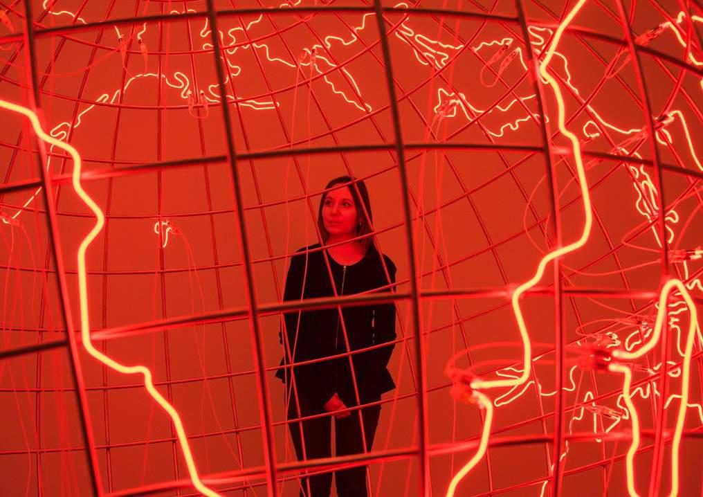
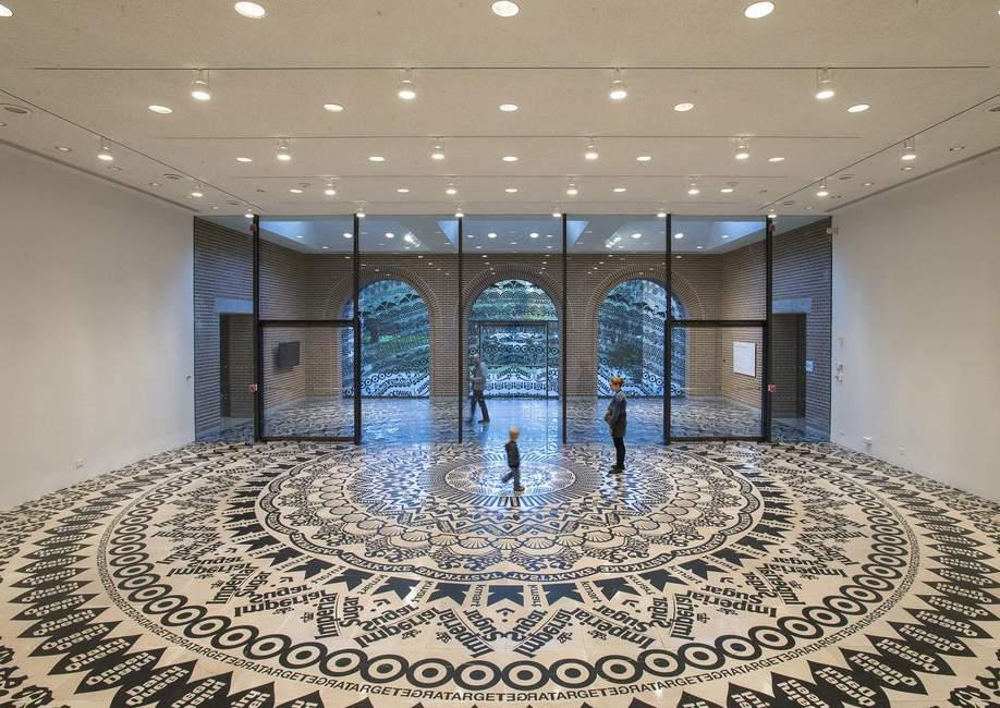
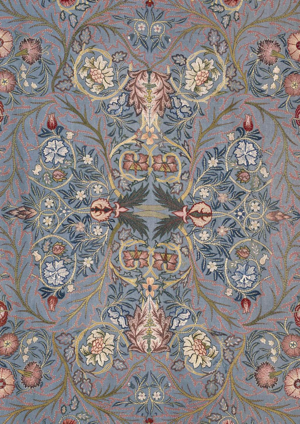
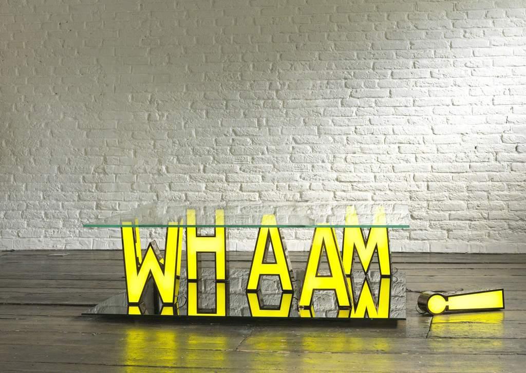
49 OUR IMAGERY Use of imagery is a key part of our visual identity. The photography should be inspirational and aspirational: engaging and exciting. Avoid the obvious and clichéd. Cropping a photograph well can have a dramatic effect on its impact, drawing the viewers eye and excluding visual clutter. Photographs should be of the highest possible quality never use pictures which look slightly out of focus or dull. Each of the imagery themes is described in more detail in the following pages. 48


50 WORKS OF ART Use interesting crops and angles to create intrigue and focus. Include a range of different mediums and artists work to show diversity. 49


51 WORKS OF ART Include photographs of people interacting with pieces of art, or show an immersive experience, in order to communicate the idea of connection and enriching lives. 50


52 ARTISTS Try close-ups and interesting angles to capture the emotion and passion. Photographing artists in their working environment can provide an insight into their line of work. 51


53 LOCAL AREAS Art by local artists or of the local area can be used for local leaflets and websites. 52


54 PORTRAITS These should be bright and inspiring. The subject matter of the lecturer or artist should be combined. 53


55 EVENTS Images of events help capture the atmosphere and can communicate our social and welcoming side. They should look natural and not staged or posed. 54


56 DETAILS Use detail images to focus in on every aspect of artists and what makes each technique unique. These can be materials or work in progress shots and help to communicate our knowledge and expertise. 55


57 GRAPHIC COLOUR TREATMENT Graphic treatments can be used with imagery on select applications. Using monochrome imagery, tints of the core colour can be added to create further texture and depth. 56


58 WHAT NOT TO DO Do not (clockwise from top left): Use stock imagery. Use uninspiring photographs. Use out of focus photographs. Use clip art. 57


59 WHAT NOT TO DO Do not (clockwise from top left): Use overly staged photography. Use badly cropped images. Use unnecessary filters on images. Use indistinct images. 58
Brand identity guidelines
 Brand identity guidelines Version 1.2 November 2016 01 Contents 01 Contents 02 Introducing the 03 Who are these guidelines for? 04 The logo 05 Explaining the logo 06 Logo exclusion zone 07 Logo minimum
one M2M Logo Brand Guidelines
 one M2M Logo Brand Guidelines July 2012 Logo Design Explanation What does the one M2M logo symbolize? The number 2 in the middle part of the logo symbolizes the connection between the two machines, the
Version 3:0 September 2015
 Identity guidelines Version 3:0 September 2015 The Buxton logotype The new logotype embraces the concept of water - and a source of water. The focal point of the design is the letter O' where water emerges
Brand Guidelines. January 2015
 Brand Guidelines January 2015 Table of Contents 1.0 What s a brand? 3 1.1 The logo 4 1.2 Colour 1.2.1 Spot & Process 1.2.2 Black & White 5 5 6 1.3 Logo Sizing 1.3.1 Minimum Clear Space 1.3.2 Positioning
The U.S. Fund for UNICEF Communications Style. Guide
 The U.S. Fund for UNICEF Communications Style Guide Table of Contents 1.0 The U.S. Fund for UNICEF 1.1 Our Mission 1.2 Our Brand Position 2.0 Our Goals 3.0 The UNICEF Story 4.0 Logo Versions 4.1 Logo Size
Kodiak Brand Guide. April 2015
 Kodiak Brand Guide April 2015 //kodiakptt.com/company/brand/ Table of Contents The brand is more than a logo 2 Communication 4 Tone & Style 4 Kodiak in Writing 4 Kodiak Marks & Logo 5 Standard Wordmark
INTRODUCTION. NASS is an action sports & music festival that celebrates the very best of alternative culture, bringing you three days of:
 BRAND GUIDELINES INTRODUCTION NASS is an action sports & music festival that celebrates the very best of alternative culture, bringing you three days of: PRO SKATE + BMX COMPETITIONS WITH THE WORLD S BEST
School of Social Work. Partnering for Change Style Guide
 School of Social Work Partnering for Change Style Guide September 4, 2009 Partnering for Change Campaign Introduction Rutgers School of Social Work is embarking upon a campaign intended to create a comprehensive,
Visual Style Guide April 2016
 Visual Style Guide April 2016 Contents Introduction to the Logo 3 Safe Area and Size 4 Incorrect Usage 5 Color Palette 6 Typography 7 Tone and Style of Photography 8 Print Examples 9 Screen Examples 10
CMA VISUAL IDENTITY GUIDE. January 2018
 CMA VISUAL IDENTITY GUIDE January 2018 CMA Visual Identity Guide Logo overview The CMA logo is composed of the French and English wordmarks and the CMA icon (note: the logo is always bilingual, even in
FOURSQUARE BRAND GUIDE LOGO USAGE. Brand Guide FALL 2014
 FOURSQUARE BRAND GUIDE LOGO USAGE 1 Brand Guide FALL 2014 FOURSQUARE BRAND GUIDE INTRODUCTION 2 The Foursquare brand is more than just a logo. It is a visual system and language made up of many parts that
Brand Typeface Headlines Establishing Hierarchy Photography Iconography & Infographics... 18
 Brand Guide VERSION 1.0 2017 Contents at a glance Introduction Using Brand Guidelines... 3 A Note on Branding... 4 Logo Color Version... 5 Special Cases Only... 6 Logo Usage Clear Space... 7 Minimum Size...
Version 1 / February IADC Logo Usage Guidelines
 Version 1 / February 2014 IADC Logo Usage Guidelines IADC / Logo Usage Guidelines 3/36 This document outlines correct use of the IADC logo for members, chapters and partners. For a set of full brand guidelines,
FACILITYLINK CORPORATE IDENTITY MANUAL
 FACILITYLINK CORPORATE IDENTITY MANUAL Table of Contents Page 2 of 47 Introduction 3 Corporate Design Elements 7 Corporate Design Application 25 Logo Application for Subsidised Activities 44 Table of Contents
Branding guidelines. This quick reference guide is designed to help you consistently apply our brand when you communicate.
 Branding guidelines This quick reference guide is designed to help you consistently apply our brand when you communicate. If you have any questions or need any additional support please email M&CDesign@bournemouth.ac.uk
Open University Logo Guidelines for External Partners
 Open University Logo Guidelines for External Partners The Open University s brand is a valuable property for the organisation and needs to be carefully managed. With a robust identity which conveys our
BRANDING STANDARDS MANUAL
 BRANDING STANDARDS MANUAL 2014 Index Logo University version 2 School versions 3 Usage Spacing 4 Sizing 5 Color 6 Logo mark 7 Unacceptable Executions 8-9 Color 10-11 Typography 12 Other Graphic Marks Seal
GETTING UMSU BRAND BASICS RIGHT
 GETTING UMSU BRAND BASICS RIGHT UMSU Brand Guidelines 2017 UMSU BRAND GUIDELINES 2017 CONTENTS INTRODUCTION 4 UMSU BRAND: AN OVERVIEW 6 UMSU LOGO 7 UOM LOGO 8 CORRECT USE OF THE LOGO 9 INCORRECT USE OF
VISUAL BRAND IDENTITY GUIDELINES
 1 / 72 VISUAL BRAND IDENTITY GUIDELINES V 1.5 CONTACT Address National Supercomputing Centre (NSCC) Singapore 1 Fusionopolis Way, Connexis South, #17-01, Singapore 138632 Phone + 65 6714 9450 Email contact@nscc.sg
brand guidelines march 2013
 brand guidelines march 2013 1 1 about these guidelines This document focuses specifically on the guidelines for using the Acal BFi logo. It covers practical details like how to choose the correct logo
Brand Guidelines 2018
 Contents Logotype 03 Space required of logotype 04 Logo variants 05 Incorrect use of logotype 06 Brand colours 07 Typefaces 08 Additional graphic elements 09 Supporting logo for EHNS countries 10 Logotype
BRAND GUIDELINES
 BRAND GUIDELINES 2018-19 Mount Pisgah Christian School Department of Admissions and Marketing OUR BRAND Our brand is the composite of all elements that communicate to the world who we are as a school and
Visual Identity and Brand Guidelines
 Visual Identity and Brand Guidelines June 2013 Version 1.0 1 BUILDING BLOCKS 10 Vermont Tech Logo We re practical, straightforward, and confident and our logo embodies these. It stands proudly on its own
GLOBAL BRANDING LOGO
 GLOBAL BRANDING LOGO Our logo is the centerpiece of our visual identity. It is the key design element representing our organization and the basis for our design approach. Logo elements logomark The YFU
Wales Coast Path LBrand Guidelines
 LBrand Guidelines lwybr Arfordir Cymru 1 WG15224 Crown Copyright Contents Guidelines introduction 4 incorrect logo usage 12 The logo versions 5 Using the dragon shell 13 Primary logo colour options 6 signage
Graphic Identity Manual MARKETING DEPARTMENT
 Graphic Identity Manual MARKETING DEPARTMENT Introduction The success of the Westfield State graphic identity depends on the consistent use of communications materials by everyone involved with the university.
Sunshine School. Branding Guideline
 Branding Guideline 2010-2011 www.snshnscl.org Contents 3 Introduction What We Do and Why We Do It Our Organization Our Personality The Importance of a Brand 6 The Logo Our Logo Logo Usage Variations of
HarvestMaster Logo LOGO COLORS: STANDARD COLOR & SPACING LOGO COLORS: SIMPLIFIED
 HarvestMaster COLOR & SPACING LOGO COLORS: STANDARD LOGO COLORS: SIMPLIFIED To ensure the prominence, clarity, and visual impact of the HarvestMaster logo, please adhere to the following guidelines regarding
Brand guidelines. July 2014 NEXT
 Brand guidelines July 2014 The purpose of these guidelines is to help Kick It Out present their brand communications consistently and with impact. Kick It Out s brand is the organisations most valuable
BRAND. niagaracanada.com
 BRAND niagaracanada.com Introduction 3 Prospective Niagara Residents and Immigrants Audiences 4 Key Messages 5 Welcome Niagara Canada - The Visual Brand/Logo 6 Logo Lock-up 7 Colour Palette 8 Black and
BRANDING GUIDELINES Foundation for Environmental Education
 BRANDING GUIDELINES Foundation for Environmental Education INTRODUCTION Intro This is a guide to the branding elements that make up the Foundation for Environmental Education and its programmes. Have a
BRAND GUIDELINES 1 BRAND GUIDELINES
 BRAND GUIDELINES 1 BRAND GUIDELINES BRAND GUIDELINES 2 BRAND GUIDELINES 3 Contents Introduction The aims of the brand 02 About this booklet 02 Who can use the brand 02 Resources 02 Design Elements & Usage
Thank you for your continued support, and as always your feedback is welcome.
 Subject: New Tait Logo Dear Sir/Madam, To visually demonstrate the importance of the relationship between Tait Communications and your business, we have created a new Tait logo for you to use. The term
www. enocean. com EnOcean Brand Guidelines
 www. enocean. com EnOcean Brand Guidelines V3.2 MARCH 2012 EnOcean Brand Guidelines EnOcean GmbH is the innovator and producer of the award-winning, patented batteryless radio technology, thus establishing
Core brand elements CWT logos
 Two logo versions The preferred version of the logo should always be used where possible. Only use the one-line version when space does not allow for the preferred version. CWT logos Preferred logo The
TERADATA 2015 PARTNERS CONFERENCE & EXPO BRANDED ST YLE GUIDE
 TERADATA 2015 PARTNERS CONFERENCE & EXPO BRANDED ST YLE GUIDE Breaking Big BREAKING BIG is an assertive, positive, and empowering theme that will resonate with and inspire the PARTNERS target audience
BRAND GUIDELINES. July version 2.1
 BRAND GUIDELINES July 2015 - version 2.1 INTRODUCTION The Noritz Brand As we grow and advance as an organization, it sometimes becomes necessary to reevaluate our visual identity. That s why I am pleased
United Way Waterloo Region Communities Brand Identity Guidelines September 2018
 United Way Waterloo Region Communities Brand Identity Guidelines September 2018 United Way Centraide Master Brandmark The United Way Centraide master brandmark is made of three distinct elements: logo
Great Falls College Montana State University Graphic Standards
 Table of Contents Why are graphic standards important?... A The Great Falls College Montana State University brand... B Vision, Mission and Values...B1 Core Themes...B2 The Brand Components... C The Academic
BRAND GUIDELINES ISSUE V6.0
 BRAND GUIDELINES ISSUE 27.08.12 V6.0 BRAND GUIDELINES VERSION 5.0 2 A revolutionary new competition demands an exciting visual identity. In every sense, the America s Cup is about to reinvent itself. The
BRAND GUIDELINES 2017
 BRAND GUIDELINES 2017 WE ARE 02 EVERYDAY ADVENTUREWEAR BORN FROM NEW ENGLAND CHARLES RIVER APPAREL OUR STORY 03 EVERYDAY ADVENTUREWEAR BORN FROM NEW ENGLAND It all started with a rain jacket in 1983 -
The VISUAL IDENTITY. Visual Identity
 The VISUAL IDENTITY Visual Identity 2013 1 introduction What you have here is a complete how-to guide to the Freeview brand. We ve thought long and hard about what we offer our customers and how we can
BRAND STYLE GUIDE v
 BRAND STYLE GUIDE v.2.0 04.05.2015 OVERVIEW TABLE OF CONTENTS This document is designed to maintain the integrity of the Kirkwood Station Brewing Company brand and brand assets. Contained within are guidelines
B R A N D G U I D E L I N E S
 BRAND GUIDELINES OUR PRODUCT IS OUR PEOPLE EVERY DAY OUR PEOPLE PROVIDE AN ENTIRELY POSITIVE, ABOVE AND BEYOND SERVICE EXPERIENCE TO EVERY CLIENT IN THE TSP FAMILY. We believe in the power of relationships
Brand Identity Guidelines. Khwaja Fareed University of Engineering & Information Technology
 Brand Identity Guidelines Khwaja Fareed University of Engineering & Information Technology Our Vision To become a world-class University of Engineering and Information Technology that contributes significantly
EUDQG VWDQGDUGV v2.6.13
 v2.6.13 keep it simple. Our brand personality must be clear and consistent across all aspects of the business from advertising to customer communications, to products and cobranding. These guidelines have
Al Ajban Chicken Brand Guideline
 Al Ajban Chicken Brand Guideline Implementing the Al Ajban Chicken brand in communications V.I - November 2015 Introduction In 1981, Al Ajban Poultry Farm started its operations, becoming the first and
MORE THAN YOU KNOW. GRAPHIC STANDARDS GUIDE v.2
 MORE THAN YOU KNOW GRAPHIC STANDARDS GUIDE v.2 Making Our Message Clear CONTENTS 04 Logo 05 Color 06 Type Families 08 Proper Logo Usage 10 Improper Logo Usage 12 Branded Imagery 14 Application Examples
Visit Greenwich Full Logo Guides
 Contents 2 Our Logos 3 Primary Logos 8 Secondary Logos 13 Merchandise Logos Visit Greenwich Full Logo Guides 01 Our Logos The Visit Greenwich logos are a set of brand marks that have different hierarchical
Avast logo manual. Logo Overview
 2 Overview The Avast logo consists of a symbol (the amoeba) and a wordmark. Both elements of the logo have been carefully redesigned to work together for maximum legibility. Do not redraw the symbol, typeset
Program Identity Guidelines
 resources.specialolympics.org/healthy_athletes_brand.aspx Program Identity Guidelines Version 1.0 / English Zero-G / August, 2012 Version 1.0 Contents Healthy Athletes introduction 3 Guidelines introduction
Graphic Identity Standards
 Graphic Identity Standards Welcome to our visual identity. At Loyola Marymount University, our goal is to become one of the nation s distinguished Catholic universities with a commitment to academic ecellence
Branding Style Guidelines. (Revised: September 6, 2017)
") Branding Style Guidelines (Revised: September 6, 2017) Table of Contents 2 3 4 5 6 7 8 10 12 13 14 Introduction Brand elements Clear space and minimum size Logo and tagline Symbol as a graphic Logo palette
Branding Style Guidelines (Revised: September 6, 2017) Table of Contents 2 3 4 5 6 7 8 10 12 13 14 Introduction Brand elements Clear space and minimum size Logo and tagline Symbol as a graphic Logo palette
Divider Motion heading graphics
 6.31 8.0 Divider Motion heading graphics INTRODUCTION 4.1 STUDYING AT MACQUARIE OVERVIEW Overview OF ELEMENTS 8.1 4.2 Undergraduate 4.3 INTRO SEQUENCES Course guide 8.2 ENDFRAME International SEQUENCES
BRAND AND VISUAL IDENTITY STANDARDS. Guidelines for usage and application January 22, 2015 VERSION 5
 BRAND AND VISUAL IDENTITY STANDARDS Guidelines for usage and application January 22, 2015 VERSION 5 Visual Identity Hierarchy LEVEL 1: LOGO The logo is the top tier representing the institution as a whole.
BRAND GUIDELINES Update: November 2016
 BRAND GUIDELINES Update: November 2016 1 Contents Introduction 1 The Basics 2 Primary logo Colour logo options Single colour logo options Exclusion zones Title Partners Cheltenham Festivals British Council
BASIC MANUAL OF CEPSA IDENTITY
 BASIC MANUAL OF CEPSA IDENTITY April 2018 Cepsa Basic Identity Manual Welcome This manual contains all the elements that make up the Cepsa identity. This manual contains all the elements that make up the
CORPORATE VISUAL IDENTITY GUIDELINES. for the use of the OAAS Logo
 CORPORATE VISUAL IDENTITY GUIDELINES for the use of the OAAS Logo ONTARIO ASSOCIATION OF AGRICULTURAL SOCIETIES September 2017 Introduction Our branding is more than a name and a logo. Our branding is
COLLEGE IDENTITY GUIDE
 COLLEGE IDENTITY GUIDE Table of Contents TABLE OF CONTENTS Introduction...3 Identity Platform Essentials...4 Vision, Mission, Values and Positioning... 5 Marketing Messages and Tagline... 6 Traits & Attributes...
INTRODUCTION TO THE LOGOS AND BRAND
 Brand and Style Guide July 2010 INTRODUCTION TO THE LOGOS AND BRAND The City of Film brand has been developed to reflect the Mission, Vision, values, key messages and organisational strategy of Bradford
LOGO GUIDELINES. A guide for partners
 LOGO GUIDELINES LOGO FULL COLOUR LOGO Our corporate full colour logo is the most recognisable symbol of the ACD and is unique to us. As such, it is crucial we use it correctly and consistently. Whenever
United Way Centraide Brand Starter Kit. April 2011
 United Way Centraide Brand Starter Kit April 2011 United Way Centraide Brand Starter Kit, April 2011 01 Table of Contents 02 Introduction 03 Our Brand Framework Brand Elements 22 Tagline 33 Language 33
BRAND LAUNCH FALL 2017 GRAPHIC STANDARDS
 BRAND LAUNCH FALL 2017 GRAPHIC STANDARDS INTRODUCTION THESE ARE THE COMPREHENSIVE BRAND GUIDELINES FOR THE NATIONAL WESTERN CENTER. As with any good brand, adherence to graphic standards is a sure way
Swansea University Brand Asset Guidelines. Version 2 May 2018
 Swansea University Brand Asset Guidelines 1 Version 2 May 2018 Contents We are Swansea University page 3 Brand structure page 4 Visual identity usage guidance page 5 Swansea University s coat of arms page
C O R P O R A T E G R A P H I C I D E N T I T Y P O L I C Y
 C O R P O R A T E G R A P H I C I D E N T I T Y P O L I C Y J A N U A R Y 2019 1 Graphic Identity 2 Corporate identity policy This corporate identity manual standardizes the communication elements and
CLICK TO GO BACK TO THE START CLICK TO JUMP TO ANY SECTION
 Style Guide CLICK TO GO BACK TO THE START CLICK TO JUMP TO ANY SECTION 2 2018 TABLE OF CONTENTS 3 BRAND POSITION 4 FAMILY OF MARKS 17 Mission Statement 5 Tournament of Roses 19 Vision Statement 5 Rose
Corporate IDENTITY and BRANDING Standards Manual
 Corporate IDENTITY and BRANDING Standards Manual shift4.com info@shift4.com Mission Statement To empower and protect merchants accepting electronic payments by providing the fastest, most efficient, reliable
Corporate Identity and Visual Identity Guidelines June 2011
 Corporate Identity and Visual Identity Guidelines June 2011 Index A Basic Design Elements A 01 The BenQ Logo A 02 Minimum Size, Minimum Staging Area A 03 Typography A 04 Corporate Colours B B 01 B 02 B
LUDIS IUNGIT VISUAL IDENTITY GUIDELINES
 LUDIS IUNGIT VISUAL IDENTITY GUIDELINES of the Logo 2 Logo Meaning The PANATHLON INTERNATIONAL LUDIS IUNGIT logo is made up of a pictogram and a logo. Both elements are aligned centrally. The pictogram
American Chemical Society ChemClub Program Brand Guide Version 1.0
 American Chemical Society ChemClub Program Brand Guide Version 1.0 What s new with the ACS ChemClubs? The 2015/2016 school year marked the tenth anniversary of the American Chemical Society (ACS) High
GRAPHIC STANDARDS MANUAL Policy and guidelines for using the Hostos Community College 50 th Anniversary Brand Identity
 GRAPHIC STANDARDS MANUAL Policy and guidelines for using the Hostos Community College 50 th Anniversary Brand Identity TABLE OF CONTENTS Policy and Applications... 3 Hostos 50th Anniversary Primary Logo...
UNIVERSITY OF KENTUCKY ATHLETICS BRAND IDENTITY
 UNIVERSITY OF KENTUCKY ATHLETICS BRAND IDENTITY CONTENTS 2 UNIVERSITY OF KENTUCKY ATHLETICS INTRODUCTION INTRODUCTION 4 VISION Though our reputation and core values have remained consistent, our visual
VISUAL IDENTITY STANDARDS
 VISUAL IDENTITY STANDARDS CURRENT AS OF 12/5/2016 1 HUSTLER VISUAL IDENTITY STANDARDS: TABLE OF CONTENTS TABLE OF CONTENTS OVERVIEW Hustler Visual Identity Standards Policy... 2 LOGO STANDARDS Vertical
Brand Standards QUICK GUIDELINES
 Brand Standards QUICK GUIDELINES Table of Contents 1.0 1.1 1.2 BRANDMARK Master / Staging Color / Size 2.0 2.1 TAGLINE Usage / Specifications / Staging 3.0 3.1 3.2 3.3 BRAND SYSTEM Typography Color Palette
LOGO USAGE GUIDELINES OCTOBER 2016
 LOGO USAGE GUIDELINES OCTOBER 2016 PREFERRED LOGO The Robert Toigo Foundation logo is the most often seen expression of our identity. When we use our logo consistently and correctly, our audiences will
Quality Care Pharmacy Program
 Quality Care Pharmacy Program How to use the QCPP logo in your pharmacy and promote your accreditation. Contents Logo Specifications...2 Logo Placement...3 QCPP Decal...4 Logo Colours for print and screen...5
Primary Logo cune.edu/logo
 Primary Logo The Concordia symbol shows the cross, which identifies our central purpose, and the Weller tower spires clustered in groups of four identifying the symbol with Concordia University, Nebraska
Village Seven Presbyterian Church Graphic Standards Manual VillageSeven
 Village Seven Graphic Standards Manual Village Seven Graphic Standards Manual Contents Statement of Purpose 3 Endorsement Letter 3 Logo 4 Logo Usage 5 Colors 6 Alternate Logo Formats 7 Additional Logo
Logo Overview. Always use the original digital artwork, available through the Brand Center, to help maintain consistency and integrity.
 Avast logo manual 10 Overview The Avast logo consists of a symbol (the amoeba) and a wordmark. Both elements of the logo have been carefully redesigned to work together for maximum legibility. Do not redraw
UNICEF CLUBS BRAND BOOK
 UNICEF CLUBS BRAND BOOK 2016 17 updated July 1, 2016 Contents How to Use This Book.... 3 Logo Usage Guidelines.... 4 Typography Our Fonts.... 10 Color USF Color Palette.... 11 2 UNICEF CLUBS Brand Book
SOUTHEAST TECH BRANDING IDENTITY STANDARDS MANUAL
 SOUTHEAST TECH BRANDING IDENTITY STANDARDS MANUAL INTRODUCTION The Southeast Tech Branding Identity Standards Manual was created to provide all Southeast Tech employees and associates with the ability
Introduction. All collateral outlined within these guidelines can be downloaded at leicesterbusinessfestival.com
 Introduction Leicester Business Festival (LBF) is currently the regions largest business event and has been developed by business for business since 2014 to put Leicester and Leicestershire front and centre
Corporate Identity and Branding Standards Manual.
 Corporate Identity and Branding Standards Manual www.shift4.com WELCOME Shift4 provides merchant-centric software and services in the electronic payments industry. Secure connections are made from the
For Children with Developmental Differences. Brand Identity Guide
 For Children with Developmental Differences Brand Identity Guide Table of Contents 3 Our Visual Identity System 4 About These Guidelines 5 The Logo 6 Clear Space & Minimum Size 7-8 Logo Variations 9 Icon
Visual identity guidelines
 Visual identity guidelines Contents Introduction 01 Our logo 02 Using our logo 03 05 Our symbol 06 Our coat of arms 07 Our typefaces 08 09 Our colour palette 10 11 Our imagery 12 13 Contacts 14 Introduction
OUR MISSION: We at Metro Transit deliver environmentally sustainable transportation choices that link people, jobs and community conveniently,
 OUR MISSION: We at Metro Transit deliver environmentally sustainable transportation choices that link people, jobs and community conveniently, consistently and safely. d Metro Transit Brand Standards The
Brand Identity Guidelines
 Brand Identity Guidelines For Organisations offering BPAY services and Member Financial Institutions BPAY Brand Identity Guidelines Introduction 2 This guide should be used in conjunction with the BPAY
Bran d Identity Guide
 UNC ESHELMAN SCHOOL OF PHARMACY Brand Identity Guide Table of Contents INTRO 3 LOGO 5 Horizontal 6 Vertical 8 PROMISE 10 FONTS 12 COLORS 14 BRAND IMAGERY 16 Graphic Elements 17 Icons 18 Photography 19
University Marks 2.1. Institutional Logo Overview
 University Marks 2.1 Institutional Logo Overview Northern Arizona University s logo combines the bold strength of the ligature/acronym* with the sophistication of the wordmark to identify our institution
Canadian Aquatic Invasive Species Network
 Canadian Aquatic Invasive Species Network Graphic Standards Manual Effective January 2007 This Graphic Standards Manual covers the graphic identity guidelines for the Canadian Aquatic Invasive Species
Introduction Brand Philosophy
 Brand Guidelines Introduction Brand Philosophy Evolution over time 1999-2006 Open Mind, Global Vision 2013 - Bright Ideas Connected 1992-1998 Your Key Components Partner 2006-2013 Open & Share AOPEN has
CORPORATE LOGO BRAND GUIDELINES
 CORPORATE LOGO BRAND GUIDELINES Contact Address 5470 Shilshole Avenue NW Suite 500 Seattle, WA 98107 Phone & Fax Phone: +1 206 783 0510 Fax: +1 206 706 3083 Online Email: Website: info@uptimeinstitute.com
Partner Brand Guidelines October 2017
 Partner Brand Guidelines October 2017 Brand Expression From the Magnificent Mile to Route 66, Illinois offers a wide variety of travel experiences. The unifying force behind these experiences is our Illinois
Cisco College Style Guide
 Cisco College Style Guide Cisco College is a leading provider of education in West Central Texas and presenting a consistent brand and image is imperative to the organization s continued success. In today
VISUAL IDENTITY GUIDELINES. Updated
 VISUAL IDENTITY GUIDELINES Updated 2.12.2016 VISUAL IDENTITY GUIDELINES Table of Contents 1. Introduction Basic Design Elements 2. Logo 2.1 Clear zone 2.2 Logo misuse 2.3 Sponsor logo lock-up 3. Colors
CAMPAIGN TAGLINE GUIDELINES
 CAMPAIGN TAGLINE GUIDELINES 1 Campaign Tagline The campaign tagline should appear on all campaign-related communications. The campaign tagline should always be used in conjunction with the Block W logo
MORECAMBE BAY PARTNERSHIP. Brand guidelines October 2013
 Brand guidelines October 2013 Key messages These statements are intrinsic to the identity of the Morecambe Bay Partnership, summing up the goals, aspirations and values of the organisation. The messages
Table of Contents. Stationery 24 Business card 25 Letterhead 26 #10 Envelope. Document Note
 Table of Contents Document Note The goal of these guidelines is to help communicate the strategy and visual system behind the SPX brand. If you have questions about anything in this guide, please reach
Our Identity QUICK START GUIDE
 Our Identity QUICK START GUIDE February 2016 Our Identity Our Identity System The s graphic identity system is based upon the primary wordmark, and is in alignment with the master Northwestern University
AMBA Development Network Brand Usage and Style Guidelines
 AMBA Development Network Brand Usage and Style Guidelines IDENTITY GUIDE PALETTE USAGE The AMBA Development Network brand Leverage the strength and status of the ADN by clearly displaying the AMBA Development