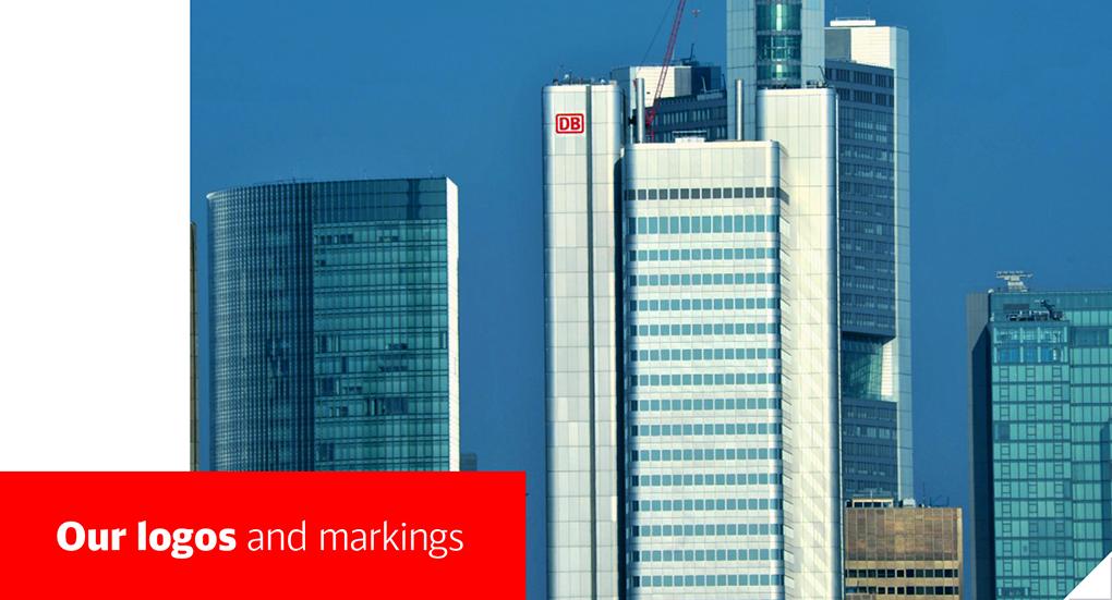
Basic Elements > Logos and Markings
|
|
|
- Sharon Fletcher
- 5 years ago
- Views:
Transcription
1 Page 1


2 Please note: The full functionality of the tutorial is guaranteed only with use of the latest browser versions. Contents At a glance: DB brand Division Logo DB Netze Division Logo DB Schenker Color variants and backgrounds Logos and markings Corporate design guidelines: Construction principle of the logos Logo clearspace Tagline Downloads Contact partners and links As a mobility and logistics group we operate nationally and internationally within a rapidly evolving market environment. The DB brand is the unifying element across all market segments. It represents the Group, the divisions Passenger Transport (within Germany and across borders) and Rail Freight Transport and is an integral element of the word-image logos of DB Netze and DB Schenker. Our brands store the values and visions of our corporation, our self-image, and the collective expectations and experiences of our target groups. As the visual manifestation of these marks, our logos are an essential element of our sender identification and therefore our corporate design. For a convincing corporate presence, our brand logos must be represented uniformly and unaltered. Therefore please use the official reproduction templates provided under the Downloads Corporate Design menu. Logos Additional informationen about our brands: Brand What is our current brand strategy? Page 2

3 At a glance: Page 3
 and Rail Freight Transport.")


4 The DB brand represents the Group and the divisions Passenger Transport (within Germany & across borders) and Rail Freight Transport. As sender logo it is used in the communications of the Group, and the Services, Passenger- and Rail Freight Transport Divisions. As an element of our division brands it is present in all market areas. The DB brand is also used in themes including more than one division. On durable investment goods, e.g. on buildings and products in train station areas, on vehicles and corporate uniforms, likewise only the DB logo is used. Page 4


5 DB Netze is the DB division brand for providing sustainable traffic systems. The Infrastructure division develops and operates products including a one-stop array of rail networks, passenger train stations and energy grids. Communications media in train stations (e.g. on timetables) are directed at end users of Passenger Transport. For reasons of non-discrimination against other companies, these media use only the DB brand for sender identification purposes. Advertisements and Posters The DB Netze division brand is used especially on the stationery and media of our corporate communications. Page 5


6 DB Schenker is our division brand offering complete, global solutions for transportation and logistics. The division renders services in Overland Transport, Air- and Sea Cargo as well as Contract Logistics. The DB Schenker division brand identifies stationery, communications media, vehicles, buildings and corporate apparel. Products of Rail Freight Transport appear under the DB brand. Page 6


7 White, bright or metallic backgrounds standard version: DB brand: DB Red, Internal space: white Word mark: black Dark background: Word mark: white Red background: The DB brand has a white dividing border on red panes. This border is not calculated into dimensional measurements. It is omitted if the red background color differs substantially from DB Red. Monochrome on bright or dark background: The internal space of the DB brand is always filled white. In monochrome depictions on dark backgrounds the DB brand receives a white dividing line. The monochrome versions are only used if, for technical reasons only one color (black or special color) can be printed. Page 7


8 Depiction exceptions: In exceptional cases, if necessary for production reasons, the logo may be depicted inversely (as a negative), e.g. on promotional materials or in textile printing. In such exceptions the Corporate Design Team must be consulted beforehand. The negative version is also used, if a color reserved sender identification is necessary, e.g. semi transparent as corner logo in AV media, on glass surfaces, as a watermark or as repeat pattern in corporate fashion. (Specifications apply to all logos and markings) Page 8

9 Our logos are adapted to the various requirements of our customers in each respective market. The visual harmony of the DB brand and the division logos tells customers our aspiration to be the world s leading mobility and logistics company. We use markings in addition to our logos to capture and identify the complete spectrum of the DB Group s products and services. They are always used together with the respective division logo. For additional information: Markings Our logos can accomplish their task as the most important agents of our image only when consistently embedded in our corporate design and uniformly used. For additional information, please see our respective Corporate Design guidelines: Digital Media, UX-UI Design Print Media Vehicles Environmental Design Office Communications Page 9


10 Corporate design guidelines: Construction principle of the logos DB brand The DB brand has an aspect ratio of 10:7. Both its letters and frame are designed specially for the brand and may not be altered or recreated. The DB brand may not be mirrored vertically, as the lower bowl of the letter B is wider than the upper one. Division logos The division logos consist of the DB brand and the word marks Netze or Schenker. The letters height equals 85% of the cap height of the letters DB in the DB brand. The distance between the corporate and word marks equals one fourth of the DB brand s width. DB Schenker partner logo Details on construction and application (with examples) can be found under Logo Downloads. DB Schenker Partner Logo Page 10

11 Logo clearspace The minimum clearspace surrounding a logo equals half of the DB brand width (½ DBx) to all sides. In principle the clearspace surrounding the logo should be as large as possible in order to avoid a distraction through other graphic elements. Page 11


12 Tagline Brands within the DB Group with a defined tagline use it in advertising media together with the logo. The tagline placement is determined by the respective brand's communication guidelines and his formally regulated here for advertising and publications. You can find all information about taglines under the menu item Brand. What is our current brand strategy? Tagline placement In publications the tagline is placed at the bottom of list texts, or as a stand-alone instead of the list text with an overline. Typeface: DB Sans Bold, The tagline is set 20-30% larger than the list. Please observe an optically even spacing of the overlines. Exception: The tagline is vertically centered if it stands in a ½ DBx-high color stripe beneath the logo clearspace. In this case the font height equals ¼ DBx. The tagline can be placed in advertisements below the body copy in DB Sans Bold. In this case it is left-aligned to the body copy and set 20-30% larger with increased line spacing. Alternatively, the tagline may be placed at the end of the body copy using the same font size. The tagline is highlighted using DB Red. The tagline is used in the same font as the body copy and his highlighted in bold. The tagline may be placed beneath the logo within the image or color pane. In this case the font height is ¼ DBx. The font color is white. In consultation with the CI/CD and Creative department, the color black can be used on light image backgrounds. The spacing between the top of the tagline caps to the bottom of the DB brand equals ½ DBx. Exception: The tagline is vertically centered if placed in a ½ DBx tall color stripe below the logo clearspace. Extreme portrait or landscape formats have differing rules for tagline placement. You can find them under: Advertisements and Posters Other tagline application options require previous consultation with the Brand Management department. Page 12
.")
13 Application of a stand-alone logo with tagline Two placement options If a brand presence requires a stand-alone logo-tagline combination (e.g. in sponsoring activities or foreign media), there are two basic placement variants side-by-side or stacked. Tagline and logo always have the same size relationship (tagline cap height = ½ cap height of the DB lettering in the brand). For special requirements, individual adjustments with other proportions may be used in previous consultation with the CI/CD and Creative department. Side-by-side placement In horizontal placement the tagline is spaced from the logo by the width of the DB brand and positioned to the right of the logo, on a baseline with the respective word mark. Font and Color A logo-tagline combination uses DB Sans Bold for the tagline. On white and light backgrounds the tagline is black. If the negative form of the logo is used, the tagline also appears negative in white. Stacked placement In vertical placement the tagline stands left-aligned with the DB brand beneath the logo. Spacing between the tagline s cap topline and the bottom of the DB brand equals the tagline s cap height. Page 13


14 Downloads The templates are offered as download package for each brand. Included in the packages are files in RGB color mode for digital media and Office applications. Also included are files in CMYK color mode for print media and files in special color for special applications. Templates DB Brand Templates DB NETZE Templates DB SCHENKER Notes concerning the usage of the logo templates For the consistent and credible presence of DB in all communication, please observe the following: When selecting a logo, bear in mind the correct data format, color version and size of the template. No elements or distances within a logo may be altered or recreated. Use only the templates provided under Downloads Corporate Design?. Logos When placing a logo, keep the required clearspace around it. Contact partners and links Contact partner For design questions concerning logos and markings please the Corporate Design team: Team Corporate Design [1] Glossaries Content-related questions concerning the logos and brands of the DB Group are answered by Brand Management: Brand Management [2] with helpful terminology explanations can be found here: Glossary DB Marketing Portal Brand Glossary published: Verweisliste [1] Team Corporate Design: design@deutschebahn.com [2] Brand Management: marke@deutschebahn.com Page 14
Vehicles > Road Vehicles > Heavy Duty Trucks > Vehicles marked DB Schenker. Regulations for heavy duty vehicles branded DB Schenker
 Regulations for heavy duty vehicles branded DB Schenker The logo is used worldwide in six standard sizes between 55cm and 560cm width. It is placed broadly on both vehicle sides (560cm or 450cm on trucks,
FACILITYLINK CORPORATE IDENTITY MANUAL
 FACILITYLINK CORPORATE IDENTITY MANUAL Table of Contents Page 2 of 47 Introduction 3 Corporate Design Elements 7 Corporate Design Application 25 Logo Application for Subsidised Activities 44 Table of Contents
Graphic standards for the Electric Circuit logo
 Graphic standards for the Electric Circuit logo January 2017 Official logo versions and colors The elements of the logo form a whole: the shapes, colors, proportions and locations of these elements may
CORPORATE VISUAL IDENTITY GUIDELINES. for the use of the OAAS Logo
 CORPORATE VISUAL IDENTITY GUIDELINES for the use of the OAAS Logo ONTARIO ASSOCIATION OF AGRICULTURAL SOCIETIES September 2017 Introduction Our branding is more than a name and a logo. Our branding is
Brand Guidelines. January 2015
 Brand Guidelines January 2015 Table of Contents 1.0 What s a brand? 3 1.1 The logo 4 1.2 Colour 1.2.1 Spot & Process 1.2.2 Black & White 5 5 6 1.3 Logo Sizing 1.3.1 Minimum Clear Space 1.3.2 Positioning
The University of Arizona Brand Identity Guide/ Logo Standards
 The University of Arizona Brand Identity Guide/ Logo Standards Official logos and colors of The University of Arizona. One of these logo versions must appear on the front of all UA-related printed materials
Logo and Brand Standards Manual. Copyright November 2013
 Logo and Brand Standards Manual Copyright November 2013 Table of Contents Rice Lake Branding... 1 Primary Logo... 2 International Logos... 3 Vertical Industry Logos... 4 Partner Logos... 5 Subsidiary Logos...
TARGA RESOURCES, INC.
 TARGA RESOURCES, INC. Corporate Identity Program STANDARDS CORPORATE LOGO STANDARDS The corporate logo standards provide guidelines for applying the Targa Resources corporate logo to publications, signage,
FileMaker Corporate Style Guide
 ilemaker Corporate Style Guide General guidelines for logo usage and corporate identity 5201 Patrick Henry Drive Santa Clara, CA 95054, USA Tel: (408) 987.7000 Welcome Our identity is one of our most valuable
Branding Guidelines NOTICE:
 Branding Guidelines NOTICE: THE STRUCTURE OF THE HEVC ADVANCE LICENSING PROGRAM, INCLUDING THE TERMS HEVC ADVANCE IS CURRENTLY AUTHORIZED TO OFFER IN ITS PATENT PORTFOLIO LICENSE AGREEMENT, ARE SUBJECT
Corporate Identity and Visual Identity Guidelines June 2011
 Corporate Identity and Visual Identity Guidelines June 2011 Index A Basic Design Elements A 01 The BenQ Logo A 02 Minimum Size, Minimum Staging Area A 03 Typography A 04 Corporate Colours B B 01 B 02 B
CAMPAIGN TAGLINE GUIDELINES
 CAMPAIGN TAGLINE GUIDELINES 1 Campaign Tagline The campaign tagline should appear on all campaign-related communications. The campaign tagline should always be used in conjunction with the Block W logo
Table of Contents. Stationery 24 Business card 25 Letterhead 26 #10 Envelope. Document Note
 Table of Contents Document Note The goal of these guidelines is to help communicate the strategy and visual system behind the SPX brand. If you have questions about anything in this guide, please reach
Brand identity guidelines
 Brand identity guidelines Version 1.2 November 2016 01 Contents 01 Contents 02 Introducing the 03 Who are these guidelines for? 04 The logo 05 Explaining the logo 06 Logo exclusion zone 07 Logo minimum
2007 Chadwick School School Logo Style Guide
 CHADWICK SCHOOL LOGO STYLE GUIDE 2007 Chadwick School School Logo Style Guide T A B L E O F C O N T E N T S 3 Letter From the Headmaster 4 Basic Guidelines For Use 5 Logo Anatomy 6 Logo Color 7 Color Specifications
AUCA Standard Graphic Identity Manual
 AUCA Standard Graphic Identity Manual GRAPHIC STANDARDS MANUAL This is the Graphic Standards Manual for the American University of Central Asia. It sets the standard for the design of all AUCA public communications
BLAZER BLACK. PANTONE Process Black C or U PANTONE Black C or U CMYK: C=0 M=0 Y=0 K=100 RGB: Red=0 Green=0 Blue=0 BLAZER SILVER
 LOGO The Blazer Ammunition Logo is to be used any time the corporation s identity is needed to define the company s presence, ownership, or legal identification. The Blazer Ammunition Logo is represented
BRAND / The CDW Logo
 BRAND / The CDW Logo 10 Overview The CDW logo consists of a solid square with CDW and a distinctive oval shape reversed out. Both a standalone square logo and a logo-with-tagline lockup are available for
TITLE MASTER GARDENER PROGRAMS STYLE GUIDE MASTER GARDENER STYLE GUIDE
 TITLE MASTER GARDENER PROGRAMS STYLE GUIDE 1 TABLE OF CONTENTS 3 INTRODUCTION 4 About 5 Program Hierarchy 6 LOGO LOCK-UP GUIDELINES 7 Clearspace and Alignment 8 Subset Program Lock-Ups 9 LOGO ALTERNATES,
VISUAL IDENTITY GUIDELINES. Updated
 VISUAL IDENTITY GUIDELINES Updated 2.12.2016 VISUAL IDENTITY GUIDELINES Table of Contents 1. Introduction Basic Design Elements 2. Logo 2.1 Clear zone 2.2 Logo misuse 2.3 Sponsor logo lock-up 3. Colors
wirelessgroup.co.uk Updated: Brand Guidelines 1/7/2018 V1.0 Brand Guidelines Version 1.0
 wirelessgroup.co.uk Updated: Brand Guidelines 1/7/2018 1 Brand Guidelines Version 1.0 wirelessgroup.co.uk Brand Guidelines 2 Contents 03 04 07 09 11 12 13 14 Primary Logo Secondary Logos Group Indicator
Brand Identity Manual
 Brand Identity Manual Changing the economics of desalination. Table of Contents Introduction 1 Signature Lock-up 2 Logo Configuration 3 Color of Logo 4 Black and White 5 Don t Do This 6 Minimum Sizing
Introduction Brand Philosophy
 Brand Guidelines Introduction Brand Philosophy Evolution over time 1999-2006 Open Mind, Global Vision 2013 - Bright Ideas Connected 1992-1998 Your Key Components Partner 2006-2013 Open & Share AOPEN has
BASIC MANUAL OF CEPSA IDENTITY
 BASIC MANUAL OF CEPSA IDENTITY April 2018 Cepsa Basic Identity Manual Welcome This manual contains all the elements that make up the Cepsa identity. This manual contains all the elements that make up the
University of Iowa Stead Family Children s Hospital Brand Identity Standards
 University of Iowa Stead Family Children s Hospital Brand Identity Standards Effective November 11, 2016 1 Contents Introduction Introduction... 1 Editorial Style Guide... 2 General communication... 2
I D E N T I T Y G U I D E L I N E S
 I D E N T I T Y G U I D E L I N E S THE CORPORATE MARK Logo Components The Digium family of logos are the cornerstone of the identity program. Together with the following key design elements, the logo
BRAND STANDARDS GUIDE
 BRAND STANDARDS GUIDE This document is designed to provide a guide for presentation and use of the CTO logo. The details outlined are generally applicable to stationery, presentations, signage, marketing
AAA Logo Usage Guide. Revised date:
 AAA Logo Usage Guide Revised date: AAA Vehicle Signage Guide October 12, 20181 In This Guide AAA Masterbrand Overview: The AAA Masterbrand...1 Emblem Regulations: Legal Side of the Masterbrand...2 Masterbrand
BRAND GUIDELINES CRAFTSMAN QUALITY STAINS & FINISHES SINCE 1953.
 BRAND GUIDELINES CRAFTSMAN QUALITY STAINS & FINISHES SINCE 1953. TOP 10 THINGS TO REMEMBER ABOUT Old Masters BRANDING 1. Always use the correct logo artwork. 2. Never modify or recreate logo artwork. 3.
Visual Identity and Brand Guidelines
 Visual Identity and Brand Guidelines June 2013 Version 1.0 1 BUILDING BLOCKS 10 Vermont Tech Logo We re practical, straightforward, and confident and our logo embodies these. It stands proudly on its own
C O R P O R A T E G R A P H I C I D E N T I T Y P O L I C Y
 C O R P O R A T E G R A P H I C I D E N T I T Y P O L I C Y J A N U A R Y 2019 1 Graphic Identity 2 Corporate identity policy This corporate identity manual standardizes the communication elements and
Visual Identification Manual
 Visual Identification Manual Basic Design October 1, 2014 Publicity Group, General Affairs Department, Daikin Industries, Ltd. 1 Global Rules Applying to the Basic Design Elements The four basic design
GLOBAL BRANDING LOGO
 GLOBAL BRANDING LOGO Our logo is the centerpiece of our visual identity. It is the key design element representing our organization and the basis for our design approach. Logo elements logomark The YFU
Introduction. 2 MOTT Community College Identity Guidelines
 IDENTITY GUIDELINES Introduction It is important that Mott Community College maintain a consistent, professional image. All Mott materials, including internal and external publications, signage, flyers,
OUR MISSION: We at Metro Transit deliver environmentally sustainable transportation choices that link people, jobs and community conveniently,
 OUR MISSION: We at Metro Transit deliver environmentally sustainable transportation choices that link people, jobs and community conveniently, consistently and safely. d Metro Transit Brand Standards The
Brand Identity Guidelines
 Brand Identity Guidelines For Organisations offering BPAY services and Member Financial Institutions BPAY Brand Identity Guidelines Introduction 2 This guide should be used in conjunction with the BPAY
Graphic Identity Manual MARKETING DEPARTMENT
 Graphic Identity Manual MARKETING DEPARTMENT Introduction The success of the Westfield State graphic identity depends on the consistent use of communications materials by everyone involved with the university.
CORPORATE LOGO LOGO. Here s how to best represent our logo in any experience: Treat the logo as one individual unit never divide it.
 CORPORATE Our logo is the face of VMware to the world. It s the single most recognizable expression of the VMware brand, so it s vital that the logo s iconic power be strengthened through consistent expression
IREM Headquarters and Chapter Version January 9, Brand and Style Guide
 IREM Headquarters and Chapter Version January 9, 2018 Brand and Style Guide Table of Contents Section 1: Brand Messaging 3 - About IREM 4 - Brand Positioning 5 - IREM Trademarks 6-7 Section 2: Logos and
Brand. Standards Manual ATENEO DE MANILA UNIVERSITY. 3.25x. 1x 3.25x 3.25x x x. 4.25x. 0.55x
 8.5x Brand 1x 3.25x 3.25x 1x Standards C L Manual 4.25x 8.5x 1x 1x 3.25x 0.22x 0.425x R=4.25x5x 0.55x 0.225x x 0.225x Introduction The Logotype A strong identity is a fundamental part of institutional
Book of visual identification
 Copyright 2018 Table of content 01. Introduction................................................. 3 02. Forms of sign................................................. 4 03. Colour variants of the sign...................................
Rivier University Graphic Identity Standards
 Rivier University Graphic Identity Standards First Edition Published November 2012 Revised January 2013 Office of Marketing and Communications Rivier University Rivier University Graphic Identity Standards
Foundation...3 Messaging...4 Visual Identity...6 Primary Logo Mark...7 Secondary Marks...8 Colors...9 Fonts Usage Guidelines...
 BRANDING GUIDE Foundation...3 Messaging...4 Visual Identity...6 Primary Logo Mark...7 Secondary Marks...8 Colors...9 Fonts... 10 Usage Guidelines... 11 2 FOUNDATION purpose statement Our purpose is to
BRAND GUIDELINES. July version 2.1
 BRAND GUIDELINES July 2015 - version 2.1 INTRODUCTION The Noritz Brand As we grow and advance as an organization, it sometimes becomes necessary to reevaluate our visual identity. That s why I am pleased
CERTIFICATION MARK STANDARDS GUIDE
 CERTIFICATION MARK STANDARDS GUIDE TABLE OF CONTENTS I. Certification Mark...3-4 A. Colors... 4 B. Clear Space... 4 C. Minimum Size... 4 II. Certification Signature...5 1. Horizontal...5 2. With URL...5
Brand Guidelines. A quick guide to using the British Shooting Show brand correctly.
 Brand Guidelines A quick guide to using the British Shooting Show brand correctly www.shootingshow.co.uk British Shooting Show Logo General info The Great British Shooting Show is the UK s largest trade
Brand Identity Guide March 2011
 Brand Identity Guide March 2011 CONTENTS Introduction 3 Attributes of the Brand 4 Brand Architecture 5 The Summit Bechtel Reserve Brand Extension 6 The Summit Bechtel Reserve 7 Primary Logotype 9 Secondary
1.0 SDSU Research Foundation. The New SDSU Research Foundation Graphic Identity System
 1.0 The New SDSU Research Foundation Graphic Identity System Table of Contents A Message from the Chief Executive Officer...................3 The Vertical Logo............................................4-7
1. Introduction. nexogy is more than just next technology, it is a team working for customer solutions.
 CONTENT 1. Introduction 2. Using nexogy s Logo 3. Tagline 4. Stationary Set 5. Promotional design 6. Vehicles Wrapping 7. Signage 8. Typography 9. Color Pallete 1. Introduction This is a friendly guide
For Children with Developmental Differences. Brand Identity Guide
 For Children with Developmental Differences Brand Identity Guide Table of Contents 3 Our Visual Identity System 4 About These Guidelines 5 The Logo 6 Clear Space & Minimum Size 7-8 Logo Variations 9 Icon
Partner Brand Guidelines October 2017
 Partner Brand Guidelines October 2017 Brand Expression From the Magnificent Mile to Route 66, Illinois offers a wide variety of travel experiences. The unifying force behind these experiences is our Illinois
Logo Guidelines. September 2014 ver.1. ACTIVEON guidelines
 Logo Guidelines September 2014 ver.1 101 CONTENTS Ⅰ Brand Overview 03. Extreme Logotype 05. Signature type 06. Grid system 08. Monochrome logo option 10. Clear space 1 1. Minimum size Logo colors 13. Color
Manual for what? What move a brand? She is moved by TRUST AND VALUES OF PERCEPTION BY YOUR CONSUMERS.
 Manual for what? What move a brand? She is moved by TRUST AND VALUES OF PERCEPTION BY YOUR CONSUMERS. And Heavyload brand conveys that confidence and also creates this perception! In every moment it presents
School of Social Work. Partnering for Change Style Guide
 School of Social Work Partnering for Change Style Guide September 4, 2009 Partnering for Change Campaign Introduction Rutgers School of Social Work is embarking upon a campaign intended to create a comprehensive,
JUNE 24, 2014 SCHOOL OF PROFESSIONAL STUDIES VISUAL IDENTITY. Mark Courtney, Visual Identity Manager, ,
 JUNE 24, 2014 SCHOOL OF PROFESSIONAL STUDIES VISUAL IDENTITY Mark Courtney, Visual Identity Manager, 212.998.6820, a@nyu.edu LOGOS There are two forms of the logo. Both include the institutional mark (torch
Peace4Youth Brand Guidelines
 PeaceYouth Brand Guidelines 2 Introduction PeaceYouth is the brand name which has been specifically developed for the Children and Young People Objective 2 (Action 2.1) of the European Union s PEACE IV
Cinema Pacific Film Festvial
 Graphic Standards for Cinema Pacific Film Festvial Emma Hsu Fall 2013 Graphic Standards for Cinema Pacific Film Festvial 2 Table of Contents Introduction Glossary Logo watermark Color Typography Business
INTRODUCTION. NASS is an action sports & music festival that celebrates the very best of alternative culture, bringing you three days of:
 BRAND GUIDELINES INTRODUCTION NASS is an action sports & music festival that celebrates the very best of alternative culture, bringing you three days of: PRO SKATE + BMX COMPETITIONS WITH THE WORLD S BEST
Branding Style Guidelines. (Revised: September 6, 2017)
") Branding Style Guidelines (Revised: September 6, 2017) Table of Contents 2 3 4 5 6 7 8 10 12 13 14 Introduction Brand elements Clear space and minimum size Logo and tagline Symbol as a graphic Logo palette
Branding Style Guidelines (Revised: September 6, 2017) Table of Contents 2 3 4 5 6 7 8 10 12 13 14 Introduction Brand elements Clear space and minimum size Logo and tagline Symbol as a graphic Logo palette
BRAND GUIDELINES
 BRAND GUIDELINES 2018-19 Mount Pisgah Christian School Department of Admissions and Marketing OUR BRAND Our brand is the composite of all elements that communicate to the world who we are as a school and
TABLE OF CONTENTS. SPACING & ENVIRONMENT...59 Connecticut spacing guides...60 Connecticut logo surrounding space guidelines...63
 BRAND MANUAL 1 table of contents 2 TABLE OF CONTENTS BRAND OVERVIEW... 3 Positioning...4 Attributes...5 Personality...6 Essence...7 Our brand: still revolutionary... 7 LOGOS...8 Connecticut logo...9 Elements
Corporate Identity Standards
 Corporate Identity Standards Securing e-business C o r p o r a t e I d e n t i t y S t a n d a r d s Table of Contents Our Identity 1 Cylink Corporation Logo 2 Logo Proportions 2 Exclusion Zone 3 Using
ENGINEERING VISUAL IDENTITY
 AUGUST 16, 2013 ENGINEERING VISUAL IDENTITY Mark Courtney, Visual Identity Manager, 212.998.6820, mark.courtney@nyu.edu LOGOS There are two forms of the logo. Both include the institutional mark (torch
2: core graphic elements 2:1:1 logotype
 2:1:1 logotype The Ramirent logotype The core of a graphic profile is always the logotype. It is the signature of a company. Our logo is made up of the name Ramirent, written in specialy designed letters.
TOWN OF QUEEN CREEK BRAND GUIDE
 BRAND GUIDE DEC2016 BRAND GUIDE INTRODUCTION CONTACT TOWN OF QUEEN CREEK COMMUNICATIONS, MARKETING AND RECREATION DEPARTMENT 22358 SOUTH ELLSWORTH ROAD QUEEN CREEK, AZ 85142 480-358-3198 communication@queencreek.org
graphic identity standards
 graphic identity standards agrimissouri graphic identity standards introduction The AgriMissouri logo helps to ensure a new era for the initiative: an era of unprecedented brand identity, awareness and
FOURSQUARE BRAND GUIDE LOGO USAGE. Brand Guide FALL 2014
 FOURSQUARE BRAND GUIDE LOGO USAGE 1 Brand Guide FALL 2014 FOURSQUARE BRAND GUIDE INTRODUCTION 2 The Foursquare brand is more than just a logo. It is a visual system and language made up of many parts that
HINO BRAND VISUAL DESIGN MANUAL V1.2e
 HINO BRAND VISUAL DESIGN MANUAL V1.2e Introduction Each basic element in communications, such as the corporate logomark and brand colors, contributes to building brand and plays a vital role in creating
Centers of Excellence and Institutes Logo Usage Guidelines
 Centers of Excellence and Institutes Logo Usage Guidelines 10/30/14 Approach to Logos for Centers of Excellence and Institutes Examples of Logo Treatment for Centers of Excellence and Institutes Using
DPS Logo. Version 1.0
 DPS Logo standards Version 1.0 2 Denver public schools Logo standards Version 1.0 The Denver Public Schools Logo is a reflection of who we are and the benefits we deliver. These logo standards are your
Member co-branding guidelines, August V1
 Member co-branding guidelines, August 2014. V1 OnTheMarket.com These guidelines are designed to help you introduce and manage co-branding with OnTheMarket.com across all your relevant communications material.
National Association of Professional Surplus Lines Offices
 National Association of Professional Surplus Lines Offices, Ltd. 200 NE 54th St., Ste. 200 Kansas City, MO 64118 816.741.3910 F 816.741.5409 www.napslo.org Brand Identity Standards National Association
VISUAL CHARTER SCREEN BRUSSELS
 VISUAL CHARTER SCREEN BRUSSELS 2017 WWW.SCREEN.BRUSSELS CONTENT P.03 LOGO AND ITS BUFFER ZONE P.04 APPLYING THE LOGO ON A BACKGROUND P.05 MONOCHROME LOGO P.06 DON TS P.07 MAIN FONTS P.08 SECONDARY FONTS
Visit Greenwich Full Logo Guides
 Contents 2 Our Logos 3 Primary Logos 8 Secondary Logos 13 Merchandise Logos Visit Greenwich Full Logo Guides 01 Our Logos The Visit Greenwich logos are a set of brand marks that have different hierarchical
Brand Style Guide January 2018
 Brand Style Guide January 2018 Introduction Keeping a well-rounded and consistent brand is crucial in an industry filled with many logos and brands with similar graphics and colors. The brand elements
BRANDING GUIDELINES Foundation for Environmental Education
 BRANDING GUIDELINES Foundation for Environmental Education INTRODUCTION Intro This is a guide to the branding elements that make up the Foundation for Environmental Education and its programmes. Have a
UNICEF CLUBS BRAND BOOK
 UNICEF CLUBS BRAND BOOK 2016 17 updated July 1, 2016 Contents How to Use This Book.... 3 Logo Usage Guidelines.... 4 Typography Our Fonts.... 10 Color USF Color Palette.... 11 2 UNICEF CLUBS Brand Book
Bran d Identity Guide
 UNC ESHELMAN SCHOOL OF PHARMACY Brand Identity Guide Table of Contents INTRO 3 LOGO 5 Horizontal 6 Vertical 8 PROMISE 10 FONTS 12 COLORS 14 BRAND IMAGERY 16 Graphic Elements 17 Icons 18 Photography 19
Brand Guidelines A quick guide to using the British Shooting Show brand correctly
 100% Brand Guidelines A quick guide to using the British Shooting Show brand correctly www.shootingshow.co.uk 2. BSS Logo General info The Great British Shooting Show is the UK & Europe s largest trade
LOGO USAGE GUIDELINES OCTOBER 2016
 LOGO USAGE GUIDELINES OCTOBER 2016 PREFERRED LOGO The Robert Toigo Foundation logo is the most often seen expression of our identity. When we use our logo consistently and correctly, our audiences will
Member co-branding guidelines, August V1
 Member co-branding guidelines, August 2014. V1 OnTheMarket.com These guidelines are designed to help you introduce and manage co-branding with OnTheMarket.com across all your relevant communications material.
RESNET. Professional Logos Guide
 RESNET Professional Logos Guide Trusted Experts in Home Energy Efficiency The National Association of State Energy Officials and Mortgage Bankers Association of America founded the Residential Energy Services
UNREAL ENGINE STYLE GUIDE
 UNREAL ENGINE STYLE GUIDE APRIL 212 CONTENTS CONTENTS LOGO USAGE LOGO USAGE CONT. LOGO LOCKUPS ANIMATED LOGO CLEARSPACE LOGO COLOR INCORRECT USE PRINT & PACKAGING TRADEMARK/COPYRIGHT 2 3 4 5 6 7 8 9 1
CORPORATE LOGO BRAND GUIDELINES
 CORPORATE LOGO BRAND GUIDELINES Contact Address 5470 Shilshole Avenue NW Suite 500 Seattle, WA 98107 Phone & Fax Phone: +1 206 783 0510 Fax: +1 206 706 3083 Online Email: Website: info@uptimeinstitute.com
BRAND STANDARDS GRAPHIC & PROMOTIONAL GUIDELINES
 BRAND STANDARDS GRAPHIC & PROMOTIONAL GUIDELINES CONTENTS... 3.Logo Components... 3 Taglines...4 Logo Specifications... 5 Color Options...9 Samples of Logo, Color and Font Usage... 10 Samples of Social
Appendix 01: Logo Usage. Brand Identity Guidelines 2015
 Appendix 01: Logo Usage Brand Identity Guidelines 2015 Our logos and their uses Arts Council corporate logo Arts Council exceptional use and partnership logo Grant award logo Arts Council corporate logo
Thank you for your continued support, and as always your feedback is welcome.
 Subject: New Tait Logo Dear Sir/Madam, To visually demonstrate the importance of the relationship between Tait Communications and your business, we have created a new Tait logo for you to use. The term
Flinders University 50 th Anniversary Style Guide
 Flinders University 50 th Anniversary Contents Contents 1.0 The Logo 03 1.1 Colour logos 04 1.2 Mono logos 06 1.3 Clearspace 08 1.4 Minimum size 09 1.5 Incorrect use 10 2.0 Stationery and Forms 11 2.1
Franklin Regional School District LOGO & BRAND IDENTITY GUIDELINES
 Franklin Regional School District LOGO & BRAND IDENTITY GUIDELINES Revised June 2017 1 Franklin Regional School District Logo Specifics Franklin Regional School District Logo & Branding Identity Guidelines
CMA VISUAL IDENTITY GUIDE. January 2018
 CMA VISUAL IDENTITY GUIDE January 2018 CMA Visual Identity Guide Logo overview The CMA logo is composed of the French and English wordmarks and the CMA icon (note: the logo is always bilingual, even in
Logo Overview. Always use the original digital artwork, available through the Brand Center, to help maintain consistency and integrity.
 Avast logo manual 10 Overview The Avast logo consists of a symbol (the amoeba) and a wordmark. Both elements of the logo have been carefully redesigned to work together for maximum legibility. Do not redraw
HINO BRAND VISUAL DESIGN MANUAL V1.3e
 HINO BRAND VISUAL DESIGN MANUAL V1.3e Introduction Each basic element in communications, such as the corporate logomark and brand colors, contributes to building brand and plays a vital role in creating
Visual Identity Guidelines. Essential guidelines to help you create cohesive brand communications
 Visual Identity Guidelines Essential guidelines to help you create cohesive brand communications August 2017 GENERAL GUIDELINES The use of the logo is reserved for official Summa partners only (dealers,
Prometric Graphic Standards
 www.prometricbrand.com Version 3.0 :: August 2015 Introduction: Our Brand Every interaction we have with our marketplace affects our brand. In fact, our brand is nothing more than the cumulative impression
United Way Waterloo Region Communities Brand Identity Guidelines September 2018
 United Way Waterloo Region Communities Brand Identity Guidelines September 2018 United Way Centraide Master Brandmark The United Way Centraide master brandmark is made of three distinct elements: logo
Background. Proper Color Usage
 Utah Tr ansit autho rit y G r a ph i c S ta n da r ds Background The purpose of this guide is to ensure proper usage of the UTA logo so that a consistent, well-recognized brand identity can be maintained.
may 2016 brand guide
 may 2016 brand guide Logo Format The logo is the signature symbol of Living Beyond Breast Cancer. It is composed of a graphic and a logotype. GRAPHIC The logo always features both the graphic and the logotype.
Trojan Holding Corporate Brand Guideline. Implementing the Trojan Holding brand in communications
 Trojan Holding Corporate Brand Guideline Implementing the Trojan Holding brand in communications V.II - September 2015 Introduction Trojan Holding is considered one of the fastest-growing construction
Event Guidelines. The Qt Company
 Event Guidelines The Qt Company Last update: 24.01.2018 Event Guidelines Index This is a guide to the core visual elements of the Qt brand used in all events. Keeping a visual identity consistent over
Kodiak Brand Guide. April 2015
 Kodiak Brand Guide April 2015 //kodiakptt.com/company/brand/ Table of Contents The brand is more than a logo 2 Communication 4 Tone & Style 4 Kodiak in Writing 4 Kodiak Marks & Logo 5 Standard Wordmark