LogoGuide. Version
|
|
|
- Everett King
- 5 years ago
- Views:
Transcription
1 LogoGuide Version
2 Rejseplanen LogoGuide 2 This is Rejseplanen s LogoGuide which aims to ensure consistent and coherent use of the logo. If you have any questions regarding LogoGuide, you are more than welcome to contact us at data@rejseplanen.dk.
3 Rejseplanen LogoGuide 3 Contents 4 Brand naming 5 Use of original logo 6 Original logo versus app logo 7 App logo: reasoning 8 Buffer zone, minimum size 9 Positioning of logo 10 Incorrect use of logo 11 Positioning of logo search box 12 Module 13 Module variants 14 Positioning of module results 15 Typography 17 Ownership (examples: DSB, NT, DOT) 26 Partner communication 39 Partners (example: Google Maps)

4 Rejseplanen LogoGuide 4 Brand naming Rejseplanen s original logo should be used when making any reference to Rejseplanen and in any mention of the brand that does not relate to the use of Rejseplanen s data. Brand naming may, for example, be - Bus signs referring to Rejseplanen - Printed matter referring to Rejseplanen - Digital links to Rejseplanen Example of brand naming at banedanmark.dk
5 Rejseplanen LogoGuide 5 Use of the original logo Rejseplanen s logo for general naming of the brand and any mention of the brand can be displayed in colour, greyscale and white (shown below). We always recommended using the coloured logo, if possible. Colour Greyscale White Incorrect use of original logo The logo must not be used on dark surfaces or surfaces which make it difficult to read the logo 2. The logo must only be reproduced in original colours, as well as black and white 3. The various components of the logo must not be split and used separately
6 Rejseplanen LogoGuide 6 Original logo versus app logo When it is Rejseplanen that communicates or when the brand is named, the Rejseplanen logo is used. In terms of communication relating to the use of Rejseplanen s data, Rejseplanen s app logo is used instead.
7 Rejseplanen LogoGuide 7 App logo: reasoning Rejseplanen s app-logo is used in any data communication because: 1. The white background ensures that the logo works optimally on all surfaces 2. More than 3.5 million downloads ensure that the icon is quickly recognisable 3. The name forms part of a module which is shown in search results (page 10) using the logo with a name tag is therefore not necessary. Therefore the app logo will henceforth be referred to as the logo.
8 Rejseplanen LogoGuide 8 Buffer zone Space is an important element in Rejseplanen s communications, as this helps to ensure simple and aesthetic expression. In order to ensure that Rejseplanen always stands out clearly, a minimum area around the logo has been defined to ensure that the logo has space and is not disturbed by graphic elements, images or text. The free area corresponds to half the logo's height and width. Minimum free area Free area for exceptions The image on the right also shows a free area for exceptions. This area can be used as a guideline in special cases when it is necessary to move away from the free area. Minimum logo size To ensure that the logo is always clear, it should be no less than the minimum size. Minimum size 25 px
9 Rejseplanen LogoGuide 9 Positioning of logo Here are examples of logo positioning in different formats and sizes, where the free space is used as a guideline. The logo must always be positioned appropriately on the website in question. The goal is to develop a visual standard and, as indicated, it is important for the appearance that the free area is used correctly. If the logo is on a white background, there will be a frame around the symbol. The colour of the line is the dark blue in the logo (RGB: 0,41,66). The thickness of the line is adjusted optically according to the size of the icon, so it appears as indicated in the example below.

10 Rejseplanen LogoGuide 10 Incorrect use of logo It is important to preserve the integrity of the Rejseplanen logo. Therefore no distracting elements or colours should be used when displaying the logo. On the right are various examples of how not to use the logo, as detailed below. 1. Do not use shadows when displaying the logo 2. The logo should not be displayed in outline 3. The logo may only be displayed in original colours 4. The logo must not be made transparent 5. The shape of the logo must not be distorted 6. The logo must not be displayed without its white box 7. The logo must not appear on a white background without a frame 8. The logo must not be rotated 9. The logo must only be displayed on a quiet background
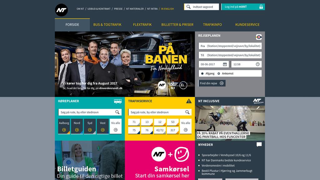
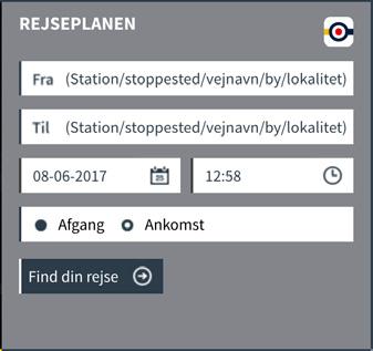
11 Rejseplanen LogoGuide 11 Positioning of logo search box In search boxes, we recommend that the logo is used by itself. This means that the app logo is used and not Rejseplanen s own logo. We also recommend that only Rejseplanen s app logo is communicated in search boxes. 1. Ensure you keep a buffer area around the icon 2. Ensure that the logo has at least the minimum size 3. Make adjustments if necessary depending on other elements on the page The logo is aligned with the edge of the search button. Find journey From To Search
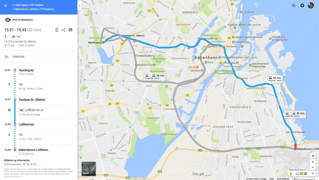
12 Rejseplanen LogoGuide 12 Module The logo is used with the additional sentence Data from Rejseplanen. This module is used for displaying search results and can be found in different versions. Data from Rejseplanen
13 Rejseplanen LogoGuide 13 Module variants Depending on the space available on the website in question, the module that best fits is the one that is chosen. Data from Rejseplanen Minimum size 25 px All variants are shown with a positive and negative version of the text. Data from Rejseplanen Data from Rejseplanen Data from Rejseplanen Data from Rejseplanen
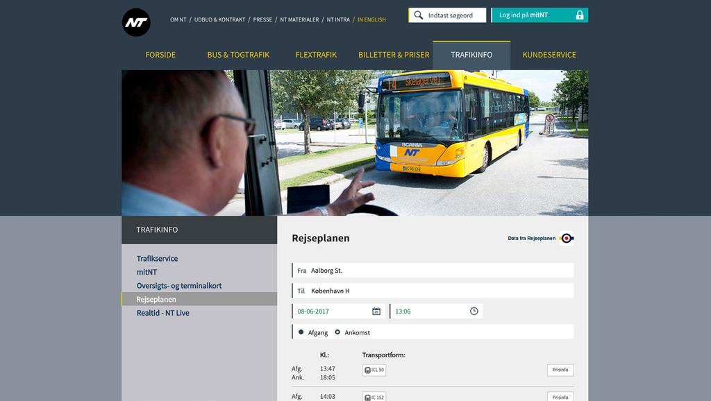
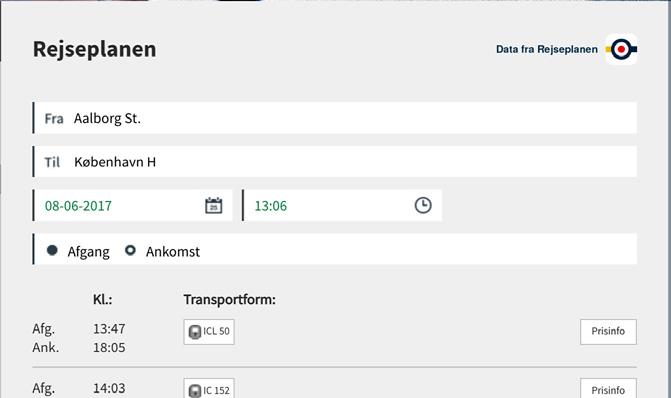
14 Rejseplanen LogoGuide 14 Positioning of module results Data from Rejseplanen We have found 15 search results for you In search results, the module is used with logo and text. Here are examples of logo positioning in different formats and sizes, where the free area is used as a guideline. The module must always be placed appropriately in relation to the layout of the website. 1. If the module is placed on the left, the logo must be to the left of it 2. If the module is placed on the right, the logo must be to the right of it 3. Alternative versions of the module can be used as needed 4. Ensure you keep a buffer area around the icon 5. Ensure that the logo has the minimum size 6. Adjust if necessary according to other items on the page We have found 15 search results for you Data from Rejseplanen The logo is aligned with the lines Results Data from Rejseplanen From Copenhagen to Aalborg From Copenhagen to Aalborg... >
15 Rejseplanen LogoGuide 15 Typography Digital The typography used is based on Rejseplanen s current digital typography in order to ensure consistency across websites. TeX Gyre Heros regular bold italic bolditalic Rejseplanen was officially launched on 1st October Rejseplanen A/S was founded on 1st January Rejseplanen delivers over 30 million web and app search results for journeys every month. There are over 1.2 million searches per day. ABCDEFGHIJKLMNOPQRSTUVWXYZÆØÅ abcdefghijklmnopqrstuvwxyzæøå ,@-?&/!.
16 Rejseplanen LogoGuide 16 Typography Print When using Rejseplanen or MinRejseplan in print media, the following font is applicable. Source Sans Pro regular bold italic bolditalic Search your travel based on your current position, and with the option to search from all addresses, stations, stops and attractions. Begin your search using the new drag & drop feature, which gives you an overview of your favourite destinations and latest travels. It makes easy to swipe from one address to the other and see your travel. On the result page it is easy to see every travel. It is also easy to make a quick screening on the next departure, the cheapest ticket or how you arrive the fastest, and based on that choose your preferred destination. ABCDEFGHIJKLMNOPQRSTUVWXYZÆØÅ abcdefghijklmnopqrstuvwxyzæøå ,@-?&/!.
17 Rejseplanen LogoGuide 17 Ownership Examples: DSB, NT, DOT


18 Data fra Rejseplanen Rejseplanen LogoGuide 18 DSB Search box

19 Rejseplanen LogoGuide 19 DSB Results

20 Data fra Rejseplanen Rejseplanen LogoGuide 20 DSB Search box (tablet)


21 Rejseplanen LogoGuide 21 DSB Results (mobile)
22 Rejseplanen LogoGuide 22 NT Search box
23 Rejseplanen LogoGuide 23 NT Results

24 Rejseplanen LogoGuide 24 DOT Search box

25 Rejseplanen LogoGuide 25 DOT Results
26 Rejseplanen LogoGuide 26 Partner communication When mentioning and referring to Rejseplanen
27 Rejseplanen LogoGuide 27 Partner communication when using Rejseplanen Reference Both the app logo with call-to-action and Rejseplanen s original logo are used when any mention is made of Rejseplanen and any reference is made to the download in any communication by partners. Download Rejseplanen at Google Play and App Store

28 Rejseplanen LogoGuide 28 Partner communication Hierarchy Clear heading Find din rejse og køb den direkte på mobilen Reference to app: The app logo should always appear with any reference to the download. Hent Rejseplanen på GooglePlay eller AppStore Partner logos: The sender (primary logo) must either be to the side or above the Rejseplanen logo - depending on the media and format.

29 Rejseplanen LogoGuide 29 Partner communication Example

30 Rejseplanen LogoGuide 30 Partner communication Example

31 Rejseplanen LogoGuide 31 Partner communication Example

32 Rejseplanen LogoGuide 32 Partner communication Example
33 Rejseplanen LogoGuide 33 Partner communication When mentioning and referring to MinRejseplan
34 Rejseplanen LogoGuide 34 Partner communication when using MinRejseplan When mentioning MinRejseplan and referring to download of MinRejseplan App, both App-logo with call-to-action and MinRejseplan logo are used. Download MinRejseplan at Google Play and App Store

35 Rejseplanen LogoGuide 35 Wrong use of logo As with the logo of Rejseplanen, it is important to preserve the logo identity of MinRejseplan. It is prohibited to use disturbing elements or colours in connection with rendition of the logo. To the right you see examples of wrong use of logo. They are explained in detail below. 1. Shadows may not be used when rendering the logo 2. The logo must not be framed by contours 3. The logo must only be rendered in original colours 4. The logo must not be transparent 5. The logo must not be distorted 6. The logo must not be cut out 7. The logo must not be used on a white background without a frame 8. The logo must not be rotated 9. The logo must only be displayed on monochrome backgrounds 10. The clear space for the logo follows the rules from Rejseplan logo. See further, page The minimum logo size follows the rules from Rejseplan logo. See further, page

36 Rejseplanen LogoGuide 36 Partner communication when using MinRejseplan Hierarchy Clear headline Referring to the App: The logo for the app must always be placed next to a reference to download. Partnership logos: Sender (primary logo) must always be placed above or next to the logo of Rejseplanen - depending on the media and format.
37 Ny App giver nordjyderne endnu flere muligheder Cykel Ny App giver nordjyderne endnu flere muligheder Cykel Hent MinRejseplan App på GooglePlay eller AppStore Hent MinRejseplan App på GooglePlay eller AppStore GoMore PlusTur Gåtur GoMore PlusTur Gåtur Tog Bus Bus Rejseplanen LogoGuide 37 Partner communication when using MinRejseplan Example Tog Taxa Taxa FlexTur FlexTur


38 Rejseplanen LogoGuide 38 Partner communication when using MinRejseplan Example MinRejseplan Bus PlusTur GoMore Taxa Cykel Tog Gåtur Hent MinRejseplan på GooglePlay eller AppStore
39 Rejseplanen LogoGuide 39 Partners Example: Google Maps
40 Rejseplanen LogoGuide 40 Google Maps
41 If you want to know more, or if you have questions about the LogoGuide, feel free to contact us at
one M2M Logo Brand Guidelines
 one M2M Logo Brand Guidelines July 2012 Logo Design Explanation What does the one M2M logo symbolize? The number 2 in the middle part of the logo symbolizes the connection between the two machines, the
Appendix 01: Logo Usage. Brand Identity Guidelines 2015
 Appendix 01: Logo Usage Brand Identity Guidelines 2015 Our logos and their uses Arts Council corporate logo Arts Council exceptional use and partnership logo Grant award logo Arts Council corporate logo
AUCA Standard Graphic Identity Manual
 AUCA Standard Graphic Identity Manual GRAPHIC STANDARDS MANUAL This is the Graphic Standards Manual for the American University of Central Asia. It sets the standard for the design of all AUCA public communications
Asia-Europe Meeting (ASEM)
") Version 1.0 / October 2013 www.aseminfoboard.org Asia-Europe Meeting (ASEM) Logo Guidelines Information on how to apply the ASEM logo 1.0 The ASEM Logo The core element of the brand identity is the logo.
Version 1.0 / October 2013 www.aseminfoboard.org Asia-Europe Meeting (ASEM) Logo Guidelines Information on how to apply the ASEM logo 1.0 The ASEM Logo The core element of the brand identity is the logo.
Version 1.0 February MasterPass. Branding Requirements
 Version 1.0 February 2013 MasterPass Branding Requirements Using PDF Documents This document is optimized for Adobe Acrobat Reader version 7.0, or newer. Using earlier versions of Acrobat Reader may result
BRAND GUIDELINES 1 BRAND GUIDELINES
 BRAND GUIDELINES 1 BRAND GUIDELINES BRAND GUIDELINES 2 BRAND GUIDELINES 3 Contents Introduction The aims of the brand 02 About this booklet 02 Who can use the brand 02 Resources 02 Design Elements & Usage
Brand Guidelines A quick guide to using the British Shooting Show brand correctly
 100% Brand Guidelines A quick guide to using the British Shooting Show brand correctly www.shootingshow.co.uk 2. BSS Logo General info The Great British Shooting Show is the UK & Europe s largest trade
Brand Guidelines. A quick guide to using the British Shooting Show brand correctly.
 Brand Guidelines A quick guide to using the British Shooting Show brand correctly www.shootingshow.co.uk British Shooting Show Logo General info The Great British Shooting Show is the UK s largest trade
Branding & Design Standards. LIMITED USE: These standards are for areas where FIRST is not a registered trademark. Standards Are Strictly Enforced
 11.3.2015 Branding & Design Standards Standards Are Strictly Enforced LIMITED USE: These standards are for areas where FIRST is not a registered trademark. FIRST Logo Our logo consists of uniquely configured
HERO OPTION #1. Guidelines and Specs for Standard Sponsorship
 HERO PRODUCT HERO OPTION #1 Guidelines and Specs for Standard Sponsorship HOME PAGE HERO IMAGE Standard Sponsorship Guidelines and Specs IMAGE FRAME Image Requirement Content of image must display and
Version 1 / February IADC Logo Usage Guidelines
 Version 1 / February 2014 IADC Logo Usage Guidelines IADC / Logo Usage Guidelines 3/36 This document outlines correct use of the IADC logo for members, chapters and partners. For a set of full brand guidelines,
INTRODUCTION. NASS is an action sports & music festival that celebrates the very best of alternative culture, bringing you three days of:
 BRAND GUIDELINES INTRODUCTION NASS is an action sports & music festival that celebrates the very best of alternative culture, bringing you three days of: PRO SKATE + BMX COMPETITIONS WITH THE WORLD S BEST
GETTING UMSU BRAND BASICS RIGHT
 GETTING UMSU BRAND BASICS RIGHT UMSU Brand Guidelines 2017 UMSU BRAND GUIDELINES 2017 CONTENTS INTRODUCTION 4 UMSU BRAND: AN OVERVIEW 6 UMSU LOGO 7 UOM LOGO 8 CORRECT USE OF THE LOGO 9 INCORRECT USE OF
Brand Guidelines. Version 4 - Dec 2016
 Brand Guidelines Version 4 - Dec 2016 CONTENTS pg.3 pg.4 pg.5-6 pg.7 pg.8 pg.9 pg.10 pg.11 pg.12 pg.13 pg.14 pg.15 pg.16 pg.17 pg.18 Tone of Voice Brand Colours Logo Logo - Clearance Zones Logo - Minimum
For Children with Developmental Differences. Brand Identity Guide
 For Children with Developmental Differences Brand Identity Guide Table of Contents 3 Our Visual Identity System 4 About These Guidelines 5 The Logo 6 Clear Space & Minimum Size 7-8 Logo Variations 9 Icon
Brand Guidelines. January 2015
 Brand Guidelines January 2015 Table of Contents 1.0 What s a brand? 3 1.1 The logo 4 1.2 Colour 1.2.1 Spot & Process 1.2.2 Black & White 5 5 6 1.3 Logo Sizing 1.3.1 Minimum Clear Space 1.3.2 Positioning
This tool is the collection of all the fundamental rules for the use of BOCAhealth brand. Its use helps to make all the communication tools coherent
 B R A N D B O O K This tool is the collection of all the fundamental rules for the use of BOCAhealth brand. Its use helps to make all the communication tools coherent each other, reinforcing the image
Basic Elements > Logos and Markings
 Page 1 Please note: The full functionality of the tutorial is guaranteed only with use of the latest browser versions. Contents At a glance: DB brand Division Logo DB Netze Division Logo DB Schenker Color
CMA VISUAL IDENTITY GUIDE. January 2018
 CMA VISUAL IDENTITY GUIDE January 2018 CMA Visual Identity Guide Logo overview The CMA logo is composed of the French and English wordmarks and the CMA icon (note: the logo is always bilingual, even in
The U.S. Fund for UNICEF Communications Style. Guide
 The U.S. Fund for UNICEF Communications Style Guide Table of Contents 1.0 The U.S. Fund for UNICEF 1.1 Our Mission 1.2 Our Brand Position 2.0 Our Goals 3.0 The UNICEF Story 4.0 Logo Versions 4.1 Logo Size
YOU HAVE A NEW LOGO, NOW WHAT?
 YOU HAVE A NEW LOGO, NOW WHAT? It has been a pleasure to work on your brand the last few weeks. Because my goal is to help your organization look its best, I have put together this helpful guide for you.
Brand identity guidelines
 Brand identity guidelines Version 1.2 November 2016 01 Contents 01 Contents 02 Introducing the 03 Who are these guidelines for? 04 The logo 05 Explaining the logo 06 Logo exclusion zone 07 Logo minimum
Branding Guidelines NOTICE:
 Branding Guidelines NOTICE: THE STRUCTURE OF THE HEVC ADVANCE LICENSING PROGRAM, INCLUDING THE TERMS HEVC ADVANCE IS CURRENTLY AUTHORIZED TO OFFER IN ITS PATENT PORTFOLIO LICENSE AGREEMENT, ARE SUBJECT
VISUAL BRAND IDENTITY GUIDELINES
 1 / 72 VISUAL BRAND IDENTITY GUIDELINES V 1.5 CONTACT Address National Supercomputing Centre (NSCC) Singapore 1 Fusionopolis Way, Connexis South, #17-01, Singapore 138632 Phone + 65 6714 9450 Email contact@nscc.sg
FileMaker Corporate Style Guide
 ilemaker Corporate Style Guide General guidelines for logo usage and corporate identity 5201 Patrick Henry Drive Santa Clara, CA 95054, USA Tel: (408) 987.7000 Welcome Our identity is one of our most valuable
Table of Contents. Brand Overview. Logo Versions. Standard Logos. How to Use. Colors. Typography. Logo Usage. Misuses. Exceptions.
 Brand Guidelines Table of Contents 01 / 09 Brand Overview Logo Versions Standard Logos How to Use Colors Typography Logo Usage Misuses Exceptions Photography & Art Star Background 2 3 3 4 5 6 7 7 8 9 9
VISUAL IDENTITY STANDARDS
 VISUAL IDENTITY STANDARDS CURRENT AS OF 12/5/2016 1 HUSTLER VISUAL IDENTITY STANDARDS: TABLE OF CONTENTS TABLE OF CONTENTS OVERVIEW Hustler Visual Identity Standards Policy... 2 LOGO STANDARDS Vertical
VMWARE LOGO GUIDELINES FEBRUARY 2017
 VMWARE LOGO GUIDELINES FEBRUARY 2017 CORPORATE LOGO CORPORATE LOGO Our corporate logo is the most visible expression of our brand. This word mark is the constant that represents VMware in every communication.
VISUAL IDENTITY GUIDELINES. Updated
 VISUAL IDENTITY GUIDELINES Updated 2.12.2016 VISUAL IDENTITY GUIDELINES Table of Contents 1. Introduction Basic Design Elements 2. Logo 2.1 Clear zone 2.2 Logo misuse 2.3 Sponsor logo lock-up 3. Colors
Introduction. All collateral outlined within these guidelines can be downloaded at leicesterbusinessfestival.com
 Introduction Leicester Business Festival (LBF) is currently the regions largest business event and has been developed by business for business since 2014 to put Leicester and Leicestershire front and centre
IDENTITY GUIDELINES BUILDING THE SKYWARD BRAND
 IDENTITY GUIDELINES BUILDING THE SKYWARD BRAND TABLE OF CONTENTS INTRODUCTION...02 SKYWARD TRADEMARK...03 LOGO. PRINT...04 Size, Spacing & Positioning LOGO. SCREEN...05 Web & Video COLOUR...06 TYPOGRAPHY...07
CAMPAIGN TAGLINE GUIDELINES
 CAMPAIGN TAGLINE GUIDELINES 1 Campaign Tagline The campaign tagline should appear on all campaign-related communications. The campaign tagline should always be used in conjunction with the Block W logo
Hospice & Palliative Care of Greensboro Brand Guide January 2012 Version 1.1. Hospice and Palliative Care of Greensboro
 & Palliative Care of Greensboro Brand Guide January 2012 Version 1.1 & Palliative Care of Greensboro Brand Guide INTRODUCTION Foreword 00.01 The HPCG brand will be in constant conversation with its best
School of Social Work. Partnering for Change Style Guide
 School of Social Work Partnering for Change Style Guide September 4, 2009 Partnering for Change Campaign Introduction Rutgers School of Social Work is embarking upon a campaign intended to create a comprehensive,
CONTENTS 1. LOGOTYPE 2. BRAND IDENTITY FINAL COMMENTS Concept 1.2. Structure & proportions Using the logotype
 www.syno-int.com BRAND GUIDELINES CONTENTS 1. LOGOTYPE 4 1.1. Concept 4 1.2. Structure & proportions 6 1.3. Using the logotype 8 1.4. Versions 10 1.5. Usability on different backgrounds 12 1.6. Usability
Core brand elements CWT logos
 Two logo versions The preferred version of the logo should always be used where possible. Only use the one-line version when space does not allow for the preferred version. CWT logos Preferred logo The
wirelessgroup.co.uk Updated: Brand Guidelines 1/7/2018 V1.0 Brand Guidelines Version 1.0
 wirelessgroup.co.uk Updated: Brand Guidelines 1/7/2018 1 Brand Guidelines Version 1.0 wirelessgroup.co.uk Brand Guidelines 2 Contents 03 04 07 09 11 12 13 14 Primary Logo Secondary Logos Group Indicator
VISUAL CHARTER SCREEN BRUSSELS
 VISUAL CHARTER SCREEN BRUSSELS 2017 WWW.SCREEN.BRUSSELS CONTENT P.03 LOGO AND ITS BUFFER ZONE P.04 APPLYING THE LOGO ON A BACKGROUND P.05 MONOCHROME LOGO P.06 DON TS P.07 MAIN FONTS P.08 SECONDARY FONTS
TABLE OF CONTENTS TOLEDO ZOO & AQUARIUM BRAND GUIDELINES 2
 BRAND GUIDELINES TABLE OF CONTENTS Brand Inspiration 3 Our Mission 4 Primary Logo 5 Secondary Logo 7 Logo Color Usage & Proximity 8 Logo Application on Photos 9 Unacceptable Usage 10 Typography 11 Color
Visual identity guidelines
 Visual identity guidelines Contents Introduction 01 Our logo 02 Using our logo 03 05 Our symbol 06 Our coat of arms 07 Our typefaces 08 09 Our colour palette 10 11 Our imagery 12 13 Contacts 14 Introduction
BRANDING GUIDELINES Foundation for Environmental Education
 BRANDING GUIDELINES Foundation for Environmental Education INTRODUCTION Intro This is a guide to the branding elements that make up the Foundation for Environmental Education and its programmes. Have a
Brand Guidelines 2018
 Contents Logotype 03 Space required of logotype 04 Logo variants 05 Incorrect use of logotype 06 Brand colours 07 Typefaces 08 Additional graphic elements 09 Supporting logo for EHNS countries 10 Logotype
Branding guidelines. This quick reference guide is designed to help you consistently apply our brand when you communicate.
 Branding guidelines This quick reference guide is designed to help you consistently apply our brand when you communicate. If you have any questions or need any additional support please email M&CDesign@bournemouth.ac.uk
2018 LOGO STYLE GUIDE
 2018 LOGO STYLE GUIDE For over 60 years, ASIS International has provided an integrated destination for education, cuttingedge technologies, and peer-to-peer networking, in the Annual Seminar and Exhibits.
IREM Headquarters and Chapter Version January 9, Brand and Style Guide
 IREM Headquarters and Chapter Version January 9, 2018 Brand and Style Guide Table of Contents Section 1: Brand Messaging 3 - About IREM 4 - Brand Positioning 5 - IREM Trademarks 6-7 Section 2: Logos and
Foundation...3 Messaging...4 Visual Identity...6 Primary Logo Mark...7 Secondary Marks...8 Colors...9 Fonts Usage Guidelines...
 BRANDING GUIDE Foundation...3 Messaging...4 Visual Identity...6 Primary Logo Mark...7 Secondary Marks...8 Colors...9 Fonts... 10 Usage Guidelines... 11 2 FOUNDATION purpose statement Our purpose is to
BRAND GUIDELINES VENDOR COPY AUGUST ecoatm BRAND GUIDELINES
 BRAND GUIDELINES VENDOR COPY AUGUST 2014 7059.0814 1 BRAND STANDARDS CONTENTS Brand Standards Primary Logo Endorsers Logo Lockup Secondary Logos, Black and White Margins and Minimum Size Incorrect Usage
Thank you for your continued support, and as always your feedback is welcome.
 Subject: New Tait Logo Dear Sir/Madam, To visually demonstrate the importance of the relationship between Tait Communications and your business, we have created a new Tait logo for you to use. The term
CONTENTS CREST CREST COLOUR PALETTE TIPOGRAFHY PARTNER ARCHITECTURE IMAGERY
 BOOK 2015.16 The VCF crest is both a symbol of the football club and the City of Valencia. Instantly recognisable it is a powerful representation of our identity and it should be treated with respect.
National Association of Professional Surplus Lines Offices
 National Association of Professional Surplus Lines Offices, Ltd. 200 NE 54th St., Ste. 200 Kansas City, MO 64118 816.741.3910 F 816.741.5409 www.napslo.org Brand Identity Standards National Association
CORPORATE LOGO LOGO. Here s how to best represent our logo in any experience: Treat the logo as one individual unit never divide it.
 CORPORATE Our logo is the face of VMware to the world. It s the single most recognizable expression of the VMware brand, so it s vital that the logo s iconic power be strengthened through consistent expression
Partner Brand Guidelines October 2017
 Partner Brand Guidelines October 2017 Brand Expression From the Magnificent Mile to Route 66, Illinois offers a wide variety of travel experiences. The unifying force behind these experiences is our Illinois
LOGO GUIDELINES. A guide for partners
 LOGO GUIDELINES LOGO FULL COLOUR LOGO Our corporate full colour logo is the most recognisable symbol of the ACD and is unique to us. As such, it is crucial we use it correctly and consistently. Whenever
United Way Waterloo Region Communities Brand Identity Guidelines September 2018
 United Way Waterloo Region Communities Brand Identity Guidelines September 2018 United Way Centraide Master Brandmark The United Way Centraide master brandmark is made of three distinct elements: logo
BRAND STANDARDS GUIDE
 BRAND STANDARDS GUIDE This document is designed to provide a guide for presentation and use of the CTO logo. The details outlined are generally applicable to stationery, presentations, signage, marketing
FOURSQUARE BRAND GUIDE LOGO USAGE. Brand Guide FALL 2014
 FOURSQUARE BRAND GUIDE LOGO USAGE 1 Brand Guide FALL 2014 FOURSQUARE BRAND GUIDE INTRODUCTION 2 The Foursquare brand is more than just a logo. It is a visual system and language made up of many parts that
TABLE OF CONTENTS BRAND IDENTITY INTRODUCTION...3 OFFICIAL COLOR PALETTE...4 PRIMARY ATHLETIC MARK SECONDARY ATHLETIC MARKS...
 TABLE OF CONTENTS BRAND IDENTITY INTRODUCTION...3 OFFICIAL COLOR PALETTE...4 PRIMARY ATHLETIC MARK...5-6 SECONDARY ATHLETIC MARKS...7-8 ATHLETIC WORDMARKS... 9-10 TYPOGRAPHY... 11 WORDMARK LOCKUPS...12-15
G P S C. Graphic Standards Manual 2.0
 G P S C Graphic Standards Manual 2.0 Contents The Family 3 Brand Palette 4 Font 5 GPSC Logo Colour Logo 6 Grayscale Logo 7 Black Logo 8 Colour Usage 9 Safety Area 10 Don ts 11 PSP Logo Colour Logo 21 Grayscale
Branding Style Guidelines. (Revised: September 6, 2017)
") Branding Style Guidelines (Revised: September 6, 2017) Table of Contents 2 3 4 5 6 7 8 10 12 13 14 Introduction Brand elements Clear space and minimum size Logo and tagline Symbol as a graphic Logo palette
Branding Style Guidelines (Revised: September 6, 2017) Table of Contents 2 3 4 5 6 7 8 10 12 13 14 Introduction Brand elements Clear space and minimum size Logo and tagline Symbol as a graphic Logo palette
VISUAL IDENTITY STYLE GUIDE
 VISUAL IDENTITY STYLE GUIDE for projects information and communication activities Version No 1/2017 Version No. Valid from Valid to Main changes Version No. 1/2017 22 December 2017 \ 2 TABLE OF CONTENTS
University Marks 2.1. Institutional Logo Overview
 University Marks 2.1 Institutional Logo Overview Northern Arizona University s logo combines the bold strength of the ligature/acronym* with the sophistication of the wordmark to identify our institution
Brand Guidelines 2017 Version 1.0
 Brand Guidelines 2017 Version 1.0 OwnLocal 2017. ALL RIGHT RESERVED OwnLocal Headquarters 205 W 9th Street Suite 600 Austin, TX 78701 www.ownlocal.com TABLE OF CONTENTS 01 Introduction Our Mission Core
FACILITYLINK CORPORATE IDENTITY MANUAL
 FACILITYLINK CORPORATE IDENTITY MANUAL Table of Contents Page 2 of 47 Introduction 3 Corporate Design Elements 7 Corporate Design Application 25 Logo Application for Subsidised Activities 44 Table of Contents
Centennial Year Brand Standards Guide
 Centennial Year Brand Standards Guide FOR USAGE NOV. 21, 2016 - NOV. 21, 2017 welcome The identity of Federation CJA is much more than just a logo. It defines how those around us view both the federation
Main design manual RONA, a.s.
 DESIGN MANUAL Main categories A Logotype 4 D Printed materials 40 B Font type 26 E Promotional items 50 What is a design manual and what is it used for? C Slogan 32 F Other 64 A design manual is a collection
CORPORATE VISUAL IDENTITY GUIDELINES. for the use of the OAAS Logo
 CORPORATE VISUAL IDENTITY GUIDELINES for the use of the OAAS Logo ONTARIO ASSOCIATION OF AGRICULTURAL SOCIETIES September 2017 Introduction Our branding is more than a name and a logo. Our branding is
DPS Logo. Version 1.0
 DPS Logo standards Version 1.0 2 Denver public schools Logo standards Version 1.0 The Denver Public Schools Logo is a reflection of who we are and the benefits we deliver. These logo standards are your
Corporate IDENTITY and BRANDING Standards Manual
 Corporate IDENTITY and BRANDING Standards Manual shift4.com info@shift4.com Mission Statement To empower and protect merchants accepting electronic payments by providing the fastest, most efficient, reliable
BRAND GUIDELINES ISSUE V6.0
 BRAND GUIDELINES ISSUE 27.08.12 V6.0 BRAND GUIDELINES VERSION 5.0 2 A revolutionary new competition demands an exciting visual identity. In every sense, the America s Cup is about to reinvent itself. The
Visual Identity and Brand Guidelines
 Visual Identity and Brand Guidelines June 2013 Version 1.0 1 BUILDING BLOCKS 10 Vermont Tech Logo We re practical, straightforward, and confident and our logo embodies these. It stands proudly on its own
HarvestMaster Logo LOGO COLORS: STANDARD COLOR & SPACING LOGO COLORS: SIMPLIFIED
 HarvestMaster COLOR & SPACING LOGO COLORS: STANDARD LOGO COLORS: SIMPLIFIED To ensure the prominence, clarity, and visual impact of the HarvestMaster logo, please adhere to the following guidelines regarding
Version 3:0 September 2015
 Identity guidelines Version 3:0 September 2015 The Buxton logotype The new logotype embraces the concept of water - and a source of water. The focal point of the design is the letter O' where water emerges
Windsor Windows & Doors Brand Identity Guidelines. Rev. 4/07
 Windsor Windows & Doors Brand Identity Guidelines Rev. 4/07 Table of Contents Brand Overview...3 Logo...3 Tagline...4 Logo Clear Space...5 Typography...6 Primary Color Palette...7 Secondary Color Palette...7
VISUAL IDENTITY STYLE GUIDE ALUMNI ASSOCIATION CHAPTERS
 VISUAL IDENTITY STYLE GUIDE ALUMNI ASSOCIATION CHAPTERS CONFIGURATIONS ALUMNI ASSOCIATION EMPHASIS CHAPTER EMPHASIS FORMAL ALUMNI ASSOCIATION EMPHASIS CHAPTER EMPHASIS HORIZONTAL 2 COLORS BRAND.UGA.EDU
VERSIONS PRIMARY LOGO. Stacked Version. Inline Version
 LOGO USAGE GUIDE VERSIONS PRIMARY LOGO The innovative nature of our Silicon Valley-based tech company is reflected in our logo. Our primary logo, shown here is a striking balance of Atlona Orange and 100%
MER MEC S.p.A. // B R A N D G U I D E USE OF THE LOGO. version EN
 B R A N D G U I D E USE OF THE LOGO version EN0314.01 OUR LOGO Here it is again our logo. Our logo is the most visible element of our identity a universal signature across all Demand Media communications.
BrainPOP Identity Standards BrainPOP. All rights reserved.
 BrainPOP Identity Standards 2 Contents 1 Introduction 3 LOGOS 4 Fighter 38 Relative size 39 BrainPOP logo 5 BrainPOP Jr. logo 10 BrainPOP ESL logo 15 4 LEGAL GUIDELINES 42 Graphics 43 Text 48 BrainPOP
Digital. Brand Guide Bringing Designs To Life
 Digital Brand Guide Bringing Designs To Life Table Of Content 01 02 03 04 05 The Brand Logo Website Typography Social THE BRAND Logo Design Avenue The hub of digital designing service Overview We know
Safe Boating Campaign Brand Guidelines
 Safe Boating Campaign Brand Guidelines Reference to any specific commercial product, process, or service, or the use of any trade, firm or corporation name is for the information and convenience of the
BASIC MANUAL OF CEPSA IDENTITY
 BASIC MANUAL OF CEPSA IDENTITY April 2018 Cepsa Basic Identity Manual Welcome This manual contains all the elements that make up the Cepsa identity. This manual contains all the elements that make up the
v CORPORATE GUIDELINES
 1. CORPORATE GUIDELINES Primary colours for print Colours to be used across print platforms globally. Pantone Orange 172 SPOT PREFERRED PRINT OPTION CMYK Orange 4 COLOUR SECONDARY PRINT OPTION C0/M6/Y100/K0
AAA Logo Usage Guide. Revised date:
 AAA Logo Usage Guide Revised date: AAA Vehicle Signage Guide October 12, 20181 In This Guide AAA Masterbrand Overview: The AAA Masterbrand...1 Emblem Regulations: Legal Side of the Masterbrand...2 Masterbrand
INTRODUCTION TO THE LOGOS AND BRAND
 Brand and Style Guide July 2010 INTRODUCTION TO THE LOGOS AND BRAND The City of Film brand has been developed to reflect the Mission, Vision, values, key messages and organisational strategy of Bradford
Table of Contents. Stationery 24 Business card 25 Letterhead 26 #10 Envelope. Document Note
 Table of Contents Document Note The goal of these guidelines is to help communicate the strategy and visual system behind the SPX brand. If you have questions about anything in this guide, please reach
C O R P O R A T E G R A P H I C I D E N T I T Y P O L I C Y
 C O R P O R A T E G R A P H I C I D E N T I T Y P O L I C Y J A N U A R Y 2019 1 Graphic Identity 2 Corporate identity policy This corporate identity manual standardizes the communication elements and
A guide to using your Star Rating
 A guide to using your Star Rating Describing Star Ratings in copy These guidelines will help you determine the best way to use the Star Ratings logo and how to reference it in marketing copy. It covers
Logo Guidelines Version 1.1, September 2008
 Thermaltake Corporate Trademark Logo Guidelines Version 1.1, September 2008 - The following pages contain all necessary details for proper use of Thermaltake Logo. - Any application of Thermaltake Logo
LOGO USAGE / BRANDING STYLE GUIDE
 2019 LOGO USAGE / BRANDING STYLE GUIDE VERSIONS 3, 4 COLOR 5 SIZING 6 SPACING 7, 8 USAGE 9 TYPE FACE 10 ABOUT ATLONA 11 LOGO USAGE / BRANDING STYLE GUIDE Questions? Email marketing@atlona.com 2 VERSIONS
BRAND GUIDELINES VERSION /2018 OPERATED BY EBU
 BRAND GUIDELINES VERSION 5-2017/2018 OPERATED BY EBU THE EUROVISION SONG CONTEST - A SIMPLE IDEA THAT HAS SUCCEEDED. MARCEL BEZENÇON DIRECTOR OF THE EBU (1950-1970) AND INITIATOR OF THE EUROVISION SONG
University of Iowa Stead Family Children s Hospital Brand Identity Standards
 University of Iowa Stead Family Children s Hospital Brand Identity Standards Effective November 11, 2016 1 Contents Introduction Introduction... 1 Editorial Style Guide... 2 General communication... 2
BRAND STYLE GUIDE v
 BRAND STYLE GUIDE v.2.0 04.05.2015 OVERVIEW TABLE OF CONTENTS This document is designed to maintain the integrity of the Kirkwood Station Brewing Company brand and brand assets. Contained within are guidelines
Wales Coast Path LBrand Guidelines
 LBrand Guidelines lwybr Arfordir Cymru 1 WG15224 Crown Copyright Contents Guidelines introduction 4 incorrect logo usage 12 The logo versions 5 Using the dragon shell 13 Primary logo colour options 6 signage
STYLE GUIDE Edition 1.0 November 2012
 STYLE GUIDE Edition 1.0 November 2012 Contents CONTENTS 1. Logo 2. Logo Guidelines 3. Logo Margins & Minimum Size 4. Logo Use In Copy 5. Primary Logo Files 6. TCC Logos Logo 1 Primary Secondary LOGO COLOR
Visit Greenwich Full Logo Guides
 Contents 2 Our Logos 3 Primary Logos 8 Secondary Logos 13 Merchandise Logos Visit Greenwich Full Logo Guides 01 Our Logos The Visit Greenwich logos are a set of brand marks that have different hierarchical
Book of visual identification
 Copyright 2018 Table of content 01. Introduction................................................. 3 02. Forms of sign................................................. 4 03. Colour variants of the sign...................................
Brand guidelines. July 2014 NEXT
 Brand guidelines July 2014 The purpose of these guidelines is to help Kick It Out present their brand communications consistently and with impact. Kick It Out s brand is the organisations most valuable
LOGO USAGE GUIDELINES OCTOBER 2016
 LOGO USAGE GUIDELINES OCTOBER 2016 PREFERRED LOGO The Robert Toigo Foundation logo is the most often seen expression of our identity. When we use our logo consistently and correctly, our audiences will
CTAM TV Everywhere guidelines. version June, 2015
 CTAM TV Everywhere guidelines version 3.0 - June, 2015 Table of Contents General Rules Logo Versions Spacing and Sizing Incorrect Uses Applications Colors Contact Info 3 4-7 8 9 10 11 12 2 General Rules
Logo Overview. Always use the original digital artwork, available through the Brand Center, to help maintain consistency and integrity.
 Avast logo manual 10 Overview The Avast logo consists of a symbol (the amoeba) and a wordmark. Both elements of the logo have been carefully redesigned to work together for maximum legibility. Do not redraw
SOTI Brand Guidelines 2012
 SOTI Brand Guidelines 2012 CONTENTS Legal Guidelines 3 SOTI logo usage: / Spacing 5 Typography 6 Enterprise Products: MobiControl 7 MobiAssist 10 MobiScan 13 Pocket Controller Pro for Enterprise 16 Consumer