Statistics for Engineers
|
|
|
- Marylou Harris
- 5 years ago
- Views:
Transcription

1 Statistics for Engineers ChE 4C3 and 6C3 Kevin Dunn, Overall revision number: 19 (January 2013) 1

2 Copyright, sharing, and attribution notice This work is licensed under the Creative Commons Attribution-ShareAlike 3.0 Unported License. To view a copy of this license, please visit This license allows you: to share - to copy, distribute and transmit the work to adapt - but you must distribute the new result under the same or similar license to this one commercialize - you are allowed to use this work for commercial purposes attribution - but you must attribute the work as follows: Portions of this work are the copyright of Kevin Dunn, or This work is the copyright of Kevin Dunn (when used without modification) 2
3 We appreciate: if you let us know about any errors in the slides any suggestions to improve the notes All of the above can be done by writing to or anonymous messages can be sent to Kevin Dunn at If reporting errors/updates, please quote the current revision number: 19 Please note that all material is provided as-is and no liability will be accepted for your usage of the material. 3

4 Plot your data 4
5 Usage examples Co-worker: Here are the yields from a batch system for the last 3 years (1256 data points), can you help me: understand more about the time-trends in the past 3 year? efficiently summarize the yield from all batches run in 2010? Manager: effectively summarize the (a) number and (b) types of defects on 17 aluminum grades for the past 12 months Tiffany s example Yourself: 24 different variables being measured vs time (5 readings per minute, over 300 minutes) for each batch we produce; how can we visualize these 36,000 data points? see next slides 5

6 Batch systems: large quantities of valuable data [From Cecilia Rodrigues M.A.Sc thesis, 2006, McMaster [Flickr: # ] University, used with permission] 6
7 Batch systems: large quantities of valuable data Data from a single batch Data from many batches 7
8 References 1. Edward Tufte, Envisioning Information, Graphics Press, (10th printing in 2005) 2. Edward Tufte, The Visual Display of Quantitative Information, Graphics Press, Edward Tufte, Visual Explanations: Images and Quantities, Evidence and Narrative, 2nd edition, Graphics Press, William Cleveland, Visualizing Data, and The Elements of Graphing Data, Hobart Press; 2nd edition, Stephen Few, Show Me the Numbers, and Now You See It, Analytics Press. 6. Su, It s easy to produce chartjunk using Microsoft Excel 2007 but hard to make good graphs, Computational Statistics and Data Analysis, 52 (10), , 2008, 8
9 Background This class might seem too easy, too obvious. It is! The human eye and brain are excellent at pattern recognition, sorting through signal and noise. We can easily cope with bad plots; but good plots save time and show a clearer, more honest picture. Cliches: Let the data speak for themselves, Plot the data We will look at: how and show examples of bad plots 9
10 Time-series plots It is a 2-dimensional plot: (usually) horizontal x-axis: time or sequence order other axis: the data values Univariate plot Our eyes can deal with high data density: sinusoids spikes outliers separate noise from signal 10
11 Time-series plots Good, automated labelling is important. Here s an example of bad labelling (and bad axis scaling and colour choices) 11
: should")

12 Time-series plots Multiple lines (trajectories): should not cross and jumble Colours and markers help only slightly 12
13 Time-series plots Use separate, parallel axes rather; and minimal ink These non-default settings can take a long time to set (10 minutes for this example) 13
 Built into Excel 2010 Good for ipods, cell phones, tablet computers: high density, small size.")
14 Time-series plots Sparklines Read more about them from this website (link also in the notes) Used for financial trends (see Google Finance, for example) Built into Excel 2010 Good for ipods, cell phones, tablet computers: high density, small size. 14

15 Time-series plots Example of sparklines in everyday use: [Wikipedia: File:12leadECG.jpg] 15
16 Time-series plots Further tips Keep the x-axis spacing constant: helps interpretation Keep constant spacing on a time-axis (months) Don t use magnifying glass concept; rather show a second plot [DOI: /j.apgeochem ] 16
17 Time-series plots Adjust for inflation when plotting money values against time sales of polymer to DuPont over the past 10 years example of car sales: rnau/411infla.htm 17
18 Time-series plots Show reasonable amount of data for context 18
19 Bar plots A univariate plot on a two dimensional axis. Has a category axis and value axis Use a bar plot when: many categories interpretation does not change if category axis is reordered 19

20 Bar plots Rather use a time-series plot if the data have a sequence: You can see the trends more clearly. 20
 5. the top edge of each bar, just below the number 6.")
21 Bar plots Bar plots can be wasteful as each data point is repeated several times: 1. left edge (line) of each bar 2. right edge (line) of each bar 3. the height of the colour in the bar 4. the number s position (up and down along the y-axis) 5. the top edge of each bar, just below the number 6. the number itself 21

22 Bar plots Maximize data ink ratio within reason total ink for data Maximize data ink ratio = total ink for graphics = 1 proportion of ink that can be erased without loss of data information Rather use a table for a handful of data points: 22

23 Bar plots Don t use cross-hatching, textures, or unusual shading in the plots: it creates visual vibrations 23

24 Worst bar plot ever? Actual example from a production report board at a company. 24
25 Bar plots Use horizontal bars if: there is a some ordering to the categories the labels do not fit side-by-side You can place the labels inside the bars You should usually start the non-category axis at zero 25
26 Box plots A graphical display of the 5-number summary for 1 variable whisker = minimum sample value [or: median 1.5 IQR] 25th percentile (1st quartile) 50th percentile (median) 75th percentile (3rd quartile) whisker = maximum sample value [or: median +1.5 IQR] Notes: 1. 25th percentile is the value below which 25 percent of the observations in the sample are found 2. distance from 3rd to 1st quartile = interquartile range (IQR) Box plots are effective for comparing similar variables (same units of measurement) 26

27 Box plots: compared to a pure normal distribution [Wikipedia has some really great illustrations to explain statistical concepts] 27


28 Box plots Video of data source: sawmill in Québec 4 degrees of rotation of log as it moves through the saws 28


29 Box plots Thickness measured at 6 locations; target = 1680 mils Actual 2x6 thickness = 1500 mils; extra for the lumber to dry out 29
30 Box plots 30
31 Box plots Some variations: use the mean instead of the median outliers shown as dots, where an outlier is most commonly defined as any point 1.5 IQR distance units above and below the median. use the 2nd percentile (instead of median 1.5 IQR) use the 98th percentile (instead of median IQR) add the density histogram onto the box plot: violin plot Now we can see some of the distortion at positions 1 and 3 (next slide) 31

32 Box plot variation: violin plot 32
33 Scatter plots Used to help understand the relationship between two variables: a bivariate plot Collection of points in the 2 axes Each point is the intersection of the values on each axis Intention of a scatter plot Asks the viewer to draw a causal relationship between the two variables 33
34 Scatter plots 34
35 Scatter plots However, not all scatter plots show causal phenomenon. 35
36 Scatter plots Strive for graphical excellence by: making each axis as tight as possible avoid heavy grid lines use the least amount of ink do not distort the axes 36
37 Scatter plots There is an unfounded fear that others won t understand your 2D scatter plot. Tufte study (VDQI): no scatter plots in a sample (1974 to 1980) of Western dailies 12 year olds can interpret such plots. Japanese newspapers frequently use scatterplots Plant control room: seldom see scatter plots. Key point The producers of charts must assume their audience is capable of interpreting them. Rather, assume that if you can understand the plot, so will your audience. 37
 the correlations effectively?")
38 Here s an example (January 2013 publication) Why did the author use a time-series plot to show correlation? Would the plot be more informative as 2D-scatter plot? What if you were to repeat this analysis for multiple regions/- countries/cities. How would you show (visualize) the correlations effectively? [Read the full story for more interesting details and geographic visualizations: Pb(CH 2 CH 3 )

39 Scatter plots Add box plots or histograms to assist interpretation: 39

40 Scatter plots Add a 3rd variable: different marker sizes Add a 4th variable: use colour or grayscale shading The GapMinder website allows you to play the graph over time (the 5th variable) 40
41 Scatter plots Web-based demo from Demo by Hans Rosling (requires internet access) 41
42 Tables Tables are for comparative data analysis on categorical objects. categorical objects: the cars Note the rows are in default alphabetical order. We can make the table tell a story if we reorder the rows by some other variable. e.g. monthly insurance payment 42

43 Tables Compare defect types (columns) for different product grades (rows) Categorical variables appear in the rows and columns here Which defects cost us the most money? 43
44 Tables Defect frequency If 1850 lots of grade A4636 (first row): defect A rate = 1/50 If 250 lots of grade A2610 (last row): defect A rate = 1/50 Redraw table on production rate basis If comparing defects over different grades: go down the table (show fraction within the column) If comparing defects within grade: go across table (show fraction with the row) Could weight each column by cost of defect 44

45 Tables Three common pitfalls: 1. using pie charts when tables will do I cannot explain the pitfalls of pie charts as well as Stephen Few does: Save the pies for dessert (please read) 45


46 Tables vs pie charts: plenty of bad examples [Globe and Mail, March 2010 (top left); SDL reports, 4N4, 2012 (all others)] 46

47 Tables 2. arbitrarily ordering of the rows 47

48 Tables 3. using excessive grid lines 48

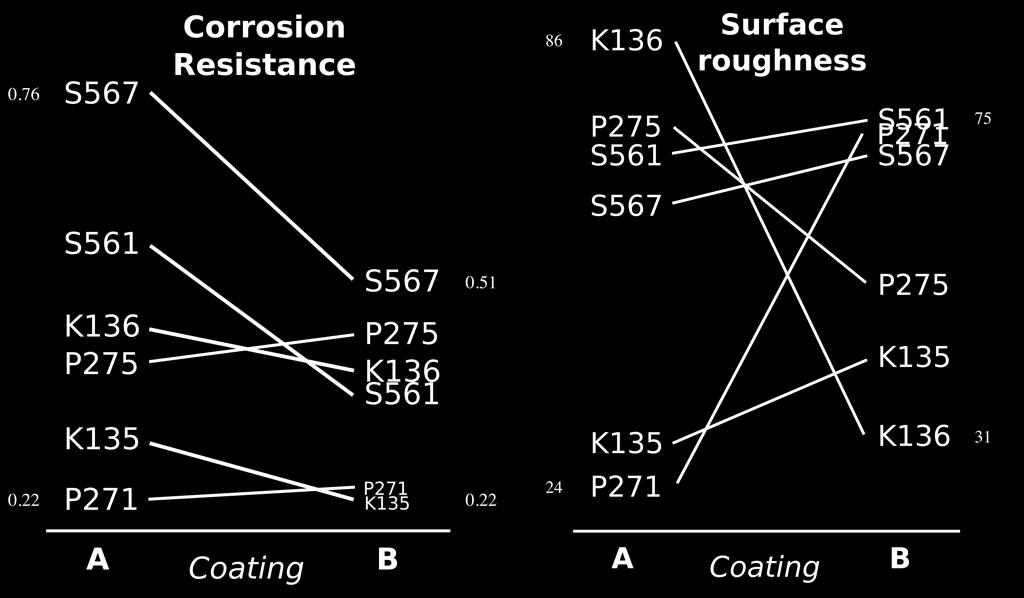
49 Tables Interesting example: comparing two treatments Coating A or B are applied to different products K-series, P-series, S-series How does the coating affect corrosion and surface roughness? 49
50 Tables 50
51 Data frames Frames are the basic containers that surround the data and give context to our numbers. Here are some tips: 1. Use round numbers 2. Tighten the axes as much as possible, except when showing comparison plots: all axes must have the same minima and maxima 51
52 Aesthetics and style I highly recommend reading Tufte s 4 books: contain remarkable examples of how to bring data to life. 52
53 Colour Colour is effective, but: readers could be colour-blind, document read from a gray-scale print out There is no standard colour progression (blues, greens, yellows, orange, red). Safest colour progression is gray-scale axis: from black to white satisfies colour-blind readers looks good in printed form 53
54 General summary No general advice that applies in every instance. Useful tips nevertheless: To understand causality, you must show causality: use bivariate scatter plots (sometimes line plots also work well) Plots and text go together: a plot = paragraph of text add labels to plots for outliers and interesting points add equations add small summary tables Avoid codes: A = grade TK133, B = grade RT231 54

55 General summary Avoid unnecessary extras to enliven the plot If the statistics are boring, then you ve got the wrong numbers. 55
56 General summary Adjust for inflation if plot involves money and time Maximize the data-ink ratio = (ink for data) / (total ink for graphics). 1. eliminate non-data ink 2. erase redundant data-ink. Maximize data density: 250 data points per linear inch, and 625 data points per square inch. 56
Frequencies. Chapter 2. Descriptive statistics and charts
 An analyst usually does not concentrate on each individual data values but would like to have a whole picture of how the variables distributed. In this chapter, we will introduce some tools to tabulate
Chapter 5. Describing Distributions Numerically. Finding the Center: The Median. Spread: Home on the Range. Finding the Center: The Median (cont.
 Chapter 5 Describing Distributions Numerically Copyright 2007 Pearson Education, Inc. Publishing as Pearson Addison-Wesley Copyright 2007 Pearson Education, Inc. Publishing as Pearson Addison-Wesley Slide
Homework Packet Week #5 All problems with answers or work are examples.
 Lesson 8.1 Construct the graphical display for each given data set. Describe the distribution of the data. 1. Construct a box-and-whisker plot to display the number of miles from school that a number of
Algebra I Module 2 Lessons 1 19
 Eureka Math 2015 2016 Algebra I Module 2 Lessons 1 19 Eureka Math, Published by the non-profit Great Minds. Copyright 2015 Great Minds. No part of this work may be reproduced, distributed, modified, sold,
STAT 113: Statistics and Society Ellen Gundlach, Purdue University. (Chapters refer to Moore and Notz, Statistics: Concepts and Controversies, 8e)
") STAT 113: Statistics and Society Ellen Gundlach, Purdue University (Chapters refer to Moore and Notz, Statistics: Concepts and Controversies, 8e) Learning Objectives for Exam 1: Unit 1, Part 1: Population
STAT 113: Statistics and Society Ellen Gundlach, Purdue University (Chapters refer to Moore and Notz, Statistics: Concepts and Controversies, 8e) Learning Objectives for Exam 1: Unit 1, Part 1: Population
6 ~ata-ink Maximization and Graphical Design
 6 ~ata-ink Maximization and Graphical Design So far the principles of maximizing data-ink and erasing have helped to generate a series of choices in the process of graphical revision. This is an important
Chapter 4. Displaying Quantitative Data. Copyright 2007 Pearson Education, Inc. Publishing as Pearson Addison-Wesley
 Chapter 4 Displaying Quantitative Data Copyright 2007 Pearson Education, Inc. Publishing as Pearson Addison-Wesley Dealing With a Lot of Numbers Summarizing the data will help us when we look at large
Measuring Variability for Skewed Distributions
 Measuring Variability for Skewed Distributions Skewed Data and its Measure of Center Consider the following scenario. A television game show, Fact or Fiction, was canceled after nine shows. Many people
Visual Encoding Design
 CSE 442 - Data Visualization Visual Encoding Design Jeffrey Heer University of Washington A Design Space of Visual Encodings Mapping Data to Visual Variables Assign data fields (e.g., with N, O, Q types)
Lesson 7: Measuring Variability for Skewed Distributions (Interquartile Range)
") : Measuring Variability for Skewed Distributions (Interquartile Range) Exploratory Challenge 1: Skewed Data and its Measure of Center Consider the following scenario. A television game show, Fact or Fiction,
: Measuring Variability for Skewed Distributions (Interquartile Range) Exploratory Challenge 1: Skewed Data and its Measure of Center Consider the following scenario. A television game show, Fact or Fiction,
Normalization Methods for Two-Color Microarray Data
 Normalization Methods for Two-Color Microarray Data 1/13/2009 Copyright 2009 Dan Nettleton What is Normalization? Normalization describes the process of removing (or minimizing) non-biological variation
MATH& 146 Lesson 11. Section 1.6 Categorical Data
 MATH& 146 Lesson 11 Section 1.6 Categorical Data 1 Frequency The first step to organizing categorical data is to count the number of data values there are in each category of interest. We can organize
E X P E R I M E N T 1
 E X P E R I M E N T 1 Getting to Know Data Studio Produced by the Physics Staff at Collin College Copyright Collin College Physics Department. All Rights Reserved. University Physics, Exp 1: Getting to
Box Plots. So that I can: look at large amount of data in condensed form.
 LESSON 5 Box Plots LEARNING OBJECTIVES Today I am: creating box plots. So that I can: look at large amount of data in condensed form. I ll know I have it when I can: make observations about the data based
MATH 214 (NOTES) Math 214 Al Nosedal. Department of Mathematics Indiana University of Pennsylvania. MATH 214 (NOTES) p. 1/3
 Math 214 Al Nosedal. Department of Mathematics Indiana University of Pennsylvania. MATH 214 (NOTES) p. 1/3") MATH 214 (NOTES) Math 214 Al Nosedal Department of Mathematics Indiana University of Pennsylvania MATH 214 (NOTES) p. 1/3 CHAPTER 1 DATA AND STATISTICS MATH 214 (NOTES) p. 2/3 Definitions. Statistics is
MATH 214 (NOTES) Math 214 Al Nosedal Department of Mathematics Indiana University of Pennsylvania MATH 214 (NOTES) p. 1/3 CHAPTER 1 DATA AND STATISTICS MATH 214 (NOTES) p. 2/3 Definitions. Statistics is
Lesson 7: Measuring Variability for Skewed Distributions (Interquartile Range)
") : Measuring Variability for Skewed Distributions (Interquartile Range) Student Outcomes Students explain why a median is a better description of a typical value for a skewed distribution. Students calculate
: Measuring Variability for Skewed Distributions (Interquartile Range) Student Outcomes Students explain why a median is a better description of a typical value for a skewed distribution. Students calculate
The One Penny Whiteboard
 The One Penny Whiteboard Ongoing, in the moment assessments may be the most powerful tool teachers have for improving student performance. For students to get better at anything, they need lots of quick
What is Statistics? 13.1 What is Statistics? Statistics
 13.1 What is Statistics? What is Statistics? The collection of all outcomes, responses, measurements, or counts that are of interest. A portion or subset of the population. Statistics Is the science of
Writing a Scientific Research Paper. Abstract. on the structural features of the paper. However, it also includes minor details concerning style
 Feihong Rodell Ms. Hanson Advanced Composition 24 March 2015 Writing a Scientific Research Paper Abstract This paper talks about writing scientific research papers. Most of the information is based on
Estimation of inter-rater reliability
 Estimation of inter-rater reliability January 2013 Note: This report is best printed in colour so that the graphs are clear. Vikas Dhawan & Tom Bramley ARD Research Division Cambridge Assessment Ofqual/13/5260
Math 7 /Unit 07 Practice Test: Collecting, Displaying and Analyzing Data
 Math 7 /Unit 07 Practice Test: Collecting, Displaying and Analyzing Data Name: Date: Define the terms below and give an example. 1. mode 2. range 3. median 4. mean 5. Which data display would be used to
Chapter 1 Midterm Review
 Name: Class: Date: Chapter 1 Midterm Review Multiple Choice Identify the choice that best completes the statement or answers the question. 1. A survey typically records many variables of interest to the
Math 81 Graphing. Cartesian Coordinate System Plotting Ordered Pairs (x, y) (x is horizontal, y is vertical) center is (0,0) Quadrants:
 (x is horizontal, y is vertical) center is (0,0) Quadrants:") Math 81 Graphing Cartesian Coordinate System Plotting Ordered Pairs (x, y) (x is horizontal, y is vertical) center is (0,0) Ex 1. Plot and indicate which quadrant they re in. A (0,2) B (3, 5) C (-2, -4)
Math 81 Graphing Cartesian Coordinate System Plotting Ordered Pairs (x, y) (x is horizontal, y is vertical) center is (0,0) Ex 1. Plot and indicate which quadrant they re in. A (0,2) B (3, 5) C (-2, -4)
Dot Plots and Distributions
 EXTENSION Dot Plots and Distributions A dot plot is a data representation that uses a number line and x s, dots, or other symbols to show frequency. Dot plots are sometimes called line plots. E X A M P
Chapter 3. Averages and Variation
 Chapter 3 Averages and Variation Understandable Statistics Ninth Edition By Brase and Brase Prepared by Yixun Shi Bloomsburg University of Pennsylvania Measures of Central Tendency We use the term average
MIS 0855 Data Science (Section 005) Fall 2016 In-Class Exercise (Week 6) Advanced Data Visualization with Tableau
 Fall 2016 In-Class Exercise (Week 6) Advanced Data Visualization with Tableau") MIS 0855 Data Science (Section 005) Fall 2016 In-Class Exercise (Week 6) Advanced Data Visualization with Tableau Objective: Learn how to use Tableau s advanced data visualization tools Learning Outcomes:
MIS 0855 Data Science (Section 005) Fall 2016 In-Class Exercise (Week 6) Advanced Data Visualization with Tableau Objective: Learn how to use Tableau s advanced data visualization tools Learning Outcomes:
Tech Paper. HMI Display Readability During Sinusoidal Vibration
 Tech Paper HMI Display Readability During Sinusoidal Vibration HMI Display Readability During Sinusoidal Vibration Abhilash Marthi Somashankar, Paul Weindorf Visteon Corporation, Michigan, USA James Krier,
Table of Contents. Introduction...v. About the CD-ROM...vi. Standards Correlations... vii. Ratios and Proportional Relationships...
 Table of Contents Introduction...v About the CD-ROM...vi Standards Correlations... vii Ratios and Proportional Relationships... 1 The Number System... 10 Expressions and Equations... 23 Geometry... 27
Multiple-point simulation of multiple categories Part 1. Testing against multiple truncation of a Gaussian field
 Multiple-point simulation of multiple categories Part 1. Testing against multiple truncation of a Gaussian field Tuanfeng Zhang November, 2001 Abstract Multiple-point simulation of multiple categories
Comparing Distributions of Univariate Data
 . Chapter 3 Comparing Distributions of Univariate Data Topic 9 covers comparing data and constructing multiple univariate plots. Topic 9 Multiple Univariate Plots Example: Building heights in Philadelphia,
Beautiful Evidence: A Journey through the Mind of Edward Tufte Stephen Few August 8, 2006
 Beautiful Evidence: A Journey through the Mind of Edward Tufte Stephen Few August 8, 2006 I owe a great deal to the work of Edward Tufte. Attending his one-day seminar many years ago inspired me to shift
THE OPERATION OF A CATHODE RAY TUBE
 THE OPERATION OF A CATHODE RAY TUBE OBJECT: To acquaint the student with the operation of a cathode ray tube, and to study the effect of varying potential differences on accelerated electrons. THEORY:
1. Structure of the paper: 2. Title
 A Special Guide for Authors Periodica Polytechnica Electrical Engineering and Computer Science VINMES Special Issue - Novel trends in electronics technology This special guide for authors has been developed
EDDY CURRENT IMAGE PROCESSING FOR CRACK SIZE CHARACTERIZATION
 EDDY CURRENT MAGE PROCESSNG FOR CRACK SZE CHARACTERZATON R.O. McCary General Electric Co., Corporate Research and Development P. 0. Box 8 Schenectady, N. Y. 12309 NTRODUCTON Estimation of crack length
6 th Grade Semester 2 Review 1) It cost me $18 to make a lamp, but I m selling it for $45. What was the percent of increase in price?
 It cost me $18 to make a lamp, but I m selling it for $45. What was the percent of increase in price?") 6 th Grade Semester 2 Review 1) It cost me $18 to make a lamp, but I m selling it for $45. What was the percent of increase in price? 2) Tom's weekly salary changed from $240 to $288. What was the percent
6 th Grade Semester 2 Review 1) It cost me $18 to make a lamp, but I m selling it for $45. What was the percent of increase in price? 2) Tom's weekly salary changed from $240 to $288. What was the percent
UNIVERSITY OF MASSACHUSETTS Department of Biostatistics and Epidemiology BioEpi 540W - Introduction to Biostatistics Fall 2002
 1 UNIVERSITY OF MASSACHUSETTS Department of Biostatistics and Epidemiology BioEpi 540W - Introduction to Biostatistics Fall 2002 Exercises Unit 2 Descriptive Statistics Tables and Graphs Due: Monday September
Histograms and Frequency Polygons are statistical graphs used to illustrate frequency distributions.
 Number of Families II. Statistical Graphs section 3.2 Histograms and Frequency Polygons are statistical graphs used to illustrate frequency distributions. Example: Construct a histogram for the frequency
Relationships Between Quantitative Variables
 Chapter 5 Relationships Between Quantitative Variables Three Tools we will use Scatterplot, a two-dimensional graph of data values Correlation, a statistic that measures the strength and direction of a
CSE Data Visualization. Graphical Perception. Jeffrey Heer University of Washington
 CSE 512 - Data Visualization Graphical Perception Jeffrey Heer University of Washington Design Principles [Mackinlay 86] Expressiveness A set of facts is expressible in a visual language if the sentences
Lecture 2 Video Formation and Representation
 2013 Spring Term 1 Lecture 2 Video Formation and Representation Wen-Hsiao Peng ( 彭文孝 ) Multimedia Architecture and Processing Lab (MAPL) Department of Computer Science National Chiao Tung University 1
Graphical Perception. Graphical Perception. Graphical Perception. Which best encodes quantities? Jeffrey Heer Stanford University
 CS448B :: 7 Oct 2010 Graphical Perception Graphical Perception Jeffrey Heer Stanford University Graphical Perception The ability of viewers to interpret visual (graphical) encodings of information and
common available Go to the provided as Word Files Only Use off. Length Generally for a book comprised a. Include book
 Springer Briefs in Molecular Science: History of Chemistry Manuscript Preparation and Author Guidelines The aim of the series is to provide volumes that would be of broad interestt to the chemical community,
Relationships. Between Quantitative Variables. Chapter 5. Copyright 2006 Brooks/Cole, a division of Thomson Learning, Inc.
 Relationships Chapter 5 Between Quantitative Variables Copyright 2006 Brooks/Cole, a division of Thomson Learning, Inc. Three Tools we will use Scatterplot, a two-dimensional graph of data values Correlation,
AP Statistics Sampling. Sampling Exercise (adapted from a document from the NCSSM Leadership Institute, July 2000).
.") AP Statistics Sampling Name Sampling Exercise (adapted from a document from the NCSSM Leadership Institute, July 2000). Problem: A farmer has just cleared a field for corn that can be divided into 100
AP Statistics Sampling Name Sampling Exercise (adapted from a document from the NCSSM Leadership Institute, July 2000). Problem: A farmer has just cleared a field for corn that can be divided into 100
1.1 Common Graphs and Data Plots
 1.1. Common Graphs and Data Plots www.ck12.org 1.1 Common Graphs and Data Plots Learning Objectives Identify and translate data sets to and from a bar graph and a pie graph. Identify and translate data
Objective: Write on the goal/objective sheet and give a before class rating. Determine the types of graphs appropriate for specific data.
 Objective: Write on the goal/objective sheet and give a before class rating. Determine the types of graphs appropriate for specific data. Khan Academy test Tuesday Sept th. NO CALCULATORS allowed. Not
Permutations of the Octagon: An Aesthetic-Mathematical Dialectic
 Proceedings of Bridges 2015: Mathematics, Music, Art, Architecture, Culture Permutations of the Octagon: An Aesthetic-Mathematical Dialectic James Mai School of Art / Campus Box 5620 Illinois State University
THE OPERATION OF A CATHODE RAY TUBE
 THE OPERATION OF A CATHODE RAY TUBE OBJECT: To acquaint the student with the operation of a cathode ray tube, and to study the effect of varying potential differences on accelerated electrons. THEORY:
Scout 2.0 Software. Introductory Training
 Scout 2.0 Software Introductory Training Welcome! In this training we will cover: How to analyze scwest chip images in Scout Opening images Detecting peaks Eliminating noise peaks Labeling your peaks of
Logo Guidelines Version 1.1, September 2008
 Thermaltake Corporate Trademark Logo Guidelines Version 1.1, September 2008 - The following pages contain all necessary details for proper use of Thermaltake Logo. - Any application of Thermaltake Logo
Navigate to the Journal Profile page
 Navigate to the Journal Profile page You can reach the journal profile page of any journal covered in Journal Citation Reports by: 1. Using the Master Search box. Enter full titles, title keywords, abbreviations,
User Guide. S-Curve Tool
 User Guide for S-Curve Tool Version 1.0 (as of 09/12/12) Sponsored by: Naval Center for Cost Analysis (NCCA) Developed by: Technomics, Inc. 201 12 th Street South, Suite 612 Arlington, VA 22202 Points
Journal of Equipment Lease Financing Author Guidelines
 Journal of Equipment Lease Financing Author Guidelines Journal of Equipment Lease Financing Author Guidelines Published by the Equipment Leasing & Finance Foundation Updated November 2017 I. JOURNAL POLICY
User s Manual. Log Scale (/LG) GX10/GX20/GP10/GP20/GM10 IM 04L51B01-06EN. 3rd Edition
 GX10/GX20/GP10/GP20/GM10 IM 04L51B01-06EN. 3rd Edition") User s Manual Model GX10/GX20/GP10/GP20/GM10 Log Scale (/LG) 3rd Edition Introduction Thank you for purchasing the SMARTDAC+ Series GX10/GX20/GP10/GP20/GM10 (hereafter referred to as the recorder, GX,
User s Manual Model GX10/GX20/GP10/GP20/GM10 Log Scale (/LG) 3rd Edition Introduction Thank you for purchasing the SMARTDAC+ Series GX10/GX20/GP10/GP20/GM10 (hereafter referred to as the recorder, GX,
Blueline, Linefree, Accuracy Ratio, & Moving Absolute Mean Ratio Charts
 INTRODUCTION This instruction manual describes for users of the Excel Standard Celeration Template(s) the features of each page or worksheet in the template, allowing the user to set up and generate charts
MARK SCHEME for the November 2004 question paper 9702 PHYSICS
 UNIVERSITY OF CAMBRIDGE INTERNATIONAL EXAMINATIONS GCE Advanced Level MARK SCHEME for the November 2004 question paper 9702 PHYSICS 9702/05 Paper 5 (Practical Test), maximum raw mark 30 This mark scheme
Full file at
 Exam Name SHORT ANSWER. Write the word or phrase that best completes each statement or answers the question. Provide an appropriate response. 1) A parcel delivery service lowered its prices and finds that
On Figure of Merit in PAM4 Optical Transmitter Evaluation, Particularly TDECQ
 On Figure of Merit in PAM4 Optical Transmitter Evaluation, Particularly TDECQ Pavel Zivny, Tektronix V1.0 On Figure of Merit in PAM4 Optical Transmitter Evaluation, Particularly TDECQ A brief presentation
AWT Guidelines for Speakers
 AWT Guidelines for Speakers The guidelines listed below were developed to preserve the integrity of the educational experience and provide the best learning environment for our attendees. The educational
NAA ENHANCING THE QUALITY OF MARKING PROJECT: THE EFFECT OF SAMPLE SIZE ON INCREASED PRECISION IN DETECTING ERRANT MARKING
 NAA ENHANCING THE QUALITY OF MARKING PROJECT: THE EFFECT OF SAMPLE SIZE ON INCREASED PRECISION IN DETECTING ERRANT MARKING Mudhaffar Al-Bayatti and Ben Jones February 00 This report was commissioned by
User s Manual. Log Scale (/LG) GX10/GX20/GP10/GP20/GM10 IM 04L51B01-06EN. 2nd Edition
 GX10/GX20/GP10/GP20/GM10 IM 04L51B01-06EN. 2nd Edition") User s Manual Model GX10/GX20/GP10/GP20/GM10 Log Scale (/LG) User s Manual 2nd Edition Introduction Notes Trademarks Thank you for purchasing the SMARTDAC+ Series GX10/GX20/GP10/GP20/GM10 (hereafter referred
User s Manual Model GX10/GX20/GP10/GP20/GM10 Log Scale (/LG) User s Manual 2nd Edition Introduction Notes Trademarks Thank you for purchasing the SMARTDAC+ Series GX10/GX20/GP10/GP20/GM10 (hereafter referred
Overview. Teacher s Manual and reproductions of student worksheets to support the following lesson objective:
 Overview Lesson Plan #1 Title: Ace it! Lesson Nine Attached Supporting Documents for Plan #1: Teacher s Manual and reproductions of student worksheets to support the following lesson objective: Find products
Bar Codes to the Rescue!
 Fighting Computer Illiteracy or How Can We Teach Machines to Read Spring 2013 ITS102.23 - C 1 Bar Codes to the Rescue! If it is hard to teach computers how to read ordinary alphabets, create a writing
Dektak Step by Step Instructions:
 Dektak Step by Step Instructions: Before Using the Equipment SIGN IN THE LOG BOOK Part 1: Setup 1. Turn on the switch at the back of the dektak machine. Then start up the computer. 2. Place the sample
Chrominance Subsampling in Digital Images
 Chrominance Subsampling in Digital Images Douglas A. Kerr Issue 2 December 3, 2009 ABSTRACT The JPEG and TIFF digital still image formats, along with various digital video formats, have provision for recording
More About Regression
 Regression Line for the Sample Chapter 14 More About Regression is spoken as y-hat, and it is also referred to either as predicted y or estimated y. b 0 is the intercept of the straight line. The intercept
T HE M AGIC OF G RAPHS AND S TATISTICS
 p01.qxd 10/29/03 9:25 AM Page 1 I T HE M AGIC OF G RAPHS AND S TATISTICS It s hard to get through a day without seeing a graph or chart somewhere, whether you re reading a newspaper or a magazine, watching
TL-2900 AMMONIA & NITRATE ANALYZER DUAL CHANNEL
 TL-2900 AMMONIA & NITRATE ANALYZER DUAL CHANNEL DATA ACQUISITION SYSTEM V.15.4 INSTRUCTION MANUAL Timberline Instruments, LLC 1880 S. Flatiron Ct., Unit I Boulder, Colorado 80301 Ph: (303) 440-8779 Fx:
Advanced LA Independent Novel Project
 Advanced LA Independent Novel Project You will be reading four books outside of class this year. Each book choice must correspond with the required genre listed below, depending on the quarter. Since you
DIFFERENTIATE SOMETHING AT THE VERY BEGINNING THE COURSE I'LL ADD YOU QUESTIONS USING THEM. BUT PARTICULAR QUESTIONS AS YOU'LL SEE
 1 MATH 16A LECTURE. OCTOBER 28, 2008. PROFESSOR: SO LET ME START WITH SOMETHING I'M SURE YOU ALL WANT TO HEAR ABOUT WHICH IS THE MIDTERM. THE NEXT MIDTERM. IT'S COMING UP, NOT THIS WEEK BUT THE NEXT WEEK.
Notes Unit 8: Dot Plots and Histograms
 Notes Unit : Dot Plots and Histograms I. Dot Plots A. Definition A data display in which each data item is shown as a dot above a number line In a dot plot a cluster shows where a group of data points
imso-104 Manual Revised August 5, 2011
 imso-104 Manual Revised August 5, 2011 Section 1 Getting Started SAFETY 1.10 Quickstart Guide 1.20 SAFETY 1.30 Compatibility 1.31 Hardware 1.32 Software Section 2 How it works 2.10 Menus 2.20 Analog Channel
Distribution of Data and the Empirical Rule
 302360_File_B.qxd 7/7/03 7:18 AM Page 1 Distribution of Data and the Empirical Rule 1 Distribution of Data and the Empirical Rule Stem-and-Leaf Diagrams Frequency Distributions and Histograms Normal Distributions
Version : 1.0: klm. General Certificate of Secondary Education November Higher Unit 1. Final. Mark Scheme
 Version : 1.0: 11.10 klm General Certificate of Secondary Education November 2010 Mathematics Higher Unit 1 43601H Final Mark Scheme Mark schemes are prepared by the Principal Examiner and considered,
Automatic LP Digitalization Spring Group 6: Michael Sibley, Alexander Su, Daphne Tsatsoulis {msibley, ahs1,
 Automatic LP Digitalization 18-551 Spring 2011 Group 6: Michael Sibley, Alexander Su, Daphne Tsatsoulis {msibley, ahs1, ptsatsou}@andrew.cmu.edu Introduction This project was originated from our interest
Getting started with Spike Recorder on PC/Mac/Linux
 Getting started with Spike Recorder on PC/Mac/Linux You can connect your SpikerBox to your computer using either the blue laptop cable, or the green smartphone cable. How do I connect SpikerBox to computer
Mathematics in Contemporary Society Chapter 11
 City University of New York (CUNY) CUNY Academic Works Open Educational Resources Queensborough Community College Fall 2015 Mathematics in Contemporary Society Chapter 11 Patrick J. Wallach Queensborough
by people with a variety of skills and training. What I have just said about graphics, skepticism at suitable standards is not new.
 AUTOMATING STATISTICAL GRAPHICS: A TOOL FOR COMMUNICATION Vincent P. Barabba, Bureau of the Census Today I'm going to discuss with you some efforts, both inside and outside the Census Bureau to develop
9.2 Data Distributions and Outliers
 Name Class Date 9.2 Data Distributions and Outliers Essential Question: What statistics are most affected by outliers, and what shapes can data distributions have? Eplore Using Dot Plots to Display Data
Chapt er 3 Data Representation
 Chapter 03 Data Representation Chapter Goals Distinguish between analog and digital information Explain data compression and calculate compression ratios Explain the binary formats for negative and floating-point
Introduction to IBM SPSS Statistics (v24)
") to IBM SPSS Statistics (v24) to IBM SPSS Statistics is a two day instructor-led classroom course that guides students through the fundamentals of using IBM SPSS Statistics for typical data analysis process.
to IBM SPSS Statistics (v24) to IBM SPSS Statistics is a two day instructor-led classroom course that guides students through the fundamentals of using IBM SPSS Statistics for typical data analysis process.
Branding Guidelines NOTICE:
 Branding Guidelines NOTICE: THE STRUCTURE OF THE HEVC ADVANCE LICENSING PROGRAM, INCLUDING THE TERMS HEVC ADVANCE IS CURRENTLY AUTHORIZED TO OFFER IN ITS PATENT PORTFOLIO LICENSE AGREEMENT, ARE SUBJECT
MATLAB Programming. Visualization
 Programming Copyright Software Carpentry 2011 This work is licensed under the Creative Commons Attribution License See http://software-carpentry.org/license.html for more information. Good science requires
Logo Guidelines Version 1.1, September 2009
 Tt APOLLOS esport TEAM Logo Guidelines Version 1.1, September 2009 - The following pages contain all necessary details for proper use of Tt Apollos Logo. - Any application of Tt Apollos Logo that fall
Chapter 27. Inferences for Regression. Remembering Regression. An Example: Body Fat and Waist Size. Remembering Regression (cont.)
") Chapter 27 Inferences for Regression Copyright 2007 Pearson Education, Inc. Publishing as Pearson Addison-Wesley Slide 27-1 Copyright 2007 Pearson Education, Inc. Publishing as Pearson Addison-Wesley An
Chapter 27 Inferences for Regression Copyright 2007 Pearson Education, Inc. Publishing as Pearson Addison-Wesley Slide 27-1 Copyright 2007 Pearson Education, Inc. Publishing as Pearson Addison-Wesley An
Title page. Journal of Radioanalytical and Nuclear Chemistry. Names of the authors: Title: Affiliation(s) and address(es) of the author(s):
 and address(es) of the author(s):") 1 Title page 2 3 4 5 Names of the authors: Title: Affiliation(s) and address(es) of the author(s): E-mail address of the corresponding author: 6 1 7 Concise and informative title 8 9 10 Alan B. Correspondent
1 Title page 2 3 4 5 Names of the authors: Title: Affiliation(s) and address(es) of the author(s): E-mail address of the corresponding author: 6 1 7 Concise and informative title 8 9 10 Alan B. Correspondent
How to Write a Research Paper I
 How to Write a Research Paper I Start with the Data The first in a series of V Lectures to help you prepare your Final Papers But First Consider Science of Scientific Writing If the reader is to grasp
Object selectivity of local field potentials and spikes in the macaque inferior temporal cortex
 Object selectivity of local field potentials and spikes in the macaque inferior temporal cortex Gabriel Kreiman 1,2,3,4*#, Chou P. Hung 1,2,4*, Alexander Kraskov 5, Rodrigo Quian Quiroga 6, Tomaso Poggio
Getting Started. Connect green audio output of SpikerBox/SpikerShield using green cable to your headphones input on iphone/ipad.
 Getting Started First thing you should do is to connect your iphone or ipad to SpikerBox with a green smartphone cable. Green cable comes with designators on each end of the cable ( Smartphone and SpikerBox
Congratulations to the Bureau of Labor Statistics for Creating an Excellent Graph By Jeffrey A. Shaffer 12/16/2011
 Congratulations to the Bureau of Labor Statistics for Creating an Excellent Graph By Jeffrey A. Shaffer 12/16/2011 The Bureau of Labor Statistics (BLS) has published some really bad graphs and maps over
Example: compressing black and white images 2 Say we are trying to compress an image of black and white pixels: CSC310 Information Theory.
 CSC310 Information Theory Lecture 1: Basics of Information Theory September 11, 2006 Sam Roweis Example: compressing black and white images 2 Say we are trying to compress an image of black and white pixels:
Principles of Data Visualization. Jeffrey University of Washington
 Principles of Data Visualization Jeffrey Heer @jeffrey_heer University of Washington Data Analysis & Statistics, Tukey & Wilk 1966 Four major influences act on data analysis today: 1. The formal theories
QCTool. PetRos EiKon Incorporated
 2006 QCTool : Windows 98 Windows NT, Windows 2000 or Windows XP (Home or Professional) : Windows 95 (Terms)... 1 (Importing Data)... 2 (ASCII Columnar Format)... 2... 3... 3 XYZ (Binary XYZ Format)...
Bootstrap Methods in Regression Questions Have you had a chance to try any of this? Any of the review questions?
 ICPSR Blalock Lectures, 2003 Bootstrap Resampling Robert Stine Lecture 3 Bootstrap Methods in Regression Questions Have you had a chance to try any of this? Any of the review questions? Getting class notes
graphic standards adopted May 2007
 graphic standards adopted May 2007 All Canadian made for all Canadian weather Gord Wiebe President & CEO Dear All Weather Windows Colleague, The All Weather Windows brand and product are valuable company
one M2M Logo Brand Guidelines
 one M2M Logo Brand Guidelines July 2012 Logo Design Explanation What does the one M2M logo symbolize? The number 2 in the middle part of the logo symbolizes the connection between the two machines, the
Best Pat-Tricks on Model Diagnostics What are they? Why use them? What good do they do?
 Best Pat-Tricks on Model Diagnostics What are they? Why use them? What good do they do? Before we get started feel free to download the presentation and file(s) being used for today s webinar. http://www.statease.com/webinar.html
Flow Cytometry Histograms: Transformations, Resolution, and Display
 Review Article Flow Cytometry Histograms: Transformations, Resolution, and Display David Novo, 1 * James Wood 2 1 De Novo Software, 3250 Wilshire Blvd. Suite 803, Los Angeles, California 2 Department of
Answers. Chapter 9 A Puzzle Time MUSSELS. 9.1 Practice A. Technology Connection. 9.1 Start Thinking! 9.1 Warm Up. 9.1 Start Thinking!
 . Puzzle Time MUSSELS Technolog Connection.. 7.... in. Chapter 9 9. Start Thinking! For use before Activit 9. Number of shoes x Person 9. Warm Up For use before Activit 9.. 9. Start Thinking! For use before
Interface Practices Subcommittee SCTE STANDARD SCTE Measurement Procedure for Noise Power Ratio
 Interface Practices Subcommittee SCTE STANDARD SCTE 119 2018 Measurement Procedure for Noise Power Ratio NOTICE The Society of Cable Telecommunications Engineers (SCTE) / International Society of Broadband