C O R P O R A T E G R A P H I C I D E N T I T Y P O L I C Y
|
|
|
- Marilynn Davis
- 5 years ago
- Views:
Transcription

1 C O R P O R A T E G R A P H I C I D E N T I T Y P O L I C Y J A N U A R Y

2 Graphic Identity 2

3 Corporate identity policy This corporate identity manual standardizes the communication elements and provides the graphic basis for the appearance of its information and advertising materials, as well as uniforms, vehicles, signs, stationery, web, etc. can disseminate a unitary and coherent image that transmits solidity and differentiation. It is the task of all staff to ensure that the elements and materials that are carriers of corporate identity always follow the standards that have been accepted and standardized in this manual, since Dominion's own visual identity is as important as its use and application in the different supports. 3
4 Corporate identity policy We want to build and communicate a powerful, innovative and innovative visual identity, differential and generating values and meanings for Dominion. Playing with the letter "D" of Dominion, we create a curved shape that resembles the shapes of a magnet, which "absorbs" a square. This square represents the companies that belong to Dominion, and not only that, but also everything that Dominion is capable of doing. COMPANIES OF THE TECHNOLOGICAL SECTOR Rectangle that gives last to companies in the sector. Its position within the semicircle helps us to understand that it "is inside Dominion". D LETTER DOMINION Magnet shape, attraction, solidity. 4

 will be carried out in all cases in a high box using the Nexa Bold typeface.")


5 Imagotipo Logotype In the graphic construction of the imagotype, the global form of the image has been coincided with the golden ratio, in such a way that it helps to build an imagotype that is aesthetically more harmonious and pleasing to the human eye. As a general rule, the brand must be reproduced from the digital originals provided in digital format. The graphic construction of the name (logo) will be carried out in all cases in a high box using the Nexa Bold typeface. We chose this typeface because of its simplicity, its adaptability to all applications and because it transmits strength and solidity. The geometric shapes of this typography create wide spaces between them, being characters that occupy the same size in width as in height, which provides stability to the word and facilitates its reading, without extra elements that distract the view and prevent recognition. easily. The proportions of font size must always be maintained, as well as its justification centered on the imagotype. Logo and imagotype can be used independently when necessary, in this way we provide both a greater presence and rotundity. In case you need the files, contact with corporate.communication@dominion-global.com 5
6 Versions When it comes to reflecting the brand in materials, you must always take into account the basis on which it will go, to choose the logo version that will be available. It is necessary to check with corporate before making any request so that they have proof and verify that it meets the requirements of visual identity. In case you need the files, contact with 6


7 Constructive reticle LOGOTIPO E IMAGOTIPO LOGOTIPO The combination of the symbol and the logo constitutes the main element of graphic identity. This page shows the construction of the imagotype on a modular grid giving an X measurement, to offer a guide that establishes the proportions suitable for the correct reproduction on any support and at any size. LOGOTIPO E IMAGOTIPO CON DIVISIÓN LOGOTIPO SIN IMAGOTIPO CON DIVISIÓN DIVISION The reduced version of division in its simplest format, it will be applied exclusively when the Dominion brand is alluded to in the same environment. The reduced version of division can never be used as a cover or as the main element of a composition. In case you need the files, contact with corporate.communication@dominion-global.com 7


8 Graphic representation of supported brands BASIC SUB-BRAND CORPORATE USE The visual identities of the brands supported by Dominion or those that are under Dominion within the brand architecture will be graphically adapted in the following way: As described in the concept section, the inner box within the symbol represents all the companies that are "within Dominion". That is why in the representation of the logos of the backed brands these are aligned with the interior box, in such a way that it seems that the name of the brand comes out, enters or forms part of that picture. We use the Dominion imagery along with the name of the backed brand, written in a high box and with the Nexa Bold typeface, as in the Dominion logo. In the case of companies with extensive naming or two different words, the secondary word will be placed in a second line under the main word and to a smaller size. In case you need the files, contact with corporate.communication@dominion-global.com 8


9 Protection area The zone of protection refers to the minimum spaces that must be kept clear for the brand when it is accompanied by texts, photographs, illustrations or other brands. This regulation aims to ensure the visual independence of the brand from the rest of the graphic elements and facilitate their immediate identification. These regulations are calculated according to the measure X, established in the same way in the constructive reticle of the brand. To offer a correct legibility of the logo text, it is necessary to establish a minimum size, which establishes the limit of reproduction size of the logo. In this case, a minimum size has been established for the logo and the imagotype and another for the option with area or department. Logo + Imagotype 13.5 x 7.5 mm Logo + Imagotype + Area or department 18.8 x 12.8 mm In case you need the files, contact with corporate.communication@dominion-global.com 9
10 Incorrect uses As mentioned above, it is very important that everyone who uses the brand for its subsequent reproduction takes into account the basic rules required in this manual, since any change in the visual identity of Dominion can generate a progressive distortion in the image general. Here are some examples of incorrect uses that should not be used in any case. In case you need the files, contact with corporate.communication@dominion-global.com 10
11 Typography When developing the visual identity of a brand, one of the fundamental bases is to implement in it a typeface to be used in all applications. This facilitates the correct reproduction of the brand, as well as its rapid identification, creating an own style of graphic identity. Therefore, it is important to choose a typography that is easy to identify, but which in turn is legible, sober, modern and solid. Nexa Bold is the main corporate typography of the brand, used in the logo, in the denomination of the areas or departments, the backed brands and the owners. For online applications, typographical correspondences of Google Fonts are established, to be used in headlines, menus and body - copies. In case you need the files, contact with corporate.communication@dominion-global.com 11
12 Color palette MAIN PALETTE SECONDARY PALETTE We define the color to transmit our innovative essence and our solid, energetic and powerful character, maintaining the bluish range that Dominion has acquired over time. Chosen for its freshness, power and confidence, the different tonal versions have been established for its correct reproduction in any medium and any type of printing. Regardless of the type of finish (gloss or matte) or the paper used, it should always be matched with the tonality. In case you need the files, contact with 12

13 Photographic treatment S I M P L E P H O T O G R A P H Y When using photography to improve the user experience, choose images that express personal relevance, information and closeness. Make sure that the images are dynamic and relevant to the context. It is recommended to use visuals that are easy to interpret in order to substantially improve the understanding of the message YES. It is recommended the use of dynamic photographs that tell a story, that show naturalness and confidence. YES. The most powerful and iconic images are those that consist of few essential elements, with minimal distractions. DO NOT. Images that can convey a sense of falsehood and rigidity will be avoided. DO NOT. The use of excessive elements in the same image can confuse the user and force him to try to deduce the meaning of it. In case you need the files, contact with corporate.communication@dominion-global.com 13

14 Photographic treatment P H O T O G R A P H Y W I T H M A S K Both illustration and photography can live within the same product. Photography automatically implies a degree of specificity and should be used to show specific elements and stories. For this, there are a series of predesigned resources that combine photography with illustration. These resources can be applied in the visual environment of Dominion, achieving a distinctive and exclusive seal, even based on many occasions in stock images. In case you need the files, contact with corporate.communication@dominion-global.com 14
15 Iconography and illustration S I M P L E I C O N O G R A P H Y Simple iconography serves as an informative element that can accompany a headline or a text. The icon is not intended to be the protagonist of the message, but rather to help contextualize the information. I L L U S T R A T E D I C O N O G R A P H Y It is applied in more complex destinations such as computer graphics or pieces that seek to attract the attention of users. They should never be used in very small spaces. T R A C E D I C O N S They are used in large sizes and when there are no problems for their readability. If we form a group of tracedicons, they should never be accompanied by mass icons. M A S S I C O N S They apply when the iconography is in small spaces. The mass iconography is well recognized in very small sizes. If we form a group of mass icons, they should never be accompanied by traced icons. In case you need the files, contact with corporate.communication@dominion-global.com 15

16 Business cards policy 16

17 Business cards Objective: Unify the Corporate image. Exceptions: Phone House and Abside, who have their own branding. AS well as Commonwealth, due to US peculiarities. Business cards details Details will be only in one language. If a secondary is needed, it must be approved by Human Resources. Logos: The logo will be on the top right side of the front of the card. The allowed logos are the ones associated to divisions and sub-brands, in their Corporate use model, as it is showed on the Brand architecture document. The back always needs to reflect the corporate logo and slogan. In case you need the files, please contact with corporate.communication@dominion-global.com 17
. 3. Mobile phone 4. Phone (land line) 5. Email address + Skype unified format 6. Address 7.")
18 Business cards 1. Name and surname(s). 2. Job title (it must be the officially designated by Human Resources. In case you have any question, please contact with your manager or with he Human Resources department). 3. Mobile phone 4. Phone (land line) 5. address + Skype unified format 6. Address 7. Dominion website url In case you need the files, please contact with corporate.communication@dominion-global.com 18
19 Business cards examples The Corporate design can be used in all cases and will be the preferred one. Corporate Example Division example Sub-Brand example ** Abside and Phone House have their own branding and visual identity. Commonweatlh works as an exception. In case you need the files, please contact with 19

20 signatures: general structure 20
21 E M A I L S I G N A T U R E S P O L I C Y : G E N E R A L S T R U C T U R E In general, Dominion employees signatures must follow this structure: 1. Dominion logo 2. Name and surname 3. Job title 4. Can be empty or indicate the division/subbrand/ business area to which it belongs (and that must be approved by Corporate Communications) 5. address 6. Mobile phone (can be empty if you don t have one) 7. Phone/Land line (can be empty if you don t have one) 8. Dominion s Social Media direct access links (LinkedIn, Twitter and YouTube) 9. Address (according to work placement) 10. Dominion web In case you need the files, please contact with corporate.communication@dominion-global.com 21

22 E M A I L S I G N A T U R E S P O L I C Y : G E N E R A L S T R U C T U R E As exception, some modifications are allowed to Dominion employees associated to sub-brands with own identity. It also applies to transition brands, only as a temporary measure in an agreed term. Modifications can be included in: 1 1. Sub-Brand logo, with a Dominion Company 2. Links to sub-brand s Social Media channels, in case they exist. If not, links to Dominion s. 3. Sub-Brand or product website url (as well as Dominion s website) 2 3 This casuistry is contemplated for the list of sub-brands" included in the brand architecture, which can be checked on: ateid.aspx In case you need the files, please contact with corporate.communication@dominion-global.com 22

23 E M A I L S I G N A T U R E S P O L I C Y : G E N E R A L S T R U C T U R E ADDITIONAL ELEMENTS In order to advertise our participation in events and other relevant facts, additional signatures are contemplated. Any Dominion employee can propose the creation of these signatures, which must be communicated an approved by the Communication department. In case you need the files, please contact with corporate.communication@dominion-global.com 23
24 E X A M P L E S signatures examples General structure 24
25 E X A M P L E S signatures examples Sub-brand: Begirale 25

26 E X A M P L E S signatures examples Sub-brand: Steelcon 26

27 E X A M P L E S signatures examples Sub-brand: NovoCOS 27

28 E X A M P L E S signatures examples Sub-brand: Commonwealth 28
29 Wardrobe, vehicles and merchandising 29


30 Wardrobe Below are some examples of brand application in costume, where the corporate image goes on the back of the piece and the sub-brand or product on the front. There are also examples of other materials, where the same pattern of conjugating corporate image with sub-brand or product is followed, never appearing independently. * As a general criterion, it is preferable to use only Dominion, that is, the corporate model, although if necessary, the sub-brand can be used. In case you need the files, contact with corporate.communication@dominion-global.com 30

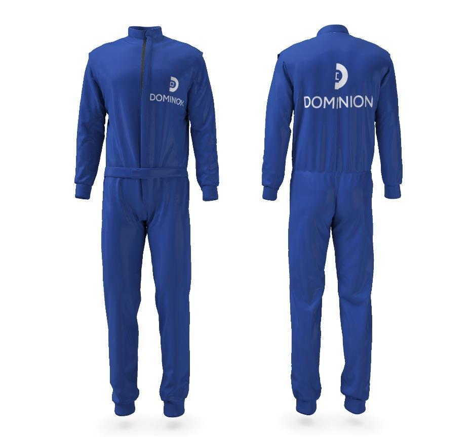
31 Wardrobe In case you need the files, contact with 31


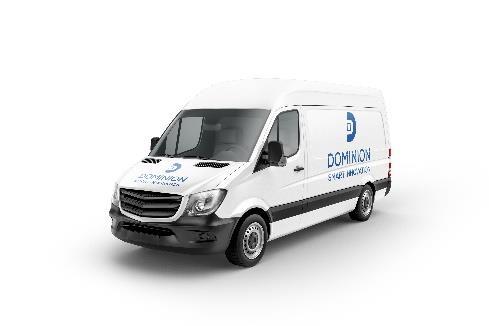
32 Vehicles In case you need the files, contact with 32


33 Merchandising Merchandising is a good method of brand promotion and product development, so it is usually connected to the demand and prepared by the Dominion Marketing Department. In case you need the files, contact with corporate.communication@dominion-global.com 33

34 w w w. d o m i n i o n - g l o b a l. c o m 34
Brand Guidelines. January 2015
 Brand Guidelines January 2015 Table of Contents 1.0 What s a brand? 3 1.1 The logo 4 1.2 Colour 1.2.1 Spot & Process 1.2.2 Black & White 5 5 6 1.3 Logo Sizing 1.3.1 Minimum Clear Space 1.3.2 Positioning
BASIC MANUAL OF CEPSA IDENTITY
 BASIC MANUAL OF CEPSA IDENTITY April 2018 Cepsa Basic Identity Manual Welcome This manual contains all the elements that make up the Cepsa identity. This manual contains all the elements that make up the
TOWN OF QUEEN CREEK BRAND GUIDE
 BRAND GUIDE DEC2016 BRAND GUIDE INTRODUCTION CONTACT TOWN OF QUEEN CREEK COMMUNICATIONS, MARKETING AND RECREATION DEPARTMENT 22358 SOUTH ELLSWORTH ROAD QUEEN CREEK, AZ 85142 480-358-3198 communication@queencreek.org
This tool is the collection of all the fundamental rules for the use of BOCAhealth brand. Its use helps to make all the communication tools coherent
 B R A N D B O O K This tool is the collection of all the fundamental rules for the use of BOCAhealth brand. Its use helps to make all the communication tools coherent each other, reinforcing the image
Branding Style Guidelines. (Revised: September 6, 2017)
") Branding Style Guidelines (Revised: September 6, 2017) Table of Contents 2 3 4 5 6 7 8 10 12 13 14 Introduction Brand elements Clear space and minimum size Logo and tagline Symbol as a graphic Logo palette
Branding Style Guidelines (Revised: September 6, 2017) Table of Contents 2 3 4 5 6 7 8 10 12 13 14 Introduction Brand elements Clear space and minimum size Logo and tagline Symbol as a graphic Logo palette
one M2M Logo Brand Guidelines
 one M2M Logo Brand Guidelines July 2012 Logo Design Explanation What does the one M2M logo symbolize? The number 2 in the middle part of the logo symbolizes the connection between the two machines, the
Brand Typeface Headlines Establishing Hierarchy Photography Iconography & Infographics... 18
 Brand Guide VERSION 1.0 2017 Contents at a glance Introduction Using Brand Guidelines... 3 A Note on Branding... 4 Logo Color Version... 5 Special Cases Only... 6 Logo Usage Clear Space... 7 Minimum Size...
Graphic Standards. A guide to Lane s visual identity, with information on using the college logo, Lane colors and typefaces, stationery, and more.
 Graphic Standards A guide to Lane s visual identity, with information on using the college logo, Lane colors and typefaces, stationery, and more. TABLE OF CONTENTS Introduction to Graphic Standards...1
FileMaker Corporate Style Guide
 ilemaker Corporate Style Guide General guidelines for logo usage and corporate identity 5201 Patrick Henry Drive Santa Clara, CA 95054, USA Tel: (408) 987.7000 Welcome Our identity is one of our most valuable
CMA VISUAL IDENTITY GUIDE. January 2018
 CMA VISUAL IDENTITY GUIDE January 2018 CMA Visual Identity Guide Logo overview The CMA logo is composed of the French and English wordmarks and the CMA icon (note: the logo is always bilingual, even in
BRAND GUIDELINES. July version 2.1
 BRAND GUIDELINES July 2015 - version 2.1 INTRODUCTION The Noritz Brand As we grow and advance as an organization, it sometimes becomes necessary to reevaluate our visual identity. That s why I am pleased
Brand Standards QUICK GUIDELINES
 Brand Standards QUICK GUIDELINES Table of Contents 1.0 1.1 1.2 BRANDMARK Master / Staging Color / Size 2.0 2.1 TAGLINE Usage / Specifications / Staging 3.0 3.1 3.2 3.3 BRAND SYSTEM Typography Color Palette
Version 3:0 September 2015
 Identity guidelines Version 3:0 September 2015 The Buxton logotype The new logotype embraces the concept of water - and a source of water. The focal point of the design is the letter O' where water emerges
CORPORATE VISUAL IDENTITY GUIDELINES. for the use of the OAAS Logo
 CORPORATE VISUAL IDENTITY GUIDELINES for the use of the OAAS Logo ONTARIO ASSOCIATION OF AGRICULTURAL SOCIETIES September 2017 Introduction Our branding is more than a name and a logo. Our branding is
Corporate Identity and Visual Identity Guidelines June 2011
 Corporate Identity and Visual Identity Guidelines June 2011 Index A Basic Design Elements A 01 The BenQ Logo A 02 Minimum Size, Minimum Staging Area A 03 Typography A 04 Corporate Colours B B 01 B 02 B
BRAND GUIDELINES
 BRAND GUIDELINES 2018-19 Mount Pisgah Christian School Department of Admissions and Marketing OUR BRAND Our brand is the composite of all elements that communicate to the world who we are as a school and
University of Iowa Stead Family Children s Hospital Brand Identity Standards
 University of Iowa Stead Family Children s Hospital Brand Identity Standards Effective November 11, 2016 1 Contents Introduction Introduction... 1 Editorial Style Guide... 2 General communication... 2
Introduction. 2 MOTT Community College Identity Guidelines
 IDENTITY GUIDELINES Introduction It is important that Mott Community College maintain a consistent, professional image. All Mott materials, including internal and external publications, signage, flyers,
FACILITYLINK CORPORATE IDENTITY MANUAL
 FACILITYLINK CORPORATE IDENTITY MANUAL Table of Contents Page 2 of 47 Introduction 3 Corporate Design Elements 7 Corporate Design Application 25 Logo Application for Subsidised Activities 44 Table of Contents
Book of visual identification
 Copyright 2018 Table of content 01. Introduction................................................. 3 02. Forms of sign................................................. 4 03. Colour variants of the sign...................................
National Association of Professional Surplus Lines Offices
 National Association of Professional Surplus Lines Offices, Ltd. 200 NE 54th St., Ste. 200 Kansas City, MO 64118 816.741.3910 F 816.741.5409 www.napslo.org Brand Identity Standards National Association
Kodiak Brand Guide. April 2015
 Kodiak Brand Guide April 2015 //kodiakptt.com/company/brand/ Table of Contents The brand is more than a logo 2 Communication 4 Tone & Style 4 Kodiak in Writing 4 Kodiak Marks & Logo 5 Standard Wordmark
CONTENTS CREST CREST COLOUR PALETTE TIPOGRAFHY PARTNER ARCHITECTURE IMAGERY
 BOOK 2015.16 The VCF crest is both a symbol of the football club and the City of Valencia. Instantly recognisable it is a powerful representation of our identity and it should be treated with respect.
For Children with Developmental Differences. Brand Identity Guide
 For Children with Developmental Differences Brand Identity Guide Table of Contents 3 Our Visual Identity System 4 About These Guidelines 5 The Logo 6 Clear Space & Minimum Size 7-8 Logo Variations 9 Icon
AMBA Development Network Brand Usage and Style Guidelines
 AMBA Development Network Brand Usage and Style Guidelines IDENTITY GUIDE PALETTE USAGE The AMBA Development Network brand Leverage the strength and status of the ADN by clearly displaying the AMBA Development
BRAND GUIDELINES CRAFTSMAN QUALITY STAINS & FINISHES SINCE 1953.
 BRAND GUIDELINES CRAFTSMAN QUALITY STAINS & FINISHES SINCE 1953. TOP 10 THINGS TO REMEMBER ABOUT Old Masters BRANDING 1. Always use the correct logo artwork. 2. Never modify or recreate logo artwork. 3.
Appendix 01: Logo Usage. Brand Identity Guidelines 2015
 Appendix 01: Logo Usage Brand Identity Guidelines 2015 Our logos and their uses Arts Council corporate logo Arts Council exceptional use and partnership logo Grant award logo Arts Council corporate logo
Asia-Europe Meeting (ASEM)
") Version 1.0 / October 2013 www.aseminfoboard.org Asia-Europe Meeting (ASEM) Logo Guidelines Information on how to apply the ASEM logo 1.0 The ASEM Logo The core element of the brand identity is the logo.
Version 1.0 / October 2013 www.aseminfoboard.org Asia-Europe Meeting (ASEM) Logo Guidelines Information on how to apply the ASEM logo 1.0 The ASEM Logo The core element of the brand identity is the logo.
Visit Greenwich Full Logo Guides
 Contents 2 Our Logos 3 Primary Logos 8 Secondary Logos 13 Merchandise Logos Visit Greenwich Full Logo Guides 01 Our Logos The Visit Greenwich logos are a set of brand marks that have different hierarchical
Shippensburg University. University Communications and Marketing
 Shippensburg University University Communications and Marketing 1 (Updated September 2017) The Shippensburg University Institutional Identity Guide establishes official policy and standards for the use
Corporate Identification Guidelines
 It s Our Corporate Signature Corporate Identification Guidelines The Electro-Motive company logotype or logo is our corporate signature. It identifies the products, services, service parts, facilities,
Brand Guidelines 2018
 Contents Logotype 03 Space required of logotype 04 Logo variants 05 Incorrect use of logotype 06 Brand colours 07 Typefaces 08 Additional graphic elements 09 Supporting logo for EHNS countries 10 Logotype
HarvestMaster Logo LOGO COLORS: STANDARD COLOR & SPACING LOGO COLORS: SIMPLIFIED
 HarvestMaster COLOR & SPACING LOGO COLORS: STANDARD LOGO COLORS: SIMPLIFIED To ensure the prominence, clarity, and visual impact of the HarvestMaster logo, please adhere to the following guidelines regarding
GRAPHIC STANDARDS MANUAL Policy and guidelines for using the Hostos Community College 50 th Anniversary Brand Identity
 GRAPHIC STANDARDS MANUAL Policy and guidelines for using the Hostos Community College 50 th Anniversary Brand Identity TABLE OF CONTENTS Policy and Applications... 3 Hostos 50th Anniversary Primary Logo...
OUR MISSION: We at Metro Transit deliver environmentally sustainable transportation choices that link people, jobs and community conveniently,
 OUR MISSION: We at Metro Transit deliver environmentally sustainable transportation choices that link people, jobs and community conveniently, consistently and safely. d Metro Transit Brand Standards The
AUCA Standard Graphic Identity Manual
 AUCA Standard Graphic Identity Manual GRAPHIC STANDARDS MANUAL This is the Graphic Standards Manual for the American University of Central Asia. It sets the standard for the design of all AUCA public communications
Basic Elements > Logos and Markings
 Page 1 Please note: The full functionality of the tutorial is guaranteed only with use of the latest browser versions. Contents At a glance: DB brand Division Logo DB Netze Division Logo DB Schenker Color
BRAND. niagaracanada.com
 BRAND niagaracanada.com Introduction 3 Prospective Niagara Residents and Immigrants Audiences 4 Key Messages 5 Welcome Niagara Canada - The Visual Brand/Logo 6 Logo Lock-up 7 Colour Palette 8 Black and
About RF IDeas. About Us
 Branding Guidelines About RF IDeas RF IDeas, founded in 1995, is the innovator of WaveID, the standard for badge-based authentication and identification solutions powered by RF IDeas readers. Under the
BRAND / The CDW Logo
 BRAND / The CDW Logo 10 Overview The CDW logo consists of a solid square with CDW and a distinctive oval shape reversed out. Both a standalone square logo and a logo-with-tagline lockup are available for
Brand Guidelines Consumer Marketing
 Brand Guidelines Consumer Marketing Michigan Economic Development Corporation Version 3.3 (October 2016) What is it? The words Pure Michigan and the logo are trademarked by the MEDC. While the MEDC has
NSW INSTITUTE OF SPORT CORPORATE IDENTITY MANUAL. Guidelines for the use of the NSWIS and ClubsNSW corporate identity
 NSW INSTITUTE OF SPORT CORPORATE IDENTITY MANUAL Guidelines for the use of the NSWIS and ClubsNSW corporate identity CONTENTS Introduction 1 The NSWIS Brand 1 NSWIS Purpose 2 NSWIS Values 2 Use of the
GEORGIA BRANDING STANDARDS USAGE GUIDE
 GEORGIA BRANDING STANDARDS USAGE GUIDE January 2014 Georgia Department of Economic Development 75 Fifth Street, NW, Suite 1200 Atlanta, Georgia 30308 - USA 404.962.4000 Georgia.org THE GEORGIA BRAND The
VISUAL IDENTITY GUIDELINES. Updated
 VISUAL IDENTITY GUIDELINES Updated 2.12.2016 VISUAL IDENTITY GUIDELINES Table of Contents 1. Introduction Basic Design Elements 2. Logo 2.1 Clear zone 2.2 Logo misuse 2.3 Sponsor logo lock-up 3. Colors
HINO BRAND VISUAL DESIGN MANUAL V1.3e
 HINO BRAND VISUAL DESIGN MANUAL V1.3e Introduction Each basic element in communications, such as the corporate logomark and brand colors, contributes to building brand and plays a vital role in creating
HINO BRAND VISUAL DESIGN MANUAL V1.2e
 HINO BRAND VISUAL DESIGN MANUAL V1.2e Introduction Each basic element in communications, such as the corporate logomark and brand colors, contributes to building brand and plays a vital role in creating
LOGO MANUAL. Definition of the basic use of the logo
 LOGO MANUAL Definition of the basic use of the logo INTRODUCTION The KELLYS Logo Manual is a document that sets forth the basic rules for the use of the graphic elements of the KELLYS BICYCLES logo and
Introduction. Page 1. Welcome to the signage guidelines for St John Ambulance premises, updated as of May 2013.
 Signage guidelines Introduction Welcome to the signage guidelines for St John Ambulance premises, updated as of May 2013. These guidelines provide a signage standard for all St John Ambulance buildings,
OUR VISION WHERE WE RE GOING
 1 INTRODUCTION A brand is not just a logo or a strap line. A brand is a set of beliefs, goals and values that guides an organisation, its decisions and communications, both internally and externally. To
Graphic Identity Standards
 Graphic Identity Standards Welcome to our visual identity. At Loyola Marymount University, our goal is to become one of the nation s distinguished Catholic universities with a commitment to academic ecellence
CERTIFICATION MARK STANDARDS GUIDE
 CERTIFICATION MARK STANDARDS GUIDE TABLE OF CONTENTS I. Certification Mark...3-4 A. Colors... 4 B. Clear Space... 4 C. Minimum Size... 4 II. Certification Signature...5 1. Horizontal...5 2. With URL...5
IREM Headquarters and Chapter Version January 9, Brand and Style Guide
 IREM Headquarters and Chapter Version January 9, 2018 Brand and Style Guide Table of Contents Section 1: Brand Messaging 3 - About IREM 4 - Brand Positioning 5 - IREM Trademarks 6-7 Section 2: Logos and
7 steps to know the basic design principles
 7 steps to know the basic design principles 1 construction & meaning 2 elements & alignment A Sign Logo Constant space Word mark B Duality The logo was created with the two product lines, Pro Audio and
Graphics Standards Manual
 height of letters width of shield 1 Introduction When Winthrop gained university status in 1992, the occasion was marked by the unveiling of a new logo reflecting the institution s distinctive qualities.
1. Introduction. nexogy is more than just next technology, it is a team working for customer solutions.
 CONTENT 1. Introduction 2. Using nexogy s Logo 3. Tagline 4. Stationary Set 5. Promotional design 6. Vehicles Wrapping 7. Signage 8. Typography 9. Color Pallete 1. Introduction This is a friendly guide
Short Version / Brand Guidelines Coleg Cymraeg Cenedlaethol
 Short Version / 2014 Coleg Cymraeg Cenedlaethol The Aim of the Guidelines 01/ Contents The aim of these guidelines is to offer practical assistance in relation to the acknowledgement of support from the
School of Social Work. Partnering for Change Style Guide
 School of Social Work Partnering for Change Style Guide September 4, 2009 Partnering for Change Campaign Introduction Rutgers School of Social Work is embarking upon a campaign intended to create a comprehensive,
GETTING UMSU BRAND BASICS RIGHT
 GETTING UMSU BRAND BASICS RIGHT UMSU Brand Guidelines 2017 UMSU BRAND GUIDELINES 2017 CONTENTS INTRODUCTION 4 UMSU BRAND: AN OVERVIEW 6 UMSU LOGO 7 UOM LOGO 8 CORRECT USE OF THE LOGO 9 INCORRECT USE OF
BRAND GUIDELINES. DavidMason.com or CHICAGO SAINT LOUIS CENTER CITY NORRISTOWN
 BRAND GUIDELINES DavidMason.com or Info@DavidMason.com SAINT LOUIS CHICAGO CENTER CITY NORRISTOWN 800 South Vandeventer Ave. St. Louis, Missouri 63110 Phone: 314.534.1030 Fax: 314.534.1053 464 North Milwaukee
Canadian Aquatic Invasive Species Network
 Canadian Aquatic Invasive Species Network Graphic Standards Manual Effective January 2007 This Graphic Standards Manual covers the graphic identity guidelines for the Canadian Aquatic Invasive Species
Village Seven Presbyterian Church Graphic Standards Manual VillageSeven
 Village Seven Graphic Standards Manual Village Seven Graphic Standards Manual Contents Statement of Purpose 3 Endorsement Letter 3 Logo 4 Logo Usage 5 Colors 6 Alternate Logo Formats 7 Additional Logo
graphic standards adopted May 2007
 graphic standards adopted May 2007 All Canadian made for all Canadian weather Gord Wiebe President & CEO Dear All Weather Windows Colleague, The All Weather Windows brand and product are valuable company
Brand Guidelines. A quick guide to using the British Shooting Show brand correctly.
 Brand Guidelines A quick guide to using the British Shooting Show brand correctly www.shootingshow.co.uk British Shooting Show Logo General info The Great British Shooting Show is the UK s largest trade
Graphic Identity Manual MARKETING DEPARTMENT
 Graphic Identity Manual MARKETING DEPARTMENT Introduction The success of the Westfield State graphic identity depends on the consistent use of communications materials by everyone involved with the university.
CAMPAIGN TAGLINE GUIDELINES
 CAMPAIGN TAGLINE GUIDELINES 1 Campaign Tagline The campaign tagline should appear on all campaign-related communications. The campaign tagline should always be used in conjunction with the Block W logo
visual identity guidelines
 visual identity guidelines Georgetown University Alumni Association s visual identity looks to the past for inspiration but must remain relevant for the 21st century and be responsive to the varied needs
Branding Guidelines NOTICE:
 Branding Guidelines NOTICE: THE STRUCTURE OF THE HEVC ADVANCE LICENSING PROGRAM, INCLUDING THE TERMS HEVC ADVANCE IS CURRENTLY AUTHORIZED TO OFFER IN ITS PATENT PORTFOLIO LICENSE AGREEMENT, ARE SUBJECT
Partner Brand Guidelines October 2017
 Partner Brand Guidelines October 2017 Brand Expression From the Magnificent Mile to Route 66, Illinois offers a wide variety of travel experiences. The unifying force behind these experiences is our Illinois
Graphic Standards & Brand Guidelines
 Graphic Standards & Brand Guidelines Overview The Brand Seattle Southside Regional Tourism Authority is about substance more than style, comfort more than luxury, and value more than status. With this
WHAT S NEW TABLE OF CONTENTS
 G R A P H I C S S T A N D A R D S A N D S T Y L E G U I D E VERSION 3.0 SEPTEMBER 2012 G R A P H I C S S T A N D A R D S A N D S T Y L E G U I D E 2 WHAT S NEW This guide has been updated. Please read
MSOE Brand and Identity Guidelines
 MSOE Brand and Identity Guidelines The first, and sometimes only, tangible expressions of MSOE are the communication vehicles created by the university. Whether print or digital, they are a vital part
Al Ajban Chicken Brand Guideline
 Al Ajban Chicken Brand Guideline Implementing the Al Ajban Chicken brand in communications V.I - November 2015 Introduction In 1981, Al Ajban Poultry Farm started its operations, becoming the first and
branding style guide Brand Book s aim is to be a valid instrument
 Brand Book s aim is to be a valid instrument for all those who are responsible for operating with the image of the firm. It gives indications and solutions surrounding the main aspects of reproduction
DESIGN & BRAND Guidelines
 DESIGN & BRAND Guidelines TABLE OF CONTENTS This document provides guidelines to ensure the correct use of the Belgian Development Cooperation visual identity. A correct and consistent implementation conveys
IADD BRANDING GUIDELINES
 IADD BRANDING GUIDELINES VERSION 1, JULY 2107 The International Association of Directional Drilling (IADD) is a 501(c) (6) not-for-profit organization dedicated to promoting directional drilling, as well
STYLE GUIDE CITY OF ORLANDO
 STYLE GUIDE CITY OF ORLANDO LOGO LOGO SYMBOLISM The city of Orlando s icon contains visual elements that represent our community. By implementing the new logo, we are creating a visual connection with
FLY THE DREAM BRAND GUIDE
 FLY THE DREAM BRAND GUIDE INTRODUCTION PURPOSE AND VALUES BRAND POSITION BRAND VISION BRAND PROMISE MAKING OUR MARK THE IAC BRAND FAMILY 3 4 5 6 7 9 10 CONTENT THE IAC LOGOS TABLE OF CONTENTS IAC SHIELD
brand guidelines march 2013
 brand guidelines march 2013 1 1 about these guidelines This document focuses specifically on the guidelines for using the Acal BFi logo. It covers practical details like how to choose the correct logo
may 2016 brand guide
 may 2016 brand guide Logo Format The logo is the signature symbol of Living Beyond Breast Cancer. It is composed of a graphic and a logotype. GRAPHIC The logo always features both the graphic and the logotype.
Corporate Logo usage guidelines
 Corporate Logo usage guidelines This logo usage guide provides the tools to maintain the integrity of our Association s identity. Since our identity is the visual means by which we distinguish our professional
Visual Identity and Brand Guidelines
 Visual Identity and Brand Guidelines June 2013 Version 1.0 1 BUILDING BLOCKS 10 Vermont Tech Logo We re practical, straightforward, and confident and our logo embodies these. It stands proudly on its own
GLOBAL BRANDING LOGO
 GLOBAL BRANDING LOGO Our logo is the centerpiece of our visual identity. It is the key design element representing our organization and the basis for our design approach. Logo elements logomark The YFU
EUDQG VWDQGDUGV v2.6.13
 v2.6.13 keep it simple. Our brand personality must be clear and consistent across all aspects of the business from advertising to customer communications, to products and cobranding. These guidelines have
MER MEC S.p.A. // B R A N D G U I D E USE OF THE LOGO. version EN
 B R A N D G U I D E USE OF THE LOGO version EN0314.01 OUR LOGO Here it is again our logo. Our logo is the most visible element of our identity a universal signature across all Demand Media communications.
www. enocean. com EnOcean Brand Guidelines
 www. enocean. com EnOcean Brand Guidelines V3.2 MARCH 2012 EnOcean Brand Guidelines EnOcean GmbH is the innovator and producer of the award-winning, patented batteryless radio technology, thus establishing
CORPORATE LOGO BRAND GUIDELINES
 CORPORATE LOGO BRAND GUIDELINES Contact Address 5470 Shilshole Avenue NW Suite 500 Seattle, WA 98107 Phone & Fax Phone: +1 206 783 0510 Fax: +1 206 706 3083 Online Email: Website: info@uptimeinstitute.com
Corporate Identity Manual for Polaris
 Corporate Identity Manual for Polaris Corporate Identification Manual Content Introduction... 1 Letter from the CMD... 2 Communicative Identification... 3 Color... 4 Logo on Color Background... 5 Newspaper
Cisco College Style Guide
 Cisco College Style Guide Cisco College is a leading provider of education in West Central Texas and presenting a consistent brand and image is imperative to the organization s continued success. In today
TERADATA 2015 PARTNERS CONFERENCE & EXPO BRANDED ST YLE GUIDE
 TERADATA 2015 PARTNERS CONFERENCE & EXPO BRANDED ST YLE GUIDE Breaking Big BREAKING BIG is an assertive, positive, and empowering theme that will resonate with and inspire the PARTNERS target audience
A comprehensive guide for visual consistency. in Auraria Higher Education Center (AHEC) publications, graphic images, and clothing BRAND STYLE GUIDE
 publications, graphic images, and clothing BRAND STYLE GUIDE") BRAND STYLE GUIDE A comprehensive guide for visual consistency in Auraria Higher Education Center (AHEC) publications, graphic images, and clothing Rev 03/17 CONTENTS Establishing Our Brand 1 Logos, Colors,
BRAND STYLE GUIDE A comprehensive guide for visual consistency in Auraria Higher Education Center (AHEC) publications, graphic images, and clothing Rev 03/17 CONTENTS Establishing Our Brand 1 Logos, Colors,
Swansea University Brand Asset Guidelines. Version 2 May 2018
 Swansea University Brand Asset Guidelines 1 Version 2 May 2018 Contents We are Swansea University page 3 Brand structure page 4 Visual identity usage guidance page 5 Swansea University s coat of arms page
VISUAL IDENTITY GUIDELINES VERSION 1.1-7/08
 VISUAL IDENTITY GUIDELINES VERSION 1.1-7/08 VISUAL IDENTITY GUIDELINES CONTENTS Contents Introduction Using this Manual........................................2 Standards for the University Logo Logo Usage.............................................4
Visual Identification Manual
 Visual Identification Manual Basic Design October 1, 2014 Publicity Group, General Affairs Department, Daikin Industries, Ltd. 1 Global Rules Applying to the Basic Design Elements The four basic design
Corporate Identity Standards
 Corporate Identity Standards Securing e-business C o r p o r a t e I d e n t i t y S t a n d a r d s Table of Contents Our Identity 1 Cylink Corporation Logo 2 Logo Proportions 2 Exclusion Zone 3 Using
University Marks 2.1. Institutional Logo Overview
 University Marks 2.1 Institutional Logo Overview Northern Arizona University s logo combines the bold strength of the ligature/acronym* with the sophistication of the wordmark to identify our institution
wirelessgroup.co.uk Updated: Brand Guidelines 1/7/2018 V1.0 Brand Guidelines Version 1.0
 wirelessgroup.co.uk Updated: Brand Guidelines 1/7/2018 1 Brand Guidelines Version 1.0 wirelessgroup.co.uk Brand Guidelines 2 Contents 03 04 07 09 11 12 13 14 Primary Logo Secondary Logos Group Indicator
Texas A&M International University
 Texas A&M International University Athletics Style Guide Contents Introduction 3 Graphic Standards Policy 4 Marks 4 Proper Logo Use 5 Color Variations 6 Common Mistakes 7 2 Introduction As symbols of a
Logo Overview. Always use the original digital artwork, available through the Brand Center, to help maintain consistency and integrity.
 Avast logo manual 10 Overview The Avast logo consists of a symbol (the amoeba) and a wordmark. Both elements of the logo have been carefully redesigned to work together for maximum legibility. Do not redraw
The U.S. Fund for UNICEF Communications Style. Guide
 The U.S. Fund for UNICEF Communications Style Guide Table of Contents 1.0 The U.S. Fund for UNICEF 1.1 Our Mission 1.2 Our Brand Position 2.0 Our Goals 3.0 The UNICEF Story 4.0 Logo Versions 4.1 Logo Size
Visual Style Guide April 2016
 Visual Style Guide April 2016 Contents Introduction to the Logo 3 Safe Area and Size 4 Incorrect Usage 5 Color Palette 6 Typography 7 Tone and Style of Photography 8 Print Examples 9 Screen Examples 10