Chapter 2 Notes.notebook. June 21, : Random Samples
|
|
|
- Lewis Roberts
- 6 years ago
- Views:
Transcription
1 2.1: Random Samples Random Sample sample that is representative of the entire population. Each member of the population has an equal chance of being included in the sample. Each sample of the same size is equally likely to be selected. 1
2 Simple Random Sample of n measurements from a population is one selected in such a manner that every sample of size n from the population has equal probability of being selected, and every member of the population has equal probability of being included in the sample. 2
3 Is open space around metropolitan areas important? Players of the Colorado Lottery might think so, since some of the proceeds of the game go to fund open space and outdoor recreational space. To play the game, you pay one dollar and choose any six different numbers from the group of numbers 1 through 42. If your group of six numbers matches the winning group of six numbers selected by simple random sampling, then you are a winner of a grand prize of at least 1.5 million dollars. (a) Is the number 25 as likely to be selected in the winning group of six numbers as the number 5? (b) Could all the winning numbers be even? (c) Your friend always plays the numbers Could she ever win? 3
4 How do we get random samples??? One way to pick a random sample is to number cards. For example, suppose we need to know how many bicycle helmets fit the given safety requirements. We want to pick a random sample of 25 bicycles out of a shipment of 200. We could number cards from and select 25 of these cards at random. Another method to selecting numbers is to use a Random Number Table. You can make one of these for yourself by writing the digits 0 9 on separate cards and mixing these cards up. Draw a card and record the digit, return the card, and mix the cards up again. Draw another card; record the digit, etc 4
5 Random Numbers on the Calculator 5
6 Examples: Using Table 1 in Appendix II or your calculator, pick a random sample for each of the following: 1) You want to pick a random sample of 30 cars from a population of 500 cars. Solution: Assign each car a different number from Then use the random number table to choose the sample. Table 1 in Appendix II has 50 rows and 10 blocks of five digits each; it can be thought of as a solid mass of digits that has been broken up into rows and blocks for convenience. Read the digits by beginning anywhere in the table. Now, take three digits at a time until we have enough to satisfy the given conditions. *** If a number is above or below our range, skip it. *** If a number is repeated, skip it. *** Rows go up & down, Blocks go across. Now try these out (Explain you work!!!): 2) You want to pick a random sample of 25 trucks from a population of 300 trucks. 3) You want to pick a random sample of 40 jerseys from a population of 1000 jerseys. 4) You want to pick a random sample of 10 volleyballs from a population of 65 volleyballs. 5) Use a random number table to get a list of 9 random numbers from ) Use a random number table to get a list of 6 random numbers from ) Use a random number list to get a list of 8 random numbers from ) Use a random number list to get a list of 4 random numbers from ) Use a random number list to get a list of 8 random numbers from 12,007 14, ) Use a random number list to get a list of 3 random numbers from 11,999 15,891. 6
7 Another important use of random number tables is in simulation. It is not always necessary to read the random number tables by rows or blocks, but there are also other schemes that we can follow. Some of these include columns and diagonals. However, it is necessary to use a consistent scheme in order to pick up a random sample. A simulation is a numerical facsimile or representation of a real world phenomenon. 7
8 Use a random number table or your calculator to simulate the outcomes of tossing a balanced (that is, fair) penny 10 times. (a) How many outcomes are possible when you toss a coin once? (b) There are several ways to assign numbers to the two outcomes. Because we assume a fair coin, we can assign an even digit to the outcome heads and an odd digit to the outcome tails. Then, starting at block 3 of row 2 of Table 1 in the Appendix, list the first 10 single digits. (c) What are the outcomes associated with the 10 digits? (d) If you start in a different block and row of Table 1 in the Appendix, will you get the same sequence of outcomes? 8
9 Some other sampling techniques to be familiar with are: 1) Stratified Sampling groups or classes inside a population that share a common characteristic are called strata. 2) Systematic Sampling it is assumed that the elements of the population are arranged in some natural sequential order. 3) Cluster Sampling used extensively by government agencies and certain private research organizations. 4) Convenience Sampling uses results or data that are conveniently and readily obtained. 9
10 2.2: Graphs Graph a visual representation of a set of data. 10
11 Suppose we are given these two scenarios: 1) Over the past couple of decades it has been reported that the following number of children were born in New York City: In 1940, there were 25,000, in 1950, there were 25,600, in 1960, there were 38,000, in 1970, there were 45,000, in 1980, there were 32,600, in 1990, there were 42,320, and in 2000, there were 13,978. 2) Decade Children , , , , , , ,978 Which of the above was easier to interpret? Why??? 11


12 Bar Graphs: 1) Bars can be horizontal or vertical, but they should be a uniform width and uniformly spaced. 2) The length of a bar represents the quantity we wish to compare under various conditions. 3) When interpreting a bar graph be aware of changing scales. 4) Both axes are labeled and have scale markings. 12
13 Recently published was a list of the World s Longest Suspension Bridges with the following: Humber (England) 1,400 meters, Verrazano Narrows (NYC) 1,300 meters, Golden Gate (San Francisco) 1,280 meters, Mackinac Straits (Michigan) 1,150 meters, Minami Bisan Seto (Japan) 1,100 meters, Bosporus (Turkey) 1,050 meters, and George Washington (NYC) 1,025 meters. To Construct a Bar Graph: First construct a table to help you organize the data Bridge Length (in meters) Humber 1,400 Verrazano Narrows 1,300 Golden Gate 1,280 Mackinac Straits 1,150 Minami Bisan Seto 1,100 Bosporus 1,050 George Washington 1,025 1) We now need to construct two axes, horizontal and vertical. We will label the vertical axis, length (in meters), and the horizontal axis with the bridge. 2) Include scale markings on each axis. 3) Each bar will be centered over its bridge, and the height of the bar will represent the length (in meters). 4) Make sure the bars have the same width and the spacing between all the bars is the same. 5) At the top of each bar, put the actual length. 13
14 Make Bar Graphs for the Following 1) The heights of five dams are: Boulder, 730 ft., Kensico, 310 ft., Shasta, 600 ft., Grand Coulee, 450 ft., and Gatun, 120 ft. Construct a vertical bar graph to display the data. 14
15 2) Sunshine Travel Agency offers a rain insurance policy on their Hawaii tours. It costs an extra $100. If you buy the optional policy and it rains during more than 15% of the days of your trip, you will be reimbursed for meals and lodging during the extra rainy days (beyond 15% and up to 5 days). You are planning a trip to Hawaii and you are debating about taking the insurance. You obtain the following rainfall information from the U.S. National Oceanic and Atmospheric Administration. Month Jan. Feb. Mar. Apr. May June July Aug. Sept. Oct. Nov. Dec. Rainfall (inches) a) Make a bar graph of this information with month on the horizontal axis and rainfall on the vertical axis. b) There is the rainy season and there is the dry season. From the graph, which 6 months would you say make up the rainy season? The dry season? c) Without the rain insurance, which winter month (Nov., Dec., Jan., or Feb.) would be best for your trip? 15
16 3) The capacity at some National League ballparks is as follows, AT&T Park, 41,600, Shea Stadium, 57,333, Minute Maid Park, 40, 950, Petco Park, 42, 500, Chase Field, 49,033, Busch Stadium, 46,700. Construct a horizontal bar graph with the stadium on the vertical axis and the capacity on the horizontal axis. 16
 The bars are arranged according to height, with the tallest bar placed on the left.")
17 Pareto Charts: 1) Listed as one of the most helpful charts. 2) Vertical bar graphs in which the height represents frequency. 3) The bars are arranged according to height, with the tallest bar placed on the left. 4) Often used to organize data about causes of problems so as to highlight major causes from left to right. 17
18 Suppose you want to arrive at your college class 15 minutes before your first class so that you can feel relaxed when you walk into class. An early arrival time also allows room for unexpected delays. However, you always find yourself arriving just in time or slightly late. What causes you to be late? One student made a list of possible causes and then kept a checklist for 2 months. On some days more than one item was checked because several events occurred that caused the student to be late. (Refer to the table below.) Make a Pareto chart showing the causes for lateness. Cause Frequency Snoozing after alarm goes off 15 Car trouble 5 Breakfast stop 13 Last minute studying 20 Finding something to wear 8 Talking too long w/ roommate 9 Other 3 To Construct the Pareto Chart: 1) Construct a table to display the frequency of each given event. (This has been done already above!) 2) From your table, you will now have an idea of the order the events should be placed. Remember: Most frequent events are placed on the left. 3) Label each axis. 4) Plot a bar for each event. The height of the bar should equal the frequency from the table constructed in step 1. 18
19 1) You recently inherited $10,000 and would like to apply it to some of your outstanding bills. Here is what you owe: Home Improvement Loan Balance, $1,956; Visa Bill, $2,007; MasterCard Bill, $1,983; St. Francis Donation, $2,000; Balance of Car Loan, $1,971; and School Tuition, $2,030. Construct a Pareto Chart to show your outstanding debts. 19
20 2) You have just been given a new job as the superintendent of a building in NYC. You conduct a survey of the tenants to see where you can make improvements to the overall building. The results came back as follows: Complaint Frequency Loud Music 30 Insufficient Hot Water 23 Inadequate Lighting 175 Poor Quality TV Reception 10 Worn out Furniture 1 Insufficient Storage Space 25 Cockroaches 324 Rooms Too Warm or Too Cold 300 Garbage Disposal 12 Construct a Pareto Chart to aid you in finding where the major problems are and come up with solutions on how maybe you can get rid or reduce the frequency of these problems. 20
21 Circle Graphs (Pie Chart): 1) Safe from misinterpretation and is especially useful for showing the division of a total quantity into its component parts. 2) 100% is represented by the entire circle. 3) Each wedge of the circle represents a component part of the total, and the wedge is labeled with corresponding percentages of the total. 21
22 Notre Dame does not have on campus housing. However, there is a special housing service to help out of town students find approved living quarters. The current list includes 720 rental units divided up as follows: Room, no kitchen 360 Efficiency apartment 130 One bedroom apartment 120 Two bedroom apartment 90 Three bedroom apartment 20 Before we can construct a circle graph we need to make a table with multiple columns. First, we will put down the data and the frequency: Housing Frequency Fractional Part Percent # of Degrees Room, no kitch. 360 Efficiency Bedroom Bedroom 90 3 Bedroom 20 Total 720 Now, we have to make the actual circle graph. We should have a title and label each of the wedges that we place in our circle. 22
23 23
24 24
25 25
26 26
27 Time Plot: 1) Graph showing the data measurements in time order. 2) Put time on the horizontal scale and the variable being measured on the vertical scale. 3) Connect the data points by lines. Time Series: 1) Data sets composed of similar measurements taken at regular intervals over time. 2) Often used in economics, finance, sociology, medicine, and any situation where we want to study or monitor a similar measure over a period of time. 3) A time plot can reveal some of the main features of a time series. 27
28 To Construct a Time Plot: 1) Graph showing the data measurements in time order. 2) Put time on the horizontal scale and the variable being measured on the vertical scale. 3) Connect the data points by lines. Example: The following chart contains the price of a bottle of soda over the past 10 years: Year Cost $1.00 $1.00 $1.10 $1.15 $1.25 $1.25 $1.30 $1.40 $1.45 $
29 Two researchers measured the ph ( a scale on which a value of 7 is neutral and values below 7 are acidic) of water collected from rain or snow over a 26 month period in Allegheny County, Pennsylvania. The first value listed is January 1984 and it proceeds in order there after Construct a time plot to display the data. 29
30 You have just moved into a new area that you are not familiar with. Your desire is to arrive at work on time, but you have just noticed over your first couple of weeks on the job that it doesn t take the same amount of time each day of the week. You decide to monitor the amount of time it takes (in minutes) to get to work over the next four weeks. Construct a time plot based on the data below. Monday Tuesday Wednesday Thursday Friday Week Week Week Week

31 2.3: Histograms and Frequency Distributions Histogram a bar graph where the bars always touch and the width of a bar represents a quantitative value. 31
32 To Construct a Histogram: 1) Decide how many bars or classes you want. (Usually 5 to 15) 2) Find a convenient class width. (Each class should have the same width; however, usually the first or last class width is a slight bit longer or shorter!) 3) Organize the data into a frequency table. 4) Since we want the bars to touch, put in class boundaries. Class Width: Largest Data Value Smallest Data Value Desired Number of Classes *Round the value computed to the next highest whole number. Lower Class Limit lowest value that fits in a class. Upper Class Limit highest value that fits in a class. Midpoint: Lower Class Limit + Upper Class Limit 2 *The midpoint is often used as a representative value of the entire class. Frequency Table shows the limits of each class, the frequency with which the data fall in a class, and the class midpoint. To Construct a Frequency Table: 1) Determine the class width. 2) Create the distinct classes. We use the convention that the lower class limit of the first class is the smallest data value. Add the class width to this number to get the lower class limit of the next class. 3) Tally the data into classes. Each data value should fall exactly into one class. Total the tallies to obtain each class frequency. 4) Compute the midpoint (class mark) for each class. 5) Determine the class boundaries. Class Boundaries: 1) Assures us that the bars of the histogram touch and that no data fall on the boundaries. 2) To calculate, take the lower class limit and subtract.5, take the upper class limit and add.5 * Sometimes a histogram using class boundaries looks silly. Instead, some use lower class limits as labels, with the premise that a data value falling on the class limit is included in the next higher class or the class to the right of the limit. 32
33 The following example will help us to see how easily a histogram can be constructed: Bridget Phillips is the star of the school s basketball team. The numbers of points scored by Bridget in her last 20 games are: 36, 32, 28, 30, 33, 36, 24, 33, 29, 30, 30, 25, 34, 36, 34, 31, 36, 29, 30, and 34. First, we need to decide how many bars we would like in our histogram. If we analyze the numbers, we see that 5 will be sufficient. Second, we need to come up with the class width. We use the formula: Class Width = Class Width = largest data value smallest data value desired number of classes = 12 = 2.4 = 3 *Always round to the next whole number 5 5 The class width tells us that we will have intervals of 3 numbers. We can now begin constructing the frequency table and filling in the information: Frequency Table of Bridget Phillips Points Scored Over Last 20 Games Played Interval (Class) Tally Frequency Class Midpoint Sometimes, it is necessary to calculate the class midpoint (class mark). This is used as a representative of the entire class. To do this we use the following formula: Midpoint = Lower Class Limit + Upper Class Limit 2 ***Calculate the midpoint for each class and fill in the above table. Now, since we want our bars to touch we need to compute the class boundaries for each bar. To calculate the class boundaries, we look at each interval. We take the lower class limit and subtract.5. Next, we take the upper class limit and add.5. For example, our lowest interval is We take 23 and subtract.5 to get 22.5, and we take 25 and add.5 to get These boundaries will go on the horizontal axis of our histogram. We now have everything we need to construct the histogram! We can also answer the following questions: A) Which interval contains the greatest frequency? B) In how many games did Bridget score 32 or more points? C) In what percent of these 20 games did Bridget score fewer than 26 points? 33
34 Examples 1) The table below represents the number of miles per gallon (mpg) of gasoline obtained by 40 drivers of compact cars in a large city. Interval Frequency Construct a frequency table and frequency histogram based on the data. Then, answer the following questions. A) In what interval is the greatest frequency found? B) What is the number (or frequency) of cars reporting mileage between 28 and 31 mpg? C) In what interval are the fewest cars reported? D) How many of the cars reported mileages greater than 31 mpg? E) What percent of the cars reported mileages from 24 to 27 mpg? 34
35 Thirty students on the track team were timed in the 200 meter dash. Each student s time was recorded to the nearest tenth of a second. The times were: 29.3, 31.2, 37.6, 30.9, 26.0, 32.4, 31.8, 36.6, 35.0, 38.0, 37.0, 22.8, 35.2, 35.8, 37.7, 38.1, 34.0, 34.1, 28.8, 29.6, 26.9, 36.9, 39.6, 29.9, 30.0, 36.0, 36.0, 36.1, 38.2, and Complete the table below and construct a frequency histogram for the given data. Interval Tally Frequency Midpoint
36 Complete the following table and construct a histogram using the data: Interval Frequency Midpoint
37 Calculator Instructions We can also construct histograms on the calculator. Let s try the following example using the calculator: The number of houses sold each month by two realtors, Pete and Mildred, is shown below for the last 36 months. Pete: Mildred: Let s complete the frequency table and histogram for Pete. 1) First, we should figure out the class sizes using what we have learned. We know we want five classes, with our largest data value being 13 and our smallest data value being 0. Therefore, we will have a class width of 3. We should now begin constructing our frequency table. 2) Hit STAT and choose #1 EDIT. This will bring you to a screen that looks like table. 3) Under L1 we will enter all of the individual number of houses sold for Pete, making sure we have entered 36 values. 4) Now we will hit STAT PLOT which is 2ND Y =. Select #1. Turn this ON and under TYPE: choose the figure that looks like a histogram. 5) Now we will hit ZOOM 9 for the statistics window. Unfortunately, this gives us 7 classes for our data when all we wanted was 5. This means that we will have to change our window setting. Hit WINDOW and you will see a list that looks like this and we will fill in the appropriate information: Xmin = (lowest class boundary after rounding) = 0 Xmax = (highest class boundary after rounding) = 15 Xscl = (class width) = 3 Ymin = (lowest value we would like to see on our axis) = 0 Ymax = (highest value we would like to see on our axis) = 15 Yscl = 1 Xres = 1 6) Select GRAPH to view the histogram. 7) Select TRACE to see the frequency of each bar. 8) Copy and complete all parts of the question. Do now: Complete the histogram and frequency table for Mildred and answer Part B. 37
38 Relative Frequency Table if you know how to construct a frequency table, then just divide the class frequency by the total of all frequencies (sample size). Relative Frequency = f = Class Frequency n Total of all Frequencies *** The total of the relative frequencies should be 1. (Unless you have rounded your answers!) 38
39 In a health care utilization study, a random sample of 25 patients having total care insurance at a designated clinic was studied. The number of times each patient went to the clinic during a one year period was recorded. The results follow: A) Construct a relative frequency table using five classes. B) Construct a relative frequency histogram using the same classes. Solution: Since we already have an understanding of the frequency table, we should know how to come up with the 5 classes. Health Care Utilization Study of 25 Patients Class Boundary Tally Frequency Relative Frequency Total = Under the frequency column, there is a total. We will take the individual frequency for each class and divide it by the total frequency, which in this case will be 25. For the first class, we tally equals 12. We now take 12 and divide it by 25 to get.48. ***Hint: If take a total of the relative frequency column, you should always get approximately 1. Now, we will construct the relative frequency histogram. The horizontal column would remain the same as if we were constructing a regular histogram. The vertical axis will be marked with relative frequencies instead of the actual frequencies. 39
40 Home Video Incorporated rents out new releases. A random sample of 32 days gave the following information about the number of new releases rented each day at one of he local stores: A) Construct a relative frequency table using 5 classes. B) Construct a relative frequency histogram. 40
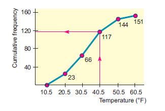
41 The district manager of a suburban park and recreation area wants to estimate the amount of time people spend in their local park in July. A random sample of 50 local residents gave the following information on the estimated number of hours they spent in the regional park during the month of July:
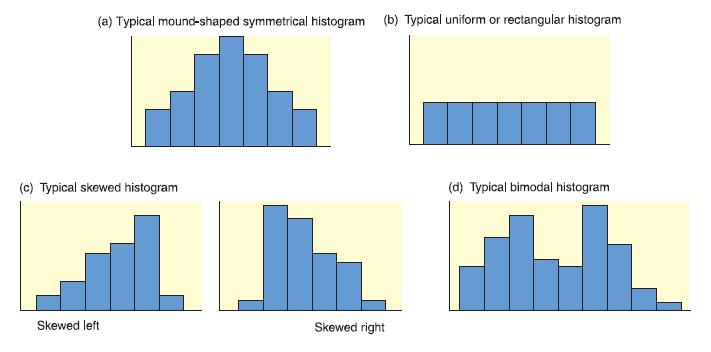
42 Distribution Shapes 42
43 Frequency Polygons: A frequency polygon emphasizes the continuous rise or fall of the frequencies. It is made by connecting, in order, the top midpoints of the bars in a histogram. Frequency polygons are especially useful if you wish to compare two distributions. To Construct a Frequency Polygon: 1) Construct a histogram. (Optional) 2) Calculate the midpoints of each class and place a point on the tops of each bar where the midpoint would be. 3) Connect, in order, the midpoints. 4) Extend the lines on the left and on the right so that the polygon begins and ends with a frequency of zero. 5) Place the extensions one class width to the left and right of the first and last midpoints, respectively. *** Without the histogram, simply plot the class frequency over the class midpoint, and then connect the points in order. 43
44 A random sample of 40 days gave the following information about the total number of people treated each day at the Community Hospital emergency room: a) Make a frequency table using eight classes. b) Make a histogram. c) Make a frequency polygon. 44
45 The number of hamburgers sold at McDonald s in each of the 50 states during August of last year was as follows (in units of 1,000 hamburgers): a) Make a frequency table and histogram using 10 classes. b) Make a frequency polygon. 45
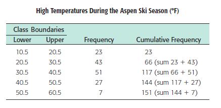
46 Ogives: An ogive is a way to graph information showing cumulative frequencies. To make an ogive, we first construct a cumulative frequency table. Your vertical scale will represent cumulative frequencies and your horizontal scale will represent upper class boundaries. The reason that you use upper class boundaries on the horizontal scale is that we cannot be sure that we have all the data in that class until we get to the upper class boundary. Ogives always start at the left with a cumulative frequency of zero at the lower class boundary of the first class. The ogive should end on the right with the cumulative frequency equal to the sample size at the upper class boundary of the last class. Heavy dots indicate the cumulative frequency for a class and these dots are connected by straight lines. 46
47 To Construct an Ogive: 1. Construct a cumulative frequency table. 2. Your vertical scale represents cumulative frequencies. 3. Your horizontal scale represents upper class boundaries. 4. Plot the points and connect with straight lines. 5. The ogive should start on the left with a cumulative frequency of zero at the lower class boundary of the first class. 6. The ogive should end on the right with a cumulative frequency equal to the sample size at the upper class boundary of the last class. 47
48 48
49 On a test consisting of 20 questions, 15 students received the following scores: Construct a cumulative frequency table using 4 classes. 2. Construct an ogive. 49
50 The following data consists of weights, in pounds, of 35 adults: Construct a cumulative frequency table using 5 classes. 2. Construct an ogive. 50
51 Thirty students on the track team were timed in the 200 meter dash. Each student s time was recorded to the nearest tenth of a second. The times were: Construct a cumulative frequency table using 5 classes. 2. Construct an ogive. 51
52 2.4 Stem and Leaf Displays: Exploratory Data Analysis (EDA) useful for detecting patterns and extreme data values and are designed to help us explore a data set, to ask questions we had not thought of before, or to pursue leads in many directions. Stem and Leaf Display device that organizes and groups data but allows us to see many of the digits in each data value as we wish. 52

53 To Construct a Stem and Leaf Display: 1. Break the digits of each data value into two parts.» Left group of digits is called a stem.» The remaining group of digits is called a leaf. 2. List each possible stem once on the left and all of its leaves in the same row on the right. 3. Indicate the scale. 4. Give it a title. *** The lengths of the leaves give the visual impression that a sideways histogram would be present. *** Decimal points are omitted in the stems and leaves, but indicated in the unit designation as appropriate. 53
54 On a recent exam, 32 students received the following grades: Construct a stem and leaf plot to display the data. 54
55 The following scores were recorded in an algebra class at St. Francis: Construct a stem and leaf plot to display the data. 55
56 Multiple Lines Per Stem: We could also construct a stem and leaf display which spreads the data out even more. We call this multiple lines per stem. In this case we can say that leaves 0 4 would go with one stem and leaves 5 9 would go with a second stem. However, if you would like to use a multiple line stem and leaf, you must use an asterisk (*) for your first stem and a raised dot ( ) for your second stem. 56
57 The following grades were scored on a recent exam: Construct a stem and leaf plot with two lines per stem. 57
58 The following number of slices were sold each month at Fresh Meadows (over the last 2 years): Construct a stem and leaf plot with two lines per stem. 58

59 Back to Back Stem Plot: Many real life applications of statistics involve comparisons of two populations. 59
60 The caloric intake of 20 people on each of two weight loss programs are recorded as follows: Program A: Program B: Construct a back to back stem and leaf plot to display the data. 60
61 In a 40 year study, survival years were measured for cancer patients undergoing one of two different chemotherapy treatments. The data for 25 patients on the first drug and 30 on the second were as follows: Drug A: Drug B: Construct a back to back stem and leaf plot to display the data. 61
Objective: Write on the goal/objective sheet and give a before class rating. Determine the types of graphs appropriate for specific data.
 Objective: Write on the goal/objective sheet and give a before class rating. Determine the types of graphs appropriate for specific data. Khan Academy test Tuesday Sept th. NO CALCULATORS allowed. Not
Histograms and Frequency Polygons are statistical graphs used to illustrate frequency distributions.
 Number of Families II. Statistical Graphs section 3.2 Histograms and Frequency Polygons are statistical graphs used to illustrate frequency distributions. Example: Construct a histogram for the frequency
What is Statistics? 13.1 What is Statistics? Statistics
 13.1 What is Statistics? What is Statistics? The collection of all outcomes, responses, measurements, or counts that are of interest. A portion or subset of the population. Statistics Is the science of
Distribution of Data and the Empirical Rule
 302360_File_B.qxd 7/7/03 7:18 AM Page 1 Distribution of Data and the Empirical Rule 1 Distribution of Data and the Empirical Rule Stem-and-Leaf Diagrams Frequency Distributions and Histograms Normal Distributions
Algebra I Module 2 Lessons 1 19
 Eureka Math 2015 2016 Algebra I Module 2 Lessons 1 19 Eureka Math, Published by the non-profit Great Minds. Copyright 2015 Great Minds. No part of this work may be reproduced, distributed, modified, sold,
Graphical Displays of Univariate Data
 . Chapter 1 Graphical Displays of Univariate Data Topic 2 covers sorting data and constructing Stemplots and Dotplots, Topic 3 Histograms, and Topic 4 Frequency Plots. (Note: Boxplots are a graphical display
Chapter 3 Answers. Problem of the Week p a)
") Chapter 3 Answers Problem of the Week p. 3 1. a) How Much Water I Drank Number of glasses 8 b) For example, the data range would go from 3 to 1, so the broken line would move up. It would start at 3 and
Chapter 3 Answers Problem of the Week p. 3 1. a) How Much Water I Drank Number of glasses 8 b) For example, the data range would go from 3 to 1, so the broken line would move up. It would start at 3 and
MATH 214 (NOTES) Math 214 Al Nosedal. Department of Mathematics Indiana University of Pennsylvania. MATH 214 (NOTES) p. 1/3
 Math 214 Al Nosedal. Department of Mathematics Indiana University of Pennsylvania. MATH 214 (NOTES) p. 1/3") MATH 214 (NOTES) Math 214 Al Nosedal Department of Mathematics Indiana University of Pennsylvania MATH 214 (NOTES) p. 1/3 CHAPTER 1 DATA AND STATISTICS MATH 214 (NOTES) p. 2/3 Definitions. Statistics is
MATH 214 (NOTES) Math 214 Al Nosedal Department of Mathematics Indiana University of Pennsylvania MATH 214 (NOTES) p. 1/3 CHAPTER 1 DATA AND STATISTICS MATH 214 (NOTES) p. 2/3 Definitions. Statistics is
MATH& 146 Lesson 11. Section 1.6 Categorical Data
 MATH& 146 Lesson 11 Section 1.6 Categorical Data 1 Frequency The first step to organizing categorical data is to count the number of data values there are in each category of interest. We can organize
Full file at
 Exam Name SHORT ANSWER. Write the word or phrase that best completes each statement or answers the question. Provide an appropriate response. 1) A parcel delivery service lowered its prices and finds that
Chapter 1 Midterm Review
 Name: Class: Date: Chapter 1 Midterm Review Multiple Choice Identify the choice that best completes the statement or answers the question. 1. A survey typically records many variables of interest to the
Box Plots. So that I can: look at large amount of data in condensed form.
 LESSON 5 Box Plots LEARNING OBJECTIVES Today I am: creating box plots. So that I can: look at large amount of data in condensed form. I ll know I have it when I can: make observations about the data based
Frequencies. Chapter 2. Descriptive statistics and charts
 An analyst usually does not concentrate on each individual data values but would like to have a whole picture of how the variables distributed. In this chapter, we will introduce some tools to tabulate
Chapter 2 Describing Data: Frequency Tables, Frequency Distributions, and
 Frequency Chapter 2 - Describing Data: Frequency Tables, Frequency Distributions, and Graphic Presentation Chapter 2 Describing Data: Frequency Tables, Frequency Distributions, and 1. Pepsi-Cola has a
Math 81 Graphing. Cartesian Coordinate System Plotting Ordered Pairs (x, y) (x is horizontal, y is vertical) center is (0,0) Quadrants:
 (x is horizontal, y is vertical) center is (0,0) Quadrants:") Math 81 Graphing Cartesian Coordinate System Plotting Ordered Pairs (x, y) (x is horizontal, y is vertical) center is (0,0) Ex 1. Plot and indicate which quadrant they re in. A (0,2) B (3, 5) C (-2, -4)
Math 81 Graphing Cartesian Coordinate System Plotting Ordered Pairs (x, y) (x is horizontal, y is vertical) center is (0,0) Ex 1. Plot and indicate which quadrant they re in. A (0,2) B (3, 5) C (-2, -4)
Comparing Distributions of Univariate Data
 . Chapter 3 Comparing Distributions of Univariate Data Topic 9 covers comparing data and constructing multiple univariate plots. Topic 9 Multiple Univariate Plots Example: Building heights in Philadelphia,
UNIVERSITY OF MASSACHUSETTS Department of Biostatistics and Epidemiology BioEpi 540W - Introduction to Biostatistics Fall 2002
 1 UNIVERSITY OF MASSACHUSETTS Department of Biostatistics and Epidemiology BioEpi 540W - Introduction to Biostatistics Fall 2002 Exercises Unit 2 Descriptive Statistics Tables and Graphs Due: Monday September
Key Maths Facts to Memorise Question and Answer
 Key Maths Facts to Memorise Question and Answer Ways of using this booklet: 1) Write the questions on cards with the answers on the back and test yourself. 2) Work with a friend to take turns reading a
Lesson 7: Measuring Variability for Skewed Distributions (Interquartile Range)
") : Measuring Variability for Skewed Distributions (Interquartile Range) Exploratory Challenge 1: Skewed Data and its Measure of Center Consider the following scenario. A television game show, Fact or Fiction,
: Measuring Variability for Skewed Distributions (Interquartile Range) Exploratory Challenge 1: Skewed Data and its Measure of Center Consider the following scenario. A television game show, Fact or Fiction,
Applications of Mathematics
 Write your name here Surname Other names Pearson Edexcel GCSE Centre Number Candidate Number Applications of Mathematics Unit 1: Applications 1 For Approved Pilot Centres ONLY Higher Tier Wednesday 6 November
Lesson 7: Measuring Variability for Skewed Distributions (Interquartile Range)
") : Measuring Variability for Skewed Distributions (Interquartile Range) Student Outcomes Students explain why a median is a better description of a typical value for a skewed distribution. Students calculate
: Measuring Variability for Skewed Distributions (Interquartile Range) Student Outcomes Students explain why a median is a better description of a typical value for a skewed distribution. Students calculate
download instant at
 13 Introductory Statistics (IS) / Elementary Statistics (ES): Chapter 2 Form A Exam Name SHORT ANSWER. Write the word or phrase that best completes each statement or answers the question. Classify the
Functions Modeling Change A Preparation for Calculus Third Edition
 Powerpoint slides copied from or based upon: Functions Modeling Change A Preparation for Calculus Third Edition Connally, Hughes-Hallett, Gleason, Et Al. Copyright 2007 John Wiley & Sons, Inc. 1 CHAPTER
Version : 27 June General Certificate of Secondary Education June Foundation Unit 1. Final. Mark Scheme
 Version : 27 June 202 General Certificate of Secondary Education June 202 Mathematics Foundation Unit 4360F Final Mark Scheme Mark schemes are prepared by the Principal Examiner and considered, together
Notes Unit 8: Dot Plots and Histograms
 Notes Unit : Dot Plots and Histograms I. Dot Plots A. Definition A data display in which each data item is shown as a dot above a number line In a dot plot a cluster shows where a group of data points
Statistics: A Gentle Introduction (3 rd ed.): Test Bank. 1. Perhaps the oldest presentation in history of descriptive statistics was
: Test Bank. 1. Perhaps the oldest presentation in history of descriptive statistics was") Chapter 2 Test Questions 1. Perhaps the oldest presentation in history of descriptive statistics was a. a frequency distribution b. graphs and tables c. a frequency polygon d. a pie chart 2. In her bar
Chapter 2 Test Questions 1. Perhaps the oldest presentation in history of descriptive statistics was a. a frequency distribution b. graphs and tables c. a frequency polygon d. a pie chart 2. In her bar
Measuring Variability for Skewed Distributions
 Measuring Variability for Skewed Distributions Skewed Data and its Measure of Center Consider the following scenario. A television game show, Fact or Fiction, was canceled after nine shows. Many people
STAT 113: Statistics and Society Ellen Gundlach, Purdue University. (Chapters refer to Moore and Notz, Statistics: Concepts and Controversies, 8e)
") STAT 113: Statistics and Society Ellen Gundlach, Purdue University (Chapters refer to Moore and Notz, Statistics: Concepts and Controversies, 8e) Learning Objectives for Exam 1: Unit 1, Part 1: Population
STAT 113: Statistics and Society Ellen Gundlach, Purdue University (Chapters refer to Moore and Notz, Statistics: Concepts and Controversies, 8e) Learning Objectives for Exam 1: Unit 1, Part 1: Population
AP Statistics Sec 5.1: An Exercise in Sampling: The Corn Field
 AP Statistics Sec.: An Exercise in Sampling: The Corn Field Name: A farmer has planted a new field for corn. It is a rectangular plot of land with a river that runs along the right side of the field. The
AskDrCallahan Calculus 1 Teacher s Guide
 AskDrCallahan Calculus 1 Teacher s Guide 3rd Edition rev 080108 Dale Callahan, Ph.D., P.E. Lea Callahan, MSEE, P.E. Copyright 2008, AskDrCallahan, LLC v3-r080108 www.askdrcallahan.com 2 Welcome to AskDrCallahan
You must have: Pen, HB pencil, eraser, calculator, ruler, protractor.
 Write your name here Surname Other names Pearson Edexcel Award Statistical Methods Level 1 Calculator allowed Centre Number Candidate Number Wednesday 10 May 2017 Morning Time: 1 hour 30 minutes You must
Unit 7, Lesson 1: Exponent Review
 Unit 7, Lesson 1: Exponent Review 1. Write each expression using an exponent: a. b. c. d. The number of coins Jada will have on the eighth day, if Jada starts with one coin and the number of coins doubles
Summer School: 5 th Grade Math Common Core Activities. Name:
 Summer School: 5 th Grade Math Common Core Activities Name: 2- DIGIT SUBTRACTION 3- DIGIT SUBTRACTION 2- DIGIT ADDITION 3- DIGIT ADDITION 4- DIGIT ADDITION PLACE VALUE 5,788-7,342-71,975-5,863-450,555-32,534-12,364-23,954-24,889-5,788-5,360-71,475-850,555-932,534-88,342-283,954-172,364-183,924
1 Boxer Billy Input File: BoxerBillyIn.txt
 1 Boxer Billy Input File: BoxerBillyIn.txt After paying his college tuition Billy is short on funds. Therefore, he wants to purchase the minimum number of boxes, all of the same capacity, to put his books
Grade 5 Mathematics Mid-Year Assessment REVIEW
 Grade 5 Mathematics Mid-Year Assessment REVIEW The learning targets (Texas Essential Knowledge and Skill statements) are listed prior to sample items. The sample items are not an exhaustive list and only
(Refer Slide Time 1:58)
") Digital Circuits and Systems Prof. S. Srinivasan Department of Electrical Engineering Indian Institute of Technology Madras Lecture - 1 Introduction to Digital Circuits This course is on digital circuits
Digital Circuits and Systems Prof. S. Srinivasan Department of Electrical Engineering Indian Institute of Technology Madras Lecture - 1 Introduction to Digital Circuits This course is on digital circuits
UNIVERSITY OF CAMBRIDGE INTERNATIONAL EXAMINATIONS General Certificate of Education Ordinary Level
 UNIVERSITY OF CAMBRIDGE INTERNATIONAL EXAMINATIONS General Certificate of Education Ordinary Level *0192736882* STATISTICS 4040/12 Paper 1 October/November 2013 Candidates answer on the question paper.
Dot Plots and Distributions
 EXTENSION Dot Plots and Distributions A dot plot is a data representation that uses a number line and x s, dots, or other symbols to show frequency. Dot plots are sometimes called line plots. E X A M P
Chapter 4. Displaying Quantitative Data. Copyright 2007 Pearson Education, Inc. Publishing as Pearson Addison-Wesley
 Chapter 4 Displaying Quantitative Data Copyright 2007 Pearson Education, Inc. Publishing as Pearson Addison-Wesley Dealing With a Lot of Numbers Summarizing the data will help us when we look at large
CALIFORNIA STANDARDS TEST CSM00433 CSM01958 A B C CSM02216 A 583,000
 G R E Which of these is the number 5,005,0? five million, five hundred, fourteen five million, five thousand, fourteen five thousand, five hundred, fourteen five billion, five million, fourteen LIFORNI
T HE M AGIC OF G RAPHS AND S TATISTICS
 p01.qxd 10/29/03 9:25 AM Page 1 I T HE M AGIC OF G RAPHS AND S TATISTICS It s hard to get through a day without seeing a graph or chart somewhere, whether you re reading a newspaper or a magazine, watching
6 th Grade Semester 2 Review 1) It cost me $18 to make a lamp, but I m selling it for $45. What was the percent of increase in price?
 It cost me $18 to make a lamp, but I m selling it for $45. What was the percent of increase in price?") 6 th Grade Semester 2 Review 1) It cost me $18 to make a lamp, but I m selling it for $45. What was the percent of increase in price? 2) Tom's weekly salary changed from $240 to $288. What was the percent
6 th Grade Semester 2 Review 1) It cost me $18 to make a lamp, but I m selling it for $45. What was the percent of increase in price? 2) Tom's weekly salary changed from $240 to $288. What was the percent
Math 7 /Unit 07 Practice Test: Collecting, Displaying and Analyzing Data
 Math 7 /Unit 07 Practice Test: Collecting, Displaying and Analyzing Data Name: Date: Define the terms below and give an example. 1. mode 2. range 3. median 4. mean 5. Which data display would be used to
MATH 214 (NOTES) Math 214 Al Nosedal. Department of Mathematics Indiana University of Pennsylvania. MATH 214 (NOTES) p. 1/11
 Math 214 Al Nosedal. Department of Mathematics Indiana University of Pennsylvania. MATH 214 (NOTES) p. 1/11") MATH 214 (NOTES) Math 214 Al Nosedal Department of Mathematics Indiana University of Pennsylvania MATH 214 (NOTES) p. 1/11 CHAPTER 6 CONTINUOUS PROBABILITY DISTRIBUTIONS MATH 214 (NOTES) p. 2/11 Simple
MATH 214 (NOTES) Math 214 Al Nosedal Department of Mathematics Indiana University of Pennsylvania MATH 214 (NOTES) p. 1/11 CHAPTER 6 CONTINUOUS PROBABILITY DISTRIBUTIONS MATH 214 (NOTES) p. 2/11 Simple
Section 2.1 How Do We Measure Speed?
 Section.1 How Do We Measure Speed? 1. (a) Given to the right is the graph of the position of a runner as a function of time. Use the graph to complete each of the following. d (feet) 40 30 0 10 Time Interval
Jumpstarters for Math
 Jumpstarters for Math Short Daily Warm-ups for the Classroom By CINDY BARDEN COPYRIGHT 2005 Mark Twain Media, Inc. ISBN 10-digit: 1-58037-297-X 13-digit: 978-1-58037-297-8 Printing No. CD-404023 Mark Twain
Chapter 6. Normal Distributions
 Chapter 6 Normal Distributions Understandable Statistics Ninth Edition By Brase and Brase Prepared by Yixun Shi Bloomsburg University of Pennsylvania Edited by José Neville Díaz Caraballo University of
RIDERSHIP SURVEY 2016 Conducted for the San Francisco Municipal Transportation Agency
 RIDERSHIP SURVEY 2016 Conducted for the San Francisco Municipal Transportation Agency KEY FINDINGS July to August 2016 Prepared by COREY, CANAPARY & GALANIS RESEARCH San Francisco, California 1 SURVEY
Estimation of inter-rater reliability
 Estimation of inter-rater reliability January 2013 Note: This report is best printed in colour so that the graphs are clear. Vikas Dhawan & Tom Bramley ARD Research Division Cambridge Assessment Ofqual/13/5260
Pioneer Trail Middle School. Choir Handbook Mr. Eric Newlin Director of Choirs
 Pioneer Trail Middle School Choir Handbook 2014-2015 Mr. Eric Newlin Director of Choirs enewlinpt@olatheschools.org 913.780.7270 Choir Handbook Table of Contents A Note From Mr. Newlin p. 3 Honorable Behavior
Record your answers and work on the separate answer sheet provided.
 MATH 106 FINAL EXAMINATION This is an open-book exam. You may refer to your text and other course materials as you work on the exam, and you may use a calculator. You must complete the exam individually.
EOC FINAL REVIEW Name Due Date
 1. The line has endpoints L(-8, -2) and N(4, 2) and midpoint M. What is the equation of the line perpendicular to and passing through M? A. B. Y= C. Y= D. Y= 3x + 6 2. A rectangle has vertices at (-5,3),
Calculated Percentage = Number of color specific M&M s x 100% Total Number of M&M s (from the same row)
") Name: Date: Period: The M&M (not the rapper) Lab Who would have guessed that the idea for M&M s Plain Chocolate Candies was hatched against the backdrop of the Spanish Civil War? Legend has it that, while
Name: Date: Period: The M&M (not the rapper) Lab Who would have guessed that the idea for M&M s Plain Chocolate Candies was hatched against the backdrop of the Spanish Civil War? Legend has it that, while
EXPLORING DISTRIBUTIONS
 CHAPTER 2 EXPLORING DISTRIBUTIONS 18 16 14 12 Frequency 1 8 6 4 2 54 56 58 6 62 64 66 68 7 72 74 Female Heights What does the distribution of female heights look like? Statistics gives you the tools to
The National Traffic Signal Report Card: Highlights
 The National Traffic Signal Report Card: Highlights THE FIRST-EVER NATIONAL TRAFFIC SIGNAL REPORT CARD IS THE RESULT OF A PARTNERSHIP BETWEEN SEVERAL NTOC ASSOCIATIONS LED BY ITE, THE AMERICAN ASSOCIATION
Lesson 25: Solving Problems in Two Ways Rates and Algebra
 : Solving Problems in Two Ways Rates and Algebra Student Outcomes Students investigate a problem that can be solved by reasoning quantitatively and by creating equations in one variable. They compare the
Rounding Foldable Download or Read Online ebook rounding foldable in PDF Format From The Best User Guide Database
 Free PDF ebook Download: Download or Read Online ebook rounding foldable in PDF Format From The Best User Guide Database Nov 25, 2013 - Make this to help you organize information about decimals. Begin
Sampling Worksheet: Rolling Down the River
 Sampling Worksheet: Rolling Down the River Name: Part I A farmer has just cleared a new field for corn. It is a unique plot of land in that a river runs along one side. The corn looks good in some areas
Margin of Error. p(1 p) n 0.2(0.8) 900. Since about 95% of the data will fall within almost two standard deviations, we will use the formula
 n 0.2(0.8) 900. Since about 95% of the data will fall within almost two standard deviations, we will use the formula") Name Margin of Error A survey of a sample population gathers information from a few people and then the results are used to reflect the opinions of a larger population. The reason that researchers and
Name Margin of Error A survey of a sample population gathers information from a few people and then the results are used to reflect the opinions of a larger population. The reason that researchers and
MultiSpec Tutorial: Visualizing Growing Degree Day (GDD) Images. In this tutorial, the MultiSpec image processing software will be used to:
 Images. In this tutorial, the MultiSpec image processing software will be used to:") MultiSpec Tutorial: Background: This tutorial illustrates how MultiSpec can me used for handling and analysis of general geospatial images. The image data used in this example is not multispectral data
MultiSpec Tutorial: Background: This tutorial illustrates how MultiSpec can me used for handling and analysis of general geospatial images. The image data used in this example is not multispectral data
Table of Contents. Introduction...v. About the CD-ROM...vi. Standards Correlations... vii. Ratios and Proportional Relationships...
 Table of Contents Introduction...v About the CD-ROM...vi Standards Correlations... vii Ratios and Proportional Relationships... 1 The Number System... 10 Expressions and Equations... 23 Geometry... 27
1.1 Common Graphs and Data Plots
 1.1. Common Graphs and Data Plots www.ck12.org 1.1 Common Graphs and Data Plots Learning Objectives Identify and translate data sets to and from a bar graph and a pie graph. Identify and translate data
Thinking Involving Very Large and Very Small Quantities
 Thinking Involving Very Large and Very Small Quantities For most of human existence, we lived in small groups and were unaware of things that happened outside of our own villages and a few nearby ones.
Mobile Math Teachers Circle The Return of the iclicker
 Mobile Math Teachers Circle The Return of the iclicker June 20, 2016 1. Dr. Spock asked his class to solve a percent problem, Julia set up the proportion: 4/5 = x/100. She then cross-multiplied to solve
MINNEHAHA COUNTY ON-SITE WASTEWATER TREATMENT SITE EVALUATION WORKSHEET Form #1. Land Owner. Legal Description
 MINNEHAHA COUNTY ON-SITE WASTE TREATMENT SITE EVALUATION WORKSHEET Form #1 Land Owner Legal Description Type of Structure (check one): Residence Commercial Industrial Accessory Building Other If Residence:
NAA ENHANCING THE QUALITY OF MARKING PROJECT: THE EFFECT OF SAMPLE SIZE ON INCREASED PRECISION IN DETECTING ERRANT MARKING
 NAA ENHANCING THE QUALITY OF MARKING PROJECT: THE EFFECT OF SAMPLE SIZE ON INCREASED PRECISION IN DETECTING ERRANT MARKING Mudhaffar Al-Bayatti and Ben Jones February 00 This report was commissioned by
TI-Inspire manual 1. Real old version. This version works well but is not as convenient entering letter
 TI-Inspire manual 1 Newest version Older version Real old version This version works well but is not as convenient entering letter Instructions TI-Inspire manual 1 General Introduction Ti-Inspire for statistics
ALA Webinar August 21, 2013
 BUSINESS INTELLIGENCE THROUGH FINANCIAL REPORTING ALA Webinar August 21, 2013 Barry Jackson, CLM, CPA President JC4LM LLC www.jc4lm.com BUSINESS INTELLIGENCE THROUGH FINANCIAL REPORTING Dashboard Graphics
Unit 7, Lesson 1: Exponent Review
 Unit 7, Lesson 1: Exponent Review Let s review exponents. 1.1: Which One Doesn t Belong: Twos Which expression does not belong? Be prepared to share your reasoning. 8 1.2: Return of the Genie m.openup.org/1/8-7-1-2
SPEED DRILL WARM-UP ACTIVITY
 SPEED DRILL WARM-UP ACTIVITY Name the operation representative of each of the following: percent left reduction total more half less twice off lower each double Write the equivalents: 20% as a decimal
Copyright 2013 Pearson Education, Inc.
 Chapter 2 Test A Multiple Choice Section 2.1 (Visualizing Variation in Numerical Data) 1. [Objective: Interpret visual displays of numerical data] Each day for twenty days a record store owner counts the
Answer questions 1-35 on your Scantron. Questions 1-30 will be scored for the Power Bowl event. In the
 Answer questions 1-35 on your Scantron. Questions 1-30 will be scored for the Power Bowl event. In the event of a tie, questions 31-35 will be used as the tiebreaker. 1. Subtract. a. 3 b. c. d. e. Not
Answers. Chapter 9 A Puzzle Time MUSSELS. 9.1 Practice A. Technology Connection. 9.1 Start Thinking! 9.1 Warm Up. 9.1 Start Thinking!
 . Puzzle Time MUSSELS Technolog Connection.. 7.... in. Chapter 9 9. Start Thinking! For use before Activit 9. Number of shoes x Person 9. Warm Up For use before Activit 9.. 9. Start Thinking! For use before
Uses of Fractions. Fractions
 Uses of The numbers,,,, and are all fractions. A fraction is written with two whole numbers that are separated by a fraction bar. The top number is called the numerator. The bottom number is called the
The One Penny Whiteboard
 The One Penny Whiteboard Ongoing, in the moment assessments may be the most powerful tool teachers have for improving student performance. For students to get better at anything, they need lots of quick
Parent Handbook! Third Grade: Benchmark 3!
 Third Grade: Benchmark 3 Parent Handbook This handbook will help your child review material learned this quarter, and will help them prepare for their third Benchmark Test. Please allow your child to work
KPI and SLA regime: September 2015 performance summary
 OB31 Paper 07 KPI Report (September) KPI and SLA regime: September 2015 performance summary Ref Jul 15 Aug 15 Sep 15 Target Description KPI A 100% 99.87% 100% 99% green 98% amber Service Restoration within
Homework Monday. The Shortcut
 Name 1 Homework Monday Directions: Read the passage below. As you are reading practice: Visualizing Check for understanding Figuring out word meanings The Shortcut Follow me. I know a shortcut, Danny said.
d. Could you represent the profit for n copies in other different ways?
 Special Topics: U3. L3. Inv 1 Name: Homework: Math XL Unit 3 HW 9/28-10/2 (Due Friday, 10/2, by 11:59 pm) Lesson Target: Write multiple expressions to represent a variable quantity from a real world situation.
9.2 Data Distributions and Outliers
 Name Class Date 9.2 Data Distributions and Outliers Essential Question: What statistics are most affected by outliers, and what shapes can data distributions have? Eplore Using Dot Plots to Display Data
Coronado & Jacó Beach PRICE LIST
 Coronado & Jacó Beach PRICE LIST 2016 www.academiatica.com Book at wordlwide lowest price at: https://www.languagecourse.net/hr/skolaacademiaticasanjose +44330 124 03 17 supporthr@languagecourse.net Very
PHY221 Lab 1 Discovering Motion: Introduction to Logger Pro and the Motion Detector; Motion with Constant Velocity
 PHY221 Lab 1 Discovering Motion: Introduction to Logger Pro and the Motion Detector; Motion with Constant Velocity Print Your Name Print Your Partners' Names Instructions August 31, 2016 Before lab, read
PRESS RELEASE No. 186 of September 5, 2011 Average earnings *) in July 2011
 in July 2011") ROMÂNIA NATIONAL INSTITUTE OF STATISTICS Press Office 16, Libertăţii avenue, sector 5, Bucureşti Tel/Fax: 021 318 18 69; Fax 021 312 48 75 e-mail: romstat@insse.ro; biroupresa@insse.ro PRESS RELEASE No.
ROMÂNIA NATIONAL INSTITUTE OF STATISTICS Press Office 16, Libertăţii avenue, sector 5, Bucureşti Tel/Fax: 021 318 18 69; Fax 021 312 48 75 e-mail: romstat@insse.ro; biroupresa@insse.ro PRESS RELEASE No.
(1) + 1(0.1) + 7(0.001)
 + 1(0.1) + 7(0.001)") Name: Quarterly 1 Study Guide The first quarterly test covers information from Modules 1, 2, and 3. If you complete this study guide and turn it in on Tuesday, you will receive 5 bonus points on your Quarterly
Name: Quarterly 1 Study Guide The first quarterly test covers information from Modules 1, 2, and 3. If you complete this study guide and turn it in on Tuesday, you will receive 5 bonus points on your Quarterly
MAT Practice (solutions) 1. Find an algebraic formula for a linear function that passes through the points ( 3, 7) and (6, 1).
 1. Find an algebraic formula for a linear function that passes through the points ( 3, 7) and (6, 1).") MAT 110 - Practice (solutions) 1. Find an algebraic formula for a linear function that passes through the points ( 3, 7) and (6, 1). Answer: y = 2 3 + 5 2. Let f(x) = 8x 120 (a) What is the y intercept
MAT 110 - Practice (solutions) 1. Find an algebraic formula for a linear function that passes through the points ( 3, 7) and (6, 1). Answer: y = 2 3 + 5 2. Let f(x) = 8x 120 (a) What is the y intercept
Welcome to Your University Store!
 Welcome to Your University Store! The University Store was established to provide books and supplies in a convenient, on-campus location for you at competitive prices. The University Store offers the course
TeeJay Publishers. Curriculum for Excellence. Course Planner - Level 1
 TeeJay Publishers Curriculum for Excellence Course Planner Level 1 To help schools develop their courses, TeeJay Publishers has produced a Course Planner for CfE Level 1. This Planner from TeeJay provides
Musical Theater Registration and Release Form All registrations are Due AUGUST 10 th Please fill one per student
 Musical Theater Registration and Release Form All registrations are Due AUGUST 10 th Please fill one per student Student s Name: Student Cell: Age: Grade: Gender: M F Mother s Cell: Father s Cell: Email
Statistics for Engineers
 Statistics for Engineers ChE 4C3 and 6C3 Kevin Dunn, 2013 kevin.dunn@mcmaster.ca http://learnche.mcmaster.ca/4c3 Overall revision number: 19 (January 2013) 1 Copyright, sharing, and attribution notice
Estimating. Proportions with Confidence. Chapter 10. Copyright 2006 Brooks/Cole, a division of Thomson Learning, Inc.
 Estimating Chapter 10 Proportions with Confidence Copyright 2006 Brooks/Cole, a division of Thomson Learning, Inc. Principal Idea: Survey 150 randomly selected students and 41% think marijuana should be
Collecting Data Name:
 Collecting Data Name: Gary tried out for the college baseball team and had received information about his performance. In a letter mailed to his home, he found these recordings. Pitch speeds: 83, 84, 88,
Delta College Middle School Math Competition Practice Test A 2018
 Delta College Middle School Math Competition Practice Test A 208 ) In the Noveo music group there are 4 times as many flutes as there are bassoons. The number of clarinets is 8 more than triple the number
Relationships Between Quantitative Variables
 Chapter 5 Relationships Between Quantitative Variables Three Tools we will use Scatterplot, a two-dimensional graph of data values Correlation, a statistic that measures the strength and direction of a
Periodical Usage in an Education-Psychology Library
 LAWRENCE J. PERK and NOELLE VAN PULIS Periodical Usage in an Education-Psychology Library A study was conducted of periodical usage at the Education-Psychology Library, Ohio State University. The library's
In Chapter 4 on deflection measurement Wöhler's scratch gage measured the bending deflections of a railway wagon axle.
 Cycle Counting In Chapter 5 Pt.2 a memory modelling process was described that follows a stress or strain input service history and resolves individual hysteresis loops. Such a model is the best method
The Proportion of NUC Pre-56 Titles Represented in OCLC WorldCat
 The Proportion of NUC Pre-56 Titles Represented in OCLC WorldCat Jeffrey Beall and Karen Kafadar This article describes a research project that included a designed experiment and statistical analysis to
INSTITUTO POLITÉCNICO NACIONAL SECRETARIA ACADÉMICA DIRECCIÓN DE EDUCACIÓN MEDIA SUPERIOR CENTRO'DE'ESTUDIOS'TECNOLÓGICOS' WALTER'CROSS'BUCHANAN
 INSTITUTO POLITÉCNICO NACIONAL SECRETARIA ACADÉMICA DIRECCIÓN DE EDUCACIÓN MEDIA SUPERIOR CENTRO'DE'ESTUDIOS'TECNOLÓGICOS' WALTER'CROSS'BUCHANAN Subject: English I Shift: Evening Semester: 1st. Period:
TEAMS Competition 2014
 TEAMS Competition 2014 Electrical Grid Urban infrastructures throughout the United States are aging. As our demand for electricity grows, so does our need for uninterrupted service for more than 130 million
Before the Federal Communications Commission Washington, D.C ) ) ) ) ) ) ) ) ) REPORT ON CABLE INDUSTRY PRICES
 ) ) ) ) ) ) ) ) REPORT ON CABLE INDUSTRY PRICES") Before the Federal Communications Commission Washington, D.C. 20554 In the Matter of Implementation of Section 3 of the Cable Television Consumer Protection and Competition Act of 1992 Statistical Report
Before the Federal Communications Commission Washington, D.C. 20554 In the Matter of Implementation of Section 3 of the Cable Television Consumer Protection and Competition Act of 1992 Statistical Report
On Your Own. Applications. Unit 2. ii. The following are the pairs of mutual friends: A-C, A-E, B-D, C-D, and D-E.
 Applications 1 a. i. No, students A and D are not mutual friends because D does not consider A a friend. ii. The following are the pairs of mutual friends: A-C, A-E, B-D, C-D, and D-E. iii. Each person