Visual Identity and Brand Guidelines
|
|
|
- Harriet Spencer
- 5 years ago
- Views:
Transcription
1 Visual Identity and Brand Guidelines June 2013 Version 1.0 1
2 BUILDING BLOCKS 10

3 Vermont Tech Logo We re practical, straightforward, and confident and our logo embodies these. It stands proudly on its own and needs no icon to support it. Key Green on White Key Green on Charcoal White on Key Green LINEAR VERSION This is Vermont Tech s Primary logo, which should be used to reflect the whole of the college. When using it, please select from one of these approved options before creating another. Some examples demonstrate placement on a colored field. Never place the logo inside a box! Key Green on Legacy Green Knockout on Photograph Black on approved Brand Color Charcoal or Black on White 11
4 Stacked Logo Key Green on White White on Key Green STACKED VERSION While the linear version should be the default choice, this alternate lockup of the logo may be better suited for narrower formats such as signage or as a square icon, because it can better fill the space. Since this lockup is center-aligned, placement will tend to be best in the center, rather than anchored in a corner. Again never, never, ever place the logo inside a box! Key Green on Legacy Green Charcoal or Black on White 12
5 VTC Monogram VTC Monogram on its own VTC. It s our web address. People know us & refer to us this way. The bottom line is that it s the most efficient way to refer to the college, and it s here to stay. While it may have some mixed historical meaning associated with it, our job is to inject the right meaning into it over time. VTC Monogram with linear logotype The VTC monogram is NOT our logo. Please do not refer to it as such. Do not use it in place of a logo. It is a mark for the believers for internal audiences and those already part of the Vermont Tech family. The VTC monogram should never be used for marketing purposes. It is intended to be a supporting element, usually used within proximity of the primary logotype. If VTC and logotype are used together the letters in the monogram should be smaller than the logotype. VTC Monogram with stacked logotype The minimum recommended size for the circular monogram is.375" to preserve legibility. 13
6 Monogram Lockup VTC is smaller. If VTC and logotype are used together, the VTC in the monogram should always be smaller than the logotype, in deference. Always centered. When used together, the circle should be centered in relation to the logotype, never to the left or any other configuration. Vertical Spacing. The spacing between the circle and the logotype is equal to the height of the VTC. 14

7 Clear Space The Vermont Tech logo is most effective when surrounded by as much open space as possible. A minimum amount of clear space, equal to the height of the H should surround the logo at all times, as demonstrated on this page. Always use approved and provided electronic artwork. This clear space guideline is a rule of thumb to be followed in most instances. g The poster layout above breaks this rule in an approved manner. In this instance, the Vermont Tech logo is being used as part of a sentence, with surrounding text that is low contrast so it does not visually interfere with the logo. The left and right sides of the logo adhere to the H clear spacing. 15
8 Program Lockups Currently, the only approved lockup is for academic programs, centered with the linear logotype. The logo should not be locked up with any elements without the prior approval of the design agency. The program is set in Brandon Text Bold, in all caps, with extra tracking (+25). Text is center aligned with the linear logotype, with a target area defined between the R and the C. The space separating the two elements is equal to the size of the counter (center circle) of the O in the logo. Longer programs may extend close to (but not exceed) the full width. Extremely long programs may wrap to two lines, but this is not recommended, and a shorter name should be chosen if possible. AUTOMOTIVE NURSING FIRE SCIENCE ELECTRICAL ENGINEERING VT: 26pt / Program: 20pt = 77% ratio VT: 26pt / Program: 15pt = 58% ratio AGRICULTURE CIVIL AND ENVIRONMENTAL ENGINEERING TECHNOLOGY VT: 26pt / Program: 15pt (18 Leading) = 58% ratio 16

9 Incorrect Usage Do not alter, redraw or add any additional words or graphic elements to the logo. Always use approved high-resolution VTC artwork. Don t use VTC monogram as a substitute for the logo. Don t create additional VTC lockups. Don t left-align the words. Don t use on a diagonal. Don t place in a box or container shape of any kind. Don t scale elements within the logo. Don t add a dropshadow. Don t use the logo in legacy green. Don t stretch or distort the logo. Don t add stroke, gradient or other effects. Don t use unapproved colors. Don t try to recreate the logo with a typeface. Don t use low resolution, bitmap files. Don t place on visually distracting backgrounds. 17
10 Color This palette captures aspects of Vermont at various seasons while moving away from the earthy and muted colors that have become tired. We ve retained the legacy green as a way to acknowledge our history and have introduced a new spring green as the key color. It conveys a sense of promise, potential and is easily recognizable. Green should be the color that we are known for. Please see the example applications section of this document to get a sense of how the secondary colors are used. PRIMARY COLORS SECONDARY COLORS Key Green Charcoal Light Gray Legacy Green Orange Gold Blue PMS: 360 PMS: Cool Gray 11 PMS: Cool Gray 1 PMS: 356 PMS: 158 PMS: 143 PMS: 2915 CMYK: 75/0/100/0 CMYK: 67/59/53/34 CMYK: 10/8/10/0 CMYK: 96/27/100/16 CMYK: 4/68/99/0 CMYK: 4/34/93/0 CMYK: 58/13/0/0 RGB: 112/191/71 RGB: 74/74/82 RGB: 235/222/229 RGB: 23/143/79 RGB: 240/110/38 RGB: 242/171/33 RGB: 89/176/227 Hex: #70be46 Hex: #484a52 Hex: #c6c4c2 Hex: #158d4e Hex: #ef6d26 Hex: #f1ac21 Hex: #59afe2 18
11 Darker Shades When designing for screen, subtle variations in colors are often needed for legibility, hierarchy, hover states and the like. Since the website has not been designed yet, here is a starting point for adapting the color palette to on-screen use. Key Green Charcoal Light Gray Legacy Green Orange Gold Blue Regular: #70be46 Regular: #484a52 Regular: #c6c4c2 Regular: #158d4e Regular: #ef6d26 Regular: #f1ac21 Regular: #59afe2 Darker: #68a74e Darker: #393d42 Darker: #393d42 Darker: # Darker: #ce6138 Darker: #cd923d Darker: #5b9dbe g These darker swatches were defined in Photoshop by placing a Light Gray layer above the underlying swatch, and then switching to multiply in the layer effects palette. The step was repeated twice to create the result. 19
12 Primary Typeface Adelle Sans is our primary typeface, for documents and collateral produced by professional designers. It is friendly, versatile and expresses just the right amount of personality while getting out of the way. This will be our day-to-day typeface for corporate communications, ideal for setting large amount of text. Adelle Sans should only be used by a professional designer, and can be licensed here for desktop and web use: Adelle Sans Bold Adelle Sans Bold: 36px / 42px Leading / 0 Tracking Adelle Sans SemiBold Adelle Sans SemiBold: 36px / 42px Leading / 0 Tracking Adelle Sans Regular Adelle Sans Regular: 36px / 42px Leading / 0 Tracking Adelle Sans Light Adelle Sans Light: 36px / 42px Leading / 0 Tracking Adelle Sans Bold. Lorem ipsum dolor sit amet, consectetur adipisicing elit, sed do eiusmod tempor incididunt ut Bold 12px / 18px Leading / 0 Tracking Adelle Sans SemiBold. Lorem ipsum dolor sit amet, consectetur adipisicing elit, sed do eiusmod tempor incididunt SemiBold 12px / 18px Leading / 0 Tracking Adelle Sans Regular. Lorem ipsum dolor sit amet, consectetur adipisicing elit, sed do eiusmod tempor incididunt Regular 12px / 18px Leading / 0 Tracking Adelle Sans Light. Lorem ipsum dolor sit amet, consectetur adipisicing elit, sed do eiusmod tempor incididunt Light 12px / 18px Leading / 0 Tracking 20
13 Display Typeface Brandon Text is a cheerful typeface intended for headlines and areas where impact and strength are needed. Its subtle rounded terminals express warmth. Brandon plays a supporting role to Adelle. It should be used sparingly, for headings, pull quotes and short bursts of text, as demonstrated throughout this document. Brandon Text should only be used by a professional designer, and can be licensed here for desktop and web use: In the system, Brandon Text is set most often in all caps with extra tracking (+25 tracking / +1 letterspacing in CSS). Mixed case may be occasionally used in short amounts for pull quotes, captions or other short display elements. BRANDON TEXT BOLD ALL CAPS Brandon Text Bold: 36px / 36px Leading / +25 Tracking Brandon Text Bold Mixed Case Brandon Text Bold: 36px / 36px Leading / 0 Tracking BRANDON TEXT BOLD ALL CAPS Brandon Text Light: 36px / 36px Leading / +25 Tracking Brandon Text Bold Mixed Case Brandon Text Light: 36px / 36px Leading / 0 Tracking 21
14 Alternate Font Because licensing the selected fonts is expensive and not practical for general use, we are selecting Arial as the alternate font. It is pre-installed on every computer. This font will be used for PowerPoint presentations and any other communication not prepared by a professional designer. ARIAL BOLD ALL CAPS Arial Bold: 36px / 36px Leading Arial Bold Mixed Case Arial Bold: 36px / 36px Leading Arial Regular ALL CAPS Arial Regular: 36px / 36px Leading Arial Regular Mixed Case Arial Regular: 36px / 36px Leading 22
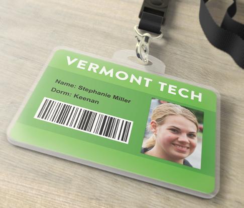
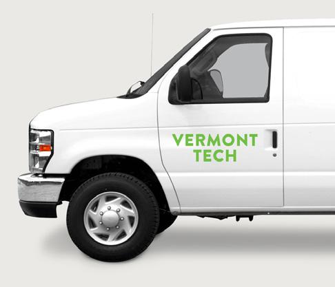
15 Application EXAMPLE APPLICATIONS 26


16 Application Campus Signage Possible wayfinding signage shown with a mix of Adelle Sans Extra Bold, Light and Brandon Text Set in All Caps. 27
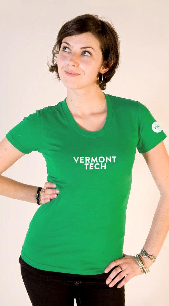


17 Application Apparel 28
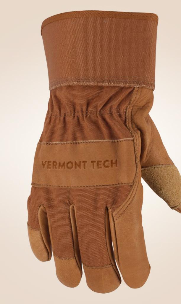
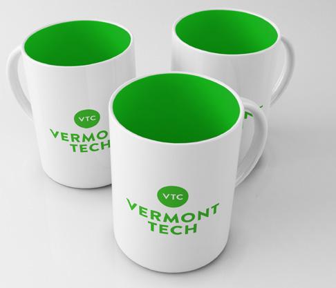
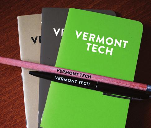
18 Application School Spirit 29
BRAND GUIDELINES VENDOR COPY AUGUST ecoatm BRAND GUIDELINES
 BRAND GUIDELINES VENDOR COPY AUGUST 2014 7059.0814 1 BRAND STANDARDS CONTENTS Brand Standards Primary Logo Endorsers Logo Lockup Secondary Logos, Black and White Margins and Minimum Size Incorrect Usage
HINO BRAND VISUAL DESIGN MANUAL V1.2e
 HINO BRAND VISUAL DESIGN MANUAL V1.2e Introduction Each basic element in communications, such as the corporate logomark and brand colors, contributes to building brand and plays a vital role in creating
HINO BRAND VISUAL DESIGN MANUAL V1.3e
 HINO BRAND VISUAL DESIGN MANUAL V1.3e Introduction Each basic element in communications, such as the corporate logomark and brand colors, contributes to building brand and plays a vital role in creating
BRAND / The CDW Logo
 BRAND / The CDW Logo 10 Overview The CDW logo consists of a solid square with CDW and a distinctive oval shape reversed out. Both a standalone square logo and a logo-with-tagline lockup are available for
BRANDING STANDARDS MANUAL
 BRANDING STANDARDS MANUAL 2014 Index Logo University version 2 School versions 3 Usage Spacing 4 Sizing 5 Color 6 Logo mark 7 Unacceptable Executions 8-9 Color 10-11 Typography 12 Other Graphic Marks Seal
University of Iowa Stead Family Children s Hospital Brand Identity Standards
 University of Iowa Stead Family Children s Hospital Brand Identity Standards Effective November 11, 2016 1 Contents Introduction Introduction... 1 Editorial Style Guide... 2 General communication... 2
CYPRESS FAIRBANKS ISD
 CYPRESS FAIRBANKS ISD BRAND Standards and Guidelines Table of Contents Basic Guidelines 3 Color 4 Correct Uses 5 Incorrect Uses 6 Stationery 7 Video 8 Social Media 9 Print Communications 11 Electronic
Table of Contents. Stationery 24 Business card 25 Letterhead 26 #10 Envelope. Document Note
 Table of Contents Document Note The goal of these guidelines is to help communicate the strategy and visual system behind the SPX brand. If you have questions about anything in this guide, please reach
one M2M Logo Brand Guidelines
 one M2M Logo Brand Guidelines July 2012 Logo Design Explanation What does the one M2M logo symbolize? The number 2 in the middle part of the logo symbolizes the connection between the two machines, the
The Center For Educator, Recruitment, Retention and Advancement. Graphic Standards Manual
 The Center For Educator, Recruitment, Retention and Advancement Graphic Standards Manual 2016 Main Logotype The logotype is the central element in CERRA s visual communications system. Through consistent
may 2016 brand guide
 may 2016 brand guide Logo Format The logo is the signature symbol of Living Beyond Breast Cancer. It is composed of a graphic and a logotype. GRAPHIC The logo always features both the graphic and the logotype.
Introduction. 2 MOTT Community College Identity Guidelines
 IDENTITY GUIDELINES Introduction It is important that Mott Community College maintain a consistent, professional image. All Mott materials, including internal and external publications, signage, flyers,
Brand standards and usage guidelines for partners
 Brand standards and usage guidelines for partners 1 Successful implementation PURPOSE AND GOAL Colorado Crisis Services exists to provide help to Coloradans in need. This document serves that mission by
CORPORATE LOGO LOGO. Here s how to best represent our logo in any experience: Treat the logo as one individual unit never divide it.
 CORPORATE Our logo is the face of VMware to the world. It s the single most recognizable expression of the VMware brand, so it s vital that the logo s iconic power be strengthened through consistent expression
For Children with Developmental Differences. Brand Identity Guide
 For Children with Developmental Differences Brand Identity Guide Table of Contents 3 Our Visual Identity System 4 About These Guidelines 5 The Logo 6 Clear Space & Minimum Size 7-8 Logo Variations 9 Icon
wirelessgroup.co.uk Updated: Brand Guidelines 1/7/2018 V1.0 Brand Guidelines Version 1.0
 wirelessgroup.co.uk Updated: Brand Guidelines 1/7/2018 1 Brand Guidelines Version 1.0 wirelessgroup.co.uk Brand Guidelines 2 Contents 03 04 07 09 11 12 13 14 Primary Logo Secondary Logos Group Indicator
BRAND GUIDELINES 2017
 BRAND GUIDELINES 2017 WE ARE 02 EVERYDAY ADVENTUREWEAR BORN FROM NEW ENGLAND CHARLES RIVER APPAREL OUR STORY 03 EVERYDAY ADVENTUREWEAR BORN FROM NEW ENGLAND It all started with a rain jacket in 1983 -
TITLE MASTER GARDENER PROGRAMS STYLE GUIDE MASTER GARDENER STYLE GUIDE
 TITLE MASTER GARDENER PROGRAMS STYLE GUIDE 1 TABLE OF CONTENTS 3 INTRODUCTION 4 About 5 Program Hierarchy 6 LOGO LOCK-UP GUIDELINES 7 Clearspace and Alignment 8 Subset Program Lock-Ups 9 LOGO ALTERNATES,
VISUAL IDENTITY GUIDELINES. Updated
 VISUAL IDENTITY GUIDELINES Updated 2.12.2016 VISUAL IDENTITY GUIDELINES Table of Contents 1. Introduction Basic Design Elements 2. Logo 2.1 Clear zone 2.2 Logo misuse 2.3 Sponsor logo lock-up 3. Colors
BRAND STANDARDS AGENT
 BRAND STANDARDS AGENT TABLE OF CONTENTS PREFACE Welcome to our brand. This guide is a culmination of the thought and reasoning behind everything in the ReeceNichols brand identity from the colors to the
Visual Style Guide April 2016
 Visual Style Guide April 2016 Contents Introduction to the Logo 3 Safe Area and Size 4 Incorrect Usage 5 Color Palette 6 Typography 7 Tone and Style of Photography 8 Print Examples 9 Screen Examples 10
BRAND GUIDELINES
 BRAND GUIDELINES 2018-19 Mount Pisgah Christian School Department of Admissions and Marketing OUR BRAND Our brand is the composite of all elements that communicate to the world who we are as a school and
BRANDBOOK STYLE 2017
 BRANDBOOK STYLE 2017 01 Logo Identity The logo consists of a graphic element, the name of the district and our tagline. The tagline, Soar to Greatness, enhances our brand identity as a district that believes
brand manual partners edition
 partners edition brand manual 2016 color palette The Plus color palette contains six colors. The value of each color is listed in PMS (1-color spot), CMYK (4-color process), RGB and hexadecimal. Any of
UNICEF CLUBS BRAND BOOK
 UNICEF CLUBS BRAND BOOK 2016 17 updated July 1, 2016 Contents How to Use This Book.... 3 Logo Usage Guidelines.... 4 Typography Our Fonts.... 10 Color USF Color Palette.... 11 2 UNICEF CLUBS Brand Book
TOWN OF QUEEN CREEK BRAND GUIDE
 BRAND GUIDE DEC2016 BRAND GUIDE INTRODUCTION CONTACT TOWN OF QUEEN CREEK COMMUNICATIONS, MARKETING AND RECREATION DEPARTMENT 22358 SOUTH ELLSWORTH ROAD QUEEN CREEK, AZ 85142 480-358-3198 communication@queencreek.org
visual identity guidelines
 visual identity guidelines Georgetown University Alumni Association s visual identity looks to the past for inspiration but must remain relevant for the 21st century and be responsive to the varied needs
Branding Style Guidelines. (Revised: September 6, 2017)
") Branding Style Guidelines (Revised: September 6, 2017) Table of Contents 2 3 4 5 6 7 8 10 12 13 14 Introduction Brand elements Clear space and minimum size Logo and tagline Symbol as a graphic Logo palette
Branding Style Guidelines (Revised: September 6, 2017) Table of Contents 2 3 4 5 6 7 8 10 12 13 14 Introduction Brand elements Clear space and minimum size Logo and tagline Symbol as a graphic Logo palette
Visual Identity Guidelines. Essential guidelines to help you create cohesive brand communications
 Visual Identity Guidelines Essential guidelines to help you create cohesive brand communications August 2017 GENERAL GUIDELINES The use of the logo is reserved for official Summa partners only (dealers,
James D. Parsons President
 Logo Guidelines Contents: Letter from the President 1 Primary Logo 2 Color Palette & Font 3 Secondary Logos 4 Logo Sizing 5 Logo Area of Isolation 6 Logo Application 7 Logo File Types 8 Founded in 2001,
OUR MISSION: We at Metro Transit deliver environmentally sustainable transportation choices that link people, jobs and community conveniently,
 OUR MISSION: We at Metro Transit deliver environmentally sustainable transportation choices that link people, jobs and community conveniently, consistently and safely. d Metro Transit Brand Standards The
Leveraging and Protecting the NATE Brand
 Identity Guidelines Leveraging and Protecting the NATE Brand As the nation s largest non-profit certification organization for heating, ventilation, air conditioning and refrigeration technicians, North
INTRODUCTION. NASS is an action sports & music festival that celebrates the very best of alternative culture, bringing you three days of:
 BRAND GUIDELINES INTRODUCTION NASS is an action sports & music festival that celebrates the very best of alternative culture, bringing you three days of: PRO SKATE + BMX COMPETITIONS WITH THE WORLD S BEST
Brand Typeface Headlines Establishing Hierarchy Photography Iconography & Infographics... 18
 Brand Guide VERSION 1.0 2017 Contents at a glance Introduction Using Brand Guidelines... 3 A Note on Branding... 4 Logo Color Version... 5 Special Cases Only... 6 Logo Usage Clear Space... 7 Minimum Size...
Logo Overview. Always use the original digital artwork, available through the Brand Center, to help maintain consistency and integrity.
 Avast logo manual 10 Overview The Avast logo consists of a symbol (the amoeba) and a wordmark. Both elements of the logo have been carefully redesigned to work together for maximum legibility. Do not redraw
Corporate Identity and Visual Identity Guidelines June 2011
 Corporate Identity and Visual Identity Guidelines June 2011 Index A Basic Design Elements A 01 The BenQ Logo A 02 Minimum Size, Minimum Staging Area A 03 Typography A 04 Corporate Colours B B 01 B 02 B
Brand guidelines. July 2014 NEXT
 Brand guidelines July 2014 The purpose of these guidelines is to help Kick It Out present their brand communications consistently and with impact. Kick It Out s brand is the organisations most valuable
Avast logo manual. Logo Overview
 2 Overview The Avast logo consists of a symbol (the amoeba) and a wordmark. Both elements of the logo have been carefully redesigned to work together for maximum legibility. Do not redraw the symbol, typeset
CAMPAIGN TAGLINE GUIDELINES
 CAMPAIGN TAGLINE GUIDELINES 1 Campaign Tagline The campaign tagline should appear on all campaign-related communications. The campaign tagline should always be used in conjunction with the Block W logo
TABLE OF CONTENTS TOLEDO ZOO & AQUARIUM BRAND GUIDELINES 2
 BRAND GUIDELINES TABLE OF CONTENTS Brand Inspiration 3 Our Mission 4 Primary Logo 5 Secondary Logo 7 Logo Color Usage & Proximity 8 Logo Application on Photos 9 Unacceptable Usage 10 Typography 11 Color
Brand Guidelines. January 2015
 Brand Guidelines January 2015 Table of Contents 1.0 What s a brand? 3 1.1 The logo 4 1.2 Colour 1.2.1 Spot & Process 1.2.2 Black & White 5 5 6 1.3 Logo Sizing 1.3.1 Minimum Clear Space 1.3.2 Positioning
The U.S. Fund for UNICEF Communications Style. Guide
 The U.S. Fund for UNICEF Communications Style Guide Table of Contents 1.0 The U.S. Fund for UNICEF 1.1 Our Mission 1.2 Our Brand Position 2.0 Our Goals 3.0 The UNICEF Story 4.0 Logo Versions 4.1 Logo Size
CMA VISUAL IDENTITY GUIDE. January 2018
 CMA VISUAL IDENTITY GUIDE January 2018 CMA Visual Identity Guide Logo overview The CMA logo is composed of the French and English wordmarks and the CMA icon (note: the logo is always bilingual, even in
VMWARE LOGO GUIDELINES FEBRUARY 2017
 VMWARE LOGO GUIDELINES FEBRUARY 2017 CORPORATE LOGO CORPORATE LOGO Our corporate logo is the most visible expression of our brand. This word mark is the constant that represents VMware in every communication.
JUNE 24, 2014 SCHOOL OF PROFESSIONAL STUDIES VISUAL IDENTITY. Mark Courtney, Visual Identity Manager, ,
 JUNE 24, 2014 SCHOOL OF PROFESSIONAL STUDIES VISUAL IDENTITY Mark Courtney, Visual Identity Manager, 212.998.6820, a@nyu.edu LOGOS There are two forms of the logo. Both include the institutional mark (torch
3.1 Corporate Logotype Primary vertical version
 3.1 Corporate Logotype Primary vertical version Our new logotype (or logo) is a modern representation of our company. It is designed to clearly and proudly reflect our brand promise advocates for innovation
IREM Headquarters and Chapter Version January 9, Brand and Style Guide
 IREM Headquarters and Chapter Version January 9, 2018 Brand and Style Guide Table of Contents Section 1: Brand Messaging 3 - About IREM 4 - Brand Positioning 5 - IREM Trademarks 6-7 Section 2: Logos and
/San Diego Continuing Education STYLE GUIDE/ NOVEMBER, 2016
 /San Diego Continuing Education STYLE GUIDE/ NOVEMBER, 2016 1 4 2 5 6 3 1. The preferred logo for Continuing Education is using the SDCCD seal and the fully spelled-out version of Continuing Education
BRAND. niagaracanada.com
 BRAND niagaracanada.com Introduction 3 Prospective Niagara Residents and Immigrants Audiences 4 Key Messages 5 Welcome Niagara Canada - The Visual Brand/Logo 6 Logo Lock-up 7 Colour Palette 8 Black and
Brand Identity Manual
 Brand Identity Manual Changing the economics of desalination. Table of Contents Introduction 1 Signature Lock-up 2 Logo Configuration 3 Color of Logo 4 Black and White 5 Don t Do This 6 Minimum Sizing
CERTIFICATION MARK STANDARDS GUIDE
 CERTIFICATION MARK STANDARDS GUIDE TABLE OF CONTENTS I. Certification Mark...3-4 A. Colors... 4 B. Clear Space... 4 C. Minimum Size... 4 II. Certification Signature...5 1. Horizontal...5 2. With URL...5
VIRGINIA BEACH CONVENTION & VISITORS BUREAU brand standards. style guide ACH CON V ENTION & V ISITORS BURE AU 2018
 B R A N D S TA N DA RV D SI RS G T YILN E IGAU I B DE E ACH CON V ENTION & V ISITORS BURE AU 2018 brand standards style guide 1 2 thank you This guide was produced for our trusted partners, to instill
FOURSQUARE BRAND GUIDE LOGO USAGE. Brand Guide FALL 2014
 FOURSQUARE BRAND GUIDE LOGO USAGE 1 Brand Guide FALL 2014 FOURSQUARE BRAND GUIDE INTRODUCTION 2 The Foursquare brand is more than just a logo. It is a visual system and language made up of many parts that
LOGO USAGE GUIDELINES OCTOBER 2016
 LOGO USAGE GUIDELINES OCTOBER 2016 PREFERRED LOGO The Robert Toigo Foundation logo is the most often seen expression of our identity. When we use our logo consistently and correctly, our audiences will
Bran d Identity Guide
 UNC ESHELMAN SCHOOL OF PHARMACY Brand Identity Guide Table of Contents INTRO 3 LOGO 5 Horizontal 6 Vertical 8 PROMISE 10 FONTS 12 COLORS 14 BRAND IMAGERY 16 Graphic Elements 17 Icons 18 Photography 19
RESNET. Professional Logos Guide
 RESNET Professional Logos Guide Trusted Experts in Home Energy Efficiency The National Association of State Energy Officials and Mortgage Bankers Association of America founded the Residential Energy Services
ENGINEERING VISUAL IDENTITY
 AUGUST 16, 2013 ENGINEERING VISUAL IDENTITY Mark Courtney, Visual Identity Manager, 212.998.6820, mark.courtney@nyu.edu LOGOS There are two forms of the logo. Both include the institutional mark (torch
Nature Connects and Sean Kenney 2. The Nature Connects logo 3. Logo background colors 4. The single-color logo 5. The tagline logo 6
 This document outlines how to use the Nature Connects brand and the LEGO brand in your promotional content. If you use the Nature Connects logo or write LEGO, send us your designs for review prior to publishing
TERADATA 2015 PARTNERS CONFERENCE & EXPO BRANDED ST YLE GUIDE
 TERADATA 2015 PARTNERS CONFERENCE & EXPO BRANDED ST YLE GUIDE Breaking Big BREAKING BIG is an assertive, positive, and empowering theme that will resonate with and inspire the PARTNERS target audience
CORPORATE LOGO BRAND GUIDELINES
 CORPORATE LOGO BRAND GUIDELINES Contact Address 5470 Shilshole Avenue NW Suite 500 Seattle, WA 98107 Phone & Fax Phone: +1 206 783 0510 Fax: +1 206 706 3083 Online Email: Website: info@uptimeinstitute.com
OTTAWA SCHOOL OF ART brand guidelines & logo guidelines
 OTTAWA SCHOOL OF ART brand guidelines & logo guidelines Prepared August 2015 logo guidelines primary logo logo 1 CORPORATE SIGNATURE Graphic mark and logotype in horizontal configuration and centered.
FILLM IDENTITY TOOLKIT
 FILLM IDENTITY TOOLKIT IDENTITY DESCRIPTION The visual identity of FILLM is based on the International Federation for Modern Languages and Literatures profile and values. The federation aims to reach a
TABLE OF CONTENTS COLOR VARIATIONS AND USE ON BACKGROUNDS 15 FILE FORMATS 16 MISUSE OF LOGOS 17 OFFICIAL ATHLETICS COLORS 18
 IDENTITY STANDARDS TABLE OF CONTENTS ABOUT ITHACA COLLEGE AND THE ATHLETICS DEPARTMENT 3 MESSAGE FROM THE ATHLETICS DIRECTOR 4 VISUAL IDENTITY AND CORE VALUES 5 OFFICIAL ATHLETICS LOGOS 6 MARKS AND LOCKUPS
LOGO GUIDELINES LOGO LOCKUPS. Vertical Logo Lockups: This is our primary logo; it should be used whenever possible.
 LOGO LOCKUPS The logo lockup is available in three different formats. Each of the formats outlined below has been given consideration in terms of sizes and relationships between other layout elements.
School of Social Work. Partnering for Change Style Guide
 School of Social Work Partnering for Change Style Guide September 4, 2009 Partnering for Change Campaign Introduction Rutgers School of Social Work is embarking upon a campaign intended to create a comprehensive,
Version 3:0 September 2015
 Identity guidelines Version 3:0 September 2015 The Buxton logotype The new logotype embraces the concept of water - and a source of water. The focal point of the design is the letter O' where water emerges
BLAZER BLACK. PANTONE Process Black C or U PANTONE Black C or U CMYK: C=0 M=0 Y=0 K=100 RGB: Red=0 Green=0 Blue=0 BLAZER SILVER
 LOGO The Blazer Ammunition Logo is to be used any time the corporation s identity is needed to define the company s presence, ownership, or legal identification. The Blazer Ammunition Logo is represented
Branding & Design Standards. LIMITED USE: These standards are for areas where FIRST is not a registered trademark. Standards Are Strictly Enforced
 11.3.2015 Branding & Design Standards Standards Are Strictly Enforced LIMITED USE: These standards are for areas where FIRST is not a registered trademark. FIRST Logo Our logo consists of uniquely configured
Brand Standards QUICK GUIDELINES
 Brand Standards QUICK GUIDELINES Table of Contents 1.0 1.1 1.2 BRANDMARK Master / Staging Color / Size 2.0 2.1 TAGLINE Usage / Specifications / Staging 3.0 3.1 3.2 3.3 BRAND SYSTEM Typography Color Palette
Gin-Cor Industries Inc. Brand Guidelines
 Last updated: August 26, 2015 About Our Vision To be a leader in the manufacturing of vocational trucks. Our Mission To manufacture customized vocational trucks that workers want to drive and owners want
Business Professionals of America
 Business Professionals of America Brand Guide Updated August 15, 2018 Disclaimer: The Business Professionals of America Brand Guide is not to be used for reference or preparation during the 2017-2018 Workplace
BRAND GUIDELINES RELEASED / APRIL 2017
 BRAND GUIDELINES RELEASED / APRIL 2017 LOGOS & USAGE BRAND GUIDELINES / APRIL 2017 2 PRIMARY LOGOTYPE PRIMARY LOGOTYPE The logo is not integrated with text. Any pairing of text and the Primary logotype
BRAND v2 GUIDELINES 1
 1 BRAND GUIDELINES v2 THESE GUIDELINES SHOW HOW TO USE OUR IDENTITY ACROSS ALL COMMUNICATIONS ON SCREEN, IN PRINT, AND ON PRODUCTS. LET S BRING THE ULTIMATE EARS BRAND TO LIFE. LISTEN 2 UP 3 CONTENT 04
LOGOS & USAGE BRAND GUIDELINES / APRIL 2017
 LOGOS & USAGE BRAND GUIDELINES / APRIL 2017 PRIMARY LOGOTYPE PRIMARY LOGOTYPE The logo is not integrated with text. Any pairing of text and the Primary logotype needs to be approved by the Brand team.
Leonard Bernstein at 100 Centennial Logo Guide
 Leonard Bernstein at 100 Centennial Logo Guide Introduction to the Leonard Bernstein at 100 Logo Guide In an effort to assemble all of the events of the Leonard Bernstein Centennial under one unifying
Kodiak Brand Guide. April 2015
 Kodiak Brand Guide April 2015 //kodiakptt.com/company/brand/ Table of Contents The brand is more than a logo 2 Communication 4 Tone & Style 4 Kodiak in Writing 4 Kodiak Marks & Logo 5 Standard Wordmark
VICTORY BREWING COMPANY LOGOS
 REVISION DATE - 5/2/2017 VICTORY BREWING COMPANY LOGOS Victory Brewing Company offers the following logos for marketing and branding needs. BANNER LOGO BOTTLE CAP LOGO VICTORY BREWING COMPANY LOGOTYPE
SOUTHEAST TECH BRANDING IDENTITY STANDARDS MANUAL
 SOUTHEAST TECH BRANDING IDENTITY STANDARDS MANUAL INTRODUCTION The Southeast Tech Branding Identity Standards Manual was created to provide all Southeast Tech employees and associates with the ability
BRAND GUIDELINES. July version 2.1
 BRAND GUIDELINES July 2015 - version 2.1 INTRODUCTION The Noritz Brand As we grow and advance as an organization, it sometimes becomes necessary to reevaluate our visual identity. That s why I am pleased
BRAND GUIDELINES CRAFTSMAN QUALITY STAINS & FINISHES SINCE 1953.
 BRAND GUIDELINES CRAFTSMAN QUALITY STAINS & FINISHES SINCE 1953. TOP 10 THINGS TO REMEMBER ABOUT Old Masters BRANDING 1. Always use the correct logo artwork. 2. Never modify or recreate logo artwork. 3.
FLY THE DREAM BRAND GUIDE
 FLY THE DREAM BRAND GUIDE INTRODUCTION PURPOSE AND VALUES BRAND POSITION BRAND VISION BRAND PROMISE MAKING OUR MARK THE IAC BRAND FAMILY 3 4 5 6 7 9 10 CONTENT THE IAC LOGOS TABLE OF CONTENTS IAC SHIELD
PRIOR USE APPROVAL CYCLE FOR SURVIVAL FULL COLOR LOGO
 STYLE GUIDE 2017 PRIOR USE APPROVAL This style guide is compiled as a comprehensive guide to the usage of the Cycle for Survival name and logo marks (LOGO). We know there will be unforeseen instances where
CLICK TO GO BACK TO THE START CLICK TO JUMP TO ANY SECTION
 Style Guide CLICK TO GO BACK TO THE START CLICK TO JUMP TO ANY SECTION 2 2018 TABLE OF CONTENTS 3 BRAND POSITION 4 FAMILY OF MARKS 17 Mission Statement 5 Tournament of Roses 19 Vision Statement 5 Rose
GEORGIA BRANDING STANDARDS USAGE GUIDE
 GEORGIA BRANDING STANDARDS USAGE GUIDE January 2014 Georgia Department of Economic Development 75 Fifth Street, NW, Suite 1200 Atlanta, Georgia 30308 - USA 404.962.4000 Georgia.org THE GEORGIA BRAND The
The Anchor Paper Main Logo
 The Anchor Paper Main Logo The 2C version is for offset spot printing, CMYK version is for 4-color printing and RGB versions are for internet, Aside from the full-color versions, black and reversed-out
The logo. Diamond mark
 1.1 The logo The guidelines in this section apply to the highest level of the Dow AgroSciences organization, when communicators are promoting Dow AgroSciences as a business entity or when the RCU or country
AUCA Standard Graphic Identity Manual
 AUCA Standard Graphic Identity Manual GRAPHIC STANDARDS MANUAL This is the Graphic Standards Manual for the American University of Central Asia. It sets the standard for the design of all AUCA public communications
Canadian Aquatic Invasive Species Network
 Canadian Aquatic Invasive Species Network Graphic Standards Manual Effective January 2007 This Graphic Standards Manual covers the graphic identity guidelines for the Canadian Aquatic Invasive Species
INTRODUCTION Positioning Statement Branches
 INTRODUCTION Positioning Statement Branches PRIMARY ELEMENTS Logo / Signature / - Color Variations - Clear Zones & Sizing - Abstractions Color Palette Voice Typography APPLICATIONS Public Space - Public
TABLE OF CONTENTS BRAND IDENTITY INTRODUCTION...3 OFFICIAL COLOR PALETTE...4 PRIMARY ATHLETIC MARK SECONDARY ATHLETIC MARKS...
 TABLE OF CONTENTS BRAND IDENTITY INTRODUCTION...3 OFFICIAL COLOR PALETTE...4 PRIMARY ATHLETIC MARK...5-6 SECONDARY ATHLETIC MARKS...7-8 ATHLETIC WORDMARKS... 9-10 TYPOGRAPHY... 11 WORDMARK LOCKUPS...12-15
COLLEGE IDENTITY GUIDE
 COLLEGE IDENTITY GUIDE Table of Contents TABLE OF CONTENTS Introduction...3 Identity Platform Essentials...4 Vision, Mission, Values and Positioning... 5 Marketing Messages and Tagline... 6 Traits & Attributes...
BRAND GUIDELINES VERSION 3: FEBRUARY 2014
 BRAND GUIDELINES VERSION 3: FEBRUARY 2014 Mission Hall Creative Introduction Brand Guidelines 2 These brand guidelines are designed to help internal and external individuals or organisations implement
Corporate Identity and Branding Standards Manual.
 Corporate Identity and Branding Standards Manual www.shift4.com WELCOME Shift4 provides merchant-centric software and services in the electronic payments industry. Secure connections are made from the
Swansea University Brand Asset Guidelines. Version 2 May 2018
 Swansea University Brand Asset Guidelines 1 Version 2 May 2018 Contents We are Swansea University page 3 Brand structure page 4 Visual identity usage guidance page 5 Swansea University s coat of arms page
Safe Boating Campaign Brand Guidelines
 Safe Boating Campaign Brand Guidelines Reference to any specific commercial product, process, or service, or the use of any trade, firm or corporation name is for the information and convenience of the
Windsor Windows & Doors Brand Identity Guidelines. Rev. 4/07
 Windsor Windows & Doors Brand Identity Guidelines Rev. 4/07 Table of Contents Brand Overview...3 Logo...3 Tagline...4 Logo Clear Space...5 Typography...6 Primary Color Palette...7 Secondary Color Palette...7
The Dodge Brand. Key Visual Elements and Usage Guidelines
 The Dodge Brand Key Visual Elements and Usage Guidelines Contents 3 Dodge Brand Mark 4 Dodge Brand Mark Guidelines 4 Area of Isolation 5 Rules of Use 6 Trademark Ownership Statement 7 Use of Dodge Brand
A GUIDE TO LOGO USAGE AND CORPORATE STYLES A HANDBOOK FOR VENDORS
 A GUIDE TO LOGO USAGE AND CORPORATE STYLES A HANDBOOK FOR VENDORS THE LOGO AND ITS VARIATIONS Logo elements The Steel Dynamics logo is a unique piece of artwork that was designed specifically for SDI (figure
GRAPHIC STANDARDS MANUAL Policy and guidelines for using the Hostos Community College 50 th Anniversary Brand Identity
 GRAPHIC STANDARDS MANUAL Policy and guidelines for using the Hostos Community College 50 th Anniversary Brand Identity TABLE OF CONTENTS Policy and Applications... 3 Hostos 50th Anniversary Primary Logo...
Graphic Standards. A guide to Lane s visual identity, with information on using the college logo, Lane colors and typefaces, stationery, and more.
 Graphic Standards A guide to Lane s visual identity, with information on using the college logo, Lane colors and typefaces, stationery, and more. TABLE OF CONTENTS Introduction to Graphic Standards...1