Hue combinations in web design for Swedish and Thai users
|
|
|
- Kerrie Small
- 6 years ago
- Views:
Transcription
1 BA THESIS IN INFORMATICS 15 POINTS Spring term 2017 Department of Health and Society Design and Computer Science Digital Design Hue combinations in web design for Swedish and Thai users Guidelines for combining color hues onscreen for Swedish and Thai users in the context of designing web sites
2 Hue combinations in web design for Swedish and Thai users Guidelines for combining color hues onscreen for Swedish and Thai users in the context of designing web sites Author: Vidal Ruse Advisor: Montathar Faraon Examiner: Kerstin Ådahl Abstract Users can assess the visual appeal of a web page within 50 milliseconds and color is the first thing noticed onscreen. That directly influences user perception of the web site, and choosing appealing color combinations is therefore crucial for successful web design. Recent scientific research has identified which individual colors are culturally preferred in web design in different countries but there is no similar research on hue combinations. Currently no effective, scientifically based guidelines on combining hues for web designers exist either, since recent research by Ou et al and Szabo et al, among others, proves the classic color harmonies invalid. Therefore this study aims to identify guidelines for culturally appropriate hue combination in context of web design. The study is limited to culturally appropriate combining of hues in Thai and Swedish web design. Keywords: hue combinations; color onscreen; Thai design; Swedish design; web design; culturally appropriate color use
3 TABLE OF CONTENTS 1. Introduction Background and Informatics as the discipline of this study Problem statement Research goal Research question Delimitations Definitions 8 2. Literature review Colors Cultural differences in color perception and preference Culturally appropriate color use in web design Search words Method Participants Materials Procedure Ethical considerations Results and analysis Large data sets from Thai and Swedish websites Guidelines for hue combinations for Thai and Swedish web design User survey results Findings from the user survey Discussion Discussion of method Discussion of results Future work Conclusion 31 References 33 APPENDIX A. 38 APPENDIX B. 44 APPENDIX C. 46
4 1. Introduction 1.1. Background and Informatics as the discipline of this study Bo Dahlbom (1996) describes informatics as a theory and design oriented study of information technology use. Digital designers use information technology in order to design digital artifacts - which in their turn constitute information technology, - and the users use these artifacts. Web designers use information technology to combine colors in order to produce digital artifacts - such as websites - for users to use. Knowledge about color plays an important role in informatics as further indicated by the established Erasmus Mundus Master program in Color in Informatics and Media Technology. It is interdisciplinary and covers color, photonics, computer vision and imaging science, computer science and multimedia technology (Trémeau et al 2011). The absolute majority of websites have color, and the color influences the users (Bergström 2009:256) that perceive these digital artifacts. Color is the first thing noticed onscreen, in an app or on a website, even before the users see what language is being used, or start reading the message (De Bortoli & Maroto 2001). Based on three studies that were conducted to identify how long does it take for users to form an opinion about the visual appeal of a web page, it was determined that the visual appeal can be assessed in 50 milliseconds (Lindgaard et al. 2006). Reinecke et al (2013) emphasizes that the initial impression the users get within a short moment of viewing the website later influences their opinion about how usable or trustworthy the site is, and attempted to predict this initial impression based on website s colorfulness. During further research Reinecke & Gajos (2014) identified significant effect of colorfulness on appeal along with the finding that preference for different levels of colorfulness is highly influenced by a person s country of residence. Reinecke & Gajos (2014) had a goal to improve the information technology so that web designers could benefit from their findings in order to design more appealing websites for their target audiences. June Kaminski, PhD(c), an authority in Nursing Informatics, also notes that color is one of the first impressions users receive about a web site, and argues that research shows that people subconsciously make a judgement about an environment or artifact in first 90 seconds and about 62-90% of this assessment is based on color (Kaminski 2016). The body of research allows to conclude that color directly influences user perception of the website. Studying the color use in digital artifacts - websites - can therefore add to the knowledge about color which leads to an improvement of information technology use when designing websites. Dahlbom (1996:42) emphasizes that the interest in information technology use in informatics is design oriented. We are interested in the use of technology because we are interested in changing and improving that use, he adds. Therefore it can be said that informatics strives to improve the use of information technology while maintaining focus on design. Pelle Ehn (1995) even argues that informatics can be seen as a design discipline.
5 An analysis of graphic design and web design forums such as designerstalk.com, webdesignforums.net, as well as design groups on Facebook and LinkedIn reveals that the designers either use the classic color harmonies such as complementary or analogous, or follow their gut (B 2014) when combining colors for use onscreen. Looking closer into the design discussions in the aforementioned forums, a clear pattern emerges in which designers generally do not know about the recent research in color, and can be confused about what the best practice of combining colors would be. As an example of this existing problem, one of the forum users states: One good indication of how arguable this all is, and of how much it depends what you are describing and for what purpose: not even the "standard" RGB hue wheel has 100% support among practitioners such as visual artists and designers and the multiplicity of attempts at [color] system is actually a truer and a more useful outcome, IMO [in my opinion] - than if there existed only one approved system which had defeated all others, and to which everybody gave complete unquestioning credence. Who SAYS a particular purple is the complementary of a particular yellow? (richardplondon 2016). This indicates that the present use of information technology with focus on design concerning color combinations needs improvement. Dahlbom (1996:37) writes that the information society is now turning into a communication and media society. In such society, the existing organizations, businesses, and now with the emerging of Web 2.0 individuals as well would benefit greatly from informed use of color combinations in their communication with their target audiences, such as guidelines for culturally appropriate color combinations in the websites targeted for their users. Recent research has established guidelines for combining colors concerning user preference for two characteristics of color - chroma and lightness (Ou & Luo 2006; Szabo et al. 2010; Camgöz et al. 2002), but not concerning the third - hue. The classic color harmonies that are still the most used practically in order to combine colors are proven to be invalid by the recent color research by Ou & Luo (2006), Szabo et al. (2010), and Camgöz et al. (2002). Furthermore, both Ou and Szabo s color harmony models failed to predict the results in the research of color harmony of juice packaging (Wei et al 2015), which means that even these models for combining color aren t optimal. Therefore all abovementioned research leads to a conclusion that no effective scientifically proven framework for combining hues has been identified at the moment. There is no consensus in recent research concerning which color combinations users prefer based on hue difference. However, scientific evidence (O Donovan et al. 2011; Ruse 2015) exists on the grounds of which it is possible to consider that the preference for hue combinations might be individual and rotationally-invariant about the color wheel. To improve web designers use of information technology with focus on design when combining colors, which in its turn translates into an improved user experience when using a website, it would be necessary to identify guidelines on how to combine hues,
6 since no such effective, scientifically proven guidelines exist at the moment. The color combinations including blue having higher preference (Ruse 2015) can indicate that the preference for color combinations might be based on single hue preference, since blue is the most preferred single color (Camgöz et al. 2002:204; Blanchard & Kabene 2010:325). It can also indicate that hue combinations might be individual. In such a case it is harder to find a scientific base on grounds of which it would be possible to identify guidelines for combining hues. Yet, if the preference for hue combinations would be individual, individuals belong to different cultural backgrounds. Researching preferences for color combinations which are based on the individual s cultural background could lead to a possibility to identify such guidelines. Goldkuhl (1996) states that informatics doesn t study people in general, but people in specific roles related to the use of information technology, primarily the roles of system developers and users. For the purpose of this study w eb designers would assume the role of developers and the target audience of the websites - the role of users. To sum it up, current research (Lindgaard et al. 2006; De Bortoli & Maroto 2001; Kaminski 2016; Sillence et al 2004) proves that users can make a judgement about websites in 50 milliseconds - whether they will want to interact with a particular website or not, how do they experience it - and color plays a big part in it. Current research (Ou & Luo 2006; Szabo et al. 2010; Camgöz et al. 2002; Wei et al 2015) shows no effective scientifically proven guidelines on combining hues has been identified. Researching cultural preferences for color combinations could lead to a possibility to identify such guidelines. Which individual colors are culturally preferred in web design in different countries has been researched already (Kondratova & Goldfarb 2006) but there is no similar research on hue combinations. Since color directly influences user perception of the website, informed guidelines for choosing hue combinations would be crucial for successful web design. Therefore, in order to improve the use of information technology with focus on design, it is a task of current importance to identify such guidelines in the context of web design Problem statement The subject area of this study is culturally appropriate hue combinations in web design. It is paramount for a web designer to design a website that is attractive to the target audience since the visual appeal of the website strongly influences users early decisions whether or not to reject the website and to leave (Sillence et al 2004). Color plays an important role in this appeal. Recent research has established guidelines for combining colors concerning user preference for chroma and lightness (Ou & Luo 2006; Szabo et al. 2010; Camgöz et al. 2002), but not concerning hue. Since scientific evidence (O'Donovan et al. 2011:11; Ruse 2015) shows that user preference for hue combinations might be individual, the current thesis sets out to investigate a possibility to identify effective guidelines for combining
7 hues based on cultural differences in the context of web design, and to test the effects of these guidelines. Research indicates that color perception (Jantathai et al. 2014) and color preference is different in different cultures (Blanchard & Kabene 2010:325). Therefore individual preferences for hue combinations might be influenced by the individual s culture. Since culture is a factor that unites individuals, using this approach it could be possible to reveal hue combination preference patterns that would be helpful for web designers combining colors for users in different countries. In my research I pay more attention to hue preference than harmony, based on preference being a more important factor for designers when choosing a color scheme that would be appealing to the target audience in the context of web design. The thesis is delimited to identifying guidelines for designing websites for Swedish and Thai users Research goal The goal of this research is to research if there is a possibility to identify effective, culturally appropriate guidelines for combining hues for digital artifacts for onscreen use, namely web sites that are targeted for Swedish and Thai users. There are certain steps to be implemented to reach the goal. First the necessary data has to be obtained to answer the question whether such guidelines can be identified or not. If it is possible, the next step is to identify what are these guidelines. Then the identified guidelines have to be tested to determine their effectivity. Without identifying the guidelines in order to test them it is impossible to answer the question concerning effectivity of the guidelines. The research topic is of current importance since web designers would highly benefit from scientifically based guidelines on combining hues in web design. With the globalization and increasing amount of designers working internationally, guidelines about how to combine colors for users of different cultural backgrounds are very useful. Moreover, Sweden and Thailand are countries with many ties between them. These guidelines are intended to serve as support for web designers, but even other professionals could benefit from scientifically grounded guidelines for combining colors onscreen, since informatics is interdisciplinary. The findings of this study can as well contribute in estimating whether color combinations are culturally dependent, and can support further research.
8 1.4. Research question Can effective guidelines for combining color hues onscreen be identified that are based on cultural background for Swedish and Thai users in the context of designing websites? 1.5. Delimitations The current study is delimited to studying color combinations in web design context. Since the scope of studying all the cultures is too large for this study, it is also delimited to studying color combinations in only Thai and Swedish culture-specific web design Definitions Color is characterized by hue, chroma and lightness. Hue is an attribute of a visual perception according to which an area appears to be similar to one or to proportions of two, of the perceived colours, red, yellow, green, and blue (Hunt & Pointer 2011:440). Chroma is the colourfulness of an area judged in proportion to the brightness of a similarly illuminated area that appears to be white or highly transmitting (Hunt & Pointer 2011:433). Saturation is colourfulness of an area judged in proportion to its brightness (Hunt & Pointer 2011:448). Saturation is very similar to chroma. Lightness is the brightness of an area (Hunt & Pointer 2011:442). Monochromatic is the state of containing only one color (Stone 2006). Hue contrast refers to the perceptually different hue values (Itten 1973), not considering lightness or saturation, only hue value. One example of high hue contrast is a complementary hue combination, of hues across from each other on the color wheel. When hue contrast is low, the hues are within a narrow range. One of the leading UX specialists Gabriel-Petit (2006) emphasizes the parallels between high hue contrast and complementary color combinations, as well as low hue contrast and analogous color combinations. Constable et al (2015) used the definition of perceptually different hue values as well as referred to the values on opposite sides of the color wheel to determine hue contrast. Different color wheels have different complementary hue pairs; the strongest perceptual hue contrast is widely assumed to exist in the complementary combinations of RYB hue wheel but this assumption hasn t been researched with
9 modern scientific methods because it is experimentally difficult to measure maximum difference (Constable et al 2015). Hue difference is the difference between two hue angles. In color theory the perceptual hue difference is normally measured in equal perceptual steps, but spatial distribution of hues is different in different hue wheels. There is, for example, a larger green sector in RGB hue wheel than in RYB hue wheel (Constable et al 2015), which is explained by the fact that human eye is more sensitive to green than any other wavelength (Nondestructive Testing Resource Center, n.d.). 2. Literature review 2.1. Colors Classic color harmonies is a well known concept to every designer; it is based on the thought that the preference and harmony of color combinations is rotationally variant along the color wheel - the angle and distance between two hues on the color wheel determine if they would be perceived as harmonious and attractive for the user. Two examples of classic color harmonies are complementary and analogous color schemes. The founding documents of color theory that the classic color harmonies are based upon are Theory of Color by Goethe (1810) The Principles of Harmony and Contrast of Colors by Chevreul (1855), both based on personal observations and ideas instead of scientific research. There is an emphasis on complementary colors - hues opposite on the color wheel, in these books. As an example Goethe (1810) states that colors situated opposite of each other on his color wheel would be harmonious. Classic color harmonies are still taught in study books for design students (Stone 2006:42). Recent research proves the classic color harmonies invalid. The findings of the research by Ou et al. (2011) where color wheels and complex images were studied showed negative harmony response for complementary hue combinations in color wheels and neutral - in complex images (Ou et al. 2011:366). In the research by Szabo et al (2010:48) two-color combinations proved harmonious if they were monochrome - shared the same hue. The findings of this study invalidated the assumption that complementary or triadic hue combinations would be harmonious (Szabo et al. 2010:48-49). Moreover, both Ou and Szabo s color harmony models showed higher color harmony scores than the classic color harmonies (Szabo et al 2010:46). However if guidelines for combining colors - such as user preference for color combinations of high chroma and large brightness contrast - have been established in recent research as far as it concerns preference for chroma and lightness(ou & Luo 2006; Szabo et al. 2010, Camgöz et al.2002, Schloss & Palmer 2011:569), it is not the same concerning hue. Szabo et al (2010:46-48) identified that users prefer neighboring hues, Schloss & Palmer (2011:567) - that users prefer color combinations of colors that are
10 most similar in hue. Concerning the preference of color combinations based on hue difference, no preferable color combinations with larger than minimal hue difference between the colors combined were identified in current research. Furthermore, both Ou and Szabo s color harmony models failed to predict the results in the study of color harmony of juice packaging, even if the principles of equal-hue and equal-chroma [that two colours that have similar hue or chroma appear harmonious (Wei et al. 2013)] proved somewhat true (Wei et al. 2013). All the abovementioned leads to a conclusion that no effective scientifically proven framework for combining hues is identified at the moment. Only the principle of equal-hue has enough scientific proof to be considered valid as research by Schloss & Palmer (2011:567), Szabo et al. (2009:46-48), Wei et al.(2013) indicates. There is some scientific evidence (O Donovan et al. 2011; Ruse 2015) pointing to a possibility that the preference for hue combinations might be individual and rotationally-invariant about the color wheel. O Donovan et al. (2011) studied color preference researching color themes and user-created color combinations online. The findings of O'Donovan et al. present that contrary to belief, preferences are not rotationally-invariant about the color wheel: green s complement is purple, yet these plots suggest users prefer to pair green with blue or yellow instead. On the other hand, orange often pairs with cyan, its complement on the hue wheel (O'Donovan et al. 2011:11). In my research on preferred hue combinations onscreen, which I conducted for my undergraduate thesis (Ruse 2015), I studied two-color combinations in order to discover a pattern in onscreen color preference based on hue difference. The findings showed that the preference for hue difference was divided almost even along the color wheel, as well as that each tested color combination had received a large variation of ratings from different observers. I also identified that the combinations including blue had overall higher preference (Ruse 2015), which could indicate that the preference for color combinations is based on single hue preference, since blue is the most preferred single color (Camgöz et al. 2002:204; Blanchard & Kabene 2010:325) Cultural differences in color perception and preference There is a large body of research proving cultural differences in color perception, preference and use. Most research into culturally appropriate color use involves focus on individual colors such as culturally influenced user preference of individual colors. A few studies are conducted even from a cross-cultural perspective. A comparative study between Japanese and Thai university students by Maruyama et al (1984) showed cultural differences between Thai and Japanese students. The findings also showed that Thai students preferred cold colors when choosing bright colors, warm colors, when
11 choosing dark colors, and white or black to grey colors. This information can be interesting when discussing the results of current study. The perception of colors is also influenced by the perceiver s cultural background as f.ex. a survey conducted among students from 20 different countries as well as a research in 8 countries in 1999 demonstrates (De Bortoli & Maroto 2001). One of the most prominent researchers studying cross-cultural color preference is Saito, who through years of research has demonstrated distinct cultural differences in color preference among observers of different cultural backgrounds (Saito 2015). Saito has identified f.ex. a distinct Japanese preference for white color, where the observers of other, by Japanese culture not influenced cultural backgrounds, didn t show such a high preference for white (Saito 2015). To determine whether preference for white was present in countries strongly influenced by Japanese culture, Saito (1996) carried out comparative studies on color preference in Japan, Korea (Seoul) and Taipei. The preference for white was present in Seoul and Taipei as well. I t is necessary to add that vivid blue color was also preferred highly in all researched areas (Saito 1996). Saito (2015) emphasizes that v ivid blue is the only color that all cultural groups usually prefer highly, and that also indicates that color preference is strongly influenced by the cultural variables. The global preference for blue, or the Blue-Seven Phenomenon, has been scientifically proven and thoroughly studied (Saito 2015; Suk & Irtel 2010:76; Camgöz et al. 2002:204). Blue has been identified in scientific research as the most preferred hue since 1934 (Camgöz et al. 2002:204). The preference for blue is interesting concerning the current study as well. Ou & Luo (2006:201) in their research identified that blue is the hue that most likely creates harmony in color combinations. Schloss & Palmer (2011) agree that harmony and preference are closely related, but have also identified differences: preferred color combinations have bigger difference in brightness, while harmonious color combinations tend to be more similar in hue. Moreover, since it is also possible for a user to find a hue combination harmonious but unappealing. Ou et al. (2012:37) notes that the responses for color harmony and color preference are highly correlated and can be predicted from each other. Therefore it is possible to deduct that color harmony and color preference are different terms and shouldn t be used interchangeably, but have much in common. According to Schloss & Palmer (2011:568), user preference for color combinations is influenced by their preference for individual colors. According to O'Donovan et al (2011:11) though the preferences of single colors and the preferences of color combinations aren t the same. The abovementioned indicates that a possibility exists that users might prefer color combinations including blue because blue is their preferred individual color, but it isn t necessarily so. Research studying the cultural influence on the use of individual colors in context also exists. F.ex. Jantathai et al (2014) studied color perceptions of colored Thai desserts and
12 the findings showed that Austrian users preferred yellow desserts while Thai users preferred green. The only identified existing research of combining hues in the context of cultural differences is from Participants from 8 countries were asked to match colors for a logo, and the findings showed both cultural similarities and differences in combining colors (De Bortoli & Maroto 2001) Culturally appropriate color use in web design The research question of this study is focused on web design, therefore existing research about culturally appropriate color use in web design is of utmost relevance. No research studying influence of cultural differences on combining hues in web design has been found. The most similar study to current research is Cultural Interface Design: Global Colors Study conducted by Kondratova & Goldfarb (2006). Kondratova & Goldfarb studied large data sets of country-specific websites in order to identify culturally appropriate color usage in web design for fifteen countries. The findings showed a color palette that was used in web design in all the countries studied, as well as country-specific color palettes. The international color palette - the colors preferentially used in all the countries studied - consisted of white, black, different shades of grey, different shades of blue and a light yellow color (Kondratova & Goldfarb 2006). Based on their research, Kondratova & Goldfarb (2006) recommended web designers to use their identified international color palette when designing for international target audience, rendering the design appropriate for cultural multitude. When localization would be necessary, such as designing for a country-specific target audience, they recommended web designers to add country-specific colors. Kondratova & Goldfarb didn t research color combinations though, so no guidelines for culturally appropriate color combinations were identified. Reinecke & Gajos (2014) collected 2.4 million ratings of the visual appeal of websites from nearly 40 thousand participants researching colorfulness, visual complexity and visual appeal of websites in order to contribute to scientifically based guidelines for web designers on how to design more appealing websites for their target audiences. Reinecke & Gajos (2014) identified that colorfulness had a large main effect on appeal, and that a preference for different levels of colorfulness is highly influenced by a person s country. For example, Macedonians found highly colorful websites more appealing than any other nationality in the researched dataset. Reinecke & Gajos (2014) also discovered that Northern Europeans preferred lower colorfulness than Asians such as Chinese, Singaporeans and Malaysians which might be of relevance for the current study. Another research which is somewhat related to culturally appropriate color use in web design is the research of colors of the historical Yugoslav web domain (Ben-David et al 2016). Analyzing the visual data of the Yugoslav web domain, Ben-David et al (2016)
13 identified that color plays a non-arbitrary role as a characterizing element of a national Web domain. In particular, the combination of color and other structural elements of the domain (distribution of sub-domains and hyperlink topology) reveals patterns that distinguish between Websites and yields a dynamic view of the changes in the visual appeal of the national domain over time. Color use in a national web domain and color use that s culturally based have some differences mostly because a nation such as Yugoslav nation included many different cultural backgrounds. Yet, there are definite similarities, and research by Ben-David et al showed that color was a characterizing element of a national web domain. That can indicate that color can play a role in culturally appropriate color use in web design as well Search words Following databases have been used in order to find previous research that would be relevant for the current study: ACM Digital Library, DOAJ (Directory of Open Access Journals), Wiley Online Library. Following search words and combinations of search words have been used in order to find previous research that would be relevant for the current study: informatics color, informatics color research, informatics color onscreen, color use, informatics color use, color web design, color web cultural, color web, web color combination, color combination cultural, hue combinations, color combinations, hue cultural, cross-cultural color, informatics web design color, informatics web design user response, website first impression, website user response, thai color, swedish color, thai design color, swedish design color, thai web design color, swedish web design color, comparative web color cultural, color harmonies, web color use, web color use cultural, informatics design improvement, culturally appropriate color use, color cultural perception, digital color use. 3. Method In order to answer the research question whether effective guidelines for combining color hues onscreen can be identified that are based on cultural background for Swedish and Thai users in the context of designing websites, the current thesis employs quantitative methods. The research question is of such a character that it demands employing quantitative methods. Quantitative methods provide a possibility to reveal patterns as well as secure a broad scope in the resulting data. The research question doesn t demand a particular depth of the resulting data, therefore qualitative methods don t need to be employed. The obtained data forms a base to support the identifying and testing the guidelines in this study. In order to identify the guidelines - to answer the question whether such guidelines can be identified and if it is possible, what are they (otherwise it wouldn t be possible to test their effectivity) - large data sets: 250 country specific websites per country were analyzed. In order to test the guidelines - to answer
14 the question whether these guidelines are effective - a user survey was conducted on Swedish and Thai users Participants 49 users participated in the survey to evaluate the created guidelines. 24 of them self-identified as belonging to Swedish culture, 22 - as belonging to Thai culture. 3 users self-identified as belonging to another culture than Swedish or Thai and therefore were not included in processing of the results as this survey was targeted specifically to research the response of Swedish and Thai users. 10 users of Thai cultural background were male and 12 - female. The known age range of the Thai users was between 22 and 43 years old. 7 were in their 20 ies, 8 in their 30 ies and 7 in their 40 ies. The age of one user is unknown as this user chose not to answer the question about age. 9 users of Swedish cultural background identified as male, 12 - as female, 3 - as other. The known age range of the Swedish users was between 25 and 67 years old. 4 were in their 20 ies, 13 - in their 30 ies, 1 - in 40 ies and 1 - in 60 ies. The age of 5 users is unknown as these users chose not to answer the question about age. To reach potential participants, an open call to the online survey including a link and an invitation to share in social media was released. Since the initial response from Thai participants was low, in order to boost the participation I also contacted Thai universities, posted in different relevant groups on Facebook, as well as posted the invitation to participate including a link in Thai forums such as Sanook.com Materials For gathering the information on the basis of which the guidelines are generated large data sets were needed. Dominant color combinations in 250 country specific websites per country (Sweden or Thailand) were analyzed, which amounts to 500 websites in total. The selection criteria for these websites to be included into the sample frame is that the website has to be country specific, i.e. targeted for the respective country s users. With regards to cultural preferences, the color combinations on websites are chosen by designers, not the users themselves. Yet, the body of designers as an information resource can reveal a certain knowing-in-action (Schön 2003:50), a cultural tacit knowledge. The paramount factor is using large data sets in order to eliminate mistakes, just like in Culturally Appropriate Web User Interface Design study (Kondratova & Goldfarb 2006). That s because, as indicated before, no effective, scientifically based guidelines on how to combine hues exist, designers are often confused about combining colors, and it would be very misleading to assume that every designer combines colors effectively for their target audience. Therefore it is only from a large data set and not
15 from small or medium amount of websites that there is a possibility to identify any culturally preferred hue combinations or potential hue combining patterns. And therefore it is even more important to test the guidelines developed based on the collected data extracted from these large data sets. In order to test if the guidelines are effective, a set of concept designs for user tests were created using different color combinations based on the identified guidelines. The concept designs were essentially web page mock-ups where the color combinations were presented in the appropriate web design context. The HSB values of the colors utilized in creating the concept designs are included in Table 1. The actual survey including the images of concept designs is presented in Appendix C. 16 different designs were developed. 5 of these designs were developed according to the guidelines to be culturally appropriate for users with Thai background, and 5 of these designs were developed according to the guidelines to be culturally appropriate for users with Swedish background. Since the large data sets even indicated that Thai websites use much more visual contrast (for the purposes of this study, the term visual contrast is used to describe visually perceived sense of contrast) than Swedish websites, the colors are often highly saturated and bright, and dark colors are contrasted with saturated, bright colors, while Swedish websites have much lower visual contrast, colors have lower saturation, dark colors can be paired with very light colors of low saturation, additional 5 designs were developed using the same, lower saturated hues. To ensure the content validity of the study it was necessary to decrease the possibility of other variables than hue influencing the user preference while retaining the capacity to measure user preference according to different variables. All the samples have brightness difference of either 60 or 25 steps according to HSB scale. The reason for that is to provide a possibility to measure whether Swedish users indeed prefer darker colors paired with light ones, since it was observed that dark colors are combined differently in Swedish and in Thai web design. The third color - a tint - used in order to give the website mockups more realistic look and more acceptable readability, is a constant in all non-monochromatic samples with saturation of 10 and brightness of 95 according to HSB scale. The non-monochromatic samples are divided into high visual contrast (hues of high saturation 95 & 75 on HSB scale) and low visual contrast (hues of saturation 85 & 35 on HSB scale) samples, which are targeted to represent Thai high visual contrast and Swedish low visual contrast combinations according to the identified guidelines. The colors of the same hue in the monochromatic samples have saturation difference of 70 steps according to HSB scale. The accompanying neutral color - grey, black or white - is chosen depending on which neutral color was more popular for the relevant cultural background in the collected data from Thai and Swedish websites.
16 Table 1. HSB values of color combinations used in creating web mock-up samples for user survey HSB values Sample Nr 1st color 2nd color 3rd color
17 3.3. Procedure The sampling strategy chosen to research the color combinations on the websites was pseudo-random sampling. This strategy was chosen because it was not possible to survey all the country specific websites of Sweden and Thailand: there are too many for it to be effective as well as the existence of websites is dynamic - new ones are constantly added and removed. Random sampling as a method allows for very unbiased selection and should result in a representative sample (Patel & Davidson 2011:56) so that the findings concerning this sample could be generalized to all the country specific websites of Sweden or Thailand. To be considered a country specific website, the website had to be clearly designed for respectively Thai or Swedish users. One indicator for this was a country-specific domain name extension, such as.se or.co.th, but it couldn t be the only indicator as the website could be still targeted specifically for foreigners (such as Bangkok Post s PostPublishing.co.th). Swedish and Thai languages were used as indicators. Clearly international websites (such as Toyota.co.th) were not included in the study because their international graphic corporate identity could easily override country-specific design decisions. To describe colors the current study uses HEX triplets - hexadecimal numbers used in programming languages HTML and CSS to represent colors since the HEX triplets are used to code websites and therefore are the most straightforward choice. HSB color space is used in order to identify hue, chroma and brightness. Both HEX triplets and HSB are converted within Adobe Photoshop software and that eliminates the need for excessive external conversion that would reduce precision. Moreover, primarily it is web designers who would benefit from the guidelines, and web designers are using HEX triplets and have much better working understanding of HSB than CIELAB, a color space dominant in research. An automatic method exists to crawl the websites with a web spider application to extract the HEX triplets - but the web spider application cannot take into consideration the color coverage and therefore there would be a lack of credibility of the study. Therefore, another method was employed that captured a snapshot image of the home page (in this research home page means the main page of the website that presents the main concept of the site and facilitates navigation to all the other pages) of each website. The dominant color combination in each image was analyzed manually, extracting 2 dominant colors from each website. The criteria for the extraction of colors are as follows:
, the colors have to have been actively chosen by a designer or be an element of the website design, such as the color of a background, a table, a font, as opposed to colors of content or photos")
18 the colors have to rank high among all the other colors on the page in visual hierarchy (for instance, covering a large area, coloring a visually dominant element on the page, perceptually standing out), the colors have to have been actively chosen by a designer or be an element of the website design, such as the color of a background, a table, a font, as opposed to colors of content or photos used on the page which might have been uploaded without designer s intention or knowledge, the color combination has to have a hue, since the research question is about combining hues. When the dominant color combination includes one neutral color such as black or white which has no hue, and one color which has a hue, the color combination can be seen as consisting of a single hue (monochrome). When any of the colors in the dominant color combination have extreme HSB values (such as saturation with value of 1) which leads to no perceptual hue - they are perceived as grey, black or white (i.e. de-saturated), they were categorized as such. Both colors of the dominant color combination extracted from the website have to be present on the screen simultaneously, which is ensured by both colors present on a screen capture of the homepage of each website from which the colors are extracted. FIG. 1: HSB color wheel (Adobe Systems Inc. 2000a) In order to analyze the extracted dominant color combinations, HSB color wheel (Adobe Systems Inc. 2000a) was used. Twelve main hues of the color wheel (yellow, yellow green, green, blue green, blue, blue violet, violet, red violet, red, red orange, orange and yellow orange) were categorized based on their HSB hue values. A hue combination was evaluated as having high hue contrast if both hues were across each other on the color wheel - and, keeping in mind that different color wheels exist, at least three other hues had to be between two hues to classify them as a high hue contrast combination. A hue
19 combination was evaluated as having low hue contrast when hues were either adjacent or having maximum one another hue in between them on the color wheel. Guidelines were developed, based on the collected quantitative data. An online study was conducted using Swedish and Thai participants to measure the effects of the use of the identified guidelines. The study measures the user preference for color combinations created using the identified guidelines for their respective cultural preference: Thai or Swedish, with special focus on how highly they rate the combinations created for their cultural preference. The participants rate each color combination on the scale from 1 to 5, 1 being the least appealing, and 5 being the most appealing Ethical considerations All the important ethical considerations were observed when designing the survey. In the beginning of the survey the potential participants were informed about what their task is and the conditions of their participation, according to the recommendations set by the Swedish Research Council (2012). They were informed that the participation is voluntary and that they are entitled to interrupt their participation at any time if they so wish. Therefore also the demand for consent is fulfilled: the users decide themselves whether they wish to participate, and they know they can withdraw at any time during the survey. All the data obtained is anonymous which fulfills the demand for confidentiality. The data available to the researcher is only the data the users provide in the survey questions, and there is too little personal information to identify any of the participants. Moreover, the users are offered a possibility to not disclose background variables (age and gender) that are not crucial for the research. And as for the last requirement - the demand for correct use - data collected is only used for research purposes, and the potential participants are informed about that (Swedish Research Council 2012). 4. Results and analysis 4.1. Large data sets from Thai and Swedish websites The analysis of all the dominant hue combinations extracted from the researched Thai and Swedish websites is included in Appendix A in order to provide an overview of the results for every identified hue combination. This study is delimited to identifying effective guidelines for hue combinations based on Thai or Swedish cultural background, therefore more weight is put on cultural differences. Appendix A leaves a useful possibility to see how widespread is the use of any identified hue combination in either Swedish or Thai websites.
20 Analyzing the large data sets of dominant hue combinations in Thai and Swedish websites, several cultural differences were identified. The dominant hue combinations in both Thai and Swedish websites proved to be different, as presented in Table 2. Table 2. Dominant hue combinations in the researched Thai and Swedish websites (monochromatic color combinations excluded) Dominant hue combinations Thai Swedish hue combination nr of websites where it is dominant hue combination nr of websites where it is dominant red - blue 12 yellow orange - blue 11 yellow orange - violet 11 yellow green - blue 9 yellow orange - blue 10 red - blue 8 orange - blue 8 yellow orange - red 8 yellow orange - red 7 orange - yellow green 6 Several culture-specific hue combinations emerged. In Thai websites a combination of violet and yellow orange was one of the most used (11 websites), while in Swedish websites it was completely absent. The other two hue combinations culture-specific for Thai websites were: orange and blue (used in 8 Thai websites and only 1 Swedish website), and orange and yellow green (used in 6 Thai websites and 1 Swedish website). In Swedish websites two culture-specific hue combinations were identified: yellow green and blue was dominant in 9 Swedish websites and 1 Thai, green and blue - in 5 Swedish and 1 Thai website. Two additional potentially culture-specific hue combinations were identified: red and green, and yellow and red orange, but the difference of use in Thai and Swedish website (these combinations were dominant in 4 Swedish and 1 Thai website each) was smaller. Additionally, when analyzing hue contrast in the dominant hue combinations, another pattern emerged. The use of medium and low hue contrast combinations in both Swedish and Thai websites was approximately the same, but Thai websites used twice as much (81 Thai websites against 41 Swedish websites) high hue contrast combinations. Swedish websites used much more monochromatic color combinations with only one dominant
21 hue than Thai websites (157 Swedish websites against 95 Thai websites). That indicates that comparatively in Swedish web design there is a preference for monochromatic color combinations and in Thai web design there is a preference for high hue contrast combinations. There were differences even in monochromatic (i.e. with black, white, grey or the same hue) color combinations; the more significant of those are presented in Table 3. Table 3. The biggest differences between Thai and Swedish websites in monochromatic color combinations the dominant hue in the monochromatic color combination nr of Thai websites where it is dominant nr of Swedish websites where it is dominant green 5 10 red red violet 20 6 violet 5 0 blue green blue 0 9 Other observations during the study of Thai and Swedish websites include: Thai websites use much more visual contrast than Swedish websites, and the colors are often highly saturated and bright. Very little colors of low saturation are used in Thai web design and dark colors are contrasted with saturated, bright colors. Swedish websites on the average have much lower visual contrast, less saturated colors and darker colors are used much more than in Thai web design. It is also often one can see a dark color paired with a very light color of low saturation Guidelines for hue combinations for Thai and Swedish web design The following guidelines form part of the answer to the research question of this study: whether effective guidelines for combining color hues onscreen can be identified that are based on cultural background for Swedish and Thai users in the context of designing websites. In order to answer whether such guidelines exist and, if they do, what are they, 250 country specific websites per country were analyzed. The results of the analysis allowed to identify the following guidelines for Thai and Swedish web design.
22 The recommended hue combinations for Thai web design are: red & blue, yellow orange & violet, yellow orange & blue, orange & blue, yellow orange & red, orange & yellow green. Monochromatic color combinations (with black, white, grey or same hue) are preferred as well as high hue contrast combinations (consisting of hues across the color wheel from each other, with at least 3 other hues in between them on a 12-hue color wheel). In monochromatic color combinations the preferred hues are red, red violet and blue. Even violet can be used in monochromatic color combinations which would not be recommended for Swedish web design. Additionally, high visual contrast and saturated, bright colors are recommended. If using dark colors, it is advisable to contrast them with saturated, bright colors. The recommended hue combinations for Swedish web design are: yellow orange & blue, yellow green & blue, red & blue, yellow orange & red. Hue combinations such as green & blue can also be used, which would be less recommended for Thai web design. Monochromatic color combinations (with black, white, grey or same hue) are highly preferred. In monochromatic color combinations the preferred hues are blue and red. Even green blue can be used in monochromatic color combinations which would not be recommended for Thai web design. Additionally, very high visual contrast such as visual contrast created by combining bright colors of high saturation is rarely recommended. Usage of low saturated or darker colors is fully acceptable. A dark color can be paired with a very light color of low saturation User survey results In order to test whether the identified guidelines for hue combinations for Thai and Swedish web design are effective, a user survey was conducted. All the data received by conducting the user survey is included in Appendix B for transparency purposes. The results of the survey using Thai and Swedish participants are presented in Table 4.
23 Table 4. The findings of the user survey: average preference for the tested color combinations among Thai and Swedish users Nr Image file nr Fits guidelines for... culture Specifications* Average preference among Thai respondent s Average preference among Swedish respondent s 1 10 Thai HVC 3,64 2, LVC, BrD 60 3,41 2, Thai HVC 3,55 2, LVC, BrD 25 2,64 2, HVC, BrD 60 2,23 2, Swedish LVC, BrD 60 2,23 2, HVC, BrD 25 2,36 2, Swedish LVC, BrD 25 2,32 2, Thai HVC, BrD 25 3,41 2, LVC, BrD 25 2,23 2, HVC, BrD 25 2,46 1, Swedish LVC, BrD , Thai monochromatic 3, Thai monochromatic 3, Swedish monochromatic 2,68 2, Swedish monochromatic 2,64 2,79 *BrD = brightness difference (HSB scale); HVC = 'high visual contrast' sample (saturation high, 95 & 75 on HSB scale), LVC = 'low visual contrast' sample (saturation low, 85 & 35 on HSB scale) 4.4. Findings from the user survey The analysis of the data obtained through the user survey leads to the following findings. Thai culture-specific hue combinations yellow orange & violet, yellow green & orange and orange & blue proved to be more preferred by Thai than Swedish users. Low visual contrast samples, more targeted for Swedish users, of yellow orange & violet and yellow green & orange hue combinations were also more preferred by Thai than Swedish users,
24 indicating the preference of culture-specific hue combinations might override the preference for visual contrast and saturation. The low visual contrast samples of Thai culture-specific hue combinations were though less preferred by Thai users than the high visual contrast samples, which were more targeted for Thai users. There was one exception, when a low visual contrast sample of Thai culture-specific hue combinations was more preferred by Swedish than Thai users - it was the low visual contrast sample of orange & blue. It could be explained though by the low saturation of the sample where the blue (saturation 35 on HSB scale) was more similar to grey, which would ve rendered the sample much less appealing to Thai users. In the analyzed 250 Thai websites blue & orange hues were almost always both high saturated. Swedish culture-specific hue combinations yellow green & blue and green & blue also proved to be more preferred by Swedish than Thai users. The preference for low visual contrast samples among Swedish users weren t so clearly expressed as among Thai users. In the analyzed 250 Swedish websites there were not only websites with low visual contrast, many websites had quite high visual contrast too, which could explain the user preference here. The results were interesting for hue combination green & red. It was listed under Swedish country-specific hue combinations, although the difference between how dominant it was in the researched Swedish and Thai websites was not so prominent. Therefore it wasn t recommended as a Swedish culture-specific hue combination. The survey proves that it couldn t be recommended as a Swedish culture-specific hue combination. The high visual contrast sample is more preferred by Thai users than by Swedish users; it can be easily explained by the sample s unusually high visual and hue contrast, - the colors in it almost produce visual vibration. Samples of so high visual contrast were rather often found among analyzed Thai, but not Swedish websites. The low visual contrast sample of green & red was slightly more preferred by Swedish users but the preference for both Swedish and Thai users for this sample was very low. For the monochromatic color combinations Thai users showed higher preference for Thai culture-specific hues violet and red violet than Swedish users did, and Swedish users shower higher preference for Swedish culture-specific hues blue green and blue than Thai users did. In the analyzed Swedish websites observed practice to combine dark color with low saturated very light colo r was tested. The first low visual contrast sample of brightness difference of 60 steps on HSB scale proved more preferred by Thai users than Swedish users, that can be explained by it employing Thai culture-specific hue combination. That can once again indicate that the preference of culture-specific hue combinations might override the preference for contrast and saturation. The second low visual contrast sample of brightness difference of 60 steps on HSB scale employed Swedish culture-specific hue combination of blue & yellow green, and Swedish users preferred it more than Thai users.
25 Determining the most preferred and the least preferred of all the samples among Thai users, it was identified that Thai users preferred Thai culture-specific hue combinations and Thai culture-specific monochromatic color combinations the most. The highest rated were the violet & yellow orange high visual contrast sample (the average rating among Thai users 3.64), monochromatic violet combination (3.64), monochromatic red violet combination (3.64), yellow green & orange high visual contrast sample (3.55) and blue & orange high visual contrast sample (3.41). Determining the most preferred and the least preferred of all the samples among Swedish users, it was identified that interestingly and unexpectedly the highest preference among Swedish users was for monochromatic Thai culture-specific violet and red violet samples (the average rating among Swedish users 3 for each of the samples). That was closely followed by Swedish culture-specific monochromatic green blue (2.79) and blue (2.79) samples. These findings prove that monochromatic color combinations indeed are the most preferred among Swedish users. They also confirm a deviation from the guidelines and signify that Swedish users are open for monochromatic violet and monochromatic red violet color combinations, and find them appealing. The sample with similarly high average rating from Swedish users was low visual contrast Swedish culture-specific hue combination of yellow green & blue (2.88). The least preferred of all the samples by Swedish users was the high visual contrast red & green sample, which is easily explained by very high visual contrast in this sample which has been unidentified in the researched Swedish websites. 5. Discussion 5.1. Discussion of method The manual method of extracting data about dominant color combinations from websites was a correct method choice. It would be impossible to determine the visual hierarchy and evaluate which colors are dominant using an automatic method, and the results would ve had low validity. The manual evaluation helped to determine how perceptual hues had to be categorized: f.ex.a color which has a hue value of 60 that would correspond to yellow hue according to HSB color wheel, but has saturation value of 1 and lightness 96, is perceived not as yellow but as grey and should be categorized as such. Several Thai websites were black and white due to passing of the King of Thailand. These websites couldn t be included in the study. In a few cases it was necessary to visit more pages of the same website to determine if the initial conclusion about which color combination is dominant, is correct or wrong. The visual evaluation, of course, opens the question about subjectivity choosing which colors form the dominant color combination on the website. To ensure higher objectivity
26 of the study, the evaluation of color combinations on the websites was done in a uniform manner. The criteria of extracting colors, mentioned above when discussing method, was used: visual hierarchy and color impact was considered, only colors that could be intentionally picked by web designer could be extracted. The evaluator s experience in web design was a positive factor since the task was to determine which color combination another web designer had designed to be dominant. Of course there is a possibility for certain subjectivity influencing the study results when choosing the dominant color combinations on the websites, but attempts were made to minimize it and it is believed that it has had minimum possible effect on the findings. To avoid technical inconsistencies the evaluation and extraction of colors from the websites was conducted on a calibrated monitor with high color accuracy. The guidelines for culturally appropriate hue combination were created based on large data sets extracted from country-specific websites; to ensure that the guidelines are based on cultural background care was taken to include only websites that targeted users of Thai or Swedish cultural backgrounds, as well as the user survey participants that were included in the analysis of the survey findings identified as either Thai or Swedish. The results from user survey support the guidelines. Quantitative method was used to conduct the user survey. Participants were recruited widely over social media and various other online platforms such as forums. The selection of the participants was random, and the sample includes 46 people which is an amount large enough so that the findings of the survey can be generalized from the sample to the whole population of adult users. The sample cannot be generalized to children or elderly people. Survey questions were created in order the reflect the subject researched and include the key subjects, which ensures content validity. A question can be raised about internal validity (considering the relationship between independent and dependent variables) concerning term visual contrast and the variables that determine the difference of high and low visual contrast samples. For the purpose of this study the term visual contrast is used to describe visually perceived sense of contrast, instead of measurable contrast. The variables used - different measurable levels of saturation - correspond to how the visual contrast is expressed in the analyzed Thai and Swedish websites. In Thai websites the visual contrast often is very high because of combining highly saturated, bright colors. In Swedish websites the visual contrast is often lower thanks to lower saturation and the observed pattern of not combining highly saturated, bright colors often. The variables are delimited to saturation on the grounds of using as few variables as possible apart from the main variable: hue. The reliability of the data obtained from the survey can be influenced by different factors. In research of color combinations it is often observed that the sample consists of, f.ex., university students of similar age. The sample of the current study is of more
27 heterogenous character as the obtained data contained in the background variables confirm. The heterogeneous character of the sample increases the reliability. To increase reliability, it could have been advisable to use three different versions of user survey, employing three different languages - English, Swedish and Thai. Since the survey is published in English, the reliability might suffer somewhat in case if any of the participants doesn t fully understand English. The amount of informative text at the beginning of the survey might have caused potential participants who don t understand English well leaving the survey without participation. Additionally, thanks to the awareness that the native language of most of the participants is other than English, a lot of attention was paid to choosing simpler words when creating the survey. Thai translation was also used in a few crucial parts of the survey Discussion of results The research question of this study is whether effective guidelines for combining color hues onscreen can be identified that are based on cultural background for Swedish and Thai users in the context of designing websites. Analysis of the data collected from the large data sets of Thai and Swedish websites allowed to conclude that enough grounds existed on which the guidelines based on cultural background for Swedish and Thai users could be identified. There were clear differences in how a number of hue combinations were used in Thai and Swedish websites. The guidelines were developed and, as their effectivity was tested with Thai and Swedish users, the guidelines were confirmed to be effective. That follows from the facts that Swedish culture-specific hue combinations in the user survey were more preferred by Swedish than Thai users, Thai culture-specific hue combinations were more preferred by Thai than Swedish users. For the monochromatic color combinations Thai users showed higher preference for Thai culture-specific hues than Swedish users did, and Swedish users shower higher preference for Swedish culture-specific hues than Thai users did. Since low visual contrast samples of Thai culture-specific hue combinations in the survey were more preferred by Thai than Swedish users, that might indicate that the preference for culture-specific hue combinations might override the preference for visual contrast and saturation. When testing the identified Swedish culture-specific guideline to combine dark color with low saturated very light color, one of low visual contrast samples proved to be more preferred by Thai users than Swedish users, that can be explained by it employing a Thai culture-specific hue combination. This result can once again indicate that the preference of culture-specific hue combinations might override the preference for contrast and saturation. It is impossible to compare these findings with existing research since no research studying preference of culture-specific hue combinations in relation to contrast and saturation exists.
28 Determining the most preferred of all the survey samples among Thai users, it was identified that Thai users preferred Thai culture-specific hue combinations and Thai culture-specific monochromatic color combinations the most, that once again supports the identified guidelines. The only guideline which proved invalid was the guideline to not use violet hue in monochromatic color combinations for Swedish web design. When determining the most preferred of all the survey samples among Swedish users, it was identified that the highest preference among Swedish users was for monochromatic Thai culture-specific violet sample. That constitutes a deviation from the guidelines. The deviation of this guideline can be explained by the fact that these guidelines for culturally appropriate hue combination in Swedish web design were created based on the data extracted from Swedish websites. Monochromatic violet hue combination was not found among these - Swedish web designers had not used it. The users show that they find this combination appealing though, and the large data sets indicate that Swedish web designers are obviously yet unaware of this preference. Since monochromatic violet hue combinations were absent in the analyzed Swedish web sites, the findings of this study indicate that such a monochromatic color combination can be introduced in Swedish web design. A question might be raised why monochromatic color combinations are included in the research into hue combinations. Monochromatic color combinations were included in the survey because the data gathered from the country-specific websites confirmed that monochromatic color combinations couldn t be omitted from the guidelines. The overwhelming majority (157 out of 250) of the extracted dominant color combinations in the analyzed 250 Swedish websites are monochromatic. Therefore excluding monochromatic color combinations from the guidelines would have led to the guidelines being misleading. Similar cultural differences to the cultural differences identified in hue combinations were identified in monochromatic (i.e. with black, white, grey or the same hue) color combinations extracted from the large data sets. The findings in Table 3 which present the more significant of these cultural differences therefore can serve to confirm the reliability of the information about cultural differences in hue combinations extracted from the large data sets. Two examples are: yellow orange and violet being a widely used hue combination in Thai websites while violet being absent in Swedish monochromatic combinations, and the larger preference of green color and blue color in Swedish monochromatic combinations compared with the hue combination of blue and green being much more widespread in Swedish websites than Thai. No similar research has been conducted, therefore it is only possible to compare the findings of the current study with somewhat related studies. Reinecke et al (2013) conducted a similar research involving large data sets, collecting ratings of colorfulness and visual appeal of 450 websites, and used the data to develop quantitative models to measure the perceived colorfulness in order to predict the initial
29 appeal of the website. The difference is though that Reinecke et al (2013) researched colorfulness, not color combinations, therefore their findings and the findings of the current study aren t directly comparable. However, both studies contribute to improving the knowledge about color use influencing the initial appeal of websites. The findings of Reinecke et al (2013) indicated that preferences might be individual and therefore the need for personal models of appeal was identified. The current research is grounded in the thought that preferences might be individual and therefore the research, based on the individual s cultural background, is undertaken. The guidelines for color combinations for Thai and Swedish web design have similarities with Reinecke s et al models of appeal in that they are also based on demographic variables - the cultural background of the users. These similarities may further confirm the validity of the chosen approach. The research by Reinecke & Gajos (2014) had a similar purpose as the current study - in both cases it would be web designers who would benefit from scientifically based guidelines on color use in order to design more appealing websites for their target audiences. Since Reinecke & Gajos researched colorfulness and this study researches color combinations, these studies aren t directly comparable, but similarities exist. Reinecke & Gajos (2014) identified that colorfulness had a large main effect on appeal, and that a preference for different levels of colorfulness is highly influenced by a person s country. The current study has identified that preference for different hue combinations is influenced by person s ethnic background and culture connected to it. Reinecke & Gajos (2014) discovered that Northern Europeans preferred lower colorfulness than Asians such as Chinese, Singaporeans and Malaysians. Current study identified guidelines where for Thai web design it was recommended to use saturated, bright colors, while for Swedish web design it was rarely recommended to use high visual contrast created by combining bright colors of high saturation, and usage of low saturated or darker colors was recommended. These recommendations coincide with the findings of Reinecke & Gajos (2014) that Northern Europeans preferred lower colorfulness than Asians. This similarity may further confirm the findings of the current study. Kondratova & Goldfarb (2006) studied large data sets of country-specific websites in order to identify culturally appropriate individual color usage in web design for fifteen countries, but neither in Sweden nor in Thailand. The findings showed a color palette that was used in web design in all the countries studied (white, black, grey, different shades of blue, light yellow), as well as country-specific color palettes. Findings of the current study also show frequent use of black, white, grey and different shades of blue, being in agreement with the study of Kondratova & Goldfarb (2006) who state that these colors can be seen as the international color palette. Yet it is important to note that individual color use wasn t specifically measured in this research as the research question of this study was about hue combinations, not individual colors. Therefore it is also to comment on light yellow color, since brightness of color was not a mandatory variable in this study. When designing for a country-specific target audience, Kondratova & Goldfarb (2006) recommended web designers to use country-specific colors. Current research was not
30 set to identify country-specific individual colors as this task is partly already accomplished by Kondratova & Goldfarb, but the identified guidelines recommend the use of country-specific hue combinations in context of web design. A question can arise though whether it is valid to compare culturally based preference of individual colors with culturally based preference of color combinations. According to Schloss & Palmer (2011:568), user preference for color combinations is influenced by their preference for individual colors. According to O'Donovan et al (2011:11) the preferences of single colors and the preferences of color combinations aren t the same. The findings of the current study might support the position of O Donovan. It is scientifically proven that a global preference for blue individual color exists (Saito 2015; Suk & Irtel 2010:76; Camgöz et al. 2002:204). If user preference for color combinations is influenced by their preference for individual colors, the combinations including blue would be more preferred. The color combinations containing blue in the user survey of the current study were 30, 31, 40, 41, 50, 51 and 85, but the findings of the survey in Table 4 indicate no particular user preference for the combinations containing blue. That might support O Donovan s statement that the preferences of single colors and the preferences of color combinations aren t the same. However, this research, research of Kondratova & Goldfarb (2006), and research of Yugoslav web domain by Ben-David et al (2016) all confirm the country-specific color use and preference in context of web design. Distinct cultural differences in color preference have also been confirmed by Saito (2015), who emphasizes that v ivid blue is the only color that all cultural groups usually prefer highly, which is an additional indicator that color preference is strongly influenced by the cultural variables. This raises a question though why color combinations containing blue weren t more preferred in this study. The reason for it might be that, once again, user preference for hue combinations might be different than preference for individual colors which Saito researched, or that the color combinations in the user survey presented different shades of blue, not necessarily the vivid blue Saito mentions. It is relevant to discuss these questions as well - the goal of current study is motivated by the lack of scientifically proven guidelines for combining hues and partly influenced by assumption that identifying existing cultural preference for hue combinations might support in current research existing proposition of preference for hue combinations being individual instead of rotationally variant along the color wheel (O Donovan et al 2011, Ruse 2015). It wasn t the goal of this research to confirm or reject this assumption, since it would demand much more research, but current study can contribute to the problem area nonetheless by affirming that cultural preference for hue combinations in the context of web design exist as indicated by the identified guidelines. Previous research confirmed only such cultural preferences for individual colors, not color combinations.
31 6. Future work The current study proves that a pattern exists based on which it is possible to create valid guidelines for culturally appropriate hue combinations. Therefore similar studies can be conducted in order to identify such guidelines for users of other cultural backgrounds than Swedish and Thai. Moreover, further research can be considered to investigate if the identified culture-specific hue combinations might extend to other areas of application than web design. Such studies could eventually contribute to research into user preferred hue combinations in general, resulting in a major improvement of scientifically supported information technology use with focus on design. 7. Conclusion In order to determine whether effective guidelines for combining color hues onscreen can be identified that are based on cultural background for Swedish and Thai users in the context of designing websites, analysis of large data sets from country-specific websites was conducted. The analysis allowed to conclude that enough grounds existed on which the guidelines could be developed. The effectivity of the identified guidelines was tested conducting a survey involving Thai and Swedish users, and the guidelines were confirmed to be effective. The user-tested effective guidelines for combining color hues that are based on cultural background for Swedish and Thai users in the context of designing websites are the following. The recommended hue combinations for Thai web design are: red & blue, yellow orange & violet, yellow orange & blue, orange & blue, yellow orange & red, orange & yellow green. Hue combinations such as green & blue are less recommended for Thai web design. Monochromatic color combinations (with black, white, grey or same hue) are preferred as well as high hue contrast combinations (consisting of hues across the color wheel from each other, with at least 3 other hues in between them on a 12-hue color wheel). In monochromatic color combinations the preferred hues are red, red violet and blue. Even violet can be used in monochromatic color combinations, but green blue is not recommended. Additionally, high visual contrast and saturated, bright colors are recommended. If using dark colors, it is advisable to contrast them with saturated, bright colors.
32 The recommended hue combinations for Swedish web design are: yellow orange & blue, yellow green & blue, red & blue, yellow orange & red. Hue combinations such as green & blue can also be used. Monochromatic color combinations (with black, white, grey or same hue) are very highly preferred. In monochromatic color combinations the preferred hues are blue and red. Even green blue can be used in monochromatic color combinations. Additionally, very high visual contrast such as visual contrast created by combining bright colors of high saturation is very rarely recommended. Usage of low saturated or darker colors is fully acceptable. A dark color can be paired with a very light color of low saturation. The only part of the initially identified guidelines which was proven invalid and therefore omitted in the guidelines above, was the guideline to not use violet hue in monochromatic color combinations for Swedish web design. The preferences of Swedish users in the survey indicated the opposite - that they found violet in monochromatic color combinations appealing. Since monochromatic violet hue combinations were absent in the analyzed Swedish web sites, the findings of this study indicate that such a monochromatic color combination can be introduced in Swedish web design. That s one way how improving the use of information technology with focus on design can manifest itself. Additionally, the current study indicates that a pattern exists based on which it can be possible to create effective guidelines for culturally appropriate hue combinations in context of web design for other cultural backgrounds than Swedish and Thai.
33 References Adobe Systems Inc. (2000a). HSB/HSL color wheel [image]. Available at: [Accessed ] B (2014). I tend to pick color palettes based on.. Graphic Design forum [forum], October 11. Available at: color-harmonies-and-mixing [Accessed ] Ben-David, Anat, Amram, Adam & Bekkerman, Ron (2016). The colors of the national Web: visual data analysis of the historical Yugoslav Web domain. International Journal on Digital Libraries, 12/2016 doi: /s Bergström, Bo (2009). Effektiv visuell kommunikation : om nyheter, reklam och profilering i vår visuella kultur. 7 uppl. Stockholm : Carlsson. Blanchard, Emmanuel & Kabene, Stefane M. (2010). Handbook of Research on Culturally-Aware Information Technology: Perspectives and Models (1 Volume). Hershey, PA: Information Science Reference. Camgöz, Nilgün, Yener, Cengiz and Güvenç, Dilek (2002). Effects of hue, saturation, and brightness on preference. Color Res. Appl., 27: doi: /col Available at: [Accessed ] Chevreul, Michel Eugene (1855). The Principles of Harmony and Contrast of Colours. London: Longman. Available at: o00martgoog.pdf [Accessed ] Constable, Martin, Wang, Junyuan, Chan, Kap Luk, Zhang, Xiaoyan (2015). A Definition of Global Hue Contrast in Artworks. Journal of the International Colour Association, 14, pp Available at: [Accessed ] Dahlbom, Bo (1996). The New Informatics. Scandinavian Journal of Information Systems, 8(2): Available at: [Accessed ] De Bortoli, Mario & Maroto, Jesús (2001). Colours Across Cultures: Translating Colours in Interactive Marketing Communications. In Proceedings of the European
34 Languages and the Implementation of Communication and Information Technologies (Elicit) conference. University of Paisley, 9-10 nov Available at: [Accessed ] Ehn, Pelle (1995). Informatics - design for usability, in Dahlbom B. (Ed) The infological equation. Essays in honor of Börje Langefors, Gothenburg Studies in information systems, 6, Göteborg University Gabriel-Petit, Pabini (2005). Color Theory for Digital Displays: A Quick Reference: Part II. Available at: uick-reference-part-ii.php [Accessed ] Goethe, Johann Wolfgang. Theory of Colours. (Translated by C. L. Eastlake (1840) from German edition Farbenlehre of 1810). New York: Dover; p Goldkuhl, Göran (1996). Informatik: Ett ämne i, om och för förändring. Föreläsning vid professorsinstallation 12 oktober Internationella Handelshögskolan: Högskolan i Jönköping Available at: [Accessed ] Hunt, Robert & Pointer, Michael (2011). Wiley-IS&T Series in Imaging Science and Technology : Measuring Colour (4th Edition). Somerset, NJ, USA: John Wiley & Sons. ProQuest ebrary. [Accessed ] Itten, Johannes (1973). The Art of Color: the subjective experience and objective rationale of color. New York: Van Nostrand Reinhold Jantathai, Srinual, Sungsri-in, Manatchaya, Mukprasirt, Amornrat & Dürrschmid, Klaus (2014). Sensory expectations and perceptions of Austrian and Thai consumers: A case study with six colored Thai desserts. Food Research International, 64, pp Available at erceptions_of_austrian_and_thai_consumers_a_case_study_with_six_colored_th ai_desserts [Accessed ] Kaminski, June (2016). Set The Site Mood With Color. Nursing Informatics Learning Center. Available at: [Accessed ] Kondratova, Irina & Goldfarb, Illia (2006). Cultural Interface Design: Global Colors Study. In Proceedings, Part I, Conference On the Move to Meaningful Internet Systems. Montpellier, France 29 oct - 3 nov Available at:
35 Colors_Study [Accessed ] Lindgaard, Gitte, Fernandes, Gary, Dudek, Cathy & Brown J. (2006). Attention web designers: You have 50 milliseconds to make a good first impression! Behaviour & Information Technology, 25(2), pp Maruyama, Yoshiya, Fujioka, Shinji & Ito, Suehiro (1984). A Comparative Study between Japanese and Thai University Students Using Color Choice Test. Japanese Journal of Health and Human Ecology, 50(1), pp Available at [Accessed ] Nondestructive Testing Resource Center (n.d.). The Human Eye s Response to Light. Available at: tion/lightresponse.htm [Accessed ] O'Donovan, Peter, Agarwala, Aseem & Hertzmann, Aaron (2011). Color compatibility from large datasets. In ACM SIGGRAPH 2011 papers (SIGGRAPH '11), Hugues Hoppe (Ed.). ACM, New York, NY, USA,, Article 63, 12 pages. Available at: [Accessed ] Ou, Li-Chen, Chong, Patrick, Luo, Ronnier M. and Minchew, Carl (2011). Additivity of colour harmony. Color Res. Appl., 36: doi: /col Available at: [Accessed ] Ou, Li-Chen & Luo, Ronnier M. (2006). A colour harmony model for two-colour combinations. Color Res. Appl., 31: doi: /col Available at: [Accessed ] Patel, Runa & Davidson, Bo (2011). Forskningsmetodikens grunder. Lund: Studentlitteratur. Reinecke, Katharina, Yeh, Tom, Miratrix, Luke, Mardiko, Rahmatri, Zhao, Yuechen, Liu, Jenny & Gajos, Krzysztof Z. (2013). Predicting users' first impressions of website aesthetics with a quantification of perceived visual complexity and colorfulness. In CHI (Paris 2013), ACM, doi: / Reinecke, Katharina & Gajos, Krzysztof Z. (2014). Quantifying visual preferences around the world. In the 32nd annual ACM conference on Human factors in computing systems (2014), ACM. doi: /
36 richardplondon (2016). One good indication of how arguable this all is... Digital Photography Review [forum], February 23. Available at: [Accessed ] Ruse, Vidal (2015). Preferred Hue Combinations Onscreen, undergraduate thesis, Kristianstad University, Kristianstad. Saito, Miho (1996). Comparative studies on color preference in Japan and other Asian regions, with special emphasis on the preference for white. Color Res. Appl., 21: Available at: <35::AID-COL4>3. 0.CO;2-6/pdf [Accessed ] Saito, Miho (2015). Comparative (Cross-cultural) Color Preference and Its Structure. Encyclopedia of Color Science and Technology. New York: Springer Science Business Media. Available at: nditsstructure.pdf [Accessed ] Schloss, Karen B., & Palmer, Stephen E. (2011). Aesthetic response to color combinations: preference, harmony, and similarity. Attention, Perception, & Psychophysics, 73 (2), Available at: [Accessed ] Schön, D.A. (2003). The reflective practitioner: how professionals think in action. Aldershot : Ashgate Elizabeth Sillence, Pam Briggs, Lesley Fishwick, and Peter Harris (2004). Trust and mistrust of online health sites. In Proceedings of the SIGCHI Conference on Human Factors in Computing Systems (CHI '04). ACM, New York, NY, USA, pp DOI= Stone, Terry L. (2006). Color Design Workbook: A Real-World Guide to Using Color in Graphic Design. Massachusetts: Rockport Publishers Suk, Hyeon-Jeong & and Irtel, Hans (2010). Emotional response to color across media. Color Res. Appl., 35: doi: /col Available at: [Accessed ] Swedish Research Council (2012). Forskningsetiska principer inom humanistisk-samhällsvetenskaplig forskning. Stockholm: Swedish Research Council.
37 Szabó, Ferenc, Bodrogi, Peter & Schanda, Janos (2010). Experimental modeling of colour harmony. Color Res. Appl., 35: doi: /col Available at: [Accessed ] Trémeau, Alain, Hardeberg, Jon, Hernandez-Andrès, Javier, Nieves, Juan Luis & Parkkinen, Jussi (2011). An innovative Erasmus Mundus Master program in Color in Informatics and Media Technology. Journal sur l'enseignement des sciences et technologies de l'information et des systèmes, 10/2011. Available at: [Accessed ]. Wei, Shuo-Ting, Ou, Li-Chen, Luo, Ronnier M. & Hutchings, John (2015). Psychophysical Models of Consumer Expectations and Colour Harmony in the Context of Juice Packaging. Color Research and Application, 40(2), pp Available at: [Accessed ]
38 APPENDIX A. Analysis of the dominant hue combinations extracted from the large data sets color pair in the dominant color combination of the website how many Thai sites has ID numbers of Thai websites how many SWE sites has ID numbers of Swedish websites hue contrast: (h) high (m)medium (l) low (sh) same hue yellow orange 2 31, , 487 l yellow red (pink) h yellow red violet h yellow violet 2 63, 216 h yellow blue violet 1 6 h yellow (w green shade) blue violet h yellow blue 3 3, 65, , 411 h yellow blue green 2 69, 230 m yellow green 2 97, 212 l yellow yellow green l yellow orange orange 4 106, 127, 169, , 396 l yellow orange orange (brown) l yellow orange red orange , 439, 446, 479 l yellow orange red 4 15, 102, 159, , 326, 348, 384, 386, 455 yellow orange red (brown) 1 25 m yellow orange (beige or dark gold) red 2 92, , 415 m yellow orange red violet h yellow orange (dark gold) yellow orange violet 11 red violet h 1,2, 11, 64, 141, 149, 176, 177, m h
39 226, 231, 245 yellow orange blue violet h yellow orange blue 8 yellow orange (brown) yellow orange (dark gold) yellow orange blue green 3 yellow orange (brown) yellow orange green 4 yellow orange (dark gold) 8, 113, 145, 164, 184, 202, 208, , 305, 318, 328, 339, 354, 362, 456, 483, 485 blue h blue 2 182, 217 h 21, 199, h blue green h 44, 81, 196, , 463 m green m yellow orange yellow green 2 427, 489 l orange yellow green 6 30, 84, 85, 166, 172, m orange green 3 45, 50, h h orange blue green 4 orange blue 8 37, 116, 170, 220 7, 54, 60, 68, 75, 121, 124, , 466 h h orange blue violet h orange violet 2 88, 201 h orange red violet m orange red 2 471, 499 l orange (dark brown) red l red orange green 2 20, 76 h red orange blue green h red orange blue 3 5, 128, 209 h red yellow green 4 53, 61, 96, , 404 h
40 red green , 325, 461, 469 h red green blue , 302, 462 h red blue 12 4, 13, 17, 26, 77, 109, 111, 135, 155, 168, 198, , 276, 294, 341, 351, 361, 398, 434 red red violet , 330, 424, 440 l red red violet (pink) 2 186, 205 l red violet 1 19 l red blue violet 2 115, 162 m red violet violet 1 9 l red violet blue 2 72, , 365, 444 m violet blue , 433 l blue violet violet 1 42 l blue violet blue 1 74 l blue green green 2 312, 375 l blue green blue 4 95, 138, 200, , 371 l blue green red violet 2 313, 465 h blue green red violet (pink) yellow green green h 89, 101, 211 yellow green blue l 258, 314, 329, 370, 374, 418, 445, 493, 500 yellow green violet h green blue , 264, 303, 376, 486 l green red violet h green red violet (pink) h h m SAME HUE COMBINATIONS green green sh green white 3 67, 126, , 267, 322, 436 sh green grey , 342, 414, 432, 476 sh green (same hue total) 5 10
41 yellow green yellow green sh yellow green white 4 yellow green grey 3 29, 70, 80, , 105, , 308, 309, 311, 333, 387, 454 sh sh yellow green black 3 49, 82, sh yellow green yellow yellow sh yellow black 5 270, 283, 332, 337, 366 sh yellow 1 5 yellow orange (beige or brown) white sh yellow orange grey , 428, 451, 474 sh yellow orange (dark gold) yellow orange black 6 grey 2 153, 174 sh 18, 36, 47, 71, 161, , 406, 488 sh yellow orange yellow orange 2 51, , 482, 490 sh yellow orange orange orange sh orange white 5 orange (brown or beige) orange grey 4 orange (golden beige) 12, 40, 43, 129, , 310, 360, 383, 395, 429, 491 white 2 87, 130 sh 152, 154, 237, 248 sh 5 269, 288, 368, 416, 472 sh grey sh orange black 2 35, , 346 sh orange (brown or beige) black sh orange red orange white 1 38 sh red orange grey 2 83, 243 sh red orange black sh red orange 3 1 red red 2 282, 473 sh
42 red white 10 red grey 9 red black 4 28, 39, 55, 86, 104, 112, 139, 175, 214, , 34, 57, 98, 99, 133, 150, 163, , 32, 94, 229 red , 349, 352, 353, 367, 382, 389, 394, 407, 413, 426, 452, , 334, 345, 364, 385, 391, 400, 402, 409, 422, 425, 431, 435, 441, 449, 460, , 262, 265, 299, 372, 397, 420 red violet red violet sh red violet (pink) red violet 2 48, 250 sh red violet (pink) white 4 24, 117, 132, 157 red violet white , 355 sh red violet (pink) grey 2 56, sh red violet grey 5 red violet black 4 59, 78, 119, 165, , 93, 179, 181 red violet (pink) black , 419, 438 sh red violet 20 6 violet violet sh violet white 2 46, 90 sh violet grey 2 58, 213 sh violet 5 0 blue violet white sh blue violet grey sh blue violet 2 0 blue blue 8 blue white 6 14, 52, 136, 189, 203, 206, 215, , 122, 151, 173, 195, , 266, 268, 280, 287, 292, 293, 297, 301, 392,, 403, 410, 417, 423, 484, , 272, 284, 304, 321, 336, 338, 350, 379, 401, 412, 421, 442, 443, 448, 450, 459, 475, 478, 492, 496 sh sh sh sh sh sh sh sh
43 blue grey 3 23, 140, , 286, 291, 320, 323, 335, 340, 344, 369, 373, 378, 458, 470 blue black sh blue green blue green blue sh green blue white 3 359, 457, 495 sh green blue grey 4 307, 324, 356, 464 sh green blue black sh green blue 0 9 sh high hue contrast combinations medium hue contrast combinations low hue contrast combinations same hue combinations
44 APPENDIX B. User survey answers by color sample age gender culture design sample ID Male Thai Male Thai Female Swedish Male Thai Female Swedish Female Thai Female Swedish Female Swedish Female Swedish Female Swedish Male Swedish Other Swedish Female Thai Male Swedish Other Swedish Male Swedish Male Swedish Male Swedish Female Swedish Female Thai Female Swedish Male Swedish Female Swedish Female Other Female Swedish Male Swedish
45 Female Swedish Other Swedish Female Other Male Swedish Female Swedish Male Swedish Male Thai Female Thai Male Thai Female Thai Male Thai Female Thai Female Thai Male Thai Female Thai Male Thai Female Thai Male Thai Female Thai Female Thai Female Other Male Thai Female Thai
46 APPENDIX C. User survey
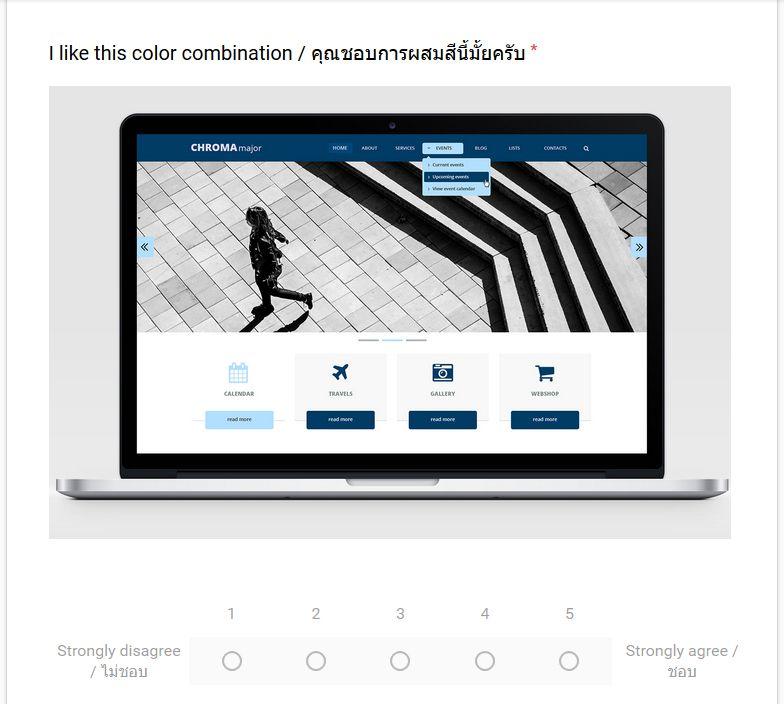
47
48
49
50
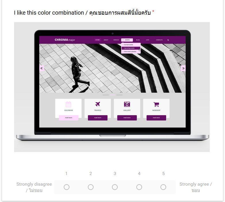
51
Hue Combinations for Web Design: Guidelines for Combining Color Hues Onscreen for Swedish and Thai User s
 Hue Combinations for Web Design: Guidelines for Combining Color Hues Onscreen for Swedish and Thai User s Vidal Ruse 1, Montathar Faraon 2 1 Xene Inc., Linköping Sweden 2 Kristianstad University Kristianstad,
Supplemental Material: Color Compatibility From Large Datasets
 Supplemental Material: Color Compatibility From Large Datasets Peter O Donovan, Aseem Agarwala, and Aaron Hertzmann Project URL: www.dgp.toronto.edu/ donovan/color/ 1 Unmixing color preferences In the
The Art and Science of Depiction. Color. Fredo Durand MIT- Lab for Computer Science
 The Art and Science of Depiction Color Fredo Durand MIT- Lab for Computer Science Color Color Vision 2 Talks Abstract Issues Color Vision 3 Plan Color blindness Color Opponents, Hue-Saturation Value Perceptual
Processing. Electrical Engineering, Department. IIT Kanpur. NPTEL Online - IIT Kanpur
 NPTEL Online - IIT Kanpur Course Name Department Instructor : Digital Video Signal Processing Electrical Engineering, : IIT Kanpur : Prof. Sumana Gupta file:///d /...e%20(ganesh%20rana)/my%20course_ganesh%20rana/prof.%20sumana%20gupta/final%20dvsp/lecture1/main.htm[12/31/2015
BBC Television Services Review
 BBC Television Services Review Quantitative audience research assessing BBC One, BBC Two and BBC Four s delivery of the BBC s Public Purposes Prepared for: November 2010 Prepared by: Trevor Vagg and Sara
Colour Features in Adobe Creative Suite
 Colour Features in Adobe Creative Suite HSB Based on the human perception of color, the HSB model describes three fundamental characteristics of color: Hue, Saturation, Brightness Hue Color reflected from
Journal of Chemical and Pharmaceutical Research, 2015, 7(3): Research Article
: Research Article") Available online www.jocpr.com Journal of Chemical and Pharmaceutical Research, 2015, 7(3):555-563 Research Article ISSN : 0975-7384 CODEN(USA) : JCPRC5 Application of color matching in the design of network
Available online www.jocpr.com Journal of Chemical and Pharmaceutical Research, 2015, 7(3):555-563 Research Article ISSN : 0975-7384 CODEN(USA) : JCPRC5 Application of color matching in the design of network
Discussing some basic critique on Journal Impact Factors: revision of earlier comments
 Scientometrics (2012) 92:443 455 DOI 107/s11192-012-0677-x Discussing some basic critique on Journal Impact Factors: revision of earlier comments Thed van Leeuwen Received: 1 February 2012 / Published
ILDA Image Data Transfer Format
 INTERNATIONAL LASER DISPLAY ASSOCIATION Technical Committee Revision 006, April 2004 REVISED STANDARD EVALUATION COPY EXPIRES Oct 1 st, 2005 This document is intended to replace the existing versions of
ILDA Image Data Transfer Format
 ILDA Technical Committee Technical Committee International Laser Display Association www.laserist.org Introduction... 4 ILDA Coordinates... 7 ILDA Color Tables... 9 Color Table Notes... 11 Revision 005.1,
CSE Data Visualization. Color. Jeffrey Heer University of Washington
 CSE 512 - Data Visualization Color Jeffrey Heer University of Washington Color in Visualization Identify, Group, Layer, Highlight Colin Ware Purpose of Color To label To measure To represent and imitate
Color Reproduction Complex
 Color Reproduction Complex 1 Introduction Transparency 1 Topics of the presentation - the basic terminology in colorimetry and color mixing - the potentials of an extended color space with a laser projector
This tool is the collection of all the fundamental rules for the use of BOCAhealth brand. Its use helps to make all the communication tools coherent
 B R A N D B O O K This tool is the collection of all the fundamental rules for the use of BOCAhealth brand. Its use helps to make all the communication tools coherent each other, reinforcing the image
BBC Trust Review of the BBC s Speech Radio Services
 BBC Trust Review of the BBC s Speech Radio Services Research Report February 2015 March 2015 A report by ICM on behalf of the BBC Trust Creston House, 10 Great Pulteney Street, London W1F 9NB enquiries@icmunlimited.com
A Study on the Psychology of Color Perception In Color Palettes & Color Pickers
 A Study on the Psychology of Color Perception In Color Palettes & Color Pickers S. M. Fazlul Hoque Department of Computer and Systems Sciences The Royal Institute of Technology (KTH) Stockholm, Sweden
Television History. Date / Place E. Nemer - 1
 Television History Television to see from a distance Earlier Selenium photosensitive cells were used for converting light from pictures into electrical signals Real breakthrough invention of CRT AT&T Bell
Sound visualization through a swarm of fireflies
 Sound visualization through a swarm of fireflies Ana Rodrigues, Penousal Machado, Pedro Martins, and Amílcar Cardoso CISUC, Deparment of Informatics Engineering, University of Coimbra, Coimbra, Portugal
Complementary bibliometric analysis of the Health and Welfare (HV) research specialisation
 research specialisation") April 28th, 2014 Complementary bibliometric analysis of the Health and Welfare (HV) research specialisation Per Nyström, librarian Mälardalen University Library per.nystrom@mdh.se +46 (0)21 101 637 Viktor
April 28th, 2014 Complementary bibliometric analysis of the Health and Welfare (HV) research specialisation Per Nyström, librarian Mälardalen University Library per.nystrom@mdh.se +46 (0)21 101 637 Viktor
Guidelines for Manuscript Preparation for Advanced Biomedical Engineering
 Guidelines for Manuscript Preparation for Advanced Biomedical Engineering May, 2012. Editorial Board of Advanced Biomedical Engineering Japanese Society for Medical and Biological Engineering 1. Introduction
Fundamentals of Studio Art I
 Fundamentals of Studio Art I Overview This studio art course offers a survey of methods and materials associated with student art creation. Focus will be on basic instruction in drawing, painting, printmaking,
Using the NTSC color space to double the quantity of information in an image
 Stanford Exploration Project, Report 110, September 18, 2001, pages 1 181 Short Note Using the NTSC color space to double the quantity of information in an image Ioan Vlad 1 INTRODUCTION Geophysical images
The theory of data visualisation
 The theory of data visualisation V2017-10 Simon Andrews, Phil Ewels simon.andrews@babraham.ac.uk phil.ewels@scilifelab.se Data Visualisation A scientific discipline involving the creation and study of
Comparing gifts to purchased materials: a usage study
 Library Collections, Acquisitions, & Technical Services 24 (2000) 351 359 Comparing gifts to purchased materials: a usage study Rob Kairis* Kent State University, Stark Campus, 6000 Frank Ave. NW, Canton,
LOUDNESS EFFECT OF THE DIFFERENT TONES ON THE TIMBRE SUBJECTIVE PERCEPTION EXPERIMENT OF ERHU
 The 21 st International Congress on Sound and Vibration 13-17 July, 2014, Beijing/China LOUDNESS EFFECT OF THE DIFFERENT TONES ON THE TIMBRE SUBJECTIVE PERCEPTION EXPERIMENT OF ERHU Siyu Zhu, Peifeng Ji,
1.4.5.A2 Formalism in dance, music, theatre, and visual art varies according to personal, cultural, and historical contexts.
 Unit Overview Content Area: Art Unit Title: Storytelling in art Grade Level: 4 Unit Summary: This unit is intended to be taught throughout the year as a unifying theme for the year s lessons. In fourth
Fundamentals of Multimedia. Lecture 3 Color in Image & Video
 Fundamentals of Multimedia Lecture 3 Color in Image & Video Mahmoud El-Gayyar elgayyar@ci.suez.edu.eg Mahmoud El-Gayyar / Fundamentals of Multimedia 1 Black & white imags Outcomes of Lecture 2 1 bit images,
Escaping RGBland: Selecting Colors for Statistical Graphics
 Escaping RGBland: Selecting Colors for Statistical Graphics Achim Zeileis Kurt Hornik Paul Murrell http://statmath.wu-wien.ac.at/~zeileis/ Overview Motivation Statistical graphics and color Color vision
What Are You Really Buying? FJU Students Opinions on Eslite Bookstore and its Adoption on Cultural Commodification Strategy
 ENGLISH DEPARTMENT, FU JEN CATHOLIC UNIVERSITY GRADUATION PROJECT 2016 What Are You Really Buying? FJU Students Opinions on Eslite Bookstore and its Adoption on Cultural Commodification Strategy Research
Torture Journal: Journal on Rehabilitation of Torture Victims and Prevention of torture
 Torture Journal: Journal on Rehabilitation of Torture Victims and Prevention of torture Guidelines for authors Editorial policy - general There is growing awareness of the need to explore optimal remedies
Introduction. The report is broken down into four main sections:
 Introduction This survey was carried out as part of OAPEN-UK, a Jisc and AHRC-funded project looking at open access monograph publishing. Over five years, OAPEN-UK is exploring how monographs are currently
Vannevar Bush: As We May Think
 Vannevar Bush: As We May Think 1. What is the context in which As We May Think was written? 2. What is the Memex? 3. In basic terms, how was the Memex intended to work? 4. In what ways does personal computing
Tranformation of Scholarly Publishing in the Digital Era: Scholars Point of View
 Original scientific paper Tranformation of Scholarly Publishing in the Digital Era: Scholars Point of View Summary Radovan Vrana Department of Information Sciences, Faculty of Humanities and Social Sciences,
Analysis of data from the pilot exercise to develop bibliometric indicators for the REF
 February 2011/03 Issues paper This report is for information This analysis aimed to evaluate what the effect would be of using citation scores in the Research Excellence Framework (REF) for staff with
BIBLIOMETRIC REPORT. Bibliometric analysis of Mälardalen University. Final Report - updated. April 28 th, 2014
 BIBLIOMETRIC REPORT Bibliometric analysis of Mälardalen University Final Report - updated April 28 th, 2014 Bibliometric analysis of Mälardalen University Report for Mälardalen University Per Nyström PhD,
Centre for Economic Policy Research
 The Australian National University Centre for Economic Policy Research DISCUSSION PAPER The Reliability of Matches in the 2002-2004 Vietnam Household Living Standards Survey Panel Brian McCaig DISCUSSION
AN EXPERIMENT WITH CATI IN ISRAEL
 Paper presented at InterCasic 96 Conference, San Antonio, TX, 1996 1. Background AN EXPERIMENT WITH CATI IN ISRAEL Gad Nathan and Nilufar Aframian Hebrew University of Jerusalem and Israel Central Bureau
Review Your Thesis or Dissertation
 The College of Graduate Studies Okanagan Campus EME2121 Tel: 250.807.8772 Email: gradask.ok@ubc.ca Review Your Thesis or Dissertation This document shows the formatting requirements for UBC theses. Theses
Sky Mosaic Building a Shared Mosaic. Joyce Ma. September 2004
 Sky Mosaic Building a Shared Mosaic Joyce Ma September 2004 Keywords: < formative environmental visual perception collaboartive art > 1 Outdoor Exploratorium Formative Evaluation Sky Mosaic Building a
Typography Day Typography and Culture
 Typography Day 2014 - Typography and Culture Technique for optimization of font color in subtitling of modern media. Dhvanil Patel, Indian Institute of Technology Guwahati, India, dhvanilpatel2012@gmail.com
Version 1.0 February MasterPass. Branding Requirements
 Version 1.0 February 2013 MasterPass Branding Requirements Using PDF Documents This document is optimized for Adobe Acrobat Reader version 7.0, or newer. Using earlier versions of Acrobat Reader may result
Community Orchestras in Australia July 2012
 Summary The Music in Communities Network s research agenda includes filling some statistical gaps in our understanding of the community music sector. We know that there are an enormous number of community-based
Japan Library Association
 1 of 5 Japan Library Association -- http://wwwsoc.nacsis.ac.jp/jla/ -- Approved at the Annual General Conference of the Japan Library Association June 4, 1980 Translated by Research Committee On the Problems
 1 of 8 8/19/2014 8:15 AM Units: Teacher: Barnett, Kimberly Course: VisArtDesignandProd Year: 2012-13 Elements of Art SubUnit 1: Color SubUnit 2: Form/Shape SubUnit 3: Line SubUnit 4: Space SubUnit 5: Texture
The Development of a Synthetic Colour Test Image for Subjective and Objective Quality Assessment of Digital Codecs
 2005 Asia-Pacific Conference on Communications, Perth, Western Australia, 3-5 October 2005. The Development of a Synthetic Colour Test Image for Subjective and Objective Quality Assessment of Digital Codecs
Ch. 1: Audio/Image/Video Fundamentals Multimedia Systems. School of Electrical Engineering and Computer Science Oregon State University
 Ch. 1: Audio/Image/Video Fundamentals Multimedia Systems Prof. Ben Lee School of Electrical Engineering and Computer Science Oregon State University Outline Computer Representation of Audio Quantization
Spearhead Display. How To Guide
 Spearhead Display The Tektronix color tool set has always been about allowing the user to marry the Art & Science irrespective of the color space they are working in. How To Guide How To Guide Figure 1.
Colour Reproduction Performance of JPEG and JPEG2000 Codecs
 Colour Reproduction Performance of JPEG and JPEG000 Codecs A. Punchihewa, D. G. Bailey, and R. M. Hodgson Institute of Information Sciences & Technology, Massey University, Palmerston North, New Zealand
one M2M Logo Brand Guidelines
 one M2M Logo Brand Guidelines July 2012 Logo Design Explanation What does the one M2M logo symbolize? The number 2 in the middle part of the logo symbolizes the connection between the two machines, the
Brand Identity Standards & Guidelines. PTCB Brand Identity Standards & Guidelines / V.001 / ptcb.org
 Brand Identity Standards & Guidelines 1 CONTENTS Our Story 03 OVERVIEW Brand Identity Standards & Guidelines 05 BRAND STRATEGY Mission, Vision & Tagline 07 Services & Target Audiences 08 Brand Principles
To show the Video Scopes, click on the down arrow next to View located in the upper- right corner of your playback panel.
 1 FCPX: 3.3 COLOR CORRECTION Color Correcting and Color Grading are usually the last things you do before exporting your video. Color Correcting is the process of achieving the correct, natural color of
Skip Length and Inter-Starvation Distance as a Combined Metric to Assess the Quality of Transmitted Video
 Skip Length and Inter-Starvation Distance as a Combined Metric to Assess the Quality of Transmitted Video Mohamed Hassan, Taha Landolsi, Husameldin Mukhtar, and Tamer Shanableh College of Engineering American
Power saving in LCD panels
 Power saving in LCD panels How to save power while watching TV Hans van Mourik - Philips Consumer Lifestyle May I introduce myself Hans van Mourik Display Specialist Philips Consumer Lifestyle Advanced
FEASIBILITY STUDY OF USING EFLAWS ON QUALIFICATION OF NUCLEAR SPENT FUEL DISPOSAL CANISTER INSPECTION
 FEASIBILITY STUDY OF USING EFLAWS ON QUALIFICATION OF NUCLEAR SPENT FUEL DISPOSAL CANISTER INSPECTION More info about this article: http://www.ndt.net/?id=22532 Iikka Virkkunen 1, Ulf Ronneteg 2, Göran
Colors. Matthew Woehlke
 Matthew Woehlke 2 Contents 1 Colors 4 1.1 Scheme Management.................................... 4 1.2 Edit or Create Schemes................................... 4 1.2.1 Color Scheme Options...............................
Complementary bibliometric analysis of the Educational Science (UV) research specialisation
 research specialisation") April 28th, 2014 Complementary bibliometric analysis of the Educational Science (UV) research specialisation Per Nyström, librarian Mälardalen University Library per.nystrom@mdh.se +46 (0)21 101 637 Viktor
April 28th, 2014 Complementary bibliometric analysis of the Educational Science (UV) research specialisation Per Nyström, librarian Mälardalen University Library per.nystrom@mdh.se +46 (0)21 101 637 Viktor
Quality Of Manuscripts and Editorial Process
 TITLE OF PRESENTATION Quality Of Manuscripts and Editorial Process How Editorial Project Managers facilitate the publishing process from its beginning to the end Presented By Mariana Kühl Leme Date September
Achieve Accurate Critical Display Performance With Professional and Consumer Level Displays
 Achieve Accurate Critical Display Performance With Professional and Consumer Level Displays Display Accuracy to Industry Standards Reference quality monitors are able to very accurately reproduce video,
Rules of Convergence What would become the face of the Internet TV?
 364 Rules of Convergence What would become the face of the Internet TV? Hyoshik Yu, Youngsu Lee, Seokin Hong, Jinwoo Kim and Hyunho Kim Yonsei University Abstract Internet TV is a convergent appliance
A Study of Predict Sales Based on Random Forest Classification
 , pp.25-34 http://dx.doi.org/10.14257/ijunesst.2017.10.7.03 A Study of Predict Sales Based on Random Forest Classification Hyeon-Kyung Lee 1, Hong-Jae Lee 2, Jaewon Park 3, Jaehyun Choi 4 and Jong-Bae
Enrichment process for title submission in STEP
 Enrichment process for title submission in STEP Shareef Bhailal Product Manager Scopus Title Evaluation Platform s.bhailal@elsevier.com March 8 th, 5 th Editor workshop for Scopus indexing Thai Pilot Project
How to get published Preparing your manuscript. Bart Wacek Publishing Director, Biochemistry
 How to get published Preparing your manuscript Bart Wacek Publishing Director, Biochemistry b.wacek@elsevier.com 2 Academic publishing What is peer review? Peer review consists of the evaluation of articles
Murdoch redux. Colorimetry as Linear Algebra. Math of additive mixing. Approaching color mathematically. RGB colors add as vectors
 Murdoch redux Colorimetry as Linear Algebra CS 465 Lecture 23 RGB colors add as vectors so do primary spectra in additive display (CRT, LCD, etc.) Chromaticity: color ratios (r = R/(R+G+B), etc.) color
INTERLACE CHARACTER EDITOR (ICE) Programmed by Bobby Clark. Version 1.0 for the ABBUC Software Contest 2011
 Programmed by Bobby Clark. Version 1.0 for the ABBUC Software Contest 2011") INTERLACE CHARACTER EDITOR (ICE) Programmed by Bobby Clark Version 1.0 for the ABBUC Software Contest 2011 INTRODUCTION Interlace Character Editor (ICE) is a collection of three font editors written in
INTERLACE CHARACTER EDITOR (ICE) Programmed by Bobby Clark Version 1.0 for the ABBUC Software Contest 2011 INTRODUCTION Interlace Character Editor (ICE) is a collection of three font editors written in
Research Article. ISSN (Print) *Corresponding author Shireen Fathima
 *Corresponding author Shireen Fathima") Scholars Journal of Engineering and Technology (SJET) Sch. J. Eng. Tech., 2014; 2(4C):613-620 Scholars Academic and Scientific Publisher (An International Publisher for Academic and Scientific Resources)
Scholars Journal of Engineering and Technology (SJET) Sch. J. Eng. Tech., 2014; 2(4C):613-620 Scholars Academic and Scientific Publisher (An International Publisher for Academic and Scientific Resources)
Theory of Colour Harmony and Its Application
 ISSN 1330-3651 (Print), ISSN 1848-6339 (Online) https://doi.org/10.17559/tv-20170316092852 Subject review Theory of Colour Harmony and Its Application Primož WEINGERL, Dejana JAVORŠEK Abstract: The colour
Color in Information Visualization
 Color in Information Visualization James Bernhard April 2012 Color serves different purposes in art and in information visualization: In art, color is used for creative and expressive purposes In information
In accordance with the Trust s Syndication Policy for BBC on-demand content. 2
 BBC One This service licence describes the most important characteristics of BBC One, including how it contributes to the BBC s public purposes. Service Licences are the core of the BBC s governance system.
EVALUATING THE IMPACT FACTOR: A CITATION STUDY FOR INFORMATION TECHNOLOGY JOURNALS
 EVALUATING THE IMPACT FACTOR: A CITATION STUDY FOR INFORMATION TECHNOLOGY JOURNALS Ms. Kara J. Gust, Michigan State University, gustk@msu.edu ABSTRACT Throughout the course of scholarly communication,
Ebook Collection Analysis: Subject and Publisher Trends
 Library Faculty Publications Library Faculty/Staff Scholarship & Research 2012 Ebook Collection Analysis: Subject and Publisher Trends J. Cory Tucker University of Nevada, Las Vegas, cory.tucker@unlv.edu
Peer Review Process in Medical Journals
 Korean J Fam Med. 2013;34:372-376 http://dx.doi.org/10.4082/kjfm.2013.34.6.372 Peer Review Process in Medical Journals Review Young Gyu Cho, Hyun Ah Park* Department of Family Medicine, Inje University
AN INTEGRATED CURRICULUM UNIT FOR THE CRITIQUE OF PROSE AND FICTION
 AN INTEGRATED CURRICULUM UNIT FOR THE CRITIQUE OF PROSE AND FICTION OVERVIEW I. CONTENT Building on the foundations of literature from earlier periods, significant contributions emerged both in form and
Essence of Image and Video
 1 Essence of Image and Video Wei-Ta Chu 2009/9/24 Outline 2 Image Digital Image Fundamentals Representation of Images Video Representation of Videos 3 Essence of Image Wei-Ta Chu 2009/9/24 Chapters 2 and
Power Consumption Trends in Digital TVs produced since 2003
 Power Consumption Trends in Digital TVs produced since 2003 Prepared by Darrell J. King And Ratcharit Ponoum TIAX LLC 35 Hartwell Avenue Lexington, MA 02421 TIAX Reference No. D0543 for Consumer Electronics
Set-Top-Box Pilot and Market Assessment
 Final Report Set-Top-Box Pilot and Market Assessment April 30, 2015 Final Report Set-Top-Box Pilot and Market Assessment April 30, 2015 Funded By: Prepared By: Alexandra Dunn, Ph.D. Mersiha McClaren,
Color Gamut Mapping based on Mahalanobis Distance for Color Reproduction of Electronic Endoscope Image under Different Illuminant
 Color Gamut Mapping based on Mahalanobis Distance for Color Reproduction of Electronic Endoscope Image under Different Illuminant N. Tsumura, F. H. Imai, T. Saito, H. Haneishi and Y. Miyake Department
MindMouse. This project is written in C++ and uses the following Libraries: LibSvm, kissfft, BOOST File System, and Emotiv Research Edition SDK.
 Andrew Robbins MindMouse Project Description: MindMouse is an application that interfaces the user s mind with the computer s mouse functionality. The hardware that is required for MindMouse is the Emotiv
In this paper, the issues and opportunities involved in using a PDA for a universal remote
 Abstract In this paper, the issues and opportunities involved in using a PDA for a universal remote control are discussed. As the number of home entertainment devices increases, the need for a better remote
MAKE ROOM FOR BETTER MEETINGS. The IT & Facility Manager s guide
 MAKE ROOM FOR BETTER MEETINGS The IT & Facility Manager s guide Create the ultimate meeting room experience This guide is for anyone who s responsible for designing or operating company meeting facilities.
Journal of Japan Academy of Midwifery Instructions for Authors submitting English manuscripts
 Journal of Japan Academy of Midwifery Instructions for Authors submitting English manuscripts 1. Submission qualification Manuscripts should publish new findings of midwifery studies, and the authors must
Challenges in the design of a RGB LED display for indoor applications
 Synthetic Metals 122 (2001) 215±219 Challenges in the design of a RGB LED display for indoor applications Francis Nguyen * Osram Opto Semiconductors, In neon Technologies Corporation, 19000, Homestead
Planar LookThru OLED Transparent Display. Content Developer s Guide. 1 TOLED Content Developer s Guide A
 Planar LookThru OLED Transparent Display Content Developer s Guide 1 TOLED Content Developer s Guide 020-1316-00A Table of Contents How Transparent OLED Works... 3 History and Definitions... 3 Pixel Structure...
Gerald Graff s essay Taking Cover in Coverage is about the value of. fully understand the meaning of and social function of literature and criticism.
 1 Marissa Kleckner Dr. Pennington Engl 305 - A Literary Theory & Writing Five Interrelated Documents Microsoft Word Track Changes 10/11/14 Abstract of Graff: Taking Cover in Coverage Graff, Gerald. "Taking
The Effects of Web Site Aesthetics and Shopping Task on Consumer Online Purchasing Behavior
 The Effects of Web Site Aesthetics and Shopping Task on Consumer Online Purchasing Behavior Cai, Shun The Logistics Institute - Asia Pacific E3A, Level 3, 7 Engineering Drive 1, Singapore 117574 tlics@nus.edu.sg
B R A N D G U I D E L I N E S
 BRAND GUIDELINES OUR PRODUCT IS OUR PEOPLE EVERY DAY OUR PEOPLE PROVIDE AN ENTIRELY POSITIVE, ABOVE AND BEYOND SERVICE EXPERIENCE TO EVERY CLIENT IN THE TSP FAMILY. We believe in the power of relationships
Adaptive Key Frame Selection for Efficient Video Coding
 Adaptive Key Frame Selection for Efficient Video Coding Jaebum Jun, Sunyoung Lee, Zanming He, Myungjung Lee, and Euee S. Jang Digital Media Lab., Hanyang University 17 Haengdang-dong, Seongdong-gu, Seoul,
Superior Digital Video Images through Multi-Dimensional Color Tables
 Superior Digital Video Images through Multi-Dimensional Color Tables TruVue eecolor Technology White Paper Jim Sullivan CEO, Entertainment Experience, LLC About the Author Jim Sullivan joined Entertainment
Quantify. The Subjective. PQM: A New Quantitative Tool for Evaluating Display Design Options
 PQM: A New Quantitative Tool for Evaluating Display Design Options Software, Electronics, and Mechanical Systems Laboratory 3M Optical Systems Division Jennifer F. Schumacher, John Van Derlofske, Brian
Presentation from the EISZ Conference The use and generation of scientific content. Roles for Libraries in Budapest, Hungary Sep 12 th, 2016
 Stockholm University Press for researchers, by researchers but, what is the library publisher adding? Sofie Wennström, Analyst & Managing Editor, Stockholm University Library Presentation from the EISZ
Visual Arts and Language Arts. Complementary Learning
 Visual Arts and Language Arts Complementary Learning Visual arts can enable students to learn more. Schools that invest time and resources in visual arts learning have the potential to increase literacies
Analysing and Mapping Cited Works: Citation Behaviour of Filipino Faculty and Researchers
 Qualitative and Quantitative Methods in Libraries (QQML) 5: 355-364, 2016 Analysing and Mapping Cited Works: Citation Behaviour of Filipino Faculty and Researchers Marian Ramos Eclevia 1 and Rizalyn V.
Disputing about taste: Practices and perceptions of cultural hierarchy in the Netherlands van den Haak, M.A.
 UvA-DARE (Digital Academic Repository) Disputing about taste: Practices and perceptions of cultural hierarchy in the Netherlands van den Haak, M.A. Link to publication Citation for published version (APA):
Chapter Two: Long-Term Memory for Timbre
 25 Chapter Two: Long-Term Memory for Timbre Task In a test of long-term memory, listeners are asked to label timbres and indicate whether or not each timbre was heard in a previous phase of the experiment
On the Characterization of Distributed Virtual Environment Systems
 On the Characterization of Distributed Virtual Environment Systems P. Morillo, J. M. Orduña, M. Fernández and J. Duato Departamento de Informática. Universidad de Valencia. SPAIN DISCA. Universidad Politécnica
CONQUERING CONTENT EXCERPT OF FINDINGS
 CONQUERING CONTENT N O V E M B E R 2 0 1 5! EXCERPT OF FINDINGS 1 The proliferation of TV shows: a boon for TV viewers, a challenge for the industry More new shows: # of scripted original series (by year):
Computer Graphics. Raster Scan Display System, Rasterization, Refresh Rate, Video Basics and Scan Conversion
 Computer Graphics Raster Scan Display System, Rasterization, Refresh Rate, Video Basics and Scan Conversion 2 Refresh and Raster Scan Display System Used in Television Screens. Refresh CRT is point plotting
bwresearch.com twitter.com/bw_research facebook.com/bwresearch
 2725 JEFFERSON STREET, SUITE 13, CARLSBAD CA 92008 50 MILL POND DRIVE, WRENTHAM, MA 02093 T (760) 730-9325 F (888) 457-9598 bwresearch.com twitter.com/bw_research facebook.com/bwresearch TABLE OF CONTENTS
h t t p : / / w w w. v i d e o e s s e n t i a l s. c o m E - M a i l : j o e k a n a t t. n e t DVE D-Theater Q & A
 J O E K A N E P R O D U C T I O N S W e b : h t t p : / / w w w. v i d e o e s s e n t i a l s. c o m E - M a i l : j o e k a n e @ a t t. n e t DVE D-Theater Q & A 15 June 2003 Will the D-Theater tapes
Subjective evaluation of common singing skills using the rank ordering method
 lma Mater Studiorum University of ologna, ugust 22-26 2006 Subjective evaluation of common singing skills using the rank ordering method Tomoyasu Nakano Graduate School of Library, Information and Media
UCSB LIBRARY COLLECTION SPACE PLANNING INITIATIVE: REPORT ON THE UCSB LIBRARY COLLECTIONS SURVEY OUTCOMES AND PLANNING STRATEGIES
 UCSB LIBRARY COLLECTION SPACE PLANNING INITIATIVE: REPORT ON THE UCSB LIBRARY COLLECTIONS SURVEY OUTCOMES AND PLANNING STRATEGIES OCTOBER 2012 UCSB LIBRARY COLLECTIONS SURVEY REPORT 2 INTRODUCTION With
PRNANO Editorial Policy Version
 We are signatories to the San Francisco Declaration on Research Assessment (DORA) http://www.ascb.org/dora/ and support its aims to improve how the quality of research is evaluated. Bibliometrics can be