Type Dance Paper on Kalari type, Typography Day /7/2013 Infosys Limited Ajai Raghav, Jolly Joseph, Manoj Neelakanthan, Orion Jose
|
|
|
- Ralf Farmer
- 5 years ago
- Views:
Transcription
1 Type Dance Paper on Kalari type, Typography Day /7/2013 Infosys Limited Ajai Raghav, Jolly Joseph, Manoj Neelakanthan, Orion Jose
2 TITLE... 2 AUTHORS... 2 ABSTRACT... 2 KEYWORDS... 2 INTRODUCTION... 2 HISTORICAL REFERENCES... 2 AIMS AND OBJECTIVES... 3 METHODOLOGY... 3 EARLY EXPLORATIONS IN FINDING IDENTITY... 3 KALARI AS FONT, AN ARMCHAIR INTERPRETATION... 3 THE PERFORMING ARTIST AS TEAM MEMBER... 5 TRANSLATING THE SEEN... 5 TYPE OR TRADITION?... 6 RECOGNITION AND LEGIBILITY... 6 OBSERVATIONS / RESULTS... 7 CONCLUSION... 7 ACKNOWLEDGEMENTS... 9 REFERENCES... 9 ~ 1 ~
3 TITLE Type Dance AUTHORS Ajai Raghav Senior Brand Experience Designer, Communications Design Group, Infosys Limited Jolly Joseph Senior Graphic Designer, Communications Design Group, Infosys Limited Manoj Neel Principal, Experience Design, Communications Design Group, Infosys Limited Orion Jose Senior Graphic Designer, Communications Design Group, Infosys Limited ABSTRACT Through this project we have attempted to humanize the letterform in a context that was familiar to us. It is a work that has progressed from an interest in the printed word as well as a preoccupation with the performing and visual arts. Having made that first connection between the martial art form of Kalaripayattu 1 and the English alphabet, we worked on continually refining the graphic outcome. We trod the fine line between faithfulness to the art form and a certain expectation of recognition that the alphabet demanded. In all honesty though, we weighed more to the former than the latter. In so doing, we may have created a typeface that delights the aesthete more than satisfies the pragmatic needs of a reader. But that is in the spirit of an endeavor that has always sought to be a bridge the rootedness of identity vs. the openness of familiarity. Though it is obvious to see its application in the printed word, our experience has made us think beyond this. Photographing the performers in the act brought home to us a drama and dynamism that is perhaps best expressed when freed from the confines of a page. The paper thus describes a journey that is yet without pause; that can be a springboard to possibilities across media, and further married happily to the many art forms of India. KEYWORDS Indian type, Identity, Human form, Kalaripayattu INTRODUCTION The premise for the Type Dance project is that all type wants to be free and wants to attain a human quality elevating the communication it serves. The alphabet acquires a presence in time and space, quite unlike pixels adjusted for effect. There is thus room for expression, gesture and body language to add subtlety to meaning. Historical references In 1970, designer Anthon Beeke interpreted the spirit of the times with a composition of nudes artfully arranged on the floor to construct a 2-letter alphabet. Forty years on, Domus magazine paid a more modest tribute to Anthon Beeke s human alphabet in composing the word Libri (books) for its 1 Kalaripayattu is an Indian martial art from the southern state of Kerala. One of the oldest fighting systems in existence, it is practiced in Kerala and parts of Tamil Nadu, Karnataka as well as northeastern Sri Lanka and among the Malayali community of Malaysia. It was practiced primarily by groups among Keralite castes such as the Nairs and Thiyyas, and was taught by a special caste named Kalari Panicker. It includes strikes, kicks, grappling, preset forms, weaponry and healing methods. ~ 2 ~
4 March, 2011 issue 2. Thus in the spirit of anthropomorphism and with due regard to its varied interpretations over time, we set out to explore the theme in our familiarity. We were also conscious of the diverse art forms of our country, India and the possibilities of visual spectacle that such a rich context afforded us. In particular, the HandpaintedType project 3 that preserves the typographic practice of street painters in India was an inspiration. AIMS AND OBJECTIVES We set out to create letterforms in an Indian theme. On looking back, some of the motivations that guided us were - a) To contribute to the body of work that brings an Indian aesthetic to the letterform, or conversely a letterform aesthetic to the Indian art form. b) To create a family of letters that, within a certain frame of reference, can be expressed across media from print to the performing arts. c) To explore a connection between the human form and the alphabet in the context of India. METHODOLOGY In the making of the letters, we found a willing collaborator in Ranjan Mullarattu and his disciples at the Kalari Gurukulam, Bangalore. They were well integrated into the process of our creation, which progressed from a thought, through a period of uncertainty (would the human form and the vocabulary of Kalaripayattu converge at the English alphabet?), eventually ending in the letterforms that we see today. Early explorations in finding identity In the beginning, we simply sought forms that would lend themselves to the shape and proportions of the English alphabet. We chose the English alphabet for (relative) simplicity of form. We also felt that a set of 26 letters gave us a sufficiently tight frame within which to evolve a family feel. Out of this blue-sky thinking there emerged the idea of doing something distinctly Indian. In effect we were looking for a frame of reference, a milieu, a context that would lend meaning. We considered dance forms, wrestling (!), yoga and made rough sketches. All of us in the team hailed from Kerala, and shared a certain feel for the place and its visual art forms. It was natural therefore for us to look in this direction. We chose the martial art form of Kalaripayattu that blends grace and aggression in its style. Set against the sandy shores and blue skies of Kerala, the image of two warriors one leaping in combat, the other bracing for attack offered tantalizing possibilities in typographic form. Kalari as font, an armchair interpretation Our first attempt was all innocence, all naiveté, as we took to the crouch-and-leap vocabulary of the art, its weapons (sword and shield) and costume; the swirling red sash held at the waist and the free flowing dhoti. Convinced of the range and flexibility that the premise afforded us, we set about framing the letters within a grid, to achieve consistency across letters in size and proportion. We chose a grid that allowed us freedom in arc and line, in keeping with the dynamism of Kalaripayattu. We then freed the exercise from the medium of pen and pencil, and turned to the free flow of brush and ink. In the new medium we further improvised the letterforms, and brought spontaneity into our compositions. This move allowed us to better express the dynamics of the art form we aspired to. 2 Naked and Dressed Alphabets, Domus, 03 March 2011 issue, Author Italo Lupi 3 HandPaintedType.com ~ 3 ~

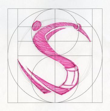

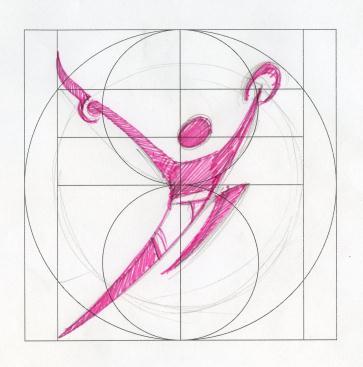

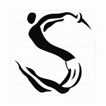

5 ~ 4 ~ Fig.1. Early explorations Letters E, O, S, Y from the complete set


6 The performing artist as team member We realized that while this unfettered approach gave us license-to-visualize, it was removed from an art form ethic. We felt the need for an informed voice, an informed eye to guide the experiment. Drawing inspiration from our sketches, the martial artists of Kalari Gurukulam interpreted each letter as a discrete performance one or more artists in full flow of the performance, working within the vocabulary of the art form. The sessions were exhilarating, where the lines between designer and performing artist dissolved, as we worked together in the spirit of uncovering something new. In so doing, we pushed the envelope of the art form too. Together, artists and designers discovered new ground, new configurations in a performance that would suit our objective. Fig.2. Artist in performance Letter I with Parija (shield) and Vaal (sword) Translating the seen We had recorded the artists performing at the Gurukulam; we also had photographs of formations that alluded to the letters. Armed with these, we began translating what we saw into a graphical form. A typeface is nothing but handwriting that creates the impression of unerring consistency, as they say; and so began the process of finding identity in the new medium of type. Fig.3. Artist in performance Letter I traced in brush and ink ~ 5 ~


7 Type or tradition? Obvious though it might have seemed, the transition from image to graphic was anything but. It led us willy-nilly into a debate on loyalties and integrity. Should faithfulness to the art form weigh over considerations of familiarity and legibility? Or should readability triumph over art? A balance between the two was easier said than sought. With an image everything is authentic, what you see is what you get, in color, in form and in movement. But with a graphic everything is suggestive of the original. Also, in the context of a family of letters, there is the matter of coherence when they are rendered together in groups. Clearly we had to choose between - i. An earthy form that closely mimicked the photographic image in the medium of brush and ink, or ii. A stylized form that moved away from the earthiness of the original, embracing a contemporary aesthetic. We chose not to prefer one over the other; we retained both journeys. Fig.4. Abstracting the performance Letter I in earthy and stylized graphic forms Recognition and legibility This is where we record our impressions on the outcome both from an artist s and a reader s point of view. i. Does the artist recognize his art in an unfamiliar (now familiar) medium? Can he claim an association with it and own it with pride? A yes would vouch for the integrity of the design. ii. Does the viewer read it well and with distinction? The answer to this question is laced with a caveat, that of context. Given its moorings, we do anticipate the need to frame the objective, contextualize it as it were. Given this introduction, would the viewer discern the letter in a practical application e.g. a display signage? Would he at the same time, also appreciate the particular aesthetic that the letters contain? The answers to the above are yet to be ascertained, and await completion of the character set as a typeface. ~ 6 ~

 A certain magic realism has found its way into the letters, well into the very ink of its making.")
 We found a marked inclination to the contemporary in the artists we worked with. Far from being trapped in time or inflexible, we found them keen to experiment.")
8 Fig.5.From Photographic to graphic Journey of the letter I OBSERVATIONS / RESULTS At the time of writing this paper, it is yet premature to comment on results, both from an all-round perspective (viewer vs. aesthete vs. artist), as well as from a completion point of view (the complete set would include letters A-Z and numbers 0-9). Nevertheless, some observations from all of us who worked in the team a) A certain magic realism has found its way into the letters, well into the very ink of its making. What began as an exploration has transcended and evolved into a refined letterset, marrying perfectly well the demands of legibility and the pleasures of art. b) We found a marked inclination to the contemporary in the artists we worked with. Far from being trapped in time or inflexible, we found them keen to experiment. This to us is the resilience of an art form that actively seeks influences from outside to enrich itself. c) The letters designed represent the efforts and enthusiasm of a team of artistes, designers and photographers. It points to possibilities that lie when a team of many talents come together with a vision and a will. The experience has been both a humbling and an uplifting one. Respect for the other, an affirmation of one s identity and a forward-looking spirit have been the cornerstones of the experience. Continued on page 8 ~ 7 ~

9 ~ 8 ~ The character set A-Z
10 CONCLUSION In conclusion, we choose not to conclude; rather pause in the journey we ve undertaken. Having completed the work in print, we aim to express the letter in other media, thereby uncovering fresh possibilities in the new medium. In the spirit of enquiry that has guided us thus far; we d like to explore the worlds of dance, theatre, and other narratives that surface the letterform. We also see a future where other art forms too embrace such endeavors. There are many India s within India as they say, each with its distinct warp and weft. We have but touched upon a fertile corner of South India. We see similar exercises being taken up by many among us artistes, writers, designers, photographers alike, in bridging their identities with the world that we engage with. ACKNOWLEDGEMENTS Anish Velayudhan Kutty, Graphic Designer, Communication Design Group, Infosys Limited Ranjan Mullaratt and team of students, Kalari Gurukulam, Bangalore REFERENCES Kalaripayattu. Retrieved February 6, 2013, from HandPaintedType.com. Retrieved February 6, 2013, from Lupi, Italo (2011, March 03). Naked and Dressed Alphabets. Domus ~ 9 ~
C O R P O R A T E G R A P H I C I D E N T I T Y P O L I C Y
 C O R P O R A T E G R A P H I C I D E N T I T Y P O L I C Y J A N U A R Y 2019 1 Graphic Identity 2 Corporate identity policy This corporate identity manual standardizes the communication elements and
graphic identity standards
 graphic identity standards agrimissouri graphic identity standards introduction The AgriMissouri logo helps to ensure a new era for the initiative: an era of unprecedented brand identity, awareness and
Brand Standards QUICK GUIDELINES
 Brand Standards QUICK GUIDELINES Table of Contents 1.0 1.1 1.2 BRANDMARK Master / Staging Color / Size 2.0 2.1 TAGLINE Usage / Specifications / Staging 3.0 3.1 3.2 3.3 BRAND SYSTEM Typography Color Palette
CLICK TO GO BACK TO THE START CLICK TO JUMP TO ANY SECTION
 Style Guide CLICK TO GO BACK TO THE START CLICK TO JUMP TO ANY SECTION 2 2018 TABLE OF CONTENTS 3 BRAND POSITION 4 FAMILY OF MARKS 17 Mission Statement 5 Tournament of Roses 19 Vision Statement 5 Rose
INTRODUCTION AND PURPOSE
 1 INTRODUCTION AND PURPOSE Our institutional seal and logotype are essential elements of our brand. They are the school s physical identity that upholds our vision, mission, goals and institutional core
alphabet book of confidence
 Inner rainbow Project s alphabet book of confidence dictionary 2017 Sara Carly Mentlik by: sara Inner Rainbow carly Project mentlik innerrainbowproject.com Introduction All of the words in this dictionary
Black Swan. Fannin Musical Productions Storyboard by Jason Shelby (270)
") Black Swan Fannin Musical Productions Storyboard by Jason Shelby jason@fanninmusic.com (270) 293-4106 Black Swan is a study in contrasting beauty: classical vs. contemporary, timeless & elegant vs. mysterious
Black Swan Fannin Musical Productions Storyboard by Jason Shelby jason@fanninmusic.com (270) 293-4106 Black Swan is a study in contrasting beauty: classical vs. contemporary, timeless & elegant vs. mysterious
Visual Arts» 2D. September 22, 2015
 1 of 8 9/22/2015 10:49 AM Visual Arts» 2D September 22, 2015 Like 8 Tweet Share By Chi Sherman Internationally known illustrator speaks with an elegance and cadence that turn his words into a dance. His
Visual & Performing Arts
 LAUREL SPRINGS SCHOOL Visual & Performing Arts COURSE LIST 1 American Music Appreciation Music in America has a rich history. In American Music Appreciation, students will navigate this unique combination
The Three Eyes and Modern Art
 The Three Eyes and Modern Art The perplexed prospective art student looks at a Picasso painting in which a woman has three eyes. Two questions spring to the student's lips: Why did he do that? Why does
STYLE-BRANDING, AESTHETIC DESIGN DNA
 INTERNATIONAL CONFERENCE ON ENGINEERING AND PRODUCT DESIGN EDUCATION 10 & 11 SEPTEMBER 2009, UNIVERSITY OF BRIGHTON, UK STYLE-BRANDING, AESTHETIC DESIGN DNA Bob EVES 1 and Jon HEWITT 2 1 Bournemouth University
Branding Guidelines NOTICE:
 Branding Guidelines NOTICE: THE STRUCTURE OF THE HEVC ADVANCE LICENSING PROGRAM, INCLUDING THE TERMS HEVC ADVANCE IS CURRENTLY AUTHORIZED TO OFFER IN ITS PATENT PORTFOLIO LICENSE AGREEMENT, ARE SUBJECT
By John W. Jacobsen. This article first appeared in LF Examiner (September, 2008) Vol 11 No. 8, and is reproduced with permission.
 Vol 11 No. 8, and is reproduced with permission.") DISCUSS DIGSS! By John W. Jacobsen This article first appeared in LF Examiner (September, 2008) Vol 11 No. 8, and is reproduced with permission. Managers of giant-screen theaters in North American science
DISCUSS DIGSS! By John W. Jacobsen This article first appeared in LF Examiner (September, 2008) Vol 11 No. 8, and is reproduced with permission. Managers of giant-screen theaters in North American science
to the development of any art to its maximum extent. These patrons therefore have been the cause to have brought in a sea of change in the presentatio
 CONCLUSION Tradition and culture of a country are generally seen in the art of the state. India, being a vast country has a great and rich culture that has been handed to the present generation from the
CARLISLE AREA SCHOOL DISTRICT Carlisle, PA GRAPHIC DESIGN (Formerly Commercial Art I) GRADES 10-12
 GRADES 10-12") CARLISLE AREA SCHOOL DISTRICT Carlisle, PA 17013 GRAPHIC DESIGN (Formerly Commercial Art I) GRADES 10-12 Date of Board Approval: April 15, 2010 Revised: November 17, 2016 (Title change only) CARLISLE AREA
CARLISLE AREA SCHOOL DISTRICT Carlisle, PA 17013 GRAPHIC DESIGN (Formerly Commercial Art I) GRADES 10-12 Date of Board Approval: April 15, 2010 Revised: November 17, 2016 (Title change only) CARLISLE AREA
Sculpture Park. Judith Shea, who completed a piece here at the ranch, introduced us.
 aulson Press is proud to announce the release of two new prints by sculptor Martin Puryear. Both prints were created during his many visits to the studio beginning in 2001. Puryear uses the flexibility
how does this collaboration work? is it an equal partnership?
 dialogue kwodrent x FARMWORK with chee chee [phd], assistant professor, department of architecture, national university of singapore tan, principal, kwodrent sim, director, FARMWORK, associate, FARMWORK
Free Ebooks Brush Writing: Calligraphy Techniques For Beginners
 Free Ebooks Brush Writing: Calligraphy Techniques For Beginners For many a deep and lasting interest in Japanese culture, its people and its language, begins with a fascination for beautifully drawn characters
Table of Contents. Stationery 24 Business card 25 Letterhead 26 #10 Envelope. Document Note
 Table of Contents Document Note The goal of these guidelines is to help communicate the strategy and visual system behind the SPX brand. If you have questions about anything in this guide, please reach
B R A N D G U I D E L I N E S
 BRAND GUIDELINES OUR PRODUCT IS OUR PEOPLE EVERY DAY OUR PEOPLE PROVIDE AN ENTIRELY POSITIVE, ABOVE AND BEYOND SERVICE EXPERIENCE TO EVERY CLIENT IN THE TSP FAMILY. We believe in the power of relationships
Great Falls College Montana State University Graphic Standards
 Table of Contents Why are graphic standards important?... A The Great Falls College Montana State University brand... B Vision, Mission and Values...B1 Core Themes...B2 The Brand Components... C The Academic
TYPOGRAPHY ENVIRONMENT OF ORISSA IN CULTURAL CONTEXT AN INSIGHT AND VISUAL PERCEPTION
 Typography ENVIRONMENT of Orissa in Cultural Context An insight and visual perception 1 TYPOGRAPHY ENVIRONMENT OF ORISSA IN CULTURAL CONTEXT AN INSIGHT AND VISUAL PERCEPTION Prof Paresh Choudhury MIT Institute
Version 3:0 September 2015
 Identity guidelines Version 3:0 September 2015 The Buxton logotype The new logotype embraces the concept of water - and a source of water. The focal point of the design is the letter O' where water emerges
Environmental Typography of Orissa in response to its Culture.
 Environmental Typography of Orissa in response to its Culture. Prof. Paresh Choudhury MIT INSTITUTE OF DESIGN, Pune, India pareshchoudhury@mitid.edu.in ` Abstract: When we talk about Oriya (Orissan) Typography
For Children with Developmental Differences. Brand Identity Guide
 For Children with Developmental Differences Brand Identity Guide Table of Contents 3 Our Visual Identity System 4 About These Guidelines 5 The Logo 6 Clear Space & Minimum Size 7-8 Logo Variations 9 Icon
Brand Typeface Headlines Establishing Hierarchy Photography Iconography & Infographics... 18
 Brand Guide VERSION 1.0 2017 Contents at a glance Introduction Using Brand Guidelines... 3 A Note on Branding... 4 Logo Color Version... 5 Special Cases Only... 6 Logo Usage Clear Space... 7 Minimum Size...
www. enocean. com EnOcean Brand Guidelines
 www. enocean. com EnOcean Brand Guidelines V3.2 MARCH 2012 EnOcean Brand Guidelines EnOcean GmbH is the innovator and producer of the award-winning, patented batteryless radio technology, thus establishing
SOUTHEAST TECH BRANDING IDENTITY STANDARDS MANUAL
 SOUTHEAST TECH BRANDING IDENTITY STANDARDS MANUAL INTRODUCTION The Southeast Tech Branding Identity Standards Manual was created to provide all Southeast Tech employees and associates with the ability
MANOR ROAD PRIMARY SCHOOL
 MANOR ROAD PRIMARY SCHOOL MUSIC POLICY May 2011 Manor Road Primary School Music Policy INTRODUCTION This policy reflects the school values and philosophy in relation to the teaching and learning of Music.
West Windsor-Plainsboro Regional School District Art Elective Grade 7
 West Windsor-Plainsboro Regional School District Art Elective Grade 7 Unit 1: Communication Logo Content Area: Visual and Performing Arts Course & Grade Level: Art Elective, Grade 7 Summary and Rationale
Centennial Year Brand Standards Guide
 Centennial Year Brand Standards Guide FOR USAGE NOV. 21, 2016 - NOV. 21, 2017 welcome The identity of Federation CJA is much more than just a logo. It defines how those around us view both the federation
foucault s archaeology science and transformation David Webb
 foucault s archaeology science and transformation David Webb CLOSING REMARKS The Archaeology of Knowledge begins with a review of methodologies adopted by contemporary historical writing, but it quickly
McGraw-Hill Treasures Grade 3
 Unit 3/Week 5 Title: What Do Illustrators Do Suggested Time: 5 days (45 minutes per day) Common Core ELA Standards: RI.3.1, RI.3.2, RI.3.3, RI.3.4, RI.3.7; W.3.1, W.3.4; SL.3.1, SL.3.2; L.3.1, L.3.2, L.3.4
Cole Olson Drama Truth in Comedy. Cole Olson
 Truth in Comedy Cole Olson Grade 12 Dramatic Arts Comedy: Acting, Movement, Speech and History March 4-13 Holy Trinity Academy 1 Table of Contents Item Description Rationale Page A statement that demonstrates
High School Photography 1 Curriculum Essentials Document
 High School Photography 1 Curriculum Essentials Document Boulder Valley School District Department of Curriculum and Instruction February 2012 Introduction The Boulder Valley Elementary Visual Arts Curriculum
Case Study ASK THE ARTISTS: DENNIS SCHÄFER
 ASK THE ARTISTS: DENNIS SCHÄFER Ask the artists: dennis schäfer Dennis Schäfer has gained a reputation as a leading designer and Ventuz Artist at the German agency Stereolize and as cofounder of the agency
PIANO SAFARI FOR THE OLDER STUDENT REPERTOIRE & TECHNIQUE BOOK 1
 PIANO SAFARI FOR THE OLDER STUDENT REPERTOIRE & TECHNIQUE BOOK 1 TEACHER GUIDE by Dr. Julie Knerr TITLE TYPE BOOK PAGE NUMBER TEACHER GUIDE PAGE NUMBER Unit 1 Table of Contents 9 Goals and Objectives 10
Object Oriented Learning in Art Museums Patterson Williams Roundtable Reports, Vol. 7, No. 2 (1982),
,") Object Oriented Learning in Art Museums Patterson Williams Roundtable Reports, Vol. 7, No. 2 (1982), 12 15. When one thinks about the kinds of learning that can go on in museums, two characteristics unique
Object Oriented Learning in Art Museums Patterson Williams Roundtable Reports, Vol. 7, No. 2 (1982), 12 15. When one thinks about the kinds of learning that can go on in museums, two characteristics unique
OUR VISION WHERE WE RE GOING
 1 INTRODUCTION A brand is not just a logo or a strap line. A brand is a set of beliefs, goals and values that guides an organisation, its decisions and communications, both internally and externally. To
CONTENTS 1. LOGOTYPE 2. BRAND IDENTITY FINAL COMMENTS Concept 1.2. Structure & proportions Using the logotype
 www.syno-int.com BRAND GUIDELINES CONTENTS 1. LOGOTYPE 4 1.1. Concept 4 1.2. Structure & proportions 6 1.3. Using the logotype 8 1.4. Versions 10 1.5. Usability on different backgrounds 12 1.6. Usability
Drama & Theater. Colorado Sample Graduation Competencies and Evidence Outcomes. Drama & Theater Graduation Competency 1
 Drama & Theater Colorado Sample Graduation Competencies and Evidence Outcomes Drama & Theater Graduation Competency 1 Create drama and theatre by applying a variety of methods, media, research, and technology
INTRODUCTION TO GRAPHIC DESIGN
 1 CHAPTER INTRODUCTION TO GRAPHIC DESIGN When we look around we find that we are surrounded by a number of pictures, photos and images. These visuals are various forms of graphic design. Graphic design
GRAPHIC STANDARDS MANUAL
 GRAPHIC STANDARDS MANUAL Azusa Pacific University is an, evangelical Christian community of disciples and scholars who seek to advance the work of God in the world through academic excellence in liberal
School of Drama Courses
 School of Drama Courses DRA 1131: Technical Theatre IA (2 credits) A series of introductory courses in costuming, lighting and scenery. Students learn the use of equipment and basic construction techniques.
Brand Guidelines. January 2015
 Brand Guidelines January 2015 Table of Contents 1.0 What s a brand? 3 1.1 The logo 4 1.2 Colour 1.2.1 Spot & Process 1.2.2 Black & White 5 5 6 1.3 Logo Sizing 1.3.1 Minimum Clear Space 1.3.2 Positioning
ART I: UNIT NINE CALLIGRAPHY
 Unit 9 ART I: UNIT NINE CALLIGRAPHY CONTENTS INTRODUCTION............................... 1 I. PRACTICE.................................... 3 Proper Positioning............................. 3 Roman Alphabet................................
UNIVERSITY OF KENTUCKY ATHLETICS BRAND IDENTITY
 UNIVERSITY OF KENTUCKY ATHLETICS BRAND IDENTITY CONTENTS 2 UNIVERSITY OF KENTUCKY ATHLETICS INTRODUCTION INTRODUCTION 4 VISION Though our reputation and core values have remained consistent, our visual
BRAND STANDARDS and VISUAL IDENTITY MANUAL
 BRAND STANDARDS and VISUAL IDENTITY MANUAL Table of Contents Logo... 1 Primary Logo... 2 Secondary Logos... 2 Protected Area... 3 Resizing The Logo... 3 Minimum Resizing Area... 4 Color Scheme... 4 Official
KINDERGARTEN ART. 1. Begin to make choices in creating their artwork. 2. Begin to learn how art relates to their everyday life and activities.
 KINDERGARTEN ART Art Education at the kindergarten level encourages early discovery, exploration and experimentation through the introduction of various art media, tools, processes and techniques. Individual
CERTIFICATION MARK STANDARDS GUIDE
 CERTIFICATION MARK STANDARDS GUIDE TABLE OF CONTENTS I. Certification Mark...3-4 A. Colors... 4 B. Clear Space... 4 C. Minimum Size... 4 II. Certification Signature...5 1. Horizontal...5 2. With URL...5
Interior Alignment. Trademark and Logo Usage Handbook
 Interior Alignment Trademark and Logo Usage Handbook Why is Interior Alignment trademarked? In ancient times, owning and upholding a trademark was not a part of feng shui curriculum or space clearing practice.
Formatting a Document in Word using MLA style
 Formatting a Document in Word using MLA style 1. Using MS Word - various versions 2. Using MLA Handbook for Writers of Research Papers 7 th ed. (2009) 3. The 7 th ed. is also in Term Paper Assistance section
Ronald N. Morris & Associates, Inc. Ronald N. Morris Certified Forensic Document Examiner
 Ronald N. Morris & Associates, Inc. Ronald N. Morris Certified Forensic Document Examiner Obtaining Requested Known Handwriting Specimens The handwriting comparison process starts with the investigator!
ST JOSEPH S MARIST COLLEGE SENIOR SCHOOL 27 JANUARY 2012 GRADE 12
 ST JOSEPH S MARIST COLLEGE SENIOR SCHOOL JMJ ENGLISH HOME LANGUAGE 27 JANUARY 2012 GRADE 12 TIME: 1 Hour MARKS: 70 EXAMINER: MS CJ CALLAHAN MODERATOR: MR J SKEA MEMORANDUM Learning Outcomes LO 2; LO 3;
María Tello s artistic career traces a journey from thought to image. Homemade, by. Manuel Andrade*
 48 Eye. María Homemade, by Tello Manuel Andrade* María Tello s artistic career traces a journey from thought to image that, for the moment, has ended in poetry. A philosopher by training and a self-taught
2 nd Grade Visual Arts Curriculum Essentials Document
 2 nd Grade Visual Arts Curriculum Essentials Document Boulder Valley School District Department of Curriculum and Instruction February 2012 Introduction The Boulder Valley Elementary Visual Arts Curriculum
The Extron MGP 464 is a powerful, highly effective tool for advanced A/V communications and presentations. It has the
 MGP 464: How to Get the Most from the MGP 464 for Successful Presentations The Extron MGP 464 is a powerful, highly effective tool for advanced A/V communications and presentations. It has the ability
Recycling for Life. Brand Style Guide
 Brand Style Guide Brand Identity Brand identity expresses both what an organization is and what it aspires to be. It is a promise as well as a commitment. A strong identity indicates that a company has
Philosophy in the educational process: Understanding what cannot be taught
 META: RESEARCH IN HERMENEUTICS, PHENOMENOLOGY, AND PRACTICAL PHILOSOPHY VOL. IV, NO. 2 / DECEMBER 2012: 417-421, ISSN 2067-3655, www.metajournal.org Philosophy in the educational process: Understanding
Commentary on Presentations
 Y. Terada ed. Saito Art Authenticity and and Christian Cultural Conversion Identity in the Jesuit Missions on Garfias Commentary the Spanish South American on Presentations Frontier Senri Ethnological
Fine and Performing Arts Course Offerings
 Fine and Performing Arts Course Offerings 2017-2018 Two-Semester Courses Studio Art: 2-semester course, 1 credit None Students who take Studio Art learn the basics of drawing and painting, including both
Village Seven Presbyterian Church Graphic Standards Manual VillageSeven
 Village Seven Graphic Standards Manual Village Seven Graphic Standards Manual Contents Statement of Purpose 3 Endorsement Letter 3 Logo 4 Logo Usage 5 Colors 6 Alternate Logo Formats 7 Additional Logo
Expressive arts Experiences and outcomes
 Expressive arts Experiences and outcomes Experiences in the expressive arts involve creating and presenting and are practical and experiential. Evaluating and appreciating are used to enhance enjoyment
The Construction of Graphic Design Aesthetic Elements
 2016 3 rd International Symposium on Engineering Technology, Education and Management (ISETEM 2016) ISBN: 978-1-60595-382-3 The Construction of Graphic Design Aesthetic Elements Jian Liu 1 Abstract The
Graphic Design Standards
 Graphic Design Standards By Jordan Schwartz- Fall Term 2015 Table of Contents Overview Introduction 3 Glossary 4 Marks Logo and Logotype 5 Use of Space 6 Color 7 Logo Variations 8 Typography 9 Collateral
National Association of Professional Surplus Lines Offices
 National Association of Professional Surplus Lines Offices, Ltd. 200 NE 54th St., Ste. 200 Kansas City, MO 64118 816.741.3910 F 816.741.5409 www.napslo.org Brand Identity Standards National Association
2007 Chadwick School School Logo Style Guide
 CHADWICK SCHOOL LOGO STYLE GUIDE 2007 Chadwick School School Logo Style Guide T A B L E O F C O N T E N T S 3 Letter From the Headmaster 4 Basic Guidelines For Use 5 Logo Anatomy 6 Logo Color 7 Color Specifications
VISUAL BRAND IDENTITY GUIDELINES
 1 / 72 VISUAL BRAND IDENTITY GUIDELINES V 1.5 CONTACT Address National Supercomputing Centre (NSCC) Singapore 1 Fusionopolis Way, Connexis South, #17-01, Singapore 138632 Phone + 65 6714 9450 Email contact@nscc.sg
BASIC MANUAL OF CEPSA IDENTITY
 BASIC MANUAL OF CEPSA IDENTITY April 2018 Cepsa Basic Identity Manual Welcome This manual contains all the elements that make up the Cepsa identity. This manual contains all the elements that make up the
Canadian Aquatic Invasive Species Network
 Canadian Aquatic Invasive Species Network Graphic Standards Manual Effective January 2007 This Graphic Standards Manual covers the graphic identity guidelines for the Canadian Aquatic Invasive Species
Style Guide Working copy as of December 2018
 Style Guide Working copy as of December 2018 WQPT is a public media service of Western Illinois University 2018 by WQPT TV. All rights reserved. Purpose of this Style Guide This guide was developed to
Brand Style Guide January 2018
 Brand Style Guide January 2018 Introduction Keeping a well-rounded and consistent brand is crucial in an industry filled with many logos and brands with similar graphics and colors. The brand elements
1. Introduction. nexogy is more than just next technology, it is a team working for customer solutions.
 CONTENT 1. Introduction 2. Using nexogy s Logo 3. Tagline 4. Stationary Set 5. Promotional design 6. Vehicles Wrapping 7. Signage 8. Typography 9. Color Pallete 1. Introduction This is a friendly guide
IADD BRANDING GUIDELINES
 IADD BRANDING GUIDELINES VERSION 1, JULY 2107 The International Association of Directional Drilling (IADD) is a 501(c) (6) not-for-profit organization dedicated to promoting directional drilling, as well
Content Area: Dance Grade Level Expectations: High School - Fundamental Pathway Standard: 1. Movement, Technique, and Performance
 Colorado Academic Standards Dance - High School - Fundamental Pathway Content Area: Dance Grade Level Expectations: High School - Fundamental Pathway Standard: 1. Movement, Technique, and Performance Prepared
Published By. Office of Marketing & Communications The University of Texas at Tyler uttyler.edu/marketing/
 Brand Guide Published By Office of Marketing & Communications The University of Texas at Tyler uttyler.edu/marketing/ Table of Contents INTRODUCTION 3 Our Branding 4 OUR LOGOS 7 Our Logo 8 Primary Usage
88 INTERVIEW MICHAEL ANASTASSIADES POETRY IN MOTION
 88 INTERVIEW 89 I N T E R V I E W POETRY IN MOTION Stelios Kallinikou Michael Anastassiades has elevated simplicity to an art form in his finely engineered luminaires. He reveals the inspiration behind
Brand Style Guide v
 Brand Style Guide v.5.2018 1 Table of Contents Introduction 3 Logomark Graphic Breakdown 4 Primary Logomark Configuration 5 Secondary Logomark Configuration 6 Clear Space/Minimum Sizes 7 Logo/Tagline Lockup
Florida Music Educators Conference
 Active Music Making With Interactive Technology in Elementary General Music Education Technology can be an aid to facilitate learning and teaching without compromising active music making that is the core
Published By. Office of Marketing & Communications The University of Texas at Tyler uttyler.edu/marketing/
 Brand Guide Published By Office of Marketing & Communications The University of Texas at Tyler uttyler.edu/marketing/ Table of Contents Introduction INTRODUCTION 3 Our Branding 4 OUR LOGOS 7 Our Logo 8
Introduction. Page 1. Welcome to the signage guidelines for St John Ambulance premises, updated as of May 2013.
 Signage guidelines Introduction Welcome to the signage guidelines for St John Ambulance premises, updated as of May 2013. These guidelines provide a signage standard for all St John Ambulance buildings,
Visual Identity Handbook. Designed by Gina Garavalia
 Visual Identity Handbook Designed by Gina Garavalia Table of Contents The Challenge 2 Executive Summary Proposal The Process 6 Sketches Typography Initial Designs Final Concepts Explorations Final Mark
Brand Guidelines. v.4 - February, 2018
 Brand Guidelines v.4 - February, 2018 Hello! We Are SAV Digital Environments, 2018 Brand Guidelines»2« A Comprehensive, Process-Driven, Integration Firm 2018 Brand Guidelines»3« Offering Design & Installation
VISUAL VOCABULARY LECTURE 2 TYPOGRAPHY II COUNTY COLLEGE OF MORRIS PROFESSOR GAYLE REMBOLD FURBERT
 VISUAL VOCABULARY LECTURE 2 TYPOGRAPHY II COUNTY COLLEGE OF MORRIS PROFESSOR GAYLE REMBOLD FURBERT Observing abstract form In this chapter, the vocabulary of elements and principles of visual design are
OFFICE OF MARKETING AND DEVELOPMENT GRAPHICS STYLE GUIDE
 OFFICE OF MARKETING AND DEVELOPMENT GRAPHICS STYLE GUIDE April 2010 CONTENT 4 JOHN JAY COLLEGE LOGOTYPE 6 STATIONERY 7 BUSINESS CARDS 8 MEMO 9 USE OF LOGO IN POWERPOINT PRESENTATION 10 FAX COVER SHEET
BRAND AND VISUAL IDENTITY STANDARDS. Guidelines for usage and application January 22, 2015 VERSION 5
 BRAND AND VISUAL IDENTITY STANDARDS Guidelines for usage and application January 22, 2015 VERSION 5 Visual Identity Hierarchy LEVEL 1: LOGO The logo is the top tier representing the institution as a whole.
Second Grade: National Visual Arts Core Standards
 Second Grade: National Visual Arts Core Standards Connecting #VA:Cn10.1 Process Component: Interpret Anchor Standard: Synthesize and relate knowledge and personal experiences to make art. Enduring Understanding:
The Dodge Brand. Key Visual Elements and Usage Guidelines
 The Dodge Brand Key Visual Elements and Usage Guidelines Contents 3 Dodge Brand Mark 4 Dodge Brand Mark Guidelines 4 Area of Isolation 5 Rules of Use 6 Trademark Ownership Statement 7 Use of Dodge Brand
The Genrefication of an Elementary School Library
 The Genrefication of an Elementary School Library Saskatchewan School Library Association THE MEDIUM SPRING/SUMMER 2018 Sophie Long St. Bernadette School The Genrefication of an Elementary School Library
presented by beauty partners Davines and [ comfort zone ] ETHICAL ATLAS creating shared values
![presented by beauty partners Davines and [ comfort zone ] ETHICAL ATLAS creating shared values](/thumbs/86/93148259.jpg "presented by beauty partners Davines and [ comfort zone ] ETHICAL ATLAS creating shared values") presented by beauty partners Davines and [ comfort zone ] ETHICAL ATLAS creating shared values creating shared values Conceived and realised by Alberto Peretti, philosopher and trainer why One of the reasons
presented by beauty partners Davines and [ comfort zone ] ETHICAL ATLAS creating shared values creating shared values Conceived and realised by Alberto Peretti, philosopher and trainer why One of the reasons
Jay Moskowitz Integrative Project Written Thesis. Creature Feature
 Jay Moskowitz Integrative Project Written Thesis Creature Feature Introduction The guiding questions for this artwork have changed several times throughout its execution. This essay will narrate the trajectory
West Windsor-Plainsboro Regional School District String Orchestra Grade 9
 West Windsor-Plainsboro Regional School District String Orchestra Grade 9 Grade 9 Orchestra Content Area: Visual and Performing Arts Course & Grade Level: String Orchestra Grade 9 Summary and Rationale
A System for Generating Real-Time Visual Meaning for Live Indian Drumming
 A System for Generating Real-Time Visual Meaning for Live Indian Drumming Philip Davidson 1 Ajay Kapur 12 Perry Cook 1 philipd@princeton.edu akapur@princeton.edu prc@princeton.edu Department of Computer
First Steps Calligraphy PDF
 First Steps Calligraphy PDF Make your first steps in calligraphy fun and rewarding! You'll be delighted at how easy this guide makes it to address invitations with a touch of class, send unforgettable
Discoloration and ratty dust jacket. Pen underlining. Moderate wear.
 File Sharing: Reading the Index in Rosalind Krauss and Wim Crouwel Danielle Aubert Discoloration and ratty dust jacket. Pen underlining. Moderate wear. description on Amazon.com of a Used Acceptable copy
Voqal Identity Guidelines. August 2018 Version 4.0
 Voqal Identity Guidelines August 2018 Version 4.0 2 The Voqal Logo Core Brand ldentity EIements The Voqal master brand logo consists of the logotype, the canopy graphic element and tagline (called a logo
WHAT IS GRAPHIC DESIGN? It is difficult to define something that is both a moving target and a ubiquitous part of our culture.
 THIS IS YOUR TIME What I say is not absolute. My goal is to help you understand how all this unfolded and where we find ourselves. You are at the beginning of your journey. This is your time. PAY ATTENTION
What is the thought process in the mind when you stand
 Sometimes perception may be very peripheral but if we make an endeavor to go deeper and understand the different works he created you may not just come to like his work but even appreciate it. Nitin Bhalla
Another Look at Leopold. Aldo Leopold, being one of the foremost important figures in the science of natural
 Another Look at Leopold Aldo Leopold, being one of the foremost important figures in the science of natural resources, has been evaluated and scrutinized by scholars and the general population alike. Leopold
How To Make Your Carvings Come To Life
 How To Make Your Carvings Come To Life Observations by Mark Bosworth, Athol MA Ridgway Chainsaw Carver s Rendezvous 2015 My Background Gift & Hobbies An artistic gift or bent to almost everything I do.