Visual Identity Handbook. Designed by Gina Garavalia
|
|
|
- Vivien Hart
- 6 years ago
- Views:
Transcription

1 Visual Identity Handbook Designed by Gina Garavalia
2 Table of Contents The Challenge 2 Executive Summary Proposal The Process 6 Sketches Typography Initial Designs Final Concepts Explorations Final Mark The Logo 13 Preferred Versions Alternate Versions Colors Texture Typography Implementation Architectural Grid Application 21 Posters Posters in Action Stationery Merchandise Website Wayfinding Architecture
3 The recurring cycle of growth, decline, and rebirth has propelled Detroit through the pages of history. The city s motto, We hope for better things; it shall rise from the ashes evokes imagery of a phoenix, conveying the city s resilience and desire to begin anew. Likewise, Spark Box breathes new life into both the ground it occupies and the recycled materials used in its construction. The project endeavors to be a catalyst for positive change within the city. By providing both an opportunity for small business owners and a destination area for Detroit s residents and visitors, Spark Box will become part of the recovery process. Building a new community within a common gathering space, Spark Box promotes sustainable business practices and collaboration between business owners. The project aims to be a phase one which will later expand due to the versatility of shipping containers as building materials, creating a model which other cites can follow. The word Spark carries a dual meaning; while it draws upon Detroit s motto and the fire associated with phoenixes, it also means catalyst, describing the project s goal. Box describes the shipping containers used in the project. Together, these words define a place where new ideas can begin. In the logotype, the letters K and X merge, connecting the words together and creating a box shape. The letter X physically becomes the spark in Spark Box. The colors red and white, used throughout the branding, appear like glowing fire. The image of a phoenix, used alongside the logotype, becomes a powerful symbol and easily-recognizable mascot for the project.
4 The Proposal Overview of the Project We hope for better things; it shall rise from the ashes. Certainly, the client kept Detroit s inspirational motto in mind when envisioning the shipping container market project. Rising from the ashes is the act of beginning anew. Likewise, the container market project hopes to breathe new life into both the ground it occupies and the recycled materials used in its construction. In order to understand the context of the project, one must first understand the city of Detroit. Unfortunately, Detroit holds a negative connotation in the minds of many Americans today. Historically, the city has experienced a repetitive cycle of prosperity, decline, and recovery. Located at a strategic point along the Huron River, it found success as a trading post. A fire destroyed most of the city in 1805, leaving its citizens to rebuild and recover. In the 1900s, Detroit was home to the Ford Motor Industry, and it experienced an economic boom as citizens from all over the country flocked there to work in the factories. As a result, Detroit expanded to accommodate the influx of people and the lifestyles they brought with them. When the factory relocated elsewhere, however, those people with the economic means to do so left the area, leaving mostly those poor minorities behind. The homes and buildings erected to accommodate Detroit s population were left abandoned, and once again, Detroit entered a state of gradual decline. Today, Detroit is working to bring itself back out of depression. The low cost of living there presents an opportunity for young people, particularly artists, to move there and practice without having to worry about high rent. Because the city has experienced many ups and downs, it has a sort of resilience and determination to recover and start anew. The shipping container market project endeavors to be part of the recovery process by providing both an opportunity for business owners and a destination area for people living in, and visiting, Detroit. The project aims to be a phase one which will later expand, creating a model which other cites can follow. The project focuses on re-purposing shipping containers into businesses. The market is a destination area unlike anything the city has seen before. The stores located in the market will be new, unlike others currently available in the city. These businesses will be chosen by the client, creating a curated space. The client asks the question: what do the people of Detroit need there to be in this space? Subsequently, the list of proposed businesses includes places that are not easily found in the city: a vegan grocery store, an art gallery, and a pop-up classroom just to name a few. These businesses aim to not only reach the new younger residents of Detroit but those original residents who have always made their lives there. The project also provides for Detroit s current residents by allowing aspiring entrepreneurs to start new business in a low-cost way. This presents a new opportunity for those who might have tried and failed elsewhere. In contrast to traditional construction methods, the contain- 3
5 ers are relatively cheap to adapt into businesses. Each container can be customized according to the business it houses, and each container will be designed by a different architect. My branding will create a sense of uniformity to counteract this variation. Sustainability plays a huge part in the project by teaching people how to run a business in an eco-friendly way. Reusing shipping containers is equivalent to giving them a new life and a new purpose. Besides recycling the shipping containers, the project plans to use green energy to power its facilities. Walkways and fences will be built out of recycled tires, again tying the project into Detroit s identity and history. Incorporating greenery into the space is also an important part of the project. The location of the market in a now-empty lot equates to giving both the community and the land a new life. The arrangement of the space will promote community and collaboration between business owners. The bathrooms will be located at a central area, encouraging interaction as everyone must frequently visit a singular space. Significance of the Project The shipping container market project is important because, in some ways, it can be seen as a metaphor for the city it resides in. Like Detroit, the project aspires to create something out of nothing to begin anew. The market s future location is currently an empty lot. Once, there was a community there. Now, the project aims to bring back that community and make something positive happen in the space again, redefining the land s purpose. Providing a space about which Detroit s people can be proud invokes a sense of community and civic pride. This civic pride is incredibly important to the recovery of Detroit. Often, people believe what they are told. If newspaper headlines and stories tell only of the collapse of Detroit and the hopelessness of the situation, people will inevitably begin to believe that nothing can be done about it. However, the container market project brings with it a note of energy and activity, and with these comes optimism. If this project successfully promotes a sense of community and rebuilds what was lost, why can t the rest of the city do the same? The shipping container market project aims to be a catalyst for a much larger project, one which the client hopes will have real impact on the city. Because of the versatility of the shipping containers and the ease of which they can be stacked and manipulated, more business can follow in the footsteps of the original planned twelve. In addition, those businesses can expand should their needs call for it by adding new containers to the existing structure. It is important to avoid using the word incubator to describe the business district, as this implies that once they ve gained momentum, the businesses will leave the district and expand elsewhere. Keeping the core businesses together in this lifestyle of community and sustainability is of utmost importance. If the businesses expand elsewhere, their location within the container market must be kept also. The client hopes the expansion of the container market will allow for phase two of the project, a housing district constructed from shipping containers. Ultimately, the client hopes this project will provide a precedent for other cities to follow. 4
6 Branding of the Project In branding the container market project, I would like to place particular emphasis on the idea of creating something new more specifically, something beginning anew or being given new life. The word new can be used to describe many aspects of this project. The cycle of beginning anew is reminiscent of the cycle Detroit itself has experienced over and over throughout the years. I recognize the need for the project to fit in with the current residents of Detroit while still attracting the eyes of the new people coming to the city. The branding must fit into the current environment, but it also must promote the sense of optimism and civic pride mentioned before. I began by considering what motifs are known for beginning anew. I immediately thought of the phoenix, as this mythological beast s cycle of rebirth recalls Detroit s motto, We will rise from the ashes. Words such as Phoenix and Firebird led me to other names that relate to fire and the renewal symbolism represented by the phoenix. After considering many possibilities, I settled on the word Spark. I feel that Spark carries a dual meaning it fits into the phoenix imagery mentioned before and thereby the city of Detroit. At the same time, it means inspiration or catalyst, which this project intends to become for the city. Spark reflects the beginning anew ideas I described before. Also, it is quite versatile in its ability to create a play-on-words for advertising purposes. (For example: Let s Spark something new. ) I decided to combine the word Spark with another word, Box. Box describes the shipping containers used in the project. It also defines a sense of place that Spark alone was lacking. Together, they create the name Spark Box, which suggests a place in which new ideas can come to life. The letterforms of Spark Box relate quite nicely to each other in particular, the A, K, and X contain sharp angles and bear physical resemblance to a box. I hoped to combine the imagery of the box with the imagery of a spark. I achieved this in my logo by combining the K and the X letterforms to create a box shape on the top, while the X itself becomes the spark. I chose to use the Gill Sans typeface for its elegance and the appearance of right angles in its letters, especially in the letter K. After exploring various weights, I settled on the regular weight for the typeface. I believe this will be most effective in safeguarding the logo s legibility and allowing the color to be visible when applicable. In implementing the logo, I have explored a combination of the red logotype on a white or lighter-red background; and the white logotype on a red or patterned background. By using these colors, I hope to evoke the appearance of glowing. In branding the project, I am combining the logotype with stylized images of phoenixes. It is my hope that these phoenixes create easily-recognizable imagery that can be used in combination with the logotype in all manner of applications from posters, to stationary, to merchandise. They can become a sort of mascot for Spark Box. I believe that Spark Box has the potential to ignite some new and exciting changes to the Detroit landscape. I plan to keep in mind this idea of hope and new life as I delve deeper into the branding for this project. 5
7 The Process


8 Sketches Upon settling on the name Spark Box, I brainstormed ideas for the logo by doing small sketches taking notes. I played with the idea of a flying spark connecting the words, but in the end, the idea I liked most was the tiny little doodle on the first page with the intersecting K and X. I liked how the angles formed the image of a box. I explored this idea further on page three. 7
9 Typography In choosing possible typefaces for Spark Box, I considered san serif styles that reflect the new, optimistic nature of the project. To narrow my search, I chose typefaces whose letterforms create right angles within the K and X glyphs, mimicking the physical appearance of a box. Angdale Mono Avenir Calibri Century Gothic Consolas Corbel Devanagari Sangam MN Euphemia UCAS Eurostile Franklin Gothic Book Furtura Geneva Gill Sans InaiMathi Letter Gothic Std Lucida Sans Myriad Pro Optima Orator Std Skia Regular Tahoma Tamil MN Telgu MN Trebuchet MS 8
10 Initial Designs Evolution of the Spark Typefaces Eurostile Gill Sans Trebuchet MS Lithos Pro Alternate Logotype Designs 9
11 Final Concepts I narrowed my search to two typefaces, Gill Sans and Eurostile, both of which I felt reflected the nature of the project, containing sharp angles and boxy letterforms. I considered light and regular versions of each typeface. Gill Sans Light Gill Sans Regular Eurostile Light Eurostile Regular 10
12 Explorations Color I chose to explore warm colors that evoke images of fire: reds, oranges, and yellows. I experimented with two different backgrounds in order to see how the colors would work surrounded by both light and dark values. I also examined the logo in grey, black, and white. 11
13 Final Mark The final Spark Box logo employs Gill Sans Regular. The distance between the letters has been altered slightly to create a logo that sticks together. The letters A and R sit comfortably atop the B, while X surrounds O on two sides at a suitable distance. The letters X and K have been altered, X being entirely different from the original Gill Sans X. The angles of the strokes have been adjusted so that together, K and X form two 90 angles, the negative space between them forming the shape of a box. The strokes of the X have been exaggerated and tapered to points, creating a four-pointed spark. The two bottom strokes of the X fall beneath the base line. 12
14 The Logo
 White on Deep Red The white logotype, printed on deep red, can be used when a darker background is needed to accent the materials. (See street banners.")
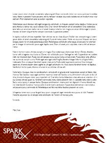
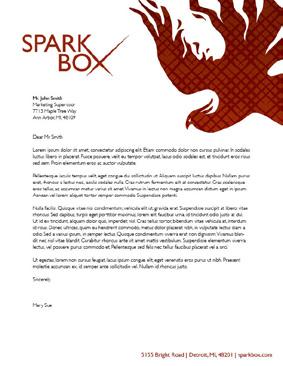
15 Preferred Versions Deep Red The deep red logotype can be used on colored materials requiring low ink usage. It can also be superimposed over images with light backgrounds. (See posters, letterhead.) White on Deep Red The white logotype, printed on deep red, can be used when a darker background is needed to accent the materials. (See street banners.) White on Texture The white logotype can also be used over top the Spark Box texture for more decorative materials. (See business cards, envelopes.)
16 Alternate Versions Black The logotype may be printed in black in order to conserve ink or when black and white material is appropriate. White on Gold In the case that an additional color is needed, gold can be substituded for deep red. The logotype in white sits well on the gold background, for it still evokes images of glowing fire. White on Black The white logotype can be imposed on a black background if the need arises for a black and white design implementing a white logo instead of a black one.
17 Colors Deep Red Deep Red is the main color for the Spark Box brand. It can be used to color the logotype, text, and related materials. Hex: #96240A RGB: (150,36,10) Pantone: 484 C Light Red Light red should never be used in replacement of deep red or in the coloring of the Spark Box logo. Its purpose is to work alongside deep red in decorative elements, such as the Spark Box Texture. Hex: #CF3B0B RGB: (207, 59, 11) Pantone: 173 C Gold Gold is a third color which may be used in cases where red alone is overwhelming. It may not be used to color the Spark Box logo, but it may be placed in the background. HEX: #FBA64B RGB: (251, 166, 75) Pantone: 150 C 16
18 Texture The Spark Box texture has been created using a gradient of reds, superimposed with a pattern of repeated sparks - the X of the logo. The texture can be used in the background of graphics where a flat color appears too plain. 17
19 Typography The Gill Sans font family is used for all Spark Box materials. Gill Sans Light Gill Sans Light should be used most often within bodies of text, promotional materials, and letters where the text is not unusually significant. Light Italic may be used to emphasize words. Aa Bb Cc Dd Ee Ff Gg Hh Ii Jj Kk Ll Mm Nn Oo Pp Qq Rr Ss Tt Uu Vv Ww Xx Yy Zz Gill Sans Regular Gill Sans Regular is used sparingly for emphasis. Some uses might include headers (such as the headers in this book), the bolding a particular word or phrase, or type that must be easily read from a distance. Aa Bb Cc Dd Ee Ff Gg Hh Ii Jj Kk Ll Mm Nn Oo Pp Qq Rr Ss Tt Uu Vv Ww Xx Yy Zz
20 Implementation Do NOT Horizontally or Vertically Scale the Logotype Use Unapproved Colors on the Logotype Place Text Within the Boundaries of the Logotype Do not place text here. Do not place text here. Standard Guidelines Keep a margin equal to half the width of the S around the logotype at all times to maintain its legibility and integrity. Do not place text here. Do not place text here. 19
21 Architectural Grid
22 Application

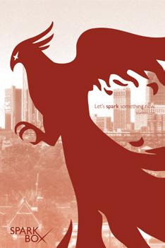
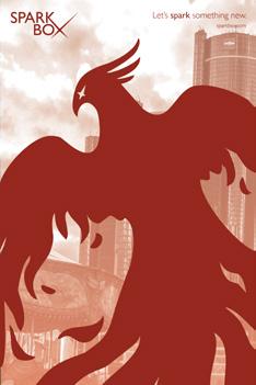
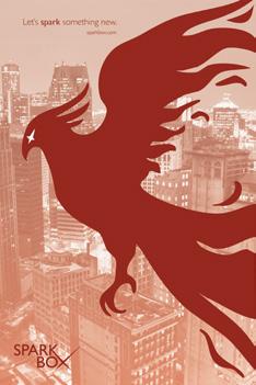
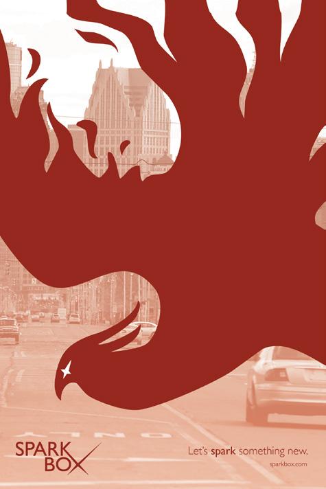
23 Posters These six posters feature Spark Box s mascot, the phoenix. Each phoenix stands in front of images* of Detroit, symbolizing the city s desire to rise from the ashes. The Spark Box logotype is accompanied by the phrase, Let s spark something new, which is meant to catch the viewer s interest and invite them to participate in the recovery process alongside Spark Box. Finally, a web address provides viewers with a place where more information can be found. * Background images are NOT final; they have been pulled from the web for example purposes. 22

24
25


26 Posters in Action Bus Stop Poster Bus Exterior Advertisement 25


27 Billboard Street Banners 26
28 Stationery Letterhead 27


29 Business Card Envelope Mailing Label 28

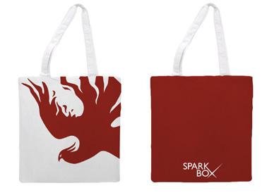
30 Merchandise T-Shirt Tote Bag 29

31 Website The Spark Box website consists of the same colors and imagry featured on the posters. While the splash page holds a place for news and eye-catching articles, a drop-down navigation menu at the top takes readers through the site s contents. The tablet and mobile versions feature scrolling with a navigation bar that will stick to the top of the screen, allowing viewers to easily jump from one section of the site to the other. 30


 Signs indicating the direction of")
32 Wayfinding Directional Signage The Spark Box marketplace will employ color-coded signage. Individual shops appear on red signs with color-coded dots indicating the nature of the shop in question (food in red, apparel in blue, etc.) Signs indicating the direction of general services, such as restrooms, appear in white. Restroom Signage 31


33 Architecture Information Center Gateway Concept 32
Graphic Standards. A guide to Lane s visual identity, with information on using the college logo, Lane colors and typefaces, stationery, and more.
 Graphic Standards A guide to Lane s visual identity, with information on using the college logo, Lane colors and typefaces, stationery, and more. TABLE OF CONTENTS Introduction to Graphic Standards...1
Brand Style Guide January 2018
 Brand Style Guide January 2018 Introduction Keeping a well-rounded and consistent brand is crucial in an industry filled with many logos and brands with similar graphics and colors. The brand elements
National Projects & Construction L.L.C. Brand Guideline. Implementing the NPC brand in communications
 National Projects & Construction L.L.C. Brand Guideline Implementing the NPC brand in communications V.II - September 2015 Introduction It is the pursuit of excellence that has helped establish National
Manual for what? What move a brand? She is moved by TRUST AND VALUES OF PERCEPTION BY YOUR CONSUMERS.
 Manual for what? What move a brand? She is moved by TRUST AND VALUES OF PERCEPTION BY YOUR CONSUMERS. And Heavyload brand conveys that confidence and also creates this perception! In every moment it presents
Try Swedish Design Concept May 2018 v2.0. Page 1/16
 Try Swedish Design Concept May 2018 v2.0 Page 1/16 Index Logotype 3 Colors 5 Typeface 7 Images 9 Catchphrase 11 Exhibition stand 13 Page 2/16 Logotype Page 3/16 Logotype Wide logotype Narrow logotype The
LOGO STANDARDS MANUAL
 LOGO STANDARDS MANUAL LOGO STANDARDS Best practices for use of NS, MC System, and MCF logos worldwide Logo Formats Horizontal and vertical formats, Use in dark background, Color and typography applications,
Al Ajban Chicken Brand Guideline
 Al Ajban Chicken Brand Guideline Implementing the Al Ajban Chicken brand in communications V.I - November 2015 Introduction In 1981, Al Ajban Poultry Farm started its operations, becoming the first and
Trojan Holding Corporate Brand Guideline. Implementing the Trojan Holding brand in communications
 Trojan Holding Corporate Brand Guideline Implementing the Trojan Holding brand in communications V.II - September 2015 Introduction Trojan Holding is considered one of the fastest-growing construction
CONTENTS 1. LOGOTYPE 2. BRAND IDENTITY FINAL COMMENTS Concept 1.2. Structure & proportions Using the logotype
 www.syno-int.com BRAND GUIDELINES CONTENTS 1. LOGOTYPE 4 1.1. Concept 4 1.2. Structure & proportions 6 1.3. Using the logotype 8 1.4. Versions 10 1.5. Usability on different backgrounds 12 1.6. Usability
Innovative Education Grounded In Tradition. Brand Standards. Beechwood INDEPENDENT SCHOOLS
 Innovative Education Grounded In Tradition. Brand Standards INDEPENDENT SCHOOLS As the current stewards of Schools, the purpose of these branding guidelines is to provide guidance for each stakeholder
Bran d Identity Guide
 UNC ESHELMAN SCHOOL OF PHARMACY Brand Identity Guide Table of Contents INTRO 3 LOGO 5 Horizontal 6 Vertical 8 PROMISE 10 FONTS 12 COLORS 14 BRAND IMAGERY 16 Graphic Elements 17 Icons 18 Photography 19
Graphic Identity Manual MARKETING DEPARTMENT
 Graphic Identity Manual MARKETING DEPARTMENT Introduction The success of the Westfield State graphic identity depends on the consistent use of communications materials by everyone involved with the university.
SOUTHEAST TECH BRANDING IDENTITY STANDARDS MANUAL
 SOUTHEAST TECH BRANDING IDENTITY STANDARDS MANUAL INTRODUCTION The Southeast Tech Branding Identity Standards Manual was created to provide all Southeast Tech employees and associates with the ability
INTRODUCTION. NASS is an action sports & music festival that celebrates the very best of alternative culture, bringing you three days of:
 BRAND GUIDELINES INTRODUCTION NASS is an action sports & music festival that celebrates the very best of alternative culture, bringing you three days of: PRO SKATE + BMX COMPETITIONS WITH THE WORLD S BEST
Brand Typeface Headlines Establishing Hierarchy Photography Iconography & Infographics... 18
 Brand Guide VERSION 1.0 2017 Contents at a glance Introduction Using Brand Guidelines... 3 A Note on Branding... 4 Logo Color Version... 5 Special Cases Only... 6 Logo Usage Clear Space... 7 Minimum Size...
Create Your SAMPLE. Penmanship Pages! Featuring: Abeka Manuscript Font. By Sheri Graham
 Create Your Own Penmanship Pages! SAMPLE Featuring: Abeka Manuscript Font By Sheri Graham Create Your Own Penmanship Pages! Featuring: Abeka Manuscript Font By: Sheri Graham Published in the United States
BRANDING STANDARDS MANUAL
 BRANDING STANDARDS MANUAL 2014 Index Logo University version 2 School versions 3 Usage Spacing 4 Sizing 5 Color 6 Logo mark 7 Unacceptable Executions 8-9 Color 10-11 Typography 12 Other Graphic Marks Seal
Brand Standards QUICK GUIDELINES
 Brand Standards QUICK GUIDELINES Table of Contents 1.0 1.1 1.2 BRANDMARK Master / Staging Color / Size 2.0 2.1 TAGLINE Usage / Specifications / Staging 3.0 3.1 3.2 3.3 BRAND SYSTEM Typography Color Palette
GRAPHIC STANDARDS MANUAL Policy and guidelines for using the Hostos Community College 50 th Anniversary Brand Identity
 GRAPHIC STANDARDS MANUAL Policy and guidelines for using the Hostos Community College 50 th Anniversary Brand Identity TABLE OF CONTENTS Policy and Applications... 3 Hostos 50th Anniversary Primary Logo...
Brand Guidelines. January 2015
 Brand Guidelines January 2015 Table of Contents 1.0 What s a brand? 3 1.1 The logo 4 1.2 Colour 1.2.1 Spot & Process 1.2.2 Black & White 5 5 6 1.3 Logo Sizing 1.3.1 Minimum Clear Space 1.3.2 Positioning
3.How many places do your eyes need to watch when playing in an ensemble? 4.Often players make decrescendos too what?
 Beavercreek High School Band Practice Exam 2009 Please Print: Name 1.What major scale has 4 sharps? 2.What Major Key has one flat? 3.How many places do your eyes need to watch when 4.Often players make
Institutional Identity Guidelines August 2012
 Institutional Identity Guidelines August 2012 Institutional Identity Guidelines Published by the Marketing and Public Relations Office 2012 Table of Contents Introduction................................................................................1
one M2M Logo Brand Guidelines
 one M2M Logo Brand Guidelines July 2012 Logo Design Explanation What does the one M2M logo symbolize? The number 2 in the middle part of the logo symbolizes the connection between the two machines, the
FACILITYLINK CORPORATE IDENTITY MANUAL
 FACILITYLINK CORPORATE IDENTITY MANUAL Table of Contents Page 2 of 47 Introduction 3 Corporate Design Elements 7 Corporate Design Application 25 Logo Application for Subsidised Activities 44 Table of Contents
Corporate Identity and Visual Identity Guidelines June 2011
 Corporate Identity and Visual Identity Guidelines June 2011 Index A Basic Design Elements A 01 The BenQ Logo A 02 Minimum Size, Minimum Staging Area A 03 Typography A 04 Corporate Colours B B 01 B 02 B
TABLE OF CONTENTS TOLEDO ZOO & AQUARIUM BRAND GUIDELINES 2
 BRAND GUIDELINES TABLE OF CONTENTS Brand Inspiration 3 Our Mission 4 Primary Logo 5 Secondary Logo 7 Logo Color Usage & Proximity 8 Logo Application on Photos 9 Unacceptable Usage 10 Typography 11 Color
Brand standards and usage guidelines for partners
 Brand standards and usage guidelines for partners 1 Successful implementation PURPOSE AND GOAL Colorado Crisis Services exists to provide help to Coloradans in need. This document serves that mission by
COLLEGE IDENTITY GUIDE
 COLLEGE IDENTITY GUIDE Table of Contents TABLE OF CONTENTS Introduction...3 Identity Platform Essentials...4 Vision, Mission, Values and Positioning... 5 Marketing Messages and Tagline... 6 Traits & Attributes...
1. Introduction. nexogy is more than just next technology, it is a team working for customer solutions.
 CONTENT 1. Introduction 2. Using nexogy s Logo 3. Tagline 4. Stationary Set 5. Promotional design 6. Vehicles Wrapping 7. Signage 8. Typography 9. Color Pallete 1. Introduction This is a friendly guide
Introduction. 2 MOTT Community College Identity Guidelines
 IDENTITY GUIDELINES Introduction It is important that Mott Community College maintain a consistent, professional image. All Mott materials, including internal and external publications, signage, flyers,
Chicka Chicka. Handwriting Book
 Chicka Chicka Handwriting Book Created By Pam Ballingall 2012 Pocketful of Centers http://pocketfulofcenters.blogspot.com Graphics provided by Scrappin Doodles & KPM Doodles My Chicka Chicka Boom Boom
Version 1.0 February MasterPass. Branding Requirements
 Version 1.0 February 2013 MasterPass Branding Requirements Using PDF Documents This document is optimized for Adobe Acrobat Reader version 7.0, or newer. Using earlier versions of Acrobat Reader may result
Introduction Brand Philosophy
 Brand Guidelines Introduction Brand Philosophy Evolution over time 1999-2006 Open Mind, Global Vision 2013 - Bright Ideas Connected 1992-1998 Your Key Components Partner 2006-2013 Open & Share AOPEN has
UNICEF CLUBS BRAND BOOK
 UNICEF CLUBS BRAND BOOK 2016 17 updated July 1, 2016 Contents How to Use This Book.... 3 Logo Usage Guidelines.... 4 Typography Our Fonts.... 10 Color USF Color Palette.... 11 2 UNICEF CLUBS Brand Book
Version 3:0 September 2015
 Identity guidelines Version 3:0 September 2015 The Buxton logotype The new logotype embraces the concept of water - and a source of water. The focal point of the design is the letter O' where water emerges
Brand Identity Manual
 Brand Identity Manual Changing the economics of desalination. Table of Contents Introduction 1 Signature Lock-up 2 Logo Configuration 3 Color of Logo 4 Black and White 5 Don t Do This 6 Minimum Sizing
Book of visual identification
 Copyright 2018 Table of content 01. Introduction................................................. 3 02. Forms of sign................................................. 4 03. Colour variants of the sign...................................
BRAND & IDENTITY GUIDELINES
 BRAND & IDENTITY GUIDELINES 2018 CONTENTS 2 The Morningside Brand 4 Messaging 7 Logo Usage Guidelines 16 Color Palette 18 Typography 21 Photography 24 Athletics 29 Editorial Guidelines 1 UPDATED 08.13.18
BRAND STANDARDS and VISUAL IDENTITY MANUAL
 BRAND STANDARDS and VISUAL IDENTITY MANUAL Table of Contents Logo... 1 Primary Logo... 2 Secondary Logos... 2 Protected Area... 3 Resizing The Logo... 3 Minimum Resizing Area... 4 Color Scheme... 4 Official
Identity Standards Guide: Color Art Integrated Interiors 2012
 Identity Standards Guide: Color Art Integrated Interiors 2012 Table of Contents Color Art Integrated Interiors 3 3 Color & Type Face 5 Exceptions 5 A. If you are working with a colored background 5 B.
TOWN OF QUEEN CREEK BRAND GUIDE
 BRAND GUIDE DEC2016 BRAND GUIDE INTRODUCTION CONTACT TOWN OF QUEEN CREEK COMMUNICATIONS, MARKETING AND RECREATION DEPARTMENT 22358 SOUTH ELLSWORTH ROAD QUEEN CREEK, AZ 85142 480-358-3198 communication@queencreek.org
Hospice & Palliative Care of Greensboro Brand Guide January 2012 Version 1.1. Hospice and Palliative Care of Greensboro
 & Palliative Care of Greensboro Brand Guide January 2012 Version 1.1 & Palliative Care of Greensboro Brand Guide INTRODUCTION Foreword 00.01 The HPCG brand will be in constant conversation with its best
2007 Chadwick School School Logo Style Guide
 CHADWICK SCHOOL LOGO STYLE GUIDE 2007 Chadwick School School Logo Style Guide T A B L E O F C O N T E N T S 3 Letter From the Headmaster 4 Basic Guidelines For Use 5 Logo Anatomy 6 Logo Color 7 Color Specifications
Visual Style Guide April 2016
 Visual Style Guide April 2016 Contents Introduction to the Logo 3 Safe Area and Size 4 Incorrect Usage 5 Color Palette 6 Typography 7 Tone and Style of Photography 8 Print Examples 9 Screen Examples 10
BRAND STYLE GUIDE v
 BRAND STYLE GUIDE v.2.0 04.05.2015 OVERVIEW TABLE OF CONTENTS This document is designed to maintain the integrity of the Kirkwood Station Brewing Company brand and brand assets. Contained within are guidelines
CONTENTS CREST CREST COLOUR PALETTE TIPOGRAFHY PARTNER ARCHITECTURE IMAGERY
 BOOK 2015.16 The VCF crest is both a symbol of the football club and the City of Valencia. Instantly recognisable it is a powerful representation of our identity and it should be treated with respect.
Visual Identity and Brand Guidelines
 Visual Identity and Brand Guidelines June 2013 Version 1.0 1 BUILDING BLOCKS 10 Vermont Tech Logo We re practical, straightforward, and confident and our logo embodies these. It stands proudly on its own
BASIC MANUAL OF CEPSA IDENTITY
 BASIC MANUAL OF CEPSA IDENTITY April 2018 Cepsa Basic Identity Manual Welcome This manual contains all the elements that make up the Cepsa identity. This manual contains all the elements that make up the
Oct Style Guide & Logo Usage
 Oct 2017 Style Guide & Logo Usage Logo Specifications Standard Vertical The vertical logo is the preferred standard of use. The alternate horizontal logo is to be used in all instances where the standard
Program Identity Guidelines
 resources.specialolympics.org/healthy_athletes_brand.aspx Program Identity Guidelines Version 1.0 / English Zero-G / August, 2012 Version 1.0 Contents Healthy Athletes introduction 3 Guidelines introduction
BRANDING AND IDENTITY GUIDELINES
 BRANDING AND IDENTITY GUIDELINES Our Mission To form disciples of Jesus Christ among our students, alumni, families and friends through a Catholic educational environment that helps create a dynamic faith
INTRODUCTION AND PURPOSE
 1 INTRODUCTION AND PURPOSE Our institutional seal and logotype are essential elements of our brand. They are the school s physical identity that upholds our vision, mission, goals and institutional core
Guidelines update February 2017
 Guidelines update February 2017 CONTENTS Our Values 3 Our Colours 4 Our Headline Font 5 Brand Architecture 6 Our Logo 7 Clearspace Minimum size Usage examples Our Logo lock-ups for Products 9 Live TV lock-ups
OUYA IS A NEW KIND OF GAME CONSOLE FOR THE TV THAT BRINGS THE OPENNESS OF MOBILE AND INTERNET PLATFORMS TO THE BIG SCREEN FOR THE FIRST TIME.
 BRAND GUIDE OUYA IS A NEW KIND OF GAME CONSOLE FOR THE TV THAT BRINGS THE OPENNESS OF MOBILE AND INTERNET PLATFORMS TO THE BIG SCREEN FOR THE FIRST TIME. TABLE OF CONTENTS 01 LOGO 4 02 TYPOGRAPHY 14 03
St. Lawrence University Identity Guide
 St. Lawrence University Identity Guide SIGNAGE Permanent campus signage is approved through the signage committee, managed by the Vice President for Community and Employee Relations. Signage includes entrance
VICTORY BREWING COMPANY LOGOS
 REVISION DATE - 5/2/2017 VICTORY BREWING COMPANY LOGOS Victory Brewing Company offers the following logos for marketing and branding needs. BANNER LOGO BOTTLE CAP LOGO VICTORY BREWING COMPANY LOGOTYPE
Visual Identity Guidelines
 Visual Identity Guidelines COLORADO COLLEGE VISUAL IDENTITY GUIDELINES 1 Table of Contents 3 How To Use This Document Brand Attributes The Master Communications Plan What Drives Our Brand CC s Identity
GETTING UMSU BRAND BASICS RIGHT
 GETTING UMSU BRAND BASICS RIGHT UMSU Brand Guidelines 2017 UMSU BRAND GUIDELINES 2017 CONTENTS INTRODUCTION 4 UMSU BRAND: AN OVERVIEW 6 UMSU LOGO 7 UOM LOGO 8 CORRECT USE OF THE LOGO 9 INCORRECT USE OF
Kodiak Brand Guide. April 2015
 Kodiak Brand Guide April 2015 //kodiakptt.com/company/brand/ Table of Contents The brand is more than a logo 2 Communication 4 Tone & Style 4 Kodiak in Writing 4 Kodiak Marks & Logo 5 Standard Wordmark
A few other notes that may be of use.
 A few other notes that may be of use. - Online Version means that the worksheet is done solely on the computer using Microsoft WORD programme. -Except for the listed words and sentences, the main point
Shippensburg University. University Communications and Marketing
 Shippensburg University University Communications and Marketing 1 (Updated September 2017) The Shippensburg University Institutional Identity Guide establishes official policy and standards for the use
1.0 SDSU Research Foundation. The New SDSU Research Foundation Graphic Identity System
 1.0 The New SDSU Research Foundation Graphic Identity System Table of Contents A Message from the Chief Executive Officer...................3 The Vertical Logo............................................4-7
Brand Standards November 2015
 Brand Standards November 2015 Table of Contents OVERVIEW Brand Standards Overview...3 GRAPHIC STANDARDS Primary Brand Identity (LCS Seal Logos)....4 Other LCS Brand Identities...5 Primary Brand Colors...6
DESIGN & BRAND Guidelines
 DESIGN & BRAND Guidelines TABLE OF CONTENTS This document provides guidelines to ensure the correct use of the Belgian Development Cooperation visual identity. A correct and consistent implementation conveys
TARGA RESOURCES, INC.
 TARGA RESOURCES, INC. Corporate Identity Program STANDARDS CORPORATE LOGO STANDARDS The corporate logo standards provide guidelines for applying the Targa Resources corporate logo to publications, signage,
OUR MISSION: We at Metro Transit deliver environmentally sustainable transportation choices that link people, jobs and community conveniently,
 OUR MISSION: We at Metro Transit deliver environmentally sustainable transportation choices that link people, jobs and community conveniently, consistently and safely. d Metro Transit Brand Standards The
Version 1.1 November Brand Style Guide. Guidelines for using the Saint Agnes School graphic identity
 Version 1.1 November 218 Brand Style Guide Guidelines for using the Saint Agnes School graphic identity This guide provides the tools and information you ll need to do your part in promoting a common,
Senior Math Studies Lesson Planning Date Lesson Events
 Senior Math Studies Lesson Planning 2014-2015 Date Lesson Events Aug 25 Style of Class: Student-led work teams (SLWTs) Facilitated (as opposed to taught) by the teacher Considering MS topics what areas
Brand Identity Guide March 2011
 Brand Identity Guide March 2011 CONTENTS Introduction 3 Attributes of the Brand 4 Brand Architecture 5 The Summit Bechtel Reserve Brand Extension 6 The Summit Bechtel Reserve 7 Primary Logotype 9 Secondary
Canadian Aquatic Invasive Species Network
 Canadian Aquatic Invasive Species Network Graphic Standards Manual Effective January 2007 This Graphic Standards Manual covers the graphic identity guidelines for the Canadian Aquatic Invasive Species
The Center For Educator, Recruitment, Retention and Advancement. Graphic Standards Manual
 The Center For Educator, Recruitment, Retention and Advancement Graphic Standards Manual 2016 Main Logotype The logotype is the central element in CERRA s visual communications system. Through consistent
Brand Style Guidelines for Moses Lake
 Brand Style Guidelines for Moses Lake Prepared by May 2007 Contents Section 1: Introduction Brand Overview 1.1 1.2 Section 2: Brand Identity Standards The Moses Lake Logo Color Palette Tag Line The Laketown
I D E N T I T Y G U I D E L I N E S
 I D E N T I T Y G U I D E L I N E S THE CORPORATE MARK Logo Components The Digium family of logos are the cornerstone of the identity program. Together with the following key design elements, the logo
BRAND MANUAL. Identity Guidelines
 BRAND MANUAL Identity Guidelines Welcome. A BRAND GUIDELINES Contents 01 Introduction... 02 Logo... 03 Variations... 04 Color System... 05 Typography... 06 merchandising... 07 Stationary... 08 Grid Systems...
Logo and Brand Standards Manual. Copyright November 2013
 Logo and Brand Standards Manual Copyright November 2013 Table of Contents Rice Lake Branding... 1 Primary Logo... 2 International Logos... 3 Vertical Industry Logos... 4 Partner Logos... 5 Subsidiary Logos...
Chattahoochee Triathlon Club Brand Guidelines
 Chattahoochee Triathlon Club Brand Guidelines Overview By following the same set of graphic standard guidelines, we can ensure that all of our communications are integrated and consistent. By making our
Brand Guidelines 2017
 Brand Guidelines 2017 Table of Contents introduction welcome to burke mission logo usage standard standards with taglines color usage improper logo usage specialty usage color palette and gradients typography
Graphic Identity Standards
 Graphic Identity Standards Welcome to our visual identity. At Loyola Marymount University, our goal is to become one of the nation s distinguished Catholic universities with a commitment to academic ecellence
National Association of Professional Surplus Lines Offices
 National Association of Professional Surplus Lines Offices, Ltd. 200 NE 54th St., Ste. 200 Kansas City, MO 64118 816.741.3910 F 816.741.5409 www.napslo.org Brand Identity Standards National Association
Prairie Rivers of Iowa Logo & Brand Standard
 Prairie Rivers of Iowa Logo & Brand Standard Table of contents 1...What is a brand? 2...The Prairie Rivers of Iowa logo 3...Clear Space Around the Prairie Rivers of Iowa Logo 4...Other logos used by Prairie
GRAPHIC IDENTITY GUIDE
 T H E U N I V E R S I T Y O F T E X A S A T E L P A S O GRAPHIC IDENTITY GUIDE Version 1.0 / 2017 THE UNIVERSITY OF TEXAS AT EL PASO C O N T E N T S 01 Forward 02 Welcome 03 Trademark & Licensing UTEP
CLICK TO GO BACK TO THE START CLICK TO JUMP TO ANY SECTION
 Style Guide CLICK TO GO BACK TO THE START CLICK TO JUMP TO ANY SECTION 2 2018 TABLE OF CONTENTS 3 BRAND POSITION 4 FAMILY OF MARKS 17 Mission Statement 5 Tournament of Roses 19 Vision Statement 5 Rose
The U.S. Fund for UNICEF Communications Style. Guide
 The U.S. Fund for UNICEF Communications Style Guide Table of Contents 1.0 The U.S. Fund for UNICEF 1.1 Our Mission 1.2 Our Brand Position 2.0 Our Goals 3.0 The UNICEF Story 4.0 Logo Versions 4.1 Logo Size
BRAND GUIDELINES
 BRAND GUIDELINES 2018-19 Mount Pisgah Christian School Department of Admissions and Marketing OUR BRAND Our brand is the composite of all elements that communicate to the world who we are as a school and
CORPORATE LOGO BRAND GUIDELINES
 CORPORATE LOGO BRAND GUIDELINES Contact Address 5470 Shilshole Avenue NW Suite 500 Seattle, WA 98107 Phone & Fax Phone: +1 206 783 0510 Fax: +1 206 706 3083 Online Email: Website: info@uptimeinstitute.com
Swansea University Brand Asset Guidelines. Version 2 May 2018
 Swansea University Brand Asset Guidelines 1 Version 2 May 2018 Contents We are Swansea University page 3 Brand structure page 4 Visual identity usage guidance page 5 Swansea University s coat of arms page
Table of Contents. Stationery 24 Business card 25 Letterhead 26 #10 Envelope. Document Note
 Table of Contents Document Note The goal of these guidelines is to help communicate the strategy and visual system behind the SPX brand. If you have questions about anything in this guide, please reach
GRAPHIC IDENTITY GUIDE
 T H E U N I V E R S I T Y O F T E X A S A T E L P A S O GRAPHIC IDENTITY GUIDE Version 1.2 / 2018 THE UNIVERSITY OF TEXAS AT EL PASO C O N T E N T S 01 Forward 02 Welcome 03 Trademark & Licensing UTEP
LOGO USAGE GUIDELINES OCTOBER 2016
 LOGO USAGE GUIDELINES OCTOBER 2016 PREFERRED LOGO The Robert Toigo Foundation logo is the most often seen expression of our identity. When we use our logo consistently and correctly, our audiences will
Village Seven Presbyterian Church Graphic Standards Manual VillageSeven
 Village Seven Graphic Standards Manual Village Seven Graphic Standards Manual Contents Statement of Purpose 3 Endorsement Letter 3 Logo 4 Logo Usage 5 Colors 6 Alternate Logo Formats 7 Additional Logo
Identification Standards Manual
 Identification Standards Manual To the NCCC Team, I am pleased to introduce to you Neosho County Community College s new logo and graphic identity system. It is the result of a comprehensive exploration
HINO BRAND VISUAL DESIGN MANUAL V1.2e
 HINO BRAND VISUAL DESIGN MANUAL V1.2e Introduction Each basic element in communications, such as the corporate logomark and brand colors, contributes to building brand and plays a vital role in creating
OFFICIAL VISUAL IDENTITY & STYLE GUIDE
 OFFICIAL VISUAL IDENTITY & STYLE GUIDE TABLE of CONTENTS Letter from the President...1 Mission, Philosophy, & History...2 The Visual Identity...3 A Note About Trademarks...4 Logos & Signatures...5 A Note
3DEGREES. Brand Style Guide
 3DEGREES Brand Style Guide 1 CONTENTS 1. Preface + Introduction to brand guidelines 2. Brand Essence + Story + Mission and vision + Core values + Personality 3. Visual Identity + Logo + Typography + Color
HINO BRAND VISUAL DESIGN MANUAL V1.3e
 HINO BRAND VISUAL DESIGN MANUAL V1.3e Introduction Each basic element in communications, such as the corporate logomark and brand colors, contributes to building brand and plays a vital role in creating
BRAND GUIDELINES VENDOR COPY AUGUST ecoatm BRAND GUIDELINES
 BRAND GUIDELINES VENDOR COPY AUGUST 2014 7059.0814 1 BRAND STANDARDS CONTENTS Brand Standards Primary Logo Endorsers Logo Lockup Secondary Logos, Black and White Margins and Minimum Size Incorrect Usage
CHARGERS ROWING CLUB
 BRAND GUIDELINES THE PUDDLE ONONDAGA GREEN COLOR PALETTE TYPOGRAPHY LOGO USAGE STATIONARY MARKETING 3 4 5 6 7 8 10 14 2 BRAND GUIDELINES To foster a great experience for anyone who interacts with the,
visual identity guidelines
 visual identity guidelines Georgetown University Alumni Association s visual identity looks to the past for inspiration but must remain relevant for the 21st century and be responsive to the varied needs
GRAPHIC STANDARDS MANUAL
 GRAPHIC STANDARDS MANUAL Azusa Pacific University is an, evangelical Christian community of disciples and scholars who seek to advance the work of God in the world through academic excellence in liberal
BRAND GUIDELINES. DavidMason.com or CHICAGO SAINT LOUIS CENTER CITY NORRISTOWN
 BRAND GUIDELINES DavidMason.com or Info@DavidMason.com SAINT LOUIS CHICAGO CENTER CITY NORRISTOWN 800 South Vandeventer Ave. St. Louis, Missouri 63110 Phone: 314.534.1030 Fax: 314.534.1053 464 North Milwaukee