Wolfgang Weingart s typographic landscape
|
|
|
- Helen Hill
- 6 years ago
- Views:
Transcription
1 Wolfgang Weingart s typographic landscape Keith Tam 1 (This article was originally published in Polish in 2+3D magazine, issue i-2003, Nr 6. Permission for the use of the images were granted by Wolfgang Weingart.) He started it all. It was he who ignited the spark of typographic anarchy that exploded on the verge of the nineteen nineties. It was he who fathered what was subsequently dubbed Swiss Punk, New Wave or whatever you care to call it perhaps even post-modernism. His name is Wolfgang Weingart. Weingart was born in the midst of the World War II in Germany. Most famous for his experimental, expressive work that broke the mould of classical Swiss typography, Weingart began his typographic career in the early sixties as an apprentice of hand composition at a typesetting firm. He then decided to further his studies at the Basel School of Design in Switzerland, the cradle of classical Swiss typography. Following his rather unsuccessful attempt at completing his course, Armin Hoffmann, who was then the head of the Basel School, invited him to teach there, by the sheer admiration of his work. He has been teaching there ever since and had made extraordinary impact on the contemporary typographic landscape. What exactly is Swiss typography? Swiss typography was founded upon the teachings of the Bauhaus in Germany soon after World War II and became a rational approach to typography. The use of grid systems was the key to the logical disposition of type and images on the page, along with sanserif typefaces for clear, functional communication. Figures such as Armin Hoffmann and Emil Ruder were the major proponents of Swiss typography, who were teachers at the Basel School of Design at the time. They believed that typography should be unobtrusive and transparent, in order to clearly communicate its textual content. By the beginning of the sixties, the language of Swiss typography had already gained reputation the world over. Swiss typography became synonymous with corporate design for multinationals, and subsequently referred to as the international typographic style. At this point, our dear Mr Weingart barges in, hurriedly corrects my one-sided viewpoint of Swiss typography: not only one conception of typography exists in Switzerland. He would proudly acknowledge that his experimental typography is also Swiss, because it was a natural progression from the classical Swiss typography as we know it. To call what he did and still does as deconstructive would be too simplistic a comment. His typographic experiments were strongly grounded, and were based on an intimate understanding of the semantic, syntactic and pragmatic functions of typography. Whereas traditional Swiss typography mainly focused on the syntactic function, Weingart was interested in how far the graphic qualities of typography can be pushed and still retain its meaning. This is when the semantic function of typography comes in: Weingart believes that certain graphic modifications of type can in fact intensify meaning. What s the use of being legible, when nothing inspires you to take notice of it? How true. Weingart s work is characterized by his painterly application of graphical and typographical elements. The emotionally-charged lines, the potent, image-like qualities of his type, the almost cinematic impact of his layouts, all speak of his great passion of creating with graphical forms. His typographic layouts are compelling yet lucid, free yet controlled. Some of his personal work is almost akin to landscape paintings, only that his paintbrush is replaced by type, rules and screens. He doesn t seem to perceive a divide between fine art and typography. His inspirations were mainly drawn from the processes of typesetting and reproduction, where he finds great pleasure in discovering their characteristics and pushing them to their limits. Since the first day when he arrived at Basel as a student, it was clear that Weingart was a rebel. In a class he had with Armin Hoffmann, the students were asked to work on a line composition using ruling pens. Instead of drawing the lines as he was told, he went over to the type shop and made a contraption that he could use to print lines. Weingart s ingenuity is simply impressive: he took a plank of wood, screwed L-shaped hooks on it in a grid format, then turned them at 0, 45 and 90 degree angles to form compositions, inked it and printed it on a letterpress. He screwed the hooks into the wood at different levels so some received ink at type-high and some did not. Perhaps rebel is too harsh of a description he was simply inquisitive. There is no doubt that Weingart bent the rule of classical Swiss typography both literally and figuratively. When he was an apprentice at a letterpress workshop, he was pondering about why the brass rules that were used to print tabular matter always had to be straight and at 90-degree angles to each other. He created highly abstract letterpress prints with rules shaped into elegant curves, almost resem-
2 2 bling rolling hills in a beautiful countryside. Weingart works with a very limited palette of typefaces. He suggests that four typefaces are enough to address all typographic problems. One of these typefaces would certainly be Akzidenz Grotesk, an early sanserif of the grotesque genre designed by the Berthold Foundry in Germany at the close of the 19th century. I grew up with Akzidenz Grotesk and I love it. Akzidenz Grotesk has a certain ugliness to it, that s why it has character. He feels that Univers, which is Emil Ruder s favorite, is too slick and cosmetic for his taste. The simplicity of his choice of typefaces speaks of his fondness of simple tools. Weingart s fascination with everything mechanical started at an early age. When he was a young boy, he once completely disassembled his bicycle and put it back together again. In his typographic work, Weingart has been equally fascinated by the technology and mechanical reproduction processes. For me, typography is a triangular relationship between design idea, typographic elements, and printing technique, writes Weingart. The possibilities that these technologies offer seem endless to him, and he finds it hugely satisfying to explore the materials: The thing that is so special for me is the variability of the materials under the influence of idea and technique. Technological progression eventually led Weingart to experiment with photographic reproduction processes. Not satisfied with the rather limited range of sizes that metal type offered, Weingart began to explore the possibilities of the repro camera. He found that with the repro camera, a more fluid range of type sizes was possible. Working alongside Emil Ruder s class at Basel, Weingart was able to continue pursuing his letter M series of typographic studies that he had begun when he was working part time at a typesetting firm. He printed a few letter Ms by letterpress, pasted them down on a cube, and photographed them from different perspectives. This unique process yielded dramatic black and white letterforms in perspective and formed the basis of many engaging abstract compositions. In the midst of his emotionally satisfying work one will also occasionally encounter work in his repertoire that is undeniably Swiss in its original flavor calm, rational and clear. That s my schizophrenic personality, says Weingart. As much as he tries to be expressive with type, he feels that there are times when the clients wishes and the users needs are of a more urgent priority. Weingart simply knows when he has to put his ego aside and emphasize on solving particular design problems. It is the tension between his desire to express and his consideration for communication that creates this interesting mix of work and his perpetually inquisitive working ethos. How well was his progressive idea about typography received at that time? Weingart recalls, in my presentations in 1972, there was always a group of audience that hated it, one group that loved it, and the rest would all leave during the lecture. The people who were against his experimentations dismissed it as something that could never be adopted commercially. It wasn t until the early eighties, when his American students like April Greiman and Dan Friedman brought back to the US a wealth of typographic arsenals from Basel and co-opted it into the mainstream of graphic design. From April Greiman s hybrid imagery to David Carson s deconstructive page layouts, anarchy reigned supreme in the nineties. Those were the days for graphic design superstars, whose style many a graphic designer adored and imitated. While no one can give a definitive answer as to whether these American graphic designers took what Weingart did and brought it to new heights, they certainly managed to make it a huge commercial success. They were doing it as a style and it was never my idea to create fashion, denotes Weingart. The teaching at Basel for Weingart is not about trends but a stability that they try to move away from, but never totally. Weingart s typographic experimentations spanned across three different eras of typesetting technology: letterpress, phototypesetting and the computer. Yet, despite how readily he accepted and pushed the boundaries of the letterpress and phototypesetting processes, he is rather unenthusiastic about the computer technology. The computer, to him, is too illusive. He compares the computer to a digital watch: a traditional watch shows a landscape, it tells a story; a digital watch only shows a particular moment. That s why Weingart s students do not design on the computer they are asked to first work out their ideas by hand. Weingart wants his students to experience design as a tactile, hands-on experience. It is surprising that he was probably also the first person to introduce the Macintosh computer into the type shop in Switzerland. In 2000, Weingart published a substantial monologue simply titled My way to typography, a remarkable object of design in itself. If you haven t read it, I suggest that you do because it is just about as much as one can look into any design-
3 3 er s life, work and influences. The book doesn t just give you glimpses, but detailed accounts of his life and times, leaving no stones unturned. Every page of the book is a handmade cookie. He had spent five years to put this book together, and it contains much of his personal exploratory work that had not seen the light of day until now. Flipping through the book is almost a voyeuristic experience it is almost as if you were looking through one s personal sketchbook or diary. Sometimes I wish I was living in the Nineteenth Century, writes Weingart in one of the pages. Why? I m an old granny you know? I miss many things that I grew up with during and after the war that can never be found any more. These provocative statements are sprinkled throughout the book, intended as foods for thought for students to contemplate what it is that they are doing. This book is perhaps a token for his passion about teaching. Or perhaps it is an antidote for his rather grim view on the future of graphic design: graphic design is in a big crisis. The education in our school is not the best any more. The value of living has changed. The computer and electronic tools in general are destroying our natural needs. The natural needs, perhaps, is our need to create, to express. Let me leave you with these wonderful words from Weingart: what still surprises and inspires me today: to turn blank paper into a printed page. Nothing can be more reassuring than to read words like these from someone who has almost forty years of experience behind him. What more can you ask for in a career? Epilogue This article is the result of my personal encounter with Wolfgang Weingart at the Emily Carr Institute of Art & Design in March 2001, where I was a student at the time. We had an immensely enjoyable afternoon of discussions and an insightful lecture in the evening. His visit was certainly one of the main highlights of my days at design school. I also consulted several sources when writing this article, and corresponded with Weingart on a couple of occasions. I would like to extend my personal thanks to Mr Weingart here.
4 Q&A session with Wolfgang Weingart (full transcription) Emily Carr Institute, 7 March Keith Tam: You said in an interview you had with Communication Arts magazine that you wished you were living in the 15th century. What made you say that, and how does that affect your work? Wolfgang Weingart: That was only a sentence. I m an old granny you know. I don t have a cell phone, I don t have , I don t have a CD player, and my record player is fifty years old. I miss many things that I grew up with during and after the war that I can t find any more. The values are so different now. When I was young I had to respect even a piece of bread, not to throw it away. That s how I grew up. And you know what the world looks like today? It s very chaotic... So I came up with this rather provocative statement to make you think, is that guy nuts or what? But it seems like you are very well versed with new technology and so innovative with it. It s just interesting how you made that statement. That s my schizophrenic personality. This book that I made [Typography] was specifically made for you younger students who grew up in a world that is different. The statement that you ve just mentioned is something for you to think about. What does he really mean by that? It gives you perhaps a bridge to think, prompting you to do some research at the library, or contemplate what you read in history books. What was it like living in the 30s and 40s? What are the differences? It s totally normal that the world goes on. There s nothing bad about it. In the book there are little provocative sentences like that for you to think about. Another one would be: I need no more than four typefaces. What does it mean for you? It s a little thing for you to think about: Is this guy mental? With all those Emigre typefaces and everything that s around. Why does he need only a maximum of four typefaces? So this book gives you some hints to think about the values in the environment that we are living in. I see very distinct feelings between your more practical, informational-based work and your more experimental work. It seems that in your experimental work it s very emotional, very personal, while your informational work is very systemic, built on grids, and very Swiss. Is it possible to inject emotional elements in informational work? How do you feel about that? We have different faces. I don t believe in a person who is constantly the same. The way I react to one person might be different from the way you react to the same person. You say this guy is not nice, and another person might think he s a great guy. It s the same with work. When I get a job (that s when I get some work from a client), I think into this work and I d say this work needs my personal push in it, the so-called ego. I m a creative person, that means I don t think only in grid systems. That s the reason why I went away from Swiss typography. For example if it s a catalogue say a book for an art fair that I designed. There was a very clear mission that I had to aim for. Anyone from a six-year-old girl to a ninetyyear-old man had to be able to find information in this book as easily as possible. It was clear that I had to put my ego in the background. But if I had to make a poster where the client says, we d like a poster that s exactly your style, then I can do what I like, or so much I can do what I like but the communication to the receiver still works. You see that I m not a dogmatic person. I can feel into the problems, and I can feel that this it right or this is wrong. That makes me very independent, free to solve every complicated problem; it s more interesting for me. I work with very simple tools. Simple tools, that s very important. The Macintosh 128k was the first Macintosh computer that came on the market in January I still believe that the first program MacPaint that came with it has not yet been fully discovered. Coming back now to the classical type shop the lead and points, lines, all those signs that you can print with, many thousands of pieces that you can combine is a wonderful challenge to train your mind for creativity and to find solutions. I don t need complex machinery to say something. Whether direct or indirect, good or bad, it doesn t matter. I don t need it. This is the reason why I don t work with computers. I was the first person (almost) in Switzerland to introduce the Macintosh computer into the type shop. I bought four Macintosh Plus computers. I started to combine lead with the new technology of computers it was wonderful. There s technology that is 500 years old (composing techniques that began in around 1445) that is still in use in our type shop, then came machinery like the Xerox machine, then came lithography. We are constantly finding new ways to express, but computers might not necessarily bring something new. With the computers, we now have the elastic band problem. You can expand or compress in whatever ways you like, make positive and negative letterspacing and leading. An example: Univers was made as a very open typeface, while
5 5 Helvetica was created to be very tight because of fashion. But you can now stretch the type, or compose it very narrow. But that wasn t Adrian Frutiger s original idea. That means it has consequences. Consequences in the basic teaching of typography. It s much more important now than before. And you need teachers who take care of this kind of things now. Typography is a very important discipline because 70 80% of what we do as graphic designers involve typography. It s important that students get very intense training in the basics of typography in their first year, in the first and second semesters. Not just typography but also colour, drawing, etc. but especially typography, because of the elastic band situation I mentioned earlier. So you re saying the rules are important... If you had lived in 500 years ago, that (letterpress) would have been a new technology, and you may not have liked it... You see, it s a very interesting phenomenon. We have these twenty-six letters, and other signs like commas, hyphens, numbers too. We can say pretty much anything we d like to say. Things like the distance between words hasn t changed in 500 years, otherwise you cannot read it. You can read German texts without having word spaces a little easier than English because capital letters are used more frequently in German, but not English. And we also need leading... These things help with readability. All those classical rules are very interesting. I just picked up this brochure from the hotel. From this distance you cannot tell whether this was done with hand-composing or photo-composing or computer composing. You can t tell if it s letterpress, even engraving, offset, or a Xerox copy, or a printout from a laser printer you can t see it. The end result is still the same. There s something wrong. We now have a monitor with a computer hooked up beside it. These two things have nothing to do with the hands any more. The monitor has nothing to do with paper any more. The biggest mistake is when people try to adapt a classical typeface like Bodoni to the computer screen. You probably need a new alphabet, or new ways of thinking about how we communicate with this medium. This is the same as those molded plastic chairs that imitate weaving. People like imitating old things but it s a new technique. Emigre typefaces are on the way to rectifying this problem. You can smell the presence of the computer in Emigre s typefaces. To say it harshly, I think trying to make another nicer Bodoni on the computer that s exactly like the original is for me, nonsense. My students don t design on the computer. When they re making, say, a book cover, they first compose the information and then they cut it out, lay them on the table and make models... Ten, twelve... You can t do that on the computer. On the computer you can show twelve sketches but they are very small. And you can t touch them or move them... well, with the mouse you can but you can t move the elements physically. When I have critiques with my students I see a landscape like my watch, it s a landscape. I can see that the plane arrives at two o clock, and how long it has taken me. I can see it there s a story for me. But if it were a digital watch, all you see is 2:00. It only shows a moment, but not a landscape. Use a computer when it is necessary. Don t use one when it s not. Just like cell phones. I don t have a cell phone. I think most of you here probably have one. Cell phones are great if my mother were to die in the next two weeks I can talk to her on it every day. But I don t need a cell phone to ask someone if dinner s ready or if the potatoes are still being cooked. It s such nonsense that some people talk on cell phones so loud that they entertain the whole restaurant. Do you think technology is being abused by students? I would say it s not the students, but the teachers, the instructors. When I was young my mother told me to eat soup sitting up, not pressing against the table. Perhaps that was a German thing... If she didn t tell me that, I wouldn t have known eating soup pressing against the table looks funny. You have no rights to say whether something is good or bad. Try it out first, learn it first, then you can decide. A lot of work is now being designed for the screen, where a lot of reading is now being done, like a printed page. For example programs like Flash, where type is being manipulated on screen. What do you think about the work that s being done in this regard? Is it counterproductive, or is it possible to establish a landscape for the screen? I d like to give you the address of the home page from the University of the Arts, formerly PCA, Philadelphia College of Art. It s the best web site that s I ve ever seen in my life. It s incredibly well made. Coming back to your question. As I told you earlier, I m not an expert in this, I know about 95% of what the computer can
6 6 do, what is possible. As far as web sites go, I am not 100% familiar, I only know one thing, and correct me if I m wrong, it s a beginning. We re in around in Gutenburg s time in the evolution timeline. All this stuff with Flash, etc., all these new tools that we have to give time to develop, for both manufacturers and users. I would say this electronic world, this information age is only in its beginning. It will eventually solve all it s problems. I don t know if this totally answers your question. I was just wondering if there is an opportunity for the screen to play a role as a reading tool, like the page. And also the possibility for introducing motion to type now. Moving type is nothing new. Type moved even in the twenties. I try to stay with tradition but I also try to be good friend with new technologies. Every time when I go over to the MIT in Boston to see John Maeda, the work interests me even though I don t understand what they do. You see, I have contacts with all these people that have very different opinions. That s very important, and that s probably the reason why I don t have problems with young people. I m 60 years old and maybe in five to eight hundred students I have problems with something like five. Maybe ten of them don t speak any more because they have problems. On one hand, we are all open for reasons, and on the other hand we are open for new things. That s very important. And the students feel it very quickly. In the lectures that I ve had in the past year there have always been about 95% of young people. It s all young people. Very interesting. Why did they come? They re read something provocative perhaps. I m not a rock star like David Carson. I don t show the students fashion, what s just in. I show them serious material and serious presentation that stand on their own two feet, with almost 35 years of experience. Exactly a year ago I gave a workshop to people who were in the practice. People from worked for three full days over the weekend on a book cover project. I prepare typefaces that they could enlarge or reduce. That was the only variation that they could do. They were totally happy. They said they learned more in those three days than they had learn in four years of typography in their schools. So it s a proof that I think that s there s an incredible need for people to learn. Why do you think tradition is important in typography? I want to stress that all I m saying is just an opinion or a person. An opinion that can be totally wrong. Don t take it as something that s absolute. Back to your question. I think you cannot start building a house with a roof. You can hire a helicopter and the gasoline will run out, the helicopter will fall down before you finish building it. It might be possible to hoist the roof up and start building the walls, theoretically, but in general, you don t start a house with the roof. So the foundation of the house is the future for the house if you will. I would say if the foundation is stable the whole structure will be stable. The fundamentals of design can open up many other possibilities and it can give you context for your work. There are many other problems that you can discuss and do with the students. This is the instructor s chance to communicate with the students and it should be as colourful and as inspiring as possible. From there you build up your things. You probably start with a pencil. This is not a fact I would say. We are still human beings. We are responsible for ourselves, for other people, for a group or perhaps even for the state. Responsible also means if you eat at McDonald s everyday you ll eventually weigh a ton and need two seats on the airplane. It s interesting how animals don t have those problems. I would say we are still human beings and we are trying our best not to be animals. That s the problem. The society is so ill. We are producing so much waste. Everything is disposable. It s crazy. But if we stop all this then thousands of people will be unemployed. It s a vicious circle. Do you think we as designers contribute a lot to that system? Do you think we can change that? Sure. We can make campaigns to change that. We can make ads and posters and televisions commercials. That surely can be a job of a visual communicator. How do you think fashion and trends relate to typography and design? Like your earlier students April Griemen. She created this so-called new wave. It became really fashionable after a while in America. And now we are on to something else. What role does fashion and trends play in typography and design? April Greiman was one of my first students. I started this kind of typography which the Americans named it new wave, Swiss Punk or
7 7 postmodern. Who created this? Who knows? Not April. She came in at the right time when I let my students to explore typography in a totally different direction from the so-called Swiss Typography, typified by the work of Emil Ruder, Müller Brockmen and so on. And she went with this new visual vocabulary to a country that was at the time very open to everything crazy things, good things, wonderful things, bad things. She had this incredible possibility to adapt this experimental typography into commercial usage. In my presentations in 1972, there was always a group of audience that hated it, one group that loved it, and the rest would all leave during the lecture. People who were against it commented that you can never use this kind of typography commercially. But I believed that one day it would be accepted for commercial work. April Griemen was the first person who could transform this experimental research into practice. It was ironic that in the seventies in America it was being copied and re-copied by many designers. Then it came Cranbrook. It had started to make new wave. They were doing it as a style, and that was not my original idea. My idea was to find an alternative to this stiff, unexpressive Swiss Typography, or it is sometimes called international style in America. My idea was never to create fashion. Our teaching at Basel never orient us into the priority of following trends. It is not about trends but a certain kind of stability that we try to swim away from, but not totally. International style because almost result in design that looks the same all over the world. It is a part of globalization. There are many factors that resulted in this. One of them is the computer and the programs. You probably have the program Freehand. Or Illustrator, Photoshop, QuarkXpress, or Fontographer if you like making new typefaces. But these programs are all over the world. It is a disease. The disease is created once and multiplied all over the world. It s interesting. You are traveling the world. Do you have a personal philosophy, a mission, or something that makes you go out into the world to talk about something specific? That s a very nice question. I grew up with my parents living in another country. I began to develop a love for travel, especially to oriental countries. And then I found myself learning hot metal typesetting in Germany for three years. And then I found out that I could perhaps become a typographer or graphic designer later. Drawing, painting and photography also fascinate me. I also love ancient architecture. I then began to photograph themes with my Hasszleblad camera and further blending this kind of experiences into my professional work. I like juxtaposing photographs with typography. You know, if you a single child you are more likely to grow up a little eccentric. I had my own world as a child. I wanted to make things that were a little different from, or better than, someone who came from a big family. I like to discover, and when I do make a discovery I d like to share it with someone. This is like printing too. When I was an apprentice in the print shop, after I had composed something, I would give it to the printer who would print hundreds of thousands of copies so I can give to many people. I like sharing my experiences with young people and I feel that I d like to say things that are little different form other people. I have lectures in different countries, in America, Canada, or England I have a whole network of people that I always try to cultivate. And I feel that elementary problems are more important than ever, and specific elementary problems interest me very much. Because of the elastic band problem I mentioned earlier. [Someone from the audience] I understand that your favourite typefaces to work with are Akzidentz Grotesk and Times. Do you exclusively work with these two fonts? As I said before I like simple tools. For me they are toys too. For me it is not important whether it is an exclusive typeface or a complex typeface. It is a matter of choosing a simple, good, readable typeface to make typographic communication work. It is the typographic result that is the centre point. Not to find any more crazy typefaces in the FontShop or Adobe font catalogues and buy them. I met Roger Black at a typography conference and he said, for him a good typographer would use about one hundred typefaces a year. Your see this is an opinion. I think it is nuts, but if he thinks so, he thinks so. Look up Jan Tschihold and Hermann Zapf at the library. Look at their typographic results, not their typefaces. You will find tremendous differences between these two typographers: Zapf is a Canadian wood-carver, and Tschihold is an aristocrat with a nice castle. You see there can be a large variety of results and personalities. What we are doing at Basel is only one out of hundreds of different possibilities of handling typography. Back to the question. I grew up with Akzidentz Grotesk and I love it. Akzidenz
8 8 Grotesk has a certain kind of ugliness to it, that s why it has character. Whereas Univer is a very slick typeface. Adrian Frutiger s twenty-one typeface system is a wonderful idea but for me it is too cosmetic. You also mentioned Times. Times for me is perhaps the most neutral serif typeface there is. Bodoni has too much meaning. I understand perhaps why you asked about Times, because I set the text in my book in Times. I chose Times because in most of my work I ve used Akzidentz Grotesk, and to give it more expression without competing with the Sans Serif typeface. It was for reading and to provide a contrast. But I disturbed all that with an underlining. That s my shocker. With the lines the whole page becomes a unit; it holds together. And then the lines will probably make people think what s that? I can t read it. The idea of using the underlining came one year before the book was actually published. I was a bit concern that because people might reject the book because they can t read the text with the underlining. But the publisher came along and thought it was a fantastic idea. But don t think it s easy to just make the lines. I ve spent a good amount of time on experimentation. How thick? Should you be able to see the serifs or not? Should the line go on the top of the text or at the bottom? Every page of the book is a handmade cookie. There are a lot of considerations being put in it. (Transcribed by Keith Tam)
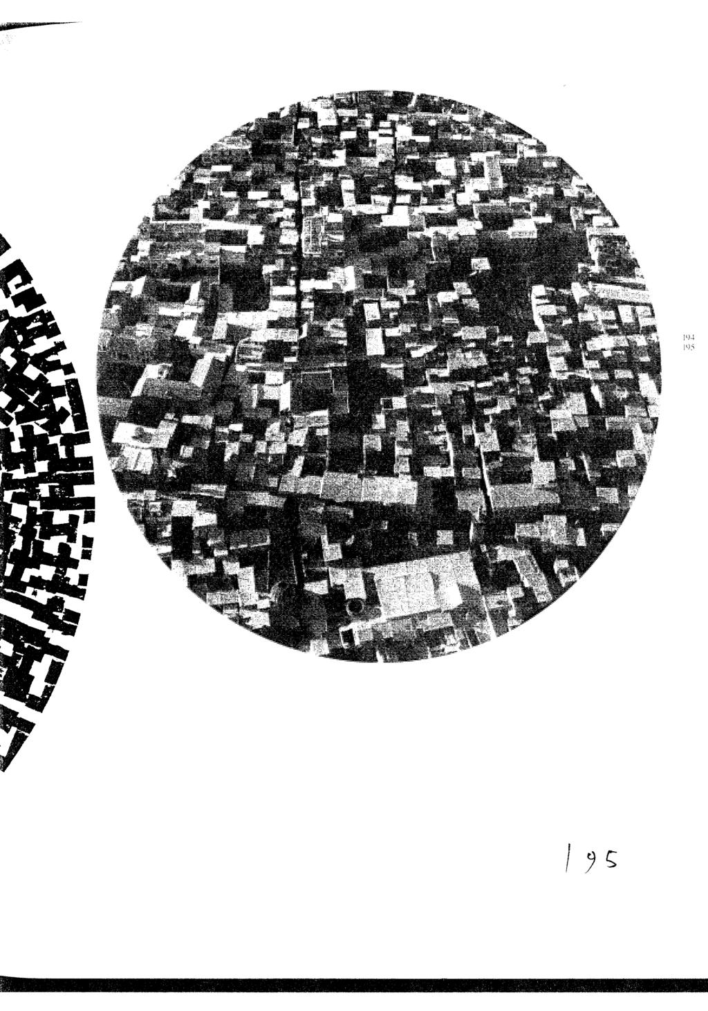
9 Illustrations for Wolfgang Weingart s typographic landscape From Weingart: my way to typography page nos. caption 84 One hundred L-shaped hooks screwed onto a wooden board, turned in various angles for printing line compositions by letterpress. Hooks that were screwed deeper into the board would not print A reconstruction of a line picture printed with the hook device, Bent brass rules embedded in plaster for printing by letterpress, Landscape with lines A composition made with straight and bent line rules and printed by letterpress, Round composition Small lead type were used to fill up a cardboard tube, then printed on their reversed sides, A reconstruction of Round composition, A photograph of the ancient section of the city of Damacus. Weingart photographed this in 1966 on a flight from Palmyra. It textural qualities closely resemble some of his round compositions (compare with [page 196]). 196 A reconstruction of Round composition, A snippet from Weingart s sketchbook, showing his ideations for his M-project, M-cube Letterpress prints of the letter M were affixed to the six sides of a cube and photographed to create letters in various prospectives M-compositions, created from the photographs of the M-cube, M-compositions, M-compositions, Seeing, Reading and Learning A cover created with handset type, Weingart created a series of 14 covers for TM, Swiss Typographic Magazine, during 1972 and A brochure for an exhibition, 1973/74. In this example Weingart s solid grounding in classical Swiss typography is very apparent.
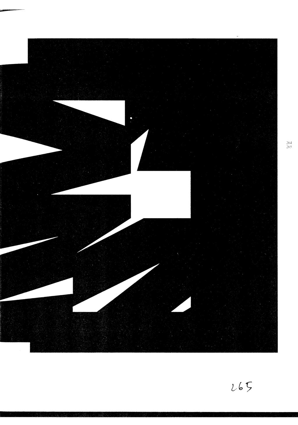
10 424 Cover design for Projekte, typographic research at the Basel School of Design, The Swiss Poster , Red version. A poster created by overlaying films with different dot screens to create a new screen pattern, producing an emotional, cinematic effect An exploration of using handwritten marks as a graphical element. A poster created for the retrospective: WordMark/Typefield/Picture/Space, A photograph of steps leading to the grounds of a temple in Baalbek. The structure of the stone wall pictured inspired Weingart to explore his stepped typography [page 119], Thoughts about a typographic curriculum. Stepped typography, composed with handset type. Weingart introduced traits like irregular paragraph breaks to create a typographic picture, 1971.
11
12
13
14
15

16
17
18
19

20

21

22
23
24
25
26
27
28
29
Miro Kozel. Logo Evaluation
 Logo Evaluation Logo Evaluation On the above two pages you can see I have compiled 48 logos which are to my liking. All of these are quite modern and interesting, they are in some ways logos I am aspiring
Name of Student September 18, 2006 Art 461 Dr. DiMarco
 Name of Student September 18, 2006 Art 461 Dr. DiMarco Critical Review #1: Type Designers I would like to compare the work of typographers Herb Lubalin and Jan Tschichold, both renowned for their modern
Problem Set 8. MIT students: Each problem should be done on a separate sheet (or sheets) of three-hole punched paper.
 of three-hole punched paper.") Introduction to Algorithms Day 26 Massachusetts Institute of Technology 6.046J/18.410J Singapore-MIT Alliance SMA5503 Professors Erik Demaine, Lee Wee Sun, and Charles E. Leiserson Handout 27 Problem Set
Introduction to Algorithms Day 26 Massachusetts Institute of Technology 6.046J/18.410J Singapore-MIT Alliance SMA5503 Professors Erik Demaine, Lee Wee Sun, and Charles E. Leiserson Handout 27 Problem Set
Sequential Storyboards introduces the storyboard as visual narrative that captures key ideas as a sequence of frames unfolding over time
 Section 4 Snapshots in Time: The Visual Narrative What makes interaction design unique is that it imagines a person s behavior as they interact with a system over time. Storyboards capture this element
Book of visual identification
 Copyright 2018 Table of content 01. Introduction................................................. 3 02. Forms of sign................................................. 4 03. Colour variants of the sign...................................
Creating furniture inspired by building a wooden canoe
 Rochester Institute of Technology RIT Scholar Works Theses Thesis/Dissertation Collections 8-5-2009 Creating furniture inspired by building a wooden canoe Brian Bright Follow this and additional works
The International Typographic Style, also known as the Swiss Style,
 A graphic design technique based on grid-work that began in the 19th century became inspiration for modifying the foundational course at the School of Design in 1908. Shortly thereafter, in 1918 Ernst
David CARSON Contemporary International - Deconstructivism
 David CARSON Contemporary International - Deconstructivism Cover for Surf in Rico magazine - 1998 WHEN THE MAGAZINE Beach Culture was launched a decade ago, the name of art director David Carson became
BRAND. niagaracanada.com
 BRAND niagaracanada.com Introduction 3 Prospective Niagara Residents and Immigrants Audiences 4 Key Messages 5 Welcome Niagara Canada - The Visual Brand/Logo 6 Logo Lock-up 7 Colour Palette 8 Black and
Your Grade: Achievement Achievement with Merit Achievement with Excellence. Produce a selection of crafted. Produce a selection of crafted
 Class Feedback Letter Dark Knight Literature Essay for Achievement Standard 91101 2.4 Produce a selection of crafted and controlled writing Submitted on 15 April 2016 Student: Your Grade: Achievement Achievement
DEFINITIONS OF TERMS
 DEFINITIONS OF TERMS A number of specialized terms are used in contracts for printing and/or publishing projects and in documentation of editions at Tamarind Institute. Whenever used, these terms are defined
Title page (page 1) Archives of Suicide Research
 Archives of Suicide Research") Manuscripts should be written in standard English and submitted in triplicate. The author should retain the original and send good, clear, legible photocopies. Manuscripts should be typed double spaced
Manuscripts should be written in standard English and submitted in triplicate. The author should retain the original and send good, clear, legible photocopies. Manuscripts should be typed double spaced
CARLISLE AREA SCHOOL DISTRICT Carlisle, PA GRAPHIC DESIGN (Formerly Commercial Art I) GRADES 10-12
 GRADES 10-12") CARLISLE AREA SCHOOL DISTRICT Carlisle, PA 17013 GRAPHIC DESIGN (Formerly Commercial Art I) GRADES 10-12 Date of Board Approval: April 15, 2010 Revised: November 17, 2016 (Title change only) CARLISLE AREA
CARLISLE AREA SCHOOL DISTRICT Carlisle, PA 17013 GRAPHIC DESIGN (Formerly Commercial Art I) GRADES 10-12 Date of Board Approval: April 15, 2010 Revised: November 17, 2016 (Title change only) CARLISLE AREA
Fine and Performing Arts Course Offerings
 Fine and Performing Arts Course Offerings 2017-2018 Two-Semester Courses Studio Art: 2-semester course, 1 credit None Students who take Studio Art learn the basics of drawing and painting, including both
Language at work Present simple
 Unit 1 Language at work Present simple Present simple Positive: Add -s or -es after the verb with he / she / it. I / you / we / they specialize in Latin American music. He / She / It specializes in high-tech
Yes, here comes wonder kid from ex-yugoslavia again. After all, considering better tubes, read this: especially expensive tubes. This time we present
 Yes, here comes wonder kid from ex-yugoslavia again. After all, considering better tubes, read this: especially expensive tubes. This time we present a set which, in any case, can be bought. In the line
This past April, Math
 The Mathematics Behind xkcd A Conversation with Randall Munroe Laura Taalman This past April, Math Horizons sat down with Randall Munroe, the author of the popular webcomic xkcd, to talk about some of
Can Burmese Pythons Learn To Hibernate? By Mikey Dorkman Fifth Grade, Mr. Robal s room, Salazar Elementary School Sreland, South Carolina
 Can Burmese Pythons Learn To Hibernate? By Mikey Dorkman Fifth Grade, Mr. Robal s room, Salazar Elementary School Sreland, South Carolina Introduction This was going to be my science project for the Science
[PDF] Stop Stealing Sheep & Find Out How Type Works (2nd Edition)
![[PDF] Stop Stealing Sheep & Find Out How Type Works (2nd Edition)](/thumbs/79/79518896.jpg "[PDF] Stop Stealing Sheep & Find Out How Type Works (2nd Edition)") [PDF] Stop Stealing Sheep & Find Out How Type Works (2nd Edition) A guide to typography. It draws in the reader with its design and layout, making use of more than 200 illustrations and photographs. It
[PDF] Stop Stealing Sheep & Find Out How Type Works (2nd Edition) A guide to typography. It draws in the reader with its design and layout, making use of more than 200 illustrations and photographs. It
Your Grade: Achievement Achievement with Merit Achievement with Excellence
 Class Feedback Letter Interim Assessment for Achievement Standard 91099 (External) 2.2 Analyse specified visual or oral text(s), supported by evidence Submitted on 15 April 2016 Student: Your Grade: Achievement
CAPITAL LETTERS. 2. All headings use capital letters (you don t need capitals for the small joining words). EXAMPLE: Exploring the Atlantic Ocean
. EXAMPLE: Exploring the Atlantic Ocean") CAPITAL LETTERS 1. All sentences begin with a capital letter. 2. All headings use capital letters (you don t need capitals for the small joining words). Exploring the Atlantic Ocean 3. Capital letters
CAPITAL LETTERS 1. All sentences begin with a capital letter. 2. All headings use capital letters (you don t need capitals for the small joining words). Exploring the Atlantic Ocean 3. Capital letters
McGraw-Hill Treasures Grade 3
 Unit 3/Week 5 Title: What Do Illustrators Do Suggested Time: 5 days (45 minutes per day) Common Core ELA Standards: RI.3.1, RI.3.2, RI.3.3, RI.3.4, RI.3.7; W.3.1, W.3.4; SL.3.1, SL.3.2; L.3.1, L.3.2, L.3.4
A MACHINE MADE THIS BOOK
 A MACHINE MADE THIS BOOK ten sketches of computer science How do we decide where to put ink on a page to draw letters and pictures? How can computers represent all the world s languages and writing systems?
Design Concept. Harmony Transparency Syntax Fluid Technique
 Design Concept The Prodigy typeface revolves around the classical musician known as Wolfgang Amadeus Mozart. Without getting too caught up in all the theory behind it, Mozart essentially creates a lot
Punctuating Personality 1.15
 Activity Punctuating Personality 1.15 SUGGESTED Learning Strategies: Quickwrite, Graphic Organizer, SOAPSTone, Close Reading, Marking the Text, Think-Pair-Share, Adding Using a grammar handbook, identify
Use... to. Amy is reading the steps on making a photo frame. Fill in the blanks with the words in the box. Suggested time: 3 minutes
 Grammar A Drill 1 Date: Focus Grammar: First, next, then, finally Use... to Usage: Writing steps Amy is reading the steps on making a photo frame. Fill in the blanks with the words in the box. Suggested
Remember when. Focus 1 Memories. What kind of music do you associate with these photos? Choose captions from the box. 16 sixteen
 Remember when Memories The past continuous (revision) Mementos The simple past & the present perfect (revision) Personal firsts much / many / a lot of Focus 1 Memories Speaking 1 What kind of music do
Thompson e Thompson Genética Médica
 Thompson e Thompson Genética Médica Robert L. Nussbaum Click here if your download doesn"t start automatically Thompson e Thompson Genética Médica Robert L. Nussbaum Thompson e Thompson Genética Médica
ART I: UNIT NINE CALLIGRAPHY
 Unit 9 ART I: UNIT NINE CALLIGRAPHY CONTENTS INTRODUCTION............................... 1 I. PRACTICE.................................... 3 Proper Positioning............................. 3 Roman Alphabet................................
Brand Guidelines. January 2015
 Brand Guidelines January 2015 Table of Contents 1.0 What s a brand? 3 1.1 The logo 4 1.2 Colour 1.2.1 Spot & Process 1.2.2 Black & White 5 5 6 1.3 Logo Sizing 1.3.1 Minimum Clear Space 1.3.2 Positioning
how does this collaboration work? is it an equal partnership?
 dialogue kwodrent x FARMWORK with chee chee [phd], assistant professor, department of architecture, national university of singapore tan, principal, kwodrent sim, director, FARMWORK, associate, FARMWORK
DIFFERENTIATE SOMETHING AT THE VERY BEGINNING THE COURSE I'LL ADD YOU QUESTIONS USING THEM. BUT PARTICULAR QUESTIONS AS YOU'LL SEE
 1 MATH 16A LECTURE. OCTOBER 28, 2008. PROFESSOR: SO LET ME START WITH SOMETHING I'M SURE YOU ALL WANT TO HEAR ABOUT WHICH IS THE MIDTERM. THE NEXT MIDTERM. IT'S COMING UP, NOT THIS WEEK BUT THE NEXT WEEK.
You need to get out more. an analysis by Christina Bennett Integrative Project Fall Winter 2016 ARTDES 498/ Hannah Smotrich & Stephanie
 You need to get out more. an analysis by Christina Bennett Integrative Project Fall 2015 - Winter 2016 ARTDES 498/499-001 Hannah Smotrich & Stephanie Rowden Bennett 2. INTRODUCTION Positive statements
V ISUAL ARTS. Visual Arts. see more at: wavisualarts.org
 Visual Arts see more at: wavisualarts.org V ISUAL ARTS Digital Art Students will develop and refine skills in photography, image editing, and illustration. Guided by the elements and principles of design,
High School Photography 1 Curriculum Essentials Document
 High School Photography 1 Curriculum Essentials Document Boulder Valley School District Department of Curriculum and Instruction February 2012 Introduction The Boulder Valley Elementary Visual Arts Curriculum
FACILITYLINK CORPORATE IDENTITY MANUAL
 FACILITYLINK CORPORATE IDENTITY MANUAL Table of Contents Page 2 of 47 Introduction 3 Corporate Design Elements 7 Corporate Design Application 25 Logo Application for Subsidised Activities 44 Table of Contents
The Greatest Invention in the World. Marshall High School Mr. Cline Western Civilization II Unit TWO JA
 The Greatest Invention in the World Marshall High School Mr. Cline Western Civilization II Unit TWO JA The State of Literacy in Medieval Europe The rise of Christianity in the West was terrible news for
UNIT 3 Past simple OJ Circle the right words in each sentence.
 UNIT 1 Present simple and present continuous OJ Cross out the wrong words in bold. Write the 1 We are always making our homework together because we are in the same class. 2 You can walk around your town
Version 3:0 September 2015
 Identity guidelines Version 3:0 September 2015 The Buxton logotype The new logotype embraces the concept of water - and a source of water. The focal point of the design is the letter O' where water emerges
Jonah and the Big Fish
 CREATIVE DRAMA LEADER GUIDE Jonah and the Big Fish (Jonah 1 4) Age-Level Overview Age-Level Overview Open the Bible Activate Faith Lower Elementary Workshop Focus: God gives us second chances. The Road
BRAND STYLE GUIDE v
 BRAND STYLE GUIDE v.2.0 04.05.2015 OVERVIEW TABLE OF CONTENTS This document is designed to maintain the integrity of the Kirkwood Station Brewing Company brand and brand assets. Contained within are guidelines
GLOSSARY for National Core Arts: Visual Arts STANDARDS
 GLOSSARY for National Core Arts: Visual Arts STANDARDS Visual Arts, as defined by the National Art Education Association, include the traditional fine arts, such as, drawing, painting, printmaking, photography,
Arkansas. the natural state. Style Guide
 Style Guide SINGLE PAGE STYLE GUIDE.indd 1 SINGLE PAGE STYLE GUIDE.indd 2 Table of Contents Page One Construction of Logotype Page Three Displaying the Logotype Correctly Page Four Displaying the Logotype
Cube model for Roy Lee
 Arriving in Weimar to take part in the Light, Design and Spatial Ambience workshop has been challenging and informative, it has helped mainly with working collaboratively and provides different viewpoints
Narrative Reading Learning Progression
 LITERAL COMPREHENSION Orienting I preview a book s title, cover, back blurb, and chapter titles so I can figure out the characters, the setting, and the main storyline (plot). I preview to begin figuring
Graphic Standards. A guide to Lane s visual identity, with information on using the college logo, Lane colors and typefaces, stationery, and more.
 Graphic Standards A guide to Lane s visual identity, with information on using the college logo, Lane colors and typefaces, stationery, and more. TABLE OF CONTENTS Introduction to Graphic Standards...1
20 performance, design/production, or performance studies Total Semester Hours 44
 Theatre and Dance 1 Theatre and Dance Website: theatre.sewanee.edu All students are invited to participate in the curriculum and production program of the Department of Theatre and Dance. The major in
The story of LOS FELIZ
 los feliz los feliz The story of LOS FELIZ A typeface designed by CHRISTIAN SCHWARTZ Story by MATT TRAGESSER CHRISTIAN SCHWARTZ & RUDY VANDERLANS Photographs by MATT TRAGESSER MATT: THE STORY OF LOS FELIZ
Kindergarten Visual Arts Curriculum Essentials Document
 Kindergarten Visual Arts Curriculum Essentials Document Boulder Valley School District Department of Curriculum and Instruction February 2012 Introduction The Boulder Valley Elementary Visual Arts Curriculum
LENNON, WEINBERG, INC.
 LENNON, WEINBERG, INC. 514 West 25 th Street, New York, NY 10001 Tel. 212 941 0012 Fax. 212 929 3265 info@lennonweinberg.com www.lennonweinberg.com Mary Lucier Paulsen, Kris. The Renegade Video Artist.
Candice Bergen Transcript 7/18/06
 Candice Bergen Transcript 7/18/06 Candice, thank you for coming here. A pleasure. And I'm gonna start at the end, 'cause I'm gonna tell you I'm gonna start at the end. And I may even look tired. And the
SURVEYS FOR REFLECTIVE PRACTICE
 SURVEYS FOR REFLECTIVE PRACTICE These surveys are designed to help teachers collect feedback from students about their use of the forty-one elements of effective teaching. The high school student survey
Action Sheet I am unique! At first sight the same, at second sight very similar but still unique?
 I am unique! At first sight the same, at second sight very similar but still unique? At first sight the same, at second sight very similar but still unique? There are many, many of us diversiflies in the
Roche Court Seminars
 Roche Court Seminars Art & Maths Educational Friends of Roche Court Art and Maths An Exploratory Seminar Saturday 11 October 2003 Dr. Ulrich Grevsmühl with Michael Kidner Richard Long Jo Niemeyer Peter
OUR VISION WHERE WE RE GOING
 1 INTRODUCTION A brand is not just a logo or a strap line. A brand is a set of beliefs, goals and values that guides an organisation, its decisions and communications, both internally and externally. To
Hugh Dubberly: What do you guys think design is?
 Hugh Dubberly Interview 1 Transcription Hugh Dubberly: What do you guys think design is? Interviewer 1: Things get made, but no one knows how it gets made. Hugh: And so what do you think design is? Interviewer
Standards for the Format and Binding of a Thesis
 Purpose of Guidance The procedure sets out regulatory standards for the format and binding of postgraduate research theses to provide clarity and consistency. This applies to theses submitted for assessment
BOOK ARTS & LETTERPRESS: COURSE SYLLABUS
 BOOK ARTS & LETTERPRESS: COURSE SYLLABUS Instructor: Aaron Cohick Office: The Press at CC, Taylor Hall Office Hours: M F, 1 PM 5 PM Office Phone: 719-389-6376 (x6376) E-mail: aaron.cohick@coloradocollege.edu
National Association of Professional Surplus Lines Offices
 National Association of Professional Surplus Lines Offices, Ltd. 200 NE 54th St., Ste. 200 Kansas City, MO 64118 816.741.3910 F 816.741.5409 www.napslo.org Brand Identity Standards National Association
Canadian Aquatic Invasive Species Network
 Canadian Aquatic Invasive Species Network Graphic Standards Manual Effective January 2007 This Graphic Standards Manual covers the graphic identity guidelines for the Canadian Aquatic Invasive Species
LinguaFolio CanDo Statements: Novice
 I can use single words and memorized phrases. LinguaFolio CanDo Statements: Novice INTERPERSONAL COMMUNICATION Novice Low Novice Mid Novice High I can interact with help using words, phrases, and memorized
Genuine Stone Style Guide
 Genuine Stone Style Guide Brand Identity Overview 2 Genuine Stone and the Coin Logo are registered trademarks of the Natural Stone Council. They can be used separately or together. When used together,
ii) Are we writing in French?. iii) Is there a book under the chair? iv) Is the house in front of them?
 Are we writing in French?. iii) Is there a book under the chair? iv) Is the house in front of them?") STAGE 1 1) Answer the questions in the long form. e.g. Are you Irish? - No, I m not Irish but I m English. i) Are you sitting on the floor?.. ii) Are we writing in French?. iii) Is there a book under the
STAGE 1 1) Answer the questions in the long form. e.g. Are you Irish? - No, I m not Irish but I m English. i) Are you sitting on the floor?.. ii) Are we writing in French?. iii) Is there a book under the
Calm Living Blueprint Podcast
 Well hello. Welcome to episode thirteen of the Calm Living Blueprint Podcast. I am your host,, the founder of the Calm Living Blueprint. Thanks for listening. I hope you re managing to stay comfortable
Non-Fiction Self-Help Book Template
 Non-Fiction Self-Help Book Template A few notes about this template: 1. This template is designed with 1-inch margins, 1.5 spacing and standard Times 12-point font. These specifications are preferred by
Anglia ESOL International Examinations. Preliminary Level (A1) Paper CC115 W1 [5] W3 [10] W2 [10]
![Anglia ESOL International Examinations. Preliminary Level (A1) Paper CC115 W1 [5] W3 [10] W2 [10]](/thumbs/93/113180324.jpg "Anglia ESOL International Examinations. Preliminary Level (A1) Paper CC115 W1 [5] W3 [10] W2 [10]") Please stick your candidate label here W R R1 [] Anglia ESOL International Examinations Preliminary Level (A1) CANDIDATE INSTRUCTIONS: For Examiner s Use Only R2 R3 R4 R5 [] [] [] [] Paper CC115 Time allowed
Please stick your candidate label here W R R1 [] Anglia ESOL International Examinations Preliminary Level (A1) CANDIDATE INSTRUCTIONS: For Examiner s Use Only R2 R3 R4 R5 [] [] [] [] Paper CC115 Time allowed
of all the rules presented in this course for easy reference.
 Overview Punctuation marks give expression to and clarify your writing. Without them, a reader may have trouble making sense of the words and may misunderstand your intent. You want to express your ideas
The Solution. The business man behind a desk, the scientist in the lab, the artist approaching his
 (Courtesy of Stephen Oglesby. Used with permission.) Stephen Oglesby Dr. Karen Boiko The Creative Spark The Solution The business man behind a desk, the scientist in the lab, the artist approaching his
Corporate Identity and Visual Identity Guidelines June 2011
 Corporate Identity and Visual Identity Guidelines June 2011 Index A Basic Design Elements A 01 The BenQ Logo A 02 Minimum Size, Minimum Staging Area A 03 Typography A 04 Corporate Colours B B 01 B 02 B
Lester Faigley Interview Transcript
 Lester Faigley Interview Transcript What is your research right now? I ve been doing a lot of thinking over the years about visual rhetoric. I ve done some historical work on that, but I m guess I m trying
Student Learning Assessment for ART 100 Katie Frank
 Student Learning Assessment for ART 100 Katie Frank 1. Number and name of the course being assessed: ART 100 2. List all the Course SLOs from the Course Outline of Record: 1. Discuss and review knowledge
Display Design Principals for Free Standing Display Cases
 Display Design Principals for Free Standing Display Cases, BFA, Env. Design. The Ohio State University Libraries 2012 The Ohio State University Libraries It all starts with your guests. From an environmental
Simon Basher. Simon Basher interviewed in London, England on August 31, 2011.
 Simon Basher TeachingBooks.net Original In-depth Author Interview Simon Basher interviewed in London, England on August 31, 2011. TEACHINGBOOKS: You are the creator of the Basher series books that make
I ve been involved in music all my adult life. I didn t plan it that way,
 p r e fa c e I ve been involved in music all my adult life. I didn t plan it that way, and it wasn t even a serious ambition at first, but that s the way it turned out. A very happy accident, if you ask
Introduction. Conventions Used in This Book
 03_578081_cintro.qxd 9/8/04 11:43 PM Page 1 Introduction you thought that the purpose of word processing was to write, not to do If amazing things on a computer... If you ever secretly wondered who in
Tony, Frank, John Movie Lesson 2 Text
 Tony, Frank, John Movie Lesson 2 Text Hi, it s AJ and welcome to part two of the Tony and Frank video. Actually, it s three people, Tony Robbins, Frank Kern and John Reece. We watched part one. Part one
ArtsECO Scholars Joelle Worm, ArtsECO Director. NAME OF TEACHER: Ian Jack McGibbon LESSON PLAN #1 TITLE: Structure In Sculpture NUMBER OF SESSIONS: 2
 ArtsECO Scholars Joelle Worm, ArtsECO Director NAME OF TEACHER: Ian Jack McGibbon LESSON PLAN # TITLE: Structure In Sculpture NUMBER OF SESSIONS: BIG IDEA: Structure is the arrangement of and relations
ENGLISH ENGLISH. Level 2. Student Workbook AMERICAN. Student Workbook ENGLISH. Level 2. Rosetta Stone Classroom. RosettaStone.
 Student Workbook ENGLISH ENGLISH AMERICAN Level 2 RosettaStone.com Level 2 ENGLISH AMERICAN 2008 Rosetta Stone Ltd. All rights reserved. xxxxxxx Student Workbook Rosetta Stone Classroom ENGLISH Level 2
Modernism. The. Problem. Child. Ellie House s
 Modernism The 1970-1980 s Problem Child Ellie House Postmodernism 1970-1980s Postmodern design, on the other hand, is often subjective and even eccentric, -Phlip B. Meggs Attributes associated with postmodernism:
The Age of Self. Place, People, and Process Mud/sun-dried bricks Michaelangelo Da Vinci Bernini
 The Age of Self Place, People, and Process Mud/sun-dried bricks Michaelangelo Da Vinci Bernini The Photo-Modernist Era of Designing Art nouveau was considered the relation of form to the artifact, which
A Day of Change. Before Reading
 Activity 2.4 SUGGESTED Learning Strategies: Drafting, Oral Reading, Think-Pair-Share, Word Map, Graphic Organizer Before Reading Quickwrite: Write about a best (or worst) birthday or other special occasion.
Which notice (A H) says this (1 5)? For questions 1 5, mark the correct letter A H on your answer sheet. A B C D E F G H
 says this (1 5)? For questions 1 5, mark the correct letter A H on your answer sheet. A B C D E F G H") Test 1 PAPER 1 READING AND WRITING (1 hour 1 minutes) PART 1 QUESTIONS 1 5 Which notice (A H) says this (1 5)? For questions 1 5, mark the correct letter A H on your answer sheet. You must use this door
Test 1 PAPER 1 READING AND WRITING (1 hour 1 minutes) PART 1 QUESTIONS 1 5 Which notice (A H) says this (1 5)? For questions 1 5, mark the correct letter A H on your answer sheet. You must use this door
Appendix 01: Logo Usage. Brand Identity Guidelines 2015
 Appendix 01: Logo Usage Brand Identity Guidelines 2015 Our logos and their uses Arts Council corporate logo Arts Council exceptional use and partnership logo Grant award logo Arts Council corporate logo
Grammar reference and practice. LOUISE HASHEMI and BARBARA THOMAS
 Grammar reference and practice LOUISE HASHEMI and BARBARA THOMAS PUBLISHED BY THE PRESS SYNDICATE OF THE UNIVERSITY OF CAMBRIDGE The Pitt Building, Trumpington Street, Cambridge CB2 RP, United Kingdom
Answer the questions based on the conversation between co-workers Rhonda and Mac:
 Lesson 15: Holiday Answer the questions based on the conversation between co-workers Rhonda and Mac: 1. Mac is working on... a. reports b. presentations c. sales calls 2. Mac and Rhonda have a lot of work
Asia-Europe Meeting (ASEM)
") Version 1.0 / October 2013 www.aseminfoboard.org Asia-Europe Meeting (ASEM) Logo Guidelines Information on how to apply the ASEM logo 1.0 The ASEM Logo The core element of the brand identity is the logo.
Version 1.0 / October 2013 www.aseminfoboard.org Asia-Europe Meeting (ASEM) Logo Guidelines Information on how to apply the ASEM logo 1.0 The ASEM Logo The core element of the brand identity is the logo.
Walt Stanchfield 03 Notes from Walt Stanchfield s Disney Drawing Classes
 Walt Stanchfield 03 Notes from Walt Stanchfield s Disney Drawing Classes Action Analyisis by Walt Stanchfield PDF produced by www.animationmeat.com 1 FOR THE ACTION ANALYSIS CLASS Here is a sheet of figures
Ideas. 5 Perfecting That s it! Focused, clear, specific, concise. 3 Enhancing On my way Ready for serious revision. 1 Developing Just beginning
 Ideas That s it! Focused, clear, specific, concise I chose an idea that others will find interesting. It is clear I know a lot about my idea. My main point is very focused and easy to understand. A reader
Discoloration and ratty dust jacket. Pen underlining. Moderate wear.
 File Sharing: Reading the Index in Rosalind Krauss and Wim Crouwel Danielle Aubert Discoloration and ratty dust jacket. Pen underlining. Moderate wear. description on Amazon.com of a Used Acceptable copy
Cover Photo: Burke/Triolo Productions/Brand X Pictures/Getty Images
 , Harvard English 59, Cover Photo: Burke/Triolo Productions/Brand X Pictures/Getty Images Updated ed. Textbooks NOTES ON THE RE-ISSUE AND UPDATE OF ENGLISH THROUGH PICTURES DESIGN FOR LEARNING These three
INTRODUCTION. NASS is an action sports & music festival that celebrates the very best of alternative culture, bringing you three days of:
 BRAND GUIDELINES INTRODUCTION NASS is an action sports & music festival that celebrates the very best of alternative culture, bringing you three days of: PRO SKATE + BMX COMPETITIONS WITH THE WORLD S BEST
UNIT 3 Comparatives and superlatives
 UNIT 1 Present simple and continuous CO Circle the correct words in each sentence. 1 People usually are dancing / dance traditional dances and there is live music. 2 I also wear often / often wear a T-shirt
(Faculty/field of study)
") ENGLISH LANGUAGE EXAM LEVEL A2 (Name and surname) (Faculty/field of study) 1 Read the article. Are sentences 1 to 7 True (T) or False (F)? EXTREME SCIENTIST: RANDY WHITE Randy is a member of a team of
ENGLISH LANGUAGE EXAM LEVEL A2 (Name and surname) (Faculty/field of study) 1 Read the article. Are sentences 1 to 7 True (T) or False (F)? EXTREME SCIENTIST: RANDY WHITE Randy is a member of a team of
The majority of schools taking part in the workshops were from special needs schools, with learning difficulties or behavioural needs.
 CREATIVE CAREERS Getting started in museums and galleries Document developed by Sunderland Comedians Evaluation Report Schools Workshop Sunderland Museum and Winter Gardens Location of project On-site
Corporate Identity Manual for Polaris
 Corporate Identity Manual for Polaris Corporate Identification Manual Content Introduction... 1 Letter from the CMD... 2 Communicative Identification... 3 Color... 4 Logo on Color Background... 5 Newspaper
関係詞. a c. ( our team / someone / coach / need / can / we / who ).. ( a song / us / touched / was / there / which )..
.. ( a song / us / touched / was / there / which )..") 関係詞 1 I have a brother () is a pilot for an international airline. Here is a book () is full of pictures. This is the man () I asked the way yesterday. A man () name was John Smith came to see me. This
関係詞 1 I have a brother () is a pilot for an international airline. Here is a book () is full of pictures. This is the man () I asked the way yesterday. A man () name was John Smith came to see me. This
Giorgio Ruggeri is an Italian designer
 thanor 5 2016 2017 short essay by about the artistic practice of a Lithuanian artist who uses his facebook private page as an artistic medium. This text serves as an introduction to a web residency by
CLIENT TESTIMONIALS PAGE 1. Sasha Lee Consultants, All Rights Reserved tel
 CLIENT TESTIMONIALS I thought I knew what Feng Shui was until I met Sasha. A lot of people practice a Western lite version of the 5000 year old tradition. Sasha spent years studying this art form to do
Conceptual Art Spring 2009 Thursdays 12:30-4:20 Holman Hall 377
 Conceptual Art Spring 2009 Thursdays 12:30-4:20 Holman Hall 377 Professor: Sarah Cunningham Office: 310 Holman Hall (inside of 308) Office Hrs: By appointment e-mail: cunningh@tcnj.edu phone: x2633 ------------------------------------------------------------------------
Australia Stamp Albums
 Australia Stamp Albums 1 / 6 2 / 6 3 / 6 Australia Stamp Albums WESTERN AUSTRALIA Perforated 14 1872-78 Swan Typographed 1872 Stamp of 1865 Surcharged in Green 1875 Swan Type of 1854 Watermarked Crown