This guide is designed to define the USA Roller Sports brand and to help you create communications that bring it to life.
|
|
|
- Susanna Caldwell
- 5 years ago
- Views:
Transcription
1 Brand Standards
2 This guide is designed to define the USA Roller Sports brand and to help you create communications that bring it to life. The consistent use of the standards will bring a unified messaging and identity system to our members and prospective members.
3 Contents OUR BRAND Overview Branding Concepts Marketing Model Brand Platform Brand Principles VISUAL GUIDELINES WRITING GUIDELINES Visual Style Our Logo Variations Logo Usage Do s and Don ts Our Tagline Position Affiliations Sport Logos Brand Colors Contrast Other Colors Visual Palettes Photography Inspiration Typography Hierarchy Headlines Copy Style Tone
4 Our Brand A brand for a company is like a reputation for a person. You earn reputation by trying to do hard things well. ~ Jeff Bezos
5 Overview Our story USA Roller Sports, formerly the United States Amateur Confederation of Roller Skating, is the national governing body of competitive Roller Sports (inline and roller skating) in the United States. It is officially recognized by the International Olympic Committee, World Skate, SportAccord and the United States Olympic Committee. USA Roller Sports has sponsored amateur roller skating competitions at the regional and national level since 1937 in figure skating, speed skating and hockey; and since 2011 in roller derby. Since 1972, it has been the U.S. representative for World Skate, the international governing body of Roller Sports, exercising jurisdiction over matters pertaining to the participation of United States athletes in international competition, including existing or potential Pan American Games and Olympic Games participation. Our mission The mission of USA Roller Sports shall be to develop, promote, educate and grow Roller Sports at all levels and to enable athletes to achieve sustained competitive excellence in domestic and international competitions. Our vision To inspire and enable our members to achieve excellence in Roller Sports and in life by building the base, promoting the sport and achieving competitive success. Our sports USA Roller Sports has five sports as official disciplines under its governance. FIGURE INLINE HOCKEY RINK HOCKEY ROLLER DERBY SPEED
6 Branding Concepts LOGO TAG LINE TONE VALUES BRAND IDENTITY THE WAY YOU WANT PEOPLE TO PERCEIVE YOU VISUAL STYLE Establishing a clear and consistent identity for the USA Roller Sports brand is our first priority. Our goal is to transform the USA Roller Sports image to be much closer to the identity of the brand. EXPERIENCE BRAND IMAGE T H E W A Y S T H A T THEY ACTUALLY PERCEIVE YOU EMOTION REPUTATION BELIEF IMPRESSION
7 Marketing Model Our model should not be limited to the services we provide to our members. In order to grow our sports we need to consider all parts of the process, from acquisition to conversion to retention, and how those should be integrated into our branding efforts. The model identifies three general audiences: non-participants, non-member participants and current members. NON-PARTICIPANTS (General Public) ACQUISITION CONVERSION NON-MEMBER PARTICIPANTS BEGINNERS FITNESS AND HEALTH USARS MEMBERS LOCAL TOURNAMENTS NATIONAL CHAMPIONSHIPS RETENTION We must deliver our brand, according to its principles, in a clear and consistent way to all audiences. However, the messaging and the type of communication used may differ based on the particular needs of each audience.
8 Brand Platform At the heart of any brand is its foundational platform, a simple but powerful expression of what we believe in, and the focus of everything we do. Our brand platform is a summary of all the elements that make us special. Our vision for the future is about the impact we want to make. Our positioning is the unique place we occupy in the world. Our offer describes what we do for all our audiences. Our values are the things we believe in that drive the way we do things. Our personality is the image we want to project. Our vision To inspire and enable our members to achieve excellence in roller sports and in life. Our positioning As the National Governing of all roller sports in the United States we are uniquely positioned to achieve our mission. Our values We believe in the power of sport as a transformative and positive force and use it to create a family of friends within our community. Our personality We are passionate about roller sports, dutiful in our commitment to members, and relentless in our pursue of excellence. Our offer We provide the environment for athletes and coaches to participate in roller sports at the level of their choice, from beginner to elite.
9 Brand Principles Follow these principles when designing a piece for USA Roller Sports. Based on our values, they describe our personality and the image we want to give to our members, prospective members and to the world. EMPOWERING WE CREATE THE ENVIRONMENT, YOU MAKE IT HAPPEN. ATHLETIC YOU DON T WIN UNTIL YOU PLAY. TRANSPARENT TRUTH BUILDS TRUST. TRUST BUILDS RESPECT. FOCUSED RESPECT THE ATHLETES, RESPECT THE GAME. CONFIDENT SUCCESS IS THE ONLY OPTION. RESILIENT TOUGH TIMES JUST MAKE US STRONGER.
10 Visual Guidelines Design, good or bad, is a vehicle of memory. Good design adds value. ~ Paul Rand
11 Visual Style The visual identity is the outward expression of USA Roller Sports. It uniquely and distinctively sets us apart from other organizations. The logo is the primary element of that identity. However, other components play an important role in establishing our visual and writing styles, including: COLOR IMAGERY TYPOGRAPHY TONE Our Design Foundation Our design style is comprised of three distinct characteristics each reinforcing the visual mood of our brand from a design perspective. When designing, they serve as the checkpoints to balance your design layouts against. Bold We want to stand out from the crowd, make a statement and, most of all, an impact. We want people to notice us, to identify with us and to proudly wear our brand. We want them to feel they are part of our sport and part of our family of friends. Clear Our designs are simple, easy to read and easy to understand. We keep the number of elements (colors, fonts, etc.) to a minimum. Every single element used as part of our brand must be there for a reason. This makes sure that our important messages stand out. Inspirational Our designs highlight the tangible aspects of our value proposition, such as the fun of skating or the skill or our members. They complement our message and become a promise for what viewers will experience when they put on their skates or when they watch our sports.
12 Our Logo The USA Roller Sports logo is the most immediate and visible representation of our organization, our people, and our brand to the world. Our logo is a valuable asset that must be used consistently in the approved forms. Horizontal This logo is the prefered brand logo and should be used, when possible, for all printed materials (publications, ads, posters, flyers) and for all screen work (websites, banners, presentations). When in doubt, use this logo. Stacked If the format of the publication or website prevents the optimal display of the horizontal logo, the stacked version may be used instead.
13 Variations Every one of the logos has been designed with alternative versions that can be used depending on the background on top of which it will be displayed. Please use the appropriate version of the logo depending on the background. B & W ONE COLOR KEYLINED FULL COLOR
14 Logo Usage Resizing the logo Our logos are designed to be scalable and look good at different sizes. There is no maximum reproduction size for any of the logos. However, there is a minimum height for each version, depending on the medium where the logo will be displayed: 10 mm. 0.4 in. Printable Materials 35px Screen and Web 20 mm. 0.8 in. 70px Clearance Our logos should always be surrounded by a minimum clearance, which ensures that headlines, text or other visual elements do not encroach on them. Our logos give a sense of motion and energy, and to emphasize this feeling, we give more space in the direction of the perceived motion. The clearance is defined by using half the height of the wheel as the reference distance, using it for the top, left and bottom, and duplicating it for the right clearance.

15 Do s And Don ts It is important that the appearance of the logo remains consistent. The logo should not be misinterpreted, modified or added to. It must never be redrawn, adjusted or modified in any way. It should only be reproduced from the artwork provided. Here are some common cases: Proper use of the logo. Do not remove or crop any portion of the logo. Never rotate the logo. Proper use of keylined logo on dark background. Do not add borders to any version of the logo. Use the appropriate background version to make logo pop. Proper use of logo in newspaper or other black and white publication. Do not use transparency when using the logo. Do not change the colors of any portion of the logo. Proper use of one-color logo on an alternative background color. Do not resize or change the spacing of any portion of the logo. Do not place the logo over busy photographic backgrounds. Proper use of keylined logo on an alternative background color. Do not add any drop-shadow or any other effect to the logo. Do not distort the logo or attempt to make it three dimensional.
16 Tagline The goal of a tagline is to distill our brand into a cogent message that s easy to say, easy to understand, and easy to remember. It s how we roll. Our tagline makes a bold and confident statement about our brand in a relaxed and playful way. It creates a sense of exclusivity and community while being inviting and engaging to others. Specifications When using the tagline in combination with the primary logo, always use the following dimensions and alignment: It s how we roll. width width x 0.75
17 Position The position and proportion of the USA Roller Sports logo should help emphasize the sense of motion that it gives to viewers. Always try to place the logo on the left side of page. Use the tagline or the website address depending on the use of the material. Try to use the following dimensions depending on the page size: 8.5in 100% 1in 2.125in 30% It s how we roll in 50% 25% 50% It s how we roll. 25%
18 Affiliations USA Roller Sports is officially recognized by several sport governing bodies. Using the official logo together with the logo of these organizations is allowed but should be limited to the following formats: National Governing Body for Roller Sports National Governing Body for Roller Sports
19 FIGURE
20 INLINE HOCKEY
21 RINK HOCKEY
22 ROLLER DERBY
23 SPEED
24 Colors The colors of the USA Roller Sports brand are representative of their status as the National Governing Body of all roller sports. The logo uses the official colors of the USA flag. Combined with blue, white and dark grey, the colors creates a distinct style that is confident and full of energy. Brand Colors CMYK CMYK CMYK RGB RGB RGB # Web Safe #CC0033 Web Safe # Web Safe Pantone 281 #00205B RGB Hex (Web) Pantone 186 #CD1330 RGB Hex (Web) Pantone 442 #A2ACAB RGB Hex (Web) PRIMARY SECONDARY SECONDARY Text Colors CMYK RGB #CC0033 Web Safe CMYK RGB # Web Safe CMYK RGB # Web Safe Pantone 186 #CD1330 RGB Hex (Web) 75% Black # RGB Hex (Web) 90% Black #3C3C3B RGB Hex (Web) HEADLINE BODY TITLES The definitions above are for printing on coated paper. Please note that if Pantone definitions are used for uncoated paper or for items that are not printed on paper, i.e. plastics, ceramics, textiles, the supplier must ensure that the ink colors which will be used in the printing process, are an accurate match to our brand colors.
25 Contrast Make sure you use high contrast color combinations, especially on the web. Using colors that contrast well helps users with color deficits and makes our sites and materials look good when viewed on a black and white screens. 18pt+ 18pt+ 18pt+ 18pt+ Compliance in the following chart was calculated against the WCAG 2 AA Standard. Check the contrast using
26 Other Colors While the brand colors have specific uses, the following supporting colors can be used anywhere but should never take precedence over the brand colors. The grays can be used for backgrounds and to reduce emphasis on text. The reds can highlight portions of your design or give it depth. Supporting Colors Medium Red C12 M100 Y79 K20 R179 G19 B41 #B31329 Highlight Red C7 M100 Y79 K0 R218 G13 B49 #DA0D31 90% Gray C0 M0 Y0 K90 R60 G60 B59 #3C3C3B 60% Gray C0 M0 Y0 K60 R135 G135 B135 # Dark Red C12 M100 Y79 K40 R146 G17 B31 #92111F 10% Gray C0 M0 Y0 K10 R237 G237 B237 #EDEDED 5% Gray C0 M0 Y0 K5 R246 G246 B246 #F6F6F6 17% Gray C0 M0 Y0 K17 R224 G224 B224 #E0E0E0 75% Gray C0 M0 Y0 K75 R100 G99 B99 # The supporting colors should be used, where appropriate, to add depth to our communications and to complement the messaging. They should work together with the brand colors but never become the dominant or distinctive colors of your designs.


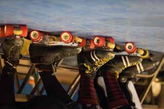
27 Visual Palettes One of our brand principles is being athletic. Part of the athleticism we are looking for relies on how the visual elements of the design connect with the fans of each one of our sports. We want our marketing materials to be a channel into the sport and the environment surrounding it. They should invoke an immediate connection between what they are seeing and what they will find at our competitions. Creating that emotional and psychological connection will engage their senses and will also help create a more iconic look for the sport. Use materials, backgrounds and objects that are directly related to roller sports. Find inspiration in all aspects of the sport experience, from the stadium to the locker rooms, from the jerseys and sweat of the athletes to the surface of the track. Here are some examples to get you started: Materials Palette Wooden Track SkateCourt Uniform Skate Lycra Helmet Pads Wheels Socks

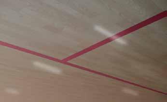
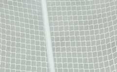
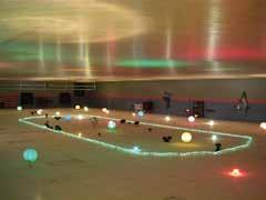


28 Backgrounds Palette Rink/Stadium Crowds Locker Room Competition Benches Lights / Reflections Floor Goal Net


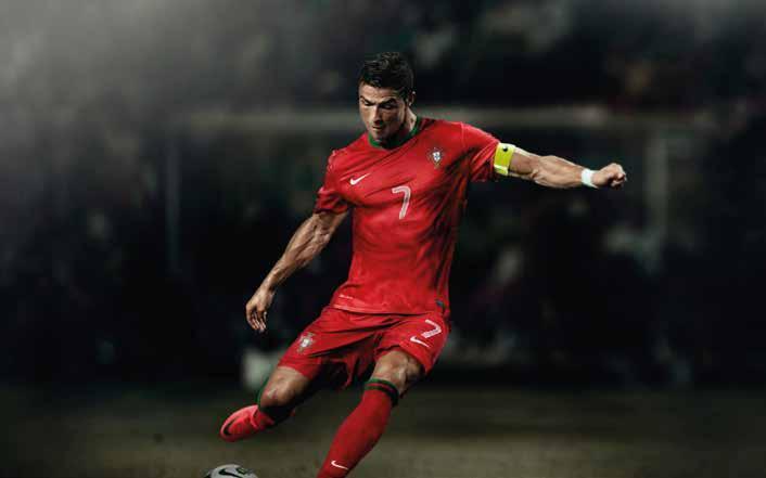
29 Photography Photos are the most powerful way to display our brand and emphasize our principles. All photos used must highlight one or more of the principles described in this guide. In addition, the following parameters should be considered when using photos: Athlete-centric Athletes are the most important representation of our brand. They are the creators of our product and the upholders of our values. They are the energy generators and the attention grabbers. Every photograph must capture and highlight their personality as it relates to the brand. Focused All shots should create drama and also visually make athletes the main focus. The background of the photographs simply provides the reminescense of the environment and the ambient. They should help establish the scene so that the main subjects can come to life and be expressive, but should have significantly less visual weight. Dynamic Our sports are fast and dynamic, so we need our photos to display fast action and a sense of movement whenever possible. We want unique action shots that not only show skating but also higlight the complexity of the sports and the intensity of the athletes.


. Authentic Roller sports are competitive and we want you to show them as they are.")
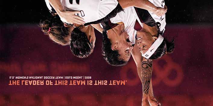
30 Photography Deep Photos that use a small depth of field are preferable since they isolate the focus into the main subject and provide a better sense of spatial dimension, which is an important aspect of sports. You can give photos depth by blurring or lowering the saturation of the background. Personal Sports can generate a range of emotions in their participants. Photos should depict such emotions in order to create a sense of connection between the viewers and the athletes. Depict athletes performing at all stages of the game (warm up, game, celebration, etc) and at all ranges of emotion (from joy to rage, from nervousness to exhaustion, from jubilation to disappointment). Authentic Roller sports are competitive and we want you to show them as they are. The athletes sweat, scream and get passionately intense while competing. Capturing all these aspects of the sports means being authentic, truthful and respectful to their essence.
31
32
33 Writing Guidelines Make it simple. Make it memorable. Make it inviting to look at. Make it fun to read. ~ Leo Burnett
34 Typography The Open Sans typeface We have selected Open Sans as the preferred typeface for our brand because of its cross-platform format, its rich linguistic support and expanded character sets, and its advanced layout features. As with our logo, consistent use of our primary typeface reinforces our brand identity. Open Sans can be used for printed materials and the web, creating a unified experience for our fans and defining our identity. Aa ABCDEFGHIJKLMNOPQRSTUVWXYZ abcdefghijklmnopqrstuvwxyz (.,:;?!$&@#*) Aa ABCDEFGHIJKLMNOPQRSTUVWXYZ abcdefghijklmnopqrstuvwxyz (.,:;?!$&@#*) Aa ABCDEFGHIJKLMNOPQRSTUVWXYZ abcdefghijklmnopqrstuvwxyz (.,:;?!$&@#*) Aa ABCDEFGHIJKLMNOPQRSTUVWXYZ abcdefghijklmnopqrstuvwxyz (.,:;?!$&@#*) Light Used seldomly to add visual appeal and to complement other copy. Do not use this with small font sizes. Regular Used primarily for body copy and defined as the primary font for print and web materials. Semibold Used sparingly for elements that require emphasis, such as titles, headers and the sub-headline. Bold Always used for the single most important message the headline. Should be used only once per page. NOTE: For web, use 'Open Sans', Arial, Helvetica, sans-serif for fallback fonts.
35 Typography The Aachen typeface We have selected Aachen as the secondary typeface for our brand, specifically for having and alternative option for use in professionally printed materials. Please note that Aachen is strictly for use in tandem with Open Sans and should never appear alone. It is available to designers in order to add depth to their pieces.
36 Hierarchy One of the most important techniques for effectively communicating (or honoring ) content is the use of typographic hierarchy. It is a system for organizing type that establishes an order of importance within the data, allowing the reader to easily find what they are looking for and navigate the content. It helps guide the reader s eye to where a section begins and ends, whilst enabling the user to isolate certain information based on the consistent use of style throughout a body of text. Open Sans Semibold 36px 36px Leading / -30 Tracking H1 / -1px Letter spacing Open Sans Semibold 32px 32px Leading / -30 Tracking H2 / -1px Letter spacing Open Sans Semibold 28px 28px Leading / -36 Tracking H3 / -1px Letter spacing Open Sans Semibold 24px 24px Leading / -43 Tracking H4 / -1px Letter spacing Open Sans Semibold 20px 20px Leading / -47 Tracking H5 / -1px Letter spacing Open Sans Semibold 16px 18px Leading / 0 Tracking Open Sans Semibold 14px 18px Leading / 0 Tracking H6 / 0px Letter spacing Strong / 0px Letter spacing
37 Headline (Online) Press releases, web stories, online promotional items and brand elements might use headlines to display information in a way that is more consumable and attractive. The format below will help ensure your headline has a unified structure and look. Headlines should always be specific and concise, providing a strong message or a description of the story below it. They should never appear below 30pt, but there is no maximum size. Descriptors and body copy are optional. HEADLINES Bold, all caps Minimum size: 30pt Leading: 85% of size Tracking: -25 No end-of-sentence punctuation DESCRIPTORS Regular, sentence case 20-25% of Headline size, adjust as needed Leading: 120% of size Normal sentence punctuation. BODY COPY Regular, sentence case Size: 11pt Leading: 13pt Normal sentence punctuation. 60 YEARS AND STILL ROLLING AROUND THE NORTHWEST The skaters, rink owner and their family held a party to honor the 60th Wedding Anniversary and the 60 years of Coaching in the Northwest, for Jerry and Marlene Bruland in Washington. Body copy set using Open Sans. Lorem ipsum dolor sit amet, consectetuer adipiscing elit. Sed ut eros vel mi tempor condimentum. Ut nec sapien eu sem sollicitudin sollicitudin. Curabitur massa justo, pellentesque nec, gravida nec, hendrerit nec. Duis tortor arcu, tincidunt sit amet, consequat sed, lacinia volutpat, sapien. Nam scelerisque tincidunt magna. Ut eleifend enim a mi. Fus ce consequat luctus ante. In luctus luctus eros. Duis nulla justo, rutrum et, cursus vitae, rhoncuseget, elit. Pendisse potenti. Proin a turpis nec magna rhoncus vulputate. Fusce tincidunt, orci a porttitor vulputate, turpis consequat augue, sed congue neque. CAP HEIGHT = H H/2 Curabitur massa justo, pellentesque nec, gravida nec, hendrerit nec, orci. In purus est, ullamcorper mattis, semper in, convallis a, eros. Praesent dignissim orci et tellus. Mauris justo ligula, nonummy et, interdum vitae, elementum non, felis. Suspendisse consectetuer dui at urna bibendum vestibulum. Ut purus tellus, feugiat vel, pretium sed, vehicula sed, sem. Vestibulum congue viverra elit. Sed a metus porta justo lacinia interdum. Sed vel nisi. Nunc molestie dolor a lectus. Sed nibh mass, volutpat eget, rutrum a, tempor tincidunt, enim. In hac habitasse platea dictumst. Praesent lectus metus, tinc idunt faucibus, interdum sed, tempor a, augue. H/2 ALIGNMENT All elements should be visually aligned.
38 Headline (Compact) Online and mobile graphics and other brand elements with reduced horizontal space may use this alternative headline layout. Just as the regular headline format, the compact format helps make sure your headlines have a unified structure and look. Headlines should always be short and to the point. Weight shift in headlines should be used at the beginning or end of the message to provide emphasis and focus. Only switch weights once and only at a line break. Headlines with no line breaks may have a weight shift on the same line. Titles and descriptors are optional. TITLES Bold, all caps 30-40% of Headline size, adjust as needed Must fit on one line INLINE SKATING TEAM H/4 HEADLINES Light, all caps Use Bold to emphasize key information Minimum size: 30pt Leading: 85% of size Tracking: -15 No end-of-sentence punctuation unless the headline has more than one sentence. DESCRIPTORS Regular, sentence case 20-25% of Headline size, adjust as needed Leading: 120% of size Normal sentence punctuation. USA WINS GOLD Team USA won the gold medal at the Hong Kong Asian Cup Classic. The event began on Nov. 26 and lasted until Nov. 30 when the medal games were played. CAP HEIGHT = H H/4 ALIGNMENT All elements should be visually aligned.
39 Headline (Print) Posters, brochures and other promotional graphics and brand elements might use headlines to display information in a way that is more consumable and attractive. The format below will help ensure your headline has a unified structure and look. Headlines should always be specific and concise, providing a strong message or a description of the story below it. They should never appear below 30pt, but there is no maximum size. Descriptors and body copy are optional. HEADLINES Aachen Bold, all caps Minimum size: 30pt Leading: 120% of size Tracking: 0 No end-of-sentence punctuation CAP HEIGHT = H H/2 DESCRIPTORS Regular, sentence case 20-25% of Headline size, adjust as needed Leading: 120% of size Normal sentence punctuation. BODY COPY Regular, sentence case Size: 11pt Leading: 13pt Normal sentence punctuation. The skaters, rink owner and their family held a party to honor the 60th Wedding Anniversary and the 60 years of Coaching in the Northwest, for Jerry and Marlene Bruland in Washington. Body copy set using Open Sans. Lorem ipsum dolor sit amet, consectetuer adipiscing elit. Sed ut eros vel mi tempor condimentum. Ut nec sapien eu sem sollicitudin sollicitudin. Curabitur massa justo, pellentesque nec, gravida nec, hendrerit nec. Duis tortor arcu, tincidunt sit amet, consequat sed, lacinia volutpat, sapien. Nam scelerisque tincidunt magna. Ut eleifend enim a mi. Fus ce consequat luctus ante. In luctus luctus eros. Duis nulla justo, rutrum et, cursus vitae, rhoncuseget, elit. Pendisse potenti. Proin a turpis nec magna rhoncus vulputate. Fusce tincidunt, orci a porttitor vulputate, turpis consequat augue, sed congue neque. H/2 Curabitur massa justo, pellentesque nec, gravida nec, hendrerit nec, orci. In purus est, ullamcorper mattis, semper in, convallis a, eros. Praesent dignissim orci et tellus. Mauris justo ligula, nonummy et, interdum vitae, elementum non, felis. Suspendisse consectetuer dui at urna bibendum vestibulum. Ut purus tellus, feugiat vel, pretium sed, vehicula sed, sem. Vestibulum congue viverra elit. Sed a metus porta justo lacinia interdum. Sed vel nisi. Nunc molestie dolor a lectus. Sed nibh mass, volutpat eget, rutrum a, tempor tincidunt, enim. In hac habitasse platea dictumst. Praesent lectus metus, tinc idunt faucibus, interdum sed, tempor a, augue. H/2 ALIGNMENT All elements should be visually aligned.
40 Copy Style The purpose of following a uniform style in our communications is to deliver a consistent message. Consistency in voice and grammatical style supports and enhances our image as a reputable organization. It adds reliability and credibility to printed pieces as well as our website. We recommend the AP Style, more formally known as The Associated Press Stylebook and Libel Manual., This is the style used most frequently by newspapers and magazines. However, there are instances in which the guidelines below veer away from AP Style. This style guide is also based on Webster s Dictionary definitions and spellings. When two spellings are listed, use the first. a.m., p.m. Use a.m. and p.m. in all cases. Not am, pm or AM, PM. Use a space after the number, e.g., 6 p.m. ampersand (&) Never use in text copy unless it is part of a formal name, such as with a sponsor name. Never substitute it for the word and. area codes/phone numbers Always include the area code: (714) commas Do not use commas before the words and and or in a series. dashes When setting off text with a dash, use a long dash with a space on either side of the dash. dates Abbreviate the month when used with a specific date, and use a comma after the year when it does not end the sentence: The tournament will be held on Dec. 15, 2014, in Chicago. Names of five months are not abbreviated. See below: Jan. March May July Sept. Nov. Feb. April June Aug. Oct. Dec. Spell out the month when used only with a year, e.g., January Spell out when used simply in reference to a month, i.e., The event will be held in January. Don t use ordinal abbreviations, e.g., Jan. 2, not Jan. 2nd. Always spell out days of the week. directions Lowercase north, south, northeast, etc., when they indicate compass direction; capitalize when they designate regions. dollars Do not include.00 as you would when the dollar amount includes cents, i.e., Tickets cost $50; not Tickets cost $ For amounts less than $1, use the word cents, i.e., Raffle tickets cost 50 cents each, not $.50. For amounts of $1 up to $999,999.99, use the dollar sign. For amounts of $1 million or more, omit zeroes and spell out the word.
41 ellipses no spaces between ellipses, but a space before and after: The dog. always use a hyphen; don t capitalize: , not or . Also, e-book, e-commerce, e-business. hyphens In general, do not hyphenate words beginning with post, pre and co, e.g., presales, coed, postgame. However, retain the hyphen with co when forming nouns, adjectives and verbs that indicate occupation or status, e.g., co-captain, co-founder. For non, the rules of prefixes apply, but in general no hyphen when forming a compound that does not have special meaning and can be understood if not is used before the base word, e.g., nontraditional. Use a hyphen before proper nouns or in awkward combinations, e.g., Non-USARS, non-native. Also: Do not use hyphens with adverbs ending in ly, e.g., highly effective jammer. noon use instead of 12 p.m. numbers/numerals Spell out zero through nine, use numerals for 10 and above. Spell out numbers at the beginning of a sentence, or if necessary, recast or rewrite the sentence. However, a number that identifies a calendar year may be used at the start of a sentence, i.e., 2010 was a very good year. SOME EXCEPTIONS in which numerals are always used for zero through nine: - ages: They have a 15-year-old player. She is 16 years old. - times: 2 a.m., not two a.m. - dimensions: She made a 4-foot-long jump. She is 5 feet 6 inches tall. online online is one word. organizations Use abbreviations only for the following: USARS - USA Roller Sports FIRS - Federation of Internationale Roller Sports USOC - United States Olympic Committee roller derby - Should be lowercase, unless used as part of an official designation, in which case it should be capitalized, i.e., USARS Roller Derby. spacing Use only one space after a period at the end of a sentence. state names Spell out state names. Exceptions: Use AP Style state abbreviations in brochures, posters, etc. (See AP Stylebook for the list of those abbreviations.) Use U.S. Postal Service abbreviations when using complete addresses, e.g., 1909 S. Laramie Ave., Cicero, IL Use a comma before and after the state, i.e., The game was held in Tulsa, Oklahoma, on Nov. 15, Do not include the state name for cities well known to our audiences or for other well-known cities nationwide, e.g., Chicago, Los Angeles, Atlanta.
42 U.S. cities that do NOT require a state name: Atlanta, Baltimore, Boston, Chicago, Cincinnati, Cleveland, Dallas, Denver, Detroit, Honolulu, Houston, Indianapolis, Las Vegas, Los Angeles, Miami, Milwaukee, Minneapolis, New Orleans, New York, Oklahoma City, Philadelphia, Phoenix, Pittsburgh, Portland (when it s Oregon), Spokane, St. Louis, Salt Lake City, San Antonio, San Diego, San Francisco, Seattle. times When a time is on the hour, do not use a colon and zeroes, e.g., 9 a.m., not 9:00 a.m. United States vs. U.S. When used as a noun, spell it out, i.e., We live in the United States. Abbreviate when used as an adjective, i.e., The U.S. economy is sluggish. upper case vs. lower case Determine if the usage is a formal name. If so, upper case. If not, lower case. USARS Inline Hockey Sport Committee is the formal name; sport committee is the reference. Clyde Park District is the formal name; park district is the reference. job titles Capitalize and spell out when the title is used in its formal sense before the name, i.e., Roller Derby Sport Director AJ Epp presented the winners. Preferred use is to put the title after the name and use lower case, i.e., AJ Epp, roller derby sport director, presented the winners. web address Remove hyperlink so text is not underlined. If Web or listing comes at the end of a sentence, place a period following the listing. Make sure Web site addresses are not underlined or hyperlinked. not necessary when www is part of the address. Include in every promotional piece, i.e., Save the Date cards and fliers, unless advised otherwise. website, Web page Use lower case for website, webcam, webcast and webmaster. The Web is capped as a short form of World Wide Web, as are Web page, Web feed. (AP Style 2010)
43 Tone Think of voice as a personality, influencing the mood, tone and tempo of conversations. Personality is ingrained in all of us, and to remove personality from what we say would leave everything flat and uninteresting. Every personality speaks from a point of view, one that influences them profoundly and that demonstrates their approach to life. Without this point of view, the most engaging personality would be rendered superficial, unfocused and uninteresting. The same applies to our brand. Our brand voice is how we engage our members and prospective members in our point of view; it s how we converse with them. Voice Characteristics The success of our brand, as a member-based sports organization, is dependent on our ability to communicate and connect with our members and potential members. These conversations must be as consistent in tone as possible across all channels and should always be Personable, Engaging and Confident. HONEST CLEAR TRANSPARENT LIVELY RESPECTFUL UNDERSTANDING AUTHENTIC COMFORTABLE CONNECTED POSITIVE CONFIDENT PERSONABLE ENGAGING SUPPORTIVE APPROACHABLE INSPIRATIONAL SIMPLE ENLIGHTENING INFORMATIVE INSIGHTFUL ORIGINAL PASSIONATE EXCITED KNOWLEDGEABLE INTERESTING
44 #1 - Personable In order to create a real connection with members and prospective members, we speak to them in a direct and simple way. We use language that shows our commitment to our sport, to our community and to them. We use terms that are familiar to people and that show we understand them and identify with their feelings. We are always respectful and inclusive to all people. #2 - Engaging Our language speaks to people on an emotional level, catching their interest while getting the point across fast. It provides information and insight into the world of roller sports, but also compels people to take action. We show our passion in the way we enthusiastically share our knowledge and explain our uniqueness. We are inquisitive and always use active voice. #3 - Confident We believe in our brand and have full trust in our ability to deliver on our promises. We have a clear value and a bold message. We don t pretend to know, we know or we find the answers, and that makes people trust us. We make ourselves visible amidst the noise by being clear and honest with our audience. Can be: Simple Approachable Inspirational Should not be: Hurried Presumptious Superficial Can be: Passionate Enlightening Original Should not be: Vague Boring Condescending Can be: Witty Authentic Positive Should not be: Loud/Overbearing Arrogant Doubtful What to avoid Don t think that just because you have stated a fact, you have communicated. Avoid clever or humorous approaches. Humour is often thinly disguised hostility and what may be funny to you, could anger another person. Except for special applications, humour leads the reader in the wrong direction. Avoid arguing. You can t persuade readers to take action if you antagonize them. Avoid moralising. This tends to block communication; the reader may feel you are patronising. Avoid analogies. An analogy, carried out to its logical conclusion, is many times ridiculous and makes readers concentrate in imagining the analogy instead.
World Solar Challenge Branding Guidelines
 World Solar Challenge Branding Guidelines Introduction The World Solar Challenge Masterbrand is based upon a set of graphic elements: the sun symbol, the logo type, the corporate typeface and the corporate
Running head: PAPER TITLE 1
 Running head: PAPER TITLE 1 The "h" is not capitalized. The paper title in the header must be capitalized; if it is too long, shorten it so that the header is all on one line. Write a descriptive title;
November Visual Identity Guidelines Ministry of Education
 November 2017 Visual Identity Guidelines Ministry of Education Introduction The way we visually represent the EarlyON brand plays a key role in the way we are perceived both internally by our various partners
Chicago Manual of Style
 Sample Typeset Xulon Press will typeset the interior of your book according to the Chicago Manual of Style method of document formatting, which is the publishing industry standard. The sample attached
Chicago Manual of Style
 Sample Typeset Xulon Press will typeset the interior of your book according to the Chicago Manual of Style method of document formatting, which is the publishing industry standard. The sample attached
Chicago Manual of Style
 Sample Typeset Xulon Press will typeset the interior of your book according to the Chicago Manual of Style method of document formatting, which is the publishing industry standard. The sample attached
Chicago Manual of Style
 Sample Typeset Xulon Press will typeset the interior of your book according to the Chicago Manual of Style method of document formatting, which is the publishing industry standard. The sample attached
Introductory Narrative
 [COOL LOGO] Design Document Cool Team Frodo Baggins, Samwise Gamgee, Meriadoc Brandybuck, Pregrin Took Introductory Narrative Lorem ipsum dolor sit amet, consectetuer adipiscing elit. Suspendisse rhoncus
TITLE OF DOCUMENT GOES HERE: BE SURE TO SINGLE SPACE
 TITLE OF DOCUMENT GOES HERE: BE SURE TO SINGLE SPACE A Specialist Project Presented to The Faculty of the Department of Psychology Western Kentucky University Bowling Green, Kentucky In Partial Fulfillment
Long Post With Pagination
 Long Post With Pagination Author : admin Date : June 6, 2014 The Amazing Spider Man 1 / 5 Lorem ipsum dolor sit amet, consectetur adipiscing elit. Integer aliquet massa leo, commodo consectetur nisi iaculis
PREZI. Online Companies. Pick an online company and discuss the following DUE. Requirements:
 PREZI DUE Online Companies Pick an online company and discuss the following Requirements: A total of 10 frames Pick a theme Show at least 4 different images Use at least 2 different shapes as part of the
Nam accumsan elit in leo. Donec ornare. Suspendisse ut dolor.
 April 2018 2 nd Grade News Our poetry unit begins in ELA this month! We will be writing and reading poetry of all kinds. We will also focus on parts of speech, metaphors, similes and point of view. Some
Imaginary Product User s Guide
 Imaginary Product User s Guide The Imaginary Company London, Ontario, Canada Copyright 2012 James Gordon Bailie Imaginary Product is a Trademark of the Imaginary Company, Ltd Contents Install the Imaginary
Bannockburn Primary School. KS1 News Letter
 Bannockburn Primary School Notices KS1 News Letter The Great Fire of London! Please remember it is school policy for all children to bring their PE kit to school every Monday. All kits will be returned
Author s Full Name. Undergraduate degree, institution, year. Master degree, if applicable, institution, year. Submitted to the Graduate Faculty of
 Title Page Title of Thesis or Dissertation by Author s Full Name Undergraduate degree, institution, year Master degree, if applicable, institution, year Submitted to the Graduate Faculty of Name of school
Brand identity guidelines September 2009
 Brand identity guidelines September 2009 Contents 1 Introduction 3 2 Brand qualities 4 2.1 Description 5 2.2 Core values 6 2.3 Working principles 7 2.4 Personality 8 3 Visual identity standards 9 3.1 Logotype
A Capstone Project Report on Analytics Work Carried Out at IBM
 A on Analytics Work Carried Out at IBM a project report submitted in partial fulfillment for the requirements of the degree of Master of IT in Business Analytics by Candidate Name under the guidance of
Learning By Design. By Design Workshops. What is Learning By Design? What are some Learning By Design projects? Look for Learning
 & Learning By Design What is Learning By Design? We are a group of dedicated PAEA educators committed to providing art teachers with the resources, skills, and tools needed to infuse design into an art
IYNA Format Guidelines
 IYNA Format Guidelines 1. IYNA Format begins with the title of each paper, which must be between 25 and 75 characters, including subtitles, size 26 black Sorts Mill Goudy typeface aligned right. 2. Beneath
Module one Elements and usage. Brand identity guidelines
 Module one Elements and usage Brand identity guidelines 1. Contents 2.1 Our mission 2.2 Our brand 2.3 Our brand identity 2.4 At a glance 3.1 Our logos and their uses 3.2 Our logo 3.3 Minimum logo sizes
visual indentity guidelines
 visual indentity guidelines The Logo This mark was inspired by the campus steeple, which is a recognizable landmark that speaks to Bluefield College s foundation in faith and academics. The steeple is
Steppenwolf Graphic Standards STEPPENWOLF
 Steppenwolf Graphic Standards By Juliet Rutter - Fall Term 2016 Table of Contents Introduction Pg. 3 Glossary Pg. 4 Logo and Logotype Pg. 5 Use of Space Pg. 6 Color Pg. 7 Typeography Pg. 8 Business Card
ICEL ND IR. Next stop, Iceland. Corporate Identity Manual for Graphic Standards
 Corporate Identity Manual for Graphic Standards Table of Contents IcelandAir s Corporate Identity Manual is here for you convenience. This manual allows you to see into the corporate identity of IcelandAir.
CES Working Papers Author guidlines
 PAGE size: A4 (21x29.7 cm); Margins: Top: 2 cm; Bottom: 1.5 cm; Left & Right: 2 cm. Paragraph format: Justified, 1.5 line spacing (spacing before: 0, after: 0, normal style. CES Working Papers Author guidlines
THE EDGE - BRAND THE EDGE - BRAND STRATEGY THE MARK PMS 7473 PMS 7473 (70%) PMS 7473 (40%) PMS 7473 (70%) PMS 7470 THE LOGOTYPE THE TAGLINE
 PMS 7473 (40%) PMS 7473 (70%) PMS 7470 THE LOGOTYPE THE TAGLINE") THE EDGE - BRAND THE MARK (70%) (40%) (70%) PMS 7470 THE LOGOTYPE THE TAGLINE PMS COOL GRAY 5 minimum size 2 PMS 717 THE EDGE - BRAND STRATEGY Having a strong brand strategy that clearly conveys a defined
THE EDGE - BRAND THE MARK (70%) (40%) (70%) PMS 7470 THE LOGOTYPE THE TAGLINE PMS COOL GRAY 5 minimum size 2 PMS 717 THE EDGE - BRAND STRATEGY Having a strong brand strategy that clearly conveys a defined
There is also a less obvious reason why some people, I believe, might be inclined to make fun of this song. A quote from Natalie:
 KIND AND GENEROUS By: Annie If there is one song above all others in Natalie Merchant's musical compendium that could be singled out as the most ripe for taunts, insults, and eye rolls, it surely is Kind
GRAPHIC STANDARDS THE UNIVERSITY OF SOUTHERN MISSISSIPPI UPDATED AUGUST 2018
 GRAPHIC STANDARDS THE UNIVERSITY OF SOUTHERN MISSISSIPPI UPDATED AUGUST 2018 QUICK POINTS UNIVERSITY LOGO 1 - Communications materials and advertisements should be approved by the Office of University
Connecting for Life Brand Book _CFL_Brand_Guidelines_Booklet_v5.indd 1 14/02/ :30
 Connecting for Life Brand Book 25679_CFL_Brand_Guidelines_Booklet_v5.indd 1 14/02/2017 11:30 1 Introduction 25679_CFL_Brand_Guidelines_Booklet_v5.indd 2 14/02/2017 11:30 1 Introduction In June 2015, Connecting
APPENDIX TO THE INTERNATIONAL COMPETITION
 APPENDIX TO THE INTERNATIONAL COMPETITION The first Conference (Cover - Title) François Lallier 1 1.- Author s Curriculum Vitae 2 2.- Application Form 2.1.- Personal details: Name: Surname: Education /
Co-Map Modeling. February 14, 2010
 Co-Map Modeling Arthur Little Micheal Kelly February 14, 010 Abstract Lorem ipsum dolor sit amet, consectetur adipiscing elit. Vivamus ut quam vel ipsum porta congue ac sit amet urna. Fusce non purus sit
Communication and Visibility Manual
 Programme funded by Joint Operational Programme Black Sea Basin 2014-2020 Communication and Visibility Manual December, 2017 nd 2 Edition Content 1. Introduction 3 2. Visual Identity Elements 2.1 Use of
Title of Your Thesis. Student s Full Name. This thesis is presented as part of the requirements for the conferral of the degree: Your Degree
 Title of Your Thesis Student s Full Name This thesis is presented as part of the requirements for the conferral of the degree: Your Degree Supervisor: Your Supervisor(s) The University of Wollongong School
BRAND IDENTITY GUIDELINES
 BRAND IDENTITY GUIDELINES CONTENTS 1. LOGO 01 2. BRAND COLOR PALETTE 07 3. TYPOGRAPHY 10 4. PUBLICATIONS 13 Section 1 LOGO The logo is the most immediate representation and important element in the overall
1st national bank Branding guidelines
 1st national bank Branding guidelines Produced by ORANGE MEDIA GROUP INC St. Lucia Limited 1st National Bank The new logo is an embodiment of the history, values and vision of the rebranded institution.
BRAND STANDARDS GUIDE. How to use the KMA brand to maintain a cohesive identity in all mediums of visual communication.
 BRAND STANDARDS GUIDE How to use the KMA brand to maintain a cohesive identity in all mediums of visual communication. BRAND VISION Going forward begins with understanding where we are. We are in Knoxville.
Instructions for Authors
 Instructions for Authors 1. About Before you submit a manuscript for publication, please read the Instructions for Authors and the Editorial Policy. Submission of a manuscript to International Journal
CORPORATE IDENTITY. Visual guidelines
 CORPORATE IDENTITY Visual guidelines This style guide will serve as a tool to maintain the integrity of the RelianceCM TM identity and brand recognition. As the brand is the most visible extension of RelianceCM,
How We Strengthen Our Logo Identity. University Guidelines for Brand Usage
 How We Strengthen Our Logo Identity University Guidelines for Brand Usage How We Strengthen Our Logo Identity University Guidelines for Brand Usage Arkansas State University-Mountain Home First Edition
Branding Guidelines NORTH SAINT PAUL SAINT PAUL
 Branding Guidelines NORTH This project was supported by the Resilient Communities Project (RCP), a program at the University of Minnesota that convenes the wide- ranging expertise of U of M faculty and
Vision Source. Signage and Brand Collateral GRAPHIC DESIGN CONTROL DOCUMENTS (DCDs) 19 February Updated - 04 March Updated - 01 April 2011
 19 February Updated - 04 March Updated - 01 April 2011") Vision Source Signage and Brand Collateral GRAPHIC DESIGN CONTROL DOCUMENTS (DCDs) 19 February 2011 Updated - 04 March 2011 Updated - 01 April 2011 Table of Contents GS Graphic Specifications Exterior
Vision Source Signage and Brand Collateral GRAPHIC DESIGN CONTROL DOCUMENTS (DCDs) 19 February 2011 Updated - 04 March 2011 Updated - 01 April 2011 Table of Contents GS Graphic Specifications Exterior
Foreward Soils as records of Past and Present: the geoarchaeological approach. Focus on: is there time for fieldwork today?
 Foreward In the frame of the scientific meeting Soils as records of Past and Present: the geoarchaeological approach. Focus on: is there time for fieldwork today? a publication will be prepared containing
Name & Branding. Design Goals. The Logo
 STYLE GUIDE 5/10/18 Name & Branding As an organization, and in many ways, as a city, our future depends on our ability to support and sustain a virtuous cycle that begins with our residents and the unique
THE UMALAYATHESIS L A T E X DOCUMENT CLASS LIM LIAN TZE INSTITUTE OF POSTGRADUATE STUDIES UNIVERSITY OF MALAYA KUALA LUMPUR
 THE UMALAYATHESIS L A T E X DOCUMENT CLASS LIM LIAN TZE INSTITUTE OF POSTGRADUATE STUDIES UNIVERSITY OF MALAYA KUALA LUMPUR 2015 THE UMALAYATHESIS LATEX DOCUMENT CLASS LIM LIAN TZE THESIS SUBMITTED IN
THE UMALAYATHESIS L A T E X DOCUMENT CLASS LIM LIAN TZE INSTITUTE OF POSTGRADUATE STUDIES UNIVERSITY OF MALAYA KUALA LUMPUR
 THE UMALAYATHESIS L A T E X DOCUMENT CLASS LIM LIAN TZE INSTITUTE OF POSTGRADUATE STUDIES UNIVERSITY OF MALAYA KUALA LUMPUR 2010 THE UMALAYATHESIS LATEX DOCUMENT CLASS LIM LIAN TZE THESIS SUBMITTED IN
GEOGRAPHY HONOURS THESIS HANDBOOK
 GEOGRAPHY HONOURS THESIS HANDBOOK 2009-2010 Prepared by Prof. Benjamin Forest Honours Thesis Coordinator Contents Thesis guidelines... 1 Thesis layout example... 8 Archival abstract guidelines... 21 Archival
THE UMALAYATHESIS L A T E X DOCUMENT CLASS LIM LIAN TZE INSTITUTE OF POSTGRADUATE STUDIES UNIVERSITY OF MALAYA KUALA LUMPUR
 THE UMALAYATHESIS L A T E X DOCUMENT CLASS LIM LIAN TZE INSTITUTE OF POSTGRADUATE STUDIES UNIVERSITY OF MALAYA KUALA LUMPUR 2015 THE UMALAYATHESIS LATEX DOCUMENT CLASS LIM LIAN TZE THESIS SUBMITTED IN
GEOGRAPHY HONOURS THESIS HANDBOOK
 GEOGRAPHY HONOURS THESIS HANDBOOK 2016-2017 Prepared by: Prof. Benjamin Forest (Hons. co- ordinator 2009-2011) Updates by: Profs Sarah Turner and Natalie Oswin (Hons. co- ordinators). Contents Thesis guidelines...1
Article Title: Subtitle or Supplementary Information. Lorem ipsum dolor sit amet, consectetuer adipiscing elit. Maecenas porttitor congue
 1 2 3 4 5 6 7 8 9 10 11 12 13 14 15 16 17 Article Title: Subtitle or Supplementary Information Name of author 1: Author 1 affiliations Name of author 2: Author 2 affiliations Name of author 3: Author 3
Visual Identity Program
 A Guide to the Utah State University Visual Identity Program www.usu.edu/prm/identity Edition Two (v9, 09/06/2016) 2 TABLE OF CONTENTS Letter from the President.... 3 Introduction.... 4 Approval process...
MULTIMEDIA UNIVERSITY THESIS TEMPLATE
 MULTIMEDIA UNIVERSITY THESIS TEMPLATE LIM LIAN TZE MASTER OF SCIENCE (INFORMATION TECHNOLOGY) MULTIMEDIA UNIVERSITY APRIL 2016 MULTIMEDIA UNIVERSITY THESIS TEMPLATE BY LIM LIAN TZE B.Sc. (Hons), University
EDUCATE. SUPPORT. INSPIRE.
 The Mission of the Arturo Sandoval Institute is to Educate, Support and Inspire music students to continue music education without regard to their economic circumstances. Providing scholarships, instruments,
IDENTITY GUIDELINES. An overview of logo useage, brand colors and fonts
 IDENTITY GUIDELINES An overview of logo useage, brand colors and fonts Last revised: APRIL 2016 This document is meant to serve as a general guideline for the use of the SMITE logo and to help ensure a
BRAND GUIDELINES. For any questions regarding branding, please contact
 BRAND GUIDELINES For any questions regarding branding, please contact austin.bullock@everbridge.com LOGO CORRECT USAGE Full logo with registered trademark symbol. Do not separate the bridges from everbridge
[pp ] Metamorphosis. Detail Lightjet print on diasec cm aluminium box edge. 160 x 160 cm. [pp ]
![[pp ] Metamorphosis. Detail Lightjet print on diasec cm aluminium box edge. 160 x 160 cm. [pp ]](/thumbs/89/97831279.jpg "[pp ] Metamorphosis. Detail Lightjet print on diasec cm aluminium box edge. 160 x 160 cm. [pp ]") Hubertus von Amelunxen Translation [pp. 162 163] Metamorphosis. Detail. 2012. Lightjet print on diasec + 3.5 cm aluminium box edge. 160 x 160 cm. [pp. 164 165] Metamorphosis. Detail. 2012. Lightjet print
Hubertus von Amelunxen Translation [pp. 162 163] Metamorphosis. Detail. 2012. Lightjet print on diasec + 3.5 cm aluminium box edge. 160 x 160 cm. [pp. 164 165] Metamorphosis. Detail. 2012. Lightjet print
The use of Rail Baltica logo Visual Guidelines
 The use of Rail Baltica logo Visual Guidelines Rail Baltica project involves the construction of a new European standard gauge high-speed rail line infrastructure to connect Northeast Europe with Central
Znips London 75 Wilton Road, London SW1V 1DE Telephone: +44 (0) Znips London Identity Manual
 Znips London Identity Manual") Znips London 75 Wilton Road, London SW1V 1DE Telephone: +44 (0)20 7828 6688 Znips London Identity Manual Znips London Identity Manual This identity manual outlines how to apply the Znips London identity
Znips London 75 Wilton Road, London SW1V 1DE Telephone: +44 (0)20 7828 6688 Znips London Identity Manual Znips London Identity Manual This identity manual outlines how to apply the Znips London identity
Introduction 1.1 Why a New Visual Identity System? Visual Identity Policy What is branding, and why is it important? 4 1.
 Introduction 1.1 Why a New Visual Identity System? 2 1.2 Visual Identity Policy 3 1.3 What is branding, and why is it important? 4 1.4 Why use the university s logo? 5 1.5 Why should you consider working
BRANDING GUIDELINES Enterprise Nation
 BRANDING GUIDELINES Enterprise Nation Enterprise Nation Logo Normal use logo The Normal use logo should be used where possible. However there are certain exceptions. Stacked logo This should only be used
BRAND IDENTITY GUIDELINES
 BRAND IDENTITY GUIDELINES Contents BRAND IDENTITY Overview Components BRAND LOGO Standards Exclusion zone Variations Rules of use Color standards Color variations BRAND TYPOGRAPHY Writing style Logo with
Safe Boating Campaign Brand Guidelines
 Safe Boating Campaign Brand Guidelines Reference to any specific commercial product, process, or service, or the use of any trade, firm or corporation name is for the information and convenience of the
MORECAMBE BAY PARTNERSHIP. Brand guidelines October 2013
 Brand guidelines October 2013 Key messages These statements are intrinsic to the identity of the Morecambe Bay Partnership, summing up the goals, aspirations and values of the organisation. The messages
PRICES/SIZES: BLACK & WHITE
 Bishop Montgomery High School The yearbook staff is now offering the opportunity to personalize the yearbook in a very special way with a Senior Ad. Space is available to congratulate a graduate. To reserve
BRAND IDENTITY GUIDELINES
 BRAND IDENTITY GUIDELINES Focus Fo rward. the logo primary logo secondary logo construction & clear space alternate versions the cellcontrol roundel color primary palette secondary palette color values
Visual Identity Standards
 1 Visual Identity Standards Information and inquiries: University Relations brand@ucalgary.ca Visual Identity Standards 2 15.0 Eyes High 15.01 Introduction 15.01 Introduction 15.02 What is Eyes High? 15.03
Kenya Vision 2030 Brand Guidelines. Brand Identity Guidelines
 Brand Identity Guidelines 1 Section Contents Section 1 - Introduction 1.0 Introdution to Kenya Vision 2030 1.1 Introduction to Our Brand Guidelines Section 2 - Brand Identity 2.0 Kenya Vision 2030 Logo
BRAND GUIDELINES VENDOR COPY AUGUST ecoatm BRAND GUIDELINES
 BRAND GUIDELINES VENDOR COPY AUGUST 2014 7059.0814 1 BRAND STANDARDS CONTENTS Brand Standards Primary Logo Endorsers Logo Lockup Secondary Logos, Black and White Margins and Minimum Size Incorrect Usage
CASE LGBT. Diversity. Show Me The BUSINESS Launch edition. LGBT Diversity: Show Me The Business Case
 LGBT Diversity Show Me The BUSINESS CASE 2015 Launch edition CONTENTS Introduction 3 Welcome 4 Power 5 Leadership 6 Champions 7 LGBT2020 Business Case data notes 8 Out at work 9 Homophobia 10 Stay or go?
Stewards of planet Earth
 Stewards of planet Earth Earth Collective Magazine August 2018 1 Purple Ad Full Page 209 x 297 mm Inside cover location Earth Collective Magazine August 2018 2 Hello Everyone, Stewards of planet Earth,
OMNIPOD DASH SYSTEM STYLEGUIDE
 OMNIPOD DASH SYSTEM STYLEGUIDE INTRODUCTION This document is intended to provide users with a basic set of graphic standards for applying the Omnipod DASH System brand standards. It also includes the core
BRAND GUIDELINES EDDY PUMP
 BRAND GUIDELINES EDDY PUMP We Pump Solids Not Water INDEX 1 2 3 ABOUT US OUR LOGO COLOR SYSTEM 4 5 TYPOGRAPHY DO'S AND DON'TS ABOUT US EDDY Pump Corporation is a dredge equipment and pump manufacturer,
BRAND v2 GUIDELINES 1
 1 BRAND GUIDELINES v2 THESE GUIDELINES SHOW HOW TO USE OUR IDENTITY ACROSS ALL COMMUNICATIONS ON SCREEN, IN PRINT, AND ON PRODUCTS. LET S BRING THE ULTIMATE EARS BRAND TO LIFE. LISTEN 2 UP 3 CONTENT 04
ENGL2200 Guidelines & Instructions for Essay 3: Abstract and Annotated Bibliography
 ENGL2200 Guidelines & Instructions for Essay 3: Abstract and Annotated Bibliography Length: Due Dates: 3-4 pages Wednesday, 22 March: Draft 1 due for in-class peer review Wednesday, 29 March: Revised Draft
BRAND. niagaracanada.com
 BRAND niagaracanada.com Introduction 3 Prospective Niagara Residents and Immigrants Audiences 4 Key Messages 5 Welcome Niagara Canada - The Visual Brand/Logo 6 Logo Lock-up 7 Colour Palette 8 Black and
BRANDING STANDARDS MANUAL
 BRANDING STANDARDS MANUAL 2014 Index Logo University version 2 School versions 3 Usage Spacing 4 Sizing 5 Color 6 Logo mark 7 Unacceptable Executions 8-9 Color 10-11 Typography 12 Other Graphic Marks Seal
Safe Boating Campaign Brand Guidelines
 Safe Boating Campaign Brand Guidelines Reference to any specifc commercial product, process, or service, or the use of any trade, frm or corporation name is for the information and convenience of the public,
THE LOOK OF OUR BRAND
 THE LOOK OF OUR BRAND For Internal Use Only Not For Use With The Public. For help and guidance on our brand standards, contact marketinginbox@firstcommand.com. OUR LOOK CONSISTENCY USAGE 29 OUR LOGO The
VIRGINIA BEACH CONVENTION & VISITORS BUREAU brand standards. style guide ACH CON V ENTION & V ISITORS BURE AU 2018
 B R A N D S TA N DA RV D SI RS G T YILN E IGAU I B DE E ACH CON V ENTION & V ISITORS BURE AU 2018 brand standards style guide 1 2 thank you This guide was produced for our trusted partners, to instill
Brand Identity Guidelines. Khwaja Fareed University of Engineering & Information Technology
 Brand Identity Guidelines Khwaja Fareed University of Engineering & Information Technology Our Vision To become a world-class University of Engineering and Information Technology that contributes significantly
2018 VERSION BRAND GUIDELINES VERSION 01.18
 2018 VERSION BRAND GUIDELINES VERSION 01.18 3.0 BRAND ELEMENTS 16 3.1 Overview 3.2 The Nutrien Logo 3.3 The Nutrien Logo with Tagline 3.4 Color System 3.5 Logo & Tagline Colors: Positive 3.6 Logo & Tagline
Gin-Cor Industries Inc. Brand Guidelines
 Last updated: August 26, 2015 About Our Vision To be a leader in the manufacturing of vocational trucks. Our Mission To manufacture customized vocational trucks that workers want to drive and owners want
Earth Collective Magazine August
 Earth Collective Magazine August 2018 1 Purple Ad Full Page 209 x 297 mm Inside cover location Earth Collective Magazine August 2018 2 Blue Ad Half Page 209 x 146 mm Inside cover location Yellow Ad Eighth
SUNDAY, OCTOBER 15, 2010
 THE Daily globe $2.00 WWW.DAILYGLOBE.COM BRITAIN PLANS DEEPEST PUBLIC SPENDING CUTS IN 60 YEARS by Andrew Martin LONDON - Praesent turpis nunc, hendrerit sed gravida at, venenatis at nulla. In hac habitasse
LATEST UPDATE 4 OF MAY Brand materials Guidelines
 LATEST UPDATE 4 OF MAY 2018 Brand materials Guidelines Material production steps 1 Select item that fit with Nortal visual identity Select the item with a color that fits the Nortal visual identity. If
The Missing Genre: Creating Quality Non-fiction Books for the Early Grades Christabel Pinto Global Literacy Director CIES 2018
 The Missing Genre: Creating Quality Non-fiction Books for the Early Grades Christabel Pinto Global Literacy Director CIES 2018 Presentation Outline Background Why Non-Fiction? What is Quality in non-fiction?
The University Brand GUIDELINES
 TM The University Brand GUIDELINES CONTENTS Why Consistent Visual Identity is Important... 4 Marshall University Brand... 5 Marshall University Brand Components...6-9 University Fonts and Colors...11-12
UNIVERSITY IDENTITY STANDARDS. Together, we are building a stronger identity of which we can be proud.
 UNIVERSITY IDENTITY STANDARDS Together, we are building a stronger identity of which we can be proud. TABLE OF CONTENTS UNIVERSITY IDENTITY STANDARDS Table of Contents 2 Letter from the President 3 Introduction
GUIDELINES FOR THE PREPARATION OF DISSERTATION AND THESIS
 GUIDELINES FOR THE PREPARATION OF DISSERTATION AND THESIS Faculty of Science@2018 THESIS FORMAT 1) CONVENTIONAL FORMAT 2) PUBLICATION FORMAT (REQUIRE 5 ISI PUBLICATIONS) Faculty of Science NOT ACCEPTED
Newnan-Coweta Chamber Brand Standards Identity, Logo Usage and Copy Style Guide. Beyond Full Circle Marketing
 Newnan-Coweta Chamber Brand Standards Identity, Logo Usage and Copy Style Guide Beyond Full Circle Marketing GRAPHIC STANDARDS. 1 Contents 2 Introduction 3 Approved Usage 4-6 Logo Usage Guidelines For
Swish. Our brand and how you use it.
 Swish. Our brand and how you use it. Introduction This document contains guidelines and requirements that are supposed to be used whenever you wish to display Swish and possibly together with your own
HINO BRAND VISUAL DESIGN MANUAL V1.3e
 HINO BRAND VISUAL DESIGN MANUAL V1.3e Introduction Each basic element in communications, such as the corporate logomark and brand colors, contributes to building brand and plays a vital role in creating
HINO BRAND VISUAL DESIGN MANUAL V1.2e
 HINO BRAND VISUAL DESIGN MANUAL V1.2e Introduction Each basic element in communications, such as the corporate logomark and brand colors, contributes to building brand and plays a vital role in creating
WELCOME TO the Canterbury. CONSISTENT. IT IS SO IMPORTAnt, and this is why we have brand guidelines. They are here to help us all get the
 WELCOME TO the Canterbury BRAND GUIDELINES. ALL THE BEST BRANDS ARE CLEAR AND CONSISTENT. IT IS SO IMPORTAnt, and this is why we have brand guidelines. They are here to help us all get the Canterbury message
GUIDELINES FOR THE PREPARATION OF DISSERTATION AND THESIS
 GUIDELINES FOR THE PREPARATION OF DISSERTATION AND THESIS Faculty of Science@2018 THESIS FORMAT 1) CONVENTIONAL FORMAT 2) PUBLICATION FORMAT (REQUIRE 5 ISI PUBLICATIONS) Faculty of Science NOT ACCEPTED
4 Advertising. Advertising
 4 4 Advertising 4.1 Introduction 4.2 lue locks System 4.3 Full-Page Grid 4.4.1 Half-Page Horizontal Grid 4.4.2 Half-Page Vertical Grid 4.5 Quarter-Page Grid 4.6 Small-Size Grid 4.7.1 Full-Page Example
Brand Guidelines GRANTEES AND PARTNERS JUN. 2018
 Brand Guidelines GRANTEES AND PARTNERS JUN. 2018 Logo Guidelines 02 Welcome Welcome to First 5 LA s etended family! We are proud of the work your organization is doing for the children and families in
Brand Guidelines. Berkshire Hathaway HomeServices Brand Guidelines. Updated: September 2016
 Berkshire Hathaway HomeServices Brand Guidelines. Updated: September 2016 Brand Guidelines Table of Contents INTRODUCTION TO THE BRAND AND BASIC BRAND GUIDELINES... 4 Referencing Mr. Buffett in Marketing
Quality Care Pharmacy Program
 Quality Care Pharmacy Program How to use the QCPP logo in your pharmacy and promote your accreditation. Contents Logo Specifications...2 Logo Placement...3 QCPP Decal...4 Logo Colours for print and screen...5
GUIDE FOR WRITING RESEARCH PAPERS
 GUIDE FOR WRITING RESEARCH PAPERS AMERICAN PSYCHOLOGICAL ASSOCIATION Wharton County Junior College English and Humanities Courses ENGL 1302 Based on Publication Manual of the American Psychological Association
Branding Identity Guidelines
 Branding Identity Guidelines Optimist International 4494 Lindell Boulevard St. Louis, MO 608 (4) 7-6000 optimist.org Canadian Service Centre 505 Metropolitan Boulevard East, Suite 00 Montreal, QC HR Z7
Brand and Logo Styleguide. Marketing & Communications. The Lone Star College Brand Identity System Updated December 2017
 Marketing & Communications Brand and Logo Styleguide The Lone Star College Brand Identity System Updated LSC Public Information Council LSC-System Office, The Woodlands Jed Young Executive Director, Communications