2018 VERSION BRAND GUIDELINES VERSION 01.18
|
|
|
- Nicholas Day
- 5 years ago
- Views:
Transcription

1 2018 VERSION BRAND GUIDELINES VERSION 01.18
 3.9 Nutrien Tab Variants 3.10 Logo & Tagline: Scaling & Minimum Size 3.11 Nutrien winged N icon 3.")
2 3.0 BRAND ELEMENTS Overview 3.2 The Nutrien Logo 3.3 The Nutrien Logo with Tagline 3.4 Color System 3.5 Logo & Tagline Colors: Positive 3.6 Logo & Tagline Colors: Reverse 3.7 Logo & Tagline: Clear Space 3.8 Logo & Tagline in Holding Shape (Tab) 3.9 Nutrien Tab Variants 3.10 Logo & Tagline: Scaling & Minimum Size 3.11 Nutrien winged N icon 3.12 Primary Font Family: Foco 3.13 Secondary Font Family: Museo 3.14 Alternate Primary Font Family: Arial 3.15 Alternate Secondary Font Family: Cambria 3.16 Logo: Incorrect Applications 3.17 Imagery Style: People / Portraits 3.18 Imagery Style: Environment / Product 4.1 Stationery: Standard Business Card 4.2 Stationery: Standard Letterhead 4.3 Signature 4.4 PowerPoint template 4.5 Packaging 4.6 Apparel 4.7 Transportation: Railcar 5.1 Tradeshow Materials: Rationale 5.2 Tradeshow Materials: Pop-up display (8 ft.) 5.3 Brochures 5.4 Outdoors 5.5 Static Digital Banners 5.6 Animated Digital Banners 5.7 Internal Communications 5.8 SubBrands (Co-branding) 5.9 Broadcasting & Video: End frame logo animation
3 3.1 OVERVIEW 17 Our brand is supported by several foundational brand elements, including: Logo Graphic Elements Color System Typography Imagery Each of these elements has been designed to create a unique and memorable visual identity for Nutrien. By using these elements properly and consistently, we can all help assure that, at a glance, our audiences will understand who we are and what our brand stands for.
4 3.2 THE NUTRIEN LOGO 18 WINGED N ICON NUTRIEN LEAF 1 NUTRIEN LEAF GRADIENT* NUTRIEN LEAF 2 LOGOTYPE: CUSTOMIZED FOCO BOLD ANGLE/SHEAR: 15 * See Color System, 3.4 The Nutrien logo is the most recognizable representation of our brand. Its sans serif font is clean and modern, with the use of italics suggesting a progressive, forward-looking company. The primarily lower case lettering, with rounded-off corners on the letterforms themselves, speaks to our humble, friendly approach to business. And the upper case N, with its two stems connected by a distinctive winged leaf icon, is a direct reference to the category we re in and to the two companies who joined to form us. The Nutrien logo without the tagline should only be used on exterior signage, clothing/uniforms, delivery vehicles and small promotional items.
5 3.3 THE NUTRIEN LOGO WITH TAGLINE 19 TAGLINE LEFT-ALIGNS WITH SHEAR OF u The Nutrien tagline, Feeding the Future, defines the vital role our company plays in providing nourishment for the world s growing population. It also speaks to our ongoing, long-term commitment to innovation. The Nutrien Logo with the tagline should be used in all communications, including advertising, brochures, letterheads, and business cards.
6 3.4 COLOR SYSTEM 20 LOGO COLORS SUPPORT COLORS Black Nutrien Leaf Gradient Nutrien Leaf 1 Nutrien Leaf 2 Nutrien Sky Nutrien Denim Nutrien Flaxen Nutrien Earth R 134 G 213 B 0 C 40 M 0 Y 100 K 0 PANTONE 375 C R 76 G 158 B 0 C 75 M 20 Y 100 K 0 PANTONE 362 C R 184 G 237 B 226 C 26 M 0 Y 15 K 0 R 70 G 95 B 112 C 76 M 55 Y 42 K 18 R 225 G 189 B 95 C 9 M 21 Y 73 K 3 R 72 G 43 B 23 C 48 M 72 Y 76 K 62 Nutrien Gray 1 Nutrien Gray 2 Nutrien Light Gray 1 Nutrien Light Gray 2 R 190 G 190 B 190 C 0 M 1 Y 1 K 29 R 130 G 133 B 135 C 0 M 0 Y 0 K 59 R 241 G 240 B 242 C 0 M 0 Y 0 K 5 R 220 G 221 B 223 C 0 M 0 Y 0 K 15 Nutrien Gray Gradient Nutrien Light Gray Gradient The core of the Nutrien Color System are the logo dress colors: black, which anchors the brand, and two shades of rich green which together in a gradient provide the leaf color for the winged N, signifying growth and the aspirations of our promise, essence, and values. The top tier of our support colors expand on the organic quality of the core greens without overpowering them. The range of grays provide some variety in the application of typography and other graphic elements in our system.
7 3.5 LOGO & TAGLINE COLORS: POSITIVE 21 PREFERRED: BLACK & NUTRIEN LEAF GRADIENT ALTERNATE: BLACK & NUTRIEN GRAY 2 ALTERNATE: BLACK & NUTRIEN LEAF 2 ALTERNATE: ALL BLACK The preferred version of our logo displays the winged leaf element in the Nutrien Leaf gradient. When a gradient effect is not possible, the winged leaf is displayed in the darker Nutrien Leaf 2 when against white or pale gray, and in the brighter Nutrien Leaf 1 when reversed against darker colors (see 3.5). For one-color applications, the winged leaf may be displayed in Nutrien Gray 2, or alternativelty the logo may appear in solid black.
8 3.6 LOGO & TAGLINE COLORS: REVERSE, ALL WHITE 22 PREFERRED: WHITE ON NUTRIEN LEAF GRADIENT ALTERNATE: WHITE ON NUTRIEN GRAY 2 ALTERNATE: WHITE ON NUTRIEN GREEN 1 ALTERNATE: WHITE ON BLACK The logo should only be applied against white, black or colors of the Nutrien color system palette. When applied against the Nutrien Leaf colors, the logo must appear in white to achieve the proper contrast for legibility and impact. For one-color applications, the background may be in Nutrien Gray 2 or solid black.
9 3.6 LOGO & TAGLINE COLORS: REVERSE, WHITE & GREEN 23 FULL-COLOR REVERSE ON NUTRIEN DENIM FULL-COLOR REVERSE ON NUTRIEN GRAY 2 FULL-COLOR REVERSE ON NUTRIEN EARTH FULL-COLOR REVERSE ON BLACK When applying the logo against the darker colors in the palette, the leaf element in the winged N must appear in a solid Nutrien Leaf 1; in those cases avoid using the Nutrien Leaf Gradient or Nutrien Leaf 2, since they will not achieve the proper contrast against the background.
10 LOGO & TAGLINE: CLEAR SPACE 24 The minimum clear space provides a buffer between the logo/tagline configuration and any other elements in its vicinity such as headlines, text, imagery or the outside trim of printed materials. The clear space is equal to the logo s x-height. Whenever possible, allow more than this amount of clear space.
11 3.8 LOGO AND TAGLINE IN HOLDING SHAPE (TAB) 25 x x x The Nutrien Tab is a useful graphic device in our system. It provides a staging ground for the logo and tagline in our more robust communications, such as marketing and advertising materials. The angle or shear of the tab, along with the distinct rounded corner, echo the design of the logo.

12 LOGO NUTRIEN & TAGLINE: TAB VARIANTS CLEAR SPACE 26 Color: The Nutrien Tab may be white or in any of the background options indicated in 3.5. Depth: The smaller version of the tab is based on the aspect ratio of the clear space. A larger tab may be used to accomodate additional content such as our URL.
13 3.10 LOGO & TAGLINE: SCALING & MINIMUM SIZE 27 SCALING: MAINTAIN A CONSISTENT ASPECT RATIO SCALING: MAINTAIN A CONSISTENT ASPECT RATIO.5 MINIMUM SIZE.75 MINIMUM SIZE In reproducing the Nutrien logo and tagline, be conscious of size and legibility. A tagline that is too small will have little or no impact. Scaling: EPS logo files may be scaled to any size necessary as long as the minimum size requirements are met. Do not scale the logo or tagline separately. Minimum size refers to the smallest allowable logo and logo tagline size. The logo may be as small as 0.5 inches, and the logo with tagline may be as small as.75 inches.
14 3.11 NUTRIEN WINGED N ICON MINIMUM SIZE In most applications, a small TM should appear immediately behind, and on the baseline of, the N icon. However, there will be instances when the N icon is so small, the TM becomes unreadable especially on company apparel and other promotional merchandise. In these instances, the TM can be removed. The Nutrien Winged N is a secondary brand identity device which may be used in special applications as a shorthand for the Nutrien brand identity, such as premium items, merchandise, or company apparel. In print and collateral it may appear as a small visual accent, such as with the page numbers of this document or on our Powerpoint presentation format (see 4.3). It may also be applied as a supergraphic for livery or environments (see 4.7, Transportation) or as a cropped watermark for use in collateral backgrounds, as demonstrated on this page. Exceptions for when the TM doesn t appear with the N icon company apparel, swag if too small. Minimum size: the Winged N should appear no smaller than.25 inches high.

15 3.11 NUTRIEN WINGED N ICON 29 FULL COLOR (LEAF GRADIENT) FULL COLOR (SOLID LEAF 1) WHITE SUPERGRAPHIC WATERMARK (TINTS) 50% NUTRIEN LEAF 1 5% BLACK As seen on this chart, color applications for the Winged N follow the same basic principles as color applications for the full Nutrien logo. The Nutrien Leaf Gradient is used against white and pale gray; the solid Leaf 1 is used against dark backgrounds, and the Winged N appears completely in white against greens and lighter backgrounds. It may be used against any Nutrien support color. When the Winged N is used as a supergraphic watermark, it may only appear as a 5% tint of black against white, or as a 50% tint of Nutrien Leaf 1 against the Nutrien Leaf Gradient. Exceptions for when the TM doesn t appear with the N icon company apparel, swag if too small.
16 3.12 PRIMARY FONT FAMILY: FOCO 30 FOCO LIGHT ABCDEFGHIJKLMNOPQRSTUVWXYZ abcdefghijklmnopqrstuvwxyz FOCO REGULAR ABCDEFGHIJKLMNOPQRSTUVWXYZ abcdefghijklmnopqrstuvwxyz FOCO BOLD ABCDEFGHIJKLMNOPQRSTUVWXYZ abcdefghijklmnopqrstuvwxyz The Foco font family is the preferred typeface for headlines, to be used in all high-level branding communications material. A distinctive sans serif font with a broad range of weights and styles, Foco fits the progressive personality of the Nutrien brand. Recommended Usage: Headlines / callouts Signage / display Stationery (design elements only)
17 3.13 SECONDARY FONT FAMILY: MUSEO 31 MUSEO 300 MUSEO 300 ITALIC ABCDEFGHIJKLMNOPQRSTUVWXYZ abcdefghijklmnopqrstuvwxyz ABCDEFGHIJKLMNOPQRSTUVWXYZ abcdefghijklmnopqrstuvwxyz At vero eos et accusamus et iusto odio dignissimos ducimus qui blanditiis praesentium voluptatum deleniti atque corrupti quos dolores et quas molestias excepturi sint occaecati cupiditate non provident, similique sunt in culpa qui officia deserunt mollitia animi, id est laborum et dolorum fuga. Et harum quidem rerum facilis est et expedita distinctio. MUSEO 500 MUSEO 500 ITALIC ABCDEFGHIJKLMNOPQRSTUVWXYZ abcdefghijklmnopqrstuvwxyz ABCDEFGHIJKLMNOPQRSTUVWXYZ abcdefghijklmnopqrstuvwxyz At vero eos et accusamus et iusto odio dignissimos ducimus qui blanditiis praesentium voluptatum deleniti atque corrupti quos dolores et quas molestias excepturi sint occaecati cupiditate non provident, similique sunt in culpa qui officia deserunt mollitia animi, id est laborum et dolorum fuga. Et harum quidem rerum facilis est et expedita The Museo font family is the preferred typeface for body copy, to be used in all high-level branding communications material. A clean and easy-to-read slab serif font, it pairs well with our headline font, Foco. Recommended Usage: Body copy Support copy / Captions Quotations
18 3.14 ALTERNATE PRIMARY FONT FAMILY: ARIAL 32 ARIAL REGULAR ABCDEFGHIJKLMNOPQRSTUVWXYZ abcdefghijklmnopqrstuvwxyz ARIAL BOLD ABCDEFGHIJKLMNOPQRSTUVWXYZ abcdefghijklmnopqrstuvwxyz When Foco is not available, the Arial font family is the alternative headline typeface. Recommended Usage: Internal communications- Headlines / callouts Presentations
19 3.15 ALTERNATE SECONDARY FONT FAMILY: CAMBRIA 33 CAMBRIA REGULAR CAMBRIA ITALIC ABCDEFGHIJKLMNOPQRSTUVWXYZ abcdefghijklmnopqrstuvwxyz ABCDEFGHIJKLMNOPQRSTUVWXYZ abcdefghijklmnopqrstuvwxyz At vero eos et accusamus et iusto odio dignissimos ducimus qui blanditiis praesentium voluptatum deleniti atque corrupti quos dolores et quas molestias excepturi sint occaecati cupiditate non provident, similique sunt in culpa qui officia deserunt mollitia animi, id est laborum et dolorum fuga. Et harum quidem rerum facilis est et expedita distinctio. CAMBRIA BOLD CAMBRIA BOLD ITALIC ABCDEFGHIJKLMNOPQRSTUVWXYZ abcdefghijklmnopqrstuvwxyz ABCDEFGHIJKLMNOPQRSTUVWXYZ abcdefghijklmnopqrstuvwxyz At vero eos et accusamus et iusto odio dignissimos ducimus qui blanditiis praesentium voluptatum deleniti atque corrupti quos dolores et quas molestias excepturi sint occaecati cupiditate non provident, similique sunt in culpa qui officia deserunt mollitia animi, id est laborum et dolorum fuga.
20 3.16 INCORRECT APPLICATIONS 34 Nutrien Feeding the Future Do not distort the Nutrien logo or any other Nutrien visual brand element. Do no redraw or substitute any part of the logo. Do not lock up any content with the logo in place of the approved tagline. Do not use the Winged N icon redundantly or in close proximity to the full logo. Do not change the color of any part of the logo or tagline. Do not use colors outside of the Nutrien color system palette. Do not apply the Nutrien Leaf Gradient against a Nutrien Leaf background. Do not add business unit, facility location or department in place of the approved tagline. All strategic business units, facilities and departments must use the Nutrien brand solely. No new (or existing) logos, visual identities or brands pertaining to strategic business units, facilities, departments, initiatives or programs shall be developed using the Nutrien brand


21 3.16 INCORRECT APPLICATIONS 35 Do not apply the Nutrien logo against a complex background. Do not use the Winged N as a primary brand identifier on communications. Do not lock up the Winged N with the tagline. Do not use the Winged N on its own inside the tab holding shape. Do not use other holding shapes aside from the tab. Do not use the tab as a holding shape for imagery or textures. Do not position the logo randomly within the tab. Do not reproduce the logo smaller than minimum size.


22 3.17 IMAGERY STYLE: PEOPLE / PORTRAITS 36 People / Portraits Our customers, our employees, and the world we serve are at the very core of what we do. We want to honor these folks by portraying them in the best possible light. They should be brightly lit and stand out from their backgrounds for a crisp, progressive look. We understand that not all photography can adhere to these standards for various reasons. When possible, please chose stock photography and legacy imagery that meet these criteria or utilize processing to match the general look. Also when possible, focus on interactions between people and the bonds they form. Nutrien prides itself on developing and maintaining long-standing relationships with its customers and employees.


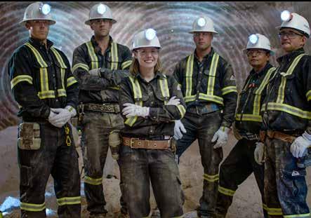
23 3.17 IMAGERY STYLE: PEOPLE / PORTRAITS 37
24 3.18 IMAGERY STYLE: ENVIRONMENT / PRODUCT 38 Environment / Product Like the portrait photography, environmental imagery should be equally sharp with colors that are processed to highlight a focal point without looking unnatural. An overall feeling of warmth and friendliness should also pervade. This can be achieved by capturing imagery during dawn or dusk hours, when the light is softest and not as harsh as midday. Image processing can also aid in achieving this look. Regardless, colors should be vibrant and healthy-looking. Concepts of plenty and abundance are also desirable.


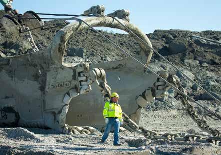
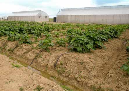
25 3.18 IMAGERY STYLE: ENVIRONMENT / PRODUCT 39
26 4.1 STATIONERY: STANDARD BUSINESS CARD 40 4-LINE CARD FORMAT x pt.25 Legal Entity/Company Name...continued Address Line 1 Address Line 2 Address Line 3 Name Here Title Here Division/Department t c f Name.Here@nutrien.com nutrien.com.3 HEIGHT OF SLASH.53 TYPOGRAPHY Legal entity/company name: 7/9 pt Foco Regular Address: 7/9 pt Foco Light Employee name: 8/9 pt Foco Bold Title: 7/9 pt Foco Light Telephone and 7/9 pt Foco Light t, c Initials: 7/9 pt Foco Bold Rule weight:.25 pt Set all text upper and lower case, flush left, ragged right, normal tracking. 5-LINE CARD 6pt Name Here Title Here Division/Department COLOR (see Color System, 3.4 for process values) Winged N leaf: Nutrien Leaf Gradient Website URL: Nutrien Leaf 2 All other text: Black Rule: Nutrien Gray 2 PRINTING METHOD Offset 6pt Legal Entity/Company Name...continued Address Line 1 Address Line 2 Address Line 3 Address Line 4 t c f Name.Here@nutrien.com nutrien.com websiteurl.two HEIGHT OF SLASH.7 PAPER Bright White 100lb (Cougar Brand recommended).25
27 4.2 STATIONERY: STANDARD LETTERHEAD FORMAT 8.5 x 11 May 21, 2018 Mr. Jonathan B. Jonas Client Company 456 Broad St. Suite 123 City, Province Dear Mr. Jonas: Ut enim ad minim veniam, quis nostrud exercitation ullamco commodo consequat laboris nisi ut aliquip ex ea commodo consequat. Lorem ipsum duis aute irure dolor velit. Duis aute irure dolor in reprehenderit in voluptate velit esse cillum fugiat nulla pariatur. Ut enim ad minim veniam, quis nostrud exercitation ullamco commodo consequat laboris nisi ut aliquip ex ea commodo consequat. Lorem ipsum duis aute irure dolor velit. Lorem ipsum dolor sit amet, consect adipisicing elit, sed eiusmod tempor incid dunt ut enim aliqua. Duis aute irure dolor in reprehenderit in voluptate velit esse cillum dolore eu fugiat nulla pariatur. Duis aute irure dolor. Lorem ipsum duis aute irure dolor velit. Duis aute irure dolor in reprehenderit in voluptate velit esse cillum fugiat nulla pariatur. Ut enim ad minim veniam, quis nostrud exercitation ullamco commodo consequat laboris nisi ut aliquip ex ea nulla pariatur commodo consequat. Sincerely, Jane Smith Vice President, Corporate Development TYPOGRAPHY Address, telephone and 7 pt Foco Light t, c Initials: 7 pt Foco Bold Rule weight:.25 pt Body copy (user generated): 11 pt Cambria, 15 pt leading preferred Set all text upper and lower case, flush left, ragged right, normal tracking. COLOR (see Color System, 3.4 for process values) Winged N leaf: Nutrien Leaf Gradient Website URL: Nutrien Leaf 2 All other text: Black Rule: Nutrien Gray 2 PRINTING METHOD Offset PAPER 60lb offset (Cougar Brand recommended) 123 Address 1 Address 2 City Province/State POS ZIP Code Country t nutrien.com.75.75
28 4.3 SIGNATURE 42 In signatures, each employee s name, title and division/department should appear in 8/9 point Arial Regular. Their contact information, including company address, phone number and , should appear in 7/9 point Arial Light. Name Title Division/Department 123 Street Address, City Prov/State Country P0S C0D t c First.Lastname@nutrien.com The website URL should appear below contact information in 7/9 Arial Bold. All signature text should be black and flush left. The full color Nutrien logo should appear below signature information, without the tagline.


 All headlines on white: Nutrien Leaf 2 Cover date: Nutrien Leaf 2")
 Rules on white: Nutrien Gray 2 Headlines/rules on Nutrien support color")

29 4.4 POWERPOINT 43 COVER INTERIOR PAGE, BULLETTED CONTENT INTERIOR PAGE, DISPLAYING LARGE CHART INTERIOR PAGE W/MULTIPLE CHARTS DIVIDER PAGE W/BACKGROUND IMAGE ALTERNATE DIVIDER PAGES TYPOGRAPHY Cover headline:47/50 pt Arial Regular Cover subhead: 24 pt Arial Regular Cover date: 12 pt Arial Regular Page header: 30 pt Arial Regular Page number: 11 pt Arial Regular Interior body text: Cambria Regular with Cambria Bold for emphasis, range of 18 pt to 24 pt recommended Footer copyright: 6 pt all caps Arial Regular Footer title, date: 10 pt all caps Arial Regular Divider page header: 36 pt Arial Regular Rule weight:.25 pt COLOR (see Color System, 3.4 for process values) All headlines on white: Nutrien Leaf 2 Cover date: Nutrien Leaf 2 Headlines/rules on image background: Black or white, depending on background value (always achieve maximum contrast) Rules on white: Nutrien Gray 2 Headlines/rules on Nutrien support color background: white Footer text: Nutrien Gray 2 All other text: black Images are full-color, except on divider pages, where they are filtered through a Nutrien Leaf Gradient effect Charts: use support colors (see 3.4); supplement with Nutrien Leaf 1 & 2 as needed for depth of data
30 4.5 PACKAGING 44 OPTION 1 OPTION 2 TYPOGRAPHY All text: u/lc Foco Regular, with Foco Bold for emphasis Rule weight: No lighter than 1 pt; rule weight should not exceed the stroke weight of text in closest proximity. All caps may be used for smaller applications where quick reading/ scanability is a concern, i.e. aisle-facing end of packaging Guaranteed Minimum Analysis Total Nitrogen (N)... 46% 46% Nitrogen Derived From Urea CAUTION Read precautions on back of bag before using. Ingredients for Growth Net Wt. 50 lbs. (22.68 kg) Nutrien U.S. Ltd. Denver CO USA Nutrien Ltd. Calgary AB Canada T2J 7E8 UREA Guaranteed Minimum Analysis Total Nitrogen (N)... 46% 46% Nitrogen Derived From Urea CAUTION Read precautions on back of bag before using. Ingredients for Growth Net Wt. 50 lbs. (22.68 kg) Nutrien U.S. Ltd. Loveland CO USA Nutrien Ltd. Calgary AB Canada T2J 7E8 UREA COLOR (see Color System, 3.4 for process values) Text on white: default color is black, with options of Nutrien Gray 2 or Nutrien Leaf 2 for emphasis Nutrien tab background: Nutrien Light Gray Gradient with option of Nutrien Leaf Gradient Text on Light Gray Gradient: black Text on Leaf Gradient: white Special case color application: cautionary content may appear in Nutrien Rust, which provided for this purpose Nutrien Light Gray Gradient Nutrien Leaf Gradient Nutrien Gray 2 Nutrien Leaf 2 Nutrien Rust R 148 G 26 B 29 C 26 M 100 Y 100 K 26

 to the promotional material, but the name")
31 4.6 APPAREL 45 GOLF SHIRT CAP (FULL LOGO AND WINGED N OPTIONS) MATERIAL/ APPLICATION For applying the Nutrien logo on premium apparel, embroidery is preferred. COLOR Apparel: white Nutrien logo, Winged N: full-color versions (match leaf to Nutrien Leaf 2 when gradient cannot be reproduced) 3.5 MAX Where applicable on promotional items, facilities can add their name (in plain font) to the promotional material, but the name must be separated from the logo to respect the clear space surrounding the brand (see Section 3.6 Clear Space)

32 4.7 TRANSPORTATION: RAILCAR 46
.")
33 4.7 TRANSPORTATION: RAILCAR 47 FPO Nutrien railcars are painted with weather-resistent enamel matching Nutrien Leaf 2 (see Color System, 3.4). Nutrien brand elements are applied in bright white electronically cut graphic film.

34 5.1 TRADESHOW MATERIALS: RATIONALE OUR BRAND / MESSAGING & GUIDELINES / BRAND ELEMENTS / APPLICATIONS / MARKETING MATERIALS 48 GENERAL RULES At all tradeshows and exhibitions, our basic corporate design elements are used. Tradeshow booth should always be a Nutrien booth. Nutrien logo should be most prominent element in booth. Product or divisional messaging should not overshadow the corporate brand. Strong graphics, concise language and a simplified message are required. All designs must closely tie to our core values while reflecting our partnership with our customers. Communication is concise, straightforward and engages in intimate dialogue with stakeholders. Approved images and type fonts are to be used. Use of tagline is important.
 49 POP-UP DISPLAY - OPTION 1 PANEL EXECUTION CAN CONSIST OF Brand image White logo and tagline Headline and subhead Bullet points Body copy URL You re handing down an awesome responsibility.")
35 5.2 TRADESHOW MATERIALS: POP-UP DISPLAY (8 FT.) 49 POP-UP DISPLAY - OPTION 1 PANEL EXECUTION CAN CONSIST OF Brand image White logo and tagline Headline and subhead Bullet points Body copy URL You re handing down an awesome responsibility. We re here to help her shoulder it. Ipsum Cuan Eran Fue Dolorse. Lorem dorem cuan eran blandit eran fue Dolor sit amet ipsum consecuter Nonummy dolorse in the cuan drizzl Lorem dorem cuan eran blandit eran fue Dolor sit amet ipsum consecuter BRAND IMAGE Always use an approved image and allow space for the headline. THE GREEN BLOCK The angled block element (colored with Nutrien Green Leaf Gradient) should always appear on the right side of the display. This area is meant to hold the logo and tagline, subhead, body copy, bullet points, and URL. COPY Headline is left-aligned and appears on Headline: Foco Regular, large pt. size Subhead: Foco Bold, maximum pt. size half the headline Body/Bulleted Copy: Foco Regular, maximum size half the headline URL: Foco Regular the brand image. The logo and tagline should be placed at the top in the green block.
36 5.3 BROCHURES OUR BRAND / MESSAGING & GUIDELINES / BRAND ELEMENTS / APPLICATIONS / MARKETING MATERIALS 50 COVER DIVISION / SUBJECT Headline for brochure. 40/43pt Foco Light. Subhead at 18pt Foco Regular BACK COVER BROCHURES CONSIST OF: Standard 8.5 x11 size Brand image Brochure title Headline CMYK logo Divisional lock-up Legal line Bottom right corner block We welcome and value your feedback on this document, Nutrien Inc Lake Fraser Dr. SE Calgary, Alberta, Canada T2J 7E8 brochure@nutrien.com


37 5.3 BROCHURES 51 INTERIOR PAGES GRID SYSTEM TABLE OF CONTENTS LOREM IPSUM 3 LOREM IPSUM LOREM IPSUM Sed in odio sit amet nibh Sed in odio sit amet nibh Sed in odio sit amet Sed in odio sit amet Sed in odio Sed in odio Sed in odio sit amet Sed in odio sit amet Sed in odio sit Sed in odio sit Sed in odio sit amet Sed in odio sit amet LOREM IPSUM LOREM IPSUM Donec dictum massa accumsan mollis Sed in odio sit amet nibh auctor. Integer aliquet cursus semper Sed in odio sit amet odio sit amet Sed in odio Sed in odio Sed in odio sit amet Sed in odio sit amet Sed in odio sit Sed in odio sit Sed in odio sit amet Sed in odio sit amet LOREM IPSUM LOREM IPSUM Sed in odio sit amet nibh Sed in odio sit amet nibh Sed in odio sit amet Sed in odio sit amet Sed in odio Sed in odio Sed in odio sit amet Sed in odio sit LOREM IPSUM Sed in odio sit amet Sed in odio sit amet nibh Sed in odio sit amet LOREM IPSUM Sed in odio Sed in odio sit amet nibh Sed in odio sit amet Sed in odio sit amet Sed in odio sit Sed in odio Sed in odio sit amet Sed in odio sit amet Sed in odio sit Sed in odio sit amet LOREM IPSUM Sed in odio sit amet nibh Sed in odio sit amet Sed in odio sit Sed in odio sit amet LOREM IPSUM Sed in odio sit amet nibh Sed in odio sit amet Sed in odio Sed in odio sit amet Sed in odio sit The formation of Nutrien molstie vitae quam. Vivamus pulvinar vestibulum Lorem ipsum dolor sit amet, consectetur adipiscing varius. Aenean id lacus ut nulla dictum blandit ac elit. Sed blandit, mi nec pulvinar luctus, arcu tortor eget eros. Pellentesque rhoncus nunc vitae tortor porta est, nec eleifend lectus quam ut orci. Nam mollis, id mollis massa dapibus. Etiam at tortor a eleifend iaculis nisi sit amet blandit. Pellentesque enim auctor dapibus venenatis ac leo. Vestibulum nec lectus quis tellus vehicula ultrices. Nulla sollicitudin elit metus. In at dignissim ipsum. Integer rut- sollicitudin pretium. Donec malesuada scelerisque pulvinar hendrerit ultrices. Sed vestibulum justo nec rum tortor vel sem blandit, eget sollicitudin lorem velit, nec bibendum ligula sollicitudin nec. suscipit. Etiam sagittis sollicitudin vestibulum. Maecenas varius ornare ligula id interdum. Maecenas Mauris sit amet gravida augue. Nam vitae placerat bibendum finibus purus consectetur viverra. Nullam ultricies blandit rutrum. Cras metus ex, facilisis tis. Nullam aliquet ex et augue suscipit, a dignissim est. Maecenas tincidunt justo quis pulvinar sagit- ac dui id, tristique condimentum purus. Ut viverra quam scelerisque. Suspendisse accumsan, enim ac tellus ut purus egestas, finibus lacinia elit viverra. Ut facilisis eleifend, diam ipsum facilisis ipsum, ut tincidunt odio nisi id metus. Curabitur nec commodo efficitur urna lacus, sed pretium dui finibus volutpat. est. Sed viverra sapien eget augue volutpat bibendum. Ut sollicitudin, sem et hendrerit suscipit, quam Vivamus erat risus, fermentum at nisi vel, rutrum ullamcorper libero. Sed ut magna in nisl tempus metus dapibus urna, et commodo lorem libero vel ornare ac ut eros. In posuere malesuada nisi, non neque. accumsan odio maximus ac. Maecenas accumsan ex eu aliquet facilisis. Nullam ac arcu metus. Sed Suspendisse potenti. Nam et gravida enim, vitae eleifend rutrum lobortis. Aenean et consequat fermentum leo. Suspendisse sit amet dui in magna tellus. Phasellus et mi eget felis volutpat iaculis sit dictum tempor in quis sapien. Cras quis lacus ut amet at arcu. Maecenas velit ipsum, pulvinar ac nisl ligula egestas mollis. Phasellus nec consequat tortor. at, porta gravida lectus. Mauris vitae gravida risus. In hac habitasse platea dictumst. Mauris vitae tellus Phasellus in ante tempor, interdum nunc blandit, leo. Nulla viverra magna sit amet massa placerat, accumsan metus. Etiam non lacus luctus, volutpat odio at, cursus lacus. Etiam interdum, ante sed fermentum, nunc sed dictum dictum, urna nunc id fermentum libero rutrum. Sed id dictum dui. Sed rhoncus vulputate, urna ante tincidunt velit, ut suscipit turpis, sit amet eleifend elit lectus at lorem. sagittis dui ex ac ante. Aliquam tincidunt sed enim Donec vitae tempus risus, in laoreet sem. quis porttitor. We are Nutrien. And we are feeding Morbi tempor, erat id pulvinar iaculis, leo quam the future. viverra dui, eu consectetur quam enim ac orci. Proin congue, urna ac maximus efficitur, urna ligula venenatis magna, ac sagittis ante massa eget nisi. Nunc nisi magna, rutrum ut pellentesque vitae, Praesent / Aliquam Donec a lobortis tortor. Donec id odio consectetur, auctor lorem at, com modo justo. Cras ac finibus libero. Praesent sapien lectus, po suere vel nisl in, facilisis rutrum tortor. Curabitur scelerisque, sem vestibulum sagittis mollis, sem quam pretium tortor, eu porttitor elit diam non neque. Sus pendisse rhoncus leo vel lacinia aliquam. Proin egestas pulvinar felis non rhoncus. Vivamus mattis hendrerit pre tium. Vestibulum eu ex nulla A B C D CAPTION FOR CHART Mauris ut sem vitae dolor gravida viverra. Vestibulum bibendum ante at sapien bibendum venenatis. elit. Sed blandit, mi nec pulvinar luctus, arcu tortor porta est, nec eleifend lectus quam ut orci. Nam eleifend iaculis nisi sit amet blandit. Pellentesque nec lectus quis tellus vehicula ultrices. Nulla sollicitudin elit metus. In at dignissim ipsum. Integer rutrum tortor vel sem blandit, eget sollicitudin lorem suscipit. Etiam sagittis sollicitudin vestibulum. Maecenas varius ornare ligula id interdum. Maecenas bibendum finibus purus consectetur viverra. Nullam ultricies blandit rutrum. Cras metus ex, facilisis ac dui id, tristique condimentum purus. Ut viverra tellus ut purus egestas, finibus lacinia elit viverra. Ut efficitur urna lacus, sed pretium dui finibus volutpat. Vivamus erat risus, fermentum at nisi vel, rutrum ullamcorper libero. Sed ut magna in nisl tempus ornare ac ut eros. In posuere malesuada nisi, non accumsan odio maximus ac. Maecenas accumsan ex eu aliquet facilisis. Nullam ac arcu metus. Sed eleifend rutrum lobortis. Aenean et consequat tellus. Phasellus et mi eget felis volutpat iaculis sit amet at arcu. Maecenas velit ipsum, pulvinar ac nisl at, porta gravida lectus. Mauris vitae gravida risus. Phasellus in ante tempor, interdum nunc blandit, accumsan metus. Etiam non lacus luctus, volutpat odio at, cursus lacus. Etiam interdum, ante sed rhoncus vulputate, urna ante tincidunt velit, ut sagittis dui ex ac ante. Aliquam tincidunt sed enim quis porttitor. Morbi tempor, erat id pulvinar iaculis, leo quam viverra dui, eu consectetur quam enim ac orci. Proin congue, urna ac maximus efficitur, urna ligula venenatis magna, ac sagittis ante massa eget nisi. Nunc nisi magna, rutrum ut pellentesque vitae, molstie vitae quam. Vivamus pulvinar vestibulum varius Suspendisse potenti. Nam et gravida enim, vitae fermentum leo. Suspendisse sit amet dui in magna dictum tempor in quis sapien. Cras quis lacus ut ligula egestas mollis. Phasellus nec consequat tortor. In hac habitasse platea dictumst. Mauris vitae tellus leo. Nulla viverra magna sit amet massa placerat, id fermentum libero rutrum. Sed id dictum dui. Sed fermentum, nunc sed dictum dictum, urna nunc suscipit turpis, sit amet eleifend elit lectus at lorem. Donec vitae tempus risus, in laoreet sem. This is a callout quote style lorem dorumeni. Firstname Lastname / Job Position Plant Name, SK Canada 6 columns x 6 rows grid Inset content placement based on rows and columns can vary between 2, 3 or even 4 column wide copy blocks or image widths CAPTION FOR PHOTOGRAPH Mauris ut sem vitae dolor gravida viverra. Vestibulum bibendum ante at sapien bibendum venenatis. LOREM IPSUM / LOREM IPSUM 5


38 5.4 OUTDOOR OUR BRAND / MESSAGING & GUIDELINES / BRAND ELEMENTS / APPLICATIONS / MARKETING MATERIALS 52 SAMPLE In outdoor applications, the Nutrien logo should always appear locked up with our tagline, Feeding the Future. For optimal impact and readability, the logo lock-up should always appear within the Nutrien Tab. The larger Nutrien Tab with the URL should be the default. The Nutrien Tab should always appear in the bottom right corner. Any of the specified Nutrien Tab colors (white, gray, green) may be used for outdoor applications.

 may be used.")
39 5.5 STATIC DIGITAL BANNERS 53 SAMPLE The following logo usage rules apply to static digital banners: Logo must be locked with tagline. Lock-up must appear within the Nutrien Tab. The smaller Nutrien Tab without the URL should be used for banners. The Nutrien Tab must appear in the lower right corner. Any of the specified tab colors (white, gray, green) may be used. The call-to-action should always appear within a pill-shaped button underneath or to the right of the headline.


 may be")
40 5.6 ANIMATED DIGITAL BANNERS OUR BRAND / MESSAGING & GUIDELINES / BRAND ELEMENTS / APPLICATIONS / MARKETING MATERIALS 54 SAMPLE The logo usage rules for animated digital banners are the same as those for static digital banners: Logo must be locked with tagline. Lock-up must appear within the Nutrien Tab. The smaller Nutrien Tab without the URL should be used for banners. The Nutrien Tab must appear in the lower right corner. Any of the specified tab colors (white, gray, green) may be used. The call-to-action should always appear within a pill-shaped button underneath or to the right of the headline.
41 5.7 INTERNAL COMMUNICATIONS 55 POSTER SAMPLE For internal communications, such as posters, all outdoor logo usage rules apply: Logo must be locked with tagline. Lock-up must appear within the Nutrien Tab. The larger Nutrien Tab size with the URL should be the default. The Nutrien Tab must appear in the lower right corner. Any of the specified tab colors (white, gray, green) may be used.

42 5.8 SUB-BRANDS (CO-BRANDING) OUR BRAND / MESSAGING & GUIDELINES / BRAND ELEMENTS / APPLICATIONS / MARKETING MATERIALS 56 POSTER SAMPLE When the Nutrien logo appears with one or more of our sub-brands, the following rules apply: All logos should appear at the bottom of the piece. The Nutrien logo must be locked with tagline. The Nutrien Tab should be extended to accommodate all sub-brand logos. All sub-brand logos should appear within the Nutrien Tab. All logos should be approximately the same size (equal in height). All logos should be the same color (full color, all black, or all white). All sub-brand logos should be separated by a thin vertical line. The distance of the vertical line from each logo should be equal to its x height. The Nutrien logo should always appear furthest to the right in any series of two or more logos.


43 5.9 BROADCASTING & VIDEO: END FRAME LOGO ANIMATION 57 Ending frames of video conclude Nutrien Winged Leaf icon quickly zooms into frame, masking out end frames of video Icon zooms toward center, revealing white background Icon settles in Nutrien N appears Remaining letters of Nutrien logotype grow outward from N Nutrien logotype fully revealed Feeding quickly fades in, moving forward the Future fades in as tagline settles in to final position
Chicago Manual of Style
 Sample Typeset Xulon Press will typeset the interior of your book according to the Chicago Manual of Style method of document formatting, which is the publishing industry standard. The sample attached
Running head: PAPER TITLE 1
 Running head: PAPER TITLE 1 The "h" is not capitalized. The paper title in the header must be capitalized; if it is too long, shorten it so that the header is all on one line. Write a descriptive title;
Chicago Manual of Style
 Sample Typeset Xulon Press will typeset the interior of your book according to the Chicago Manual of Style method of document formatting, which is the publishing industry standard. The sample attached
Chicago Manual of Style
 Sample Typeset Xulon Press will typeset the interior of your book according to the Chicago Manual of Style method of document formatting, which is the publishing industry standard. The sample attached
Chicago Manual of Style
 Sample Typeset Xulon Press will typeset the interior of your book according to the Chicago Manual of Style method of document formatting, which is the publishing industry standard. The sample attached
World Solar Challenge Branding Guidelines
 World Solar Challenge Branding Guidelines Introduction The World Solar Challenge Masterbrand is based upon a set of graphic elements: the sun symbol, the logo type, the corporate typeface and the corporate
Long Post With Pagination
 Long Post With Pagination Author : admin Date : June 6, 2014 The Amazing Spider Man 1 / 5 Lorem ipsum dolor sit amet, consectetur adipiscing elit. Integer aliquet massa leo, commodo consectetur nisi iaculis
Imaginary Product User s Guide
 Imaginary Product User s Guide The Imaginary Company London, Ontario, Canada Copyright 2012 James Gordon Bailie Imaginary Product is a Trademark of the Imaginary Company, Ltd Contents Install the Imaginary
TITLE OF DOCUMENT GOES HERE: BE SURE TO SINGLE SPACE
 TITLE OF DOCUMENT GOES HERE: BE SURE TO SINGLE SPACE A Specialist Project Presented to The Faculty of the Department of Psychology Western Kentucky University Bowling Green, Kentucky In Partial Fulfillment
PREZI. Online Companies. Pick an online company and discuss the following DUE. Requirements:
 PREZI DUE Online Companies Pick an online company and discuss the following Requirements: A total of 10 frames Pick a theme Show at least 4 different images Use at least 2 different shapes as part of the
A Capstone Project Report on Analytics Work Carried Out at IBM
 A on Analytics Work Carried Out at IBM a project report submitted in partial fulfillment for the requirements of the degree of Master of IT in Business Analytics by Candidate Name under the guidance of
Introductory Narrative
 [COOL LOGO] Design Document Cool Team Frodo Baggins, Samwise Gamgee, Meriadoc Brandybuck, Pregrin Took Introductory Narrative Lorem ipsum dolor sit amet, consectetuer adipiscing elit. Suspendisse rhoncus
Nam accumsan elit in leo. Donec ornare. Suspendisse ut dolor.
 April 2018 2 nd Grade News Our poetry unit begins in ELA this month! We will be writing and reading poetry of all kinds. We will also focus on parts of speech, metaphors, similes and point of view. Some
IYNA Format Guidelines
 IYNA Format Guidelines 1. IYNA Format begins with the title of each paper, which must be between 25 and 75 characters, including subtitles, size 26 black Sorts Mill Goudy typeface aligned right. 2. Beneath
Bannockburn Primary School. KS1 News Letter
 Bannockburn Primary School Notices KS1 News Letter The Great Fire of London! Please remember it is school policy for all children to bring their PE kit to school every Monday. All kits will be returned
November Visual Identity Guidelines Ministry of Education
 November 2017 Visual Identity Guidelines Ministry of Education Introduction The way we visually represent the EarlyON brand plays a key role in the way we are perceived both internally by our various partners
Author s Full Name. Undergraduate degree, institution, year. Master degree, if applicable, institution, year. Submitted to the Graduate Faculty of
 Title Page Title of Thesis or Dissertation by Author s Full Name Undergraduate degree, institution, year Master degree, if applicable, institution, year Submitted to the Graduate Faculty of Name of school
Learning By Design. By Design Workshops. What is Learning By Design? What are some Learning By Design projects? Look for Learning
 & Learning By Design What is Learning By Design? We are a group of dedicated PAEA educators committed to providing art teachers with the resources, skills, and tools needed to infuse design into an art
CES Working Papers Author guidlines
 PAGE size: A4 (21x29.7 cm); Margins: Top: 2 cm; Bottom: 1.5 cm; Left & Right: 2 cm. Paragraph format: Justified, 1.5 line spacing (spacing before: 0, after: 0, normal style. CES Working Papers Author guidlines
THE EDGE - BRAND THE EDGE - BRAND STRATEGY THE MARK PMS 7473 PMS 7473 (70%) PMS 7473 (40%) PMS 7473 (70%) PMS 7470 THE LOGOTYPE THE TAGLINE
 PMS 7473 (40%) PMS 7473 (70%) PMS 7470 THE LOGOTYPE THE TAGLINE") THE EDGE - BRAND THE MARK (70%) (40%) (70%) PMS 7470 THE LOGOTYPE THE TAGLINE PMS COOL GRAY 5 minimum size 2 PMS 717 THE EDGE - BRAND STRATEGY Having a strong brand strategy that clearly conveys a defined
THE EDGE - BRAND THE MARK (70%) (40%) (70%) PMS 7470 THE LOGOTYPE THE TAGLINE PMS COOL GRAY 5 minimum size 2 PMS 717 THE EDGE - BRAND STRATEGY Having a strong brand strategy that clearly conveys a defined
Brand identity guidelines September 2009
 Brand identity guidelines September 2009 Contents 1 Introduction 3 2 Brand qualities 4 2.1 Description 5 2.2 Core values 6 2.3 Working principles 7 2.4 Personality 8 3 Visual identity standards 9 3.1 Logotype
Module one Elements and usage. Brand identity guidelines
 Module one Elements and usage Brand identity guidelines 1. Contents 2.1 Our mission 2.2 Our brand 2.3 Our brand identity 2.4 At a glance 3.1 Our logos and their uses 3.2 Our logo 3.3 Minimum logo sizes
PRICES/SIZES: BLACK & WHITE
 Bishop Montgomery High School The yearbook staff is now offering the opportunity to personalize the yearbook in a very special way with a Senior Ad. Space is available to congratulate a graduate. To reserve
Steppenwolf Graphic Standards STEPPENWOLF
 Steppenwolf Graphic Standards By Juliet Rutter - Fall Term 2016 Table of Contents Introduction Pg. 3 Glossary Pg. 4 Logo and Logotype Pg. 5 Use of Space Pg. 6 Color Pg. 7 Typeography Pg. 8 Business Card
Title of Your Thesis. Student s Full Name. This thesis is presented as part of the requirements for the conferral of the degree: Your Degree
 Title of Your Thesis Student s Full Name This thesis is presented as part of the requirements for the conferral of the degree: Your Degree Supervisor: Your Supervisor(s) The University of Wollongong School
BRAND IDENTITY GUIDELINES
 BRAND IDENTITY GUIDELINES CONTENTS 1. LOGO 01 2. BRAND COLOR PALETTE 07 3. TYPOGRAPHY 10 4. PUBLICATIONS 13 Section 1 LOGO The logo is the most immediate representation and important element in the overall
Connecting for Life Brand Book _CFL_Brand_Guidelines_Booklet_v5.indd 1 14/02/ :30
 Connecting for Life Brand Book 25679_CFL_Brand_Guidelines_Booklet_v5.indd 1 14/02/2017 11:30 1 Introduction 25679_CFL_Brand_Guidelines_Booklet_v5.indd 2 14/02/2017 11:30 1 Introduction In June 2015, Connecting
ICEL ND IR. Next stop, Iceland. Corporate Identity Manual for Graphic Standards
 Corporate Identity Manual for Graphic Standards Table of Contents IcelandAir s Corporate Identity Manual is here for you convenience. This manual allows you to see into the corporate identity of IcelandAir.
visual indentity guidelines
 visual indentity guidelines The Logo This mark was inspired by the campus steeple, which is a recognizable landmark that speaks to Bluefield College s foundation in faith and academics. The steeple is
1st national bank Branding guidelines
 1st national bank Branding guidelines Produced by ORANGE MEDIA GROUP INC St. Lucia Limited 1st National Bank The new logo is an embodiment of the history, values and vision of the rebranded institution.
Co-Map Modeling. February 14, 2010
 Co-Map Modeling Arthur Little Micheal Kelly February 14, 010 Abstract Lorem ipsum dolor sit amet, consectetur adipiscing elit. Vivamus ut quam vel ipsum porta congue ac sit amet urna. Fusce non purus sit
Foreward Soils as records of Past and Present: the geoarchaeological approach. Focus on: is there time for fieldwork today?
 Foreward In the frame of the scientific meeting Soils as records of Past and Present: the geoarchaeological approach. Focus on: is there time for fieldwork today? a publication will be prepared containing
Instructions for Authors
 Instructions for Authors 1. About Before you submit a manuscript for publication, please read the Instructions for Authors and the Editorial Policy. Submission of a manuscript to International Journal
BRAND STANDARDS GUIDE. How to use the KMA brand to maintain a cohesive identity in all mediums of visual communication.
 BRAND STANDARDS GUIDE How to use the KMA brand to maintain a cohesive identity in all mediums of visual communication. BRAND VISION Going forward begins with understanding where we are. We are in Knoxville.
BRAND GUIDELINES. For any questions regarding branding, please contact
 BRAND GUIDELINES For any questions regarding branding, please contact austin.bullock@everbridge.com LOGO CORRECT USAGE Full logo with registered trademark symbol. Do not separate the bridges from everbridge
Communication and Visibility Manual
 Programme funded by Joint Operational Programme Black Sea Basin 2014-2020 Communication and Visibility Manual December, 2017 nd 2 Edition Content 1. Introduction 3 2. Visual Identity Elements 2.1 Use of
APPENDIX TO THE INTERNATIONAL COMPETITION
 APPENDIX TO THE INTERNATIONAL COMPETITION The first Conference (Cover - Title) François Lallier 1 1.- Author s Curriculum Vitae 2 2.- Application Form 2.1.- Personal details: Name: Surname: Education /
GEOGRAPHY HONOURS THESIS HANDBOOK
 GEOGRAPHY HONOURS THESIS HANDBOOK 2009-2010 Prepared by Prof. Benjamin Forest Honours Thesis Coordinator Contents Thesis guidelines... 1 Thesis layout example... 8 Archival abstract guidelines... 21 Archival
There is also a less obvious reason why some people, I believe, might be inclined to make fun of this song. A quote from Natalie:
 KIND AND GENEROUS By: Annie If there is one song above all others in Natalie Merchant's musical compendium that could be singled out as the most ripe for taunts, insults, and eye rolls, it surely is Kind
GRAPHIC STANDARDS THE UNIVERSITY OF SOUTHERN MISSISSIPPI UPDATED AUGUST 2018
 GRAPHIC STANDARDS THE UNIVERSITY OF SOUTHERN MISSISSIPPI UPDATED AUGUST 2018 QUICK POINTS UNIVERSITY LOGO 1 - Communications materials and advertisements should be approved by the Office of University
GEOGRAPHY HONOURS THESIS HANDBOOK
 GEOGRAPHY HONOURS THESIS HANDBOOK 2016-2017 Prepared by: Prof. Benjamin Forest (Hons. co- ordinator 2009-2011) Updates by: Profs Sarah Turner and Natalie Oswin (Hons. co- ordinators). Contents Thesis guidelines...1
EDUCATE. SUPPORT. INSPIRE.
 The Mission of the Arturo Sandoval Institute is to Educate, Support and Inspire music students to continue music education without regard to their economic circumstances. Providing scholarships, instruments,
Branding Guidelines NORTH SAINT PAUL SAINT PAUL
 Branding Guidelines NORTH This project was supported by the Resilient Communities Project (RCP), a program at the University of Minnesota that convenes the wide- ranging expertise of U of M faculty and
THE UMALAYATHESIS L A T E X DOCUMENT CLASS LIM LIAN TZE INSTITUTE OF POSTGRADUATE STUDIES UNIVERSITY OF MALAYA KUALA LUMPUR
 THE UMALAYATHESIS L A T E X DOCUMENT CLASS LIM LIAN TZE INSTITUTE OF POSTGRADUATE STUDIES UNIVERSITY OF MALAYA KUALA LUMPUR 2015 THE UMALAYATHESIS LATEX DOCUMENT CLASS LIM LIAN TZE THESIS SUBMITTED IN
THE UMALAYATHESIS L A T E X DOCUMENT CLASS LIM LIAN TZE INSTITUTE OF POSTGRADUATE STUDIES UNIVERSITY OF MALAYA KUALA LUMPUR
 THE UMALAYATHESIS L A T E X DOCUMENT CLASS LIM LIAN TZE INSTITUTE OF POSTGRADUATE STUDIES UNIVERSITY OF MALAYA KUALA LUMPUR 2010 THE UMALAYATHESIS LATEX DOCUMENT CLASS LIM LIAN TZE THESIS SUBMITTED IN
Vision Source. Signage and Brand Collateral GRAPHIC DESIGN CONTROL DOCUMENTS (DCDs) 19 February Updated - 04 March Updated - 01 April 2011
 19 February Updated - 04 March Updated - 01 April 2011") Vision Source Signage and Brand Collateral GRAPHIC DESIGN CONTROL DOCUMENTS (DCDs) 19 February 2011 Updated - 04 March 2011 Updated - 01 April 2011 Table of Contents GS Graphic Specifications Exterior
Vision Source Signage and Brand Collateral GRAPHIC DESIGN CONTROL DOCUMENTS (DCDs) 19 February 2011 Updated - 04 March 2011 Updated - 01 April 2011 Table of Contents GS Graphic Specifications Exterior
THE UMALAYATHESIS L A T E X DOCUMENT CLASS LIM LIAN TZE INSTITUTE OF POSTGRADUATE STUDIES UNIVERSITY OF MALAYA KUALA LUMPUR
 THE UMALAYATHESIS L A T E X DOCUMENT CLASS LIM LIAN TZE INSTITUTE OF POSTGRADUATE STUDIES UNIVERSITY OF MALAYA KUALA LUMPUR 2015 THE UMALAYATHESIS LATEX DOCUMENT CLASS LIM LIAN TZE THESIS SUBMITTED IN
How We Strengthen Our Logo Identity. University Guidelines for Brand Usage
 How We Strengthen Our Logo Identity University Guidelines for Brand Usage How We Strengthen Our Logo Identity University Guidelines for Brand Usage Arkansas State University-Mountain Home First Edition
Visual Identity Program
 A Guide to the Utah State University Visual Identity Program www.usu.edu/prm/identity Edition Two (v9, 09/06/2016) 2 TABLE OF CONTENTS Letter from the President.... 3 Introduction.... 4 Approval process...
MULTIMEDIA UNIVERSITY THESIS TEMPLATE
 MULTIMEDIA UNIVERSITY THESIS TEMPLATE LIM LIAN TZE MASTER OF SCIENCE (INFORMATION TECHNOLOGY) MULTIMEDIA UNIVERSITY APRIL 2016 MULTIMEDIA UNIVERSITY THESIS TEMPLATE BY LIM LIAN TZE B.Sc. (Hons), University
[pp ] Metamorphosis. Detail Lightjet print on diasec cm aluminium box edge. 160 x 160 cm. [pp ]
![[pp ] Metamorphosis. Detail Lightjet print on diasec cm aluminium box edge. 160 x 160 cm. [pp ]](/thumbs/89/97831279.jpg "[pp ] Metamorphosis. Detail Lightjet print on diasec cm aluminium box edge. 160 x 160 cm. [pp ]") Hubertus von Amelunxen Translation [pp. 162 163] Metamorphosis. Detail. 2012. Lightjet print on diasec + 3.5 cm aluminium box edge. 160 x 160 cm. [pp. 164 165] Metamorphosis. Detail. 2012. Lightjet print
Hubertus von Amelunxen Translation [pp. 162 163] Metamorphosis. Detail. 2012. Lightjet print on diasec + 3.5 cm aluminium box edge. 160 x 160 cm. [pp. 164 165] Metamorphosis. Detail. 2012. Lightjet print
BRAND IDENTITY GUIDELINES
 BRAND IDENTITY GUIDELINES Focus Fo rward. the logo primary logo secondary logo construction & clear space alternate versions the cellcontrol roundel color primary palette secondary palette color values
Stewards of planet Earth
 Stewards of planet Earth Earth Collective Magazine August 2018 1 Purple Ad Full Page 209 x 297 mm Inside cover location Earth Collective Magazine August 2018 2 Hello Everyone, Stewards of planet Earth,
Article Title: Subtitle or Supplementary Information. Lorem ipsum dolor sit amet, consectetuer adipiscing elit. Maecenas porttitor congue
 1 2 3 4 5 6 7 8 9 10 11 12 13 14 15 16 17 Article Title: Subtitle or Supplementary Information Name of author 1: Author 1 affiliations Name of author 2: Author 2 affiliations Name of author 3: Author 3
Znips London 75 Wilton Road, London SW1V 1DE Telephone: +44 (0) Znips London Identity Manual
 Znips London Identity Manual") Znips London 75 Wilton Road, London SW1V 1DE Telephone: +44 (0)20 7828 6688 Znips London Identity Manual Znips London Identity Manual This identity manual outlines how to apply the Znips London identity
Znips London 75 Wilton Road, London SW1V 1DE Telephone: +44 (0)20 7828 6688 Znips London Identity Manual Znips London Identity Manual This identity manual outlines how to apply the Znips London identity
Visual Identity Standards
 1 Visual Identity Standards Information and inquiries: University Relations brand@ucalgary.ca Visual Identity Standards 2 15.0 Eyes High 15.01 Introduction 15.01 Introduction 15.02 What is Eyes High? 15.03
BRANDBOOK STYLE 2017
 BRANDBOOK STYLE 2017 01 Logo Identity The logo consists of a graphic element, the name of the district and our tagline. The tagline, Soar to Greatness, enhances our brand identity as a district that believes
Name & Branding. Design Goals. The Logo
 STYLE GUIDE 5/10/18 Name & Branding As an organization, and in many ways, as a city, our future depends on our ability to support and sustain a virtuous cycle that begins with our residents and the unique
CYPRESS FAIRBANKS ISD
 CYPRESS FAIRBANKS ISD BRAND Standards and Guidelines Table of Contents Basic Guidelines 3 Color 4 Correct Uses 5 Incorrect Uses 6 Stationery 7 Video 8 Social Media 9 Print Communications 11 Electronic
BRAND GUIDELINES EDDY PUMP
 BRAND GUIDELINES EDDY PUMP We Pump Solids Not Water INDEX 1 2 3 ABOUT US OUR LOGO COLOR SYSTEM 4 5 TYPOGRAPHY DO'S AND DON'TS ABOUT US EDDY Pump Corporation is a dredge equipment and pump manufacturer,
BRANDING GUIDELINES Enterprise Nation
 BRANDING GUIDELINES Enterprise Nation Enterprise Nation Logo Normal use logo The Normal use logo should be used where possible. However there are certain exceptions. Stacked logo This should only be used
THE LOOK OF OUR BRAND
 THE LOOK OF OUR BRAND For Internal Use Only Not For Use With The Public. For help and guidance on our brand standards, contact marketinginbox@firstcommand.com. OUR LOOK CONSISTENCY USAGE 29 OUR LOGO The
LATEST UPDATE 4 OF MAY Brand materials Guidelines
 LATEST UPDATE 4 OF MAY 2018 Brand materials Guidelines Material production steps 1 Select item that fit with Nortal visual identity Select the item with a color that fits the Nortal visual identity. If
Earth Collective Magazine August
 Earth Collective Magazine August 2018 1 Purple Ad Full Page 209 x 297 mm Inside cover location Earth Collective Magazine August 2018 2 Blue Ad Half Page 209 x 146 mm Inside cover location Yellow Ad Eighth
MORECAMBE BAY PARTNERSHIP. Brand guidelines October 2013
 Brand guidelines October 2013 Key messages These statements are intrinsic to the identity of the Morecambe Bay Partnership, summing up the goals, aspirations and values of the organisation. The messages
CASE LGBT. Diversity. Show Me The BUSINESS Launch edition. LGBT Diversity: Show Me The Business Case
 LGBT Diversity Show Me The BUSINESS CASE 2015 Launch edition CONTENTS Introduction 3 Welcome 4 Power 5 Leadership 6 Champions 7 LGBT2020 Business Case data notes 8 Out at work 9 Homophobia 10 Stay or go?
SUNDAY, OCTOBER 15, 2010
 THE Daily globe $2.00 WWW.DAILYGLOBE.COM BRITAIN PLANS DEEPEST PUBLIC SPENDING CUTS IN 60 YEARS by Andrew Martin LONDON - Praesent turpis nunc, hendrerit sed gravida at, venenatis at nulla. In hac habitasse
Nature Connects and Sean Kenney 2. The Nature Connects logo 3. Logo background colors 4. The single-color logo 5. The tagline logo 6
 This document outlines how to use the Nature Connects brand and the LEGO brand in your promotional content. If you use the Nature Connects logo or write LEGO, send us your designs for review prior to publishing
ENGL2200 Guidelines & Instructions for Essay 3: Abstract and Annotated Bibliography
 ENGL2200 Guidelines & Instructions for Essay 3: Abstract and Annotated Bibliography Length: Due Dates: 3-4 pages Wednesday, 22 March: Draft 1 due for in-class peer review Wednesday, 29 March: Revised Draft
Introduction 1.1 Why a New Visual Identity System? Visual Identity Policy What is branding, and why is it important? 4 1.
 Introduction 1.1 Why a New Visual Identity System? 2 1.2 Visual Identity Policy 3 1.3 What is branding, and why is it important? 4 1.4 Why use the university s logo? 5 1.5 Why should you consider working
GUIDELINES FOR THE PREPARATION OF DISSERTATION AND THESIS
 GUIDELINES FOR THE PREPARATION OF DISSERTATION AND THESIS Faculty of Science@2018 THESIS FORMAT 1) CONVENTIONAL FORMAT 2) PUBLICATION FORMAT (REQUIRE 5 ISI PUBLICATIONS) Faculty of Science NOT ACCEPTED
FILLM IDENTITY TOOLKIT
 FILLM IDENTITY TOOLKIT IDENTITY DESCRIPTION The visual identity of FILLM is based on the International Federation for Modern Languages and Literatures profile and values. The federation aims to reach a
PLATINUM PROFILE INFORMATION & POLICIES
 Full page PLATinum Profile NEW layouts now available see options 4 thru 14 With the purchase of a Platinum Profile, our production department will help you choose the layout option that best reflects your
Kenya Vision 2030 Brand Guidelines. Brand Identity Guidelines
 Brand Identity Guidelines 1 Section Contents Section 1 - Introduction 1.0 Introdution to Kenya Vision 2030 1.1 Introduction to Our Brand Guidelines Section 2 - Brand Identity 2.0 Kenya Vision 2030 Logo
GUIDELINES FOR THE PREPARATION OF DISSERTATION AND THESIS
 GUIDELINES FOR THE PREPARATION OF DISSERTATION AND THESIS Faculty of Science@2018 THESIS FORMAT 1) CONVENTIONAL FORMAT 2) PUBLICATION FORMAT (REQUIRE 5 ISI PUBLICATIONS) Faculty of Science NOT ACCEPTED
The use of Rail Baltica logo Visual Guidelines
 The use of Rail Baltica logo Visual Guidelines Rail Baltica project involves the construction of a new European standard gauge high-speed rail line infrastructure to connect Northeast Europe with Central
Newnan-Coweta Chamber Brand Standards Identity, Logo Usage and Copy Style Guide. Beyond Full Circle Marketing
 Newnan-Coweta Chamber Brand Standards Identity, Logo Usage and Copy Style Guide Beyond Full Circle Marketing GRAPHIC STANDARDS. 1 Contents 2 Introduction 3 Approved Usage 4-6 Logo Usage Guidelines For
4 Advertising. Advertising
 4 4 Advertising 4.1 Introduction 4.2 lue locks System 4.3 Full-Page Grid 4.4.1 Half-Page Horizontal Grid 4.4.2 Half-Page Vertical Grid 4.5 Quarter-Page Grid 4.6 Small-Size Grid 4.7.1 Full-Page Example
IDENTITY GUIDELINES. An overview of logo useage, brand colors and fonts
 IDENTITY GUIDELINES An overview of logo useage, brand colors and fonts Last revised: APRIL 2016 This document is meant to serve as a general guideline for the use of the SMITE logo and to help ensure a
OMNIPOD DASH SYSTEM STYLEGUIDE
 OMNIPOD DASH SYSTEM STYLEGUIDE INTRODUCTION This document is intended to provide users with a basic set of graphic standards for applying the Omnipod DASH System brand standards. It also includes the core
BRAND GUIDELINES. a visual identity guide for the Malta EU2017 brand
 BRAND GUIDELINES a visual identity guide for the Malta EU2017 brand BRANDGUIDELINES LOGOtype Our logo is the key element that identifies the 2017 Maltese Presidency of the Council of the European Union.
Brand Guidelines. Berkshire Hathaway HomeServices Brand Guidelines. Updated: September 2016
 Berkshire Hathaway HomeServices Brand Guidelines. Updated: September 2016 Brand Guidelines Table of Contents INTRODUCTION TO THE BRAND AND BASIC BRAND GUIDELINES... 4 Referencing Mr. Buffett in Marketing
The University Brand GUIDELINES
 TM The University Brand GUIDELINES CONTENTS Why Consistent Visual Identity is Important... 4 Marshall University Brand... 5 Marshall University Brand Components...6-9 University Fonts and Colors...11-12
BRAND IDENTITY GUIDELINES
 BRAND IDENTITY GUIDELINES Contents BRAND IDENTITY Overview Components BRAND LOGO Standards Exclusion zone Variations Rules of use Color standards Color variations BRAND TYPOGRAPHY Writing style Logo with
Safe Boating Campaign Brand Guidelines
 Safe Boating Campaign Brand Guidelines Reference to any specific commercial product, process, or service, or the use of any trade, firm or corporation name is for the information and convenience of the
VIRGINIA BEACH CONVENTION & VISITORS BUREAU brand standards. style guide ACH CON V ENTION & V ISITORS BURE AU 2018
 B R A N D S TA N DA RV D SI RS G T YILN E IGAU I B DE E ACH CON V ENTION & V ISITORS BURE AU 2018 brand standards style guide 1 2 thank you This guide was produced for our trusted partners, to instill
Branding Identity Guidelines
 Branding Identity Guidelines Optimist International 4494 Lindell Boulevard St. Louis, MO 608 (4) 7-6000 optimist.org Canadian Service Centre 505 Metropolitan Boulevard East, Suite 00 Montreal, QC HR Z7
CORPORATE IDENTITY. Visual guidelines
 CORPORATE IDENTITY Visual guidelines This style guide will serve as a tool to maintain the integrity of the RelianceCM TM identity and brand recognition. As the brand is the most visible extension of RelianceCM,
CRISTINA MITTERMEIER/iLCP
 Identity Guidelines CRISTINA MITTERMEIER/iLCP Our logo is our mark, our signature, our flag. It is modern, yet it is timeless. It is iconic and, therefore, easily recognizable. Most importantly, it represents
Brand and Logo Styleguide. Marketing & Communications. The Lone Star College Brand Identity System Updated December 2017
 Marketing & Communications Brand and Logo Styleguide The Lone Star College Brand Identity System Updated LSC Public Information Council LSC-System Office, The Woodlands Jed Young Executive Director, Communications
UNIVERSITY IDENTITY STANDARDS. Together, we are building a stronger identity of which we can be proud.
 UNIVERSITY IDENTITY STANDARDS Together, we are building a stronger identity of which we can be proud. TABLE OF CONTENTS UNIVERSITY IDENTITY STANDARDS Table of Contents 2 Letter from the President 3 Introduction
This guide is designed to define the USA Roller Sports brand and to help you create communications that bring it to life.
 Brand Standards This guide is designed to define the USA Roller Sports brand and to help you create communications that bring it to life. The consistent use of the standards will bring a unified messaging
Brand Guidelines GRANTEES AND PARTNERS JUN. 2018
 Brand Guidelines GRANTEES AND PARTNERS JUN. 2018 Logo Guidelines 02 Welcome Welcome to First 5 LA s etended family! We are proud of the work your organization is doing for the children and families in
Graphic Standards Manual
 Graphic Standards Manual Contents The Importance of Graphic Standards... 3 SkillsUS Trademarks...3 Using the SkillsUS Name in Print...4 Using the SkillsUS Name in Conjunction with the SkillsUS Championships
BRAND GUIDELINES VENDOR COPY AUGUST ecoatm BRAND GUIDELINES
 BRAND GUIDELINES VENDOR COPY AUGUST 2014 7059.0814 1 BRAND STANDARDS CONTENTS Brand Standards Primary Logo Endorsers Logo Lockup Secondary Logos, Black and White Margins and Minimum Size Incorrect Usage
BRAND v2 GUIDELINES 1
 1 BRAND GUIDELINES v2 THESE GUIDELINES SHOW HOW TO USE OUR IDENTITY ACROSS ALL COMMUNICATIONS ON SCREEN, IN PRINT, AND ON PRODUCTS. LET S BRING THE ULTIMATE EARS BRAND TO LIFE. LISTEN 2 UP 3 CONTENT 04
Brand Support Guide
 Brand Support Guide 6-1-10 Table of Contents Mission Statement 1 Letter From Art Falco 2 Our Brand 3 Our Name (and why) 4 Geographical Name (and why) 5 Logo Usage 6 Logo Rationale 7 Variations 8 Colors
Corporate identity fundamental elements
 Corporate identity fundamental elements 1 LOGO: fundamentals / introduction The Cittaslow International logo was designed in 2003 by Piergiorgio Maoloni one of the most important Italian graphic designers
Visual Identity Standards
 1 Visual Identity Standards 1.0 Logo and visual identity Information and inquiries: University Relations brand@ucalgary.ca Visual Identity Standards 1.0 Logo and visual identity The importance of visual
TABLE OF CONTENTS. One eye sees, the other feels. Principles, elements and tone Wordmark Color palatte Typefaces Studio influences 3,
 brand style guide TABLE OF CONTENTS Principles, elements and tone Wordmark Color palatte Typefaces Studio influences 3, 4 5 6 7 8-13 One eye sees, the other feels. -Paul Klee 2 PRINCIPLES, ELEMENTS & TONE