Brand Guild Lines. Sustenance
|
|
|
- Byron Hugo Stanley
- 5 years ago
- Views:
Transcription
1 Brand Guild Lines Sustenance Version

2 Introduction Sustenance is a food brand that provides delicious, nutritious and locally sourced children s lunch packs. Sustenance supports the Australian economy and the Australian public by providing healthy and environmentally sustainable goods. Sustenance represents a true Australian outlook and only supports suppliers that promote Australian grown and made, and those Australian owned companies that operate in a highly ethical manner. Sustenance s corporate identity has two simple, main purposes. The first purpose is to communicate with the consumers on a visual level. Secondly, Sustenance s identity will tell people who Sustenance are and set Sustenance apart from the competitors. Through following the rules outlined in this guide you will help reinforce Sustenance s environmentally sound, child friendly, and Australian outlook. Design, good or bad, is a vehicle of memory. Good design adds value. ~Paul Rand

3 4 Sustenance 12 Business Card Contents 5 Concept 13 Envelope 6 Colours 14 Letter Head 7 Reverse 15 Paper Stock 8 Improper Use 16 Examples of logo usege 9 Typography 17 Examples of logo usage 10 Scale 18 Examples of logo usage 11 White Space 19 Logo usage
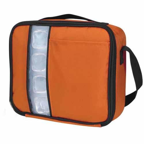
4 Sustenance A recent study of Australian children s school lunches found that most children brought home a packaged lunch box, children consumed up to four highly processed junk foods each day and almost all lunch boxes included bread and fruit, but also contained biscuits unhealthy muesli/fruit bars and packaged snacks. Sustenance takes the guess work out of children s lunches by providing a range of packaged meals that are healthy, locally sourced, and free from preservatives and gels. Sustenance is backed by a team of paediatricians and nutritionist who provide us with the latest research on Children s well-being and health. Time poor and culinary challenged Australian parents complain that they don t have the time or knowledge to source and create the healthy lunches that their children need to provide them with the most optimum sustenance. Sustenance has a range of 20 speciality meals that offer variety and options for dairy, wheat and nut allergies as well as gluten-free options. Our wide variety of meals allow for your child to have variety and assures that they will never come home with a full packed lunch box! Also, competing supermarket brands often tout healthy Children s snacks that are anything but. This was recently discovered in the recent Sanitarium debacle, when Sanitarium described a dubious percentage of fruit content on their packaging for a product which included higher amounts of other substances such as sugars and gelling agents. That s where Sustenance comes into play. Our products are all locally sourced, all items are grown, sourced and produced in Australia. We support the Australian economy and to provide the Australian public with healthy and environmentally sustainable goods. All of our profits remain here, and by giving healthy lunch solutions to families at reasonable prices, we will help sustain the future of our country. 4 S ustenance

5 Concept Sustenance is a company with an environmentally sound, child friendly, and Australian outlook. The current logo that is being presented reflects the high-end, organic and sustainable food brand, while also incorporating a child friendly edge into the design. Sustenance s mission is to provide children with a range of packed meals that are healthy, locally sourced, and is free from preservatives and gels. Through supplying healthy lunch solutions to families at reasonable prices, Sustenance will help sustain the future of the economy. Sustenance s aim is to have a logo that will appeal to adults and children. The logo is based of the Australian bird, the emu. The emu is one of Australia s national icons, which is known to feed on organic foods such as grains, flowers, berries, soft shoots, insects, grubs and whatever else they can find. The emu represents the high-end, organic aspect that Sustenance is trying to convey in its logo. The pink and green colours are used to convey the child friendly and Australian outlook the brand is trying to express to its public.the pink colouring is adapted into the logo from the bottle brush flower, found in the Australian environment. This colour also appeals to young girls and children. The green in the logo is used, as it is one of Australia s national and well-known colours. This colour within the logo is a soft green, as it will appeal to young boys and children. Through the development of the logo, it will address the problem of children bringing back home a packed lunch box. Adults and children alike will be able to associate the logo to the organic and sustainable food that will be available to families by Sustenance. Sustenance 5

6 Colours Color should reinforce the architecture, balance the natural conditions. ~John F. Saladino Pantone: DS U R 240 G 103 B 147 C 0 M 75 Y 15 K 0 Pantone: DS U R 169 G 197 B 107 C 30 M 0 Y 70 K 10 The Sustenance brand uses white space in its logo to convey an open and uncluttered feeling. White space is used as a way of strengthening its modern corporate identity. The pink and the green colours communicates the child friendly and Australian outlook the brand is trying to convey. The pink is a representation of youth and joy fullness of children. With this said, the Sustenance colour palette consists of colours that are commonly found from the Australian outback. The pink comes from the well known Australian flower, the Bottle Brush. The green is used as this colour is commonly found everywhere in the Australian environment. The green reflects and reinforces the organic, high-end and sustainable image the brand is trying to convey. Drawing upon the environment for the colour palette of the brands identity, creates a warm and approachable feeling towards Sustenance. 6 S ustenance
7 Reverse Black and White White and Black Reverse Black Reverse White Reverse Colour The use of the black and white logo, will be used for advertising along parkways, roads and places where colour may be distracting. The reverse logo will be used when the detail of the logo is lost through shrinking the image. Sustenance 7

8 2. Improper Use Squashing the logo should be avoided as it looses the initial structure. 2. Stretching the logo must be avoided as the text and the emu image looses its initial form. 3. Rotating the logo should be avoided as it looses its initial recognition. 4. Placing the logo in front of a dark or cluttered image should be avoided 5. Squashing, rotating or changing the type face of the logo must be avoided as the logo will look messy deformed and loose any message it was trying to convey. Misuse of the Sustenance logo, in any way, devalues it. The logo should always be displayed in its entirety. The proportion of the logo (height and width ratio) should always be kept. The logo should never be displayed in rough form. 8 S ustenance
9 Didot Regular is only to be used as the type face for the logo/brand identity and for office use. This typeface should never be used with italics. This type face should never placed behind a messy or busy picture and should not be used with all CAPS in body paragraphs. If all CAPS was to be used along with the pink emu logo then the message would be lost. Didot Bold is to be used for small headers in document text. Typography Didot Regular ABCDEFGHIJKLMNOPQRSTUVWXYZ abcdefghijklmnopqrstuvwxyz Didot Bold ABCDEFGHIJKLMNOPQRSTUVWXYZ abcdefghijklmnopqrstuvwxyz Arial Regular is a substitute for Didot Regular for office use only. Sometimes the use of Didot Regular can be hard to read and this type face can be used for a substitute on official documents, reports or any other office document if so required. Arial Bold is to be used for small headers in document text. Arial Regular ABCDEFGHIJKLMNOPQRSTUVWXYZ abcdefghijklmnopqrstuvwxyz Arial Bold ABCDEFGHIJKLMNOPQRSTUVWXYZ abcdefghijklmnopqrstuvwxyz Sustenance 9
10 79.2mm Scale 19.8mm This is the smallest the logo can be scaled without loosing clarity 16.8mm Enlargement x mm 118.8mm Enlargement x 6 10 S ustenance 100.8mm
11 Beauty of style and harmony and grace and good rhythm depend on simplicity. ~Plato White Space The amount of white space that should be present around the logo should be 1 x, X = height of the S in the logo type for the top and the bottom. 2 x, X = height of the S in the logo type for the right and left hand side of the logo. Sustenance 11
12 Business Card Business Cards 90mm x 55mm (Not shown at actual size) A Logo Prints 100% Pantone DS U & DS U Name Prints 100% black 11pt Didot typeface Title Prints 100% black 7pt Arial Regular typeface B Address/phone numbers/fax/ Prints 100% black 6pt Didot Regular typeface Logo background Prints 10% opacity pantone DS U Business card backing Prints 100% pantone DS U Logo prints 100% paper 12 S ustenance
13 Envelope Envelopes DL 220 x 110mm (Not shown at actual size) Address Prints 100% black 10pt Didot Regular typeface Logo Prints 100% Pantone DS U & DS U Logo background Prints 10% opacity pantone DS U Sustenance 13
14 Letterhead Letterhead 210 x 297mm (Not shown at actual size) Logo Prints 100% Pantone DS U & DS U Address/phone numbers/fax Prints 100% black 9pt Didot Regular typeface Logo background Prints 10% opacity pantone DS U Body Copy Prints 100% black 10pt Didot Regular 13pt leading 14 S ustenance

15 Paper Stock The type of paper that is chosen, can either make or break the design or logo. Along with the logo or design, the type of paper chosen, is also a representation of the brand, what it represents and the professionalism of the company. The type of paper stock that Sustenance will use is as follows: The general,everyday mailing envelope is usually 80 gsm. Other weights of envelopes include 90 gsm for mailing heavier objects, and 100 gsm for letterhead correspondence and more prestigious mailing. The brand Sustenance will use an 80 gsm weight as it is the easiest and most convenient for every day mailing. Business Cards (90mm x 55mm) 300 gsm silk Envelopes (220 x 110mm) 80 gsm white wove Letterhead (210 x 297mm) 100 gsm colotech White wove is the paper that is commonly used for envelope creation and distribution. It is simple to use, reproduce and print upon. Sustenance 15

16 Examples of Logo Usage S ustenance

17 Examples of Logo Usage 2. Sustenance 17


18 Examples of Logo Usage S ustenance
19 Logo Usage 1. Simplicity is the best form of advertising. It is uncluttered, clean and easy to see on the road or whilst driving. The placement of the logo on the truck is designed to draw the passers eye and in turn create a lasting impression upon the viewer/impressionable consumer. The colours, although are aimed at children and young families, are bright and eye catching. This is exactly what is needed in advertising and a good brand identity. 2. The second example of using the logo, is a perfect way of showing how to use the black or white alternative of the original Sustenance logo. If the pink and green logo was to be placed on a brightly coloured lunch box then the logo would fade or dissolve into the coloruing of that item. The white or black alternative is a perfect way of attracting adults into buying these products and the fun cartoon like image of the emu will attract the children into wanting the products on offer. 3. The use of street advertising on high walls or tall buildings allow for the public to be exposed to the logo/brand identity. 4. Street, poster and bus bay advertisement allows for a more personal was of advertising. It gets right into the consumers face and screams out buy me. Placing the logo behind a lightly coloured background allows for a more welcoming feel and child friendly edge, which is what the brand is trying to convey. Design should never say, Look at me. It should always say, Look at this. David Craib Sustenance 19
20
Brand Guidelines. January 2015
 Brand Guidelines January 2015 Table of Contents 1.0 What s a brand? 3 1.1 The logo 4 1.2 Colour 1.2.1 Spot & Process 1.2.2 Black & White 5 5 6 1.3 Logo Sizing 1.3.1 Minimum Clear Space 1.3.2 Positioning
Design Manual for Communication among Partners
 Edition November 2017 Design Manual for Communication among Partners an initiative of Contents The BLUecoMPETENCE initiative Page 3 Classification of logos BLUecoMPETENCE Page 4 Handling of the Page 5
FACILITYLINK CORPORATE IDENTITY MANUAL
 FACILITYLINK CORPORATE IDENTITY MANUAL Table of Contents Page 2 of 47 Introduction 3 Corporate Design Elements 7 Corporate Design Application 25 Logo Application for Subsidised Activities 44 Table of Contents
For Children with Developmental Differences. Brand Identity Guide
 For Children with Developmental Differences Brand Identity Guide Table of Contents 3 Our Visual Identity System 4 About These Guidelines 5 The Logo 6 Clear Space & Minimum Size 7-8 Logo Variations 9 Icon
Graphic Standards & Brand Guidelines
 Graphic Standards & Brand Guidelines Overview The Brand Seattle Southside Regional Tourism Authority is about substance more than style, comfort more than luxury, and value more than status. With this
School of Social Work. Partnering for Change Style Guide
 School of Social Work Partnering for Change Style Guide September 4, 2009 Partnering for Change Campaign Introduction Rutgers School of Social Work is embarking upon a campaign intended to create a comprehensive,
GRAPHIC STANDARDS MANUAL
 GRAPHIC STANDARDS MANUAL Azusa Pacific University is an, evangelical Christian community of disciples and scholars who seek to advance the work of God in the world through academic excellence in liberal
1. Introduction. nexogy is more than just next technology, it is a team working for customer solutions.
 CONTENT 1. Introduction 2. Using nexogy s Logo 3. Tagline 4. Stationary Set 5. Promotional design 6. Vehicles Wrapping 7. Signage 8. Typography 9. Color Pallete 1. Introduction This is a friendly guide
BRAND GUIDELINES CRAFTSMAN QUALITY STAINS & FINISHES SINCE 1953.
 BRAND GUIDELINES CRAFTSMAN QUALITY STAINS & FINISHES SINCE 1953. TOP 10 THINGS TO REMEMBER ABOUT Old Masters BRANDING 1. Always use the correct logo artwork. 2. Never modify or recreate logo artwork. 3.
Prairie Rivers of Iowa Logo & Brand Standard
 Prairie Rivers of Iowa Logo & Brand Standard Table of contents 1...What is a brand? 2...The Prairie Rivers of Iowa logo 3...Clear Space Around the Prairie Rivers of Iowa Logo 4...Other logos used by Prairie
Sunshine School. Branding Guideline
 Branding Guideline 2010-2011 www.snshnscl.org Contents 3 Introduction What We Do and Why We Do It Our Organization Our Personality The Importance of a Brand 6 The Logo Our Logo Logo Usage Variations of
CORPORATE VISUAL IDENTITY GUIDELINES. for the use of the OAAS Logo
 CORPORATE VISUAL IDENTITY GUIDELINES for the use of the OAAS Logo ONTARIO ASSOCIATION OF AGRICULTURAL SOCIETIES September 2017 Introduction Our branding is more than a name and a logo. Our branding is
The U.S. Fund for UNICEF Communications Style. Guide
 The U.S. Fund for UNICEF Communications Style Guide Table of Contents 1.0 The U.S. Fund for UNICEF 1.1 Our Mission 1.2 Our Brand Position 2.0 Our Goals 3.0 The UNICEF Story 4.0 Logo Versions 4.1 Logo Size
Corporate Identity and Visual Identity Guidelines June 2011
 Corporate Identity and Visual Identity Guidelines June 2011 Index A Basic Design Elements A 01 The BenQ Logo A 02 Minimum Size, Minimum Staging Area A 03 Typography A 04 Corporate Colours B B 01 B 02 B
Book of visual identification
 Copyright 2018 Table of content 01. Introduction................................................. 3 02. Forms of sign................................................. 4 03. Colour variants of the sign...................................
Background. Proper Color Usage
 Utah Tr ansit autho rit y G r a ph i c S ta n da r ds Background The purpose of this guide is to ensure proper usage of the UTA logo so that a consistent, well-recognized brand identity can be maintained.
B R A N D G U I D E L I N E S
 BRAND GUIDELINES OUR PRODUCT IS OUR PEOPLE EVERY DAY OUR PEOPLE PROVIDE AN ENTIRELY POSITIVE, ABOVE AND BEYOND SERVICE EXPERIENCE TO EVERY CLIENT IN THE TSP FAMILY. We believe in the power of relationships
HarvestMaster Logo LOGO COLORS: STANDARD COLOR & SPACING LOGO COLORS: SIMPLIFIED
 HarvestMaster COLOR & SPACING LOGO COLORS: STANDARD LOGO COLORS: SIMPLIFIED To ensure the prominence, clarity, and visual impact of the HarvestMaster logo, please adhere to the following guidelines regarding
Visual identity guidelines
 Visual identity guidelines Contents Introduction 01 Our logo 02 Using our logo 03 05 Our symbol 06 Our coat of arms 07 Our typefaces 08 09 Our colour palette 10 11 Our imagery 12 13 Contacts 14 Introduction
Kodiak Brand Guide. April 2015
 Kodiak Brand Guide April 2015 //kodiakptt.com/company/brand/ Table of Contents The brand is more than a logo 2 Communication 4 Tone & Style 4 Kodiak in Writing 4 Kodiak Marks & Logo 5 Standard Wordmark
Al Ajban Chicken Brand Guideline
 Al Ajban Chicken Brand Guideline Implementing the Al Ajban Chicken brand in communications V.I - November 2015 Introduction In 1981, Al Ajban Poultry Farm started its operations, becoming the first and
Graphic Identity Standards
 Graphic Identity Standards Welcome to our visual identity. At Loyola Marymount University, our goal is to become one of the nation s distinguished Catholic universities with a commitment to academic ecellence
BRANDING STANDARDS MANUAL
 BRANDING STANDARDS MANUAL 2014 Index Logo University version 2 School versions 3 Usage Spacing 4 Sizing 5 Color 6 Logo mark 7 Unacceptable Executions 8-9 Color 10-11 Typography 12 Other Graphic Marks Seal
University of Iowa Stead Family Children s Hospital Brand Identity Standards
 University of Iowa Stead Family Children s Hospital Brand Identity Standards Effective November 11, 2016 1 Contents Introduction Introduction... 1 Editorial Style Guide... 2 General communication... 2
Version 3:0 September 2015
 Identity guidelines Version 3:0 September 2015 The Buxton logotype The new logotype embraces the concept of water - and a source of water. The focal point of the design is the letter O' where water emerges
CMA VISUAL IDENTITY GUIDE. January 2018
 CMA VISUAL IDENTITY GUIDE January 2018 CMA Visual Identity Guide Logo overview The CMA logo is composed of the French and English wordmarks and the CMA icon (note: the logo is always bilingual, even in
Canadian Aquatic Invasive Species Network
 Canadian Aquatic Invasive Species Network Graphic Standards Manual Effective January 2007 This Graphic Standards Manual covers the graphic identity guidelines for the Canadian Aquatic Invasive Species
GRAPHIC STANDARDS MANUAL Policy and guidelines for using the Hostos Community College 50 th Anniversary Brand Identity
 GRAPHIC STANDARDS MANUAL Policy and guidelines for using the Hostos Community College 50 th Anniversary Brand Identity TABLE OF CONTENTS Policy and Applications... 3 Hostos 50th Anniversary Primary Logo...
BRAND GUIDELINES 1 BRAND GUIDELINES
 BRAND GUIDELINES 1 BRAND GUIDELINES BRAND GUIDELINES 2 BRAND GUIDELINES 3 Contents Introduction The aims of the brand 02 About this booklet 02 Who can use the brand 02 Resources 02 Design Elements & Usage
Quality Care Pharmacy Program
 Quality Care Pharmacy Program How to use the QCPP logo in your pharmacy and promote your accreditation. Contents Logo Specifications...2 Logo Placement...3 QCPP Decal...4 Logo Colours for print and screen...5
BRAND GUIDELINES. July version 2.1
 BRAND GUIDELINES July 2015 - version 2.1 INTRODUCTION The Noritz Brand As we grow and advance as an organization, it sometimes becomes necessary to reevaluate our visual identity. That s why I am pleased
recognition and strength
 Introduction A corporate identity is the fundamental style, quality, character and personality that sets one organization apart from all others. Corporate identity plays a crucial role in laying the foundation
HINO BRAND VISUAL DESIGN MANUAL V1.3e
 HINO BRAND VISUAL DESIGN MANUAL V1.3e Introduction Each basic element in communications, such as the corporate logomark and brand colors, contributes to building brand and plays a vital role in creating
AUCA Standard Graphic Identity Manual
 AUCA Standard Graphic Identity Manual GRAPHIC STANDARDS MANUAL This is the Graphic Standards Manual for the American University of Central Asia. It sets the standard for the design of all AUCA public communications
Brand Guidelines 2017
 Brand Guidelines 2017 Table of Contents introduction welcome to burke mission logo usage standard standards with taglines color usage improper logo usage specialty usage color palette and gradients typography
RESNET. Professional Logos Guide
 RESNET Professional Logos Guide Trusted Experts in Home Energy Efficiency The National Association of State Energy Officials and Mortgage Bankers Association of America founded the Residential Energy Services
TARGA RESOURCES, INC.
 TARGA RESOURCES, INC. Corporate Identity Program STANDARDS CORPORATE LOGO STANDARDS The corporate logo standards provide guidelines for applying the Targa Resources corporate logo to publications, signage,
SOUTHEAST TECH BRANDING IDENTITY STANDARDS MANUAL
 SOUTHEAST TECH BRANDING IDENTITY STANDARDS MANUAL INTRODUCTION The Southeast Tech Branding Identity Standards Manual was created to provide all Southeast Tech employees and associates with the ability
Cisco College Style Guide
 Cisco College Style Guide Cisco College is a leading provider of education in West Central Texas and presenting a consistent brand and image is imperative to the organization s continued success. In today
GETTING UMSU BRAND BASICS RIGHT
 GETTING UMSU BRAND BASICS RIGHT UMSU Brand Guidelines 2017 UMSU BRAND GUIDELINES 2017 CONTENTS INTRODUCTION 4 UMSU BRAND: AN OVERVIEW 6 UMSU LOGO 7 UOM LOGO 8 CORRECT USE OF THE LOGO 9 INCORRECT USE OF
NSW INSTITUTE OF SPORT CORPORATE IDENTITY MANUAL. Guidelines for the use of the NSWIS and ClubsNSW corporate identity
 NSW INSTITUTE OF SPORT CORPORATE IDENTITY MANUAL Guidelines for the use of the NSWIS and ClubsNSW corporate identity CONTENTS Introduction 1 The NSWIS Brand 1 NSWIS Purpose 2 NSWIS Values 2 Use of the
Recycling for Life. Brand Style Guide
 Brand Style Guide Brand Identity Brand identity expresses both what an organization is and what it aspires to be. It is a promise as well as a commitment. A strong identity indicates that a company has
CTAM TV Everywhere guidelines. version June, 2015
 CTAM TV Everywhere guidelines version 3.0 - June, 2015 Table of Contents General Rules Logo Versions Spacing and Sizing Incorrect Uses Applications Colors Contact Info 3 4-7 8 9 10 11 12 2 General Rules
Village Seven Presbyterian Church Graphic Standards Manual VillageSeven
 Village Seven Graphic Standards Manual Village Seven Graphic Standards Manual Contents Statement of Purpose 3 Endorsement Letter 3 Logo 4 Logo Usage 5 Colors 6 Alternate Logo Formats 7 Additional Logo
one M2M Logo Brand Guidelines
 one M2M Logo Brand Guidelines July 2012 Logo Design Explanation What does the one M2M logo symbolize? The number 2 in the middle part of the logo symbolizes the connection between the two machines, the
UNICEF CLUBS BRAND BOOK
 UNICEF CLUBS BRAND BOOK 2016 17 updated July 1, 2016 Contents How to Use This Book.... 3 Logo Usage Guidelines.... 4 Typography Our Fonts.... 10 Color USF Color Palette.... 11 2 UNICEF CLUBS Brand Book
BRAND GUIDELINES
 BRAND GUIDELINES 2018-19 Mount Pisgah Christian School Department of Admissions and Marketing OUR BRAND Our brand is the composite of all elements that communicate to the world who we are as a school and
Brand Guidelines. Version 4 - Dec 2016
 Brand Guidelines Version 4 - Dec 2016 CONTENTS pg.3 pg.4 pg.5-6 pg.7 pg.8 pg.9 pg.10 pg.11 pg.12 pg.13 pg.14 pg.15 pg.16 pg.17 pg.18 Tone of Voice Brand Colours Logo Logo - Clearance Zones Logo - Minimum
VICTORY BREWING COMPANY LOGOS
 REVISION DATE - 5/2/2017 VICTORY BREWING COMPANY LOGOS Victory Brewing Company offers the following logos for marketing and branding needs. BANNER LOGO BOTTLE CAP LOGO VICTORY BREWING COMPANY LOGOTYPE
IADD BRANDING GUIDELINES
 IADD BRANDING GUIDELINES VERSION 1, JULY 2107 The International Association of Directional Drilling (IADD) is a 501(c) (6) not-for-profit organization dedicated to promoting directional drilling, as well
Visual Style Guide April 2016
 Visual Style Guide April 2016 Contents Introduction to the Logo 3 Safe Area and Size 4 Incorrect Usage 5 Color Palette 6 Typography 7 Tone and Style of Photography 8 Print Examples 9 Screen Examples 10
DESIGN & BRAND Guidelines
 DESIGN & BRAND Guidelines TABLE OF CONTENTS This document provides guidelines to ensure the correct use of the Belgian Development Cooperation visual identity. A correct and consistent implementation conveys
VISUAL IDENTITY GUIDELINES. Updated
 VISUAL IDENTITY GUIDELINES Updated 2.12.2016 VISUAL IDENTITY GUIDELINES Table of Contents 1. Introduction Basic Design Elements 2. Logo 2.1 Clear zone 2.2 Logo misuse 2.3 Sponsor logo lock-up 3. Colors
Shippensburg University. University Communications and Marketing
 Shippensburg University University Communications and Marketing 1 (Updated September 2017) The Shippensburg University Institutional Identity Guide establishes official policy and standards for the use
Brand identity guidelines
 Brand identity guidelines Version 1.2 November 2016 01 Contents 01 Contents 02 Introducing the 03 Who are these guidelines for? 04 The logo 05 Explaining the logo 06 Logo exclusion zone 07 Logo minimum
Visual Identity Guide for Local Chapters
 Visual Identity Guide for Local Chapters Table of Contents Introduction............................................. 1 The Eat Smart, Move More SC Brand....................... 1 Vision, Mission, Elevator
Brand Guidelines Consumer Marketing
 Brand Guidelines Consumer Marketing Michigan Economic Development Corporation Version 3.3 (October 2016) What is it? The words Pure Michigan and the logo are trademarked by the MEDC. While the MEDC has
The Metro Logo January Hello, we re Metro.
 The Metro Logo January 2011 Hello, we re Metro. 1 Metro is accelerating. We re building on a long history of public service and adding cutting-edge technologies to plan, operate and maintain transportation
AMBA Development Network Brand Usage and Style Guidelines
 AMBA Development Network Brand Usage and Style Guidelines IDENTITY GUIDE PALETTE USAGE The AMBA Development Network brand Leverage the strength and status of the ADN by clearly displaying the AMBA Development
Brand Guidelines 2018
 Contents Logotype 03 Space required of logotype 04 Logo variants 05 Incorrect use of logotype 06 Brand colours 07 Typefaces 08 Additional graphic elements 09 Supporting logo for EHNS countries 10 Logotype
brand guidelines march 2013
 brand guidelines march 2013 1 1 about these guidelines This document focuses specifically on the guidelines for using the Acal BFi logo. It covers practical details like how to choose the correct logo
BASIC MANUAL OF CEPSA IDENTITY
 BASIC MANUAL OF CEPSA IDENTITY April 2018 Cepsa Basic Identity Manual Welcome This manual contains all the elements that make up the Cepsa identity. This manual contains all the elements that make up the
Graphic Standards. A guide to Lane s visual identity, with information on using the college logo, Lane colors and typefaces, stationery, and more.
 Graphic Standards A guide to Lane s visual identity, with information on using the college logo, Lane colors and typefaces, stationery, and more. TABLE OF CONTENTS Introduction to Graphic Standards...1
Asia-Europe Meeting (ASEM)
") Version 1.0 / October 2013 www.aseminfoboard.org Asia-Europe Meeting (ASEM) Logo Guidelines Information on how to apply the ASEM logo 1.0 The ASEM Logo The core element of the brand identity is the logo.
Version 1.0 / October 2013 www.aseminfoboard.org Asia-Europe Meeting (ASEM) Logo Guidelines Information on how to apply the ASEM logo 1.0 The ASEM Logo The core element of the brand identity is the logo.
FileMaker Corporate Style Guide
 ilemaker Corporate Style Guide General guidelines for logo usage and corporate identity 5201 Patrick Henry Drive Santa Clara, CA 95054, USA Tel: (408) 987.7000 Welcome Our identity is one of our most valuable
HINO BRAND VISUAL DESIGN MANUAL V1.2e
 HINO BRAND VISUAL DESIGN MANUAL V1.2e Introduction Each basic element in communications, such as the corporate logomark and brand colors, contributes to building brand and plays a vital role in creating
TABLE OF CONTENTS BRAND IDENTITY INTRODUCTION...3 OFFICIAL COLOR PALETTE...4 PRIMARY ATHLETIC MARK SECONDARY ATHLETIC MARKS...
 TABLE OF CONTENTS BRAND IDENTITY INTRODUCTION...3 OFFICIAL COLOR PALETTE...4 PRIMARY ATHLETIC MARK...5-6 SECONDARY ATHLETIC MARKS...7-8 ATHLETIC WORDMARKS... 9-10 TYPOGRAPHY... 11 WORDMARK LOCKUPS...12-15
Corporate Identification Guidelines
 It s Our Corporate Signature Corporate Identification Guidelines The Electro-Motive company logotype or logo is our corporate signature. It identifies the products, services, service parts, facilities,
BRAND. Standards LOGO GUIDE
 BRAND Standards LOGO GUIDE TABLE OF CONTENTS INTRODUCTION Why a Brand Standards Manual?... 4 The Big Picture....5-7 TRADEMARK STANDARDS Logo Variations... 9-13 Correct Logo Usage... 14 Incorrect Logo Usage...
Prometric Graphic Standards
 www.prometricbrand.com Version 3.0 :: August 2015 Introduction: Our Brand Every interaction we have with our marketplace affects our brand. In fact, our brand is nothing more than the cumulative impression
Graphic Identity Manual MARKETING DEPARTMENT
 Graphic Identity Manual MARKETING DEPARTMENT Introduction The success of the Westfield State graphic identity depends on the consistent use of communications materials by everyone involved with the university.
Brand Identity Standards & Guidelines. PTCB Brand Identity Standards & Guidelines / V.001 / ptcb.org
 Brand Identity Standards & Guidelines 1 CONTENTS Our Story 03 OVERVIEW Brand Identity Standards & Guidelines 05 BRAND STRATEGY Mission, Vision & Tagline 07 Services & Target Audiences 08 Brand Principles
Table of Contents. Stationery 24 Business card 25 Letterhead 26 #10 Envelope. Document Note
 Table of Contents Document Note The goal of these guidelines is to help communicate the strategy and visual system behind the SPX brand. If you have questions about anything in this guide, please reach
MER MEC S.p.A. // B R A N D G U I D E USE OF THE LOGO. version EN
 B R A N D G U I D E USE OF THE LOGO version EN0314.01 OUR LOGO Here it is again our logo. Our logo is the most visible element of our identity a universal signature across all Demand Media communications.
LOGO MANUAL. Definition of the basic use of the logo
 LOGO MANUAL Definition of the basic use of the logo INTRODUCTION The KELLYS Logo Manual is a document that sets forth the basic rules for the use of the graphic elements of the KELLYS BICYCLES logo and
Identity Standards Guide: Color Art Integrated Interiors 2012
 Identity Standards Guide: Color Art Integrated Interiors 2012 Table of Contents Color Art Integrated Interiors 3 3 Color & Type Face 5 Exceptions 5 A. If you are working with a colored background 5 B.
TITLE MASTER GARDENER PROGRAMS STYLE GUIDE MASTER GARDENER STYLE GUIDE
 TITLE MASTER GARDENER PROGRAMS STYLE GUIDE 1 TABLE OF CONTENTS 3 INTRODUCTION 4 About 5 Program Hierarchy 6 LOGO LOCK-UP GUIDELINES 7 Clearspace and Alignment 8 Subset Program Lock-Ups 9 LOGO ALTERNATES,
Introduction. Page 1. Welcome to the signage guidelines for St John Ambulance premises, updated as of May 2013.
 Signage guidelines Introduction Welcome to the signage guidelines for St John Ambulance premises, updated as of May 2013. These guidelines provide a signage standard for all St John Ambulance buildings,
v CORPORATE GUIDELINES
 1. CORPORATE GUIDELINES Primary colours for print Colours to be used across print platforms globally. Pantone Orange 172 SPOT PREFERRED PRINT OPTION CMYK Orange 4 COLOUR SECONDARY PRINT OPTION C0/M6/Y100/K0
IREM Headquarters and Chapter Version January 9, Brand and Style Guide
 IREM Headquarters and Chapter Version January 9, 2018 Brand and Style Guide Table of Contents Section 1: Brand Messaging 3 - About IREM 4 - Brand Positioning 5 - IREM Trademarks 6-7 Section 2: Logos and
Introduction. 2 MOTT Community College Identity Guidelines
 IDENTITY GUIDELINES Introduction It is important that Mott Community College maintain a consistent, professional image. All Mott materials, including internal and external publications, signage, flyers,
LUDIS IUNGIT VISUAL IDENTITY GUIDELINES
 LUDIS IUNGIT VISUAL IDENTITY GUIDELINES of the Logo 2 Logo Meaning The PANATHLON INTERNATIONAL LUDIS IUNGIT logo is made up of a pictogram and a logo. Both elements are aligned centrally. The pictogram
I D E N T I T Y G U I D E L I N E S
 I D E N T I T Y G U I D E L I N E S THE CORPORATE MARK Logo Components The Digium family of logos are the cornerstone of the identity program. Together with the following key design elements, the logo
ZOWIE IDENTITY GUIDEBOOK 2
 IDENTITY GUIDEBOOK ZOWIE IDENTITY GUIDEBOOK 2 Contents 03 Introduction 04 The Combination for Both Equity 05 The ZOWIE Logo The ZOWIE LOGO Logo Variations Horizontal Logo Variations Vertical Primary Color
LOGO IDENTITY GUIDE. Questions about this guide should be directed to: Stacia Lynch, Director
 LOGO IDENTITY GUIDE Questions about this guide should be directed to: Stacia Lynch, Director sclynch@eiu.edu Christy Kilgore, Assistant Director ckilgore@eiu.edu MARKETING & BRANDING GUIDELINES For information
The logo mark is always used in full color.
 1 - Strauss Free Raised logo mark To the right is the Strauss Free Raised logo mark. It is the principal mark that represents the brand. It should be used to represent the brand to all audiences. The logo
visual identity guidelines
 visual identity guidelines Georgetown University Alumni Association s visual identity looks to the past for inspiration but must remain relevant for the 21st century and be responsive to the varied needs
ZOWIE IDENTITY GUIDEBOOK 2
 IDENTITY GUIDEBOOK ZOWIE IDENTITY GUIDEBOOK 2 Contents 03 Introduction 04 The Combination for Both Equity 06 The ZOWIE Logo The ZOWIE LOGO Logo Variations Horizontal Logo Variations Vertical Primary Color
Member co-branding guidelines, August V1
 Member co-branding guidelines, August 2014. V1 OnTheMarket.com These guidelines are designed to help you introduce and manage co-branding with OnTheMarket.com across all your relevant communications material.
Basic Elements > Logos and Markings
 Page 1 Please note: The full functionality of the tutorial is guaranteed only with use of the latest browser versions. Contents At a glance: DB brand Division Logo DB Netze Division Logo DB Schenker Color
United Way Waterloo Region Communities Brand Identity Guidelines September 2018
 United Way Waterloo Region Communities Brand Identity Guidelines September 2018 United Way Centraide Master Brandmark The United Way Centraide master brandmark is made of three distinct elements: logo
Peace4Youth Brand Guidelines
 PeaceYouth Brand Guidelines 2 Introduction PeaceYouth is the brand name which has been specifically developed for the Children and Young People Objective 2 (Action 2.1) of the European Union s PEACE IV
BOISE STATE UNIVERSITY has adopted a graphic identity program
 GRAPHIC IDENTITY REFERENCE GUIDE BOISE STATE UNIVERSITY has adopted a graphic identity program that includes a symbol, typographic style and logos. Together, these create a mark for the university that
Great Falls College Montana State University Graphic Standards
 Table of Contents Why are graphic standards important?... A The Great Falls College Montana State University brand... B Vision, Mission and Values...B1 Core Themes...B2 The Brand Components... C The Academic
OUR MISSION: We at Metro Transit deliver environmentally sustainable transportation choices that link people, jobs and community conveniently,
 OUR MISSION: We at Metro Transit deliver environmentally sustainable transportation choices that link people, jobs and community conveniently, consistently and safely. d Metro Transit Brand Standards The
Gin-Cor Industries Inc. Brand Guidelines
 Last updated: August 26, 2015 About Our Vision To be a leader in the manufacturing of vocational trucks. Our Mission To manufacture customized vocational trucks that workers want to drive and owners want
Trojan Holding Corporate Brand Guideline. Implementing the Trojan Holding brand in communications
 Trojan Holding Corporate Brand Guideline Implementing the Trojan Holding brand in communications V.II - September 2015 Introduction Trojan Holding is considered one of the fastest-growing construction
Revision 1.1. Juniper Systems Brand Style Guide
 Revision 1.1 Juniper Systems Brand Style Guide Contents Page 1 Introduction Page 2 Adequate Spacing Page 3 Solid and Reversed Logo Types Page 4 Unacceptable Uses of the Logo and Emblem Page 5 Acceptable
Brand Guidelines 2017 Version 1.0
 Brand Guidelines 2017 Version 1.0 OwnLocal 2017. ALL RIGHT RESERVED OwnLocal Headquarters 205 W 9th Street Suite 600 Austin, TX 78701 www.ownlocal.com TABLE OF CONTENTS 01 Introduction Our Mission Core
CLICK TO GO BACK TO THE START CLICK TO JUMP TO ANY SECTION
 Style Guide CLICK TO GO BACK TO THE START CLICK TO JUMP TO ANY SECTION 2 2018 TABLE OF CONTENTS 3 BRAND POSITION 4 FAMILY OF MARKS 17 Mission Statement 5 Tournament of Roses 19 Vision Statement 5 Rose