CORPORATE IDENTITY AND BRANDING GUIDELINES 1 PAGE. SALGA CORPORATE IDENTITY AND BRANDING GUIDELINES
|
|
|
- Coleen Black
- 5 years ago
- Views:
Transcription
1 CORPORATE IDENTITY AND BRANDING GUIDELINES 1
2 2
3 Copyright 2016 South African Local Government Association (SALGA) Tel: +27 (0) Fax: +27 (0) Physical Address: Menlyn Corporate Park, Block B 175 Corobay Avenue Cnr Garsfontein and Corobay Waterkloof Glen ext11 PRETORIA Postal Address: PO Box 2094, PRETORIA 0001 No part of this manual may be copied, transmitted or used for any purpose without the permission of SALGA. STRATEGY SALGA Marketing DESIGN Graphic Design Unit LEGAL SALGA Legal Unit 3
4 TABLE OF CONTENT 1 Brand assets 1.1 Introduction Primary logo Elements of the primary logo Primary logo - Sizing grid Primary logo - Control grid Black and White logo Outline Single colour applications Secondary logo Secondary logo - Control grid Black and White logo Outline Single colour applications Logo minimum sizes Logo symbol Logo symbol - Sizing grid Speech bubble - construction Colour pallette Colour application Logo don ts The typefaces photographic style
5 2 Media Applications 2.1 Print Letterhead Compliment slip Folder Notes Pad Business cards Envelops Name tags Guidlines Fax cover sheet Internal Memo, Circular, Forms & Organisational Structure Covers Internal & External Newsletters Posters Guidlines Brochure/ Annual Report Guidlines Outdoor advertising Guidlines Electronic signature Website Powerpoint presentations CD and CD covers Co-branding Level 1-branding partners Level 2-branding partners Level 3-branding partners Special projects Multiple partners
6 3 Signage 3.1 Identification signage Pylon Wall-mounted signs Reception signs Wall projecting signs Way finding signs Information signage Window Decals Office hours sign Basic emergency signage Exhibition Pull-up banners A-Frame / Pop-up Banners Backdrop / Media Banners Promotional Items 4.1 Wrapping paper Paper bags Table Cloths Wall Calendars Desk Calendars Mouse pads Business organiser / filofax / diary Umbrellas, bags and keyrings
7 5 Corporate clothing 5.1 General and project - specific clothing Shirt, tie, cuff links and tie clip Cleaners Uniform Golf, round neck t-shirts Informal men and women s wear Sports shirt and jacket Caps and Hats Car Branding 6.1 Pick-up truck with / without canopy Hatchback Panel van with full side windows
8 Glossary Acronym Brand Brand architecture Corporate identity Brand management Branding signatures Branding Column width Corporate Identity Manual Copyright Co-branding Clear space CMYK Control grid Embossing Functional naming Foiling Kerning Leading Media applications Monolithic brand A word formed from the initial letters of other words. A brand is a mixture of tangible and intangible attributes that identity and differentiate a product, service, person or organization. It embodies the promise an organization makes to its stakeholders. Brand architecture is the organizing structure of the relationship of brands in a portfolio in relation to each other. The way by which the organization presents itself to its stakeholders and differentiates itself from other entities. The management of the intangible and tangible aspects of a brand. The composition and placement of the brand s logo and symbols on various elements of communication. Branding is the blending of tangible and intangible attributes to identify and differentiate a product, service, person or organization. The unit of measurement by which space is sold in print media. Comprehensive guidelines and instructions on the correct use of the graphic elements which make up the corporate identity. The exclusive legal right to produce, publish and sell a literary, musical or artistic work for a specified number of years. The use of two or more brand names in a communication usually to signify a partnership, joint venture or an endorsement of an initiative. The area around the symbol within which no other visual elements can encroach. Cyan, magenta, yellow and black ink used in four-colour process printing to achieve full-colour images or graphics. The definition of the space and sizing rules between the various elements of the identity such as name, logo/symbol and descriptors. Creating a raised surface on paper by using metal dye. Naming of an entity by using descriptive words that define the specific function of the entity. Application of a thin film of colour or metallic ink to a surface. The space between the individual characters in a line of set type. The measurement of space between the lines of type. Specifications for application of the SALGA logo in various media platforms. A singular overarching identity that spans or identifies the various offerings of products and services in a portfolio. 8
9 Merchandise Naming structure Point Pantone RGB Scaling Sub-brand Stock Symbol Trade mark Typography UV-varnish X-height Y-width Goods, products, stock or commodities. Guidelines specifying the display and placement of the brand name or sub-brand name in relation to the mother brand and/or logo/symbol. Unit of measurement of the size of typography. International standard for colour specification and referencing. The values of the colours red, green and blue used to make colours seen on screen, e.g. web, television, etc. Altering the horizontal or vertical measurement of any visual element. A product or service within a portfolio of brands with a distinct identity from the mother brand. Specification of paper in terms of its weight in grammage (gsm) and type (bond or laid). Visual representation of the SALGA logo. The name, symbol, figure, letter, work or mark attached to goods used by a particular firm or individual, and legally reserved for the exclusive use of the owner of the mark as maker or seller. The style of characters in type. Creating a transparent glossy surface in a selected area. The height of a type character. The unit of measurement to determine clear space around an object. 9
10 SECTION ONE BRAND ASSETS 1.1 INTRODUCTION As the only constitutionally mandated association of municipalities in South Africa, the SALGA brand is a proud and responsive catalyst for positive change. Our brand represents a people-centred approach to local government. We support, advise and where necessary, represent our members, enabling their service delivery with innovative and solutions-orientated actions. Our identity is a power symbol of enablement through positive and constructive engagement. 10
11 1.2 PRIMARY LOGO The SALGA primary logo was designed with the intent of significantly improving the sense of inter-connectedness: with each other, with our members, with other spheres of government, with international think tanks, the private sector and other successful local government associations. Most importantly, it will create a greater sense of affinity with the people and communities that our clients serve. The primary logo is uniquely distinctive, while still remaining practical and simple in it s design, it will be identified as the mark of a quality brand. 11
12 1.3 ELEMENTS OF THE PRIMARY LOGO There are four elements that make up the structure of the primary logo. A B C D A B C D The logo symbol is a crucial part of the SALGA corporate identity. the design itself embodies the core values of the brand. The logotype is a derivative of the font FOCO Corp. The typeface has been adapted in a manner that allows for balance and clarity in its design. This adaption adds to the creative element of the logo symbol, they co-exist perfectly. The logo descriptor is exactly that, it gives a clear description of what the logotype stands for, there is no misinterpretation. The logo descriptor is set in a version of Musea Slab. By using this, a ligher font, it creates a sense of balance. The tagline is a brand asset that can be used to drive the core philosophy of a brand and more importantly, its purpose. Here again we make use of an italisised version of the font Foco Corp and it s weight and size offers stabilty to an already powerful logo. The tagline tells the world why we exist. C Logo descripto r A Logo symbol B Logotype D Tagline 12
13 1.4 PRIMARY LOGO - SIZING GRID The primary logo will be applied on various applications and it s important that it be applied correctly. There are numerous elements that make up the logo and the relationship between each of these elements should be checked in order to ensure that the SALGA logo has been applied correctly. The exact proportion of the primary logo is 45 high by 100 across. This logo proportion must be applied at all times irrespective of the size and application, as the size and placement of every individual element of the logo is dependant on this ratio ,5 9 3,2 2 3, , ,5 6,
14 1.5 PRIMARY LOGO - CONTROL GRID / FREE SPACE AREA When applying the SALGA logo it s important to ensure that the logo stands proud and that the space around the logo remains free from other text and graphics. The minimum clear space area around the primary logo is equal to the width of the logo symbol. The minimum free space area around the logo ensures prominence, integrity and professionalism. 14
15 1.5.1 BLACK AND WHITE LOGO OUTLINE SINGLE COLOUR APPLICATIONS 15
16 1.6 SECONDARY LOGO The secondary logo is constructed in exactly the same way as the primary logo, but excludes the logo descriptor and tagline. The secondary logo must be applied whenever the SALGA logo needs to be applied to a surface or material that makes the logo descriptor and tagline are illegible. The secondary logo must also be used where the application of the primary logo would mean that the logo descriptor and tagline would be placed at a size that is to small to be comfortably read. 16
17 1.7 SECONDARY LOGO - CONTROL GRID / FREE SPACE AREA As with the primary logo, the secondary logo has a free space area equal to the width of the logo symbol. Again, it is important to ensure that the logo stands proud and that the space around the logo remains free from other text and graphics. 17
18 1.5.1 BLACK AND WHITE LOGO OUTLINE SINGLE COLOUR APPLICATIONS 18
19 1.8 LOGO MINIMUM SIZES In order to maintain the integrity of the logo, a minimum size has been established to which the logo must be applied. A B C D A B C D The primary logo may not be applied in print at a size smaller than 25mm wide. The primary logo may not be applied on screen at a size smaller than 100px wide. The secondary logo may not be applied in print at a size smaller than 15mm wide. The secondary logo may not be applied on screen at a size smaller than 60px wide. B A 100px 25mm Primar y logo Minimum print size Minimum size for web C 15mm D 60px Secondar y logo Minimum print sizem inimum size for web 19
20 1.9 LOGO SYMBOL This unique mark is the visual reference by which we will become known and if presented consistently, will ensure that we are always recognised. The logo symbol by it s design embodies the core values of the SALGA brand. A A B The infinity sign or the S characteristic of the logo symbol signifies the ongoing and progressive change of SALGA as it continues on the journey of constant improvement. This element of the logo symbolises: Limitless Boundless Potential Possibilty Harmony Balance Unity The speech bubbles of the logo symbol carry the message of the brand, they say We are informed We are consultative We listen We advocate We influence We represent Wherever it is applied and whatever it is applied to, will be recognised as SALGA. B Speech bubble A 20
21 1.10 LOGO SYMBOL - SIZING GRID The logo symbol will accompany every application of the SALGA logo and it is important that it be applied correctly. The exact proportion of the logo symbol are 182,5 high by 100 across. This proportion must be applied at all times irrespective of the size and application, as the size and placement of every individual element of the logo symbol is dependant on this ratio ,5 182,5 22,5 22, ,5 21
22 1.11 SPEECH BUBBLE - CONSTRUCTION The SALGA speech bubble is used in many different applications and it is important to ensure that each application uses the exact same speech bubble irrespective of it s size and/or weather being used in the logo symbol or as a design element. Master artwork will be supplied but, should you need to reproduce it, here is a brief description on how to recreate thespeech bubble: Step 1. Step 2. Step 3. Create a circle measuring 55 in diameter Place a second circle measuring 8 centred on the right edge of the large circle. Extend a line from the bottom centre of the smaller circle to right as illustrated. Step 4. Rotate everything clockwise by 30,5º. Step 5. Step 6. Step 7. Extend a line from the bottom centre of the larger circle to right as illustrated. Place another circle measuring 2 inside the intersection of the two lines so that the circles position is determined by the point of contact on these two lines (as illustrated). Create a new outline by using the original circle and the marked out shape created by the two lines and two smaller circles. Step 8. Finally rotate everything clockwise again by an additional 21º. NOTE: Speech bubbles may flipped horizontally and/or vertically, but may not be rotated Step 1.S tep 2. Step ,5º Step 4.S tep 5. Step 6. 21º Step 7. Step 8. Finished speech bubble 22
23 1.12 COLOURS PALLETTE The SALGA colour pallette consists of three primary colours namely; orange, gold and black, all of which have been taken from our national Coat of Arms. In various print applications SALGA will make use of the secondary colour grey. In the case of high quality print production the grey can be replaced with Pantone Silver. Pantone 152C CMYK : C=0 M=60 Y=100 K=0 RGB: R=240 G=125 B=0 Pantone Cool Grey 1C CMYK : C=0 M=0 Y=0 K=20 RGB: R=218 G=218 B=218 Primar y colour - Orange Secondar y colour - Grey Pantone 127C CMYK : C=0 M=11 Y=63 K=15 RGB: R=225 G=200 B=105 Pantone Silver C Republic of S outh Africa s national Coat of Arms Primar y colour - Gold Secondar y colour - Silver Pantone Process Black CMYK : C=0 M=0 Y=0 K=100 RGB: R=0 G=0 B=0 Primar y colour - Black 23
24 1.13 COLOUR APPLICATION Wherever possible the SALGA logo should be applied to a solid white background. Although this is the preferance, the logo may be applied in all the ways that have been illustrated here. Full colour logo applied to a white background Full colour logo applied to an orange background Full colour logo applied to a gold background Full colour logo applied to a grey background Black logo applied to a white background Black logo applied to an orange background Black logo applied to a gold background Black logo applied to a grey background White logo reversed out of a black background Gold logo reversed out of a black background 24
25 1.14 LOGO DON TS The following examples illustrate different examples of what not to do. Care should be taken to ensure that the logo, and the rules surrounding the construction and placement of the logo, are applied at all times. The descriptor may not appear without the tagline The tagline may not appear without the descriptor The logo may not be used without the logo symbol JO HANNESBURG CENTRAL Doing it for the people The colours of the logo symbol can not be replaced The logo may not appear with a regional office name The tagline may not be replaced with other copy The logo symbol may never be placed on its side The colours of the logo type can not be replaced Do not add a line weight to the copy of the logo 25


26 1.15 THE TYPEFACES SALGA makes use of three typefaces namely, Foco Corp, Museo Slab and Helvetica. Three versions of Foco Corp will be used in SALGA communication. Every headline will be set in this font. We will use six different versions of the Museo Slab typeface and two versions of Helvetica. These fonts has specifically been chosen for the complimentary way that it contrast with the headline font Foco Corp. By using the standard and italic variations of Museo Slab and Helvetica in different weights and point sizes you will be able to create visually stimulating communication. These fonts will be used predominantly for print applications, for example, advertisements, brochureware and posters. ARIAL FAMILY Arial - Regular ABCDEFGhijklmnopqrstuvwxyz /? :;&@ Arial - Italic ABCDEFGhijklmnopqrstuvwxyz /? :;&@ Arial - Bold ABCDEFGhijklmnopqrstuvwxyz /? :;&@ Arial - Bold Italic ABCDEFGhijklmnopqrstuvwxyz /? :;&@ Arial Black - Regular ABCDEFGhijklmnopqrstuvwxyz /? :;&@ Arial Narrow- Regular ABCDEFGhijklmnopqrstuvwxyz /? :;&@ Arial Narrow- Italic ABCDEFGhijklmnopqrstuvwxyz /? :;&@ Arial Narrow- Bold ABCDEFGhijklmnopqrstuvwxyz /? :;&@ Arial Narrow- Bold Italic ABCDEFGhijklmnopqrstuvwxyz /? :;&@ 26
.")


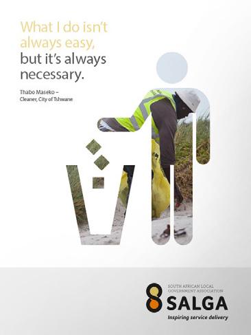
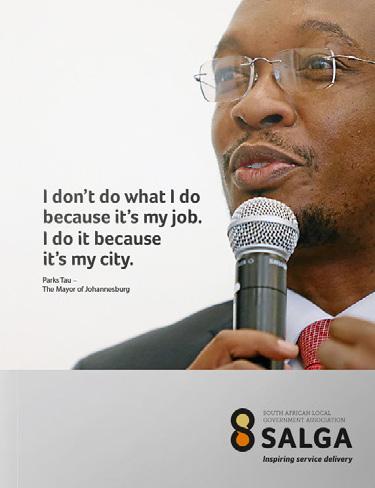
27 1.16 PHOTOGRAPHIC STYLE A picture is worth a thousand words and all photography needs to portray local government as the hero, images should be action orientated (working). Photography is a powerful branding tool, it has the power to captivate, raise awareness, spark a thought and ultimately, if our content is effective enough, trigger a response. In order to capture genuine emotion, images must look captured, the must look real (not staged, posed or fictional). Images of people must feel optimistic, aspirational and purposeful. Their depiction may not be dark, sombre and depressing. Our images must be natural, dynamic and in the moment. Avoid images that look like stock shots and steer clear of visual clichés. Images need to carry a positive energy. 27
28 SECTION TWO MEDIA APPLICATIONS 28
29 2.1 PRINT STATIONERY - LETTERHEAD Stationery plays an essential role in our communication. These specifications will ensure consistency of application of the SALGA logo on letterheads. SIZE: 210 mm x 297 mm 10 mm 190 mm 10 mm 10 mm Letter ends STATIONERY - LETTERHEAD CONTINUATION SHEET SIZE: 210 mm x 29.7 mm 10 mm 10 mm 190 mm 10 mm Letter ends 5 mm 29
30 2.1.2 STATIONERY - COMPLIMENT SLIP SIZE: 210 mm x 100 mm (5 mm BLEED) 10 mm 60 mm 180 mm 10 mm 10 mm Tel: Fax: mm Menlyn Corporate Park, Block B 175 Corobay Ave & Cnr Garsfontein RD Waterkloof Glen X 11, PRETORIA PO Box 2094, PRETORIA With compliments 5 mm Tel: Fax: Menlyn Corporate Park, Block B 175 Corobay Ave & Cnr Garsfontein RD Waterkloof Glen X 11, PRETORIA PO Box 2094, PRETORIA With compliments 30
31 2.1.3 STATIONERY - FOLDER SIZE: 436 mm x 408 mm Tel: Fax: Menlyn Corporate Park, Block B, 175 Corobay Ave & Cnr Garsfontein RD Waterkloof Glen X 11, PRETORIA PO Box 2094, PRETORIA 0001 EASTERN CAPE FREE STATE GAUTENG KWAZULU-NATAL LIMPOPO MPUMALANGA NORTHERN CAPE NORTH WEST WESTERN CAPE Berea Terrace Office 36 McGregor Street 3rd Floor Braampark 4th Floor Clifton Place 127 Marshall Street SALGA House Block Two Jade Square, Suite 400 7th floor First Floor Suite 3 East End Forum 2, 33 Hoofd 19 Hurst Grove Polokwane van Rensburg Montrio Corporate Park cnr OR Tambo & 44 Strand Street Berea Bloemfontein 9300 Street Musgrave Private Bag 9523 Street 10 Oliver Road Margaretha Prinsloo Street Cape Town 8000 East London 5214 PO Box 14 Braamfontein 2017 Durban 4001 Polokwane0700 Nelspruit 1200 Monument Heights Klerksdorp 2570 PO Box 185 P.O Box Bloemfontein 9300 PO Box PO Box 1525 PO Box 1693 Kimberley 8300 PO Box 1286 Cape Town 8000 East London 5214 Braamfontein 2017 Durban 4000 T: (015) Nelspruit 1200 PO Box 3183 Klerksdorp 2570 T: (051) F: (015) Kimberley 8300 T: (021) T: (043) F: (051) T: (011) T: (031) T: (013) T: (053) F: (021) F: (043) /67 F: (011) /7 F: (031) F: (013) T: (018) F: (053) F: (086)
32 2.1.4 NOTE PAD SIZE: 436 mm x 408 mm 32
33 2.1.5 STATIONERY - BUSINESS CARDS These specifications will ensure consistency of application on the business cards. SIZE: 90 mm x 50 mm (5 mm BLEED) 5 mm 5 mm 80 mm 5 mm 11 mm 10 mm MTHOKOZISI ZWANE OFFICE OF THE CEO: Graphic Design Officer 19 mm 5 mm Tel: Fax: Cell: mzwane@salga.org.za Physical Address: Menlyn Corporate Park, Block B 175 Corobay Ave & Cnr Garsfontein RD Waterkloof Glen, X 11, PRETORIA Postal Address: PO Box 2094, PRETORIA 0001 MTHOKOZISI ZWANE OFFICE OF THE CEO: Graphic Design Officer Tel: Fax: Cell: mzwane@salga.org.za Physical Address: Menlyn Corporate Park, Block B 175 Corobay Ave & Cnr Garsfontein RD Waterkloof Glen, X 11, PRETORIA Postal Address: PO Box 2094, PRETORIA
34 2.1.6 ENVELOPS SIZES (C4: 324 mm x 229 mm) (C5: 162 mm x 229 mm) (C6: 144 mm x 162 mm) (DL: 110 mm x 220 mm) 34

35 2.1.7 NAME TAGS SIZE: 90 mm x 140 mm (5 mm BLEED) 10 mm 5 mm 80 mm 5 mm 23 mm 17 mm 20 mm 10 mm 55 mm 5 mm STAFF Name: Mthokozisi Zwane Position: Graphic Design Officer Province/Department SALGA National Office STAFF NEC GUEST Name: Mthokozisi Zwane Position: Graphic Design Officer Province/Department SALGA National Office Name: Mthokozisi Zwane Position: Graphic Design Officer Province/Department SALGA National Office Name: Mthokozisi Zwane Position: Graphic Design Officer Province/Department SALGA National Office DELEGATE MEDIA EXHIBITOR Name: Mthokozisi Zwane Position: Graphic Design Officer Province/Department SALGA National Office Name: Mthokozisi Zwane Position: Graphic Design Officer Province/Department SALGA National Office Name: Mthokozisi Zwane Position: Graphic Design Officer Province/Department SALGA National Office 35
36 2.1.8 FAX COVER SHEET SIZE: 210 mm x 297 mm 10 mm 190 mm 10 mm 10 mm 30 mm 10 mm 30 mm Tel: Fax: Menlyn Corporate Park, Block B, 175 Corobay Ave & Cnr Garsfontein RD, Waterkloof Glen X 11, PRETORIA PO Box 2094, PRETORIA 0001 FAX COVER SHEET OFFICE NO: 196 mm TO: ORGANISATION: FAX: TEL: FROM: TEL: FAX: DATE: NO. OF S: SUBJECT: MESSAGE: 10 mm 10 mm 36


37 2.1.9 STATIONERY - INTERNAL MEMO & FORMS A Internal Memo: SIZE: 210 mm x 297 mm B Petty Cash: SIZE: 210 mm x 297 mm C Supplier/Vendor Form: SIZE: 210 mm x 297 mm Grievance Form: SIZE: 210 mm x 297 mm D Busary Form: SIZE: 210 mm x 297 mm E F Pre Approval Form: SIZE: 210 mm x 297 mm G Transport Requisition Form: SIZE: 210 mm x 297 mm H Stationary Form: SIZE: 210 mm x 297 mm I Front & Back Cover for Committee: SIZE: 210 mm x 297 mm Circular: J SIZE: 210 mm x 297 mm A J I 10 mm 10 mm 190 mm 10 mm 10 mm 10 mm 190 mm 10 mm 5 mm 5 mm 37


38 NEWSLETTERS FRONT & BACK COVER Internal & External Provincial Newsletter: SIZE: 210 mm x 297 mm FRONT & BACK COVER Insight Internal Newsletter: SIZE: 210 mm x 297 mm HOME Telephone: Fax: Physical Address: SALGA House, 11 van Rensburg Street, Nelspruit 1200 Postal Address: PO Box 1693, Nelspruit 1200 SALGA details: website: HOME Facebook: South African Local Government Association (SALGA) YouTube: SALGA TV 1 June June

39 POSTERS 39

40 BROCHURE/ ANNUAL REPORT GUIDLINES Brochure, Annual Report, Reports, Magazine & Document guidlines. 40

41 OUTDOOR ADVERTISING 41


42 2.2 ELECTRONIC SIGNATURE WEBSITE GUIDLINES 42


43 2.2.3 POWERPOINT PRESENTATIONS 2.24 CD AND CD COVERS CD COVER TITLE 43
44 2.3 CO-BRANDING LEVEL 1-BRANDING PARTNERS If SALGA is the main sponsor there are two options. In each case the SALGA logo should always take a position of priority. It should always be on the left-hand side or above the party seeking endorsement. The level 1-branding partner emblem should be no more than 3/4 of the SALGA logo. 3/4 Vertical application Horizontal application LEVEL 2-BRANDING PARTNERS Co-branding transversal programmes or entities with parliamentary exemption e.g. City of Tshwane. The SALGA logo should be no less than 3/4 of the level 2-branding partner emblem. 3/4 Vertical application Horizontal application 44
45 2.3.3 LEVEL 3-BRANDING PARTNERS If the branding partner is the lead sponsor, the SALGA logo should be equal to or no less than 3/4 of the party seeking endorsement. The SALGA logo should always be on the right-hand side or below the identity of the party seeking endorsement. 3/4 Vertical application Horizontal application 45
46 2.3.4 SPECIAL PROJECTS When co-branding a special project such as SALGA Information Knowledge Exchange (SIKE), or the National Members Assembly (NMA), the following rules apply: the SALGA logo must always be on the left-hand side of the special project logo. In this manner the SALGA logo will be read first. The SALGA and the special projects logo should be same size if using the wording as a special prodject heading, the SALGA logo must always be above or on the left-hand side of the special project wording. In this manner the SALGA logo will be read first. SALGA INFORMATION KNOWLEDGE EXCHANGE Vertical application SALGA INFORMATION KNOWLEDGE EXCHANGE NATIONAL MEMBERS ASSEMBLY (NMA) Horizontal application SALGA INFORMATION KNOWLEDGE EXCHANGE NATIONAL MEMBERS ASSEMBLY (NMA) 46
47 2.3.5 MULTIPLE PARTNERS When the SALGA is the main sponsor, the SALGA logo should always be above the co-sponsor logos. The co-sponsor logos should be no more than 1/2 of the SALGA logo. When SALGA is one of the co-sponsors, the SALGA logo should always be on the left-hand side of the other co-sponsor logos. 1/2 Vertical application Horizontal application 47
48 SECTION THREE SIGNAGE 48


49 3.1 IDENTIFICATION SIGNAGE PYLON The pylon is the primary element of the signage range, and should be positioned in prominent locations. Pylons should always feature the SALGA logo at the top. Viewing distances must always be taken into account to ensure legibility. Also be aware of any obstructions which may impair visibility. DOUBLE UNIT PYLON SIGN Reception Visitors Parking SINGLE UNIT PYLON SIGN Reception Visitors Parking WALL-MOUNTED SIGNS Wall projecting signs typically appear in prominent positions where they can be seen by members of the public. They also carry directional arrows and content that inform visitors and staff. PRIMARY SALGA OFFICE IDENTIFIER Tel: +27 (0) Fax: +27 (0) PRIMARY SALGA OFFICE IDENTIFIER WITH INFORMATION COMPONENT Menlyn Corporate Park, Block B 175 Corobay Avenue Cnr Garsfontein and Corobay Waterkloof Glen ext11 Pretoria PO Box 2094, Pretoria


 12 369 8000 Fax: +27 (0) 12 369 8001 Menlyn")
50 3.1.3 RECEPTION SIGNS WALL PROJECTING SIGNS Wall projecting signs typically appear in prominent positions where they can be seen by members of the public. They also carry directional arrows and content that inform visitors and staff. Wall projecting signs are set at right angles to the mounting surface. Tel: +27 (0) Fax: +27 (0) Menlyn Corporate Park, Block B 175 Corobay Avenue Cnr Garsfontein and Corobay Waterkloof Glen ext11 Pretoria PO Box 2094, Pretoria


51 3.1.5 WAY FINDING SIGNS Wall projecting signs typically appear in prominent positions where they can be seen by members of the public. They also carry directional arrows and content that inform visitors and staff. Reception Reception Visitors Parking 51


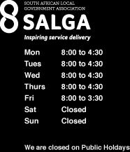
52 3.2 INFORMATION SIGNAGE WINDOW DECALS OFFICE HOURS SIGN 52


53 3.3 BASIC EMERGENCY SIGNAGE Safety is of the utmost importance. Visibility is essential and these signs should never be obscured. The signs can be ceiling suspended or wall projected. The following are examples of emergency signage: Exit Exit Exit 3.4 EXHIBITION PULL-UP BANNERS TELESCOPIC/ POP-UP BANNERS Supporting local government to deliver on equitable and sustainable services BACKDROP/ MEDIA BANNER MISSION VISION To be an association of municipalities that is at the cutting edge of quality and sustainable services. To be consultative, informed, mandated, credible and accountable to our membership and provide value for money. VALUES Responsive, Innovative, Dynamic, Excellence 53
54 SECTION FOUR PROMOTIONAL ITEMS 54


55 4.1 WRAPPING PAPER 4.2 PAPER BAG 55

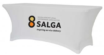
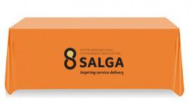
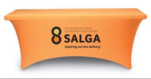
56 4.3 TABLE CLOTHS 56
57 4.4 CALENDAR 57
 11 276 1150 KWAZULU-NATAL: +27 (0) 31 817 0000 LIMPOPO: +27 (0) 15 291 1400 MPUMALANGA: +27 (0) 13 752 1200 NORTHERN CAPE: +27 (0)")


58 4.5 DESK CALENDARS NATIOANL OFFICE: +27 (0) EASTERN CAPE: +27 (0) FREE STATE: +27 (0) GAUTENG: +27 (0) KWAZULU-NATAL: +27 (0) LIMPOPO: +27 (0) MPUMALANGA: +27 (0) NORTHERN CAPE: +27 (0) NORTH WEST: +27 (0) WESTERN CAPE: +27 (0) JANUARY 2017 SUN MON TUE WEN THU FRI SAT FEBRUARY 2017 SUN MON TUE WEN THU FRI SAT MARCH 2017 SUN MON TUE WEN THU FRI SAT APRIL 2017 SUN MON TUE WEN THU FRI SAT MAY 2017 SUN MON TUE WEN THU FRI SAT JUNE 2017 SUN MON TUE WEN THU FRI SAT


59 4.6 MOUSE PADS VALUES Responsive, Innovative, Dynamic and Excellence. VALUES Responsive, Innovative, Dynamic and Excellence. 4.7 BUSINESS ORGANISER / FILOFAX / DIARY 4.8 UMBRELLAS, BAGS AND KEYRINGS 59
60 SECTION FIVE CORPORATE CLOTHING 60
61 5.1 GENERAL AND PROJECT-SPECIFIC CLOTHING 5.2 SHIRT, SCUFF AND TIE 61

62 5.3 CLEANERS UNIFORM 5.4 GOLF, ROUND NECK AND V-NECK T-SHIRTS 62


63 5.5 INFORMAL MEN AND WOMEN S WEAR SPORTS SHIRT & JACKETS CAPS & HATS 63
64 SECTION SIX CAR BRANDING 64


65 6.1 PICK-UP TRUCK WITHOUT CANOPY This is a general reference for decal placement and alignment relationships. All motor vehicle signage is to be produced in high-quality vinyl decal material. The colours, type style and spacing are to follow the specifications outlined in the following pages. Use Gold SALGA logo incase the colour of the car is black and full colour if the car is white and any other colour. 65


66 6.2 HATCHBACK This is a general reference for decal placement and alignment relationships. Use Gold SALGA logo incase the colour of the car is black and full colour if the car is white and any other colour. 66
67 6.3 PANEL VAN WITH FULL SIDE WINDOWS This is a general reference for decal placement and alignment relationships. Use Gold SALGA logo incase the colour of the car is black and full colour if the car is white and any other colour. 67
68 Tel: Fax: Menlyn Corporate Park, Block B, 175 Corobay Ave & Cnr Garsfontein RD Waterkloof Glen X 11, PRETORIA PO Box 2094, PRETORIA Facebook: South African Local Government Association (SALGA) YouTube: SALGA TV 68
1. Introduction. nexogy is more than just next technology, it is a team working for customer solutions.
 CONTENT 1. Introduction 2. Using nexogy s Logo 3. Tagline 4. Stationary Set 5. Promotional design 6. Vehicles Wrapping 7. Signage 8. Typography 9. Color Pallete 1. Introduction This is a friendly guide
Corporate Identity and Visual Identity Guidelines June 2011
 Corporate Identity and Visual Identity Guidelines June 2011 Index A Basic Design Elements A 01 The BenQ Logo A 02 Minimum Size, Minimum Staging Area A 03 Typography A 04 Corporate Colours B B 01 B 02 B
FACILITYLINK CORPORATE IDENTITY MANUAL
 FACILITYLINK CORPORATE IDENTITY MANUAL Table of Contents Page 2 of 47 Introduction 3 Corporate Design Elements 7 Corporate Design Application 25 Logo Application for Subsidised Activities 44 Table of Contents
HINO BRAND VISUAL DESIGN MANUAL V1.3e
 HINO BRAND VISUAL DESIGN MANUAL V1.3e Introduction Each basic element in communications, such as the corporate logomark and brand colors, contributes to building brand and plays a vital role in creating
Swansea University Brand Asset Guidelines. Version 2 May 2018
 Swansea University Brand Asset Guidelines 1 Version 2 May 2018 Contents We are Swansea University page 3 Brand structure page 4 Visual identity usage guidance page 5 Swansea University s coat of arms page
Brand Standards QUICK GUIDELINES
 Brand Standards QUICK GUIDELINES Table of Contents 1.0 1.1 1.2 BRANDMARK Master / Staging Color / Size 2.0 2.1 TAGLINE Usage / Specifications / Staging 3.0 3.1 3.2 3.3 BRAND SYSTEM Typography Color Palette
HINO BRAND VISUAL DESIGN MANUAL V1.2e
 HINO BRAND VISUAL DESIGN MANUAL V1.2e Introduction Each basic element in communications, such as the corporate logomark and brand colors, contributes to building brand and plays a vital role in creating
Table of Contents. Stationery 24 Business card 25 Letterhead 26 #10 Envelope. Document Note
 Table of Contents Document Note The goal of these guidelines is to help communicate the strategy and visual system behind the SPX brand. If you have questions about anything in this guide, please reach
Village Seven Presbyterian Church Graphic Standards Manual VillageSeven
 Village Seven Graphic Standards Manual Village Seven Graphic Standards Manual Contents Statement of Purpose 3 Endorsement Letter 3 Logo 4 Logo Usage 5 Colors 6 Alternate Logo Formats 7 Additional Logo
one M2M Logo Brand Guidelines
 one M2M Logo Brand Guidelines July 2012 Logo Design Explanation What does the one M2M logo symbolize? The number 2 in the middle part of the logo symbolizes the connection between the two machines, the
TARGA RESOURCES, INC.
 TARGA RESOURCES, INC. Corporate Identity Program STANDARDS CORPORATE LOGO STANDARDS The corporate logo standards provide guidelines for applying the Targa Resources corporate logo to publications, signage,
VICTORY BREWING COMPANY LOGOS
 REVISION DATE - 5/2/2017 VICTORY BREWING COMPANY LOGOS Victory Brewing Company offers the following logos for marketing and branding needs. BANNER LOGO BOTTLE CAP LOGO VICTORY BREWING COMPANY LOGOTYPE
Graphic Identity Manual MARKETING DEPARTMENT
 Graphic Identity Manual MARKETING DEPARTMENT Introduction The success of the Westfield State graphic identity depends on the consistent use of communications materials by everyone involved with the university.
2007 Chadwick School School Logo Style Guide
 CHADWICK SCHOOL LOGO STYLE GUIDE 2007 Chadwick School School Logo Style Guide T A B L E O F C O N T E N T S 3 Letter From the Headmaster 4 Basic Guidelines For Use 5 Logo Anatomy 6 Logo Color 7 Color Specifications
GRAPHIC STANDARDS MANUAL Policy and guidelines for using the Hostos Community College 50 th Anniversary Brand Identity
 GRAPHIC STANDARDS MANUAL Policy and guidelines for using the Hostos Community College 50 th Anniversary Brand Identity TABLE OF CONTENTS Policy and Applications... 3 Hostos 50th Anniversary Primary Logo...
Brand identity guidelines
 Brand identity guidelines Version 1.2 November 2016 01 Contents 01 Contents 02 Introducing the 03 Who are these guidelines for? 04 The logo 05 Explaining the logo 06 Logo exclusion zone 07 Logo minimum
BASIC MANUAL OF CEPSA IDENTITY
 BASIC MANUAL OF CEPSA IDENTITY April 2018 Cepsa Basic Identity Manual Welcome This manual contains all the elements that make up the Cepsa identity. This manual contains all the elements that make up the
Business Professionals of America
 Business Professionals of America Brand Guide Updated August 15, 2018 Disclaimer: The Business Professionals of America Brand Guide is not to be used for reference or preparation during the 2017-2018 Workplace
BRAND GUIDELINES CRAFTSMAN QUALITY STAINS & FINISHES SINCE 1953.
 BRAND GUIDELINES CRAFTSMAN QUALITY STAINS & FINISHES SINCE 1953. TOP 10 THINGS TO REMEMBER ABOUT Old Masters BRANDING 1. Always use the correct logo artwork. 2. Never modify or recreate logo artwork. 3.
Branding Style Guidelines. (Revised: September 6, 2017)
") Branding Style Guidelines (Revised: September 6, 2017) Table of Contents 2 3 4 5 6 7 8 10 12 13 14 Introduction Brand elements Clear space and minimum size Logo and tagline Symbol as a graphic Logo palette
Branding Style Guidelines (Revised: September 6, 2017) Table of Contents 2 3 4 5 6 7 8 10 12 13 14 Introduction Brand elements Clear space and minimum size Logo and tagline Symbol as a graphic Logo palette
BENTLEY SYSTEMS INCORPORATED C O R P O R A T E B R A N D I N G S T A N D A R D S
 WWW.BENTLEY.COM BENTLEY SYSTEMS INCORPORATED C O R P O R A T E B R A N D I N G S T A N D A R D S 1 TABLE OF CONTENTS NAMES... 3 COPYRIGHT AND BOILERPLATE... 4 FONTS, COLORS AND GRAPHICAL ELEMENTS... 5
DESIGN & BRAND Guidelines
 DESIGN & BRAND Guidelines TABLE OF CONTENTS This document provides guidelines to ensure the correct use of the Belgian Development Cooperation visual identity. A correct and consistent implementation conveys
Quality Care Pharmacy Program
 Quality Care Pharmacy Program How to use the QCPP logo in your pharmacy and promote your accreditation. Contents Logo Specifications...2 Logo Placement...3 QCPP Decal...4 Logo Colours for print and screen...5
NSW INSTITUTE OF SPORT CORPORATE IDENTITY MANUAL. Guidelines for the use of the NSWIS and ClubsNSW corporate identity
 NSW INSTITUTE OF SPORT CORPORATE IDENTITY MANUAL Guidelines for the use of the NSWIS and ClubsNSW corporate identity CONTENTS Introduction 1 The NSWIS Brand 1 NSWIS Purpose 2 NSWIS Values 2 Use of the
BRAND STANDARDS and VISUAL IDENTITY MANUAL
 BRAND STANDARDS and VISUAL IDENTITY MANUAL Table of Contents Logo... 1 Primary Logo... 2 Secondary Logos... 2 Protected Area... 3 Resizing The Logo... 3 Minimum Resizing Area... 4 Color Scheme... 4 Official
CORPORATE IDENTITY July 2006
 CORPORATE IDENTITY July 2006 Index identity manual Section 1 Corporate Identity Controls Section 2 Stationery Controls Section 3 Identity Application Signage How to use the identity manual This SACU Corporate
Version 3:0 September 2015
 Identity guidelines Version 3:0 September 2015 The Buxton logotype The new logotype embraces the concept of water - and a source of water. The focal point of the design is the letter O' where water emerges
SOUTHEAST TECH BRANDING IDENTITY STANDARDS MANUAL
 SOUTHEAST TECH BRANDING IDENTITY STANDARDS MANUAL INTRODUCTION The Southeast Tech Branding Identity Standards Manual was created to provide all Southeast Tech employees and associates with the ability
Graphic Standards Manual FEBRUARY 20 17
 GRAPHIC STANDARD MANUAL FEB 2017 Graphic Standards Manual FEBRUARY 20 17 INDEX Language Logo and Usages Color Palette Supporting Typefaces Clinic Logo and Usages Signage Business Cards Marketing Materials
CMA VISUAL IDENTITY GUIDE. January 2018
 CMA VISUAL IDENTITY GUIDE January 2018 CMA Visual Identity Guide Logo overview The CMA logo is composed of the French and English wordmarks and the CMA icon (note: the logo is always bilingual, even in
Introduction. Page 1. Welcome to the signage guidelines for St John Ambulance premises, updated as of May 2013.
 Signage guidelines Introduction Welcome to the signage guidelines for St John Ambulance premises, updated as of May 2013. These guidelines provide a signage standard for all St John Ambulance buildings,
Brand Guidelines. January 2015
 Brand Guidelines January 2015 Table of Contents 1.0 What s a brand? 3 1.1 The logo 4 1.2 Colour 1.2.1 Spot & Process 1.2.2 Black & White 5 5 6 1.3 Logo Sizing 1.3.1 Minimum Clear Space 1.3.2 Positioning
Chicago Pneumatic Brand Identity Manual for Distributors
 Chicago Pneumatic Brand Identity Manual for Distributors www.cp.com This manual is aimed at distributors with a valid Chicago Pneumatic agreement. Working with Chicago Pneumatic Chicago Pneumatic has worldwide
Kodiak Brand Guide. April 2015
 Kodiak Brand Guide April 2015 //kodiakptt.com/company/brand/ Table of Contents The brand is more than a logo 2 Communication 4 Tone & Style 4 Kodiak in Writing 4 Kodiak Marks & Logo 5 Standard Wordmark
BRAND STANDARDS GUIDE
 BRAND STANDARDS GUIDE This document is designed to provide a guide for presentation and use of the CTO logo. The details outlined are generally applicable to stationery, presentations, signage, marketing
brand guidelines march 2013
 brand guidelines march 2013 1 1 about these guidelines This document focuses specifically on the guidelines for using the Acal BFi logo. It covers practical details like how to choose the correct logo
IADD BRANDING GUIDELINES
 IADD BRANDING GUIDELINES VERSION 1, JULY 2107 The International Association of Directional Drilling (IADD) is a 501(c) (6) not-for-profit organization dedicated to promoting directional drilling, as well
BRANDING GUIDELINES Foundation for Environmental Education
 BRANDING GUIDELINES Foundation for Environmental Education INTRODUCTION Intro This is a guide to the branding elements that make up the Foundation for Environmental Education and its programmes. Have a
CONTENTS CREST CREST COLOUR PALETTE TIPOGRAFHY PARTNER ARCHITECTURE IMAGERY
 BOOK 2015.16 The VCF crest is both a symbol of the football club and the City of Valencia. Instantly recognisable it is a powerful representation of our identity and it should be treated with respect.
Brand Identity Guide March 2011
 Brand Identity Guide March 2011 CONTENTS Introduction 3 Attributes of the Brand 4 Brand Architecture 5 The Summit Bechtel Reserve Brand Extension 6 The Summit Bechtel Reserve 7 Primary Logotype 9 Secondary
Shippensburg University. University Communications and Marketing
 Shippensburg University University Communications and Marketing 1 (Updated September 2017) The Shippensburg University Institutional Identity Guide establishes official policy and standards for the use
BRAND GUIDELINES VERSION 3: FEBRUARY 2014
 BRAND GUIDELINES VERSION 3: FEBRUARY 2014 Mission Hall Creative Introduction Brand Guidelines 2 These brand guidelines are designed to help internal and external individuals or organisations implement
Main design manual RONA, a.s.
 DESIGN MANUAL Main categories A Logotype 4 D Printed materials 40 B Font type 26 E Promotional items 50 What is a design manual and what is it used for? C Slogan 32 F Other 64 A design manual is a collection
Identity & Communication Standards
 Identity & Communication Standards KCSOS Identity & Communication Standards Why image matters: As employees working for a taxpayersupported organization, headed by a publicly-elected superintendent of
Member co-branding guidelines, August V1
 Member co-branding guidelines, August 2014. V1 OnTheMarket.com These guidelines are designed to help you introduce and manage co-branding with OnTheMarket.com across all your relevant communications material.
Graphic Identity Standards
 Graphic Identity Standards Welcome to our visual identity. At Loyola Marymount University, our goal is to become one of the nation s distinguished Catholic universities with a commitment to academic ecellence
Prometric Graphic Standards
 www.prometricbrand.com Version 3.0 :: August 2015 Introduction: Our Brand Every interaction we have with our marketplace affects our brand. In fact, our brand is nothing more than the cumulative impression
TOWN OF QUEEN CREEK BRAND GUIDE
 BRAND GUIDE DEC2016 BRAND GUIDE INTRODUCTION CONTACT TOWN OF QUEEN CREEK COMMUNICATIONS, MARKETING AND RECREATION DEPARTMENT 22358 SOUTH ELLSWORTH ROAD QUEEN CREEK, AZ 85142 480-358-3198 communication@queencreek.org
Trojan Holding Corporate Brand Guideline. Implementing the Trojan Holding brand in communications
 Trojan Holding Corporate Brand Guideline Implementing the Trojan Holding brand in communications V.II - September 2015 Introduction Trojan Holding is considered one of the fastest-growing construction
LOGO MANUAL. Definition of the basic use of the logo
 LOGO MANUAL Definition of the basic use of the logo INTRODUCTION The KELLYS Logo Manual is a document that sets forth the basic rules for the use of the graphic elements of the KELLYS BICYCLES logo and
Asia-Europe Meeting (ASEM)
") Version 1.0 / October 2013 www.aseminfoboard.org Asia-Europe Meeting (ASEM) Logo Guidelines Information on how to apply the ASEM logo 1.0 The ASEM Logo The core element of the brand identity is the logo.
Version 1.0 / October 2013 www.aseminfoboard.org Asia-Europe Meeting (ASEM) Logo Guidelines Information on how to apply the ASEM logo 1.0 The ASEM Logo The core element of the brand identity is the logo.
Al Ajban Chicken Brand Guideline
 Al Ajban Chicken Brand Guideline Implementing the Al Ajban Chicken brand in communications V.I - November 2015 Introduction In 1981, Al Ajban Poultry Farm started its operations, becoming the first and
LOGO USAGE GUIDELINES
 LOGO USAGE GUIDELINES REV. 11.13.2015 The purpose of these guidelines is to provide a clear understanding of usage of the Savage logo. This document provides the necessary tools to convey a consistent
Accreditation Guidelines. How to acknowledge support from Creative Scotland and the National Lottery.
 Accreditation Guidelines How to acknowledge support from Creative Scotland and the National Lottery. Creative Scotland is the national leader for Scotland s arts, screen and creative industries. Creative
Brand Identity Standards & Guidelines. PTCB Brand Identity Standards & Guidelines / V.001 / ptcb.org
 Brand Identity Standards & Guidelines 1 CONTENTS Our Story 03 OVERVIEW Brand Identity Standards & Guidelines 05 BRAND STRATEGY Mission, Vision & Tagline 07 Services & Target Audiences 08 Brand Principles
Member co-branding guidelines, August V1
 Member co-branding guidelines, August 2014. V1 OnTheMarket.com These guidelines are designed to help you introduce and manage co-branding with OnTheMarket.com across all your relevant communications material.
IREM Headquarters and Chapter Version January 9, Brand and Style Guide
 IREM Headquarters and Chapter Version January 9, 2018 Brand and Style Guide Table of Contents Section 1: Brand Messaging 3 - About IREM 4 - Brand Positioning 5 - IREM Trademarks 6-7 Section 2: Logos and
BRAND GUIDELINES Update: November 2016
 BRAND GUIDELINES Update: November 2016 1 Contents Introduction 1 The Basics 2 Primary logo Colour logo options Single colour logo options Exclusion zones Title Partners Cheltenham Festivals British Council
THE STRENGTH OF A PEOPLE. THE POWER OF C
 THE STRENGTH OF A PEOPLE. THE POWER OF COMMUNITY. Brand Standards Guide Third Edition, 2012 JewishFederations.org jfederations @jfederations 1 Contents I our BRAND a. Primary Logo 4 b. Color and Typeface
BRAND GUIDELINES. July version 2.1
 BRAND GUIDELINES July 2015 - version 2.1 INTRODUCTION The Noritz Brand As we grow and advance as an organization, it sometimes becomes necessary to reevaluate our visual identity. That s why I am pleased
University of Iowa Stead Family Children s Hospital Brand Identity Standards
 University of Iowa Stead Family Children s Hospital Brand Identity Standards Effective November 11, 2016 1 Contents Introduction Introduction... 1 Editorial Style Guide... 2 General communication... 2
Brand Identity Manual
 Brand Identity Manual Changing the economics of desalination. Table of Contents Introduction 1 Signature Lock-up 2 Logo Configuration 3 Color of Logo 4 Black and White 5 Don t Do This 6 Minimum Sizing
Brand Style Guide v
 Brand Style Guide v.5.2018 1 Table of Contents Introduction 3 Logomark Graphic Breakdown 4 Primary Logomark Configuration 5 Secondary Logomark Configuration 6 Clear Space/Minimum Sizes 7 Logo/Tagline Lockup
National Projects & Construction L.L.C. Brand Guideline. Implementing the NPC brand in communications
 National Projects & Construction L.L.C. Brand Guideline Implementing the NPC brand in communications V.II - September 2015 Introduction It is the pursuit of excellence that has helped establish National
CALGARY BOARD OF EDUCATION LOGO GRAPHIC STANDARDS GUIDE
 CALGARY BOARD OF EDUCATION LOGO GRAPHIC STANDARDS GUIDE Communications Services Calgary Board of Education 2007 2 GRAPHIC STANDARDS GUIDE CONTENTS Introduction 2 Backgrounder 2 The CBE logo 4 Logo Design
Gin-Cor Industries Inc. Brand Guidelines
 Last updated: August 26, 2015 About Our Vision To be a leader in the manufacturing of vocational trucks. Our Mission To manufacture customized vocational trucks that workers want to drive and owners want
GRAPHIC STANDARDS MANUAL
 GRAPHIC STANDARDS MANUAL Azusa Pacific University is an, evangelical Christian community of disciples and scholars who seek to advance the work of God in the world through academic excellence in liberal
The U.S. Fund for UNICEF Communications Style. Guide
 The U.S. Fund for UNICEF Communications Style Guide Table of Contents 1.0 The U.S. Fund for UNICEF 1.1 Our Mission 1.2 Our Brand Position 2.0 Our Goals 3.0 The UNICEF Story 4.0 Logo Versions 4.1 Logo Size
AMBA Development Network Brand Usage and Style Guidelines
 AMBA Development Network Brand Usage and Style Guidelines IDENTITY GUIDE PALETTE USAGE The AMBA Development Network brand Leverage the strength and status of the ADN by clearly displaying the AMBA Development
BRANDING STANDARDS MANUAL
 BRANDING STANDARDS MANUAL 2014 Index Logo University version 2 School versions 3 Usage Spacing 4 Sizing 5 Color 6 Logo mark 7 Unacceptable Executions 8-9 Color 10-11 Typography 12 Other Graphic Marks Seal
How do I know which logo/mark to use? Basic Style Guide
 How do I know which logo/mark to use? Basic Style Guide Jan. 2011 Blank Page Style Guide Norco College Introduction from the President As President of Norco College, and having 30 years tenure here I have
OUR MISSION: We at Metro Transit deliver environmentally sustainable transportation choices that link people, jobs and community conveniently,
 OUR MISSION: We at Metro Transit deliver environmentally sustainable transportation choices that link people, jobs and community conveniently, consistently and safely. d Metro Transit Brand Standards The
Basic Logo Guidelines. Color. Typography. Logo Reproduction. Logo Integrity. Alternate URL Logo. Logo Use with Secondary Text
 BRAND GUIDE A handbook of informational standards created to maintain consistency and aid in alignment of the overall brand of Hennepin Technical College and its campuses Basic Logo Guidelines PRIMARY
GETTING UMSU BRAND BASICS RIGHT
 GETTING UMSU BRAND BASICS RIGHT UMSU Brand Guidelines 2017 UMSU BRAND GUIDELINES 2017 CONTENTS INTRODUCTION 4 UMSU BRAND: AN OVERVIEW 6 UMSU LOGO 7 UOM LOGO 8 CORRECT USE OF THE LOGO 9 INCORRECT USE OF
LOGO GUIDELINES. A guide for partners
 LOGO GUIDELINES LOGO FULL COLOUR LOGO Our corporate full colour logo is the most recognisable symbol of the ACD and is unique to us. As such, it is crucial we use it correctly and consistently. Whenever
Brand Guidelines 2018
 Contents Logotype 03 Space required of logotype 04 Logo variants 05 Incorrect use of logotype 06 Brand colours 07 Typefaces 08 Additional graphic elements 09 Supporting logo for EHNS countries 10 Logotype
Logo identity & Usage
 FIVA brandbook FIVA brand book 01 Introduction The way in which FIVA presents itself to the public through signs, publications, advertising, computer-based promotional material and stationery, influences
Brand Identity Guidelines
 Brand Identity Guidelines For Organisations offering BPAY services and Member Financial Institutions BPAY Brand Identity Guidelines Introduction 2 This guide should be used in conjunction with the BPAY
Brand Typeface Headlines Establishing Hierarchy Photography Iconography & Infographics... 18
 Brand Guide VERSION 1.0 2017 Contents at a glance Introduction Using Brand Guidelines... 3 A Note on Branding... 4 Logo Color Version... 5 Special Cases Only... 6 Logo Usage Clear Space... 7 Minimum Size...
Corporate Logo usage guidelines
 Corporate Logo usage guidelines This logo usage guide provides the tools to maintain the integrity of our Association s identity. Since our identity is the visual means by which we distinguish our professional
Partner Brand Guidelines October 2017
 Partner Brand Guidelines October 2017 Brand Expression From the Magnificent Mile to Route 66, Illinois offers a wide variety of travel experiences. The unifying force behind these experiences is our Illinois
The ERA Identity Standards Manual
 The ERA Identity Standards Manual Version 1: August 2010 Protecting the ERA Brand The ERA Identity Standards Manual provides you with an opportunity to bring the ERA brand to life. By using and abiding
Corporate Identification Guidelines
 It s Our Corporate Signature Corporate Identification Guidelines The Electro-Motive company logotype or logo is our corporate signature. It identifies the products, services, service parts, facilities,
Peace4Youth Brand Guidelines
 PeaceYouth Brand Guidelines 2 Introduction PeaceYouth is the brand name which has been specifically developed for the Children and Young People Objective 2 (Action 2.1) of the European Union s PEACE IV
Thank you for your continued support, and as always your feedback is welcome.
 Subject: New Tait Logo Dear Sir/Madam, To visually demonstrate the importance of the relationship between Tait Communications and your business, we have created a new Tait logo for you to use. The term
VISUAL IDENTITY GUIDELINES. Updated
 VISUAL IDENTITY GUIDELINES Updated 2.12.2016 VISUAL IDENTITY GUIDELINES Table of Contents 1. Introduction Basic Design Elements 2. Logo 2.1 Clear zone 2.2 Logo misuse 2.3 Sponsor logo lock-up 3. Colors
Institutional Identity Guidelines August 2012
 Institutional Identity Guidelines August 2012 Institutional Identity Guidelines Published by the Marketing and Public Relations Office 2012 Table of Contents Introduction................................................................................1
AUCA Standard Graphic Identity Manual
 AUCA Standard Graphic Identity Manual GRAPHIC STANDARDS MANUAL This is the Graphic Standards Manual for the American University of Central Asia. It sets the standard for the design of all AUCA public communications
Introduction. All collateral outlined within these guidelines can be downloaded at leicesterbusinessfestival.com
 Introduction Leicester Business Festival (LBF) is currently the regions largest business event and has been developed by business for business since 2014 to put Leicester and Leicestershire front and centre
ATHLETIC LOGOS. Gonzaga University Visual Identity and Graphics Standards Guide ATHLETIC LOGOS
 Gonzaga University Visual Identity and Graphics Standards Guide ATHLETIC LOGOS Updated January 2017 TABLE OF CONTENTS 3 Gonzaga University Athletic Logo Usage Policy Contact Information 4 Gonzaga Primary
INTRODUCTION. NASS is an action sports & music festival that celebrates the very best of alternative culture, bringing you three days of:
 BRAND GUIDELINES INTRODUCTION NASS is an action sports & music festival that celebrates the very best of alternative culture, bringing you three days of: PRO SKATE + BMX COMPETITIONS WITH THE WORLD S BEST
logo and design guidelines effective July 2011
 logo and design guidelines effective July 2011 This logo and design guideline is to be referenced and followed when creating marketing and advertising materials for Howard Johnson. For questions about
ZOWIE IDENTITY GUIDEBOOK 2
 IDENTITY GUIDEBOOK ZOWIE IDENTITY GUIDEBOOK 2 Contents 03 Introduction 04 The Combination for Both Equity 06 The ZOWIE Logo The ZOWIE LOGO Logo Variations Horizontal Logo Variations Vertical Primary Color
American Coaster Enthusiasts Logo Guidelines
 American Coaster Enthusiasts Logo Guidelines Introduction...2 Downloads of Logo Artwork...2 ACE Logos...2 ACE Logos...3 Usage Guidelines...5 Logo Usage Rights...5 ACE Logo and ACE Logo...5 ACE Member Logo...5
hyatt master brand guidelines 8 / 21 / 2015
 hyatt master brand guidelines 8 / 21 / 2015 table of contents introduction table of contents 2 1.0 introduction, 3 1.1 document intent 1.2 the hyatt manifesto 1.3 the spirit of our tagline 2.0 logos, 7
Flinders University 50 th Anniversary Style Guide
 Flinders University 50 th Anniversary Contents Contents 1.0 The Logo 03 1.1 Colour logos 04 1.2 Mono logos 06 1.3 Clearspace 08 1.4 Minimum size 09 1.5 Incorrect use 10 2.0 Stationery and Forms 11 2.1
OUR VISION WHERE WE RE GOING
 1 INTRODUCTION A brand is not just a logo or a strap line. A brand is a set of beliefs, goals and values that guides an organisation, its decisions and communications, both internally and externally. To
The Dodge Brand. Key Visual Elements and Usage Guidelines
 The Dodge Brand Key Visual Elements and Usage Guidelines Contents 3 Dodge Brand Mark 4 Dodge Brand Mark Guidelines 4 Area of Isolation 5 Rules of Use 6 Trademark Ownership Statement 7 Use of Dodge Brand
AAA Logo Usage Guide. Revised date:
 AAA Logo Usage Guide Revised date: AAA Vehicle Signage Guide October 12, 20181 In This Guide AAA Masterbrand Overview: The AAA Masterbrand...1 Emblem Regulations: Legal Side of the Masterbrand...2 Masterbrand
Graphic Standards & Brand Guidelines
 Graphic Standards & Brand Guidelines Overview The Brand Seattle Southside Regional Tourism Authority is about substance more than style, comfort more than luxury, and value more than status. With this