Brand Guidelines 2017 Version 1.0
|
|
|
- Bryce Jeffery Marshall
- 5 years ago
- Views:
Transcription
1 Brand Guidelines 2017 Version 1.0
2 OwnLocal ALL RIGHT RESERVED OwnLocal Headquarters 205 W 9th Street Suite 600 Austin, TX
3 TABLE OF CONTENTS 01 Introduction Our Mission Core Values 02 Identity Primary Logo Logo Integrity The Pixel Tree Last Resorts Unacceptable Usage Color Palette 03 Typography Fonts Text Hierarchy 04 Graphic Elements Iconography Secondary Graphics Imagery Applications 05 Verbal Identity
4 GUIDE PURPOSE The OwnLocal brand is more than our logo and colors. It is who we are and how we want to be viewed by the world. This guide will help to familiarize you with OwnLocal s core brand elements to assist you in designing and producing dynamic and powerful communications while still allowing degrees of flexibility. We have an opportunity to establish a vibrant brand in the minds of all people who interact with our products, services, and people. By providing consistent, positive brand experiences for our audiences we can create an identity that makes them comfortable with entrusting us with their brand and livelihood. 4 // 34
5 01 INTRODUCTION Our Mission Core Values 5 // 34

6 OUR MISSION "Removing the expense and inefficiency of ad agencies by working directly with partners to automate the building and buying of advertising. To be the best and last local marketing decision a business will ever make." 6 // 34
7 CORE VALUES Ownership At OwnLocal we expect everyone to be the CEO of their own role. Every employee is the master of their own universe. We are expected to help solve problems when we see them, and readily admit when we have caused them. No one will hold our hands; it is our responsibility to ask for help when we need it. We trust everyone to do their job and to admit when we cannot. Transparency We are direct and honest with each other. Everything at OwnLocal is open for discussion, and whenever it is possible, we are not afraid to share information across the entire company. As a growing company, it is imperative we are all on the same page, and we do so through transparency. We do not keep secrets or spread rumors. Each person cares deeply about their fellow co-workers and there is no room for ego. Growth Have fun, every day. Always be growing. Working at OwnLocal means we have an eagerness to gain knowledge, share that knowledge, and demonstrate that knowledge through innovative solutions. We encourage, celebrate, and reward progress and success. There is room here to try new things, fail and learn from our mistakes. We cheer for each other to do the impossible. We take care of our own. We provide the space for you to do the best work of your life. 7 // 34

8 "A brand's strength is built upon its determination to promote its own distinctive values and mission." Jean-Noel Kapferer 8 // 34
9 02 IDENTITY Primary Logo Logo Integrity The Pixel Tree Last Resorts Unacceptable Usage Color Palette 9 // 34
10 PRIMARY LOGO OwnLocal s logo is the most visible element of our identity: a universal signature across all communications. It is a guarantee of quality that unites our product, partners, and marketing communications. The logo is made up of two elements: the logotype and the mark. The logotype should never appear without the mark. The mark, also known as the Pixel Tree, can be used as a standalone graphic when needed. Logo Logotype Mark 10 // 34
11 LOGO INTEGRITY Logo Colors When using our logo, contrast is important. Use dark blue on light or white backgrounds and the white logo on dark backgrounds. A gray-scale logo is also acceptable if color is not available. Clear Space Just like people do, our logo needs some personal space free of type, graphics, and other elements that might cause visual clutter to maximize the recognition and impact of our identity. For an easy guide you can use the first O in OwnLocal to measure the clear space needed. This is also just a recommended space, there will be cases in which this can be broken based on design needs. Minimum Size 1.25in or 90px 11 // 34
12 THE PIXEL TREE The main mark for the OwnLocal brand is known as the Pixel Tree. In certain cases the Pixel Tree can be used as a standalone graphic to represent our brand. But just like with the primary logo, keeping the integrity of the Pixel Tree intact is important. Always use the dark blue or white version. Attention: The Pixel Tree contains a unique style where each pixel contains a transparency allowing for the color or image behind it to shine through. Due to this using vector or png files are preferred to allow for the transparency. If a transparency can not be used then the tree should be solid dark blue or solid white. Clear Space Like the primary logo, we want the Pixel Tree to have some room. But it doesn t need as much. A half-sized OwnLocal O can be used, as seen below. Minimum Size.33in or 24px 12 // 34


13 LAST RESORTS It is preferred that the primary logo or the Pixel Tree be presented in full color and with the buillt in transparency of the pixels. However cases may come up that require gray-scale or an image with transparency cannot be used. For those cases we have some options. Gray-scale Logo Sometimes color printing is just not an option. Try to use the white logo in those cases but if that isn t possible the below grayscale option is acceptable. Flat Logo The optimal way to display our logo is with a built in transparency by using vector files and pngs. If you must use a jpg or any format that doesn t allow transparency then please use a flat color version. 13 // 34


14 UNACCEPTABLE USAGE To maintain the integrity of the OwnLocal logo, and to promote the consistency of the brand, it is important to use the logo as described in this guide. The examples shown illustrate possible misuses of the OwnLocal logo that should be avoided. X DO NOT rearrange the logo elements. X DO NOT use non-approved colors. X DO NOT rotate logo. X DO NOT add drop shadows. Secondary Text Headline X DO NOT stretch logo. X DO NOT create a logo lock-up with text. X DO NOT change proportions of logo elements. X DO NOT outline the logo. 14 // 34
15 COLOR PALETTE These are the core colors that give us our personality and reinforce our brand values. By predominantly sticking to these three colors, all materials will be consistent. Along with the 3 primary colors different tones of each color are permitted to expand the available color palette. Dark Blue RGB: 53, 50, 75 CMYK: 81, 79, 44, 41 Hex: #35324b Pantone: 281U Teal RGB: 23, 161, 133 CMYK: 80, 13, 59, 01 Hex: #17a185 Pantone: 3265U Yellow RGB: 214, 185, 66 CMYK: 18, 23, 88, 00 Hex: #d6b942 Pantone: 7405U 100% 80% 60% 40% 20% 100% 80% 60% 40% 20% 100% 80% 60% 40% 20% Dark Gray RGB: 65, 65, 66 CMYK: 68, 61, 59, 46 Hex: # Pantone: Black 7U Light Gray RGB: 147, 149, 152 CMYK: 45, 36, 35, 01 Hex: # Pantone: Cool Gray 5U 15 // 34

16 "Typography is an art. Good typography is Art. " Paul Rand 16 // 34
17 03 TYPOGRAPHY Fonts Text Hierarchy 17 // 34
18 MAIN HEADER FONT OwnLocal uses two primary fonts in branding materials. Knockout Featherweight is used for headlines and Proxima Nova for all other copy. Substitute fonts can be used if these two are not available in certain scenarios. Also unique fonts can be used in unique marketing situations such as a one-time events or internal company activities. KNOCKOUT FEATHERWEIGHT A B C D E F G H I J K L M N O P Q R S T U V W X Y Z a b c d e f g h i j k l m n o p q r s t u v w x y z !" $%&/()=?`;: " [] {} '«Ω / ø π ±æ@ ºª, ç Figures Special Characters 18 // 34
19 MAIN BODY FONT PROXIMA NOVA ABCDEFGHIJKLMNOPQRSTUVWXYZ abcdefghijklmnopqrstuvwxyz ABCDEFGHIJKLMNOPQRSTUVWXYZ abcdefghijklmnopqrstuvwxyz ABCDEFGHIJKLMNOPQRSTUVWXYZ abcdefghijklmnopqrstuvwxyz ABCDEFGHIJKLMNOPQRSTUVWXYZ Light Regular Semi-bold abcdefghijklmnopqrstuvwxyz Bold ! $ % & / ( ) =? ` ; : [ ] { } «Ω øπ ± æœ@ ºª ƒ å ç Figures Special Characters 19 // 34
20 SUBSTITUTE FONTS Modern advances in font technology have made universal font freedom way easier. But there will always be strange situations in which the OwnLocal fonts may not be available. In these cases go with Impact for headers and for all other copy we shall go with the greatest and most time honored font of all Helvetica. IMPACT (For Headers) A B C D E F G H I J K L M N O P Q R S T U V W X Y Z a b c d e f g h i j k l m n o p q r s t u v w x y z Regular Figures HELVETICA (For All Other Copy) ABCDEFGHIJKLMNOPQRSTUVWXYZ abcdefghijklmnopqrstuvwxyz Regular Figures 20 // 34
21 TEXT HIERARCHY Typographic hierarchy is another form of visual hierarchy (a sub-hierarchy per se) in an overall design project. Typographic hierarchy presents lettering so that the most important words are displayed with the most impact so users can scan text for key information. Typographic hierarchy creates contrast between elements. There are a variety of ways you can create a sense of hierarchy so custom text situations will arise but here are some of the most common techniques for OwnLocal layouts. Main Body Copy: (12 points) Main Headers: 250 percent more than main body copy Secondary Headers: 175 percent more than main body copy Footers: 40 percent less than main body copy MAIN HEADER Knockout Featherweight - 30 pt - Tracking: 25 SECONDARY HEADER Proxima Nova - Semi-bold - 21 pt - Tracking: 0 COPY Proxima Nova - Light - 12 pt - Tracking: // 34

22 "Many a small thing has been made large by the right kind of advertising. " Mark Twain 22 // 34
23 04 GRAPHIC ELEMENTS Iconography Secondary Graphics Imagery Applications 23 // 34
24 ICONOGRAPHY Examples of approved icons that can be displayed in any of the OwnLocal colors. Additional icons can be created if need be but must maintain the same look as the examples provided. Icons should be one-color designs with thick outer lines but thinner inner lines when details are needed. 24 // 34


25 SECONDARY GRAPHICS Besides the OwnLocal standard logo and Pixel Tree we have a few secondary graphics that can be used with OwnLocal collateral. These graphics are to be used to enhance the brand or pinpoint a specific idea. These graphics should never be used to totally replace the standard logo or Pixel Tree. RTN Graphic The Radio Television & News graphic is a representation of the current media markets in OwnLocal s wheelhouse. The Map The OwnLocal map can be used as a background when needed. Paper Airplane Graphic The OwnLocal Paper Airplane is primarily used in ads and collateral promoting or geared towards the newspaper industry. ADAP Graphic The Automated Digital Ad Platform for Local Media is a secondary graphic used for showcasing OwnLocal s current tag line and offering to clients. 25 // 34


26 IMAGERY Photography is a powerful and dynamic tool. However, when used incorrectly, it can cause serious problems to a brand. When deciding what type of imagery to use for OwnLocal keep a few things in mind: vibrant & clear never pixelated local vibe for target audience technology focused People but NO FACES! 26 // 34


27 STYLIZED IMAGERY Color stylized images are also allowed in our brand. These images are often used as header backgrounds for different sales pieces and presentations. Typically the image is a cityscape of the locale being pitched or a lifestlye technology image. Creating this style takes two simple steps: 1st layer is set to color in the transparency settings 2nd layer is the solid color set to 50% fill. 27 // 34


28 APPLICATION All of OwnLocal s marketing communication should respect the rules outlined in this guide. Websites, print materials, and promotional materials should: be clear, clean, and refined be organized effeciently have a sense of purpose stay on brand! 28 // 34
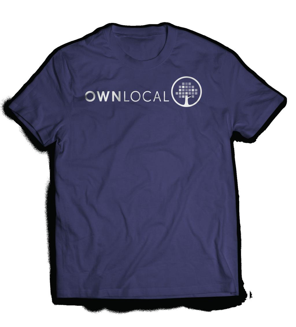

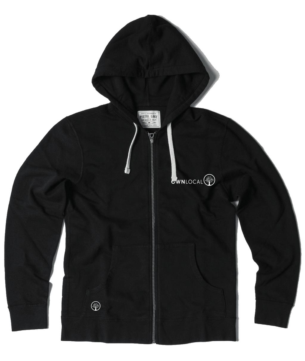

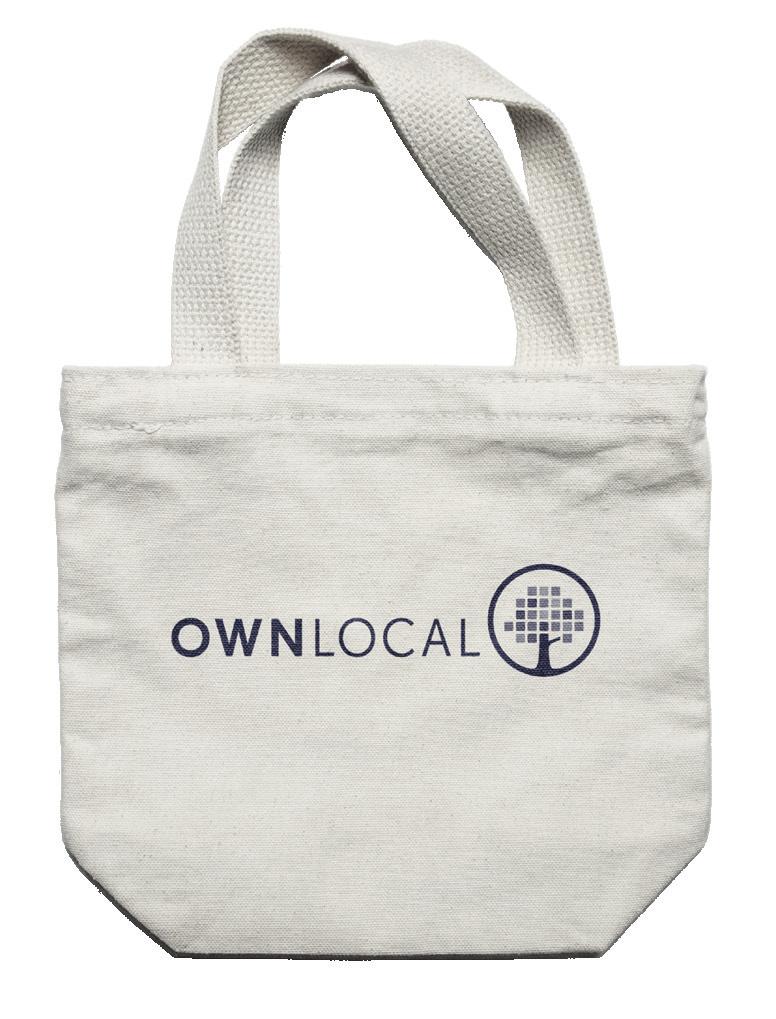

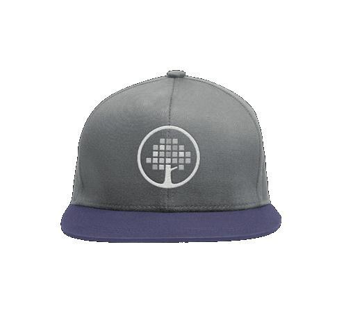

29 APPLICATION Swag should always be on brand and kept relevant. 29 // 34

30 "If you don't like what is being said, then change the conversation." Don Draper 30 // 34
31 05 VERBAL IDENTITY - COMING SOON Brand Voice Message 31 // 34

32 "Any damn fool can put on a deal, but it takes a genius, faith and perseverance to create a brand." David Ogilvy 32 // 34
33 THANK YOU! We appreciate you reading over the. If you have any additional questions about the OwnLocal brand please do not hesitate to contact us, we would love to hear from you! Contact Information OwnLocal Marketing Headquarters 205 W. 9th Street Austin, TX, USA // 34
34
VICTORY BREWING COMPANY LOGOS
 REVISION DATE - 5/2/2017 VICTORY BREWING COMPANY LOGOS Victory Brewing Company offers the following logos for marketing and branding needs. BANNER LOGO BOTTLE CAP LOGO VICTORY BREWING COMPANY LOGOTYPE
B R A N D G U I D E L I N E S
 BRAND GUIDELINES OUR PRODUCT IS OUR PEOPLE EVERY DAY OUR PEOPLE PROVIDE AN ENTIRELY POSITIVE, ABOVE AND BEYOND SERVICE EXPERIENCE TO EVERY CLIENT IN THE TSP FAMILY. We believe in the power of relationships
FileMaker Corporate Style Guide
 ilemaker Corporate Style Guide General guidelines for logo usage and corporate identity 5201 Patrick Henry Drive Santa Clara, CA 95054, USA Tel: (408) 987.7000 Welcome Our identity is one of our most valuable
MER MEC S.p.A. // B R A N D G U I D E USE OF THE LOGO. version EN
 B R A N D G U I D E USE OF THE LOGO version EN0314.01 OUR LOGO Here it is again our logo. Our logo is the most visible element of our identity a universal signature across all Demand Media communications.
one M2M Logo Brand Guidelines
 one M2M Logo Brand Guidelines July 2012 Logo Design Explanation What does the one M2M logo symbolize? The number 2 in the middle part of the logo symbolizes the connection between the two machines, the
Albertsons Companies and Tom Thumb Foundation Brand Standards. SOUTHERN DIVISION November 2017
 Albertsons Companies and Tom Thumb Foundation Brand Standards SOUTHERN DIVISION November 2017 TABLE OF CONTENTS Our Mission 3 Visual Identity 4 Photography 5 Typography 6 Albertsons Companies Foundation
TABLE OF CONTENTS TOLEDO ZOO & AQUARIUM BRAND GUIDELINES 2
 BRAND GUIDELINES TABLE OF CONTENTS Brand Inspiration 3 Our Mission 4 Primary Logo 5 Secondary Logo 7 Logo Color Usage & Proximity 8 Logo Application on Photos 9 Unacceptable Usage 10 Typography 11 Color
Brand Typeface Headlines Establishing Hierarchy Photography Iconography & Infographics... 18
 Brand Guide VERSION 1.0 2017 Contents at a glance Introduction Using Brand Guidelines... 3 A Note on Branding... 4 Logo Color Version... 5 Special Cases Only... 6 Logo Usage Clear Space... 7 Minimum Size...
Albertsons Companies, Vons, & Pavilions Foundation Brand Standards. SOUTHERN CALIFORNIA DIVISION November 2017
 Albertsons Companies, Vons, & Pavilions Foundation Brand Standards SOUTHERN CALIFORNIA DIVISION November 2017 TABLE OF CONTENTS Our Mission 3 Visual Identity 4 Photography 5 Typography 6 Albertsons Companies
VISUAL IDENTITY GUIDELINES. Updated
 VISUAL IDENTITY GUIDELINES Updated 2.12.2016 VISUAL IDENTITY GUIDELINES Table of Contents 1. Introduction Basic Design Elements 2. Logo 2.1 Clear zone 2.2 Logo misuse 2.3 Sponsor logo lock-up 3. Colors
Albertsons Companies and Safeway Foundation Brand Standards. PORTLAND DIVISION November 2017
 Albertsons Companies and Safeway Foundation Brand Standards PORTLAND DIVISION November 2017 TABLE OF CONTENTS Our Mission 3 Visual Identity 4 Photography 5 Typography 6 Albertsons Companies Foundation
Brand Identity Standards & Guidelines. PTCB Brand Identity Standards & Guidelines / V.001 / ptcb.org
 Brand Identity Standards & Guidelines 1 CONTENTS Our Story 03 OVERVIEW Brand Identity Standards & Guidelines 05 BRAND STRATEGY Mission, Vision & Tagline 07 Services & Target Audiences 08 Brand Principles
School of Social Work. Partnering for Change Style Guide
 School of Social Work Partnering for Change Style Guide September 4, 2009 Partnering for Change Campaign Introduction Rutgers School of Social Work is embarking upon a campaign intended to create a comprehensive,
ACME Foundation Brand Standards. ACME DIVISION November 2017
 ACME Foundation Brand Standards ACME DIVISION November 2017 TABLE OF CONTENTS Our Mission 3 File Formats & Usage 14 Visual Identity 4 Legal 15 Photography 5 Creative/Layout Treatments 16 Typography 6 Creative
TOWN OF QUEEN CREEK BRAND GUIDE
 BRAND GUIDE DEC2016 BRAND GUIDE INTRODUCTION CONTACT TOWN OF QUEEN CREEK COMMUNICATIONS, MARKETING AND RECREATION DEPARTMENT 22358 SOUTH ELLSWORTH ROAD QUEEN CREEK, AZ 85142 480-358-3198 communication@queencreek.org
Table of Contents. Stationery 24 Business card 25 Letterhead 26 #10 Envelope. Document Note
 Table of Contents Document Note The goal of these guidelines is to help communicate the strategy and visual system behind the SPX brand. If you have questions about anything in this guide, please reach
BRAND GUIDELINES CRAFTSMAN QUALITY STAINS & FINISHES SINCE 1953.
 BRAND GUIDELINES CRAFTSMAN QUALITY STAINS & FINISHES SINCE 1953. TOP 10 THINGS TO REMEMBER ABOUT Old Masters BRANDING 1. Always use the correct logo artwork. 2. Never modify or recreate logo artwork. 3.
Visual Style Guide April 2016
 Visual Style Guide April 2016 Contents Introduction to the Logo 3 Safe Area and Size 4 Incorrect Usage 5 Color Palette 6 Typography 7 Tone and Style of Photography 8 Print Examples 9 Screen Examples 10
Albertsons Companies, Safeway and Carrs/Safeway Foundation Brand Standards. SEATTLE DIVISION November 2017
 Albertsons Companies, Safeway and Carrs/Safeway Foundation Brand Standards SEATTLE DIVISION November 2017 TABLE OF CONTENTS Our Mission 3 Visual Identity 4 Photography 5 Typography 6 Albertsons Companies
Logo Guidelines. September 2014 ver.1. ACTIVEON guidelines
 Logo Guidelines September 2014 ver.1 101 CONTENTS Ⅰ Brand Overview 03. Extreme Logotype 05. Signature type 06. Grid system 08. Monochrome logo option 10. Clear space 1 1. Minimum size Logo colors 13. Color
Associate Degree for Transfer. Logo Guidelines. February 2017
 Associate Degree for Transfer Logo Guidelines February 2017 Logo Components The logo is comprised of 3 parts: 1) logotype, 2) logomark, 3) program name. These elements should not be resized, redrawn or
BRAND STANDARDS Kymeta Corporation
 2017 Kymeta Corporation JUNE 2017 Kymeta delivers on what connectivity is meant to be secure, available, universal, and global. We are removing barriers by providing an innovative means of leveraging satellite
Brand Guidelines Consumer Marketing
 Brand Guidelines Consumer Marketing Michigan Economic Development Corporation Version 3.3 (October 2016) What is it? The words Pure Michigan and the logo are trademarked by the MEDC. While the MEDC has
TABLE OF CONTENTS BRAND IDENTITY INTRODUCTION...3 OFFICIAL COLOR PALETTE...4 PRIMARY ATHLETIC MARK SECONDARY ATHLETIC MARKS...
 TABLE OF CONTENTS BRAND IDENTITY INTRODUCTION...3 OFFICIAL COLOR PALETTE...4 PRIMARY ATHLETIC MARK...5-6 SECONDARY ATHLETIC MARKS...7-8 ATHLETIC WORDMARKS... 9-10 TYPOGRAPHY... 11 WORDMARK LOCKUPS...12-15
Oct Style Guide & Logo Usage
 Oct 2017 Style Guide & Logo Usage Logo Specifications Standard Vertical The vertical logo is the preferred standard of use. The alternate horizontal logo is to be used in all instances where the standard
GRAPHIC STANDARDS MANUAL
 GRAPHIC STANDARDS MANUAL Azusa Pacific University is an, evangelical Christian community of disciples and scholars who seek to advance the work of God in the world through academic excellence in liberal
For Children with Developmental Differences. Brand Identity Guide
 For Children with Developmental Differences Brand Identity Guide Table of Contents 3 Our Visual Identity System 4 About These Guidelines 5 The Logo 6 Clear Space & Minimum Size 7-8 Logo Variations 9 Icon
Safe Boating Campaign Brand Guidelines
 Safe Boating Campaign Brand Guidelines Reference to any specific commercial product, process, or service, or the use of any trade, firm or corporation name is for the information and convenience of the
IREM Headquarters and Chapter Version January 9, Brand and Style Guide
 IREM Headquarters and Chapter Version January 9, 2018 Brand and Style Guide Table of Contents Section 1: Brand Messaging 3 - About IREM 4 - Brand Positioning 5 - IREM Trademarks 6-7 Section 2: Logos and
BRAND GUIDELINES
 BRAND GUIDELINES 2018-19 Mount Pisgah Christian School Department of Admissions and Marketing OUR BRAND Our brand is the composite of all elements that communicate to the world who we are as a school and
INTRODUCTION OUR MISSION
 BRAND GUIDELINES INTRODUCTION OUR MISSION Active Heroes is an IRS approved 501c3 Charity with the mission to support all U.S. military service members, veterans and their families through physical, educational,
Brand Identity Guide March 2011
 Brand Identity Guide March 2011 CONTENTS Introduction 3 Attributes of the Brand 4 Brand Architecture 5 The Summit Bechtel Reserve Brand Extension 6 The Summit Bechtel Reserve 7 Primary Logotype 9 Secondary
Logo Overview. Always use the original digital artwork, available through the Brand Center, to help maintain consistency and integrity.
 Avast logo manual 10 Overview The Avast logo consists of a symbol (the amoeba) and a wordmark. Both elements of the logo have been carefully redesigned to work together for maximum legibility. Do not redraw
Branding Style Guidelines. (Revised: September 6, 2017)
") Branding Style Guidelines (Revised: September 6, 2017) Table of Contents 2 3 4 5 6 7 8 10 12 13 14 Introduction Brand elements Clear space and minimum size Logo and tagline Symbol as a graphic Logo palette
Branding Style Guidelines (Revised: September 6, 2017) Table of Contents 2 3 4 5 6 7 8 10 12 13 14 Introduction Brand elements Clear space and minimum size Logo and tagline Symbol as a graphic Logo palette
HINO BRAND VISUAL DESIGN MANUAL V1.2e
 HINO BRAND VISUAL DESIGN MANUAL V1.2e Introduction Each basic element in communications, such as the corporate logomark and brand colors, contributes to building brand and plays a vital role in creating
Kodiak Brand Guide. April 2015
 Kodiak Brand Guide April 2015 //kodiakptt.com/company/brand/ Table of Contents The brand is more than a logo 2 Communication 4 Tone & Style 4 Kodiak in Writing 4 Kodiak Marks & Logo 5 Standard Wordmark
Cisco College Style Guide
 Cisco College Style Guide Cisco College is a leading provider of education in West Central Texas and presenting a consistent brand and image is imperative to the organization s continued success. In today
EUDQG VWDQGDUGV v2.6.13
 v2.6.13 keep it simple. Our brand personality must be clear and consistent across all aspects of the business from advertising to customer communications, to products and cobranding. These guidelines have
brand manual partners edition
 partners edition brand manual 2016 color palette The Plus color palette contains six colors. The value of each color is listed in PMS (1-color spot), CMYK (4-color process), RGB and hexadecimal. Any of
Visual Identity Guidelines. Essential guidelines to help you create cohesive brand communications
 Visual Identity Guidelines Essential guidelines to help you create cohesive brand communications August 2017 GENERAL GUIDELINES The use of the logo is reserved for official Summa partners only (dealers,
I D E N T I T Y G U I D E L I N E S
 I D E N T I T Y G U I D E L I N E S THE CORPORATE MARK Logo Components The Digium family of logos are the cornerstone of the identity program. Together with the following key design elements, the logo
wirelessgroup.co.uk Updated: Brand Guidelines 1/7/2018 V1.0 Brand Guidelines Version 1.0
 wirelessgroup.co.uk Updated: Brand Guidelines 1/7/2018 1 Brand Guidelines Version 1.0 wirelessgroup.co.uk Brand Guidelines 2 Contents 03 04 07 09 11 12 13 14 Primary Logo Secondary Logos Group Indicator
Corporate Identity and Visual Identity Guidelines June 2011
 Corporate Identity and Visual Identity Guidelines June 2011 Index A Basic Design Elements A 01 The BenQ Logo A 02 Minimum Size, Minimum Staging Area A 03 Typography A 04 Corporate Colours B B 01 B 02 B
Brand Guidelines. January 2015
 Brand Guidelines January 2015 Table of Contents 1.0 What s a brand? 3 1.1 The logo 4 1.2 Colour 1.2.1 Spot & Process 1.2.2 Black & White 5 5 6 1.3 Logo Sizing 1.3.1 Minimum Clear Space 1.3.2 Positioning
BRAND GUIDELINES 1 BRAND GUIDELINES
 BRAND GUIDELINES 1 BRAND GUIDELINES BRAND GUIDELINES 2 BRAND GUIDELINES 3 Contents Introduction The aims of the brand 02 About this booklet 02 Who can use the brand 02 Resources 02 Design Elements & Usage
GRAPHIC STANDARDS MANUAL Policy and guidelines for using the Hostos Community College 50 th Anniversary Brand Identity
 GRAPHIC STANDARDS MANUAL Policy and guidelines for using the Hostos Community College 50 th Anniversary Brand Identity TABLE OF CONTENTS Policy and Applications... 3 Hostos 50th Anniversary Primary Logo...
HINO BRAND VISUAL DESIGN MANUAL V1.3e
 HINO BRAND VISUAL DESIGN MANUAL V1.3e Introduction Each basic element in communications, such as the corporate logomark and brand colors, contributes to building brand and plays a vital role in creating
BASIC MANUAL OF CEPSA IDENTITY
 BASIC MANUAL OF CEPSA IDENTITY April 2018 Cepsa Basic Identity Manual Welcome This manual contains all the elements that make up the Cepsa identity. This manual contains all the elements that make up the
2018 LOGO STYLE GUIDE
 2018 LOGO STYLE GUIDE For over 60 years, ASIS International has provided an integrated destination for education, cuttingedge technologies, and peer-to-peer networking, in the Annual Seminar and Exhibits.
The Look BRAND GUIDELINES
 The Look BRAND GUIDELINES At Mojio, we look a certain way and we re proud of it. This guide outlines the look that makes Mojio, Mojio. These guidelines are designed to help you use our brand and assets,
TITLE MASTER GARDENER PROGRAMS STYLE GUIDE MASTER GARDENER STYLE GUIDE
 TITLE MASTER GARDENER PROGRAMS STYLE GUIDE 1 TABLE OF CONTENTS 3 INTRODUCTION 4 About 5 Program Hierarchy 6 LOGO LOCK-UP GUIDELINES 7 Clearspace and Alignment 8 Subset Program Lock-Ups 9 LOGO ALTERNATES,
ICSA LABS LOGO USAGE GUIDELINES
 ICSA LABS LOGO USAGE GUIDELINES CONTENTS ICSA LABS LOGO THE LOGO UNACCEPTABLE USAGE ICSA LABS EVALUATED LOGO THE LOGO UNACCEPTABLE USAGE ICSA LABS CERTIFIED LOGO THE LOGO UNACCEPTABLE USAGE COLOR PALETTE
Core brand elements CWT logos
 Two logo versions The preferred version of the logo should always be used where possible. Only use the one-line version when space does not allow for the preferred version. CWT logos Preferred logo The
Corporate Identification Guidelines
 It s Our Corporate Signature Corporate Identification Guidelines The Electro-Motive company logotype or logo is our corporate signature. It identifies the products, services, service parts, facilities,
The Center For Educator, Recruitment, Retention and Advancement. Graphic Standards Manual
 The Center For Educator, Recruitment, Retention and Advancement Graphic Standards Manual 2016 Main Logotype The logotype is the central element in CERRA s visual communications system. Through consistent
Primary Logo cune.edu/logo
 Primary Logo The Concordia symbol shows the cross, which identifies our central purpose, and the Weller tower spires clustered in groups of four identifying the symbol with Concordia University, Nebraska
BRAND GUIDELINES VENDOR COPY AUGUST ecoatm BRAND GUIDELINES
 BRAND GUIDELINES VENDOR COPY AUGUST 2014 7059.0814 1 BRAND STANDARDS CONTENTS Brand Standards Primary Logo Endorsers Logo Lockup Secondary Logos, Black and White Margins and Minimum Size Incorrect Usage
SOUTHEAST TECH BRANDING IDENTITY STANDARDS MANUAL
 SOUTHEAST TECH BRANDING IDENTITY STANDARDS MANUAL INTRODUCTION The Southeast Tech Branding Identity Standards Manual was created to provide all Southeast Tech employees and associates with the ability
CMA VISUAL IDENTITY GUIDE. January 2018
 CMA VISUAL IDENTITY GUIDE January 2018 CMA Visual Identity Guide Logo overview The CMA logo is composed of the French and English wordmarks and the CMA icon (note: the logo is always bilingual, even in
COLLEGE IDENTITY GUIDE
 COLLEGE IDENTITY GUIDE Table of Contents TABLE OF CONTENTS Introduction...3 Identity Platform Essentials...4 Vision, Mission, Values and Positioning... 5 Marketing Messages and Tagline... 6 Traits & Attributes...
Visual Identity and Brand Guidelines
 Visual Identity and Brand Guidelines June 2013 Version 1.0 1 BUILDING BLOCKS 10 Vermont Tech Logo We re practical, straightforward, and confident and our logo embodies these. It stands proudly on its own
LOGO USAGE GUIDELINES OCTOBER 2016
 LOGO USAGE GUIDELINES OCTOBER 2016 PREFERRED LOGO The Robert Toigo Foundation logo is the most often seen expression of our identity. When we use our logo consistently and correctly, our audiences will
3.1 Corporate Logotype Primary vertical version
 3.1 Corporate Logotype Primary vertical version Our new logotype (or logo) is a modern representation of our company. It is designed to clearly and proudly reflect our brand promise advocates for innovation
YOU HAVE A NEW LOGO, NOW WHAT?
 YOU HAVE A NEW LOGO, NOW WHAT? It has been a pleasure to work on your brand the last few weeks. Because my goal is to help your organization look its best, I have put together this helpful guide for you.
CHARGERS ROWING CLUB
 BRAND GUIDELINES THE PUDDLE ONONDAGA GREEN COLOR PALETTE TYPOGRAPHY LOGO USAGE STATIONARY MARKETING 3 4 5 6 7 8 10 14 2 BRAND GUIDELINES To foster a great experience for anyone who interacts with the,
IDENTITY GUIDELINES BUILDING THE SKYWARD BRAND
 IDENTITY GUIDELINES BUILDING THE SKYWARD BRAND TABLE OF CONTENTS INTRODUCTION...02 SKYWARD TRADEMARK...03 LOGO. PRINT...04 Size, Spacing & Positioning LOGO. SCREEN...05 Web & Video COLOUR...06 TYPOGRAPHY...07
ABOUT THESE GUIDELINES
 Brand Guidelines ABOUT THESE GUIDELINES The following style guide for the CelebrateOne campaign highlights all written, visual and graphic elements that encompass our brand. These standards are intended
Branding & Design Standards. LIMITED USE: These standards are for areas where FIRST is not a registered trademark. Standards Are Strictly Enforced
 11.3.2015 Branding & Design Standards Standards Are Strictly Enforced LIMITED USE: These standards are for areas where FIRST is not a registered trademark. FIRST Logo Our logo consists of uniquely configured
BRAND GUIDELINES. DavidMason.com or CHICAGO SAINT LOUIS CENTER CITY NORRISTOWN
 BRAND GUIDELINES DavidMason.com or Info@DavidMason.com SAINT LOUIS CHICAGO CENTER CITY NORRISTOWN 800 South Vandeventer Ave. St. Louis, Missouri 63110 Phone: 314.534.1030 Fax: 314.534.1053 464 North Milwaukee
DESIGN & BRAND Guidelines
 DESIGN & BRAND Guidelines TABLE OF CONTENTS This document provides guidelines to ensure the correct use of the Belgian Development Cooperation visual identity. A correct and consistent implementation conveys
RESNET. Professional Logos Guide
 RESNET Professional Logos Guide Trusted Experts in Home Energy Efficiency The National Association of State Energy Officials and Mortgage Bankers Association of America founded the Residential Energy Services
AMD EPYC BRAND GUIDELINES
 AMD EPYC BRAND GUIDELINES PID# 1713627-A / VERSION 1 AUGUST 2017 CONTACT Address Advanced Micro Devices, Inc 7171 Southwest Pkwy Austin, Texas 78735 United States Phone 1-512-602-1000 Online Email: Brand.Team@amd.com
HarvestMaster Logo LOGO COLORS: STANDARD COLOR & SPACING LOGO COLORS: SIMPLIFIED
 HarvestMaster COLOR & SPACING LOGO COLORS: STANDARD LOGO COLORS: SIMPLIFIED To ensure the prominence, clarity, and visual impact of the HarvestMaster logo, please adhere to the following guidelines regarding
BRAND LAUNCH FALL 2017 GRAPHIC STANDARDS
 BRAND LAUNCH FALL 2017 GRAPHIC STANDARDS INTRODUCTION THESE ARE THE COMPREHENSIVE BRAND GUIDELINES FOR THE NATIONAL WESTERN CENTER. As with any good brand, adherence to graphic standards is a sure way
FACILITYLINK CORPORATE IDENTITY MANUAL
 FACILITYLINK CORPORATE IDENTITY MANUAL Table of Contents Page 2 of 47 Introduction 3 Corporate Design Elements 7 Corporate Design Application 25 Logo Application for Subsidised Activities 44 Table of Contents
Table of Contents. Brand Overview. Logo Versions. Standard Logos. How to Use. Colors. Typography. Logo Usage. Misuses. Exceptions.
 Brand Guidelines Table of Contents 01 / 09 Brand Overview Logo Versions Standard Logos How to Use Colors Typography Logo Usage Misuses Exceptions Photography & Art Star Background 2 3 3 4 5 6 7 7 8 9 9
BRAND. Standards LOGO GUIDE
 BRAND Standards LOGO GUIDE TABLE OF CONTENTS INTRODUCTION Why a Brand Standards Manual?... 4 The Big Picture....5-7 TRADEMARK STANDARDS Logo Variations... 9-13 Correct Logo Usage... 14 Incorrect Logo Usage...
CERTIFICATION MARK STANDARDS GUIDE
 CERTIFICATION MARK STANDARDS GUIDE TABLE OF CONTENTS I. Certification Mark...3-4 A. Colors... 4 B. Clear Space... 4 C. Minimum Size... 4 II. Certification Signature...5 1. Horizontal...5 2. With URL...5
graphic standards adopted May 2007
 graphic standards adopted May 2007 All Canadian made for all Canadian weather Gord Wiebe President & CEO Dear All Weather Windows Colleague, The All Weather Windows brand and product are valuable company
Visual identity guidelines
 Visual identity guidelines Contents Introduction 01 Our logo 02 Using our logo 03 05 Our symbol 06 Our coat of arms 07 Our typefaces 08 09 Our colour palette 10 11 Our imagery 12 13 Contacts 14 Introduction
Village Seven Presbyterian Church Graphic Standards Manual VillageSeven
 Village Seven Graphic Standards Manual Village Seven Graphic Standards Manual Contents Statement of Purpose 3 Endorsement Letter 3 Logo 4 Logo Usage 5 Colors 6 Alternate Logo Formats 7 Additional Logo
VISUAL IDENTITY STANDARDS
 VISUAL IDENTITY STANDARDS CURRENT AS OF 12/5/2016 1 HUSTLER VISUAL IDENTITY STANDARDS: TABLE OF CONTENTS TABLE OF CONTENTS OVERVIEW Hustler Visual Identity Standards Policy... 2 LOGO STANDARDS Vertical
visual identity guidelines
 visual identity guidelines Georgetown University Alumni Association s visual identity looks to the past for inspiration but must remain relevant for the 21st century and be responsive to the varied needs
BRAND STANDARDS GUIDE
 BRAND STANDARDS GUIDE This document is designed to provide a guide for presentation and use of the CTO logo. The details outlined are generally applicable to stationery, presentations, signage, marketing
BRAND / The CDW Logo
 BRAND / The CDW Logo 10 Overview The CDW logo consists of a solid square with CDW and a distinctive oval shape reversed out. Both a standalone square logo and a logo-with-tagline lockup are available for
Prairie Rivers of Iowa Logo & Brand Standard
 Prairie Rivers of Iowa Logo & Brand Standard Table of contents 1...What is a brand? 2...The Prairie Rivers of Iowa logo 3...Clear Space Around the Prairie Rivers of Iowa Logo 4...Other logos used by Prairie
LOGO MANUAL. Definition of the basic use of the logo
 LOGO MANUAL Definition of the basic use of the logo INTRODUCTION The KELLYS Logo Manual is a document that sets forth the basic rules for the use of the graphic elements of the KELLYS BICYCLES logo and
Book of visual identification
 Copyright 2018 Table of content 01. Introduction................................................. 3 02. Forms of sign................................................. 4 03. Colour variants of the sign...................................
NSW INSTITUTE OF SPORT CORPORATE IDENTITY MANUAL. Guidelines for the use of the NSWIS and ClubsNSW corporate identity
 NSW INSTITUTE OF SPORT CORPORATE IDENTITY MANUAL Guidelines for the use of the NSWIS and ClubsNSW corporate identity CONTENTS Introduction 1 The NSWIS Brand 1 NSWIS Purpose 2 NSWIS Values 2 Use of the
Logo and Brand Standards Manual. Copyright November 2013
 Logo and Brand Standards Manual Copyright November 2013 Table of Contents Rice Lake Branding... 1 Primary Logo... 2 International Logos... 3 Vertical Industry Logos... 4 Partner Logos... 5 Subsidiary Logos...
Version 3:0 September 2015
 Identity guidelines Version 3:0 September 2015 The Buxton logotype The new logotype embraces the concept of water - and a source of water. The focal point of the design is the letter O' where water emerges
BRAND GUIDELINES 2017
 BRAND GUIDELINES 2017 WE ARE 02 EVERYDAY ADVENTUREWEAR BORN FROM NEW ENGLAND CHARLES RIVER APPAREL OUR STORY 03 EVERYDAY ADVENTUREWEAR BORN FROM NEW ENGLAND It all started with a rain jacket in 1983 -
Prometric Graphic Standards
 www.prometricbrand.com Version 3.0 :: August 2015 Introduction: Our Brand Every interaction we have with our marketplace affects our brand. In fact, our brand is nothing more than the cumulative impression
INTRODUCTION. NASS is an action sports & music festival that celebrates the very best of alternative culture, bringing you three days of:
 BRAND GUIDELINES INTRODUCTION NASS is an action sports & music festival that celebrates the very best of alternative culture, bringing you three days of: PRO SKATE + BMX COMPETITIONS WITH THE WORLD S BEST
UNICEF CLUBS BRAND BOOK
 UNICEF CLUBS BRAND BOOK 2016 17 updated July 1, 2016 Contents How to Use This Book.... 3 Logo Usage Guidelines.... 4 Typography Our Fonts.... 10 Color USF Color Palette.... 11 2 UNICEF CLUBS Brand Book
www. enocean. com EnOcean Brand Guidelines
 www. enocean. com EnOcean Brand Guidelines V3.2 MARCH 2012 EnOcean Brand Guidelines EnOcean GmbH is the innovator and producer of the award-winning, patented batteryless radio technology, thus establishing
Bran d Identity Guide
 UNC ESHELMAN SCHOOL OF PHARMACY Brand Identity Guide Table of Contents INTRO 3 LOGO 5 Horizontal 6 Vertical 8 PROMISE 10 FONTS 12 COLORS 14 BRAND IMAGERY 16 Graphic Elements 17 Icons 18 Photography 19
GLOBAL BRANDING LOGO
 GLOBAL BRANDING LOGO Our logo is the centerpiece of our visual identity. It is the key design element representing our organization and the basis for our design approach. Logo elements logomark The YFU
Style Guide Working copy as of December 2018
 Style Guide Working copy as of December 2018 WQPT is a public media service of Western Illinois University 2018 by WQPT TV. All rights reserved. Purpose of this Style Guide This guide was developed to
GETTING UMSU BRAND BASICS RIGHT
 GETTING UMSU BRAND BASICS RIGHT UMSU Brand Guidelines 2017 UMSU BRAND GUIDELINES 2017 CONTENTS INTRODUCTION 4 UMSU BRAND: AN OVERVIEW 6 UMSU LOGO 7 UOM LOGO 8 CORRECT USE OF THE LOGO 9 INCORRECT USE OF