JOTUN digital guidelines. Digital standards for JOTUN s Corporate Identity
|
|
|
- Susan McCormick
- 5 years ago
- Views:
Transcription
1 JOTUN digital guidelines Digital standards for JOTUN s Corporate Identity
2 Introduction WHAT IS OUR TARGET? Update JOTUN s corporate identity to include guidelines for digital use, corporate brand. Ensure simple and intuitive framework for JOTUN s users. 2
3 Target Group INTERNAL All employees involved in creating marketing material or such related material involving corporate identity EXTERNAL Advertising agencies Design agencies Video Production agencies Media agencies Digital Production agencies 3
4 Digital content BASICS 6 Logo / Digital file format 7 Logo / Clearspace 8 Logo/ Minimum size 10 Digital colours / Primary 11 Digital colours / Secondary 12 Digital Typeface / Corporate 13 Digital Typeface / System font 14 Digital Typeface / Guidelines for coded text 15 Corporate iconography PRACTICAL USE 18 Digital advertising / Standard banner ad sizes 19 Landscape banner ads 25 Portrait banner ads 31 Netboard - rectangle banner ads 37 Call to action (CTA) buttons 39 Social media / Corporate profile image 42 Facebook 51 YouTube 56 LinkedIn 62 Twitter 67 Instagram 69 App identity 73 Video 78 Info Screens 4
5 Part 1: Basics 5
6 Logo / Digital file formats The Jotun logo - optimized for web and digital use The Jotun logo is the key component of our identity, and it is present on all our materials and communications. Jotun's digital communication is not an exception. Use the links below to download the Jotun logo optimized for web and digital use. The logo must be used as provided and cannot be altered in any way. Format File size Dimensions Colour mode SVG 4 KB 300x150 px RGB PNG 58 KB 300x150 px RGB PNG 150 KB 600x250 px RGB PNG 450 KB 1200x400 px RGB EPS 300 KB 1200x400 px RGB PDF 300 KB 1200x400 px RGB 6
7 Logo / Clearspace Ensure logo visibility and impact The Clearspace around the Jotun logo has been established to ensure its visibility and impact on both big and small digital devices. x x The Clearspace should be considered as the minimum safe distance, and more room should be considered if necessary. x x x x x x x x x x x x x PRO TIP We can use this method to define the minimum CSS padding properties for the Jotun logo on a webpage. Clearspace 1 Where to use it On small formats such as SoMe thumbnails, app icons, mobile digital ads, etc. How to calculate it The Clearspace is equal to half the height of the letter N (marked as x), and is thus used as a principle for the minimum distance of the blue area around the logo. 7 Clearspace 2 Where to use it On bigger formats such as desktop digital ads, SoMe cover images, video, etc. How to calculate it The Clearspace is equal to the width of the letter N (marked as x), and is thus used as a principle for the minimum distance of the blue area around the logo.
8 Logo / Minimum Size Ensure logo legibility and impact Establishing a minimum size ensures that the Jotun Logo is reproduced correctly on all digital devices, without compromising its legibility and impact. To ensure that the Jotun Logo is always clearly legible, it should never be reproduced smaller than 70px in width in any digital communication. For logo with payoff the minimum width size should be no smaller than 200 px. Applications, thumbnails etc On applications, thumbnails etc the logo size will be generated smaller than 70 px based on predefined settings. This happens automatically, but for all logo sizes we can control, the minimum size in width must be no smaller than: 70 px for Jotun logo without payoff 200 px for Jotun logo with payoff 70 px 200 px 8
9 Jotun digital colours 9
10 Digital colours / Primary Our Corporate colours: a distinct and crucial part of our identity Our primary colours for web and digital use are listed by their RGB values and their hexadecimal equivalents (HEX codes). This to assure seamless colour transitions between coded elements and graphic elements. No colours other than the ones specified below may be used. RGB: Digital elements HEX: Coded elements Jotun Blue HEX code RGB values Jotun Yellow HEX code #FCAF17 RGB values Jotun Red HEX code #D52B1E RGB values
11 Digital colours / Secondary Colours that interact harmoniously with our primary corporate colours Our secondary colours are meant to be used primarily as background colours on web and digital material. They can also be used on menu bars, sub menu fields, fact boxes, forms, image captions, etc. These colours are listed by their RGB values and their hexadecimal equivalents (HEX codes). This to assure seamless colour transitions between coded elements and graphic elements. No colours other than the ones specified below may be used as secondary colours. Cool Gray / Dark HEX code #A5ACAF Cool Gray HEX code #D2D5D7 RGB values RGB values Cool Gray / Light HEX code #E8EAEB RGB values White HEX code #FFFFFF RGB values
12 Digital Typeface / Profile typeface Our Corporate typeface as a fundamental part of our visual style Jotun s corporate typeface Frutiger must be used whenever possible to ensure a consistent look across our print and digital communications. Frutiger is intended to be clear and highly legible both on printed and digital material. Frutiger Jotun's Corporate typeface must be used on digital comunications, ads, app identity, videos, info screens etc. Frutiger is a licensed font sold by i.e. MyFonts: Jotun use the following weights: Frutiger 45 Light Frutiger 46 Light Italic Frutiger 55 Roman Frutiger 56 Italic Frutiger 65 Bold Frutiger 66 Bold Italic Frutiger 75 Black Frutiger 76 Black Italic abcdefghijklmnopqrstuvwxyzåæø ABCDEFGHIJKLMNOPQRSTUVWXYZÅÆØ Light Light Italic Roman Roman Italic! Frutiger is not used on Jotun.com and Join. The default standard system font Verdana is used instead. See more on page 13. Bold Black Bold Italic Black Italic 12
13 Digital Typeface / System font Web safe font available for everybody and cross-platform friendly When our Corporate typeface is not suitable or available, Verdana has been selected as the default standard system font. Use Verdana on: Jotun.com Join PowerPoint presentations Office software / signatures Coded text such as HTML text in websites and intranet etc. NB! Some platforms such as various social media etc have their own system fonts. In this case it s not possible to use either Frutiger or Verdana. Verdana abcdefghijklmnopqrstuvwxyzåæø ABCDEFGHIJKLMNOPQRSTUVWXYZÅÆØ Regular Regular Italic! Are you developing a mobile app? Read about typefaces for mobile operating systems on page 71 Bold Bold Italic 13
14 Digital Typeface / Guidelines for coded text Colour and font weight as important tools to enhance typographic hierarchy Typographic hierarchy helps the user to scan text easily and find key information. Colours and weights in text create contrast between elements, so our message is displayed with the most impact. Body text: In black and regular. Enhanced text in bold and black. Text over background: In blue and regular. Enhanced text in bold and blue. Hyperlinked text: In blue and bold. Hyperlinked text on mouseover: Light blue, bold and underlined. The Jotun Group is a matrix organisation divided into seven regions responsible for the sale of Decorative Paints and Performance Coatings (Marine, Protective and Powder Coatings). Our four values Loyalty, Care, Respect and Boldness are the solid building blocks of our Penguin Spirit. The Jotun Group is a matrix organisation divided into seven regions responsible for the sale of Decorative Paints and Performance Coatings (Marine, Protective and Powder Coatings). The Jotun Group is a matrix organisation divided into seven regions responsible for the sale of Decorative Paints and Performance Coatings (Marine, Protective and Powder Coatings). Black text Blue text Link Link - Mouseover HEX code # HEX code # HEX code #04388C HEX code #4B77C0 RGB values RGB values RGB values RGB values
15 Corporate Iconography Visual tool to draw users into the content These icons are meant to help the user navigate through the content in a more intuitive way. This icon set must be used as starting point when designing more icons for digital use. This icon set is available for download here: Social media platforms have their own guidelines for their logo usage and they update them often. Always check that you are using the latest version.! Can t find the icon you need? Please contact us at corporate.identity@jotun.com for further information. Follow Jotun on 15
16 Part 2: Practical use 16
17 Digital advertising 17
18 Digital advertising / Standard banner ad sizes Standard Web Banners This table is an overview and starting point for creating Jotun banner ads with correct branding and design. The banners that are mentioned here are international examples of Google Ads standard formats. On the following pages you will see examples of the different formats with correct Jotun branding. Name Dimentions Desktop Mobile Leaderboard 728 x 90 px Billboard 970 x 250 px Skyscraper Half Page Medium rectangle Netboard banner 160 x 600 px 300 x 600 px 300 x 250 px 580 x 400 px 18
19 Digital advertising / Landscape banner ads Landscape banner ad with Jotun blue background and image Maximum logo width - 1/4 of the full width of the banner Logo width: The Jotun logo (including clearspace) must not be wider than one-fourth of the banner's full width, and not narrower than one-sixth of the full width of the banner. Image width: The image must not be wider than 40% of the banner's full width, and not narrower than 20% of the full width of the banner. Leaderboard 728 x 90 px Minimum image width - 20% of the banner's full width When to use this layout: When the image to use shows several elements or has bright colors that can collide with Jotun s corporate color/elements. When the image to use affects the readability of the message or CTA button. Billboard 970 x 250 px Minimum logo width - 1/6 of the full width of the banner Important! Use the specified clearspace for banner ads (see page 7). Never place a CTA button under the Jotun logo in a landscape banner. The CTA-button must never be higher than the yellow field of the Jotun logo. Read more about CTA-buttons on page 34. Maximum image width - 40% of the banner's full width 19

20 Digital advertising / Landscape banner ads Examples Landscape banner ad with Jotun blue background and image Leaderboard 728 x 90 px Paint for iconic buildings and beautiful homes READ MORE Billboard 970 x 250 px Paint for iconic buildings and beautiful homes READ MORE! Keep the text simple! The average time a user looks at a banner ad is 2-3 seconds! 20
21 Digital advertising / Landscape banner ads Landscape banner ad with full width image Maximum logo width - 1/4 of the full width of the banner Logo width: The Jotun logo (including clearspace) must not be wider than one-fourth of the banner's full width, and not narrower than one-sixth of the full width of the banner. Leaderboard 728 x 90 px When to use this layout: When the image has few elements and has colours that harmonize with Jotun s corporate color/elements. When the image does not affect the legibility of the main message or CTA button. Minimum logo width - 1/6 of the full width of the banner Important! Use the specified clearspace for banner ads (see page 7). Never place a CTA button under the Jotun logo in a landscape banner. The CTA-button must never be higher than the yellow field of the Jotun logo. Read more about CTA-buttons on page 34. Billboard 970 x 250 px 21

22 Digital advertising / Landscape banner ads Examples Landscape banner ad with full width image Leaderboard 728 x 90 px Lorem ipsum dolor sit amet consectetur READ MORE Billboard 970 x 250 px Lorem ipsum dolor sit amet consectetur READ MORE 22
23 Digital advertising / Landscape banner ads Landscape banner ad without image Logo width: The Jotun logo (including clearspace) must not be wider than one-fourth of the banner's full width, and not narrower than one-sixth of the banner's full width. When to use this layout: When there is not a relevant image to accompany the main message. Leaderboard 728 x 90 px Maximum logo width - 1/4 of the banner's full width Important! Use the specified clearspace for banner ads (see page 7). Never place a CTA button under the Jotun logo in a wide banner. The CTA-button must never be higher than the yellow field of the Jotun logo. Read more about CTA-buttons on page 34. Billboard 970 x 250 px Minimum logo width - 1/6 of the banner's full width 23
24 Digital advertising / Landscape banner ads Examples Landscape banner ad without image Leaderboard 728 x 90 px Spray Painter/ Lab Technician READ MORE Billboard 970 x 250 px Spray Painter/ Lab Technician READ MORE Workplace Sandefjord Application deadline
25 Digital advertising / Portrait banner ads Portrait banner ad with Jotun blue background and image Logo width: In a Skyscraper banner ad the width of the Jotun logo (including clearspace) should be the same as the full width of the banner. This applies for other portrait banners with up to 200px in width. Layout 1 Skyscraper 160 x 600 px Defined logo width (including clearspace): Full banner width Halfpage 300 x 600 px Minimum logo width (including clearspace): 1/2 of the full banner width Layout 2 Skyscraper 160 x 600 px Halfpage 300 x 600 px In a halfpage banner ad the width of the Jotun logo (including clearspace) should never be smaller than 50% of the full width of the banner. This applies for other portrait banners with 300 px in width and up. Centered logo: The logo s placement on banner ads is in the center when the logo+clearspace doesn t fill the entire format. The CTA-button should be placed to the right, following the reading direction and create a good balance in the setup. Image height: The image should not be higher than 40% of the banner's full height, and not shorter than 20% of the banner's full height. Layouts: 1. Logo on top, image comes right under the logo s clearspace. 2. Image on top, logo (including clearspace) comes right under. When to use these layouts: When the image to use shows several elements or has bright colors that can collide with Jotun s corporate color/elements. When the image to use affects the readability of the message or CTA button. Minimum image height 20% of the full banner height Maximum image height 40% of the full banner height Important! Use the specified clearspace for banner ads (see page 7). The CTA-button must always be placed at the bottom. The CTA-button must never be higher than the yellow area of the Jotun logo. Read more about CTA-buttons on page
26 Digital advertising / Portrait banner ads Examples Portrait banner ad with Jotun blue background and image Layout 1 Layout 2 Skyscraper 160 x 600 px Halfpage 300 x 600 px Skyscraper 160 x 600 px Halfpage 300 x 600 px Paint for iconic buildings and beautiful homes Paint for iconic buildings and beautiful homes Paint for iconic buildings and beautiful homes Paint for iconic buildings and beautiful homes READ MORE READ MORE READ MORE READ MORE 26
27 Digital advertising / Portrait banner ads Portrait banner ad with full width image Logo width: In a Skyscraper banner ad the width of the Jotun logo (including clearspace) should be the same as the full width of the banner. Skyscraper 160 x 600 px Logo width Full banner width Halfpage 300 x 600 px Maximum logo width Full banner width Halfpage 300 x 600 px Minimum logo width 1/2 of the full banner width In a halfpage banner ad the width of the Jotun logo (including clearspace) can be the same as the full width of the banner but never smaller than 50% of the banner-width. When to use this layout: When the image has few elements and has colours that harmonize with Jotun s corporate color/elements. When the image does not affect the legibility of the main message or CTA button. Important! Use the specified clearspace for banner ads (see page 7). The CTA-button must be always placed as lower as posible. The CTA-button must never be higher than the yellow area of the Jotun logo. Read more about CTA-buttons on page

28 Digital advertising / Portrait banner ads Examples Portrait banner ad with full width image Skyscraper 160 x 600 px Halfpage 300 x 600 px Halfpage 300 x 600 px Lorem ipsum dolor sit amet consectetur Lorem ipsum dolor sit amet consectetur Lorem ipsum dolor sit amet consectetur READ MORE READ MORE READ MORE 28
29 Digital advertising / Portrait banner ads Portrait banner ad without image Logo width: In a Skyscraper banner ad the width of the Jotun logo (including clearspace) should be the same as the full width of the banner. Skyscraper 160 x 600 px Logo width Full banner width Halfpage 300 x 600 px Maximum logo width Full banner width Halfpage 300 x 600 px Minimum logo width 1/2 of the full banner width In a halfpage banner ad the width of the Jotun logo (including clearspace) can be the same as the full width of the banner but never smaller than 50% of the banner-width. When to use this layout: When there is not a relevant image to accompany the main message. Important! Use the specified clearspace for banner ads (see page 7). The CTA-button must be always placed as lower as posible. The CTA-button must never be higher than the yellow area of the Jotun logo. Read more about CTA-buttons on page
30 Digital advertising / Portrait banner ads Examples Portrait banner ad without image Skyscraper 160 x 600 px Halfpage 300 x 600 px Spray Painter/ Lab Technician Spray Painter/ Lab Technician READ MORE READ MORE Workplace Sandefjord Application deadline Workplace Sandefjord Application deadline
31 Digital advertising / Netboard - rectangle banner ads Netboard / Medium rectangle banner ad with Jotun blue background and image Logo width - 1/2 of the full width of the banner Minimum logo width - 1/3 of the full width of the banner Logo width: In a Medium rectangle banner the width of the Jotun logo (including clearspace) should be half the full banner width. In a Netboard banner the width of the Jotun logo (including clearspace) should not be narrower than one-third of the full banner width, and it should not be wider than the half of the full banner width. Medium rectangle 300 x 250 px Netboard banner 580 x 400 px Image width: For both formats the image should be 45% of the banner's full width Maximum image width 45% of the banner's full width When to use this layout: When the image to use shows several elements or has bright colors that can collide with Jotun s corporate color/elements. When the image to use affects the readability of the message or CTA button. Maximum logo width - 1/2 of the full width of the banner Important! Use the specified clearspace for banner ads (see page 7). The CTA-button must always be placed at the bottom. The CTA-button must never be higher than the yellow area of the Jotun logo. Read more about CTA-buttons on page 34. Maximum image width 45% of the banner's full width 31

32 Digital advertising / Netboard - rectangle banner ads Example Netboard / Medium rectangle banner ad with Jotun blue background and image Medium rectangle 300 x 250 px Netboard banner 580 x 400 px Paint for iconic buildings and beautiful homes READ MORE Paint for iconic buildings and beautiful homes READ MORE 32
33 Digital advertising / Netboard - rectangle banner ads Netboard / Medium rectangle banner ad with full width image Medium rectangle 300 x 250 px Netboard banner 580 x 400 px Logo width: In a Medium rectangle banner the width of the Jotun logo (including clearspace) should not be narrower than half the width of the banner, and should not be wider than twothirds of the width of the banner Minimun logo width 1/2 of the full width of the banner Minimum logo width - 1/3 of the full width of the banner In a Netboard banner the width of the Jotun logo (including clearspace) should not be narrower than onethird of the width of the banner, and should not be wider than half the width of the banner. When to use this layout: When the image has few elements and has colours that harmonize with Jotun s corporate color/elements. When the image does not affect the legibility of the main message or CTA button. Important! Use the specified clearspace for banner ads (see page 7). The CTA-button must always be placed at the bottom. The CTA-button must never be higher than the yellow area of the Jotun logo. Read more about CTA-buttons on page 34. Maximun logo width 2/3 of the full width of the banner Maximum logo width - 1/2 of the full width of the banner 33


34 Digital advertising / Netboard - rectangle banner ads Examples Netboard / Medium rectangle banner ad with full width image Medium rectangle 300 x 250 px Netboard banner 580 x 400 px Lorem ipsum dolor sit amet consectetur READ MORE Lorem ipsum dolor sit amet consectetur READ MORE 34
35 Digital advertising / Netboard - rectangle banner ads Netboard/rectangle banner ad without image Medium rectangle 300 x 250 px Netboard banner 580 x 400 px Logo width: In a Medium rectangle banner the width of the Jotun logo (including clearspace) should not be narrower than half the width of the banner, and should not be wider than twothirds of the width of the banner Minimun logo width 1/2 of the full width of the banner Minimum logo width - 1/3 of the full width of the banner In a Netboard banner the width of the Jotun logo (including clearspace) should not be narrower than onethird of the width of the banner, and should not be wider than half the width of the banner. When to use this layout: When there is not a relevant image to accompany the main message. Important! Use the specified clearspace for banner ads (see page 7). The CTA-button must always be placed at the bottom. The CTA-button must never be higher than the yellow area of the Jotun logo. Read more about CTA-buttons on page 34. Maximun logo width 2/3 of the full width of the banner Maximum logo width - 1/2 of the full width of the banner 35
36 Digital advertising / Netboard - rectangle banner ads Examples Netboard / Rectangle banner ad without image Medium rectangle 300 x 250 px Netboard banner 580 x 400 px Spray Painter/ Lab Technician READ MORE Spray Painter/ Lab Technician READ MORE 36 Colourchange by click / tap
37 Call to action (CTA) buttons Quick visual method to draw users into the content In order to measure the ad s effect, we always need a clear CTA button that redirects the user to the next step, or informs about what to do next. CTA buttons should always begin with a verb and should have no less than two words and up to 5 words. The CTA-button must never be higher than the yellow field of the Jotun logo. This ensures optimal size contrast between the Jotun logo and the buttons. It is not allowed to have two text lines on a CTA button. Short and clear text gives better effect. These CTA buttons have different functions for different purposes. See illustration. Design: Font: Frutiger Bold, All Caps White text placed on Jotun-blue background Symbols: White colour on Jotun-blue background White border stroke around the entire frame Mouseover: White fill inside frame and Jotun-blue on text-/symbol CTA from a digital ad to a landing page READ MORE HERE CTA for links inside Jotun website ANTICORROSIVE COATING CTA to links outside Jotun website, i.e. Issuu.com 2017 TRENDS COLLECTION CTA - Download link COLOUR COLLECTION BROCHURE 37
38 Social Media 38
39 Social Media Corporate profile image One profile image only two shapes Jotun s corporate profile image on social media contains the logo without payoff centered on blue background. Logo size follows the requirements for small size clearspace (see page 7). Principle The profile image can be round or square depending on the media guidelines. It is downloadable and to be used for all Jotun corporate, brand/segments and sub-brands. Rounded profile image Facebook, YouTube, Instagram, Twitter Squared profile image LinkedIn 39
40 Social Media Corporate profile image Not allowed usage Do not use the Jotun logo with payoff in profile image Do not add extra text along with the logo Do not use any photo, product, graphics or pattern as background! Do not use any other background colours than Jotun blue! Jotun Protects Property Jotun Protects Property Marine Coatings Marine Coatings 40
41 Social Media Facebook 41


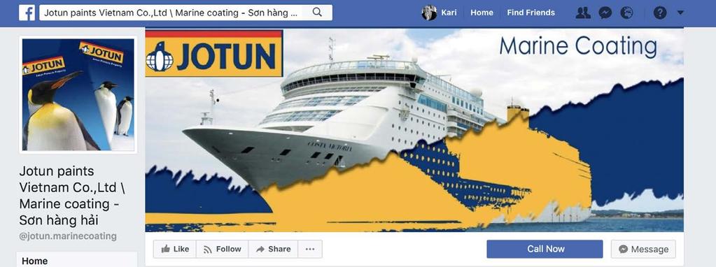
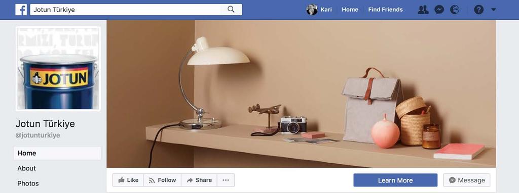
42 Facebook: Various Jotun profiles 42

43 Facebook: Various Jotun profiles mobile 43
44 Facebook: Jotun Group status Profile image Safe area: This area is visible on all devices (555x312 px) 170x170 px desktop 128x128 px smartphone 32x32 px in feed 44
45 Facebook: New design principle Desktop Mobile 1 1 Top Banner: 820x312 px Safe area: This area is visible on all devices (555x312 px) 1) It is optional to use Jotun logo in top banner, but when used, it must be placed on the upper right Use logo without payoff Se page 21 for correct logo usage on full images.! Rule for all SoMe: Never write Jotun in capital letters! 45


46 Facebook: Jotun Group new design principle Desktop Top Banner: 820x312 px Safe area: This area is visible on all devices (555x312 px) 46


47 Facebook: Campaign image with text Desktop För berömda byggnader. Och ditt hem. För berömda byggnader. Och ditt hem. Logo + text 47
48 Facebook: Profile image change Same profile photo for all Jotun corporate profiles. The Profile Name tells the difference between them. Existing 48 New
49 Facebook: Mobile newsfeed Existing New 49
50 Social Media YouTube 50

51 YouTube: Jotun Norge status Banner: 2560x423 px 51
52 YouTube: New design principle Menu colour: Jotun blue JOTUN Group HOME VIDEOS Jotun Group Jotun Group Banner: 2560x423 px Safe area: This area is visible on all devices (1546x423 px) Round profile image on YouTube 52 PLAYLISTS CHANNELS


53 YouTube: Jotun Group new design principle Menu colour: Jotun blue JOTUN Group HOME VIDEOS Jotun Group Jotun Group FEATURED CHANNELS New Global Colour Card Jotun Decorative Paints New Global Colour Card It et omnis aspis abori quia net laborio. Andenim essit ommolor sed et la ipsanis a quae. Modi as dolentius. Jotun Protective Coatings Jotun Marine Jotun Powder Coatings Jotun Lady Round profile image on YouTube 53 PLAYLISTS CHANNELS


54 YouTube: Jotun Norge new design principle JOTUN Norge Slik maler og beiser du ute HOME VIDEOS PLAYLISTS Slik maler og beiser du ute Nye vakre farger Jotun Norge Jotun Norge Top Banner: 2560x423 px Safe area: This area is visible on all devices (1546x423 px) 54 CHANNELS Change menu colour to Jotun blue Limit text in Top Banner
55 Social Media LinkedIn 55

56 LinkedIn Company page A Company Page helps LinkedIn members learn about Jotun s business, brand, and job opportunities. Any LinkedIn member can follow Jotun s Company Pages. Company page 56

57 LinkedIn company: Protective Coatings status Company profile Banner full image size: 1536x768 57

58 LinkedIn company: New design principle Jotun Group Undertitle Jotun Group Undertitle Jotun Group Undertitle The banner view on desktop and mobile is quite different Company profile Banner full image size: 1536x768 58


59 LinkedIn company: Jotun Group new design principle Jotun Group Undertitle Jotun Group Undertitle Jotun Group Undertitle Company profile Banner full image size: 1536x768 59
60 LinkedIn company: Protective Coatings new design principle Only one change Profile photo: Jotun logo without payoff Company profile 60
61 Social Media Twitter 61

62 Twitter: Jotun Indonesia status Top Banner: 1500x500 px 62
63 Twitter: New design principle Jotun Jotun 2h Us, eriam es sante officiis et eniasim iundandam que peratis quunt facea que doluptur? Aperion sequodi aut Jotun 63 Cover photo without Jotun logo and text


64 Twitter: Jotun Group new design principle Jotun Jotun 2h Us, eriam es sante officiis et eniasim iundandam que peratis quunt facea que doluptur? Aperion sequodi aut Jotun 64 Cover photo without Jotun logo and text

65 Twitter: Jotun Indonesia new design principle Cover photo without Jotun logo and text 65
66 Social Media Instagram 66


67 Instagram: Design principle jotungroup Jotun Group lorem ipsum sinctiunt magnimu sdaeculpa quae. Et offic totam, utatibea nuscit, quae idestium velita inctur? Incid qui volorest que laborecte cum aut quo int eos et entemperum Jotun Group Paint The official Instagram of Jotun Group Facebook: Jotun Group YouTube Channel: Jotun Group 67
68 App Identity 68
69 App identity A template has been created for all Jotun s corporate app icons. The template will ensure one holistic design of all Jotun s applications. Our app icons will appear with a clear design and make a distinct brand in the different application stores. The design is divided into two: Header with Jotun s logo on blue background Area in Jotun blue for white symbol or text The design is fixed and the proportions of the logo, header and freespace cannot be changed. Always use the downloadable template for app icon design. Logo header area Free space Principle Template 69


70 App icon existing designs Jotun s existing App Icons Jotun Books Yachting idesign Fuel Calculator Snap Shop Facilitator ResistList YesilAdımlar 70


71 App typefaces Using the right typeface on mobile applications Mobile devices - by default, do not have the same typefaces that are installed on a desktop system such as Windows or Mac OS. While it is fully possible to install additional typefaces onto a device, we recommend to use the default system font for each mobile operating system. These typefaces are responsive and fluid, being able to resize fonts to match any screen, ensuring legibility and good typography performance on most devices. Default system font for Android OS Roboto ABCDEFGHIJKLMNOPQRSTUVWXYZÅÆØ abcdefghijklmnopqrstuvwxyzåæø Developed by Google Default system font for ios San Francisco ABCDEFGHIJKLMNOPQRSTUVWXYZÅÆØ abcdefghijklmnopqrstuvwxyzåæø Developed by Apple Inc. 71
72 Video 72
73 Video external and internal Templates for corporate brand, sub-brands and endorsed brands Screen format 16:9, 1920 x 1080 px Video branding elements for corporate and sub-brands are: Jotun logo top right corner Frutiger and Verdana typeface on name and job-title strap* Yellow name underline Frutiger typeface on subtitle Animated outro: Jotun logo with URL on blue background Video branding elements for endorsed brands are: Jotun logo top right corner Frutiger and Verdana typeface on subtitle* Animated outro: Jotun logo on blue background * Remember that Frutiger is Jotun s main corporate typeface and it must be used whenever possible. Only use Verdana when Frutiger is not suitable or available. Graphic safe area Logo 190px width, at top right corner of the screen. Lower third (supring): Use endorsed brands s own typeface FIRST NAME LAST NAME TITLE Text safe area First Name Last Name Title Subtitle: Frutiger Book centered text and center vertical justification Corporate brand and sub-brands: Title safe areas and grid Same Subtitle: Frutiger Book/Verdana White text on dark transparent bakground 80% black 73 Subtitle: Frutiger Book centered text and center vertical justification Endorsed brands: Title safe areas and grid

 (Lower third) Subtitle (Corporate")
74 Video external and internal Examples Corporate brand and sub-brands Use the grid to ensure accuracy and consistency First Name Last Name Title jotun.com Subtitle: Frutiger Book centered text and center vertical justification Name and job-title strap (Corporate brand) (Lower third) Subtitle (Corporate brand) 74

 Subtitle (Endorsed")
75 Video external and internal Examples endorsed brands Use the grid to ensure accuracy and consistency FIRST NAME LAST NAME TITLE Optinal logo at top right corner Subtitle: Frutiger Book centered text and center vertical justification Name and job-title strap (Endorsed brand) Subtitle (Endorsed brand) 75
76 Video external and internal Outro: logo size and proportions principle jotun.com jotun.com Outro screen with URL Outro logo proportions 2/4 (50%) Centered position 76
77 Info screens 77
78 Info screens Templates for info screens 16: x 1920 px First page: Logo on blue background Subsequent pages: Black text on white backgrounds or white text on blue background. Use Frutiger typeface when possible, Verdana can be used if Frutiger is not suitable or available. Logo at the top right of info screens. 16:9 Info screen template Front page Last page: Logo with payoff Powerpoint presentations on screens: On internal info screens it is okey to use Jotun powerpoint presentations Subsequent pages white Subsequent pages blue Last page Title text Title text Template presentation 16:9 Slide white Lasting 10 seconds Transition 1 second Template presentation 16:9 Slide blue Lasting 10 seconds Transition 1 second 78
79 Info screens Templates for info screens 16:9 standing 1920 x 1080 px Same principle as for landscape screen format 16:9 Info screen template Front page Subsequent pages white Subsequent pages white Last page Title text Template presentation 16:9 Slide white Lasting 10 seconds Transition 1 second Title text Template presentation 16:9 Slide blue Lasting 10 seconds Transition 1 second 79
80 JOTUN digital guidelines / October 30th, 2018
Version 1.0 February MasterPass. Branding Requirements
 Version 1.0 February 2013 MasterPass Branding Requirements Using PDF Documents This document is optimized for Adobe Acrobat Reader version 7.0, or newer. Using earlier versions of Acrobat Reader may result
Visual Identity and Brand Guidelines
 Visual Identity and Brand Guidelines June 2013 Version 1.0 1 BUILDING BLOCKS 10 Vermont Tech Logo We re practical, straightforward, and confident and our logo embodies these. It stands proudly on its own
HSE Video Branding and Style Guidelines
 HSE Video Branding and Style Guidelines Table of Contents Overview 3 Edit Construction 4 Opening and Closing Screens 5 Partners logos 9 Text Only Screen 10 Persistent Logo 11 Lower-thirds 12 Use of Subtitles
BRAND GUIDELINES VENDOR COPY AUGUST ecoatm BRAND GUIDELINES
 BRAND GUIDELINES VENDOR COPY AUGUST 2014 7059.0814 1 BRAND STANDARDS CONTENTS Brand Standards Primary Logo Endorsers Logo Lockup Secondary Logos, Black and White Margins and Minimum Size Incorrect Usage
CMA VISUAL IDENTITY GUIDE. January 2018
 CMA VISUAL IDENTITY GUIDE January 2018 CMA Visual Identity Guide Logo overview The CMA logo is composed of the French and English wordmarks and the CMA icon (note: the logo is always bilingual, even in
Logo Overview. Always use the original digital artwork, available through the Brand Center, to help maintain consistency and integrity.
 Avast logo manual 10 Overview The Avast logo consists of a symbol (the amoeba) and a wordmark. Both elements of the logo have been carefully redesigned to work together for maximum legibility. Do not redraw
CYPRESS FAIRBANKS ISD
 CYPRESS FAIRBANKS ISD BRAND Standards and Guidelines Table of Contents Basic Guidelines 3 Color 4 Correct Uses 5 Incorrect Uses 6 Stationery 7 Video 8 Social Media 9 Print Communications 11 Electronic
Visit Greenwich Full Logo Guides
 Contents 2 Our Logos 3 Primary Logos 8 Secondary Logos 13 Merchandise Logos Visit Greenwich Full Logo Guides 01 Our Logos The Visit Greenwich logos are a set of brand marks that have different hierarchical
TITLE MASTER GARDENER PROGRAMS STYLE GUIDE MASTER GARDENER STYLE GUIDE
 TITLE MASTER GARDENER PROGRAMS STYLE GUIDE 1 TABLE OF CONTENTS 3 INTRODUCTION 4 About 5 Program Hierarchy 6 LOGO LOCK-UP GUIDELINES 7 Clearspace and Alignment 8 Subset Program Lock-Ups 9 LOGO ALTERNATES,
Standard media Animated rich media Rich media interstitial Expandable interstitial Slider interstitial 360 assets Dynamic distance Location Widget -
 2018 Standard media Animated rich media Rich media interstitial Expandable interstitial Slider interstitial 360 assets Dynamic distance Location Widget - Map Native Ad Inline video Inline video - Creative
BRAND. niagaracanada.com
 BRAND niagaracanada.com Introduction 3 Prospective Niagara Residents and Immigrants Audiences 4 Key Messages 5 Welcome Niagara Canada - The Visual Brand/Logo 6 Logo Lock-up 7 Colour Palette 8 Black and
The U.S. Fund for UNICEF Communications Style. Guide
 The U.S. Fund for UNICEF Communications Style Guide Table of Contents 1.0 The U.S. Fund for UNICEF 1.1 Our Mission 1.2 Our Brand Position 2.0 Our Goals 3.0 The UNICEF Story 4.0 Logo Versions 4.1 Logo Size
BRAND v2 GUIDELINES 1
 1 BRAND GUIDELINES v2 THESE GUIDELINES SHOW HOW TO USE OUR IDENTITY ACROSS ALL COMMUNICATIONS ON SCREEN, IN PRINT, AND ON PRODUCTS. LET S BRING THE ULTIMATE EARS BRAND TO LIFE. LISTEN 2 UP 3 CONTENT 04
C O R P O R A T E G R A P H I C I D E N T I T Y P O L I C Y
 C O R P O R A T E G R A P H I C I D E N T I T Y P O L I C Y J A N U A R Y 2019 1 Graphic Identity 2 Corporate identity policy This corporate identity manual standardizes the communication elements and
BRANDING STANDARDS MANUAL
 BRANDING STANDARDS MANUAL 2014 Index Logo University version 2 School versions 3 Usage Spacing 4 Sizing 5 Color 6 Logo mark 7 Unacceptable Executions 8-9 Color 10-11 Typography 12 Other Graphic Marks Seal
Brand Guidelines. A quick guide to using the British Shooting Show brand correctly.
 Brand Guidelines A quick guide to using the British Shooting Show brand correctly www.shootingshow.co.uk British Shooting Show Logo General info The Great British Shooting Show is the UK s largest trade
Main design manual RONA, a.s.
 DESIGN MANUAL Main categories A Logotype 4 D Printed materials 40 B Font type 26 E Promotional items 50 What is a design manual and what is it used for? C Slogan 32 F Other 64 A design manual is a collection
Centers of Excellence and Institutes Logo Usage Guidelines
 Centers of Excellence and Institutes Logo Usage Guidelines 10/30/14 Approach to Logos for Centers of Excellence and Institutes Examples of Logo Treatment for Centers of Excellence and Institutes Using
Canadian Aquatic Invasive Species Network
 Canadian Aquatic Invasive Species Network Graphic Standards Manual Effective January 2007 This Graphic Standards Manual covers the graphic identity guidelines for the Canadian Aquatic Invasive Species
Brand Style Guide January 2018
 Brand Style Guide January 2018 Introduction Keeping a well-rounded and consistent brand is crucial in an industry filled with many logos and brands with similar graphics and colors. The brand elements
Table of Contents. Stationery 24 Business card 25 Letterhead 26 #10 Envelope. Document Note
 Table of Contents Document Note The goal of these guidelines is to help communicate the strategy and visual system behind the SPX brand. If you have questions about anything in this guide, please reach
Basic Elements > Logos and Markings
 Page 1 Please note: The full functionality of the tutorial is guaranteed only with use of the latest browser versions. Contents At a glance: DB brand Division Logo DB Netze Division Logo DB Schenker Color
wirelessgroup.co.uk Updated: Brand Guidelines 1/7/2018 V1.0 Brand Guidelines Version 1.0
 wirelessgroup.co.uk Updated: Brand Guidelines 1/7/2018 1 Brand Guidelines Version 1.0 wirelessgroup.co.uk Brand Guidelines 2 Contents 03 04 07 09 11 12 13 14 Primary Logo Secondary Logos Group Indicator
Standard media Rich media interstitial Expandable interstitial Slider interstitial HTML media Native Ad Add-to-Wallet Inline video Inline video -
 2018 Standard media Rich media interstitial Expandable interstitial Slider interstitial HTML media Native Ad Add-to-Wallet Inline video Inline video - Creative Builder Vertical video Pre-roll video Connected
GETTING UMSU BRAND BASICS RIGHT
 GETTING UMSU BRAND BASICS RIGHT UMSU Brand Guidelines 2017 UMSU BRAND GUIDELINES 2017 CONTENTS INTRODUCTION 4 UMSU BRAND: AN OVERVIEW 6 UMSU LOGO 7 UOM LOGO 8 CORRECT USE OF THE LOGO 9 INCORRECT USE OF
IREM Headquarters and Chapter Version January 9, Brand and Style Guide
 IREM Headquarters and Chapter Version January 9, 2018 Brand and Style Guide Table of Contents Section 1: Brand Messaging 3 - About IREM 4 - Brand Positioning 5 - IREM Trademarks 6-7 Section 2: Logos and
Albertsons Companies and Safeway Foundation Brand Standards. PORTLAND DIVISION November 2017
 Albertsons Companies and Safeway Foundation Brand Standards PORTLAND DIVISION November 2017 TABLE OF CONTENTS Our Mission 3 Visual Identity 4 Photography 5 Typography 6 Albertsons Companies Foundation
VIRGINIA BEACH CONVENTION & VISITORS BUREAU brand standards. style guide ACH CON V ENTION & V ISITORS BURE AU 2018
 B R A N D S TA N DA RV D SI RS G T YILN E IGAU I B DE E ACH CON V ENTION & V ISITORS BURE AU 2018 brand standards style guide 1 2 thank you This guide was produced for our trusted partners, to instill
Foundation...3 Messaging...4 Visual Identity...6 Primary Logo Mark...7 Secondary Marks...8 Colors...9 Fonts Usage Guidelines...
 BRANDING GUIDE Foundation...3 Messaging...4 Visual Identity...6 Primary Logo Mark...7 Secondary Marks...8 Colors...9 Fonts... 10 Usage Guidelines... 11 2 FOUNDATION purpose statement Our purpose is to
Business Professionals of America
 Business Professionals of America Brand Guide Updated August 15, 2018 Disclaimer: The Business Professionals of America Brand Guide is not to be used for reference or preparation during the 2017-2018 Workplace
FACILITYLINK CORPORATE IDENTITY MANUAL
 FACILITYLINK CORPORATE IDENTITY MANUAL Table of Contents Page 2 of 47 Introduction 3 Corporate Design Elements 7 Corporate Design Application 25 Logo Application for Subsidised Activities 44 Table of Contents
Brand Guidelines. January 2015
 Brand Guidelines January 2015 Table of Contents 1.0 What s a brand? 3 1.1 The logo 4 1.2 Colour 1.2.1 Spot & Process 1.2.2 Black & White 5 5 6 1.3 Logo Sizing 1.3.1 Minimum Clear Space 1.3.2 Positioning
LOGO GUIDELINES. A guide for Fellows of College
 LOGO GUIDELINES INTRODUCTION BEFORE USING THE FACD LOGO The Australasian College of Dermatologists (ACD) is proud of its status as the peak body responsible for specialists in Dermatology accredited by
Version (26/Mar/2018) 1
 1") take Version 1.7.0 (26/Mar/2018) 1 Index General Guidelines 5 Submission of ads 5 Deadlines 5 Channels 5 5 RichMedia 6 Roles 6 Approved Adservers 6 HTML5Manual 7 Size of simple ad 7 Size of TAGged ads
take Version 1.7.0 (26/Mar/2018) 1 Index General Guidelines 5 Submission of ads 5 Deadlines 5 Channels 5 5 RichMedia 6 Roles 6 Approved Adservers 6 HTML5Manual 7 Size of simple ad 7 Size of TAGged ads
Leveraging and Protecting the NATE Brand
 Identity Guidelines Leveraging and Protecting the NATE Brand As the nation s largest non-profit certification organization for heating, ventilation, air conditioning and refrigeration technicians, North
OUYA IS A NEW KIND OF GAME CONSOLE FOR THE TV THAT BRINGS THE OPENNESS OF MOBILE AND INTERNET PLATFORMS TO THE BIG SCREEN FOR THE FIRST TIME.
 BRAND GUIDE OUYA IS A NEW KIND OF GAME CONSOLE FOR THE TV THAT BRINGS THE OPENNESS OF MOBILE AND INTERNET PLATFORMS TO THE BIG SCREEN FOR THE FIRST TIME. TABLE OF CONTENTS 01 LOGO 4 02 TYPOGRAPHY 14 03
LOGO GUIDELINES. A guide for partners
 LOGO GUIDELINES LOGO FULL COLOUR LOGO Our corporate full colour logo is the most recognisable symbol of the ACD and is unique to us. As such, it is crucial we use it correctly and consistently. Whenever
Brand guidelines. July 2014 NEXT
 Brand guidelines July 2014 The purpose of these guidelines is to help Kick It Out present their brand communications consistently and with impact. Kick It Out s brand is the organisations most valuable
HINO BRAND VISUAL DESIGN MANUAL V1.3e
 HINO BRAND VISUAL DESIGN MANUAL V1.3e Introduction Each basic element in communications, such as the corporate logomark and brand colors, contributes to building brand and plays a vital role in creating
Brand identity guidelines
 Brand identity guidelines Version 1.2 November 2016 01 Contents 01 Contents 02 Introducing the 03 Who are these guidelines for? 04 The logo 05 Explaining the logo 06 Logo exclusion zone 07 Logo minimum
Visual Style Guide April 2016
 Visual Style Guide April 2016 Contents Introduction to the Logo 3 Safe Area and Size 4 Incorrect Usage 5 Color Palette 6 Typography 7 Tone and Style of Photography 8 Print Examples 9 Screen Examples 10
AUCA Standard Graphic Identity Manual
 AUCA Standard Graphic Identity Manual GRAPHIC STANDARDS MANUAL This is the Graphic Standards Manual for the American University of Central Asia. It sets the standard for the design of all AUCA public communications
Swansea University Brand Asset Guidelines. Version 2 May 2018
 Swansea University Brand Asset Guidelines 1 Version 2 May 2018 Contents We are Swansea University page 3 Brand structure page 4 Visual identity usage guidance page 5 Swansea University s coat of arms page
Training Module Style Guide
 Training Module Style Guide December 2017 Glossary of Terms Ensco when referring to the company ENSCO when referring to a rig name (e.g. ENSCO DS-10) PayZone when referring to the Ensco Intranet jackup
School of Social Work. Partnering for Change Style Guide
 School of Social Work Partnering for Change Style Guide September 4, 2009 Partnering for Change Campaign Introduction Rutgers School of Social Work is embarking upon a campaign intended to create a comprehensive,
Albertsons Companies, Safeway and Carrs/Safeway Foundation Brand Standards. SEATTLE DIVISION November 2017
 Albertsons Companies, Safeway and Carrs/Safeway Foundation Brand Standards SEATTLE DIVISION November 2017 TABLE OF CONTENTS Our Mission 3 Visual Identity 4 Photography 5 Typography 6 Albertsons Companies
The Center For Educator, Recruitment, Retention and Advancement. Graphic Standards Manual
 The Center For Educator, Recruitment, Retention and Advancement Graphic Standards Manual 2016 Main Logotype The logotype is the central element in CERRA s visual communications system. Through consistent
Branding Style Guidelines. (Revised: September 6, 2017)
") Branding Style Guidelines (Revised: September 6, 2017) Table of Contents 2 3 4 5 6 7 8 10 12 13 14 Introduction Brand elements Clear space and minimum size Logo and tagline Symbol as a graphic Logo palette
Branding Style Guidelines (Revised: September 6, 2017) Table of Contents 2 3 4 5 6 7 8 10 12 13 14 Introduction Brand elements Clear space and minimum size Logo and tagline Symbol as a graphic Logo palette
Graphic Identity Standards
 Graphic Identity Standards Welcome to our visual identity. At Loyola Marymount University, our goal is to become one of the nation s distinguished Catholic universities with a commitment to academic ecellence
Corporate Identity & Branding Program
 2009 Corporate Identity & Branding Program Contents Corporate Identity 3 Brand Families Overview 4 The Design Stories 5 The Cobra Brand 6 Color Palette 8 Typography 9 3 Corporate Identity Cold Cut Systems
Quality Care Pharmacy Program
 Quality Care Pharmacy Program How to use the QCPP logo in your pharmacy and promote your accreditation. Contents Logo Specifications...2 Logo Placement...3 QCPP Decal...4 Logo Colours for print and screen...5
Graphic Standards. A guide to Lane s visual identity, with information on using the college logo, Lane colors and typefaces, stationery, and more.
 Graphic Standards A guide to Lane s visual identity, with information on using the college logo, Lane colors and typefaces, stationery, and more. TABLE OF CONTENTS Introduction to Graphic Standards...1
I D E N T I T Y G U I D E L I N E S
 I D E N T I T Y G U I D E L I N E S THE CORPORATE MARK Logo Components The Digium family of logos are the cornerstone of the identity program. Together with the following key design elements, the logo
Brand guidelines CHILD SEXUAL EXPLOITATION: IT SNOTOKAY.
 Brand guidelines Welcome Welcome to our brand guidelines This document is a guide to the brand communication style for It s not okay. It explains what our brand stands for, how it s expressed, and how
FileMaker Corporate Style Guide
 ilemaker Corporate Style Guide General guidelines for logo usage and corporate identity 5201 Patrick Henry Drive Santa Clara, CA 95054, USA Tel: (408) 987.7000 Welcome Our identity is one of our most valuable
EUDQG VWDQGDUGV v2.6.13
 v2.6.13 keep it simple. Our brand personality must be clear and consistent across all aspects of the business from advertising to customer communications, to products and cobranding. These guidelines have
Corporate Identity and Visual Identity Guidelines June 2011
 Corporate Identity and Visual Identity Guidelines June 2011 Index A Basic Design Elements A 01 The BenQ Logo A 02 Minimum Size, Minimum Staging Area A 03 Typography A 04 Corporate Colours B B 01 B 02 B
BASIC MANUAL OF CEPSA IDENTITY
 BASIC MANUAL OF CEPSA IDENTITY April 2018 Cepsa Basic Identity Manual Welcome This manual contains all the elements that make up the Cepsa identity. This manual contains all the elements that make up the
CALGARY BOARD OF EDUCATION LOGO GRAPHIC STANDARDS GUIDE
 CALGARY BOARD OF EDUCATION LOGO GRAPHIC STANDARDS GUIDE Communications Services Calgary Board of Education 2007 2 GRAPHIC STANDARDS GUIDE CONTENTS Introduction 2 Backgrounder 2 The CBE logo 4 Logo Design
Graphic standards for the Electric Circuit logo
 Graphic standards for the Electric Circuit logo January 2017 Official logo versions and colors The elements of the logo form a whole: the shapes, colors, proportions and locations of these elements may
BRANDING GUIDELINES Foundation for Environmental Education
 BRANDING GUIDELINES Foundation for Environmental Education INTRODUCTION Intro This is a guide to the branding elements that make up the Foundation for Environmental Education and its programmes. Have a
GRAPHIC STANDARDS MANUAL Policy and guidelines for using the Hostos Community College 50 th Anniversary Brand Identity
 GRAPHIC STANDARDS MANUAL Policy and guidelines for using the Hostos Community College 50 th Anniversary Brand Identity TABLE OF CONTENTS Policy and Applications... 3 Hostos 50th Anniversary Primary Logo...
Asia-Europe Meeting (ASEM)
") Version 1.0 / October 2013 www.aseminfoboard.org Asia-Europe Meeting (ASEM) Logo Guidelines Information on how to apply the ASEM logo 1.0 The ASEM Logo The core element of the brand identity is the logo.
Version 1.0 / October 2013 www.aseminfoboard.org Asia-Europe Meeting (ASEM) Logo Guidelines Information on how to apply the ASEM logo 1.0 The ASEM Logo The core element of the brand identity is the logo.
HINO BRAND VISUAL DESIGN MANUAL V1.2e
 HINO BRAND VISUAL DESIGN MANUAL V1.2e Introduction Each basic element in communications, such as the corporate logomark and brand colors, contributes to building brand and plays a vital role in creating
Albertsons Companies and Tom Thumb Foundation Brand Standards. SOUTHERN DIVISION November 2017
 Albertsons Companies and Tom Thumb Foundation Brand Standards SOUTHERN DIVISION November 2017 TABLE OF CONTENTS Our Mission 3 Visual Identity 4 Photography 5 Typography 6 Albertsons Companies Foundation
CAMPAIGN TAGLINE GUIDELINES
 CAMPAIGN TAGLINE GUIDELINES 1 Campaign Tagline The campaign tagline should appear on all campaign-related communications. The campaign tagline should always be used in conjunction with the Block W logo
Branding & Design Standards. LIMITED USE: These standards are for areas where FIRST is not a registered trademark. Standards Are Strictly Enforced
 11.3.2015 Branding & Design Standards Standards Are Strictly Enforced LIMITED USE: These standards are for areas where FIRST is not a registered trademark. FIRST Logo Our logo consists of uniquely configured
Technical specifications for ad format delivery
 Technical specifications for ad format delivery Display Ads ad format (pixels) max. file size Superbanner 728x90 200 kb Medium Rectangle 300x250 200 kb (Wide) Skyscraper 120/160x600 200 kb Halfpage Ad
Brand Guidelines 2017 Version 1.0
 Brand Guidelines 2017 Version 1.0 OwnLocal 2017. ALL RIGHT RESERVED OwnLocal Headquarters 205 W 9th Street Suite 600 Austin, TX 78701 www.ownlocal.com TABLE OF CONTENTS 01 Introduction Our Mission Core
Albertsons Companies, Vons, & Pavilions Foundation Brand Standards. SOUTHERN CALIFORNIA DIVISION November 2017
 Albertsons Companies, Vons, & Pavilions Foundation Brand Standards SOUTHERN CALIFORNIA DIVISION November 2017 TABLE OF CONTENTS Our Mission 3 Visual Identity 4 Photography 5 Typography 6 Albertsons Companies
TOWN OF QUEEN CREEK BRAND GUIDE
 BRAND GUIDE DEC2016 BRAND GUIDE INTRODUCTION CONTACT TOWN OF QUEEN CREEK COMMUNICATIONS, MARKETING AND RECREATION DEPARTMENT 22358 SOUTH ELLSWORTH ROAD QUEEN CREEK, AZ 85142 480-358-3198 communication@queencreek.org
Visual Identity Guidelines. Essential guidelines to help you create cohesive brand communications
 Visual Identity Guidelines Essential guidelines to help you create cohesive brand communications August 2017 GENERAL GUIDELINES The use of the logo is reserved for official Summa partners only (dealers,
IDENTITY GUIDELINES BUILDING THE SKYWARD BRAND
 IDENTITY GUIDELINES BUILDING THE SKYWARD BRAND TABLE OF CONTENTS INTRODUCTION...02 SKYWARD TRADEMARK...03 LOGO. PRINT...04 Size, Spacing & Positioning LOGO. SCREEN...05 Web & Video COLOUR...06 TYPOGRAPHY...07
For Children with Developmental Differences. Brand Identity Guide
 For Children with Developmental Differences Brand Identity Guide Table of Contents 3 Our Visual Identity System 4 About These Guidelines 5 The Logo 6 Clear Space & Minimum Size 7-8 Logo Variations 9 Icon
Brand Guidelines A quick guide to using the British Shooting Show brand correctly
 100% Brand Guidelines A quick guide to using the British Shooting Show brand correctly www.shootingshow.co.uk 2. BSS Logo General info The Great British Shooting Show is the UK & Europe s largest trade
OUR MISSION: We at Metro Transit deliver environmentally sustainable transportation choices that link people, jobs and community conveniently,
 OUR MISSION: We at Metro Transit deliver environmentally sustainable transportation choices that link people, jobs and community conveniently, consistently and safely. d Metro Transit Brand Standards The
Technical specifications online
 Technical specifications online TABLET Digitale Edities De Standaard (newspaper in kiosk) Format FULL PAGE 1024 px W x 695 px H FORMAT (LANDSCAPE) WIDTH (PX) HEIGHT (PX) SIZE (KB) HTML5? CLICKABLE splash
Appendix 01: Logo Usage. Brand Identity Guidelines 2015
 Appendix 01: Logo Usage Brand Identity Guidelines 2015 Our logos and their uses Arts Council corporate logo Arts Council exceptional use and partnership logo Grant award logo Arts Council corporate logo
Visual Identity Manual
 Visual Identity Manual 2014-2020 Updated version: ott 1, 2018 Contents Section I Programme visual identity 1 1. Programme logo 2 1.1. Logo 2 1.2. Logo specification 2 1.3. Colours 4 1.4. Correct usage
Graphic Identity Manual MARKETING DEPARTMENT
 Graphic Identity Manual MARKETING DEPARTMENT Introduction The success of the Westfield State graphic identity depends on the consistent use of communications materials by everyone involved with the university.
MORECAMBE BAY PARTNERSHIP. Brand guidelines October 2013
 Brand guidelines October 2013 Key messages These statements are intrinsic to the identity of the Morecambe Bay Partnership, summing up the goals, aspirations and values of the organisation. The messages
Gin-Cor Industries Inc. Brand Guidelines
 Last updated: August 26, 2015 About Our Vision To be a leader in the manufacturing of vocational trucks. Our Mission To manufacture customized vocational trucks that workers want to drive and owners want
one M2M Logo Brand Guidelines
 one M2M Logo Brand Guidelines July 2012 Logo Design Explanation What does the one M2M logo symbolize? The number 2 in the middle part of the logo symbolizes the connection between the two machines, the
VICTORY BREWING COMPANY LOGOS
 REVISION DATE - 5/2/2017 VICTORY BREWING COMPANY LOGOS Victory Brewing Company offers the following logos for marketing and branding needs. BANNER LOGO BOTTLE CAP LOGO VICTORY BREWING COMPANY LOGOTYPE
Version 3:0 September 2015
 Identity guidelines Version 3:0 September 2015 The Buxton logotype The new logotype embraces the concept of water - and a source of water. The focal point of the design is the letter O' where water emerges
ACME Foundation Brand Standards. ACME DIVISION November 2017
 ACME Foundation Brand Standards ACME DIVISION November 2017 TABLE OF CONTENTS Our Mission 3 File Formats & Usage 14 Visual Identity 4 Legal 15 Photography 5 Creative/Layout Treatments 16 Typography 6 Creative
BRAND GUIDELINES
 BRAND GUIDELINES 2018-19 Mount Pisgah Christian School Department of Admissions and Marketing OUR BRAND Our brand is the composite of all elements that communicate to the world who we are as a school and
Brand Standards QUICK GUIDELINES
 Brand Standards QUICK GUIDELINES Table of Contents 1.0 1.1 1.2 BRANDMARK Master / Staging Color / Size 2.0 2.1 TAGLINE Usage / Specifications / Staging 3.0 3.1 3.2 3.3 BRAND SYSTEM Typography Color Palette
Brand Typeface Headlines Establishing Hierarchy Photography Iconography & Infographics... 18
 Brand Guide VERSION 1.0 2017 Contents at a glance Introduction Using Brand Guidelines... 3 A Note on Branding... 4 Logo Color Version... 5 Special Cases Only... 6 Logo Usage Clear Space... 7 Minimum Size...
INTRODUCTION. NASS is an action sports & music festival that celebrates the very best of alternative culture, bringing you three days of:
 BRAND GUIDELINES INTRODUCTION NASS is an action sports & music festival that celebrates the very best of alternative culture, bringing you three days of: PRO SKATE + BMX COMPETITIONS WITH THE WORLD S BEST
Brand Identity Guidelines
 Brand Identity Guidelines For Organisations offering BPAY services and Member Financial Institutions BPAY Brand Identity Guidelines Introduction 2 This guide should be used in conjunction with the BPAY
Partner Brand Guidelines October 2017
 Partner Brand Guidelines October 2017 Brand Expression From the Magnificent Mile to Route 66, Illinois offers a wide variety of travel experiences. The unifying force behind these experiences is our Illinois
Avast logo manual. Logo Overview
 2 Overview The Avast logo consists of a symbol (the amoeba) and a wordmark. Both elements of the logo have been carefully redesigned to work together for maximum legibility. Do not redraw the symbol, typeset
Version 1 / February IADC Logo Usage Guidelines
 Version 1 / February 2014 IADC Logo Usage Guidelines IADC / Logo Usage Guidelines 3/36 This document outlines correct use of the IADC logo for members, chapters and partners. For a set of full brand guidelines,
TABLE OF CONTENTS TOLEDO ZOO & AQUARIUM BRAND GUIDELINES 2
 BRAND GUIDELINES TABLE OF CONTENTS Brand Inspiration 3 Our Mission 4 Primary Logo 5 Secondary Logo 7 Logo Color Usage & Proximity 8 Logo Application on Photos 9 Unacceptable Usage 10 Typography 11 Color
Safe Boating Campaign Brand Guidelines
 Safe Boating Campaign Brand Guidelines Reference to any specific commercial product, process, or service, or the use of any trade, firm or corporation name is for the information and convenience of the
Identity Standards Guide: Color Art Integrated Interiors 2012
 Identity Standards Guide: Color Art Integrated Interiors 2012 Table of Contents Color Art Integrated Interiors 3 3 Color & Type Face 5 Exceptions 5 A. If you are working with a colored background 5 B.
BRAND GUIDELINES 1 BRAND GUIDELINES
 BRAND GUIDELINES 1 BRAND GUIDELINES BRAND GUIDELINES 2 BRAND GUIDELINES 3 Contents Introduction The aims of the brand 02 About this booklet 02 Who can use the brand 02 Resources 02 Design Elements & Usage
Thank you for your continued support, and as always your feedback is welcome.
 Subject: New Tait Logo Dear Sir/Madam, To visually demonstrate the importance of the relationship between Tait Communications and your business, we have created a new Tait logo for you to use. The term
Introduction. 2 MOTT Community College Identity Guidelines
 IDENTITY GUIDELINES Introduction It is important that Mott Community College maintain a consistent, professional image. All Mott materials, including internal and external publications, signage, flyers,