Brand Guidelines Version Contents
|
|
|
- Stewart King
- 6 years ago
- Views:
Transcription
1 Brand Guidelines Version Contents 1.0 Foreword 1.0 Overview 1.0 The Logo 2.0 Logotype with College name 3.0 Dual-branding 4.0 International Logo 5.0 Colour 6.0 Typography 7.0 Patterns 8.0 Applications 9.0 Digital guidelines 10.0 Stationery 11.0 Accessibility
2 Foreword By Nigel Carrington, Vice-chancellor, University of the Arts London 1 Building our story Since its introduction in 2012 the new University of the Arts London (UAL) visual identity has grown considerably in stature and recognition. It is beginning to fulfil our ambition for it, by creating a strong connection between our six outstanding, individual Colleges and our collective proposition as one of the world s leading institutions of education and research in arts and design. Our visual identity is all about being bold, simple and direct, and allowing the stories of our staff and students to take centre stage. Our logo sits in the top left-hand corner wherever possible to act as a visual anchor, connecting all the different manifestations of our communities and our creativity. Our visual identity provides that allimportant first impression of UAL, and shapes the way in which current and prospective students, parents, staff, alumni and other stakeholders perceive and value the University and its Colleges. Sharing our values The breadth, variety and complexity of the University s work mean that the visual identity must operate on a number of levels. Therefore, a consistent, coherent, powerful and easily managed brand architecture and graphic vocabulary have been created to help underline the diverse nature of what UAL produces. We can take great pride in the fact that this has been recognised externally, in the form of an award at the prestigious Transform Branding Awards. It is also a matter of pride that we see the diversity of our communities reflected in all that we do, and that our commitment to those communities, to our environment and to wider society is absolutely central to who we are. With well-managed, careful and consistent use of these guidelines, UAL will be a more powerful, unified and confident brand, without compromising on any of our highly creative individual characteristics. The following pages will assist everyone in the University to design and produce compelling communications, showcasing the work of our students and staff while embracing a positive and confident brand identity.
3 Overview Introduction Overview UK and International usage 2:3 The abbreviated logo should be used in the UK, on all branded materials designed for UK audiences. The full logo will now only ever be used internationally (including across the EU), where our brand is not yet fully established. Featured in these guidelines are examples for UK usage in section 1.0 and for International usage in section 4.0. Any questions about the usage of either logo should be sent to Since 2012 University of the Arts London has been successfully gaining recognition internally and externally via its acronym: UAL. Accordingly, as of summer 2016 it has been agreed that usage of the full logo will be reduced, making the abbreviated logo the default logo. Designed as an evolving identity, UAL: was always intended to be a logotype that could stand alone. It will now be used in this way, offering a more flexible, confident and manageable logo across a wide range of applications. Default Abbreviated logo (the logo) International usage only Full Logo
4 1.0 The Logo 4: Introduction 1.2 Proportion 1.3 Protecting the Logo 1.4 Minimum size usage 1.5 Logo colours 1.6 Positioning 1.7 Logo sizing 1.8 Applied to imagery & gradients 1.9 Maintaining integrity 1.10 File formats 1.11 Example applications
5 1.0 The Logo 1.1 Introduction 1.0 The Logo 1.2 Proportion 6:7 The University of the Arts London Logo consists of the Logotype (1). This version of the UAL Logo should be used in the UK only. When using the Logo for International collateral please refer to 4.0 It is important that the UAL Logo is applied consistently across all applications as it will provide a powerful tool for aiding recognition. It is essential that the supplied Logo master files are always used. Please refer to 1.10 of this document. The UAL Logo has been designed with precision and proportion in mind. It is essential that the supplied Logo master files are always used. Please refer to 1.10 of this document. 1
6 1.0 The Logo 1.2 Proportion 1.0 The Logo 1.2 Proportion 8:9 The UAL Logo has been spaced for ease of legibility for use on various applications. It should never be re-created or modified. It is essential that the supplied Logo master files are always used. Please refer to 1.10 of this document. The UAL Logo has been created specifically for ease of readability at various sizes. In order to maintain consistent letter- and line-spacing always use approved master artwork and never try to recreate existing artwork. It is essential that the supplied Logo master files are always used. Please refer to 1.10 of this document.
7 1.0 The Logo 1.3 Protecting the Logo 1.0 The Logo 1.4 Minimum size usage 10 :11 In order to maintain the visual integrity of the master Logo, there are rules outlining the amount of clear space surrounding it. This is known as the exclusion zone. The UAL Logo exclusion zone is determined by using the dimension of the colon and applying it as a border measurement. To achieve good legibility it is essential that the Logo should never be used below 20mm in width on any printed applications which are A6 and above. For student id cards, business cards (85mm 55mm) and other smaller applications the Logo can be reduced to 10mm in width. The minimum size usage is measured from the outside edge of the u (on the left side of the Logotype) to the outside edge of the colon. For digital minimum size usage see section 8.0. Minimum size for applications which are A6 and above 20mm X X X X X Minimum size for smaller application such as id cards 10mm
8 1.0 The Logo 1.5 Logo colours 12 : 13 The UAL Logo must be rendered in the primary brand colours. To keep things as simple as possible the UAL Logo is only to be used in black (when placed on a light-coloured background) or white (when placed on a dark-coloured background). For certain applications, such as invitations, the UAL Logo can be embossed, debossed, varnished or foiled. Do not use other finishes, or cut-outs. PMS Process Black C 0 R 0 M 0 G 0 Y 0 B 0 K 100 # White C 0 R 255 M 0 G 255 Y 0 B 255 K 0 #ffffff
9 1.0 The Logo 1.6 Positioning A2 20mm 14 :15 The UAL Logo should always be positioned in the top left-hand corner of applications. This would apply to all print sizes and formats. See section 8.0 for digital guidelines. If you are intending to use the Logo in any video please contact the Communication and 10mm 10mm External Affairs department for guidance. The example below shows the Logo position on an A4 application. It should sit no closer than 10mm from the left edge of the page (using the left side of the u in the Logotype) and no closer than 210mm 10mm to the top edge of the page (using the top of the l in the Logotype). For bigger or smaller applications the Logo should be applied proportionally to these measurements. Please refer to the measurements on the right for common formats. 20mm 14mm A3 14mm A4 10mm 10mm 297mm 7mm A5 7mm A6 5mm 5mm 10mm
10 1.0 The Logo 1.7 Logo sizing 16 :17 The optimum size of the Logo that needs to be applied to common formats is shown below. On occasions the format of applications will be unique therefore the Logo should always be scaled proportionally to unique formats. A2 = 73mm A4 = 40mm A3 = 57mm A5 = 28.5mm A6 = 20mm


11 1.0 The Logo 1.8 Applied to imagery & gradients 18 :19 On occasions the UAL Logo will be applied on top of imagery. In such circumstances, the UAL Logo must be clearly legible. A6 size Logo size = 20mm A6 size Logo size = 20mm
12 1.0 The Logo 1.8 Applied to imagery & gradients 20:21 On occasions the UAL Logo will be applied on top of gradients. In such circumstances, the UAL Logo must be clearly legible. This is particularly important for visual accessibility, see section As a guide we have shown how the gradients work below. Please ensure maximum contrast between the UAL Logo and background is maintained. 100% Black 100% Black Recommend not to position identity above this point 50% Black 50% Black Recommend not to position identity below this point 100% White 100% White
13 1.0 The Logo 1.9 Maintaining integrity 22:23 The UAL Logo is the official mark of the University and should be rendered with utmost respect. It should never be tweaked, stretched, or otherwise manipulated, but reproduced with consistency and integrity. Always ensure the proportions of the Logo are locked when scaling. It should never be interpreted in a flippant manner, shown at an angle, or filled with pattern, texture, or photographic imagery. It is essential that the supplied Logo master files are always used. Please refer to 1.10 of this document. Do not distort Do not re-draw ual: ual: Do not re-arrange or re-position Do not change colour Do not rotate Maintain legibility
14 1.0 The Logo 1.10 File formats 24:25 Print formats EPS and Ai files Web formats JPG and PNG Below are the file formats, which are to be used for print and web. When using the Logo for print applications it is essential that the supplied Logo master EPS or Ai files are always used. When using the Logo for web applications it is essential that the supplied Logo master JPG or PNG files are always used. Logotype Print formats Type Software version File name Ai CS3 UAL_Logotype_BLACK_AW UAL_Logotype_WHITE_AW EPS CS3 UAL_Logotype_BLACK_AW UAL_Logotype_WHITE_AW PDF TIFF UAL_Logotype_BLACK_AW UAL_Logotype_BLACK_AW UAL_Logotype_WHITE_AW Web / screen formats Type File name JPG PNG UAL_Logotype_BLACK_AW UAL_Logotype_BLACK_AW UAL_Logotype_WHITE_AW


15 1.0 The Logo 1.11 Example applications 1.0 The Logo 1.11 Example applications 26:27
16 2.0 Logotype with College name 28: Lock-up 2.2 Proportion 2.3 Protecting the Logo 2.4 Minimum size usage 2.5 Logo colours 2.6 Logo colour hierarchy 2.7 Positioning 2.8 Applied to imagery 2.9 Maintaining integrity 2.10 File formats 2.11 Example applications
17 2.0 Logotype with College name 2.1 Lock-up 2.0 Logotype with College name 2.1 Lock-up 30:31 When applying the UAL Logo to one of the six specific Colleges the lock-up consisting of the UAL Logotype with College name should be used. The example below shows the Camberwell College of Arts lock-up. It is essential that the supplied Logo master files are always used. Please refer to 2.10 of this document. The example below shows the Central Saint Martins lock-up. It is essential that the supplied Logo masterfiles are always used. Please refer to 2.10 of this document.
18 2.0 Logotype with College name 2.1 Lock-up 2.0 Logotype with College name 2.1 Lock-up 32:33 The example below shows the Chelsea College of Arts lock-up. It is essential that the supplied Logo master files are always used. Please refer to 2.10 of this document. The example below shows the London College of Communication lock-up. It is essential that the supplied Logo master files are always used. Please refer to 2.10 of this document.
19 2.0 Logotype with College name 2.1 Lock-up 2.0 Logotype with College name 2.1 Lock-up 34:35 The example below shows the London College of Fashion lock-up. It is essential that the supplied Logo master files are always used. Please refer to 2.10 of this document. The example below shows the Wimbledon College of Arts lock-up. It is essential that the supplied Logo master files are always used. Please refer to 2.10 of this document.
20 2.0 Logotype with College name 2.1 Lock-up 36:37 The example below shows the Camberwell, Chelsea and Wimbledon lock-up. Please note in this case approval for the use of the UAL Logo with Camberwell, Chelsea and Wimbledon lock-up should be sought by the third party from the Brand and Content team at It is essential that the supplied Logo master files are always used. Please refer to 2.10 of this document.
21 2.0 Logotype with College name 2.2 Proportion 2.0 Logotype with College name 2.3 Protecting the Logo 38:39 Each UAL Logotype with College name lock-up has been specially created for consistency and legibility. They should never be re-created, modified or typeset. In order to maintain the visual integrity of the Logotype with College name lock-up, there are rules outlining the level of clear space surrounding it. This is known as the exclusion zone. The UAL Logotype with College name lock-up exclusion zone is determined by using the dimension of the colon and applying it as a border measurement. X X X X X
22 2.0 Logotype with College name 2.4 Minimum size usage 2.0 Logotype with College name 2.4 Minimum size usage 40:41 To achieve good legibility it is essential that the Logo with College name lock-up should never be used below 15mm in width on any printed applications which are A6 and above. The minimum size usage is measured from the outside edge of the u (on the left side of the University Logotype) to the outside edge of the colon (on the right side of the University Logotype). The measurement only applies to the University Logotype and should never be measured by the length of the College name lock-up. For student id cards, business cards (85mm x 55mm) and other smaller applications the Logo can be reduced to 10mm in width. The minimum size usage is measured from the outside edge of the u (on the left side of the University Logotype) to the outside edge of the colon (on the right side of the University Logotype). The measurement only applies to the University Logotype and should never be measured by the length of the College name lock-up. Minimum size for applications which are A6 and above Minimum size for for smaller applications including business cards and id cards 15mm 15mm 10mm 10mm Measurement should apply to the University Logotype and never to the full length of the college name lock-up as shown above. Measurement should apply to the University Logotype and never to the full length of the college name lock-up as shown above.
23 2.0 Logotype with College name 2.5 Logo colours 42:43 The UAL Logotype with College name needs to be rendered in one of the two primary brand colours. Please take note of the examples below which show the change of colour when applying it to both white and dark backgrounds. For certain applications, such as invitations, the UAL Logotype with College name can be embossed, debossed, varnished or foiled. Do not use other finishes, or cut-outs. (1) PMS Process Black C 0 R 0 M 0 G 0 Y 0 B 0 K 100 # (1) White C 0 R 255 M 0 G 255 Y 0 B 255 K 0 #ffffff 1
24 2.0 Logotype with College name 2.6 Logo colour hierarchy 44: 45 The black UAL Logotype with College name should be applied to light backgrounds, whilst the white version should be applied to dark backgrounds. Discretion is advised for midtone backgrounds where either option can be used, to ensure maximum visibility and standout is achieved at all times. White background Midtone background Black background Midtone background
25 2.0 Logotype with College name 2.7 Positioning 46:47 The UAL Logotype with College name should always be positioned in the top lefthand corner of applications. This would apply to all sizes and formats. The below example shows the Logo position on an A4 application. It should sit no closer than 10mm from the left edge of the page (using the left side of the u in the Logotype) and no closer than 10mm to the top edge of the page (using the top of the l in the Logotype. For bigger or smaller applications the Logo should be applied proportionally to these measurements. 10mm 10mm A4 A5 297mm A6 10mm 210mm


26 2.0 Logotype with College name 2.8 Applied to imagery 48:49 On occasions the UAL Logotype with College name will be applied on top of imagery. It is important the Logo is clearly legible in such circumstances. A6 size Logotype excluding College name = 20mm Please see section 2.0 A6 size Logotype excluding College name = 20mm Please see section 2.0


27 2.0 Logotype with College name 2.9 Maintaining integrity 50:51 The UAL Logotype with College names should never be tweaked, stretched, or otherwise manipulated, but reproduced with consistency and integrity. It should never be interpreted in a playful manner, shown at an angle,or filled with pattern, texture, or photographic imagery. It is essential that the supplied Logo master files are always used. Please refer to 2.10 of this document. Do not distort Do not re-draw ual: camberwell college of arts ual: camberwell college of arts Do not re-arrange or re-position Do not change colour Do not rotate Maintain legibility
28 2.0 Logotype with College name 2.10 File formats 52:53 Print formats Ai, EPS, PDF & TIFF files Web / screen formats JPG and PNG Below are the file formats, which are to be used for print and web. When using the Logo for print applications it is essential that the supplied Logo master EPS or Ai files are always used. When using the Logo for web / screen applications it is essential that the supplied Logo master JPG or PNG files are always used. Camberwell College of Arts Print formats Type Software version File name Ai CS5 UAL_Lockup_Camberwell_BLACK UAL_Lockup_Camberwell_WHITE EPS CS5 UAL_Lockup_Camberwell_BLACK UAL_Lockup_Camberwell_WHITE Central Saint Martins Print formats Type Software version File name Ai CS5 UAL_Lockup_CSM_BLACK UAL_Lockup_CSM_WHITE EPS CS5 UAL_Lockup_CSM_BLACK UAL_Lockup_CSM_WHITE PDF UAL_Lockup_Camberwell_BLACK PDF UAL_Lockup_CSM_BLACK TIFF UAL_Lockup_Camberwell_BLACK UAL_Lockup_Camberwell_WHITE TIFF UAL_Lockup_CSM_BLACK UAL_Lockup_CSM_WHITE Web / screen formats Type File name Web / screen formats Type File name JPG UAL_Lockup_Camberwell_BLACK JPG UAL_Lockup_CSM_BLACK PNG UAL_Lockup_Camberwell_BLACK UAL_Lockup_Camberwell_WHITE PNG UAL_Lockup_CSM_BLACK UAL_Lockup_CSM_WHITE Chelsea College of Arts Print formats Type Software version File name Ai CS5 UAL_Lockup_Chelsea_BLACK UAL_Lockup_Chelsea_WHITE EPS CS5 UAL_Lockup_Chelsea_BLACK UAL_Lockup_Chelsea_WHITE London College of Communication Print formats Type Software version File name Ai CS5 UAL_Lockup_LCC_BLACK UAL_Lockup_LCC_WHITE EPS CS5 UAL_Lockup_LCC_BLACK UAL_Lockup_LCC_WHITE PDF UAL_Lockup_Chelsea_BLACK PDF UAL_Lockup_LCC_BLACK TIFF UAL_Lockup_Chelsea_BLACK UAL_Lockup_Chelsea_WHITE TIFF UAL_Lockup_LCC_BLACK UAL_Lockup_LCC_WHITE Web / screen formats Type File name Web / screen formats Type File name JPG UAL_Lockup_Chelsea_BLACK JPG UAL_Lockup_LCC_BLACK PNG UAL_Lockup_Chelsea_BLACK UAL_Lockup_Chelsea_WHITE PNG UAL_Lockup_LCC_BLACK UAL_Lockup_LCC_WHITE
29 2.0 Logotype with College name 2.10 File formats 54:55 London College of Fashion Print formats Type Software version File name Ai CS5 UAL_Lockup_LCF_BLACK UAL_Lockup_LCF_WHITE EPS CS5 UAL_Lockup_LCF_BLACK UAL_Lockup_LCF_WHITE Camberwell, Chelsea and Wimbledon Print formats Type Software version File name Ai CS5 UAL_Lockup_CCW_BLACK UAL_Lockup_CCW_WHITE EPS CS5 UAL_Lockup_CCW_BLACK UAL_Lockup_CCW_WHITE PDF UAL_Lockup_LCF_BLACK PDF UAL_Lockup_CCW_BLACK TIFF UAL_Lockup_LCF_BLACK UAL_Lockup_LCF_WHITE TIFF UAL_Lockup_CCW_BLACK UAL_Lockup_CCW_WHITE Web / screen formats Type File name Web / screen formats Type File name JPG UAL_Lockup_LCF_BLACK JPG UAL_Lockup_CCW_BLACK PNG UAL_Lockup_LCF_BLACK UAL_Lockup_LCF_WHITE PNG UAL_Lockup_CCW_BLACK UAL_Lockup_CCW_WHITE Wimbledon College of Arts Print formats Type Software version File name Ai CS5 UAL_Lockup_Wimbledon_BLACK UAL_Lockup_Wimbledon_WHITE EPS CS5 UAL_Lockup_Wimbledon_BLACK UAL_Lockup_Wimbledon_WHITE PDF TIFF UAL_Lockup_Wimbledon_BLACK UAL_Lockup_Wimbledon_BLACK UAL_Lockup_Wimbledon_WHITE Web / screen formats Type File name JPG PNG UAL_Lockup_Wimbledon_BLACK UAL_Lockup_Wimbledon_BLACK UAL_Lockup_Wimbledon_WHITE


30 2.0 Logotype with College name 2.11 Example applications 2.0 Logotype with College name 2.11 Example applications 56:57 Printed example showing UAL and Camberwell lock-up. Printed example showing UAL and Central Saint Martins lock-up.


31 2.0 Logotype with College name 2.11 Example applications 2.0 Logotype with College name 2.11 Example applications 58:59 Signage example showing UAL and London College of Fashion lock-up. Printed example showing UAL and Chelsea lock-up.
32 3.0 Dual-branding 60: UAL lock-up 3.2 UAL lock-up colour 3.3 UAL dual-branding 3.4 UAL / College name lock-up 3.5 College dual-branding 3.6 Positioning 3.7 Co-branding
33 3.0 Dual-branding 3.1 UAL lock-up 3.0 Dual-branding 3.1 UAL lock-up 62:63 At times the UAL Logo will be used alongside the Logos of other organisations. There is a fixed relationship which applies to UAL dual-branded material. A 0.5pt line (1) is to be used to separate the Logos. Below shows how to create the 0.5pt line (1) using the height and width of one of the colon squares as a measuring tool (A). A A A A A A Logo Logo A A A 1 1
34 3.0 Dual-branding 3.2 UAL lock-up colour 3.0 Dual-branding 3.2 UAL lock-up colour 64:65 The dividing 0.5pt line can either be 100% black or 40% black depending on the application it is being applied to. When being applied to darker backgrounds the UAL lock-up and dividing 0.5pt line should be in white. 100% Black Logo Logo 40% Black Logo
35 3.0 Dual-branding 3.3 UAL dual-branding 3.0 Dual-branding 3.3 UAL dual-branding 66:67 The below examples show how the UAL Logo is used with a dual-brand, for example if an external company / organisation is sponsoring an event.
36 3.0 Dual-branding 3.4 UAL Logotype with College name lock-up 3.0 Dual-branding 3.4 UAL Logotype with College name lock-up 68:69 At times the UAL Logotype with College name will be used alongside the Logos of other organisations. There is a fixed relationship which applies to the UAL Logotype with College name dual-branded material. A 0.5pt line (1) is to be used to separate the Logos. Below shows how to create the 0.5pt line (1) using the height and width of one of the colon squares as a measuring tool (A). A A A A A Logo A A A Logo 1 1
37 3.0 Dual-branding 3.4 UAL Logotype with College name lock-up 3.0 Dual-branding 3.4 UAL Logotype with College name lock-up 70:71 The dividing 0.5pt line can either be 100% black or 40% black depending on the application it is being applied to. When being applied to darker backgrounds the UAL Logotype and College name lock-up and dividing line should be in white. 100% Black Logo Logo 40% Black Logo

38 3.0 Dual-branding 3.5 College dual-branding 72:73 The below examples show how the UAL Logotype with College name is used with a dual-brand, for example if an external company / organisation is sponsoring an event.
39 3.0 Dual-branding 3.6 Positioning 3.0 Dual-branding 3.6 Positioning 74:75 The dual-branding lock-ups can be positioned on UAL produced applications in two ways to allow flexibility. The first example below shows the dual-branding lock-up positioned in the top left corner. This example is for activities led by UAL and supported by an external partner. Discretion is advised for placement of the supporting company / organisation logo to ensure maximum legibility. Descriptors can be used to help describe the relationship between UAL and our partners. It often gives UAL a chance to define our role in a clearer way. Here are some suggestions of how to describe co-branding relationships: In partnership with A UAL partnership In association with In collaboration with Sponsored by Enabled by Logo Logo area placement

40 3.0 Dual-branding 3.7 Co-branding 76:77 In some cases the positioning of the UAL Logo or College lock-ups will not be fully in our control. This can happen when we support or are associated with applications designed and produced by a third party. In this case approval for the use of the UAL Logo or College lock-ups should be sought by the third party from the Brand and Content team at UALbrand@arts.ac.uk The criteria for approval in such cases will adhere as closely as possible to the principles outlined in this document, including faithfulness to proportions, exclusion zones, colour palette and legibility requirements. The UAL Logotype with College names must be presented to at least the same scale as adjacent Logo(s), as per the examples shown below.


41 3.0 Dual-branding 3.7 Co-branding 78:79 Printed example Printed example

42 3.0 Dual-branding 3.7 College collaboration 80:81 If an event is hosted or organised by more than one College the main UAL logo should be used in the top left corner with the names of the Colleges involved aligned to the bottom left of the page. The College names should be listed alphabetically and sit within horizontal rules to help define the hierarchy. Printed example Central Saint Martins London College of Communication
43 4.0 International Logo 82: Introduction 4.2 Proportion 4.3 Protecting the Logo 4.4 Minimum size usage 4.5 Logo colours 4.6 Positioning 4.7 Logo sizing 4.8 Applied to imagery & gradients 4.9 Maintaining integrity 4.10 File formats 4.11 Example application
44 4.0 International Logo 4.1 Introduction 4.0 International Logo 4.2 Proportion 84:85 The University of the Arts London International Logo consists of two elements. The Logotype (1) and the Descriptor (2). When using the International Logo they should always appear together as shown below. It is important that the UAL International Logo is applied consistently across all applications as it will provide a powerful tool for aiding recognition. It is essential that the supplied International Logo master files are always used. Please refer to 4.10 of this document. The University of the Arts London International Logo has been designed with precision and proportion in mind. The baseline of the Logotype sits on the baseline of the Descriptor to create a visual anchor (1). The x height of the Descriptor should line up with the top of the l in the Logotype (2). It is essential that the supplied International Logo master files are always used. Please refer to 4.10 of this document
45 4.0 International Logo 4.2 Proportion 4.0 International Logo 4.2 Proportion 86:87 The University of the Arts London International Logo has been spaced for ease of legibility for use on various applications. It should never be re-created or modified. It is essential that the supplied International Logo master files are always used. Please refer to 4.10 of this document. The University of the Arts London International Logo has been created specifically for ease of readability at various sizes. In order to maintain consistent letter- and line-spacing always use approved master artwork and never try to recreate existing artwork. It is essential that the supplied International Logo master files are always used. Please refer to 4.10 of this document.
46 4.0 International Logo 4.3 Protecting the Logo 4.0 International Logo 4.4 Minimum size usage 88:89 In order to maintain the visual integrity of the master Logo, there are rules outlining the amount of clear space surrounding it. This is known as the exclusion zone. The University of the Arts London International Logo exclusion zone is determined by using the dimension of the colon and applying it as a border measurement. To achieve good legibility it is essential that the International Logo should never be used below 40mm in width on any printed applications which are A6 and above. For student id cards, business cards (85mm 55mm) and other smaller applications the International Logo can be reduced to 30mm in width. The minimum size usage is measured from the outside edge of the u (on the left side of the Logotype) to the outside edge of the s of arts (on the right side of the Descriptor). For smaller branded items such as pencils and usb sticks the stand-alone ual: Logotype should be used. For digital minimum size usage see section 9.0. Minimum size for applications which are A6 and above 40mm X X X Minimum size for smaller application including business cards and id cards X X 30mm Use only the ual: Logotype when the Logo needs to be smaller than 30mm
47 4.0 International Logo 4.5 Logo colours 90:91 The University of the Arts London International Logo must be rendered in the primary brand colours. To keep things as simple as possible the International Logo is only to be used in black (when placed on a light-coloured background) or white (when placed on a dark-coloured background). For certain applications, such as invitations, the International version can be embossed, debossed, varnished or foiled. Do not use other finishes, or cut-outs. PMS Process Black C 0 R 0 M 0 G 0 Y 0 B 0 K 100 # White C 0 R 255 M 0 G 255 Y 0 B 255 K 0 #ffffff
48 4.0 International Logo 4.6 Positioning A2 20mm 92:93 The UAL International Logo should always be positioned in the top left-hand corner of applications. This would apply to all print sizes and formats. See section 9.0 for digital guidelines. If you are intending to use the Logo in any video please contact the Communication and 10mm External Affairs department for guidance. The example below shows the International Logo position on an A4 application. It should sit no closer than 10mm from the left edge of the page (using the left side of the u in the Logotype) and no closer than 10mm to the top edge of the page (using the top of the l in the Logotype). For bigger or smaller applications it should be applied proportionally to these measurements. Please refer to the measurements on the right for common formats. 20mm A3 14mm 10mm 14mm A4 10mm 10mm 297mm 7mm A5 7mm 5mm A6 5mm 10mm 210mm
49 4.0 International Logo 4.7 Logo sizing 94:95 The optimum size of the UAL International Logo that needs to be applied to common formats is shown below. On occasions the format of applications will be unique therefore the International Logo should always be scaled proportionally to unique formats. A2 = 143mm A4 = 79.2mm A3 = 112mm A5 = 56mm A6 = 40mm


50 4.0 International Logo 4.8 Applied to imagery & gradients 96:97 On occasions the UAL Logo will be applied on top of imagery. In such circumstances, the International Logo must be clearly legible. A6 size Logo size = 40mm A6 size Logo size = 40mm
51 4.0 International Logo 4.8 Applied to imagery & gradients 98:99 On occasions the UAL International Logo will be applied on top of gradients. In such circumstances, the International Logo must be clearly legible. This is particularly important for visual accessibility, see section As a guide we have shown how the gradients work below. Please ensure maximum contrast between the International Logo and background is maintained. 100% Black 100% Black Recommend not to position identity above this point 50% Black 50% Black Recommend not to position identity below this point 100% White 100% White

52 4.0 International Logo 4.9 Maintaining integrity 100 :101 The University of the Arts London International Logo should be rendered with utmost respect. It should never be tweaked, stretched, or otherwise manipulated, but reproduced with consistency and integrity. Always ensure the proportions of the International Logo are locked when scaling. It should never be interpreted in a flippant manner, shown at an angle, or filled with pattern, texture, or photographic imagery. It is essential that the supplied International Logo master files are always used. Please refer to 4.10 of this document. Do not distort Do not re-draw ual: university of the arts london ual: university of the arts london Do not re-arrange or re-position Do not change colour Do not rotate Maintain legibility

53 4.0 International Logo 4.10 File formats 4.0 International Logo 4.11 Example application 102:103 Print formats EPS and Ai files Web formats JPG and PNG Below are the file formats, which are to be used for print and web. When using the UAL International Logo for print applications it is essential that the supplied master EPS or Ai files are always used. When using the International Logo for web applications it is essential that the supplied master JPG or PNG files are always used. Environmental example showing the UAL International Logo applied to exhibition stand. Logotype & Descriptor Print formats Type Software version File name Ai CS3 UAL_Logo_BLACK_AW UAL_Logo_WHITE_AW EPS CS3 UAL_Logo_BLACK_AW UAL_Logo_WHITE_AW PDF TIFF UAL_Logo_BLACK_AW UAL_Logo_BLACK_AW UAL_Logo_WHITE_AW Web / screen formats Type File name JPG PNG UAL_Logo_BLACK_AW UAL_Logo_BLACK_AW UAL_Logo_WHITE_AW
54 5.0 Colour 104: Primary colour palette 5.2 Secondary colour palette
55 5.0 Colour 5.1 Primary colour palette 106:107 Our primary colour palette is very simple and powerful. Stripped back to black and white, it will enable the brand to stand out as clearly as possible in various applications. UAL-wide departments should always employ the primary colour palette only. These departments are as follows: Strategic Development Communication and External Affairs, Development and Alumni Relations, Estates, Human Resources, IT Services, Marketing and Student Recruitment Academic Development and Services Academic Registry, Academic Support, Careers and Employability, Diversity, Governance, Language Centre, Legal Affairs, Library Services, Research Management and Administration, Student Services, Teaching and Learning Exchange, UAL Awarding Body, Widening Participation PMS Process Black C 0 R 0 M 0 G 0 Y 0 B 0 K 100 # White C 0 R 255 M 0 G 255 Y 0 B 255 K 0 #ffffff
56 5.0 Colour 5.2 Secondary colour palette 108:109 The primary colour palette for all University Services communication materials is black, white and forty percent black. It is essential that the secondary palette colours below are never applied to the UAL Logo, College names, International Logo or lock-ups. The secondary colour palette should only be used sparingly as highlight or background colours for applications. Please contact the Brand and Content team at While the secondary colour palette can also be used for body copy and titles, it is essential to maintain legibility. The range of colours in our secondary palette has been chosen for flexibility; these colours are not assigned to a particular College or department. PMS 540 C 90 R 31 M 60 G 86 Y 30 B 120 K 20 #1f5678 PMS 520 C 75 R 87 M 85 G 62 Y 35 B 106 K 15 #573e6a PMS C 0 R 247 M 50 G 148 Y 100 B 29 K 0 #f7941d PMS Process Black C 0 R 0 M 0 G 0 Y 0 B 0 K 100 # PMS 306 C 60 R 83 M 5 G 190 Y 5 B 227 K 0 #53bee3 PMS 521 C 45 R 151 M 55 G 124 Y 20 B 158 K 0 #977c9e PMS C 0 R 255 M 20 G 203 Y 100 B 5 K 0 #ffcb05 PMS Cool Grey 4 C 0 R 167 M 0 G 169 Y 0 B 172 K 40 #a7a9ac PMS 297 C 45 R 126 M 0 G 211 Y 0 B 247 K 0 #7ed3f7 PMS 524 C 10 R 223 M 20 G 204 Y 0 B 228 K 0 #dfcce4 PMS Process Yellow C 0 R 255 M 0 G 242 Y 100 B 0 K 0 #fff200 PMS 5545 C 80 R 70 M 50 G 107 Y 75 B 86 K 10 #466b56 PMS Cool Grey 2 C 0 R 214 M 0 G 214 Y 0 B 212 K 20 #d6d6d4 PMS 545 C 25 R 185 M 0 G 229 Y 0 B 251 K 0 #b9e5fb PMS Process Magenta C 0 R 237 M 100 G 6 Y 20 B 119 K 0 #ed0677 PMS C 0 R 255 M 0 G 247 Y 50 B 153 K 0 #fff799 PMS 585 C 20 R 211 M 0 G 226 Y 65 B 126 K 0 #d3e27e PMS 7472 C 60 R 94 M 0 G 196 Y 35 B 182 K 0 #5ec4b6 PMS 485 C 0 R 239 M 90 G 65 Y 100 B 35 K 0 #ef4123 PMS Warm Grey 2 C 5 R 198 M 5 G 195 Y 15 B 181 K 20 #c6c3b5 PMS 340 C 75 R 31 M 0 G 174 Y 65 B 126 K 5 #1fae7e PMS 187 C 30 R 184 M 100 G 41 Y 100 B 47 K 0 #b8292f PMS 5793 C 35 R 173 M 20 G 181 Y 50 B 143 K 0 #adb58f
57 6.0 Typography 110: Primary typeface 6.2 Typeface usage 6.3 Typeface exception
58 6.0 Typography 6.1 Primary typeface 112:113 The UAL primary typeface is Helvetica Neue. It is one of the integral components for all UAL specific branding. It will be used for all University print applications. A number of weights are available, allowing flexibility when designing applications. The two weights which UAL will most commonly use are Helvetica Neue Bold and Light. This will allow for greater control and consistency when using typography on applications. For digital guidelines on typography please refer to section 9.0. Helvetica Neue Bold abcdefghijklmnopqrstuvwxyz ABCDEFGHIJKLMNOPQRSTU VWXYZ &@?!/+(.,:;) abcdefghijklmnopqrstuvwxyz ABCDEFGHIJKLMNOPQRSTUVWXYZ &@?!/+(.,:;) Helvetica Neue Light abcdefghijklmnopqrstuvwxyz ABCDEFGHIJKLMNOPQRSTU VWXYZ &@?!/+(.,:;) abcdefghijklmnopqrstuvwxyz ABCDEFGHIJKLMNOPQRSTUVWXYZ &@?!/+(.,:;)
59 6.0 Typography 6.2 Typeface usage 6.0 Typography 6.2 Typeface usage 114:115 For headings, titles or text that needs to have a strong emphasis we use Helvetica Neue Bold. In some instances we can use it for body copy. For sub-headings we simply underline the text. For body copy or descriptive text we use Helvetica Neue Light. For sub-headings we simply underline the text. Helvetica Neue Bold Helvetica Neue Light Simple Bold Direct Clear Concise Inform
60 6.0 Typography 6.3 Typeface exception 116:117 Where a user does not have the Helvetica Neue typeface family installed on their computer, Arial Bold and Regular may be used instead. All users may use Arial for standard internal needs such as Word documents, Excel sheets, PowerPoint or Keynote slides and all applications. Arial Bold abcdefghijklmnopqrstuvwxyz ABCDEFGHIJKLMNOPQRSTU VWXYZ &@?!/+(.,:;) abcdefghijklmnopqrstuvwxyz ABCDEFGHIJKLMNOPQRSTUVWXYZ &@?!/+(.,:;) Arial Regular abcdefghijklmnopqrstuvwxyz ABCDEFGHIJKLMNOPQRSTU VWXYZ &@?!/+(.,:;) abcdefghijklmnopqrstuvwxyz ABCDEFGHIJKLMNOPQRSTUVWXYZ &@?!/+(.,:;)
61 7.0 Patterns 118: Introduction 7.2 Form 7.3 Pattern A 7.4 Pattern B 7.5 Pattern C 7.6 Usage
62 7.0 Patterns 7.1 Introduction 7.0 Patterns 7.2 Form 120:121 To add to the UAL visual language a number of simple patterns have been created based on the colon (1). The patterns will assist in creating a unique image for UAL. The colon (1) is removed from the UAL Logo and is then outlined (2). By making the colon outlined it becomes less dominant. It is now the foundation from which our patterns are created
63 7.0 Patterns 7.2 Form 7.0 Patterns 7.3 Pattern A 122:123 It is essential that the patterns are not a solid but rather an outline as shown below so that they don t overpower the UAL branding. It is essential that the supplied EPS pattern master file is always used. In print applications, the pattern should never be re-created, tweaked, stretched, or otherwise manipulated, but reproduced with consistency and integrity. Animated use of the pattern is permissible under certain circumstances. If you are intending to use the pattern in any video / animated context please contact the Communication and External Affairs department for guidance.
64 7.0 Patterns 7.4 Pattern B 7.0 Patterns 7.5 Pattern C 124:125 It is essential that the supplied EPS pattern master file is always used. In print applications, the pattern should never be re-created, tweaked, stretched, or otherwise manipulated, but reproduced with consistency and integrity. Animated use of the pattern is permissible under certain circumstances. If you are intending to use the pattern in any video / animated context please contact the Brand and Content team at UALbrand@arts.ac.uk. It is essential that the supplied EPS pattern master file is always used. In print applications, the pattern should never be re-created, tweaked, stretched, or otherwise manipulated, but reproduced with consistency and integrity. Animated use of the pattern is permissible under certain circumstances. If you are intending to use the pattern in any video / animated context please contact the Brand and Content team at UALbrand@arts.ac.uk.
65 7.0 Patterns 7.6 Usage 126:127 It is best to use the patterns subtly. They should never overpower or be the most dominant feature of the application. For printed applications they can be used as a varnish, a clear foil, embossed, de-bossed or as an overprint. For environmental applications they can be recessed or raised into material such as concrete or wood. They can also be used as a detail for various types of furniture.
66 8.0 Applications 128: Publications 8.2 Campaigns 8.3 Posters 8.4 Miscellaneous 8.5 Application exceptions


67 8.0 Applications 8.1 Publications 8.0 Applications 8.2 Campaigns 130:131


68 8.0 Applications 8.3 Posters 8.0 Applications 8.4 Miscellaneous 132:133 Diaries Example of Logo de-bossed.


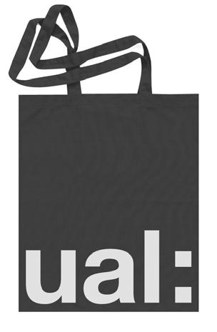
69 8.0 Applications 8.4 Miscellaneous 8.0 Applications 8.4 Miscellaneous 134:135 Cotton tote bag Screenprinted

70 8.0 Applications 8.4 Miscellaneous 8.0 Applications 8.4 Miscellaneous 136:137 T-shirt Screenprinted T-shirt Screenprinted

71 8.0 Applications 8.4 Miscellaneous 8.0 Applications 8.5 Application exceptions 138:139 USB stick Please note that USB sticks can differ in size. Please adjust proportionally. In certain exceptional circumstances it may be necessary to adapt the rules in order to ensure the master brand is sufficiently visible. This is particularly important when working with small or unusual formats. Please try to retain the principles for colour, positioning and placement whilst working within the space available. For all applications that require special attention, please contact the Brand and Content team at 60mm 3.5mm 25mm 3.8mm
72 9.0 Digital guidelines 140: signature 9.2 Optimal screen sizes 9.3 Minimum white space 9.4 Logo positioning 9.5 Maintaining consistency 9.6 Digital typefaces 9.7 Social media

73 9.0 Digital Guidelines 9.1 signature 9.0 Digital Guidelines 9.1 signature 142:143 UAL with employee name For signatures we use Arial. Both regular and bold weights are used for heirarchy and legibility. DO NOT append the Logo to your signature. UAL with College name and employee name For signatures we use Arial. Both regular and bold weights are used for heirarchy and legibility. DO NOT append the Logo to your signature. Line 60 full stops Arial Regular 10pt Line 60 full stops Arial Regular 10pt Arial Bold 12pt Arial Regular 12pt One paragraph break Arial Bold 12pt Arial Regular 12pt Arial Bold 12pt Arial Regular 12pt One paragraph break Arial Bold 12pt Arial Regular 12pt One paragraph break One paragraph break One paragraph break Environmental statement should be in green Arial Regular 12pt Line 60 full stops Arial Regular 10pt One paragraph break Environmental statement should be in green Arial Regular 12pt Line 60 full stops Arial Regular 10pt

74 9.0 Digital Guidelines 9.1 signature 144:145 UAL with employee name and College name and any additional information For signatures we use Arial. Both regular and bold weights are used for heirarchy and legibility. DO NOT append the Logo to your signature. Line 60 full stops Arial Regular 10pt Arial Bold 12pt Arial Regular 12pt One paragraph break Arial Bold 12pt Arial Regular 12pt One paragraph break One paragraph break Additional information should be separated from the main sign off by a paragraph break and another dotted line Arial Regular 12pt Line 60 full stops Arial Regular 10pt One paragraph break Environmental statement should be in green Arial Regular 12pt Line 60 full stops Arial Regular 10pt
75 9.0 Digital guidelines 9.2 Optimal screen sizes 9.0 Digital guidelines 9.3 Minimum white space 146:147 The size of the Logo should always be dependent on the screen width used and be measured based on the height of the Logotype. Three screen widths are given as guidelines: common laptop width, tablet width and smart phone width. Based on the suggested screen sizes the Logo can be resized by a maximum of 14 pixels (upwards or downwards) to accommodate any specific design needs. The direction of the Logo resizing must always follow the direction of the screen variation in relation to the given screen widths. For example, when using the Logo on an 800 pixel screen width, the 54 pixel Logo should be used and be resized only downwards by a maximum of 14 pixels if there is a need. The minimum white space around the Logo should be calculated based on the height of the Logotype. If the Descriptor is x then the minimum space around it should be: The Logo and International: Top space = x divided by 3 Right space = x divided by 2.7 Bottom space = x divided by 1.8 Left space = x divided by 5.4 College logo: Top space = x divided by 3 Right space = x divided by 2.7 Bottom space = x divided by 3 Left space = x divided by px 6px Baseline Grid x/3 When the calculated space results in decimal points, the number should always and only be rounded upwards to a whole number. 54px x x/ px x/5.4 x/2.7 x/3 48px x x/3 320px x/5.4 x/2.7 x/3 36px x x/1.8 x/5.4 x/2.7


76 9.0 Digital guidelines 9.4 Logo positioning 9.0 Digital guidelines 9.5 Maintaining consistency 148:149 The Logo should always be placed on the top left corner when used on UAL branded web sites. The black logo should always be on white space with no coloured bands spanning behind it. The Logo should only be placed on the top left side of a page. Only the black Logo should be used on a white background page.
77 9.0 Digital guidelines 9.6 Digital typefaces 150:151 The font used on UAL branded digital communications must always be in the following order depending on availability: Helvetica Neue Helvetica Arial Helvetica Neue Regular Helvetica Neue Bold abcdefghijklmnopqrstuvwxyz ABCDEFGHIJKLMNOPQRSTUVWXYZ <>?[];'\,./ abcdefghijklmnopqrstuvwxyz ABCDEFGHIJKLMNOPQRSTUVWXYZ <>?[];'\,./ Helvetica Regular Helvetica Bold abcdefghijklmnopqrstuvwxyz ABCDEFGHIJKLMNOPQRSTUVWXYZ <>?[];'\,./ abcdefghijklmnopqrstuvwxyz ABCDEFGHIJKLMNOPQRSTUVWXYZ <>?[];'\,./ Arial Regular Arial Bold abcdefghijklmnopqrstuvwxyz ABCDEFGHIJKLMNOPQRSTUVWXYZ <>?[];'\,./ abcdefghijklmnopqrstuvwxyz ABCDEFGHIJKLMNOPQRSTUVWXYZ <>?[];'\,./
78 9.0 Digital Guidelines 9.7 Social Media 9.0 Digital Guidelines 9.7 Social Media 152:153 Social media icons, which include Twitter, Facebook, Instagram and Pinterest can use the approved secondary colour palette. They should adhere to one of the four approved ways of using logo, colour, pattern and photography / illustration. When designing social media icons they should always be bold, simple and clear so that they achieve maximum impact on social media sites. To maintain this you should follow the rules on how to apply it within the social media spectrum. (e.g. Twitter, Facebook, Instagram and Pinterest). Do not apply the brand in the ways shown below. 1 Using the Logotype with secondary colour palette Do not use International version Do not use Descriptor on its own 2 Using the colon from the Logotype with secondary colour palette Do not use Logotype and College name Do not use College name on its own 3 Using pattern Do not bleed Logotype off the edges Do not bleed colon off the edges 4 Using photography / illustration Do not use Logotype over imagery Do not use Logotype in colour
79 10.0 Stationery 154: Business cards 10.2 Letterheads 10.3 Ordering stationery
80 10.0 Stationery 10.1 Business cards 10.0 Stationery 10.1 Business cards 156:157 Business Card 85mm 55mm Generic UAL and all Colleges listed with employee name. Business Card 85mm 55mm UAL and all Colleges listed for The Enterprise Collective. 3.5mm 3.5mm 3.5mm University of the Arts London Camberwell College of Arts Central Saint Martins Chelsea College of Arts London College of Communication London College of Fashion Wimbledon College of Arts Name Title University of the Arts London 272 High Holborn London WC1V 7EY United Kingdom T +44 (0) M +44 (0) E name@arts.ac.uk 3.5mm University of the Arts London Camberwell College of Arts Central Saint Martins Chelsea College of Arts London College of Communication London College of Fashion Wimbledon College of Arts All text set at Size 7.5pt Line spacing Auto Helvetica Neue Bold Helvetica Neue Light 3.5mm The Enterprise Collective Camberwell, Chelsea, Wimbledon 16 John Islip Street London SW1P 4JU United Kingdom +44 (0) enterprisecollective@arts.ac.uk
81 10.0 Stationery 10.1 Business cards 10.0 Stationery 10.1 Business cards 158:159 Business Card 85mm 55mm UAL and all Colleges listed with employee name. Business Card 85mm 55mm UAL and all Colleges listed with employee name. Name Title Camberwell College of Arts University of the Arts London Peckham Road London SE5 8UF United Kingdom T +44 (0) M +44 (0) E name@camberwell.arts.ac.uk Name Title Chelsea College of Arts University of the Arts London Millbank London SW1P 4JU United Kingdom T +44 (0) M +44 (0) E name@chelsea.arts.ac.uk University of the Arts London Camberwell College of Arts Central Saint Martins Chelsea College of Arts London College of Communication London College of Fashion Wimbledon College of Arts University of the Arts London Camberwell College of Arts Central Saint Martins Chelsea College of Arts London College of Communication London College of Fashion Wimbledon College of Arts
82 10.0 Stationery 10.1 Business cards 10.0 Stationery 10.1 Business cards 160:161 Business Card 85mm 55mm UAL and all Colleges listed with employee name. Business Card 85mm 55mm UAL and all Colleges listed with employee name. University of the Arts London Camberwell College of Arts Central Saint Martins Chelsea College of Arts London College of Communication London College of Fashion Wimbledon College of Arts Name Title Wimbledon College of Arts University of the Arts London Merton Hall Road London SW19 3QA United Kingdom T +44 (0) M +44 (0) E name@wimbledon.ac.uk University of the Arts London Camberwell College of Arts Central Saint Martins Chelsea College of Arts London College of Communication London College of Fashion Wimbledon College of Arts Name Title Central Saint Martins University of the Arts London Granary Building 1 Granary Square London, N1C 4AA United Kingdom T +44 (0) M +44 (0) E name@csm.arts.ac.uk
Version 3:0 September 2015
 Identity guidelines Version 3:0 September 2015 The Buxton logotype The new logotype embraces the concept of water - and a source of water. The focal point of the design is the letter O' where water emerges
Table of Contents. Stationery 24 Business card 25 Letterhead 26 #10 Envelope. Document Note
 Table of Contents Document Note The goal of these guidelines is to help communicate the strategy and visual system behind the SPX brand. If you have questions about anything in this guide, please reach
FACILITYLINK CORPORATE IDENTITY MANUAL
 FACILITYLINK CORPORATE IDENTITY MANUAL Table of Contents Page 2 of 47 Introduction 3 Corporate Design Elements 7 Corporate Design Application 25 Logo Application for Subsidised Activities 44 Table of Contents
Appendix 01: Logo Usage. Brand Identity Guidelines 2015
 Appendix 01: Logo Usage Brand Identity Guidelines 2015 Our logos and their uses Arts Council corporate logo Arts Council exceptional use and partnership logo Grant award logo Arts Council corporate logo
GETTING UMSU BRAND BASICS RIGHT
 GETTING UMSU BRAND BASICS RIGHT UMSU Brand Guidelines 2017 UMSU BRAND GUIDELINES 2017 CONTENTS INTRODUCTION 4 UMSU BRAND: AN OVERVIEW 6 UMSU LOGO 7 UOM LOGO 8 CORRECT USE OF THE LOGO 9 INCORRECT USE OF
Swansea University Brand Asset Guidelines. Version 2 May 2018
 Swansea University Brand Asset Guidelines 1 Version 2 May 2018 Contents We are Swansea University page 3 Brand structure page 4 Visual identity usage guidance page 5 Swansea University s coat of arms page
BRAND GUIDELINES
 BRAND GUIDELINES 2018-19 Mount Pisgah Christian School Department of Admissions and Marketing OUR BRAND Our brand is the composite of all elements that communicate to the world who we are as a school and
Brand Guidelines. January 2015
 Brand Guidelines January 2015 Table of Contents 1.0 What s a brand? 3 1.1 The logo 4 1.2 Colour 1.2.1 Spot & Process 1.2.2 Black & White 5 5 6 1.3 Logo Sizing 1.3.1 Minimum Clear Space 1.3.2 Positioning
LOGO GUIDELINES. A guide for partners
 LOGO GUIDELINES LOGO FULL COLOUR LOGO Our corporate full colour logo is the most recognisable symbol of the ACD and is unique to us. As such, it is crucial we use it correctly and consistently. Whenever
Branding Style Guidelines. (Revised: September 6, 2017)
") Branding Style Guidelines (Revised: September 6, 2017) Table of Contents 2 3 4 5 6 7 8 10 12 13 14 Introduction Brand elements Clear space and minimum size Logo and tagline Symbol as a graphic Logo palette
Branding Style Guidelines (Revised: September 6, 2017) Table of Contents 2 3 4 5 6 7 8 10 12 13 14 Introduction Brand elements Clear space and minimum size Logo and tagline Symbol as a graphic Logo palette
Brand Standards QUICK GUIDELINES
 Brand Standards QUICK GUIDELINES Table of Contents 1.0 1.1 1.2 BRANDMARK Master / Staging Color / Size 2.0 2.1 TAGLINE Usage / Specifications / Staging 3.0 3.1 3.2 3.3 BRAND SYSTEM Typography Color Palette
Brand Guidelines 2018
 Contents Logotype 03 Space required of logotype 04 Logo variants 05 Incorrect use of logotype 06 Brand colours 07 Typefaces 08 Additional graphic elements 09 Supporting logo for EHNS countries 10 Logotype
Cisco College Style Guide
 Cisco College Style Guide Cisco College is a leading provider of education in West Central Texas and presenting a consistent brand and image is imperative to the organization s continued success. In today
Brand identity guidelines
 Brand identity guidelines Version 1.2 November 2016 01 Contents 01 Contents 02 Introducing the 03 Who are these guidelines for? 04 The logo 05 Explaining the logo 06 Logo exclusion zone 07 Logo minimum
INTRODUCTION. NASS is an action sports & music festival that celebrates the very best of alternative culture, bringing you three days of:
 BRAND GUIDELINES INTRODUCTION NASS is an action sports & music festival that celebrates the very best of alternative culture, bringing you three days of: PRO SKATE + BMX COMPETITIONS WITH THE WORLD S BEST
Program Identity Guidelines
 resources.specialolympics.org/healthy_athletes_brand.aspx Program Identity Guidelines Version 1.0 / English Zero-G / August, 2012 Version 1.0 Contents Healthy Athletes introduction 3 Guidelines introduction
Albertsons Companies and Safeway Foundation Brand Standards. PORTLAND DIVISION November 2017
 Albertsons Companies and Safeway Foundation Brand Standards PORTLAND DIVISION November 2017 TABLE OF CONTENTS Our Mission 3 Visual Identity 4 Photography 5 Typography 6 Albertsons Companies Foundation
Introduction. 2 MOTT Community College Identity Guidelines
 IDENTITY GUIDELINES Introduction It is important that Mott Community College maintain a consistent, professional image. All Mott materials, including internal and external publications, signage, flyers,
ACME Foundation Brand Standards. ACME DIVISION November 2017
 ACME Foundation Brand Standards ACME DIVISION November 2017 TABLE OF CONTENTS Our Mission 3 File Formats & Usage 14 Visual Identity 4 Legal 15 Photography 5 Creative/Layout Treatments 16 Typography 6 Creative
AUCA Standard Graphic Identity Manual
 AUCA Standard Graphic Identity Manual GRAPHIC STANDARDS MANUAL This is the Graphic Standards Manual for the American University of Central Asia. It sets the standard for the design of all AUCA public communications
BRANDING STANDARDS MANUAL
 BRANDING STANDARDS MANUAL 2014 Index Logo University version 2 School versions 3 Usage Spacing 4 Sizing 5 Color 6 Logo mark 7 Unacceptable Executions 8-9 Color 10-11 Typography 12 Other Graphic Marks Seal
Version 1 / February IADC Logo Usage Guidelines
 Version 1 / February 2014 IADC Logo Usage Guidelines IADC / Logo Usage Guidelines 3/36 This document outlines correct use of the IADC logo for members, chapters and partners. For a set of full brand guidelines,
Logo Overview. Always use the original digital artwork, available through the Brand Center, to help maintain consistency and integrity.
 Avast logo manual 10 Overview The Avast logo consists of a symbol (the amoeba) and a wordmark. Both elements of the logo have been carefully redesigned to work together for maximum legibility. Do not redraw
Corporate Identity and Visual Identity Guidelines June 2011
 Corporate Identity and Visual Identity Guidelines June 2011 Index A Basic Design Elements A 01 The BenQ Logo A 02 Minimum Size, Minimum Staging Area A 03 Typography A 04 Corporate Colours B B 01 B 02 B
For Children with Developmental Differences. Brand Identity Guide
 For Children with Developmental Differences Brand Identity Guide Table of Contents 3 Our Visual Identity System 4 About These Guidelines 5 The Logo 6 Clear Space & Minimum Size 7-8 Logo Variations 9 Icon
Albertsons Companies, Vons, & Pavilions Foundation Brand Standards. SOUTHERN CALIFORNIA DIVISION November 2017
 Albertsons Companies, Vons, & Pavilions Foundation Brand Standards SOUTHERN CALIFORNIA DIVISION November 2017 TABLE OF CONTENTS Our Mission 3 Visual Identity 4 Photography 5 Typography 6 Albertsons Companies
Albertsons Companies, Safeway and Carrs/Safeway Foundation Brand Standards. SEATTLE DIVISION November 2017
 Albertsons Companies, Safeway and Carrs/Safeway Foundation Brand Standards SEATTLE DIVISION November 2017 TABLE OF CONTENTS Our Mission 3 Visual Identity 4 Photography 5 Typography 6 Albertsons Companies
GIA Alumni Association Identity Program Logo and Graphic Usage Guidelines
 GIA Alumni Association Identity Program Logo and Graphic Usage Guidelines GIA Alumni Association Identity Program GIA provides logos and graphics for use by its alumni chapters, chapter officers, and members.
BRAND GUIDELINES VERSION 3: FEBRUARY 2014
 BRAND GUIDELINES VERSION 3: FEBRUARY 2014 Mission Hall Creative Introduction Brand Guidelines 2 These brand guidelines are designed to help internal and external individuals or organisations implement
Visual identity guidelines
 Visual identity guidelines Contents Introduction 01 Our logo 02 Using our logo 03 05 Our symbol 06 Our coat of arms 07 Our typefaces 08 09 Our colour palette 10 11 Our imagery 12 13 Contacts 14 Introduction
NSW INSTITUTE OF SPORT CORPORATE IDENTITY MANUAL. Guidelines for the use of the NSWIS and ClubsNSW corporate identity
 NSW INSTITUTE OF SPORT CORPORATE IDENTITY MANUAL Guidelines for the use of the NSWIS and ClubsNSW corporate identity CONTENTS Introduction 1 The NSWIS Brand 1 NSWIS Purpose 2 NSWIS Values 2 Use of the
BRANDING GUIDELINES Foundation for Environmental Education
 BRANDING GUIDELINES Foundation for Environmental Education INTRODUCTION Intro This is a guide to the branding elements that make up the Foundation for Environmental Education and its programmes. Have a
Version 1.0 February MasterPass. Branding Requirements
 Version 1.0 February 2013 MasterPass Branding Requirements Using PDF Documents This document is optimized for Adobe Acrobat Reader version 7.0, or newer. Using earlier versions of Acrobat Reader may result
BRAND GUIDELINES 1 BRAND GUIDELINES
 BRAND GUIDELINES 1 BRAND GUIDELINES BRAND GUIDELINES 2 BRAND GUIDELINES 3 Contents Introduction The aims of the brand 02 About this booklet 02 Who can use the brand 02 Resources 02 Design Elements & Usage
Albertsons Companies and Tom Thumb Foundation Brand Standards. SOUTHERN DIVISION November 2017
 Albertsons Companies and Tom Thumb Foundation Brand Standards SOUTHERN DIVISION November 2017 TABLE OF CONTENTS Our Mission 3 Visual Identity 4 Photography 5 Typography 6 Albertsons Companies Foundation
Basic Logo Guidelines. Color. Typography. Logo Reproduction. Logo Integrity. Alternate URL Logo. Logo Use with Secondary Text
 BRAND GUIDE A handbook of informational standards created to maintain consistency and aid in alignment of the overall brand of Hennepin Technical College and its campuses Basic Logo Guidelines PRIMARY
DESIGN & BRAND Guidelines
 DESIGN & BRAND Guidelines TABLE OF CONTENTS This document provides guidelines to ensure the correct use of the Belgian Development Cooperation visual identity. A correct and consistent implementation conveys
GRAPHIC STANDARDS MANUAL Policy and guidelines for using the Hostos Community College 50 th Anniversary Brand Identity
 GRAPHIC STANDARDS MANUAL Policy and guidelines for using the Hostos Community College 50 th Anniversary Brand Identity TABLE OF CONTENTS Policy and Applications... 3 Hostos 50th Anniversary Primary Logo...
Introduction. Page 1. Welcome to the signage guidelines for St John Ambulance premises, updated as of May 2013.
 Signage guidelines Introduction Welcome to the signage guidelines for St John Ambulance premises, updated as of May 2013. These guidelines provide a signage standard for all St John Ambulance buildings,
BASIC MANUAL OF CEPSA IDENTITY
 BASIC MANUAL OF CEPSA IDENTITY April 2018 Cepsa Basic Identity Manual Welcome This manual contains all the elements that make up the Cepsa identity. This manual contains all the elements that make up the
HINO BRAND VISUAL DESIGN MANUAL V1.3e
 HINO BRAND VISUAL DESIGN MANUAL V1.3e Introduction Each basic element in communications, such as the corporate logomark and brand colors, contributes to building brand and plays a vital role in creating
one M2M Logo Brand Guidelines
 one M2M Logo Brand Guidelines July 2012 Logo Design Explanation What does the one M2M logo symbolize? The number 2 in the middle part of the logo symbolizes the connection between the two machines, the
may 2016 brand guide
 may 2016 brand guide Logo Format The logo is the signature symbol of Living Beyond Breast Cancer. It is composed of a graphic and a logotype. GRAPHIC The logo always features both the graphic and the logotype.
School of Social Work. Partnering for Change Style Guide
 School of Social Work Partnering for Change Style Guide September 4, 2009 Partnering for Change Campaign Introduction Rutgers School of Social Work is embarking upon a campaign intended to create a comprehensive,
BrainPOP Identity Standards BrainPOP. All rights reserved.
 BrainPOP Identity Standards 2 Contents 1 Introduction 3 LOGOS 4 Fighter 38 Relative size 39 BrainPOP logo 5 BrainPOP Jr. logo 10 BrainPOP ESL logo 15 4 LEGAL GUIDELINES 42 Graphics 43 Text 48 BrainPOP
Avast logo manual. Logo Overview
 2 Overview The Avast logo consists of a symbol (the amoeba) and a wordmark. Both elements of the logo have been carefully redesigned to work together for maximum legibility. Do not redraw the symbol, typeset
TARGA RESOURCES, INC.
 TARGA RESOURCES, INC. Corporate Identity Program STANDARDS CORPORATE LOGO STANDARDS The corporate logo standards provide guidelines for applying the Targa Resources corporate logo to publications, signage,
Visual Identity and Brand Guidelines
 Visual Identity and Brand Guidelines June 2013 Version 1.0 1 BUILDING BLOCKS 10 Vermont Tech Logo We re practical, straightforward, and confident and our logo embodies these. It stands proudly on its own
CORPORATE VISUAL IDENTITY GUIDELINES. for the use of the OAAS Logo
 CORPORATE VISUAL IDENTITY GUIDELINES for the use of the OAAS Logo ONTARIO ASSOCIATION OF AGRICULTURAL SOCIETIES September 2017 Introduction Our branding is more than a name and a logo. Our branding is
Kodiak Brand Guide. April 2015
 Kodiak Brand Guide April 2015 //kodiakptt.com/company/brand/ Table of Contents The brand is more than a logo 2 Communication 4 Tone & Style 4 Kodiak in Writing 4 Kodiak Marks & Logo 5 Standard Wordmark
Graphic Identity Standards
 Graphic Identity Standards Welcome to our visual identity. At Loyola Marymount University, our goal is to become one of the nation s distinguished Catholic universities with a commitment to academic ecellence
BRAND GUIDELINES ISSUE V6.0
 BRAND GUIDELINES ISSUE 27.08.12 V6.0 BRAND GUIDELINES VERSION 5.0 2 A revolutionary new competition demands an exciting visual identity. In every sense, the America s Cup is about to reinvent itself. The
brand guidelines march 2013
 brand guidelines march 2013 1 1 about these guidelines This document focuses specifically on the guidelines for using the Acal BFi logo. It covers practical details like how to choose the correct logo
Brand Identity Guidelines
 Brand Identity Guidelines For Organisations offering BPAY services and Member Financial Institutions BPAY Brand Identity Guidelines Introduction 2 This guide should be used in conjunction with the BPAY
The Center For Educator, Recruitment, Retention and Advancement. Graphic Standards Manual
 The Center For Educator, Recruitment, Retention and Advancement Graphic Standards Manual 2016 Main Logotype The logotype is the central element in CERRA s visual communications system. Through consistent
Brand Identity Standards & Guidelines. PTCB Brand Identity Standards & Guidelines / V.001 / ptcb.org
 Brand Identity Standards & Guidelines 1 CONTENTS Our Story 03 OVERVIEW Brand Identity Standards & Guidelines 05 BRAND STRATEGY Mission, Vision & Tagline 07 Services & Target Audiences 08 Brand Principles
GRAPHIC STANDARDS MANUAL
 GRAPHIC STANDARDS MANUAL Azusa Pacific University is an, evangelical Christian community of disciples and scholars who seek to advance the work of God in the world through academic excellence in liberal
IDENTITY GUIDELINES BUILDING THE SKYWARD BRAND
 IDENTITY GUIDELINES BUILDING THE SKYWARD BRAND TABLE OF CONTENTS INTRODUCTION...02 SKYWARD TRADEMARK...03 LOGO. PRINT...04 Size, Spacing & Positioning LOGO. SCREEN...05 Web & Video COLOUR...06 TYPOGRAPHY...07
IREM Headquarters and Chapter Version January 9, Brand and Style Guide
 IREM Headquarters and Chapter Version January 9, 2018 Brand and Style Guide Table of Contents Section 1: Brand Messaging 3 - About IREM 4 - Brand Positioning 5 - IREM Trademarks 6-7 Section 2: Logos and
Corporate Identification Guidelines
 It s Our Corporate Signature Corporate Identification Guidelines The Electro-Motive company logotype or logo is our corporate signature. It identifies the products, services, service parts, facilities,
Brand Identity Guide March 2011
 Brand Identity Guide March 2011 CONTENTS Introduction 3 Attributes of the Brand 4 Brand Architecture 5 The Summit Bechtel Reserve Brand Extension 6 The Summit Bechtel Reserve 7 Primary Logotype 9 Secondary
wirelessgroup.co.uk Updated: Brand Guidelines 1/7/2018 V1.0 Brand Guidelines Version 1.0
 wirelessgroup.co.uk Updated: Brand Guidelines 1/7/2018 1 Brand Guidelines Version 1.0 wirelessgroup.co.uk Brand Guidelines 2 Contents 03 04 07 09 11 12 13 14 Primary Logo Secondary Logos Group Indicator
Branding & Design Standards. LIMITED USE: These standards are for areas where FIRST is not a registered trademark. Standards Are Strictly Enforced
 11.3.2015 Branding & Design Standards Standards Are Strictly Enforced LIMITED USE: These standards are for areas where FIRST is not a registered trademark. FIRST Logo Our logo consists of uniquely configured
Canadian Aquatic Invasive Species Network
 Canadian Aquatic Invasive Species Network Graphic Standards Manual Effective January 2007 This Graphic Standards Manual covers the graphic identity guidelines for the Canadian Aquatic Invasive Species
Brand Guidelines 2017 Version 1.0
 Brand Guidelines 2017 Version 1.0 OwnLocal 2017. ALL RIGHT RESERVED OwnLocal Headquarters 205 W 9th Street Suite 600 Austin, TX 78701 www.ownlocal.com TABLE OF CONTENTS 01 Introduction Our Mission Core
HINO BRAND VISUAL DESIGN MANUAL V1.2e
 HINO BRAND VISUAL DESIGN MANUAL V1.2e Introduction Each basic element in communications, such as the corporate logomark and brand colors, contributes to building brand and plays a vital role in creating
Brand Essentials v3. Making us all look good. Chapter 1: Our logo
 Brand Essentials v3 Making us all look good Chapter 1: Our logo Why use these guides? The importance and significance of the University s brand is explained in our Brand Book. These guides will help you
Visit Greenwich Full Logo Guides
 Contents 2 Our Logos 3 Primary Logos 8 Secondary Logos 13 Merchandise Logos Visit Greenwich Full Logo Guides 01 Our Logos The Visit Greenwich logos are a set of brand marks that have different hierarchical
Graphic Standards. A guide to Lane s visual identity, with information on using the college logo, Lane colors and typefaces, stationery, and more.
 Graphic Standards A guide to Lane s visual identity, with information on using the college logo, Lane colors and typefaces, stationery, and more. TABLE OF CONTENTS Introduction to Graphic Standards...1
Wales Coast Path LBrand Guidelines
 LBrand Guidelines lwybr Arfordir Cymru 1 WG15224 Crown Copyright Contents Guidelines introduction 4 incorrect logo usage 12 The logo versions 5 Using the dragon shell 13 Primary logo colour options 6 signage
Centers of Excellence and Institutes Logo Usage Guidelines
 Centers of Excellence and Institutes Logo Usage Guidelines 10/30/14 Approach to Logos for Centers of Excellence and Institutes Examples of Logo Treatment for Centers of Excellence and Institutes Using
CORPORATE LOGO LOGO. Here s how to best represent our logo in any experience: Treat the logo as one individual unit never divide it.
 CORPORATE Our logo is the face of VMware to the world. It s the single most recognizable expression of the VMware brand, so it s vital that the logo s iconic power be strengthened through consistent expression
Accreditation Guidelines. How to acknowledge support from Creative Scotland and the National Lottery.
 Accreditation Guidelines How to acknowledge support from Creative Scotland and the National Lottery. Creative Scotland is the national leader for Scotland s arts, screen and creative industries. Creative
BRAND GUIDELINES VENDOR COPY AUGUST ecoatm BRAND GUIDELINES
 BRAND GUIDELINES VENDOR COPY AUGUST 2014 7059.0814 1 BRAND STANDARDS CONTENTS Brand Standards Primary Logo Endorsers Logo Lockup Secondary Logos, Black and White Margins and Minimum Size Incorrect Usage
Thank you for your continued support, and as always your feedback is welcome.
 Subject: New Tait Logo Dear Sir/Madam, To visually demonstrate the importance of the relationship between Tait Communications and your business, we have created a new Tait logo for you to use. The term
Brand Typeface Headlines Establishing Hierarchy Photography Iconography & Infographics... 18
 Brand Guide VERSION 1.0 2017 Contents at a glance Introduction Using Brand Guidelines... 3 A Note on Branding... 4 Logo Color Version... 5 Special Cases Only... 6 Logo Usage Clear Space... 7 Minimum Size...
Partner Brand Guidelines October 2017
 Partner Brand Guidelines October 2017 Brand Expression From the Magnificent Mile to Route 66, Illinois offers a wide variety of travel experiences. The unifying force behind these experiences is our Illinois
TOWN OF QUEEN CREEK BRAND GUIDE
 BRAND GUIDE DEC2016 BRAND GUIDE INTRODUCTION CONTACT TOWN OF QUEEN CREEK COMMUNICATIONS, MARKETING AND RECREATION DEPARTMENT 22358 SOUTH ELLSWORTH ROAD QUEEN CREEK, AZ 85142 480-358-3198 communication@queencreek.org
TITLE MASTER GARDENER PROGRAMS STYLE GUIDE MASTER GARDENER STYLE GUIDE
 TITLE MASTER GARDENER PROGRAMS STYLE GUIDE 1 TABLE OF CONTENTS 3 INTRODUCTION 4 About 5 Program Hierarchy 6 LOGO LOCK-UP GUIDELINES 7 Clearspace and Alignment 8 Subset Program Lock-Ups 9 LOGO ALTERNATES,
Quality Care Pharmacy Program
 Quality Care Pharmacy Program How to use the QCPP logo in your pharmacy and promote your accreditation. Contents Logo Specifications...2 Logo Placement...3 QCPP Decal...4 Logo Colours for print and screen...5
Introduction. All collateral outlined within these guidelines can be downloaded at leicesterbusinessfestival.com
 Introduction Leicester Business Festival (LBF) is currently the regions largest business event and has been developed by business for business since 2014 to put Leicester and Leicestershire front and centre
VISUAL IDENTITY GUIDELINES. Updated
 VISUAL IDENTITY GUIDELINES Updated 2.12.2016 VISUAL IDENTITY GUIDELINES Table of Contents 1. Introduction Basic Design Elements 2. Logo 2.1 Clear zone 2.2 Logo misuse 2.3 Sponsor logo lock-up 3. Colors
Prairie Rivers of Iowa Logo & Brand Standard
 Prairie Rivers of Iowa Logo & Brand Standard Table of contents 1...What is a brand? 2...The Prairie Rivers of Iowa logo 3...Clear Space Around the Prairie Rivers of Iowa Logo 4...Other logos used by Prairie
BRAND STANDARDS GUIDE
 BRAND STANDARDS GUIDE This document is designed to provide a guide for presentation and use of the CTO logo. The details outlined are generally applicable to stationery, presentations, signage, marketing
2007 Chadwick School School Logo Style Guide
 CHADWICK SCHOOL LOGO STYLE GUIDE 2007 Chadwick School School Logo Style Guide T A B L E O F C O N T E N T S 3 Letter From the Headmaster 4 Basic Guidelines For Use 5 Logo Anatomy 6 Logo Color 7 Color Specifications
CMA VISUAL IDENTITY GUIDE. January 2018
 CMA VISUAL IDENTITY GUIDE January 2018 CMA Visual Identity Guide Logo overview The CMA logo is composed of the French and English wordmarks and the CMA icon (note: the logo is always bilingual, even in
Logo usage guidelines for reproduction
 Logo usage guidelines for reproduction Welcome to the ELECSA logo usage guidelines This information has been prepared for our s to ensure a unified presentation of the ELECSA logo and identity. It does
LOGO MANUAL. Definition of the basic use of the logo
 LOGO MANUAL Definition of the basic use of the logo INTRODUCTION The KELLYS Logo Manual is a document that sets forth the basic rules for the use of the graphic elements of the KELLYS BICYCLES logo and
v CORPORATE GUIDELINES
 1. CORPORATE GUIDELINES Primary colours for print Colours to be used across print platforms globally. Pantone Orange 172 SPOT PREFERRED PRINT OPTION CMYK Orange 4 COLOUR SECONDARY PRINT OPTION C0/M6/Y100/K0
RESNET. Professional Logos Guide
 RESNET Professional Logos Guide Trusted Experts in Home Energy Efficiency The National Association of State Energy Officials and Mortgage Bankers Association of America founded the Residential Energy Services
MSOE Brand and Identity Guidelines
 MSOE Brand and Identity Guidelines The first, and sometimes only, tangible expressions of MSOE are the communication vehicles created by the university. Whether print or digital, they are a vital part
identity guidelines logo + preliminary applications July 1, 2013
 identity guidelines logo + preliminary applications July 1, 2013 introduction & history the system logo history of the name The state s workforce training schools known as Tennessee Technology Centers
VISUAL IDENTITY STANDARDS
 VISUAL IDENTITY STANDARDS CURRENT AS OF 12/5/2016 1 HUSTLER VISUAL IDENTITY STANDARDS: TABLE OF CONTENTS TABLE OF CONTENTS OVERVIEW Hustler Visual Identity Standards Policy... 2 LOGO STANDARDS Vertical
VISUAL BRAND IDENTITY GUIDELINES
 1 / 72 VISUAL BRAND IDENTITY GUIDELINES V 1.5 CONTACT Address National Supercomputing Centre (NSCC) Singapore 1 Fusionopolis Way, Connexis South, #17-01, Singapore 138632 Phone + 65 6714 9450 Email contact@nscc.sg
Shippensburg University. University Communications and Marketing
 Shippensburg University University Communications and Marketing 1 (Updated September 2017) The Shippensburg University Institutional Identity Guide establishes official policy and standards for the use
FileMaker Corporate Style Guide
 ilemaker Corporate Style Guide General guidelines for logo usage and corporate identity 5201 Patrick Henry Drive Santa Clara, CA 95054, USA Tel: (408) 987.7000 Welcome Our identity is one of our most valuable
SIT IDENTITY POLICY AND GUIDE
 SIT IDENTITY POLICY AND GUIDE 1 November 2017 A MESSAGE FROM THE PRESIDENT SIT has come a long way since its inception in 2009. Over the past few years, we have progressed from a start-up institute of
Corporate IDENTITY and BRANDING Standards Manual
 Corporate IDENTITY and BRANDING Standards Manual shift4.com info@shift4.com Mission Statement To empower and protect merchants accepting electronic payments by providing the fastest, most efficient, reliable
EUDQG VWDQGDUGV v2.6.13
 v2.6.13 keep it simple. Our brand personality must be clear and consistent across all aspects of the business from advertising to customer communications, to products and cobranding. These guidelines have
brand manual partners edition
 partners edition brand manual 2016 color palette The Plus color palette contains six colors. The value of each color is listed in PMS (1-color spot), CMYK (4-color process), RGB and hexadecimal. Any of