GRAPHIC STANDARDS Memorial University of Newfoundland APRIL 2008
|
|
|
- Nora Banks
- 5 years ago
- Views:
Transcription
1 GRAPHIC STANDARDS Memorial University of Newfoundland APRIL 2008
2
3 GRAPHIC STANDARDS A MESSAGE FROM THE PRESIDENT 4 ABOUT VISUAL IDENTITY 5 THE LOGO 6 GENERAL GUIDELINES FOR THE USE OF THE LOGO 8 LOGO COLOURS 10 USES 12 TAGLINE 14 ADDITIONAL ELEMENTS 16 GEOGRAPHIC ELEMENTS 18 LOGO, CAMPUS AND FACULTY/DIVISION NAME RELATIONSHIP 20 TYPOGRAPHY 22 TYPOGRAPHY GENERAL GUIDELINES 24 STATIONERY 26 LETTERHEAD 28 ENVELOPE (STANDARD #10) 30 ENVELOPE (9 X 12 AND OTHER SIZES) 32 BUSINESS CARD 34 MISCELLANEOUS STATIONERY 36 ELECTRONIC TEMPLATES 38 ADVERTISING 39 COLOUR PALETTE 40 PRINT APPLICATIONS 42 WEB APPLICATIONS 44 THE USE OF SILHOUETTES 46 THE USE OF PHOTOGRAPHY 48 MEMORIAL UNIVERSITY CEREMONIAL MARK 50 GENERAL GUIDELINES FOR USE OF THE CEREMONIAL MARK 52 LICENSING AND TRADEMARKS 54 MERCHANDISE 55 OTHER COLLATERAL MATERIALS SAMPLES 56 For more information on graphic standards, please contact MARKETING & COMMUNICATIONS marcomm@mun.ca
4 A Message from the President A picture is worth a thousand words. This old adage is surprisingly still true today, so it is critical that Memorial University s visual identity our picture, if you will helps to communicate the university s key messages in a way that will relate to our stakeholders in Newfoundland and Labrador and beyond. In 2006 we adopted a new institutional logo that conveys the modern and innovative approach this university takes to all that we do and that distinguishes us from other educational institutions. The new logo is a part of an integrated marketing plan for our university. The key objectives of the plan are to convey, in a contemporary and effective way, the principal characteristics of our university: freedom, exploration, experiential learning, creativity and ingenuity. The freedom element, in particular, reflects the fact that we were founded as a living memorial to the Newfoundlanders who fought and died for freedom in the First World War. The word/concept Become embraces these characteristics and over time we are imbuing it with new meaning related to the transformational impact of Memorial University on people and ideas. Our new logo appears on virtually all items used to communicate about Memorial today, including stationery, publications, signage, and University Bookstore merchandise. The traditional coat of arms logo that has been in use since 1994 is still an official mark of the university, but its use has been reserved for ceremonial functions to which it is more suited. Its appropriate uses are also outlined in the manual. Of course, our official name, Memorial University of Newfoundland, also remains unchanged. Our logos are legally registered marks of our university. To convey that we strive for excellence in everything we do, they must be rendered accurately and used appropriately. To accomplish this requires a co-ordinated approach. A graphic standards manual was released in 2007 to help ensure the consistent and appropriate use of the logo and related elements. The manual has now been updated in this 2008 edition, based on the past year s experience working with the users of the logo and their multitude of varied uses. Nevertheless, even though it has been reconfigured somewhat considering a wider range of uses, the manual cannot cover every potential use. If you have questions or comments, please contact the Division of Marketing and Communications. As the unit responsible for administering our integrated marketing strategy and visual identity, they will be glad to assist you. Eddy Campbell Acting President and Vice-Chancellor March 2008
5 Memorial University Graphic Standards 5 About Visual Identity Symbols play an important role in the universal language of visual communication and comprehension. The role of the symbol in our daily lives has become increasingly important, and every day we encounter symbols that communicate messages without the use of words. The term visual identity is used to describe the various visual manifestations of an organization not only its logo or mark, but the other aspects of its physical presentation, such as its standard layouts (e.g. stationery or signage), typography, color schemes and interior design. It is critical that each time the public comes in contact with the university the identity is communicated in consistent visual terms, whether it is portrayed on signage, departmental letterhead or the web. To ensure correct usage of Memorial's marks, refer to this manual and use only approved artwork. Most typical applications of the visual identity are covered in this manual, however, if you have other questions, please contact the Division of Marketing and Communications at /8664. The foundation of an organization s visual identity is a symbol or logotype. It is more than mere decoration it is a carefully defined and developed representation of the spirit of the organization. Administering the Visual Identity System Under the university's Visual Identity Policy, the Division of Marketing and Communications is charged with administering Memorial's visual identity system. This includes both non-commercial and commercial (or licensing) applications of the university's marks. For more information on the policy, contact the director of Marketing and Communications or consult the university's Policy and Procedures Manual at Memorial's name, logotype, varsity logo and acronyms are legally registered trademarks and may only be used with permission. How to use this Graphic Standards Manual This manual provides the technical information required to ensure that the visual identity of Memorial University of Newfoundland is used consistently and uniformly. That visual identity includes a number of key elements that reflect the brand strategy that the university adopted in 2006: Logo Tagline Typography Visual elements silhouettes, vistas, colour palette, design layouts Ceremonial and other marks
6 6 Memorial University Graphic Standards The Logo The modern Memorial University logo reflects and expresses the university as a place of strength, a place of vision, a place to explore. Memorial is a place where people transform and become. Adopted in 2006, it is the university's main mark for most usages. The logo is a registered trademark for the exclusive use of Memorial University of Newfoundland. For more information, see section on Licensing and Trademarks (p. 30). About the Logo The new institutional logo has been developed to communicate the university s new brand positioning we offer the freedom to explore and experience your ingenuity as well as to signal that we are a university for 21st century explorers and to set Memorial apart visually from other universities. The new logo bears the wording Memorial University in all caps, the common usage form of the university's official name and which highlights the institution's origins as a living war memorial. The logo is rendered in the university s official colours, claret and white, which were drawn from those of the Royal Newfoundland Regiment. The typography is modern and bold, rendered in all caps, suggesting strength of purpose. The Ceremonial Mark The ceremonial coat of arms logo should be used for high profile ceremonial events such as convocation, for degree certificates, official transcripts and Remembrance Day activities, as well as for other items such as special greetings scrolls from the Senate, the Board of Regents or the President s Office. Other circumstances may warrant using this mark. Permission for use other than listed above may be requested from the Division of Marketing and Communications. For more information on the ceremonial logo, refer to pp Subsidiary Logos While the logotype is the main identifier for the university, several other marks are also included in the visual identity system. These include the logo developed for the varsity athletic teams, the Sea-Hawks, and a variety of logos approved for use by some university units. In all applications, these subsidiary logos become a secondary institution signature and must be used in conjunction with the university logotype. A subsidiary logo may appear no larger than the university logo. For more information on subsidiary logos, contact the Division of Marketing and Communications. The name is partially embedded in a bold, iconic shape, suggestive of a rock face, cliff or iceberg elements evocative of our location. This iconic shape also suggests the rocky base of the Caribou monuments that mark our war memorials in various parts of the world. Most importantly, the new logo suggests many aspects of the Memorial University experience: transformational (the shape is rough, then smooth), unique (particularly among Canadian universities), modern (in typography and style) and memorable. The logo is adaptable to many uses; it reproduces clearly in small sizes, in many materials such as embroidery for clothing and in many formats such as for the web.

7 Memorial University Graphic Standards 7 University Logo Ceremonial Mark Two Layouts Examples of Subsidiary Logos
8 8 Memorial University Graphic Standards General Guidelines for Use of the Logo The logo should appear on a white or light background to ensure clear visibility. The logo should never be incorporated into text or used in conjunction with other graphic elements except as noted in these corporate standards. Placement of the logo has been predetermined for most Memorial materials. Refer to these graphic standards for application examples. When reproducing the logo, always use the official artwork from the electronic files provided. The elements of the logo are fixed and should never be redrawn or altered in any way. The claret block and name, MEMORIAL UNIVERSITY, are a single unit. These elements may not be used separately as design elements. The Memorial University name is set in a modified Avenir font. No other font may be substituted. No elements can be added to the logo other than as specified in these graphic standards. The logo is custom drawn. Do not attempt to recreate this artwork. Optimum File Type and Usage Electronic files containing various electronic and design formats of the logo are provided at When scaling the logo over 10 per cent of its original size, please use the EPS files. The EPS files are built using vector graphics and as such will scale without distortion to type or graphic elements. For PowerPoint use a PNG file, and for web use JPEG files. Logos saved in PNG format are capable of supporting transparent backgrounds in PowerPoint. For print work using InDesign or Quark, where images have not been scaled more than 10 per cent, please use the JPG or EPS files where possible. A WMF format is provided for word processing programs. Safety Zone There is a minimum space maintained around the logo to set it apart from other graphic elements. This safety zone should be equal to the height of the left side of the claret block. In general the logo should have significant white space around it and not be crowded by other elements. With the optional addition of the become tagline at the bottom of the logo, the same safety zone applies and begins at the lowest edge of this additional element. Minimum Size Minimum width of the logo is 0.59in/15mm. This is based on the width of the claret block. There is no maximum size. For advice on optimal size for your project, please contact Memorial University s Division of Marketing and Communications.
9 Memorial University Graphic Standards 9 Minimum size is 15mm measured horizontally. Nothing should appear within this safety zone. The safety zone is equal to the height of the left side of the claret block. This distance must be maintained around the entire logo.
10 10 Memorial University Graphic Standards Logo Colours The logo colours are Pantone (PMS) 202 for the claret block and PMS Cool Grey 10 for the word UNIVERSITY. The logo can also be printed in process colour, black or white. It can be also knocked out of a dark background. On mid-range background colours where the PMS Cool Grey 10 will not show clearly, the word UNIVERSITY may be dropped out (rendered in white). No other colours are acceptable. It is recommended that, where possible, the logo remain positive and sit on a white background. Gradated backgrounds are not recommended. The colour process breakdown for the claret block is: cyan 10, magenta 97, yellow 61 and black 48. The colour process for the word UNIVER- SITY is: cyan 38, magenta 29, yellow 20, black 58. For screen and web applications the RGB colour breakdown for the claret block is: red 130, green 36, blue 51. The RGB colour process breakdown for the word UNIVERSITY is: red 97, green 99, blue 101. Responsibility Anyone using the logo has an obligation to ensure that the graphic logo is used exactly in accordance with the conditions set out in these standards. If you are unclear about the use of the logo, please contact Memorial University s Division of Marketing and Communications. Marketing and Communications has the right to review any use of the logo. Inappropriate and incorrect uses will not be permitted.
11 Memorial University Graphic Standards 11 PMS 202 C10, M97, Y61, K48 R130, G36, B51 PMS Cool Grey 10 C38 M29 Y20 K58 R97, G99, B101 PMS 202 C10, M97, Y61, K48 R130, G36, B51 PMS Cool Grey 10 C38 M29 Y20 K58 R97, G99, B101 EXAMPLE OF LIGHT BACKGROUND On lighter coloured backgrounds, the word UNIVERSITY may remain as Cool Grey 10. Black & White Knock-out. Black & White. PMS 202 C10, M97, Y61, K48 R130, G36, B51 White One-colour Knock-out is permitted. In single colour reproduction, only black or claret PMS 202 are permitted. EXAMPLE OF DARK BACKGROUND On mid-range or darker coloured backgrounds, the word UNIVERSITY may be dropped out in white for clarity.
12 12 Memorial University Graphic Standards Uses In order to preserve the integrity and consistency of presentation of the logo, it must be used as specified in this manual. The following examples of how the logo should not be used can provide some further clarity on this. 1. The logo is a stand-alone design, not words or parts of a statement, and must appear separate from other elements in all applications. For example, it should not be placed in a box or circle. 2. The logo may not be used within a sentence, phrase or headline. 3. No words or images should crowd, overlap or merge with it, nor should it be placed on a photo or design that obscures the words. 4. The logo is a registered trademark and must not be altered. For example, it cannot be shaded; shadowed; screened; used in outline form; or filled with a texture or photo. Do not use a scanned, recreated, re-proportioned or otherwise modified version of the logo. Original files are available at or by contacting Marketing and Communications. Contact Marketing and Communications if you have any questions about the use of the Memorial logo. Web Use The logo should always appear in positive form, in colour, and on a clean white background. Ideal placement of the logo is in the upper lefthand corner, as shown on the Memorial web pages on p. 45 and 47. All guidelines listed above also apply to the logo in electronic form on the website. For more information on web use, please contact the Web Content Services section of Marketing and Communications. 5. Proportions of the logo must remain the same in either reduction or enlargement. It may not be stretched out of proportion in either direction. 6. The elements of the logo may not be used independently or in conjunction with other designs. 7. Combining the logo or signatures with other logos or designs not authorized by Marketing and Communications is prohibited. 8. The logo may not be cropped; it must be used in its entirety. 9. The logo should not be rotated or tilted, except by special approval on promotional and specialty items.
13 Memorial University Graphic Standards 13 1 The way. Join us!
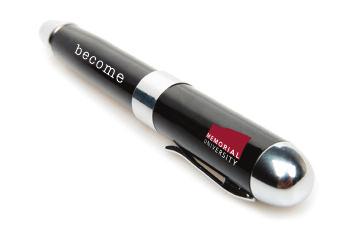
14 14 Memorial University Graphic Standards Tagline The tagline become reinforces the message that Memorial University is a place to change, to grow, to become. It is used on specific kinds of communication that reflect this brand message, and may be used only when deemed appropriate and authorized by the Division of Marketing and Communications. The become tagline is rendered in a modified American Typewriter font. No other font may be substituted. The tagline must always appear in lowercase letters. Responsibility Any authorized user has an obligation to ensure that the tagline is used in accordance with the conditions set out in this manual. If you are unclear about the use of the tagline, please contact the Division of Marketing and Communications. Marketing and Communications has the right to review any use of the tagline. Inappropriate and incorrect uses will not be permitted. General Guidelines for Use of the Tagline The elements of the tagline are custom drawn and fixed, and should never be redrawn or altered in any way. The approved artwork files are available from the Division of Marketing and Communications. Minimum Space The distance from the logo to the tagline is the height of the letter M in Memorial. Tagline Colours The tagline always prints as solid black except in cases where the Memorial logo is reversed out of a solid. In this case, the tagline will also be white. Minimum Size Where the tagline is used with the logo, the minimum size of the logo and tagline is 0.59in/15mm wide. The minimum size for the tagline is 0.287in/7.3mm wide. In instances when the tagline and logo are separate, use discretion on the size of the tagline.
15 Memorial University Graphic Standards 15 The safety zone is equal to the height of the left side of the claret block. This distance must be maintained around the entire logo. When logo and tagline are used together, the safety zone should extend below the lowest point of the combined unit. Nothing should appear within this safety zone. Minimum size is 0.59in/15mm measured horizontally. Minimum size is 0.287in/7.3mm measured horizontally.
16 16 Memorial University Graphic Standards Additional Elements The Memorial logo may appear with the following additional graphic elements: Campus Name Faculty/Division Name Campus Name and Faculty/Division Name In the case of dark backgrounds, the additional element may be dropped out in white. Black is never an option, unless your artwork is in black and white. Campus Name Approved artwork files are available from the Division of Marketing and Communications. Faculty/Division Name Campus Name Faculty/Division Name
17 Memorial University Graphic Standards 17 Campus Name Campus Name Faculty/Division Name Faculty/Division Name Black & White. Black & White Knock-out. Campus Name Campus Name Faculty/Division Name Faculty/Division Name EXAMPLE OF LIGHT BACKGROUND On lighter coloured backgrounds, the additional elements can remain as PMS 202 and Cool Grey 10. EXAMPLE OF DARK BACKGROUND On darker coloured backgrounds, the additional elements may be dropped out in white for clarity. Campus Name Campus Name Faculty/Division Name Faculty/Division Name It is not recommended that the additional elements remain as PMS 202 and Cool Grey 10 on a dark background. Changing the the additional elements ents to black is not an option.
18 18 Memorial University Graphic Standards Geographic Elements It is acceptable to use one of the following geographic elements. The font must always be in Avenir Roman, all caps, and tracked out at least 100 points. When placing under the logo, the text must be right justified with the logo. In the case of dark backgrounds, the additional element may be dropped out in white. Black is never an option, unless your artwork is in black and white. NEWFOUNDLAND & LABRADOR, CANADA NEWFOUNDLAND & LABRADOR, CANADA NEWFOUNDLAND & LABRADOR S UNIVERSITY NEWFOUNDLAND & LABRADOR S UNIVERSITY Option 1 Option 2
19 Memorial University Graphic Standards 19 NEWFOUNDLAND & LABRADOR, CANADA Black & White. NEWFOUNDLAND & LABRADOR, CANADA Black & White Knock-out. NEWFOUNDLAND & LABRADOR, CANADA NEWFOUNDLAND N ND & LABRADOR, CANADA EXAMPLE OF LIGHT BACKGROUND On lighter coloured backgrounds, the geographic element can remain as PMS 202. It is not recommended that the geographic element remain as PMS 202 on a dark background. NEWFOUNDLAND & LABRADOR, CANADA NEWFOUNDLAND D & LABRADOR, CANADA EXAMPLE OF DARK BACKGROUND On darker coloured backgrounds, the geographic element may be dropped out in white for clarity. Changing the the geographic element to black is not an option.
20 20 Memorial University Graphic Standards Logo, Campus and Faculty/Division Name Relationship To maintain a consistent look across campuses, faculties, schools and divisions, the letter M from Memorial is used as a spacing guide. A single M separates the logo from the campus name, while two stacked M s separate the logo from the faculty/division name. The height of the M is the height of the campus name. The height of the faculty/division name is the letter U from university. These rules are fixed and the relationship between these items should never be altered. The campus name is always set in PMS 202 and the faculty/division name is always set in PMS Cool Grey 10. In the case of dark backgrounds, the campus and faculty/division name may be dropped out in white. Black is never an option, unless your artwork is in black and white. If you are unclear about whether a unit is considered a faculty, school or division, please contact the Division of Marketing and Communications. Marketing and Communications has the right to review any use of the logo. Inappropriate and incorrect uses will not be permitted.
21 Memorial University Graphic Standards 21 Avenir Black 95 Campus Name Faculty/Division Name Adobe Garamond Semibold
22 22 Memorial University Graphic Standards Typography The primary typefaces to be used are Avenir and Adobe Garamond. These typefaces have been selected to complement the new logo and to bring enhanced consistency to communications materials. Avenir is a sans serif typeface and ideally suited for headers, sub headers and brief content, such as the text sections in this document. Adobe Garamond is a serif typeface and should be used for body copy where enhanced readability is needed, such as large amounts of dense text. Adobe Garamond is a large typeface family and provides a wide range of options. These fonts can be used together or separately depending on the requirements. All weights may be used. Acceptable Substitutions In electronic formats such as PowerPoint presentations, web and , Avenir and Adobe Garamond may be replaced by Arial and Times. For internal communications such as office memos, letters and address labels, Arial and Times are also acceptable. Ab Avenir Roman 55 Ab Adobe Garamond Regular
23 Memorial University Graphic Standards 23 Avenir Light 35 ABCDEFGHIJKLMNOPQRSTUVWXYZ abcdefghijklmnopqrstuvwxyz Avenir Roman 55 ABCDEFGHIJKLMNOPQRSTUVWXYZ abcdefghijklmnopqrstuvwxyz Avenir Heavy 85 ABCDEFGHIJKLMNOPQRSTUVWXYZ abcdefghijklmnopqrstuvwxyz Avenir Light Oblique 35 ABCDEFGHIJKLMNOPQRSTUVWXYZ abcdefghijklmnopqrstuvwxyz Avenir Oblique 55 ABCDEFGHIJKLMNOPQRSTUVWXYZ abcdefghijklmnopqrstuvwxyz Avenir Heavy Oblique 85 ABCDEFGHIJKLMNOPQRSTUVWXYZ abcdefghijklmnopqrstuvwxyz Avenir Book 45 ABCDEFGHIJKLMNOPQRSTUVWXYZ abcdefghijklmnopqrstuvwxyz Avenir Medium 65 ABCDEFGHIJKLMNOPQRSTUVWXYZ abcdefghijklmnopqrstuvwxyz Avenir Black 95 ABCDEFGHIJKLMNOPQRSTUVWXYZ abcdefghijklmnopqrstuvwxyz Avenir Book Oblique 45 ABCDEFGHIJKLMNOPQRSTUVWXYZ abcdefghijklmnopqrstuvwxyz Avenir Medium Oblique 65 ABCDEFGHIJKLMNOPQRSTUVWXYZ abcdefghijklmnopqrstuvwxyz Avenir Black Oblique 95 ABCDEFGHIJKLMNOPQRSTUVWXYZ abcdefghijklmnopqrstuvwxyz Adobe Garamond Regular ABCDEFGHIJKLMNOPQRSTUVWXYZ abcdefghijklmnopqrstuvwxyz Adobe Garamond Italic ABCDEFGHIJKLMNOPQRSTUVWXYZ abcdefghijklmnopqrstuvwxyz Adobe Garamond Semi Bold ABCDEFGHIJKLMNOPQRSTUVWXYZ abcdefghijklmnopqrstuvwxyz Adobe Garamond Semi Bold Italic ABCDEFGHIJKLMNOPQRSTUVWXYZ abcdefghijklmnopqrstuvwxyz Adobe Garamond Bold ABCDEFGHIJKLMNOPQRSTUVWXYZ abcdefghijklmnopqrstuvwxyz Adobe Garamond Bold Italic ABCDEFGHIJKLMNOPQRSTUVWXYZ abcdefghijklmnopqrstuvwxyz
24 24 Memorial University Graphic Standards Typography Guidelines Avoid using many different sizes and weights of type together. Upper and lower case letters should be used consistently. Avenir may be used in both all caps or in upper and lower case. Garamond may only be used in upper and lower case PRESIDENT S REPORT Avenir in all caps President s Report Avenir in upper and lower case President s Report Garamond in upper and lower case PRESIDENT S REPORT Garamond in all caps is not permitted.
25 Memorial University Graphic Standards 25 CONSEQUAT LABORTIS DOLOR Consequat Labortis Dolor Ullamcorper consectetuer aliquip volutpat consequat autem aliquip hendrerit iriure delenit vel dolore dolore accumsan in. Minim ad, eu enim commodo sed, consectetu ut nulla facilisi dignissim. Odio nulla accumsan magna, veniam nulla nibh sed vero. Eui eros ad exerci vel dolor dignissim ut tation eum tincidunt, nonummy veniam et duis. Ullamcorper consectetuer aliquip volutpat consequat autem aliquip hendrerit iriure feugait dolore dolore accumsan in. Minim ad, eu enim commodo sed, consectetuer nulla nulla dignissim. Odio nulla accumsan magna, veniam nulla nibh sed vero. Euismod dolore ea aliqu dignissim ut tation eum tincidunt, nonummy veniam et duis. Nibh erat et. Vel delenit illum sit suscipit wisi, ullamcorper hendrerit dolore tincidunt enim odio. Augue nisl nulla elit delenit veniam ut, nostrud, volutpat, magna bland praesent suscipit ea vero nibh. Nibh erat et. Vel delenit illum sit suscipit wisi, ullamcorper hendrerit dolore tincidunt iusto od Augue nisl nulla elit delenit veniam ut, nostrud, volutpat, magna blandit nostrud amet, in. S nibh. Odio nulla accumsan magna, veniam nulla nibh sed vero. Tation exerci duis suscipit at feugiat ullamcorper, suscipit sed vulputate iusto molestie molestie facilisi blandit, nulla luptatum accumsan vero ut aliquip vulputate consequa wisi in dolore. Molestie esse consequat lobortis dolor vel duis consequat tation p augue eros iriure ex ut, vel. Tation exerci duis suscipit at feugiat ullamcorper, suscipit sed vulputate iusto molestie. Com facilisi blandit, nulla luptatum accumsan vero ut aliquip vulputate consequat blandit dol Molestie esse consequat lobortis dolor vel duis consequat tation praesent esse consequat aug Avenir may be used in both all caps and in upper and lower case. Consequat Labortis Dolor CONSEQUAT LABORTIS DOLOR Ullamcorper consectetuer aliquip volutpat consequat autem aliquip hendrerit iriure delenit vel dolore dolore accumsan in. Minim ad, eu enim commodo sed, consectetu ut nulla facilisi dignissim. Odio nulla accumsan magna, veniam nulla nibh sed vero. Euis eros ad exerci vel dolor dignissim ut tation eum tincidunt, nonummy veniam et duis. Ullamcorper consectetuer aliquip volutpat consequat autem aliquip hendrerit iriure feugait dolor dolore accumsan in. Minim ad, eu enim commodo sed, consectetuer nulla nulla aliquip te ut nulla accumsan magna, veniam nulla nibh sed vero. Euismod dolore ea aliquam eros ad exerci vel do tincidunt, nonummy veniam et duis. Nibh erat et. Vel delenit illum sit suscipit wisi, ullamcorper hendrerit dolore tincidunt enim odio. Augue nisl nulla elit delenit veniam ut, nostrud, volutpat, magna bland praesent suscipit ea vero nibh. Tation exerci duis suscipit at feugiat ullamcorper, suscipit sed vulputate iusto molestie molestie facilisi blandit, nulla luptatum accumsan vero ut aliquip vulputate consequa wisi in dolore. Molestie esse consequat lobortis dolor vel duis consequat tation pr augue eros iriure ex ut, vel. Nibh erat et. Vel delenit illum sit suscipit wisi, ullamcorper hendrerit dolore tincidunt iusto odio lor nisl nulla elit delenit veniam ut, nostrud, volutpat, magna blandit nostrud amet, in. Sit praesent su Tation exerci duis suscipit at feugiat ullamcorper, suscipit sed vulputate iusto molestie. Commodo blandit, nulla luptatum accumsan vero ut aliquip vulputate consequat blandit dolore dolore w consequat lobortis dolor vel duis consequat tation praesent esse consequat augue eros iriure ex ut Garamond may only be used in upper and lower case, and not in all caps.
26 26 Memorial University Graphic Standards Stationery The logo will be used on university letterhead, envelopes, business cards and other stationery items. Refer to the following pages of these graphic standards for examples of stationery designs available from Printing Services, Department of Financial and Administrative Services. If other materials or formats are desired, please contact the Division of Marketing and Communications. Requests for stationery must be made through Printing Services, Department of Financial and Administrative Services. All stationery will be produced in accordance with university stationery specifications for design and paper stock. Personalized stationery is not available. Examples shown are smaller than actual size.
27 Memorial University Graphic Standards 27 Campus Name Faculty/Division/School Name Department/Division/School Name P.O. Box 9999, Any Town, NL Canada A1B 2C3 Tel: Fax: Faculty/Department/Division/School Name P.O. Box 4200, St. John s, NL Canada A1C 5S7 Campus Name First Name Last Name Credentials First Name Last Name Credentials JOB TITLE Faculty/Department/Division/School Building Name (optional) Memorial University of Newfoundland (optional) Any Street, Any Town, NL Canada A1B 2C3 Tel: x 9999 Cell: Fax: name@mun.ca
28 28 Memorial University Graphic Standards Letterhead The logo should always appear at the top left of the page. The letter M in Memorial is used as a spacing guide. Letterhead uses the colours PMS 202 and PMS Cool Grey 10. Subsidiary Logos An approved subsidiary logo may be placed at the bottom lefthand corner of the page. The logo may not exceed the width of the Memorial logo and must sit 0.79in/15mm from the bottom of the page. Subsidiary logos are not carried on envelopes, business cards or other stationery items. For more information on subsidiary logos, including the approval process, contact the Division of Marketing and Communications. Letterhead Composition Correspondence may be composed using Avenir and Adobe Garamond. If these fonts are not available, Arial or Times may be used instead. Example shown is smaller than actual size.
29 0.59in/ 15mm 0.62in/ 16mm 0.519in/13mm Use the M in Memorial as a guide for distance between elements Campus Name Font 10 pt. Avenir Black, Color PMS 202 Faculty/Division Name Font 10 pt. Adobe Garamond Pro, Color PMS Cool Grey 10 Department P.O. Box 9999, Any Town NL Canada A1B 2C3 Tel: Fax: January 12, 2005 Composition should begin 2in/50.5mm from top of page Mr. John Doe Company Name XX Any Street Any Town, Prov. A1B 2C3 Composition should not exceed 15mm from edge of page Dear John, Correspondence: Times 10/12 Lorem ipsum dolor sit amet, consectetuer adipiscing elit, sed diam nonummy nibh euismod tincidunt ut laoreet dolore magna aliquam erat volutpat. Ut wisi enim ad minim veniam, quis nostrud exerci tation ullamcorper suscipit lobortis nisl ut aliquip ex ea commodo consequat. Duis autem vel eum iriure dolor in hendrerit in vulputate velit esse molestie consequat, vel illum dolore eu feugiat nulla facilisis at vero eros et accumsan et iusto odio dignissim qui blandit praesent luptatum zzril delenit augue duis dolore te feugait nulla facilisi. Lorem ipsum dolor sit amet, consectetuer adipiscing elit, sed diam nonummy nibh euismod tincidunt ut laoreet dolore magna aliquam erat volutpat. Ut wisi enim ad minim veniam, quis nostrud exerci tation ullamcorper suscipit lobortis nisl ut aliquip ex ea commodo conse. Duis autem vel eum iriure dolor in hendrerit in vulputate velit esse molestie consequat, vel illum dolore eu feugiat nulla facilisis at vero eros et accumsan et iusto odio dignissim qui blandit praesent luptatum zzril delenit augue duis dolore te feugait nulla facilisi. Nam liber tempor cum soluta nobis eleifend option congue nihil imperdiet doming id quod mazim placerat facer possim assum. Lorem ipsum dolor sit amet, consectetuer adipiscing elit, sed diam nonummy nibh euismod tincidunt ut laoreet dolore magna aliquam erat volutpat. Ut wisi enim ad minim veniam, quis nostrud exerci tation ullamcorper suscipit lobortis nisl ut aliquip ex ea commodo consequat. Duis autem vel eum iriure dolor in hendrerit in vulputate velit esse molestie consequat, vel illum dolore eu feugiat nulla facilisis at vero eros et accumsan et iusto odio dignissim qui blandit praesent luptatum zzril delenit augue duis dolore te feugait nulla facilisi. Lorem ipsum dolor sit amet, consectetuer adipiscing elit, sed diam nonummy nibh euismod tincidunt ut laoreet dolore magna aliquam erat volutpat. We look forward to seeing you! Sincerely Jill Smith Lorem ipsum dolor sit amet Composition should not exceed 50mm from edge of page when subsidiary logo exists OFFICIAL SUBSIDIARY LOGO Composition should not exceed 15mm from edge of page 0.79in/15mm 0.59in/ 15mm
30 30 Memorial University Graphic Standards Envelope Example with Composition Correspondence may be composed using Avenir and Adobe Garamond. If these fonts are not available, Arial or Times may be used instead.
31 Memorial University Graphic Standards 31 Font 8 pt Avenir Roman Font 8 pt Avenir Heavy Address to be just above center line Factulty/Department Name P.O. Box 4200, St. John s, NL Canada A1C 5S7 0.59in/ 15mm 0.39in/ 10mm 0.39in/ 10mm 3.15in/80mm John Smith Lorem ipsum dolor 123 Lorem, Ipsum 123 Dolor, ON A1B 1A2
32 32 Memorial University Graphic Standards Envelope (9x12 and other sizes recycled fiber) The logo should always appear at the top left of the envelope. The address appears below the logo as shown. This envelope is printed only in black. Example shown is smaller than actual size.
33 Memorial University Graphic Standards in/ 10mm 0.39in/ 10mm Department Name P.O. Box 4200 St. John s, NL Canada A1C 5S7 Font 8 pt Avenir Heavy Font 8/10 pt Avenir Roman
34 34 Memorial University Graphic Standards Business Card The standard business card is two-sided. The logo should always appear on one side of the business card, on the top left side. To maintain an open and accessible look, a margin of white space around the edge of the card is required. No type or graphics should bleed or go beyond the active white area shown here. The size of the active area is 0.24in/6mm from the edge of the card. Front Campus Name* First Name Last Name Credentials First Name Last Name Credentials There is also a tent-style business card design for use with two languages. First Name Last Name Credentials JOB TITLE First Name Last Name Credentials JOB TITLE The business card uses the colours PMS 202 and PMS Cool Grey 10. Examples shown smaller than actual size. Business cards are available only for officials and employees of Memorial University. Examples shown on immediate left are smaller than actual size. Back Faculty/Department/Division/School Faculty/Department/Division/School Building Name Building Name Any Street, Any Town, NL Canada A1B 2C3 Any Street, Any Town, NL Canada A1B 2C3 Tel: x 9999 Cell: Tel: x 9999 Cell: Fax: Fax: name@mun.ca name@mun.ca Two versions of the standard business card. First Name Last Name Credentials JOB TITLE Department Any Street, Any Town, NL Canada A1B 2C3 Tel: x 9999 Fax: name@mun.ca FOLD Campus Name* Lorum Ipsum Dolor Amet Euismod ODIO MAGNA First Name Last Name Credentials Dignissim Any Street, Any Town, NL Canada A1B 2C3 Tel: x 9999 Fax: name@mun.ca Outside Inside Two-language version of the business card. Campus Name * First Name Last Name Credentials * Specific campus ID is used when the department, unit, activity or the position is specific to a single campus.
35 Memorial University Graphic Standards 35 Campus Name * Campus Name: Avenir Black 10.5 pt, PMS 202 * Specific campus ID is used when the department, unit, activity or the position is specific to a single campus. First Name Last Name Credentials Front The space between the title and the department is two and one half M s. First Name Last Name Credentials JOB TITLE Faculty/Department/Division/School Building Name and Room # (optional) Memorial University of Newfoundland (optional) Any Street, Any Town, NL Canada A1B 2C3 Tel: x 9999 Cell: Fax: Pager: name@mun.ca The dotted line indicates the safety zone. No type should infringe into this area, which measures 0.24in/6mm from the edge of the card. The space relationship is measured from the bottom up, where the and web address sit on the bottom left corner of the live area. Back Faculty/Division/Department/School/Building Name: Avenir Heavy 8/10pt Return space of 3 pt. Address: Avenir Roman 8/10pt. /web address: Avenir Roman 8/10pt
36 36 Memorial University Graphic Standards 2.75in/70mm Miscellaneous Stationery The sample designs show placement of the logo on some commonly used items. In some cases, items are preprinted and available for purchase through Printing Services. Please contact them for product availability. The items shown are a representation of types of stationery products. Other items can be created/adapted from these basic templates as needed. For unique stationery items, requests must be submitted to Marketing and Communications for consideration. Font 14 pt. caps, Avenir Black, black Font 8 pt. caps, Avenir Medium, black FIRST NAME LAST NAME TITLE AND DEPARTMENT 1.5in/38mm Examples shown are smaller than actual size. Metal Name Plate 9in/229mm 12in/305mm NEWFOUNDLAND AND LABRADOR, CANADA Conference Folder
37 Memorial University Graphic Standards in/105mm 4.25in/108mm Font 21 pt. Avenir Light PMS 202 With our compliments 5.75in/146mm Compliments Card With our compliments may be replaced with other text such as Announcement or Thank you. Below is a folded sample, using a subsidiary logo. 6in/152mm Note Paper Also used as menu paper. Also available in card stock. Root for us! 2.25in/57mm First Name Last Name Organization Name 4.25in/108mm First Name Last Name FOLD Font 24 pt. Avenir Black PMS 202 Name Tag 3.5in/89mm Font 20 pt. Avenir Black, PMS 202 Font 20 pt. Avenir Light, PMS 202 Place Card 5.5in/140mm

38 38 Memorial University Graphic Standards Electronic Templates Electronic templates are available for MS Word 2003 or newer. The stationery templates are not to replace standard watermarked stationery products. They are additional products intended for electronic use and sent out as attachments as needed. Forms available to download and customize with your unique information include: electronic letterhead, PowerPoint backgrounds and electronic invitation. Additional e-templates will be developed if a need is demonstrated. The templates are available for download at PLEASE FOLLOW THE DOWNLOAD INSTRUCTIONS PRINTED ON THE WEBSITE TO ENSURE YOU GET THE CORRECT FILE. E-letterhead PowerPoint PP drop-in graphics E-Invitation
39 Memorial University Graphic Standards 39 Advertising A standard layout for employment and tender advertising has been supplied to local newspapers. Promotional display advertising must exemplify the innovation and creativity of the Memorial brand. A templated, standardized approach is not desirable or acceptable. For assistance with promotional advertising, please contact the Division of Marketing and Communications. All advertising should clearly display the Memorial logo in a suitable format as outlined on pages 6-10 of this manual. Samples of employment and tender ad templates. Samples of display ads.
40 40 Memorial University Graphic Standards Colour Palette The official colours for the Memorial University logo are Pantone (PMS) 202 for the claret block, PMS Cool Grey 10 for the word UNIVERSITY and black for the tagline. These colours are to be used on all university communications, including stationery, business cards, exterior signage and brochures and pamphlets. The RGB colours listed are for web and screen use only. Please use only spot or process colours for print. A secondary colour palette has been introduced to allow for variety and distinctiveness among faculties. The secondary palette can be used for a range of communication products, including brochures, pamphlets, web pages and interior signage. Faculties are encouraged to select a colour from the palette to unify their communications materials, in consultation with the Division of Marketing and Communications. When appearing with the logo, the faculty name is always set in PMS Cool Grey 10 and should never change to the secondary colour. Visual Identity Reference Card A handy quick reference card, available on coated and uncoated card is available by contacting Marketing and Communications. The card contains: two commonly used versions of our colour palette, Pantone pure colours and their CMYK process colour equivalents; samples of the brand fonts, Avenir and Adobe Garamond; a brief description of the brand concept; and approved formats of the logo. This card is intended as a general guide only. It is designed to be used when checking press proofs or other items that get printed, such as a display pop up. It can also be used as a comparison guide when selecting fabric or other products that have unique colour systems, such as packaging, napkins, ribbon, paint, carpeting, upholstery or draperies. It will also be a quick reference tool when selecting colours for print work or a presentation.
41 Memorial University Graphic Standards 41 Primary Colour Palette Secondary Colour Palette PMS 202 C /10 M/97 Y/61 K/48 R/130 G/36 B/51 PMS Cool Gray 10 C/38 M/29 Y/20 K/28 R/97 G/99 B/101 Black C/0 M/O Y/0 K/100 R/35 G/31 B/32 PMS 117 PMS 398 PMS 5773 PMS 5507 PMS 5425 PMS 422 PMS 408 PMS 5503 PMS 126 PMS 3985 PMS 5625 PMS 5487 PMS 5405 PMS 424 PMS 410 PMS 5483 Pocket Brand Reference Card


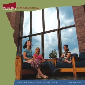
42 NEWFOUNDLAND AND LABRADOR, CANADA 42 Memorial University Graphic Standards Print Applications Where the logo appears without a campus or faculty/school/division name, it is positioned in the top right corner of the cover or page. With the addition of a name, it sits in the top left corner. Layout is clean and uncluttered. Examples shown are smaller than actual size.


 2006 FACT BOOK Benchmarks WINTER 2005 Wireless")

43 NEWFOUNDLAND AND LABRADOR, Memorial University Graphic Standards 43 P CANADA VIEWBOOK Viewbook Corner Brook, Newfoundland and Labrador, Canada Centre for Institutional Analysis and Planning (CIAP) 2006 FACT BOOK Benchmarks WINTER 2005 Wireless Software Hot opportunities for Faculty of Engineering grads Research 3 Alumni News 5 News 6 Spotlight 10 News briefs 12 Profiles 15 Faculty news 16
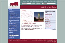
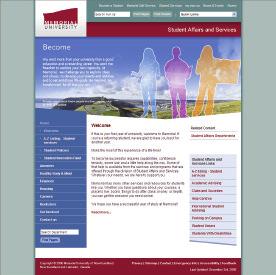
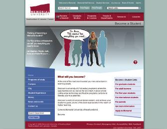
44 44 Memorial University Graphic Standards Web Applications Memorial s website design includes variations for the main page, campus sites, academic departments, administrative units, marketing sites, events/centres/groups and affiliates of the university. The common look and feel specifications for the web are available at: The following are examples of the web design options.
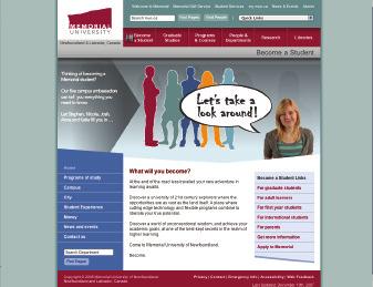
45 Memorial University Graphic Standards 45
46 46 Memorial University Graphic Standards The Use of Silhouettes The premise of the silhouette as part of the brand signature is to show the potential of those being represented in the promotional piece (i.e., what they can become), and to act as a graphical connection to the overall brand program. Four ways of using silhouettes: 1. Solid colour, of a real person: to represent a specific person (see example A) 2. Solid colour, of a generic person: to represent a concept, discipline, emotion or idea (see example B) 3. Filled of a real person: to represent a real person in a specific discipline (see example C) 4. Filled of a generic person: to represent an idea, concept, discipline or emotion or idea (see example D) Silhouettes are not required in all promotional materials. Silhouettes should be used if the promotional material is: Communicating a key brand message; Celebrating individuals; or Telling stories about people. Silhouettes should be considered if the promotional material is: Conceptual in design, though not necessarily brand-related; or Involving real people. Silhouettes should rarely be used if the promotional material is: Presenting facts only; Not featuring any people; or A small-space advertisement or a single-page promotional item. Examples shown are smaller than actual size.


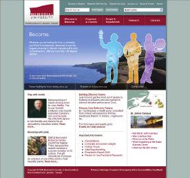
47 Memorial University Graphic Standards 47 A President s Awards Program B Brand Advertisement C Memorial Website D Page from Memorial Viewbook
48 48 Memorial University Graphic Standards The Use of Photography Another important visual element of the brand program is the vista. Images of expansive and open settings, indoor and outdoor, are used in communications materials to reflect the concepts of freedom and exploration. Photography should have high visual impact and can be used alone or as a backdrop for silhouettes. Low resolution samples of vista-type images, suitable for web or Power- Point use, are available for free download at To access high resolution, print quality files of these images and many others, please contact your faculty s communications co-ordinator, or the Division of Marketing and Communications.

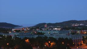

49 Memorial University Graphic Standards 49
50 50 Memorial University Graphic Standards Memorial University Ceremonial Mark The coat of arms wordmark combines the university s traditional coat of arms, designed in 1949 by alumnus Robert Horwood, and a wordmark adopted in 1995 that uses a modern rendering of traditional serif type. It may be used for high profile ceremonial events such as convocation, degree certificates, official transcripts, Remembrance Day activities and for other special uses such as ceremonial greetings from the Senate, the Board of Regents, or the President s Office. Other circumstances may warrant using the mark. Permission for use other than listed above may be requested from the Division of Marketing and Communications. Black Claret PMS 202 Gold PMS 124 The ceremonial mark is not to be altered in any way other than re-sizing. High resolution vector files, in Pantone or CMYK colour, are available on request. As the marks are to be used for ceremonial use only, they are available only for colour reproduction. Colours Pantone spot colours should be used whenever possible, given the important nature of ceremonial documents. PMS 202 C /10 M/97 Y/61 K/48 R/130 G/36 B/51 PMS 124 C/O M/27 Y/100 K/0 R/234 G/171 B/0 Black C/0 M/O Y/0 K/100 R/35 G/31 B/32
51 Memorial University Graphic Standards 51 The ceremonial mark is available in two formats: 1) Horizontal, a uniform height version with a minimum width of 2 in (see diagram) and a safety zone on all sides. 2) Vertical, stacked version with a unique graphic : wordmark ratio. The width of the coat of arms is one-half the width of the wordmark, and is centered over the wordmark. Preferred placement for this version is top centre of a document. The safety zone is indicated in the diagram. Safety zone is size of the cap M in Memorial, on all sides 1/4 1/2 1/4 Safety zone is size of the cap M in Memorial Gap between graphic and wordmark is height of lowercase m in Memorial
52 52 Memorial University Graphic Standards General Guidelines for Use of the Ceremonial Mark The mark must appear on a white or light background to ensure clear visibility. The mark should never be incorporated into text or used in conjunction with other graphic elements except as noted in these graphic standards. Placement of the mark has been predetermined for most Memorial materials. Please contact the Division of Marketing and Communications for further information. Minimum Size Horizontal format: Minimum width of the mark is 2 in/51 mm. This is based on the width of the entire mark. Do not use a width smaller than this minimum to ensure legibility. There is no maximum size. For the horizontal format, the minimum size is 2 in/51mm measured horizontally Vertical format: Minimum width of the mark is 1 in/28 mm. This is based on the width of the entire mark. Do not use a width smaller than this minimum to ensure legibility. There is no maximum size. File formats are available for dowload as TIF, EPS and JPG, in Pantone spot colour and CMYK. Please go to The ceremonial logo is a registered trademark of Memorial University and may not be altered in any way or used for purposes other than listed herein without written permission from the Division of Marketing and Communications. For the vertical format, the minimum size is 1in/28mm measured horizontally
53 Memorial University Graphic Standards 53 Symbolism of the Arms The arms of Memorial University have as their central element a cross moline, which is a fitting symbol for an institution dedicated to the memory of soldiers from this province who died during the Great Wars. The cross is the supreme symbol of sacrifice and its anchor-shaped ends signify the hope that springs from devotion to a good cause. The wavy bars above and below allude to the maritime setting of the university, while the three books in the upper part of the shield are a reference to its educational role. The motto Provehito in Altum (launch forth into the deep) captures the spirit of the adventure of learning and urges students to extend the frontiers of knowledge. Claret and white, derived from the cross of St. George, were the colours of the Royal Newfoundland Regiment during the First World War. Red is a symbol of courage and sacrifice, white is the colour of purity, and gold is associated with nobleness and magnanimity. While paying tribute to the bravery of the soldiers of Newfoundland, these colours remind all that courage tempered with mercy can be enlisted in the service of pure and noble causes. Excerpted from the program of the Ceremony for the Presentation of the Coat of Arms to Memorial University of Newfoundland. Friday, Sept. 18, 1992.
54 54 Memorial University Graphic Standards Licensing and Trademarks Licensing A trademark is a word, symbol or design, or a combination of these, used to distinguish the goods or services of a person or organization from the goods or services of others in the marketplace. University trademarks appear on a great variety of items, from t-shirts to graduation rings. It is Memorial's policy to regulate the use of its name, trademarks and official visual identity, and to collect a royalty for the privilege of the commercial use of them. This ensures that the university is consistent in the use of its trademarks and presents a unified identity that is easily recognized by the public. It also ensures that the university receives remuneration from the sale of products bearing its name and/or trademarks. Commercial Licensing As outlined in our Visual Identity Policy, Memorial licenses vendors through a non-exclusive agreement to produce products bearing its marks. In return for permission to use the marks, vendors remit royalty fees based on the volume of product sales. Manufacturers or other potential commercial licensees should contact the manager of the University Bookstore for more information, Product Design for Licensed Goods Memorial's marks are used in a variety of creative ways on a wide array of products for sale in the University Bookstore and other stores. Certain products carry the university logo while others bear the acronym MUN or the varsity sports team logo. In approving products for licensing, the university's Licensing Committee permits a degree of design flexibility in line with current fashion trends and marketing considerations. Non-commercial Use To use Memorial's marks for non-commercial purposes (i.e., on items not for sale), contact the executive director of Marketing and Communications for information.


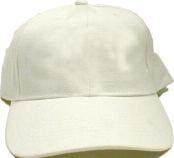
55 Memorial University Graphic Standards 55 Merchandise Below are examples of golf and T-shirts. It is recommended that the colours white, grey and burgundy fabrics be used. PMS 202 and PMS Cool Grey may not be available in pre-manufactured items so a colour should be chosen that most closely matches the official colours. The Visual Identity Reference card (see p. 40) is a useful tool to aid in this selection. Engineering The Memorial logo should appear on the left side of the chest or on the top of the sleeve. The logo should be no more than 4 in/102mm in width and may be reproduced in one or two colours. If the fabric colour is dark, the single-colour logo form may be printed in white, giving the effect of a reversed logo. In the case of a T-shirt, the become tagline could be placed on the back, across the shoulders, as an option. The size of the message and/or tagline are at the designer s discretion. ENGINEERING


56 56 Memorial University Graphic Standards Other Collateral Materials Samples
LATEST UPDATE 4 OF MAY Brand materials Guidelines
 LATEST UPDATE 4 OF MAY 2018 Brand materials Guidelines Material production steps 1 Select item that fit with Nortal visual identity Select the item with a color that fits the Nortal visual identity. If
BRAND GUIDELINES EDDY PUMP
 BRAND GUIDELINES EDDY PUMP We Pump Solids Not Water INDEX 1 2 3 ABOUT US OUR LOGO COLOR SYSTEM 4 5 TYPOGRAPHY DO'S AND DON'TS ABOUT US EDDY Pump Corporation is a dredge equipment and pump manufacturer,
Introduction 1.1 Why a New Visual Identity System? Visual Identity Policy What is branding, and why is it important? 4 1.
 Introduction 1.1 Why a New Visual Identity System? 2 1.2 Visual Identity Policy 3 1.3 What is branding, and why is it important? 4 1.4 Why use the university s logo? 5 1.5 Why should you consider working
THE LOOK OF OUR BRAND
 THE LOOK OF OUR BRAND For Internal Use Only Not For Use With The Public. For help and guidance on our brand standards, contact marketinginbox@firstcommand.com. OUR LOOK CONSISTENCY USAGE 29 OUR LOGO The
Newnan-Coweta Chamber Brand Standards Identity, Logo Usage and Copy Style Guide. Beyond Full Circle Marketing
 Newnan-Coweta Chamber Brand Standards Identity, Logo Usage and Copy Style Guide Beyond Full Circle Marketing GRAPHIC STANDARDS. 1 Contents 2 Introduction 3 Approved Usage 4-6 Logo Usage Guidelines For
UNIVERSITY IDENTITY STANDARDS. Together, we are building a stronger identity of which we can be proud.
 UNIVERSITY IDENTITY STANDARDS Together, we are building a stronger identity of which we can be proud. TABLE OF CONTENTS UNIVERSITY IDENTITY STANDARDS Table of Contents 2 Letter from the President 3 Introduction
Graphic Standards Manual
 Graphic Standards Manual Contents The Importance of Graphic Standards... 3 SkillsUS Trademarks...3 Using the SkillsUS Name in Print...4 Using the SkillsUS Name in Conjunction with the SkillsUS Championships
4 Advertising. Advertising
 4 4 Advertising 4.1 Introduction 4.2 lue locks System 4.3 Full-Page Grid 4.4.1 Half-Page Horizontal Grid 4.4.2 Half-Page Vertical Grid 4.5 Quarter-Page Grid 4.6 Small-Size Grid 4.7.1 Full-Page Example
Branding Identity Guidelines
 Branding Identity Guidelines Optimist International 4494 Lindell Boulevard St. Louis, MO 608 (4) 7-6000 optimist.org Canadian Service Centre 505 Metropolitan Boulevard East, Suite 00 Montreal, QC HR Z7
Corporate identity fundamental elements
 Corporate identity fundamental elements 1 LOGO: fundamentals / introduction The Cittaslow International logo was designed in 2003 by Piergiorgio Maoloni one of the most important Italian graphic designers
APA ESSENTIALS Style and format. Carol H. Mack, RN, PhD, JD
 APA ESSENTIALS Style and format Carol H. Mack, RN, PhD, JD The APA Publication Manual Journal article in 1929, Last revised 2009 Sets standards for scientific communication Aims to enhance dissemination
Brand Guidelines GRANTEES AND PARTNERS JUN. 2018
 Brand Guidelines GRANTEES AND PARTNERS JUN. 2018 Logo Guidelines 02 Welcome Welcome to First 5 LA s etended family! We are proud of the work your organization is doing for the children and families in
Graphic Identity Manual
 6.0 Graphic Identity Manual Download logos and learn more about the university identity system and branding policies at: brand.sdsu.edu Use only original logos downloaded from the official website above.
January 2012 BranD TOOL KIT FOr ParTnErSHIPS
 January 2012 BRAND TOOL KIT PARTNERSHIPS OVERVIEW Partnerships and collaborative relationships are an integral part of UNICEF s work. Partnerships allow UNICEF to achieve much better results for children
Co-branding guideline
 Co-branding guideline Co-branding Guideline The Ericsson Co-branding Logotypes Co-branding logotype should be used as a reference to all Partner/Reseller marketing activities promoting Ericsson solutions,
Brand Identity Guidelines. Khwaja Fareed University of Engineering & Information Technology
 Brand Identity Guidelines Khwaja Fareed University of Engineering & Information Technology Our Vision To become a world-class University of Engineering and Information Technology that contributes significantly
Book Title. Sub Title
 Book Title Sub Title Book Title Sub Title Author Name Copyright Year by Your name All rights reserved. No part of this book may be reproduced, scanned, or distributed in any printed or electronic form
World Solar Challenge Branding Guidelines
 World Solar Challenge Branding Guidelines Introduction The World Solar Challenge Masterbrand is based upon a set of graphic elements: the sun symbol, the logo type, the corporate typeface and the corporate
HINO BRAND VISUAL DESIGN MANUAL V1.3e
 HINO BRAND VISUAL DESIGN MANUAL V1.3e Introduction Each basic element in communications, such as the corporate logomark and brand colors, contributes to building brand and plays a vital role in creating
Lorem ip#um dolor #it amet, con#ectetur adipi#ici elit, #ed. Duis autem vel eum iriure dolor in hendrerit in vulputate. Putting History into Focus.
 Your competent and reliable partner in historical research, publication and representation. Lorem ip#um dolor #it amet, con#ectetur adipi#ici elit, #ed eiu#mod tempor incidunt ut labore et dolore magna
Hexion Corporate Identity Standards. Initial Release September 2005 Revised October 2006
 Hexion Corporate Identity Standards Initial Release September 2005 Revised October 2006 Table of Contents 1.0 Hexion Corporate Identity Standards To quickly navigate through the PDF file, click on any
HINO BRAND VISUAL DESIGN MANUAL V1.2e
 HINO BRAND VISUAL DESIGN MANUAL V1.2e Introduction Each basic element in communications, such as the corporate logomark and brand colors, contributes to building brand and plays a vital role in creating
CALGARY BOARD OF EDUCATION LOGO GRAPHIC STANDARDS GUIDE
 CALGARY BOARD OF EDUCATION LOGO GRAPHIC STANDARDS GUIDE Communications Services Calgary Board of Education 2007 2 GRAPHIC STANDARDS GUIDE CONTENTS Introduction 2 Backgrounder 2 The CBE logo 4 Logo Design
BRANDING STANDARDS MANUAL
 BRANDING STANDARDS MANUAL 2014 Index Logo University version 2 School versions 3 Usage Spacing 4 Sizing 5 Color 6 Logo mark 7 Unacceptable Executions 8-9 Color 10-11 Typography 12 Other Graphic Marks Seal
Hexion Corporate Identity Standards. Initial Release September 2005
 Hexion Corporate Identity Standards Initial Release September 2005 Section One Introduction Letter From Our Chairman 1.1 Communicating the Hexion Brand Dear Hexion Associates: As you are all well aware,
Leveraging and Protecting the NATE Brand
 Identity Guidelines Leveraging and Protecting the NATE Brand As the nation s largest non-profit certification organization for heating, ventilation, air conditioning and refrigeration technicians, North
A L U M N I A S S O C I A T I O N
 A L U M N I A S S O C I A T I O N VIS U A L IDENT I T Y G U I D E J A n u A r y 2 0 1 0 V.1.0 Q U E E N S U N I V E R S I T Y A L U M N I A S S O C I A T I O N V I S U A L I D E N T I T Y G U I D E C O
November Visual Identity Guidelines Ministry of Education
 November 2017 Visual Identity Guidelines Ministry of Education Introduction The way we visually represent the EarlyON brand plays a key role in the way we are perceived both internally by our various partners
Province of Manitoba Visual Identity Guidelines. August 2006
 Province of Manitoba Visual Identity Guidelines August 2006 Table of Contents 2 Introduction Logo Components and Use 3 Colours Protected Space 4 Incorrect Logo Use 5 Department Identity Sponsorship and
CORPORATE COMMUNICATIONS POLICY EXECUTIVE AND INTERGOVERNMENTAL AFFAIRS POLICY STATEMENT
 CORPORATE COMMUNICATIONS POLICY EXECUTIVE AND INTERGOVERNMENTAL AFFAIRS POLICY STATEMENT The purpose of this policy is to ensure that corporate communications across the Government of Nunavut (GN) are
Graphic Identity Manual MARKETING DEPARTMENT
 Graphic Identity Manual MARKETING DEPARTMENT Introduction The success of the Westfield State graphic identity depends on the consistent use of communications materials by everyone involved with the university.
HSE Video Branding and Style Guidelines
 HSE Video Branding and Style Guidelines Table of Contents Overview 3 Edit Construction 4 Opening and Closing Screens 5 Partners logos 9 Text Only Screen 10 Persistent Logo 11 Lower-thirds 12 Use of Subtitles
Visual Identity Standards
 1 Visual Identity Standards Information and inquiries: University Relations brand@ucalgary.ca Visual Identity Standards 2 15.0 Eyes High 15.01 Introduction 15.01 Introduction 15.02 What is Eyes High? 15.03
Corporate Identity and Visual Identity Guidelines June 2011
 Corporate Identity and Visual Identity Guidelines June 2011 Index A Basic Design Elements A 01 The BenQ Logo A 02 Minimum Size, Minimum Staging Area A 03 Typography A 04 Corporate Colours B B 01 B 02 B
GRAPHIC STANDARDS MANUAL Policy and guidelines for using the Hostos Community College 50 th Anniversary Brand Identity
 GRAPHIC STANDARDS MANUAL Policy and guidelines for using the Hostos Community College 50 th Anniversary Brand Identity TABLE OF CONTENTS Policy and Applications... 3 Hostos 50th Anniversary Primary Logo...
BRANDING GUIDELINES Enterprise Nation
 BRANDING GUIDELINES Enterprise Nation Enterprise Nation Logo Normal use logo The Normal use logo should be used where possible. However there are certain exceptions. Stacked logo This should only be used
Therma-Tru Doors Brand Standards and Guidelines 2012 Edition
 Therma-Tru Doors Brand Standards and Guidelines 2012 Edition Contents The Brand: Therma-Tru Introduction.... 3 Philosophy.... 4 Trademark Usage.... 5 Creative Elements Color Usage....6-7 Logo Usage Therma-Tru...
Brand Guidelines & Standards Manual 2017 Edition
 Brand Guidelines & Standards Manual 2017 Edition Table of Contents Introduction...3 Trademarks...4 Logos... 5 8 Fypon Logo... 5 7 Secondary Logos...8 Colors...9 Fonts... 10 11 2 Introduction The Fypon
SOUTHEAST TECH BRANDING IDENTITY STANDARDS MANUAL
 SOUTHEAST TECH BRANDING IDENTITY STANDARDS MANUAL INTRODUCTION The Southeast Tech Branding Identity Standards Manual was created to provide all Southeast Tech employees and associates with the ability
Gin-Cor Industries Inc. Brand Guidelines
 Last updated: August 26, 2015 About Our Vision To be a leader in the manufacturing of vocational trucks. Our Mission To manufacture customized vocational trucks that workers want to drive and owners want
VISUAL IDENTITY GUIDELINES VERSION 1.1-7/08
 VISUAL IDENTITY GUIDELINES VERSION 1.1-7/08 VISUAL IDENTITY GUIDELINES CONTENTS Contents Introduction Using this Manual........................................2 Standards for the University Logo Logo Usage.............................................4
CYPRESS FAIRBANKS ISD
 CYPRESS FAIRBANKS ISD BRAND Standards and Guidelines Table of Contents Basic Guidelines 3 Color 4 Correct Uses 5 Incorrect Uses 6 Stationery 7 Video 8 Social Media 9 Print Communications 11 Electronic
Chicago Manual of Style
 Sample Typeset Xulon Press will typeset the interior of your book according to the Chicago Manual of Style method of document formatting, which is the publishing industry standard. The sample attached
Graphic Identity Standards
 Graphic Identity Standards Welcome to our visual identity. At Loyola Marymount University, our goal is to become one of the nation s distinguished Catholic universities with a commitment to academic ecellence
Running head: PAPER TITLE 1
 Running head: PAPER TITLE 1 The "h" is not capitalized. The paper title in the header must be capitalized; if it is too long, shorten it so that the header is all on one line. Write a descriptive title;
NSW INSTITUTE OF SPORT CORPORATE IDENTITY MANUAL. Guidelines for the use of the NSWIS and ClubsNSW corporate identity
 NSW INSTITUTE OF SPORT CORPORATE IDENTITY MANUAL Guidelines for the use of the NSWIS and ClubsNSW corporate identity CONTENTS Introduction 1 The NSWIS Brand 1 NSWIS Purpose 2 NSWIS Values 2 Use of the
Chicago Manual of Style
 Sample Typeset Xulon Press will typeset the interior of your book according to the Chicago Manual of Style method of document formatting, which is the publishing industry standard. The sample attached
Znips London 75 Wilton Road, London SW1V 1DE Telephone: +44 (0) Znips London Identity Manual
 Znips London Identity Manual") Znips London 75 Wilton Road, London SW1V 1DE Telephone: +44 (0)20 7828 6688 Znips London Identity Manual Znips London Identity Manual This identity manual outlines how to apply the Znips London identity
Znips London 75 Wilton Road, London SW1V 1DE Telephone: +44 (0)20 7828 6688 Znips London Identity Manual Znips London Identity Manual This identity manual outlines how to apply the Znips London identity
GRAPHIC STANDARDS THE UNIVERSITY OF SOUTHERN MISSISSIPPI UPDATED AUGUST 2018
 GRAPHIC STANDARDS THE UNIVERSITY OF SOUTHERN MISSISSIPPI UPDATED AUGUST 2018 QUICK POINTS UNIVERSITY LOGO 1 - Communications materials and advertisements should be approved by the Office of University
Quality Care Pharmacy Program
 Quality Care Pharmacy Program How to use the QCPP logo in your pharmacy and promote your accreditation. Contents Logo Specifications...2 Logo Placement...3 QCPP Decal...4 Logo Colours for print and screen...5
Shippensburg University. University Communications and Marketing
 Shippensburg University University Communications and Marketing 1 (Updated September 2017) The Shippensburg University Institutional Identity Guide establishes official policy and standards for the use
Chicago Manual of Style
 Sample Typeset Xulon Press will typeset the interior of your book according to the Chicago Manual of Style method of document formatting, which is the publishing industry standard. The sample attached
Version 3:0 September 2015
 Identity guidelines Version 3:0 September 2015 The Buxton logotype The new logotype embraces the concept of water - and a source of water. The focal point of the design is the letter O' where water emerges
Chicago Manual of Style
 Sample Typeset Xulon Press will typeset the interior of your book according to the Chicago Manual of Style method of document formatting, which is the publishing industry standard. The sample attached
Brand Guidelines. January 2015
 Brand Guidelines January 2015 Table of Contents 1.0 What s a brand? 3 1.1 The logo 4 1.2 Colour 1.2.1 Spot & Process 1.2.2 Black & White 5 5 6 1.3 Logo Sizing 1.3.1 Minimum Clear Space 1.3.2 Positioning
Module one Elements and usage. Brand identity guidelines
 Module one Elements and usage Brand identity guidelines 1. Contents 2.1 Our mission 2.2 Our brand 2.3 Our brand identity 2.4 At a glance 3.1 Our logos and their uses 3.2 Our logo 3.3 Minimum logo sizes
Version 1.1 November Brand Style Guide. Guidelines for using the Saint Agnes School graphic identity
 Version 1.1 November 218 Brand Style Guide Guidelines for using the Saint Agnes School graphic identity This guide provides the tools and information you ll need to do your part in promoting a common,
The U.S. Fund for UNICEF Communications Style. Guide
 The U.S. Fund for UNICEF Communications Style Guide Table of Contents 1.0 The U.S. Fund for UNICEF 1.1 Our Mission 1.2 Our Brand Position 2.0 Our Goals 3.0 The UNICEF Story 4.0 Logo Versions 4.1 Logo Size
CMA VISUAL IDENTITY GUIDE. January 2018
 CMA VISUAL IDENTITY GUIDE January 2018 CMA Visual Identity Guide Logo overview The CMA logo is composed of the French and English wordmarks and the CMA icon (note: the logo is always bilingual, even in
Connecting for Life Brand Book _CFL_Brand_Guidelines_Booklet_v5.indd 1 14/02/ :30
 Connecting for Life Brand Book 25679_CFL_Brand_Guidelines_Booklet_v5.indd 1 14/02/2017 11:30 1 Introduction 25679_CFL_Brand_Guidelines_Booklet_v5.indd 2 14/02/2017 11:30 1 Introduction In June 2015, Connecting
Brand South Australia Brand Guidelines. Part 1 Brand Story, Elements and Applications March 2013
 Brand South Australia Brand Guidelines s March 2013 Contents s 1.0 Our brand journey 1.1 Introduction to our brand 1.1.1 The need to identify South Australia 1.1.2 So what is a brand? 1.1.3 Developing
BRAND GUIDELINES CRAFTSMAN QUALITY STAINS & FINISHES SINCE 1953.
 BRAND GUIDELINES CRAFTSMAN QUALITY STAINS & FINISHES SINCE 1953. TOP 10 THINGS TO REMEMBER ABOUT Old Masters BRANDING 1. Always use the correct logo artwork. 2. Never modify or recreate logo artwork. 3.
GUIDELINES FOR DRAFTING AND WRITING BACHELOR S AND MASTER'S THESES AT THE FACULTY OF ADMINISTRATION
 GUIDELINES FOR DRAFTING AND WRITING BACHELOR S AND MASTER'S THESES AT THE FACULTY OF ADMINISTRATION In the text, the term thesis is used for both Bachelor s and Master s theses, with the exception in cases
BRAND. niagaracanada.com
 BRAND niagaracanada.com Introduction 3 Prospective Niagara Residents and Immigrants Audiences 4 Key Messages 5 Welcome Niagara Canada - The Visual Brand/Logo 6 Logo Lock-up 7 Colour Palette 8 Black and
BRANDBOOK STYLE 2017
 BRANDBOOK STYLE 2017 01 Logo Identity The logo consists of a graphic element, the name of the district and our tagline. The tagline, Soar to Greatness, enhances our brand identity as a district that believes
University of Iowa Stead Family Children s Hospital Brand Identity Standards
 University of Iowa Stead Family Children s Hospital Brand Identity Standards Effective November 11, 2016 1 Contents Introduction Introduction... 1 Editorial Style Guide... 2 General communication... 2
CORPORATE IDENTITY. Visual guidelines
 CORPORATE IDENTITY Visual guidelines This style guide will serve as a tool to maintain the integrity of the RelianceCM TM identity and brand recognition. As the brand is the most visible extension of RelianceCM,
Visual Identity and Brand Guidelines
 Visual Identity and Brand Guidelines June 2013 Version 1.0 1 BUILDING BLOCKS 10 Vermont Tech Logo We re practical, straightforward, and confident and our logo embodies these. It stands proudly on its own
Visual Style Guide April 2016
 Visual Style Guide April 2016 Contents Introduction to the Logo 3 Safe Area and Size 4 Incorrect Usage 5 Color Palette 6 Typography 7 Tone and Style of Photography 8 Print Examples 9 Screen Examples 10
Brand identity guidelines September 2009
 Brand identity guidelines September 2009 Contents 1 Introduction 3 2 Brand qualities 4 2.1 Description 5 2.2 Core values 6 2.3 Working principles 7 2.4 Personality 8 3 Visual identity standards 9 3.1 Logotype
For Children with Developmental Differences. Brand Identity Guide
 For Children with Developmental Differences Brand Identity Guide Table of Contents 3 Our Visual Identity System 4 About These Guidelines 5 The Logo 6 Clear Space & Minimum Size 7-8 Logo Variations 9 Icon
VIRGINIA BEACH CONVENTION & VISITORS BUREAU brand standards. style guide ACH CON V ENTION & V ISITORS BURE AU 2018
 B R A N D S TA N DA RV D SI RS G T YILN E IGAU I B DE E ACH CON V ENTION & V ISITORS BURE AU 2018 brand standards style guide 1 2 thank you This guide was produced for our trusted partners, to instill
BRAND GUIDELINES
 BRAND GUIDELINES 2018-19 Mount Pisgah Christian School Department of Admissions and Marketing OUR BRAND Our brand is the composite of all elements that communicate to the world who we are as a school and
Introductory Narrative
 [COOL LOGO] Design Document Cool Team Frodo Baggins, Samwise Gamgee, Meriadoc Brandybuck, Pregrin Took Introductory Narrative Lorem ipsum dolor sit amet, consectetuer adipiscing elit. Suspendisse rhoncus
Nature Connects and Sean Kenney 2. The Nature Connects logo 3. Logo background colors 4. The single-color logo 5. The tagline logo 6
 This document outlines how to use the Nature Connects brand and the LEGO brand in your promotional content. If you use the Nature Connects logo or write LEGO, send us your designs for review prior to publishing
Business Professionals of America
 Business Professionals of America Brand Guide Updated August 15, 2018 Disclaimer: The Business Professionals of America Brand Guide is not to be used for reference or preparation during the 2017-2018 Workplace
TOWN OF QUEEN CREEK BRAND GUIDE
 BRAND GUIDE DEC2016 BRAND GUIDE INTRODUCTION CONTACT TOWN OF QUEEN CREEK COMMUNICATIONS, MARKETING AND RECREATION DEPARTMENT 22358 SOUTH ELLSWORTH ROAD QUEEN CREEK, AZ 85142 480-358-3198 communication@queencreek.org
2007 Chadwick School School Logo Style Guide
 CHADWICK SCHOOL LOGO STYLE GUIDE 2007 Chadwick School School Logo Style Guide T A B L E O F C O N T E N T S 3 Letter From the Headmaster 4 Basic Guidelines For Use 5 Logo Anatomy 6 Logo Color 7 Color Specifications
IYNA Format Guidelines
 IYNA Format Guidelines 1. IYNA Format begins with the title of each paper, which must be between 25 and 75 characters, including subtitles, size 26 black Sorts Mill Goudy typeface aligned right. 2. Beneath
Swansea University Brand Asset Guidelines. Version 2 May 2018
 Swansea University Brand Asset Guidelines 1 Version 2 May 2018 Contents We are Swansea University page 3 Brand structure page 4 Visual identity usage guidance page 5 Swansea University s coat of arms page
Imaginary Product User s Guide
 Imaginary Product User s Guide The Imaginary Company London, Ontario, Canada Copyright 2012 James Gordon Bailie Imaginary Product is a Trademark of the Imaginary Company, Ltd Contents Install the Imaginary
one M2M Logo Brand Guidelines
 one M2M Logo Brand Guidelines July 2012 Logo Design Explanation What does the one M2M logo symbolize? The number 2 in the middle part of the logo symbolizes the connection between the two machines, the
Rivier University Graphic Identity Standards
 Rivier University Graphic Identity Standards First Edition Published November 2012 Revised January 2013 Office of Marketing and Communications Rivier University Rivier University Graphic Identity Standards
BOISE STATE UNIVERSITY has adopted a graphic identity program
 GRAPHIC IDENTITY REFERENCE GUIDE BOISE STATE UNIVERSITY has adopted a graphic identity program that includes a symbol, typographic style and logos. Together, these create a mark for the university that
PLATINUM PROFILE INFORMATION & POLICIES
 Full page PLATinum Profile NEW layouts now available see options 4 thru 14 With the purchase of a Platinum Profile, our production department will help you choose the layout option that best reflects your
Author s Full Name. Undergraduate degree, institution, year. Master degree, if applicable, institution, year. Submitted to the Graduate Faculty of
 Title Page Title of Thesis or Dissertation by Author s Full Name Undergraduate degree, institution, year Master degree, if applicable, institution, year Submitted to the Graduate Faculty of Name of school
Name & Branding. Design Goals. The Logo
 STYLE GUIDE 5/10/18 Name & Branding As an organization, and in many ways, as a city, our future depends on our ability to support and sustain a virtuous cycle that begins with our residents and the unique
visual indentity guidelines
 visual indentity guidelines The Logo This mark was inspired by the campus steeple, which is a recognizable landmark that speaks to Bluefield College s foundation in faith and academics. The steeple is
Corporate Logo usage guidelines
 Corporate Logo usage guidelines This logo usage guide provides the tools to maintain the integrity of our Association s identity. Since our identity is the visual means by which we distinguish our professional
BRAND STANDARDS & STYLE GUIDE
 BRAND STANDARDS & STYLE GUIDE 1 OUR BRAND The California State University Maritime Academy brand is more than just our logo, it is our image. Our logos in publications, on outdoor boards, in newsletters,
Vision Source. Signage and Brand Collateral GRAPHIC DESIGN CONTROL DOCUMENTS (DCDs) 19 February Updated - 04 March Updated - 01 April 2011
 19 February Updated - 04 March Updated - 01 April 2011") Vision Source Signage and Brand Collateral GRAPHIC DESIGN CONTROL DOCUMENTS (DCDs) 19 February 2011 Updated - 04 March 2011 Updated - 01 April 2011 Table of Contents GS Graphic Specifications Exterior
Vision Source Signage and Brand Collateral GRAPHIC DESIGN CONTROL DOCUMENTS (DCDs) 19 February 2011 Updated - 04 March 2011 Updated - 01 April 2011 Table of Contents GS Graphic Specifications Exterior
PREZI. Online Companies. Pick an online company and discuss the following DUE. Requirements:
 PREZI DUE Online Companies Pick an online company and discuss the following Requirements: A total of 10 frames Pick a theme Show at least 4 different images Use at least 2 different shapes as part of the
BRAND STANDARDS and VISUAL IDENTITY MANUAL
 BRAND STANDARDS and VISUAL IDENTITY MANUAL Table of Contents Logo... 1 Primary Logo... 2 Secondary Logos... 2 Protected Area... 3 Resizing The Logo... 3 Minimum Resizing Area... 4 Color Scheme... 4 Official
Prometric Graphic Standards
 www.prometricbrand.com Version 3.0 :: August 2015 Introduction: Our Brand Every interaction we have with our marketplace affects our brand. In fact, our brand is nothing more than the cumulative impression
PRICES/SIZES: BLACK & WHITE
 Bishop Montgomery High School The yearbook staff is now offering the opportunity to personalize the yearbook in a very special way with a Senior Ad. Space is available to congratulate a graduate. To reserve
BRAND GUIDELINES VENDOR COPY AUGUST ecoatm BRAND GUIDELINES
 BRAND GUIDELINES VENDOR COPY AUGUST 2014 7059.0814 1 BRAND STANDARDS CONTENTS Brand Standards Primary Logo Endorsers Logo Lockup Secondary Logos, Black and White Margins and Minimum Size Incorrect Usage
Kenya Vision 2030 Brand Guidelines. Brand Identity Guidelines
 Brand Identity Guidelines 1 Section Contents Section 1 - Introduction 1.0 Introdution to Kenya Vision 2030 1.1 Introduction to Our Brand Guidelines Section 2 - Brand Identity 2.0 Kenya Vision 2030 Logo
California Logo Introduction
 Logo Introduction Hi, nice to meet you. I m California. Meet our newly refreshed logo. A unique expression of California, the logo is fun and friendly, and reflects the California spirit. The logo consists
Nam accumsan elit in leo. Donec ornare. Suspendisse ut dolor.
 April 2018 2 nd Grade News Our poetry unit begins in ELA this month! We will be writing and reading poetry of all kinds. We will also focus on parts of speech, metaphors, similes and point of view. Some
Visual identity guidelines. July 2009
 Visual identity guidelines July 2009 PAGE 1 Introduction About Alberta Approved Family Day Homes About the logo Approved family day homes are one of the many child care options available to parents in